App Journal, Episode 4: Moom, 4Eyes, Quotes Plus, Easy Timeline

App Journal is a weekly series aimed at showcasing apps we have enjoyed using on our iPhones, iPads, and Macs, but decided not to feature in a standalone, lengthy review here on MacStories. App Journal is a mix of classic reviews, weekly app recommendations, and a diary of our experiences with apps that still deserve a proper mention.

For this week’s App Journal episode, I asked my fellow writers Don, Chris, and Graham to come up with iOS and Mac apps to highlight in our weekly roundup. The result has turned out to be “quite a team effort” and, as I was reminded in our internal chat group, I still needed to come up with a proper introduction for the episode. So there you have it: window utilities, text-based search tools for iOS, timelines and famous quotes – there’s a variety of apps in App Journal Episode 4, and we’re increasingly looking forward to the updates and new apps the release of iOS 5 with iCloud support will bring.

Stay tuned for more App Journal episodes in the next weeks.

Don: Moom

Moom is a utility for moving, resizing, and manipulating application windows. It uses a mixture of pre-defined and user-defined window settings which are accessible by hovering over the green zoom button or through customizable keyboard commands. This is one of those apps that I didn’t think I needed until I gave it a chance. I was happy using a set of AppleScripts to move the front window to pre-defined locations but the problem was it only worked with applications that supported window bounds in AppleScript. This left Twitterrific and Preview out in the cold. Thankfully Moom has no issue working with these applications.

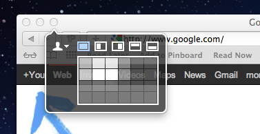
When using Moom there are two types of controls: Mouse and Keyboard. The keyboard controls are undeniably more powerful because of their speed and plethora of alterable configurations. Despite that I still found that the mouse features were treated with equal attention. Hovering over the green zoom button displays a beautiful transparent popover that has five pre-defined and extremely useful shortcuts.

Below the five icons lies a grid that can be used to dynamically draw out where you want the window to be located. The grid must be enabled under Mooms Mouse preferences. There you will find options to adjust the size of the grid as well as an option to enable access to your custom keyboard controls. Another great mouse feature is the ability to move windows across displays with nothing more than a gesture (clicking down on an icon and dragging it towards the second display).

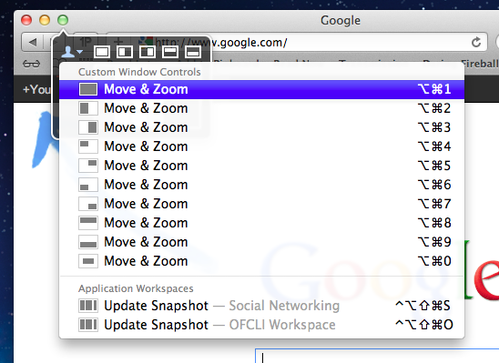
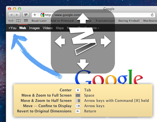
The keyboard functions are also quite interesting. There are basically two types. The first type allows you to define window positions and set them to a keyboard shortcut. It is the reason I bought the program and it did not disappoint. The ability to use a keyboard shortcut to resize a window to fill half the screen or even just a quarter of it depending on the situation is invaluable. The second type is a keyboard mode which is triggered by a hotkey and allows you to move a window around with your arrow keys for more granular on-the-fly positioning.

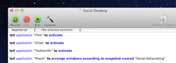
The real gem of this program is its ability to save window layouts. It basically memorizes the current positions of your windows and it saves a snapshot of them so it can restore those windows to their exact locations by way of a keyboard shortcut or from the mouse-based pop-over menu. If that wasn’t cool enough, they even added AppleScript support so you can call those saved layouts from a script!

Example: I like to keep a Desktop just for social networking applications. Now with Moom I can automate the process of opening all of my social apps and then arranging them instantly by calling the saved layout I created called “Social Networking” from an AppleScript.

The last feature I wanted to mention was its ability to run in what Moom refers to as Faceless mode. This is a mode with no dock icon and no menubar icon. Moom can also be set to show the settings panel on launch which is perfect when calling Moom from a program like Alfred. No icons to stare at and quick access to Moom’s settings from a launch bar, what could be better?

Overall this app has great functionality and a very pleasant interface, all for a conservative price. $4.99 on the Mac App Store. Read more


Western Digital Unveils Next Generation of My Passport Portable Drives

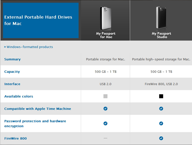
Today Western Digital introduced its newest generation of the popular My Passport portable hard drives for Mac users. They’re more compact and elegant than before with slim, all-metal designs. The My Passport Studio is a great portable solution for photographers, videographers, graphic artists or any creative that needs large amounts of storage data. It offers storage up to 1TB and has multiple connectivity options with two FireWire 800 ports and one USB 2 port. The FireWire port on the device allows for daisy-chaining with other devices such as HD camcorders, as well as Apple’s new Thunderbolt Display (which features Thunderbolt, FireWire, USB, and Ethernet ports).

The My Passport for Mac is another option for students and users that don’t need FireWire ports but still demand up to 1TB of storage.

Whether you are a member of the creative community or simply use your Mac to enjoy digital content on-the-go, users will find the perfect portable storage solution with WD’s My Passport Studio and My Passport for Mac high-capacity portable hard drives,” said Jim Welsh, executive vice president and general manager of WD’s branded products and consumer electronics groups. “We know the value our customers place on their digital content, which is why we set demanding requirements for durability, security, and long-term reliability, with all our drives.

These two drives are available right now via the WD Store (and other retails) and start at $99 for the 500 GB My Passport for Mac, and $129 for the 500GB My Passport Studio.


Financial Times’ Web App “More Popular” Than iOS App

Reuters reports on the Financial Times’ web app’s performances, noting that the HTML5-optimized version of FT.com has now 700,000 users, proving it to be “more popular” than the newspaper’s iOS app. Financial Times made headlines when it couldn’t agree with Apple on iTunes’ subscription rules for publishers – which require companies to give a 30% revenue cut to Apple, and make sharing of subscriber data opt-in. It was previously reported that 50% of iTunes subscribers opted to share their personal information; however, the Financial Times wanted more control over its mobile application, and decided to develop an HTML5 version instead. The iOS app was then pulled from the App Store.

People who are using the app are spending much more time with the content,” he said. “They are consuming about three times as many pages through the app as they are through the desktop in an average visit.”

The FT’s Web-based mobile app accounts for 15 percent of FT.com subscriptions and 20 percent of total FT.com page views from mobile users, Grimshaw said.

After launching the new web app on June 7, the Financial Times reported after three weeks they achieved 200,000 downloads, with 100,000 in the first week alone. In spite of its web app nature, the iOS-optimized FT app recommends users to “add it to their home screens”, requesting access to increased database size for local cache.

Apple has been doing a number of things to address the issues with subscriptions and delivery of content on iOS devices. They first launched iTunes app subscriptions in February, making it easier for users to subscribe to newspapers and magazine with their existing iTunes accounts. Then at WWDC the company announced Newsstand, a new unified virtual shelf on iOS devices for content a user is subscribed to. Adobe has already announced its publishing tools will be updated to take advantage of iOS 5’s Newsstand. The Financial Times is not the only publisher to find an alternative route out of Apple’s App Store, as Amazon released a web-based version of its Kindle reader with direct integration with the Kindle Store.

Both the Financial Times and Amazon couldn’t comply with Apple’s subscription rules, even after Apple slightly modified them to open up to more publishers in June.


“iPhone 4S” Name Shown On OtterBox Case Packaging

According to a series of tweets posted earlier today by @chronic on the @chronicwire Twitter account, accessory maker OtterBox has built over 3 million cases for a rumored upcoming “iPhone 4S” device. As seen in the photos posted online, the packaging of one of such cases depicts the “iPhone 4S” name, as well as what appears to be a redesigned position for the iPhone’s volume buttons, seen on the right of the device. You can check out more photos over at Twitter.

Chronic has been a source of Apple-related “leaks” in the past. For instance, he posted screenshots of several internal iOS 5 settings (high-quality YouTube and FaceTime over 3G), as well as information in the weeks that lead up to Apple’s Back to School promotion in June. Chronic was, however, incorrect in reporting MacBook Air updates weeks before Apple actually shipped the refreshed models.

There’s been a controversy in iPhone-related rumors in the past months as to whether Apple will ship a “completely redesigned” iPhone 5 in October, an iPhone 4-like “iPhone 4S” device (such name was first used by 9to5mac in discussing an A5-powered iPhone 4), or both. According to recent speculation, Apple is set to hold a media event to introduce the next iPhone on October 4th. A number of cases from third-party manufacturers have surfaced in the past months, showing both signs of a redesigned device and something very similar to the iPhone 4 – thus the discrepancy in iPhone 4S-iPhone 5 rumors. You can read more about this in our iPhone rumor roundup and retrospective.


Apple Continues Opening New Stores This Weekend

Apple has been very active the last few months in opening numerous new Apple Stores across the world and this weekend is no exception, with a total of six new stores opening. It starts with the Nanjing East store in China opening tomorrow (Friday, September 23) and then the IFC (Hong Kong), Hornsby (Australia), Centro Sicilia (Italy), New Haven (Connecticut) and Metrotownn (Canada) Apple Stores will open on Saturday.

The Nanjing East store (shown above) is the third Apple has opened in Shanghai, but this one is a little more interesting because in addition to spanning two floors, ifoAppleStore notes that three additional levels will be used as training rooms, meeting rooms and administrative offices. Jump the break for some picture of the store.

Over in Hong Kong, Apple will this Saturday open a store in the IFC Mall (shown below), the first to be located in Hong Kong. ifoApple Store notes that the store will occupy two levels and feature a unique design:

The rear wall of both levels are glass windows looking out towards the city. On the inside, the lower level has two wide stainless steel walls, with a visitor entrance in the middle. The walls include back-lit display cases promoting Apple’s products. The upper level has an all-glass front window visible from the mall hallway.

[Via ifoApple Store [1] [2], Shanghaiist]

Read more


Labeling iOS’ Back Button

Labeling iOS’ Back Button

Neven Mrgan shares a solid piece of advice for iOS app designers and developers: A Back button labeled “Back” is never a good option.

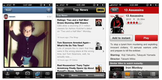
As he notes, Apple never labels the “Back” button – the left-pointing arrow at the top of most iOS apps – “Back”. They provide context as to how a parent view (the previous screen) should be shown in the button’s label.

This is a widespread issue, present in many extremely popular apps.

This is redundant and it provides no context. Note that Apple never does this, not in any app. Instead, they provide either the full title of the previous view, or an abbreviated/truncated version of it.

He offers some do/don’t examples in his blog post. Here’s a series of screenshots from my iPhone, showing apps that correctly use the “Back” button:

One of my favorite examples, the Rdio app for iPhone:

And here’s Apple in the Apple Store app:

The button itself means “back”, so the additional “Back” label is not an option. These are the minor details that make great apps, well, great.

Permalink

Gmail Mobile Web App Gets Multiple Sign-In

In the past months, Google has released a series of updates to improve the overall experience of the Gmail mobile web app, which works on iOS devices such as the iPhone and iPad, as well as other smartphones and tablets. Google made the mobile web app more accessible and usable with notifications, undo bar, Retina graphics and “pull to refresh”, and today they’ve announced another update that brings Preferences and multiple sign-in to the service when viewed from mobile devices.

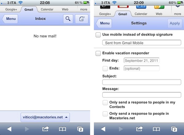
Multiple sign-in has been around in the Gmail desktop website for quite some time, and it’s a useful shortcut to quickly switch between multiple Google accounts (and thus Gmail inboxes or Google+ profiles). Starting today, a new sign-in button will appear at the bottom of the iOS web app, allowing you to jump to another account, which will automatically load its Gmail inbox. The feature is already live in Mobile Safari (tested on an iPhone 4 running the latest iOS 5 beta).

Furthermore, Google is now allowing users to set Preferences directly from the mobile web app. The company is highlighting the possibility to create a mobile-only signature, so your friends will associate typos to a smartphone’s keyboard. Also, the Preferences come with vacation auto-responder settings, and a few more options.

We know that autocorrect and other mobile spell-checks can be frustrating as you are typing on the go. Let your friends know that you are responding via your mobile phone so that they understand why you might have sent a message that you are meeting for “monitors” and not “mojitos”. It’s an easy way to make them understand why your message might be short or have a few typos. To create a mobile signature, from the menu view, press the new settings icon, choose your signature, and then check the box that tells us you want to activate it. If you ever want to disable the mobile signature, you can uncheck the box and we will use your desktop signature instead.

Google notes that each Gmail account can have a separate bookmark. On iOS devices, you can save a Gmail shortcut to the Home screen by tapping on the Action icon in Mobile Safari, and then Add to Home Screen (Gmail’s webclip icon has been optimized for the Retina Display as well).