John: The MacStories Selects Awards are our annual love letter to apps and the people who make them. Apps have become ubiquitous, seeping into every corner of our lives. They help us find a job and home, get work done, blow off steam, order a meal, and everything in between. With so many apps available in the App Store, though, it’s easy to take them and their creators for granted, which is why as the year comes to a close, we step back and pause to celebrate the MacStories Team’s favorite apps and the people who make them.
To say that bringing an app to life from idea to a fully-formed 1.0 is tough is a vast understatement, and 2020 hasn’t made the process any easier. However, as we survey the past year, the depth of innovative apps makes it clear that many developers poured themselves into their apps in 2020. The result was a list of MacStories Selects candidates that was longer than in any prior year of the awards.
We had a wealth of excellent apps to choose from this year for the seven categories the MacStories Team chose:
- Best New App
- Best App Update
- Best New Feature
- Best Watch App
- Best Mac App
- Best Design
- App of the Year
Along with the Readers’ Choice Award, which was chosen by Club MacStories members, that makes a total of eight award winners plus twelve runners-up. These are the third annual MacStories Selects Awards, which we debuted in 2018. As we did last year, we have also created beautiful physical awards commemorating the winners, which we will be sending out to each in a couple of weeks.
We also recorded a special episode of our podcast AppStories all about the MacStories Selects winners and runners-up. It’s a terrific way to learn more about this year’s apps.
You can listen to the episode below.
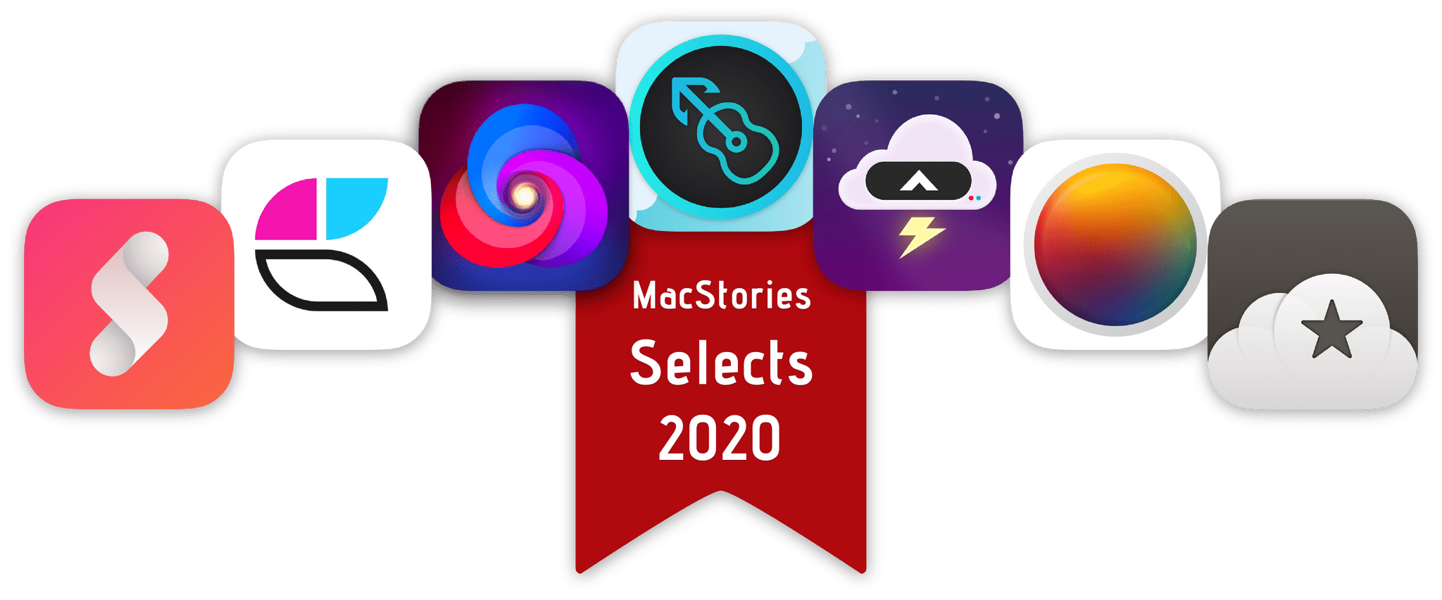
So, it’s with great admiration and respect for the developers who have persevered through a tough year to produce some of the best apps we’ve ever used that we present to our readers the 2020 MacStories Selects Awards:
Read more