For as long as I can remember being interested in music as more than a mere source of background audio, but as an art form, I’ve been interested in the people who make music – the artists and their craft. Back when I used to buy CDs at my favorite record store in Viterbo, my hometown, I would peruse each album’s liner notes to not only read official lyrics and check out the artwork and/or exclusive photographs contained inside the booklet, but also to read the credits so I could know more about who arranged or mixed a particular track. Beyond the feeling of owning a tangible piece of music, there was something about reading through an album’s credits that served as a simple, yet effective reminder: that people – engineers, instrumentalists, vocalists, producers – created the art I enjoyed.
In today’s world of endless, a la carte streaming catalogs, we’ve reduced all of this to a cold technological term: metadata. Our music listening behaviors have shifted and evolved with time; when we browse Apple Music or Spotify, we’re inclined to simply search for a song or an album and hit play before we return to another app or game on our phones. A streaming service isn’t necessarily a place where we want to spend time learning more about music: it’s just a convenient, neatly designed delivery mechanism. The intentionality of sitting down to enjoy an artist’s creation has been lost to the allure of content and effortless consumption. Don’t get me wrong: I love the comfort of music streaming services, and I’m a happy Apple Music subscriber; but this is also why, for well over a year now, I’ve been rebuilding a personal music collection I can enjoy with a completely offline high-res music player.
Whether by design or as a byproduct of our new habits, metadata and credits don’t play a big role in modern music streaming services. We’re frustrated when a service gets the title of a song wrong or reports the incorrect track sequence in an album, but we don’t consider the fact that there’s a world of context and additional information hidden behind the songs and albums we listen to every day. That context is entirely invisible to us because it’s not mass-market enough for a music streaming service. There have been small updates on this front lately1, but by and large, credits and additional track information are still very much ignored by the streaming industry. And if you ask me, that’s a shame.
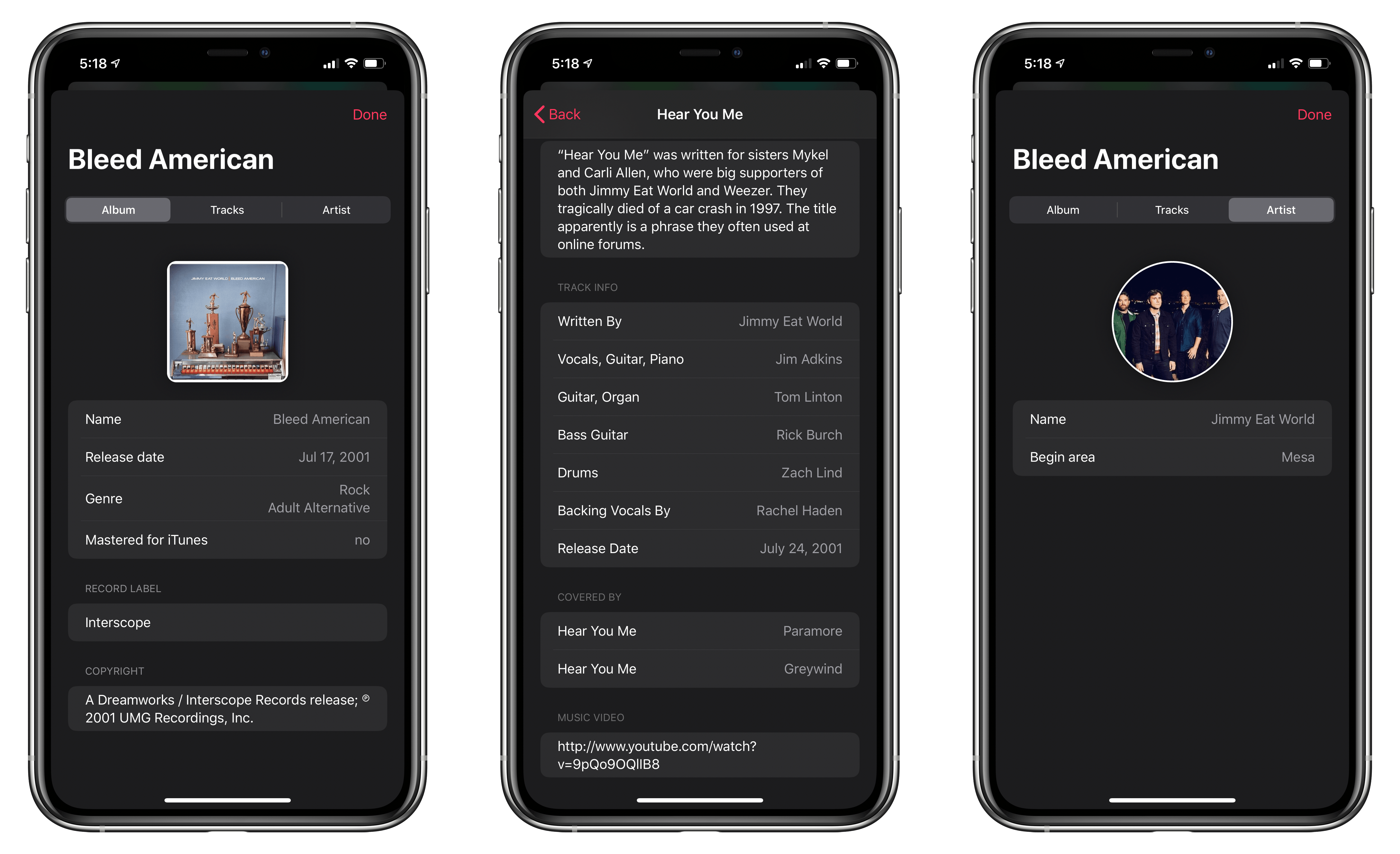
This is why I instantly fell in love with MusicSmart, the latest utility by Marcos Antonio Tanaka, developer of MusicHarbor (another favorite music app of mine). MusicSmart, which is a $1.99 paid upfront utility, revolves around a single feature: showing you credits and additional details for albums and songs available in your local music library or Apple Music’s online catalog.