This Week's Sponsor:

Dropzone 5

Improve your Drag-and-Drop Workflow


Posts in reviews

Weather Line Review

Weather Line

Weather Line

I am not a weather nerd. I don’t commute to work[1] and I don’t need to know the percentage of precipitation and humidity for the next three weeks. I spend most of my days in Viterbo and Rome, where the weather isn’t particularly crazy; I never get to try the fancy weather apps with Dark Sky integration and “radars” because those features don’t work here. You may argue that I’m forced to be a casual user of weather apps; I honestly believe that I don’t need to know everything about the weather to have a good day. I don’t travel much, and therefore I rarely need to plan my trips according to weather conditions. I enjoy simple weather apps like Today, Yahoo Weather, and even Apple’s built-in Weather app for iOS 7 because they display all the data I need without overwhelming me with terminology I don’t understand.

This is why I was curious to try Ryan Jones’ Weather Line when he emailed me a few weeks back. His pitch was simple: “I had this idea for a weather app, and I’m great at making charts”. Sure enough, I remembered Jones’ work on the iPad mini “price umbrella” chart from last year, and he seemed confident enough in his app to convince me to try it. Weather Line is available today at $2.99 on the App Store, it’s iPhone-only, and it is one of the nicest and most unique weather apps I’ve tried lately. Read more


Terminology 3 Review

Less popular than Drafts but equally impressive in terms of functionality and inter-app communication, Greg Pierce’s Terminology, a dictionary and thesaurus app for iOS, is relaunching today for iOS 7 with a new Universal app that adds sync, configurable actions, and a redesign that matches iOS’ new general aesthetic. I have been testing Terminology 3 for the past few months, and this new version holds up to expectations by honoring Terminology’s tradition of simplicity and bringing powerful new features.

We first reviewed Terminology in 2010, when it was an iPad-only app that already showed how developer Greg Pierce wanted to focus on words and definitions rather than heavily custom graphics and fancy effects. A few months after the iPad version, Pierce released a standalone iPhone version, called Terminology Ph, that carried all the features of the tablet counterpart onto the smaller screen; a year after version 1.0, Terminology 2.0 was released, refining the user interface and adding new app integrations. Throughout 2011, 2012, and the better part of this year, Pierce maintained Terminology with compatibilty updates but otherwise focused on Drafts, which, as MacStories readers know, has contributed to redefining iOS automation and the idea of a “quick notepad” for iOS.

The new Terminology represents a break from the past, fully embracing iOS 7’s new design philosophy and offering customers an easier purchase experience with a Universal version. As a new app, you will have to buy Terminology again – something that is perfectly acceptable after three years of usage of the same app. Read more


Launch Center Pro 2.0 Review

Launch Center Pro, developed by Contrast (née App Cubby), can be considered the app that spearheaded a small revolution among iOS power users. Initially envisioned as a Notification Center tool, following an Apple rejection in late 2011 the app was released as Launch Center; in the summer of 2012, App Cubby completely reworked the inner workings and design of Launch Center and turned it into Launch Center Pro, allowing users to create custom actions with personalized URL schemes and therefore kicking off a series of months that saw the apperance of several other apps focused on actions, URL schemes, and automated workflows. In looking back at the past year of iOS automation, I think that Launch Center Pro 1.0 was a major turning point in that it proved that many iOS users wanted to create actions and workflows to save time and be more productive.

In March 2013, App Cubby released Launch Center Pro 1.1, which focused on TextExpander integration in URL schemes, Action Composer tweaks, and deeper system integration with clipboard actions for text and more. The app’s library of supported third-party apps kept growing as more developers took the opportunity to address the interest sparked by Launch Center Pro to add URL schemes to their apps. I remember, however, that back then App Cubby’s David Barnard – the same developer behind the recently released and successful weather app Perfect Weather – started telling me about his plans for the future of Launch Center Pro and expanding to other supported services, apps, and devices.

With today’s Launch Center Pro 2.0 for iPhone, a free update for existing customers, Contrast wants to ask: in the era of Drafts actions and Control Center, can Launch Center Pro still have a spot on a user’s Home screen, and possibly in the dock? Read more


1Password 4 for Mac Review

1Password 4 for Mac

1Password 4 for Mac

I don’t think that 1Password, AgileBits’ popular password management and form-filling tool, needs any introduction for MacStories readers. I have been using 1Password since I got my first Mac in 2008, bought the iPhone and iPad versions, followed the development of the Mac client, and praised the major 4.0 update for iOS that was released in December 2012. The work I do on the web depends on 1Password’s feature set, which makes it easy to manage logins and web identities with the peace of mind that the app, and not your brain, will have to remember secure data for you.

Here’s how, last year, I explained the purpose of 1Password in my review:

Why Should You Use It?

Because you need to stop using the same password on every website you subscribe to; because you need stronger, unique passwords others can’t guess; and because in doing so you’ll probably want a single app that keeps them all together. That’s what 1Password does: it’a a single app that will let you easily create stronger passwords and store them in an encrypted database that only you can access. With version 4.0, the app syncs its database using iCloud and Dropbox, and it doesn’t come with a confusing combination of strikingly different iPhone/iPad designs anymore.

I wouldn’t say there’s a learning curve in using 1Password. You can just start using the app and begin adding new logins, changing your existing passwords with stronger ones, and perhaps taking a few notes with information you don’t want to keep elsewhere.

1Password 3 for Mac has been a trusted companion for four years now: the app was released in September 2009[1], before Apple made a Mac App Store, before the iPad, and when (I’m fairly certain) Apple was already doomed. 1Password 4 for Mac, released today on both AgileBits’ website and the Mac App Store, is a complete redesign of 1Password that, inspired by its iOS counterpart, brings a fresh interface to the desktop alongside new functionalities inspired by last year’s iOS update, while still ensuring that OS X users can get access to more advanced and keyboard-driven features. If you want to skip my thoughts on the app, go download 1Password 4 right now because, unsurprisingly, it’s great. Read more


The Converted: A Different Take On Unit Conversions

Unit converters are perfect as iOS apps: their feature set is limited, they can work with and without an Internet connection, and, because of their constraints and purpose-oriented nature, they allow developers to experiment with touch and UI interactions. They’re less celebrated than Twitter clients and weather apps, but they’re UI playgrounds too.

As such, I’m having a hard time settling with a specific unit converter because every week new interesting ones come out and I’m lucky enough to get to try them because trying apps is part of my job. I suppose that if converting units was a recurring task of my daily life I would be forced to pick one and stick with it, but, instead, I’m free to experiment and let my readers judge.

In the past year, I’ve taken a look at various unit and currency converters like Denominations, Convertible, Measures, and, recently, Amount. Each one of them solves a problem in a different way, either with a particular interface design or through advanced features. The Converted, developed by Ideon, is a $2.99 app that eschews manual input through a keypad to show you the relation betwen units in a unique presentation that I haven’t found in other iOS apps. Read more


Simple Photo Collages with Diptic PDQ

I’ve never been into the idea of sharing my photos as “collages”, especially because all the iPhone and iPad apps that promised to make it easy to assemble collages looked overly social, filter-oriented, or just badly designed. However, I recently wanted to send a photo collage of my dog to my parents, and I conveniently came across Diptic PDQ on the App Store thanks to Apple’s feature for iOS 7-ready apps. Apparently, PDQ (a Universal app) is the “lighter” version of Peak Systems’ more advanced Diptic app, which comes with all sorts of settings, textures, and In-App Purchases. I just needed to create simple collages with thin borders, so I bought PDQ and have been using it for the past week with nice results. Read more


Shazam for iOS 7

Much like Twitterrific’s update for iOS 7, Shazam has spruced up their app with flattened, descriptive wiry icons and simple color palettes that make the app feel at home on Apple’s new OS. Perhaps the only noticeable difference is that Shazam asks for Microphone access, a new requirement as of iOS 7, so that it can listen to what’s playing in the background to identify songs. It’s visually a nice update, but much of it is the same as before. It’s cleaner and more focused, with nice looking fades and animations as you switch between tabs.

The features added to iOS 7 revolve around social maps and Facebook. Eh. I don’t know how Shazam feels about people like me, but I’m not so intent on sharing songs with friends and seeing what people are listening to around me. I said the same thing when I took a look at the revamped iPad app earlier in the year, and I feel somewhat alienated since the only thing I really want to use Shazam for is ID’ing tracks playing at over loudspeakers, on the radio, or when some remixed version of a song pops up on a livestream somewhere. The social stuff… I don’t want any part of it. It’s cool. It’s just not for me.

Shazam currently sells a free version of Shazam, complete with advertisements that you can remove with an in-app purchase. For a few bucks you can straight up buy a version of Shazam with a darker blue icon free of ads. And then there’s a product RED version of the app that looks cool, and also removes ads. I’d rather see a single version of Shazam that’s free, with Lifetime (or Encore) as an IAP and RED as an optional theme, which you could also pay for. It’d remove a lot of the confusion about which version is which on the App Store. Regardless, if you’d like to give Shazam a try (the ID stuff is amazing — why don’t you have it?), you can download one of the following variants from the App Store:


Logacal: A Smarter Visualization Of Calendar Events

Logacal

Logacal

In the past few months, I’ve been obsessed with finding the best Calendar and Reminders clients for my iPhone and iPad. While I wouldn’t call myself a calendar power user, I do rely on iCloud Calendar to organize my daily appointments and events that require my complete attention, and I’ve been lured by the simplicity and immediacy of Reminders. As I noted in my article on living with iOS 7, I’ve also been liking the OS’ new Today view in Notification Center, which gives me a summary of all the things – events or reminders – I have to do today.

I don’t like calendar apps that are limited by old rules defined by physical calendars. For instance, what’s the point of showing a full month with past events when our devices know what the current day is? Why showing empty days in views that should list upcoming events? Our devices have a little, powerful silicon brain inside them, and yet so many calendar apps – supposedly, digital assistants for the modern age – are still stuck with concepts and metaphors of two decades ago. This is a topic that other smart people have also touched upon in the past, and I recommend reading this piece by Jason Snell.

Earlier this week I was browsing the App Store and I came across Logacal, a $2.99 iPhone app developed by Czech developer Pavel Doležal. I was intrigued by the app’s clean iOS 7 design and description:

Unlike traditional month, week or day-based calendars, Logacal doesn’t split time equally, but instead depending on how far in the future it is.

And:

Its design is vastly inspired by logarithmic scale that enables you to see and manage your calendar in a very natural and intuitive way.

Now, I’m no expert of logarithmic scales and other high level mathematical theories, but I’m good enough at clicking the Buy button in iTunes and doing some reading on Wikipedia. Apparently, some of our senses operate in a logarithmic fashion, and Pavel’s idea was to represent future days, weeks, months, and years on a scale that gets less granular as you move further in time. Read more


Twitterrific Revisited for iOS 7

Twitterrific, for a long time, was my mainstay Twitter app. It’s beautiful, functional, and extremely fast, but I’ve found myself gravitating away towards Tweetbot and Twitter’s own app. It’s not that I don’t like Twitterrific, but I needed a change of scenery, and Twitter’s own Connect tab has spoiled me with a wealth of information such as follows, RTs, and yellow stars intermingled with mentions — things I swore I never cared about. I think the biggest killer for me has been the prolonged wait for an updated Twitterrific on the Mac, which feels outdated in comparison to its iOS counterpart.

The neat thing about Twitterrific was that it was practically already ready for iOS 7. At least visually, Twitterrific had already adopted thin fonts, bright neon colors that go great with the iPhone 5c, and a sleek barebones interface. This doesn’t even account for Twitterrific’s unique layout; much of the app doesn’t really conform to traditional iOS conventions anyway (consider the tab bar at the top of the screen rather than the bottom). With iOS 7 the visual updates are relatively minor, with wire-thin icons and small visual updates prevalent throughout. Not even Ollie changed too much in Twitterific’s new stark white icon.

Twitterrific’s biggest notable update is background refreshing (The Iconfactory calls it “fetching”). Streaming isn’t something Twitterrific has been known for, but as long as the app is kept in the background, it will load new tweets in so they’ll be ready to read when you open the app. That to me makes Twitterrific much more viable as a daily Twitter app.[1]

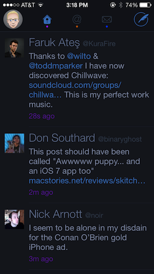
There’s lots of minor updates. You can tweet links directly from the in-app browser (great feature) and you can additionally opt to open links in Chrome. Various links are now tappable in bios. They’re all things that continue to make Twitterrific super friendly.

In fact, of all the current Twitter apps, I’d say Twitterrific is still the most friendly. Gestures are broad, sensible, and fast to execute. Twitterrific’s blazing performance continues to be stellar: tweets load unbelievably quickly as you swipe to view conversations. The core experience is about messages, whereas Twitter’s official app feels like it teeters on personal branding and brand engagement, while Tweetbot is dense with features but a little slower and not yet updated for iOS 7.

Twitterrific for iOS 7 is largely the same as its predecessors, but it continues to get faster in every iteration. I don’t know how much more performance The Iconfactory can wring out of their app before Twitterrific flies off the face of the phone. With refreshed graphics, speedy improvements, and gesture updates that better let Twitterrific mingle with iOS 7’s native gestures, you might want to consider taking another look at the blue bird if you haven’t already.

Twitterrific can be downloaded from the App Store for $2.99 for a limited time, 50% off the regular price.


  1. In fact, I almost don’t like Apple’s new multitasking interface for this reason. It encourages people to close apps, but if you do, those apps can’t perform background tasks. The new multitasking interface is perhaps misleading and counterintuitive for this reason.  ↩