Posts in news

Interesting for iOS 7

Interesting 2.0

Interesting 2.0

Back in December 2012 I linked to Interesting, an iPhone news aggregator developed by Mike Rundle that was focused on providing simple access to tech and entertainment news in a delightful design. I wrote:

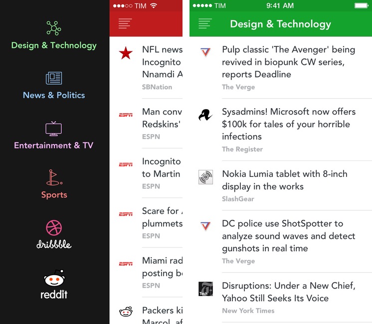
Interesting collects new articles from a variety of sources and displays a list of entries in reverse chronological order. Tapping on an item opens an embedded web view, which has a toolbar for navigation, refresh, and sharing options. Sharing includes Pocket and Twitter integration, Copy Link, Open in Safari, and Mail Link. Interesting has four sections: Design & Technology; News & Politics; Entertainment & TV; and Sports. The built-in list of sources includes websites like The Next Web, Wired, SBNation, CNN, SPIN, and various sub-reddits.

Released today, Interesting 2.0 is a major update to the original app that introduces a new interface for iOS 7 and adds more content sources to allow users to fetch even more articles to preview in the app or open in Safari.

Read more


Poster Updated for iOS 7

Poster 3

Poster 3

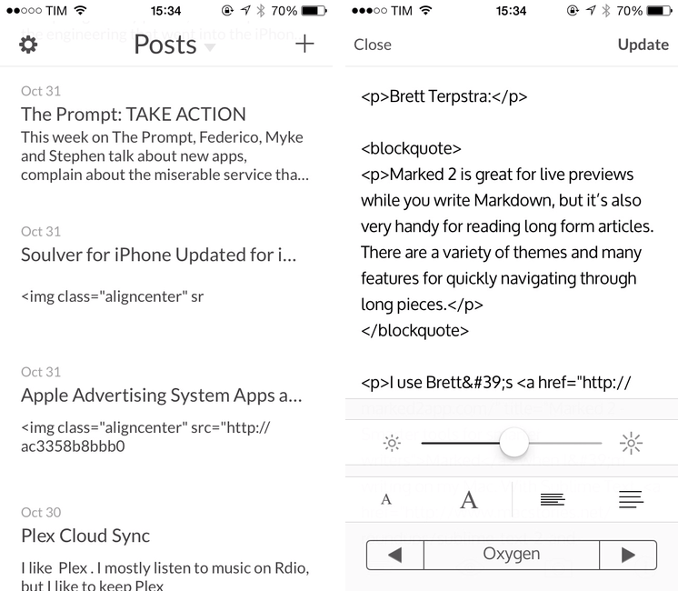
In June, Automattic acquired Poster, a popular WordPress client for iPhone and iPad that featured Dropbox integration, Markdown support, and advanced actions for power users. Poster was, before Editorial, the app that I used to write articles from my iPad and iPhone, and I wasn’t thrilled when developer Tom Witkin announced the app would be discontinued.

To my surprise, the app – which was pulled from the App Store after the acquisition – has been updated to version 3.0 this week, adding iOS 7 compatibility and fixes. There are no new notable additions, but the entire Poster UI has been updated for iOS 7 and there is a new line height option in the preview menu; Witkin got rid of textures and iOS 6-style buttons, adding subtle animations for navigation and other menus. It’s still the same Poster, only with an iOS 7 interface and less crashes.

However, the bad news is that, because the app isn’t available on the App Store anymore, only old customers can download the updated version. If you bought Poster in the past, open the App Store, find the Purchased section, and look for Poster; tap Open/Download, and the app should be reinstalled with the new version 3.0 that Witkin made for iOS 7.

Witkin figured out a way to update Poster for old customers who don’t want to switch to the official WordPress client, and I’m glad he did because some of Poster’s more advanced functionalities are still nowhere to be seen in WordPress for iOS or other text editors. I don’t know if Witkin will keep on releasing compatibility updates in this way, and, unless major changes are made, Poster will eventually stop working with future versions of iOS or WordPress – but until that day, you can enjoy Poster 3 for iOS 7. It’s still a great app.


Soulver for iPhone Updated for iOS 7 with Syntax Highlighting, More Unit Conversions, New UI

I’ve written about Soulver before: a calculator that isn’t really a calculator, Soulver lets you work with numbers for calculations and other operations using text commands across multiple lines. Soulver is, in a way, the Fantastical of calculators: using natural language, it lets you do quick calculations without having to tap dozens of buttons or scroll long menus. As the developers call it, Soulver is a “notepad calculator”.

Considering iOS 7’s focus on typography and legibility, I was looking forward to seeing how Acqualia would update Soulver (which is heavily text-based) to take advantage of the new OS, and I wasn’t disappointed. Version 2.3, released today, builds upon the app’s existing feature set to offer a redesigned interface (and icon), more unit conversations, and syntax highlighting.

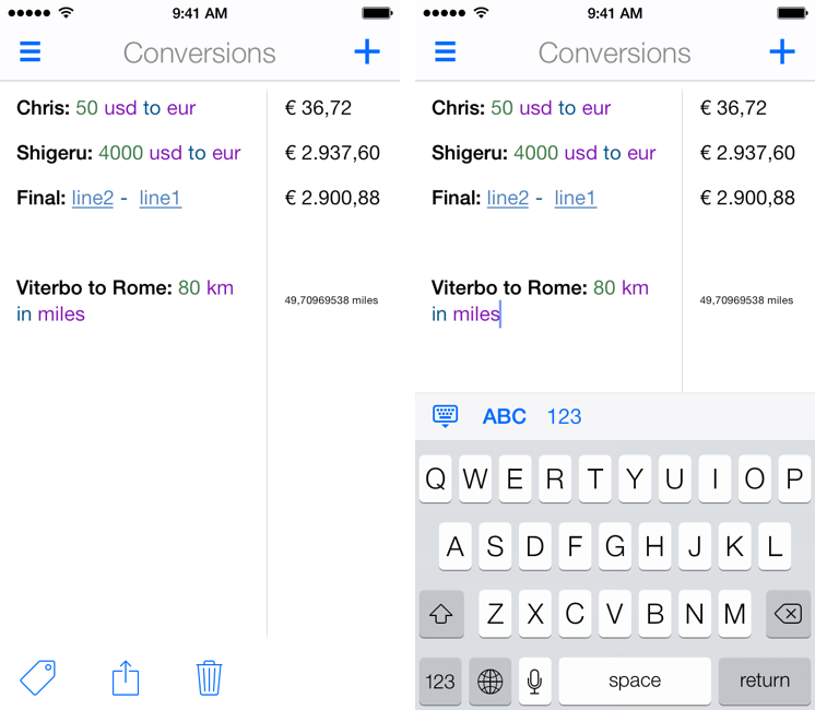
If you’ve used other iOS 7 apps like Byword, you know how syntax highlighting is beneficial to the user experience: numbers turn green, units are purple, operations are blue, and plain text is standard black. Syntax highlighting makes lines more scannable because operations and individual bits of text stand out more; furthermore, because Soulver allows you to type units manually (you can write “USD”, “usd”, “dollars”, etc) you’ll instantly know if what you typed has been recognized by the app thanks to color highlights. Besides being nice visually speaking, syntax highlighting – a simple addition in theory – makes the experience of using Soulver considerably better.

With the update, Acqualia has added new unit conversion types, which come in handy for people who, like me, often trigger the app using a URL scheme that lets them type queries in apps like Drafts or Launch Center Pro. Like Fantastical, I’m faster at writing with natural language on my iPhone than tapping menus and lists, so the addition of more units allows me to use Soulver as the primary unit converter app on my device.

Soulver 2.3 includes other design improvements such as simplified navigation and easier access to total when the keyboard isn’t shown. The app hasn’t been updated on the iPad for almost a year now, and I hope that Acqualia is working on an iOS 7 update for that platform as well. Soulver 2.3 for iPhone is $2.99 on the App Store.


Apple Advertising System Apps and Features in App Store Search Results

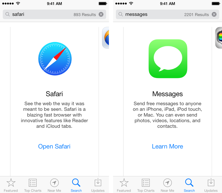
This morning, I noticed a tweet by Lukas Burgstaller with a screenshot of Apple’s Safari browser showing up in App Store search results for the “browser” search query. I did some tests, and I’ve discovered other search results advertising built-in iOS system apps and features with banners and links to open an app or read more information about it. I’m not sure when Apple started displaying their own built-in apps in the App Store search results, but it’s an interesting (and, I believe, good) idea worth discussing.

If you search for common terms like “web”, “SMS”, or “movies” in the iOS 7 App Store you’ll see special search results for Apple apps like Safari, Messages, and iTunes with a large icon, a description, and a link to learn more or open an app (such as Safari). These results appear on the App Store for iOS 7 devices (I wasn’t able to display them on a Mac using iTunes) and, in my tests, they also worked for queries like “browser”, “messages”, “cloud”, “internet”, “Siri”, and “text”. I’ve tried several other queries, but I couldn’t see results for other apps like Reminders, Calendars, Mail, Photos, Music, or Notes. Read more


Apple Q4 2013 Results: $37.5 Billion Revenue, 33.8 Million iPhones, 14.1 Million iPads Sold

Apple has published their Q4 2013 financial results for the quarter that ended on September 28, 2013. The company posted revenue of $37.5 billion. The company sold 14.1 million iPads, 33.8 million iPhones, and 4.6 million Macs, earning a quarterly net profit of $7.5 billion.

We’re pleased to report a strong finish to an amazing year with record fourth quarter revenue, including sales of almost 34 million iPhones,” said Tim Cook, Apple’s CEO. “We’re excited to go into the holidays with our new iPhone 5c and iPhone 5s, iOS 7, the new iPad mini with Retina Display and the incredibly thin and light iPad Air, new MacBook Pros, the radical new Mac Pro, OS X Mavericks and the next generation iWork and iLife apps for OS X and iOS.

For Q1 2014, Apple is providing guidance of revenue between $55 billion and $58 billion. Read more


Dispatch 1.3 Gets Unified Inbox, Dropbox and Droplr Integration, Action and URL Scheme Improvements

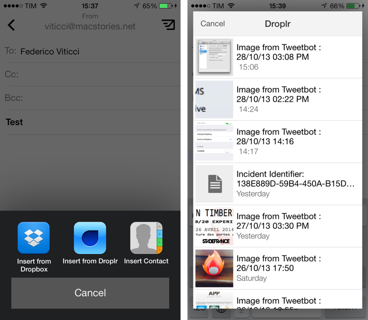
Dispatch is my favorite third-party email client for the iPhone. Released in June, Dispatch stood out from similar apps as it implemented a powerful feature set that took advantage of native iOS apps to bring inter-app communication and snippets to mobile email. In September, the app was updated with iOS 7 background fetch, message search, and a change to individual message links that allowed iOS apps to open specific messages directly in Dispatch. Thanks other several minor features and details (such as custom salutations and link actions), Dispatch became a fantastic alternative to Apple’s Mail app for users who wanted more out of their iPhone email client.

With today’s 1.3 update, Dispatch gets even more powerful and versatile with the addition of a unified inbox: a feature that I had been asking for since the first version of the app, unified inbox is a new top-level item in the app’s sidebar and it groups all, unread, and starred messages from all your configured accounts’ inboxes. From the All Inboxes view, you can manage and respond to messages as usual, but you can also search and compose a new message without switching to an individual account’s view. Read more


Day One for Mac Gets Map View On Mavericks, Location Editor, Other Enhancements

Day One is probably the most powerful app I have on my Mac and iOS devices, and I don’t mean that from a technological or functional standpoint. Day One is based on a powerful idea: it’s a journal app that combines text, locations, photos, and weather data to let you remember what you’ve done in the past. Eschewing the limitations of pen and paper, Day One’s beautiful design and smart feature set make reading and seeing moments or your life a pleasant and potent experience.

I’m a big fan of Day One. Here’s how I described it earlier this year after a very important personal anniversary:

In the app’s Calendar view, I changed the year to “2012″ and, sure enough, the “August 1, 2012″ entry was there, showing photos of my hospital room; my girlfriend sending a selfie from home; and a note that I wrote about the doctors being “nice”. Bits of life. A combination of old thoughts and visual memories that I still have, in some form, in my brain, but that here, in this app — right now — I can hold and directly look at. It is, indeed, far more powerful than memory alone.

It sounds so trivial because we’re used to it. It’s diary app! Of course it lets you browse old entries in a calendar, and of course it’s got search, and of course it accepts photos as attachments, and, okay, the fact that you can see old weather information is neat — but yes, it’s because of the GPS. Common technology terms for yet another app. But does it have a URL scheme? We often lose track of the magic of software.

With Mavericks, Day One for Mac has been updated to version 1.9, which brings some notable new features and improvements to browsing the timeline. The first, Mavericks-only new feature is the Map View with location editor: thanks to the new MapKit offered to developers in Mavericks, Day One for Mac can now show you a zoomable map with blue indicators for every location where you’ve previously created a journal entry from. Read more


Skitch for Mac Updated with Mavericks Compatibility, Redesigned Toolbar, New Icon

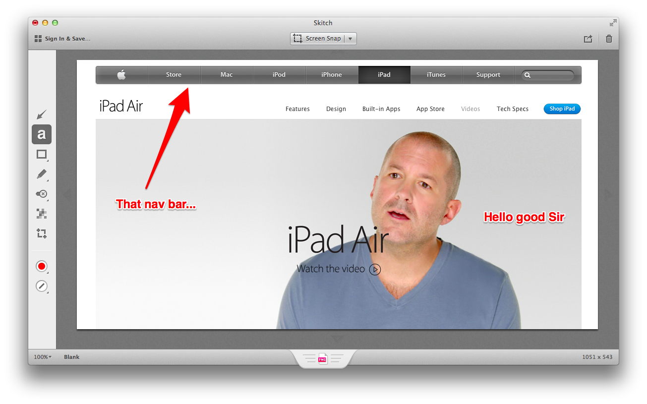
Following a major update for iOS that was released last month with a complete redesign and rewrite for annotations and sharing, Evernote updated Skitch for Mac today with a new icon, new branding, Mavericks fixes and a redesigned toolbar.

In a move that it’s in line with the company’s recent focus on Skitch as a standalone product and not an extension of Evernote apps, Skitch for Mac no longer launches with a login screen for users who don’t want to sync their image annotations to the service. Sync is still available, but all Evernote-related features have been grouped in a single area that doesn’t ask users to log into their accounts every time they launch the app. That alone was one of the biggest annoyances of the old Skitch for people who liked to keep it out of Evernote, and I’m glad it’s been improved.

In terms of using the app, Evernote has redesigned the toolbar to be more similar to the iOS counterpart in how it groups items and only shows more options when necessary. On the left side of the screen, you can click items as you’ve always done with Skitch, but now tools that have sub-menus for additional controls will navigate into a sub-view when clicked instead of showing a popup. This view can be pinned on screen to keep it visible by clicking the pin icon at the top, or you can click anywhere in the sidebar to go back to the main tool selection view. I’ve only been trying the new sidebar this morning, and it does seem to work better than the old UI for how I’m used to annotate images in Skitch (I either drag images onto the dock icon or use the menubar helper for crosshair snapshots).

The bottom section of the app has been redesigned as well. Zoom controls, file name, format, and “drag me” are more tightly integrated in a single toolbar, and I’ve noticed that you can click the filename to rename an image directly in Skitch before saving it to the Finder. Interestingly, file format options include both “PNG” and “Skitch PNG” – the only difference being that, in my tests, “Skitch PNG” set the Alpha Channel to “Yes” in the Finder’s image inspector.

I still miss the old app’s ability to snap webpages (I’ve been using Ember for that, and it’s a very nice app) but it’s good to see Evernote getting rid of cruft and polishing the design for users who don’t care about syncing their annotations to the main Evernote service. I don’t think that Skitch for Mac will ever be as simple as the new iOS version, and today’s update feels like a good one.

Skitch 2.7 is available on the Mac App Store.


Hazel 3.2 Adds Mavericks Tagging Support

Hazel is the key element of my paperless workflow and several other automation scripts I run on my Mac, such as photo backups. One day, I will get around describing my paperless system (which I have tweaked and perfected over the past months), but, today, allow me to link to version 3.2 of the app, which adds support for tags in Mavericks.

You can now create rules that check for tags in matched files and apply tags automatically. This is great if you want to process a bunch of files automatically and tag them instead of moving them into a folder. Hazel can pick up tags you’ve already created on your Mac, as well as create and replace existing tags if you want to type a tag’s name manually in Hazel.

Interestingly, Hazel can still set color labels (I assume for Mountain Lion users?) and it doesn’t show a tag’s color inline when editing an action – for me, it just displays a blue “token” for the tag with a white label. It’s really a minor issue –  I have been testing the public betas with Mavericks support and they’ve been working well for me.

You can get Hazel here, and check out our review of version 3.0 and some of my workflows.