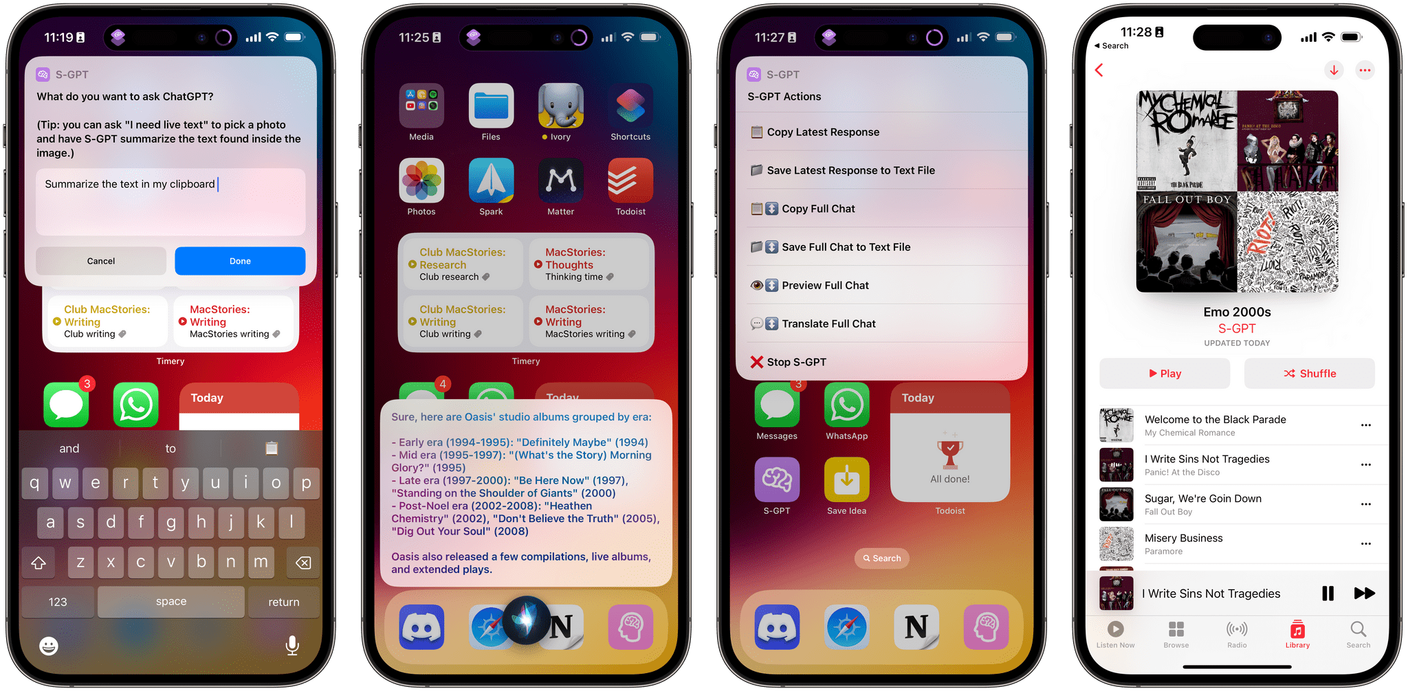
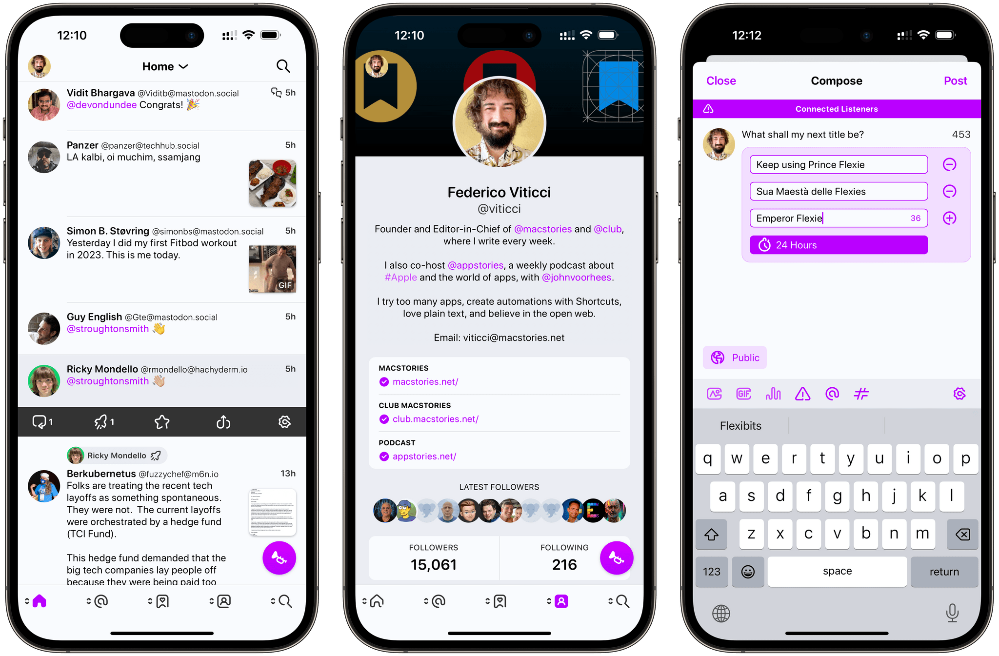
There’s an intangible, permeating quality about Tapbots apps that transcends features and specs: craftsmanship. With Ivory, launching today on the App Store for iPhone and iPad, you can instantly appreciate that level of care and refinement that the Texas-based duo is well known for after more than a decade on the App Store. But there’s something else, too: for the first time in a few years, it feels like Mark and Paul are having fun again.
Ivory is a Mastodon client, and it’s tricky to evaluate it right now because its version 1.0 is launching under extraordinary circumstances.
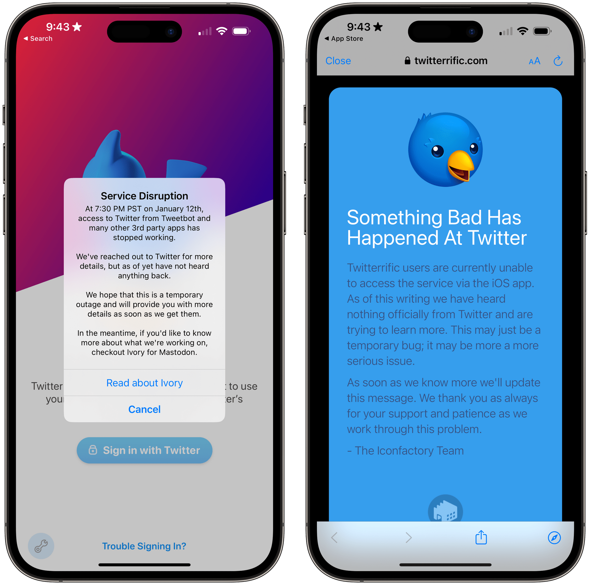
As we’ve documented on MacStories, Twitter’s idiotic new “leadership” recently decided to unceremoniously and crassly put an end to third-party clients such as Tweetbot with no warning, which forced Tapbots to scramble and figure out a solution on how to discontinue Tweetbot while dealing with subscription renewals while also accelerating the timeline for the launch of Ivory, which they’d been working on for months. I’ve been following the development of Ivory very closely (I’ve been using the app as my main Mastodon client since its first alpha in late November), and I know that the Ivory 1.0 launching today isn’t the debut version Mark and Paul were envisioning. By Tapbots’ own admission, there’s still a lot of work to do on Ivory, but given how the Twitter situation evolved, they had to ship something. There is already a roadmap on Tapbots’ website for Ivory, if you’re curious to know what the developers are planning for the foreseeable future.
As I was saying above, however, there’s something else about Ivory that, in many ways, makes today’s release an important milestone in our community worth documenting and celebrating. Ever since we at MacStories decided to abandon Twitter, we’ve gone all-in on Mastodon and, broadly speaking, we want to embrace the idea of decentralized and federated social media. Over the past few weeks, I’ve seen hundreds of other people I used to follow on Twitter do the same. I believe we’re witnessing the beginning of a new social networking era, and even though Mastodon has been around for a few years, many of us (myself included) are only realizing now that we should have paid attention to this kind of technology years ago.
For the second time since I started MacStories in 2009, I can observe developers imagining what interfaces for reading and posting status updates on the web should look like. New conventions are being created as we speak, and we are, once again, witnessing the rise of a vibrant ecosystem of third-party apps designed for different needs, platforms, and people. Only, this time, there is no single company that controls the fate of all this.
So that’s the something that makes the release of Ivory a special one in the Apple community. More than a reactionary “what if Tweetbot, but for Mastodon” move, Ivory marks a new beginning for Tapbots in a way that Netbot never was. (If you know, you know.) We’re living in new and exciting times for indie apps, and I think that you can feel it when the creator of an app feels the same way. Ivory exudes enthusiasm. Even though it’s not the most feature-rich client I’m testing right now, it’s the one I’m constantly drawn towards. Ivory is going to establish a baseline for quality and polish on iOS and iPadOS; it’s the app future Mastodon clients for iPhone and iPad (and, hopefully soon, Mac) will have to measure up against.
Ivory is the start of a new chapter for one of the most beloved indie studios in our community. So let’s take a look.
Read more