There’s an intangible, permeating quality about Tapbots apps that transcends features and specs: craftsmanship. With Ivory, launching today on the App Store for iPhone and iPad, you can instantly appreciate that level of care and refinement that the Texas-based duo is well known for after more than a decade on the App Store. But there’s something else, too: for the first time in a few years, it feels like Mark and Paul are having fun again.
Ivory is a Mastodon client, and it’s tricky to evaluate it right now because its version 1.0 is launching under extraordinary circumstances.
As we’ve documented on MacStories, Twitter’s idiotic new “leadership” recently decided to unceremoniously and crassly put an end to third-party clients such as Tweetbot with no warning, which forced Tapbots to scramble and figure out a solution on how to discontinue Tweetbot while dealing with subscription renewals while also accelerating the timeline for the launch of Ivory, which they’d been working on for months. I’ve been following the development of Ivory very closely (I’ve been using the app as my main Mastodon client since its first alpha in late November), and I know that the Ivory 1.0 launching today isn’t the debut version Mark and Paul were envisioning. By Tapbots’ own admission, there’s still a lot of work to do on Ivory, but given how the Twitter situation evolved, they had to ship something. There is already a roadmap on Tapbots’ website for Ivory, if you’re curious to know what the developers are planning for the foreseeable future.
As I was saying above, however, there’s something else about Ivory that, in many ways, makes today’s release an important milestone in our community worth documenting and celebrating. Ever since we at MacStories decided to abandon Twitter, we’ve gone all-in on Mastodon and, broadly speaking, we want to embrace the idea of decentralized and federated social media. Over the past few weeks, I’ve seen hundreds of other people I used to follow on Twitter do the same. I believe we’re witnessing the beginning of a new social networking era, and even though Mastodon has been around for a few years, many of us (myself included) are only realizing now that we should have paid attention to this kind of technology years ago.
For the second time since I started MacStories in 2009, I can observe developers imagining what interfaces for reading and posting status updates on the web should look like. New conventions are being created as we speak, and we are, once again, witnessing the rise of a vibrant ecosystem of third-party apps designed for different needs, platforms, and people. Only, this time, there is no single company that controls the fate of all this.
So that’s the something that makes the release of Ivory a special one in the Apple community. More than a reactionary “what if Tweetbot, but for Mastodon” move, Ivory marks a new beginning for Tapbots in a way that Netbot never was. (If you know, you know.) We’re living in new and exciting times for indie apps, and I think that you can feel it when the creator of an app feels the same way. Ivory exudes enthusiasm. Even though it’s not the most feature-rich client I’m testing right now, it’s the one I’m constantly drawn towards. Ivory is going to establish a baseline for quality and polish on iOS and iPadOS; it’s the app future Mastodon clients for iPhone and iPad (and, hopefully soon, Mac) will have to measure up against.
Ivory is the start of a new chapter for one of the most beloved indie studios in our community. So let’s take a look.
The Design of Ivory
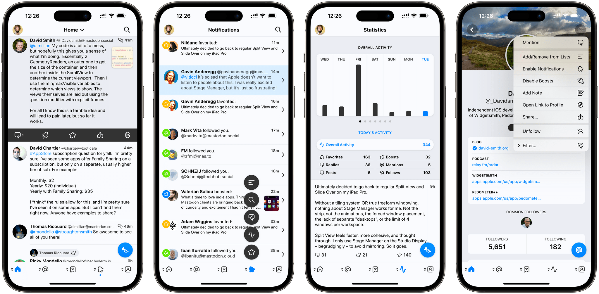
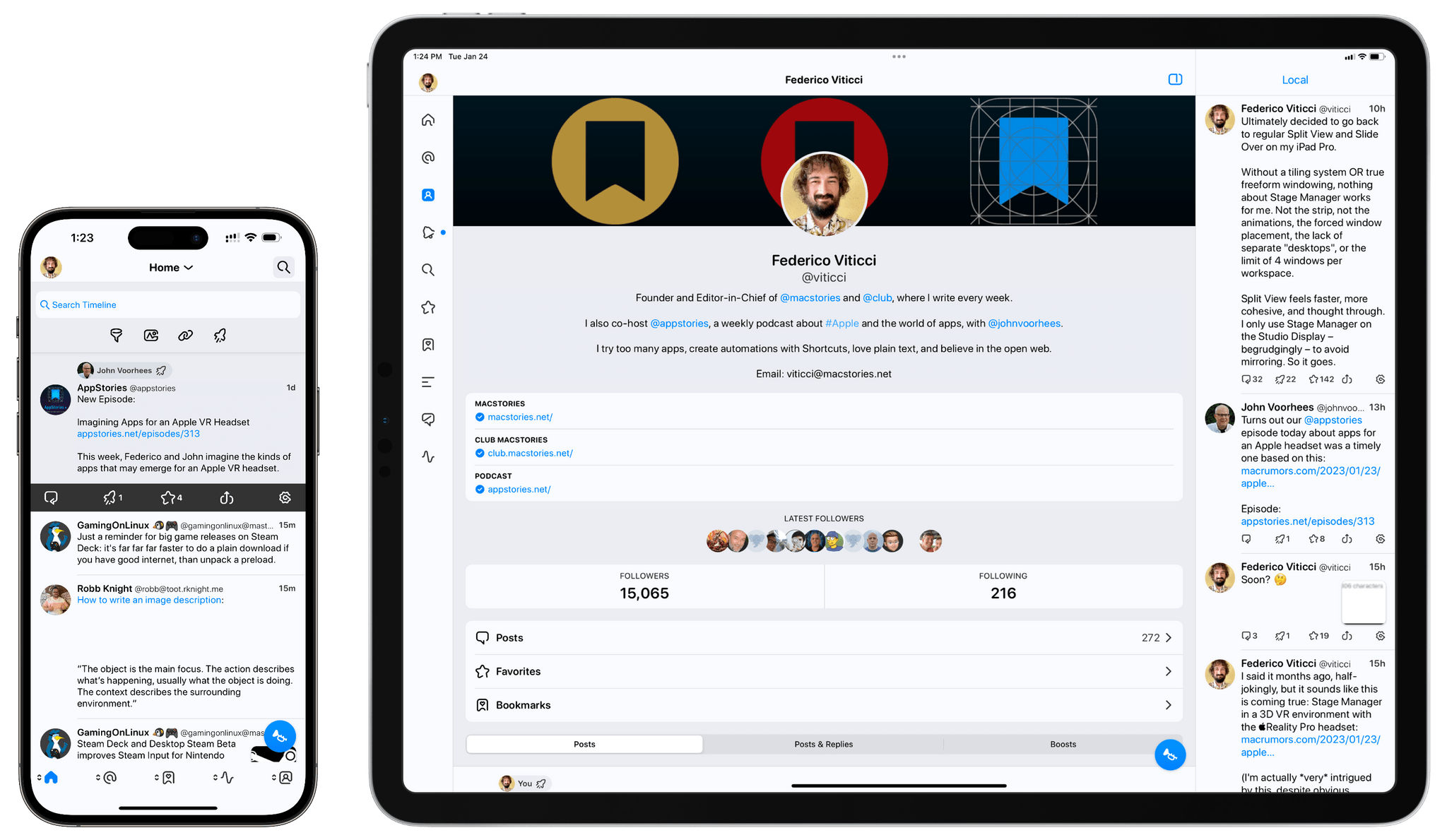
Given Tapbots’ pedigree, it’s no surprise that Ivory is an elegant, tasteful take on displaying Mastodon posts in a reverse-chronological timeline. And considering how most client experiences right now are mimicking a Twitter-like design (not just on iOS), it’s no surprise to see Ivory 1.0 rely on the core structure and layout of Tweetbot. At a glance, the app looks very similar to its dearly departed avian cousin: on iPhone, you have a set of customizable tabs at the bottom of the screen; on iPad, there’s a narrow set of tabs on the left edge of the screen with the ability to display a secondary column for another view on the right. In both apps, you can tap a title bar element to switch between timeline views; in Ivory, like in Tweetbot, you can switch between lists but also cycle through the home, local, and federated timeline of a Mastodon instance.
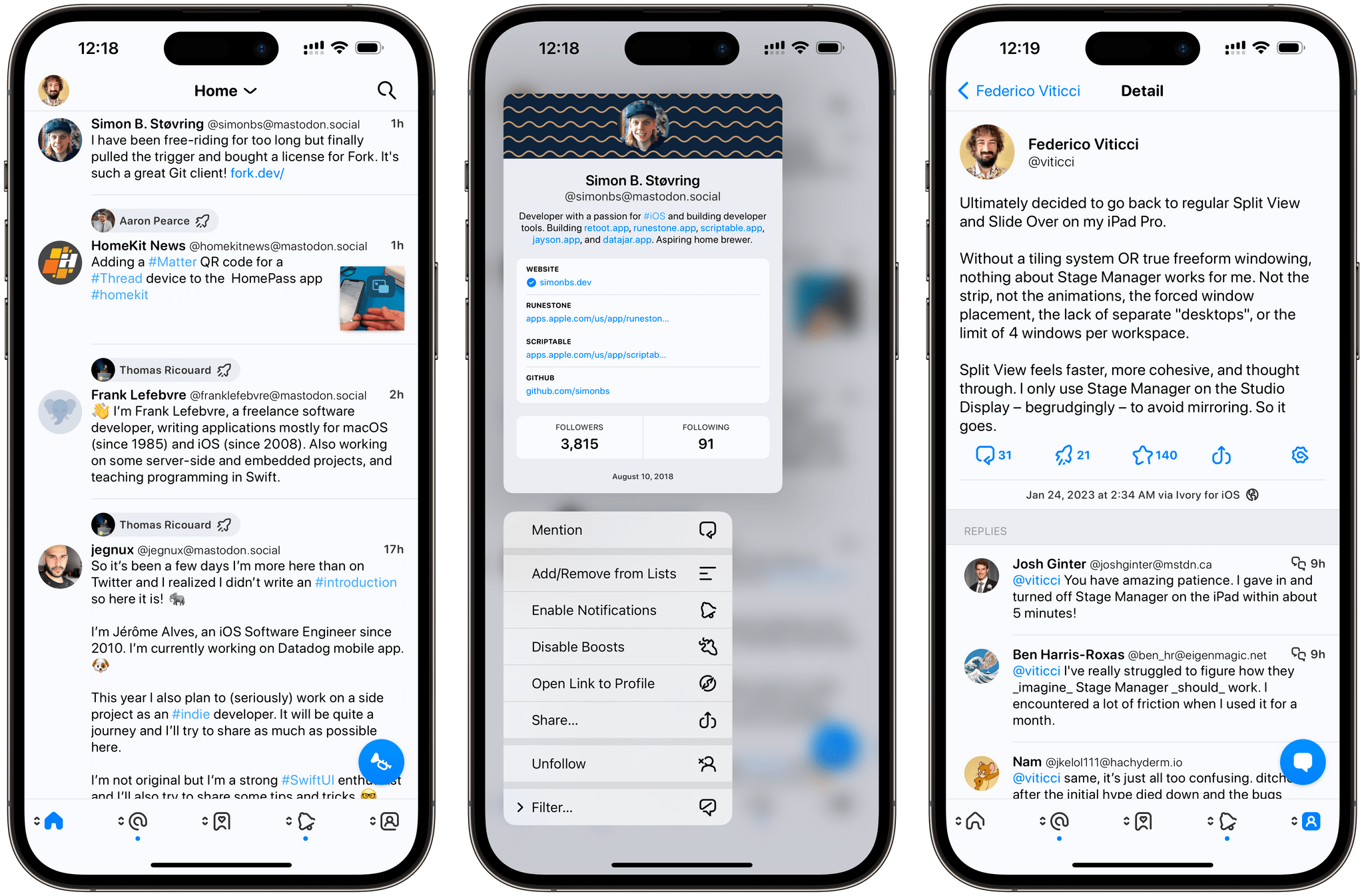
Ivory, like Tweetbot, supports mute filters, which are accessed from the ‘Filter’ button on profiles. (I did not filter you, Simon.)
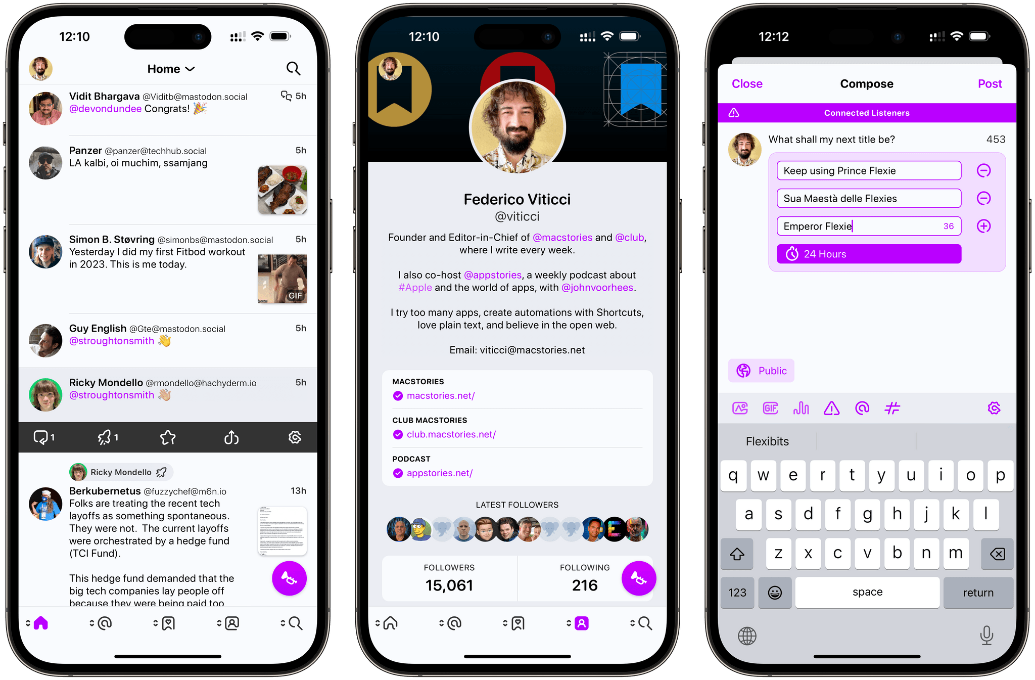
Ivory lets you choose whether you want to see buttons to interact with posts in an action drawer on tap (center) or as inline buttons (left and right). You can also choose to hide counts for favorites and boosts (right). Personally, I still prefer the action drawer.
Using the existing layout and navigation hierarchy of Tweetbot makes sense as a starting point for Ivory: it’s the easiest way to market for Tapbots, and it’s also a familiar structure for users who are migrating away from Twitter. This is where I’ll immediately mention this, though: in the future, I’d love to see Tapbots go beyond this approach we’ve known and used for years.
Everything is up for grabs: Ivory for iPad doesn’t support a Spring-like true multi-column view; you cannot create custom tabs (again, like Spring or the upcoming Mona from the same developer); Tapbots could consider allowing you to switch between “pinned” local timelines from different instances, which is something that both Ice Cubes and Toot already support. My hope is that Mark and Paul feel free to experiment with features and designs that wouldn’t have made sense for Twitter, but which could work for Mastodon. As Craig Hockenberry pointed out, there is potential for a “universal timeline” powered by technologies like Mastodon and ActivityPub; I hope Ivory will be able to support different types of experiences down the road.
Although Ivory for iPad does not support more than two columns at once, it supports multi-windowing, so you can open multiple views at once as multiple Ivory windows in Stage Manager or Split View.
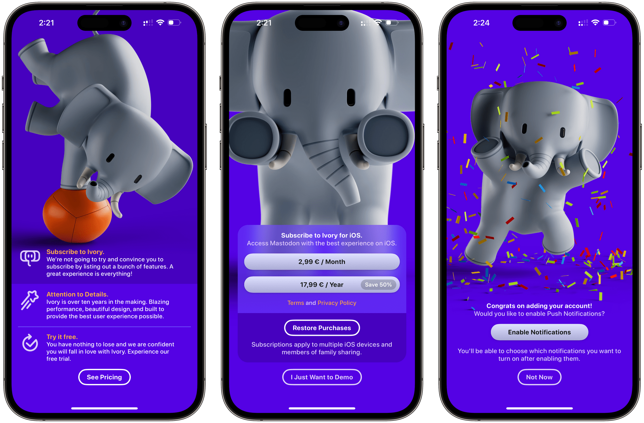
In any case, familiar structure notwithstanding, it genuinely feels like Tapbots designer Mark Jardine found a new kind of inspiration and enthusiam for Ivory. Every little detail in the app has been thought through and beautifully implemented. It starts with the onboarding flow, which features a series of splash screens explaining the app and featuring Ivory, the app’s namesake mascot. Free of the “-bot” monicker in the app’s name, Mark created a cute 3D elephant that guides users through the Ivory setup and can be found (in two distinct versions) in the app’s icon as well. The elephant character adds a lot of personality to the app; I wouldn’t mind seeing more of it in the app’s settings or perhaps in a wallpaper pack.
Elephant aside, what stands out in Ivory is the iconography. For Ivory, Jardine has drawn an entirely new set of icons for the tab bar, compose window, action drawer, and other areas of the app. These icons are lovely: they have a unique line style I haven’t seen anywhere else in iOS; they’re fresh, instantly recognizable, and legible in both light and dark modes. It’s funny how a simple icon set can make Ivory feel so different from Tweetbot, but that’s exactly what I noticed in this first version of the app.
Speaking of themes, Ivory comes with more options than Tweetbot here. You can choose between four different themes (low contrast, default, OLED, and high contrast) and 10 different accent colors. The OLED option will make the background pure black in dark mode; personally, I like using the high contrast theme and alternate between blue, yellow, and purple accent colors.1
It wouldn’t be a Tapbots app without a series of delightful touches that enrich the experience, and I’m pleased to see Ivory continuing the studio’s tradition here. If a post that exceeds 500 words appears on your timeline, Ivory will display a helpful ‘Read More’ button that hides additional content until you click through to read the post in its entirety. The compose button to create a new post (the trumpet icon) can be dragged around: long-press it, then move it and fling it wherever you want; the button will playfully bounce and dock itself to the nearest corner of the UI.
Design is not just about good looks, of course, which is why Paul Haddad’s work on Ivory’s performance deserves a mention in this review. Ivory is, by far, the smoothest, most responsive Mastodon client I’ve tried on my iPhone and iPad yet. The app’s animations are incredibly fluid on ProMotion displays, and the timeline scrolls quickly with no stutters or other glitches, which I’ve seen in other clients.
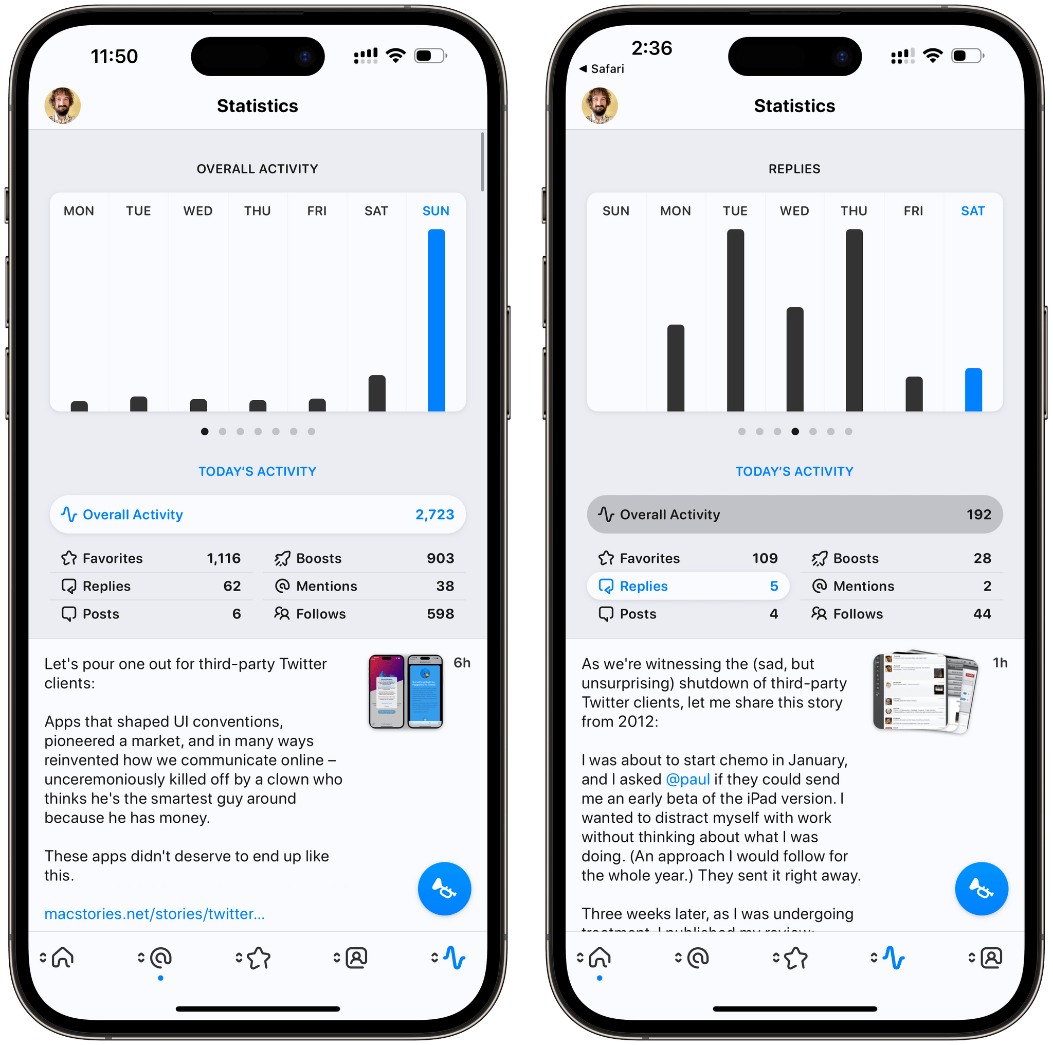
Another delightful detail: in the Statistics page, the charts animate as you open them and the selected data type is highlighted as you swipe horizontally to switch between chart views.
The folks at Tapbots have been honing their craft for over 10 years at this point, and you can tell that’s the case in Ivory. It’s the most polished 1.0 of anything I’ve used in a while.
Using Ivory
Several aspects of Ivory are reminiscent of Tweetbot: performing actions on posts is similar (thanks to the action drawer); swipe actions are the same; you can long-press on posts to bring up a context menu. Given the nature of Mastodon, however, there are some obvious differences between Tweetbot and Ivory worth examining.
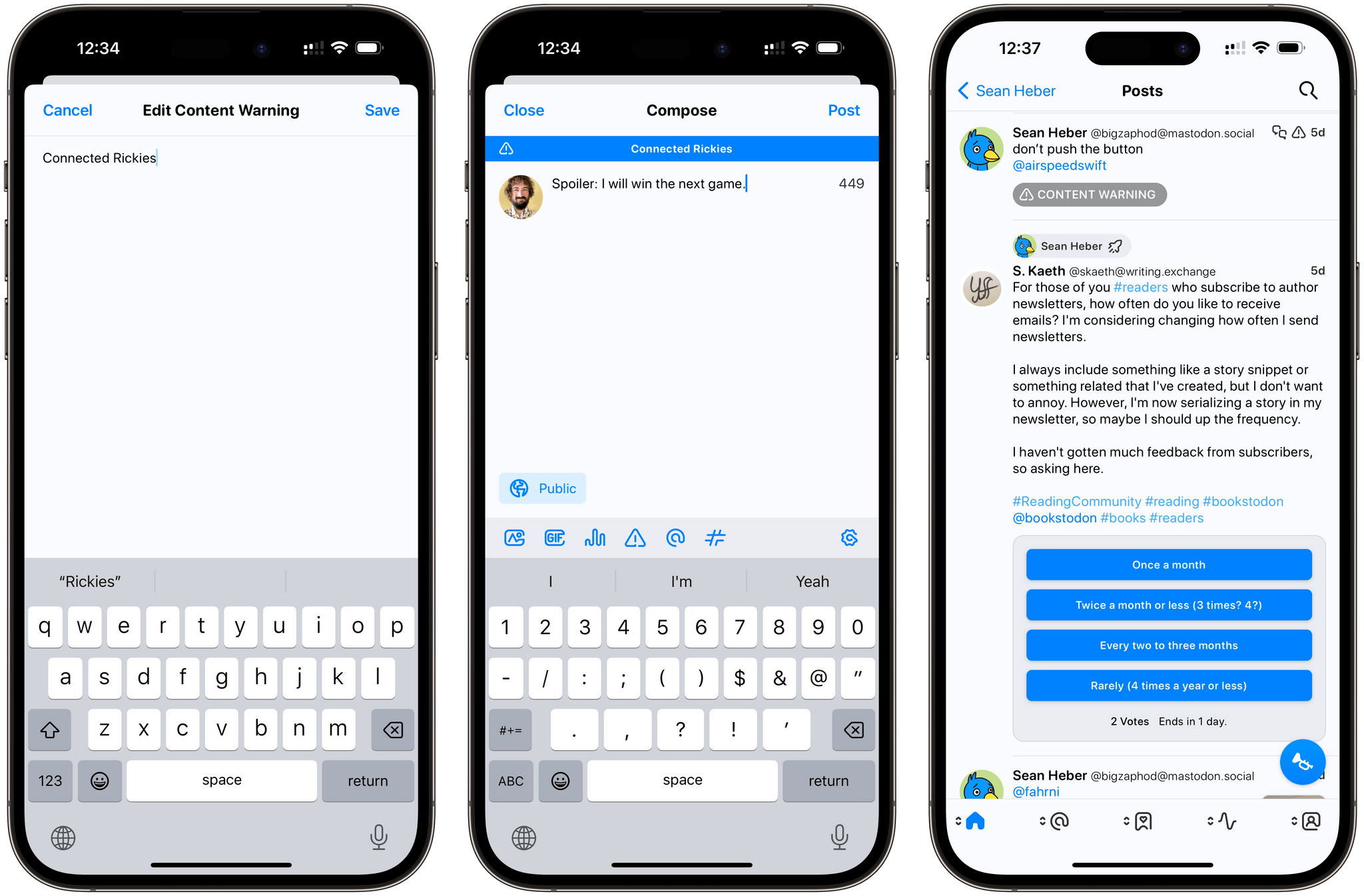
One of the features supported by Mastodon is the ability to attach content warnings to posts. Ivory supports content warnings both when crafting a post and when viewing posts in the timeline. If there’s a content warning, you’ll have to tap the post to read it in its detail view. In the app’s settings, you can tweak this behavior to always ignore content warnings (posts will be shown in full within the timeline by default) and/or always show media that’s been marked as sensitive.
Next up is sync. Ivory, like Tweetbot, supports syncing your timeline position via a custom iCloud integration. This has been working very well for me, but as I posted recently, I hope Tapbots will consider implementing Mastodon’s native sync marker API as well. One of the great aspects of this new scene is the ability to trial and switch between a variety of clients (I’ve been using Elk on Windows and Tusky on Android); if each of them uses its own, proprietary sync method, well, that’s not a great experience for users who want to jump between multiple clients.
As I noted above, Ivory isn’t as customizable as Spring/Mona at the moment: although I don’t expect this app to lean toward heavy customization as much as Mona will, there are some aspects I’d like Tapbots to consider. I’d like to be able to choose which options appear in the context menu that shows up when long-pressing posts, for example, or to pin specific local timelines for quick access from the title bar of Ivory.
Beyond the general sense of fluidity and reliability I mentioned in this review, there are two functionalities of Ivory 1.0 that deserve special mention.
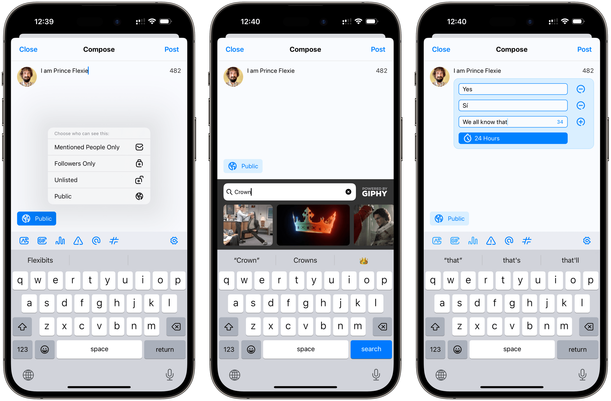
The first one is the compose window. There’s a lot you can do in this screen. If you tap on the visibility indicator, you can choose to make your post public or unlisted, restrict it to followers only, or make it a “private” post for mentioned people only. (Don’t call these DMs.) You can then attach content warnings, images and GIFs (from Giphy), insert hashtags and pick usernames, and even create polls. It’s nice to see Ivory get immediate access to these features thanks to the developer-friendly ecosystem of Mastodon; after more than a decade of Twitter’s guessing games with the developer API, it’s a welcome change of pace.
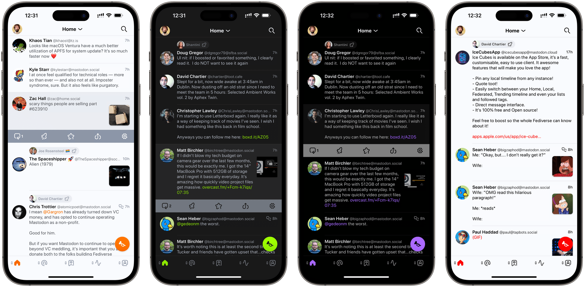
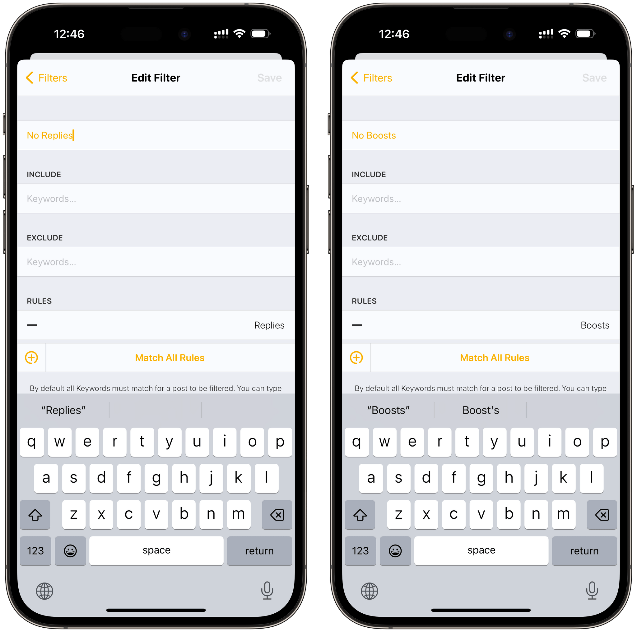
I saved the best for last: timeline filters. Ivory gives you the ability to filter your timeline to show media, links, or boosts only. Tap the search icon in the upper right corner, then pick one of the three icons and content types, and your timeline will be filtered accordingly.
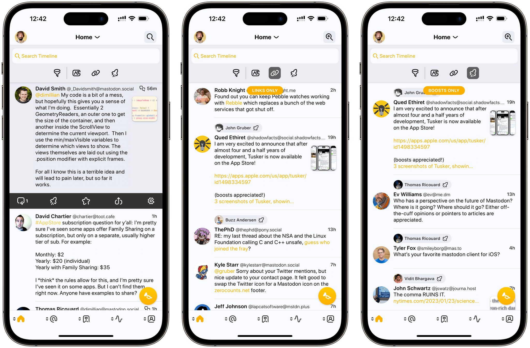
Filtering the timeline in Ivory. In a nice touch, when the timeline is filtered, the search icon (top right corner) gets a different filled state.
The hidden power of filters, however, lies in the ability to create your own with a surprisingly advanced interface. When creating a custom filter, you can include or exclude keywords, then choose to match any or all filters from a selection of the following criteria:
- Media
- Links
- Mentions
- Hashtags
- Boosts
- Replies
- People You Follow
- People That Follow You
The combination of these filters gives you a ton of freedom when it comes to finding ways to filter your timeline however you want. I’ll give you some examples. In my ‘Links from Mutuals’ filter, I set up a rule that shows me links, except videos from TikTok, from people in my timeline that also follow me. This way, I’ve got a nice filter that usually shows me articles or YouTube videos from my mutuals:
I also created separate filters called ‘No Replies’ and ‘No Boosts’ that hide those types of posts from my timeline (useful when catching up after a while) and another called ‘Mutuals’ that’s a subset of people I follow that also follow me in return.
I like the filtering feature of Ivory a lot, and it has helped me manage my timeline and find links on numerous occasions already. In the future, I’d like the ability to pin specific custom filters to the main filtering toolbar as well as an option to activate individual filters with a keyboard shortcut. Also, custom filters don’t sync with iCloud at the moment, and I think they should.
Tips for Ivory
Below, I’ve compiled a series of tips to get the most out of Ivory on your iPhone and iPad.
Long-press the photo icon in the compose window. If you do that, you’ll be able to snap a new picture with the camera instead of picking an existing one.
Switch between multiple accounts. Like in Tweetbot, you can switch between multiple accounts in Ivory either when viewing the timeline or composing a new post. In both cases, long-press on your profile picture and, if you’ve configured multiple accounts in the app, you’ll be able to quickly switch between them.
Hold down the boost button. Speaking of long-pressing and switching between accounts: if you hold down the boost icon (boosts are the Mastodon equivalent of retweets), you’ll get the option to boost a post from a different account than the one currently viewing the timeline. I use this to boost my posts from the MacStories and Club accounts, for instance.
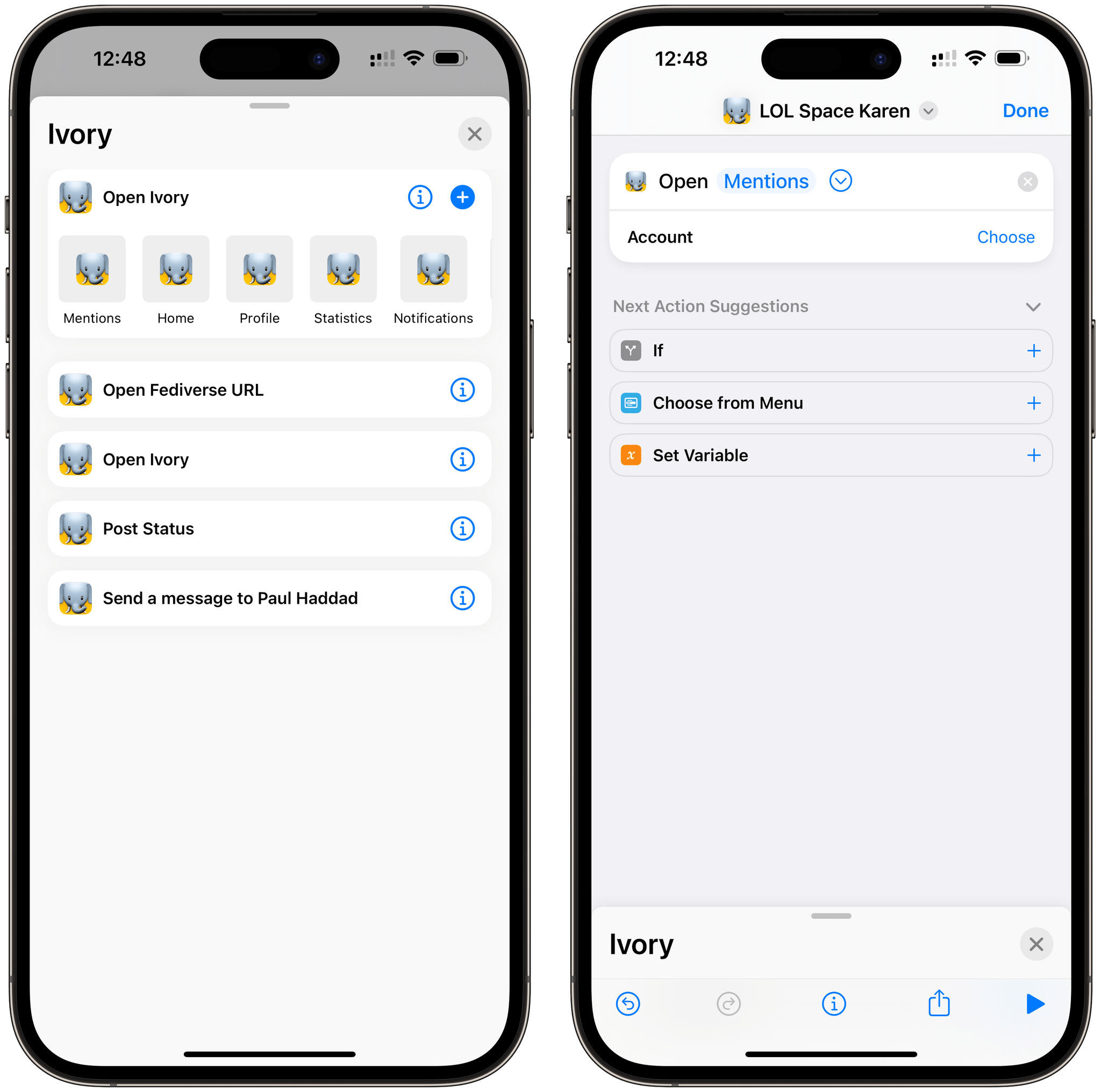
Use Shortcuts to open different views of Ivory. Ivory 1.0 comes with three native Shortcuts actions:
- Open Ivory
- Open Fediverse URL
- Post Status
The last one is fairly self-explanatory as it allows you to send a post from Shortcuts with a specific account. I’ll cover the Fediverse one below since it also relates to the built-in action extension for the share sheet. The Open Ivory action is interesting since it can be used to set up simple but useful launchers for specific views of the app. For instance, you can set up the action’s parameter to quickly open your bookmarks, or your notifications view, or your mentions.
Use the Ivory extension for profiles and posts. One of the confusing aspects of the fediverse for newcomers is the fact that, in order to follow someone or interact with a post from a different instance, you have to “remote-view” that item in your own instance. I created a shortcut called Masto-Redirect to try and improve this very issue, but Ivory has a better, easier solution: an action extension for the share sheet called ‘Open in Ivory’.
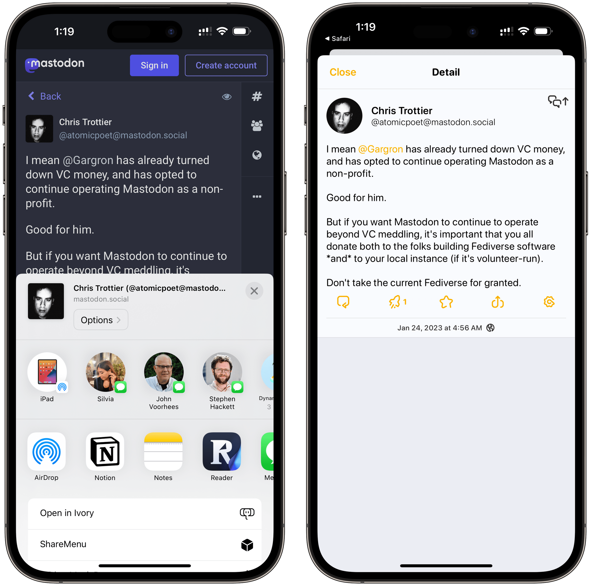
The next time someone sends you a link to a post or profile on iMessage, click the ‘Open in Ivory’ extension in Safari and you won’t have to use my shortcut or a bookmarklet to be redirected to that item on your Mastodon instance.
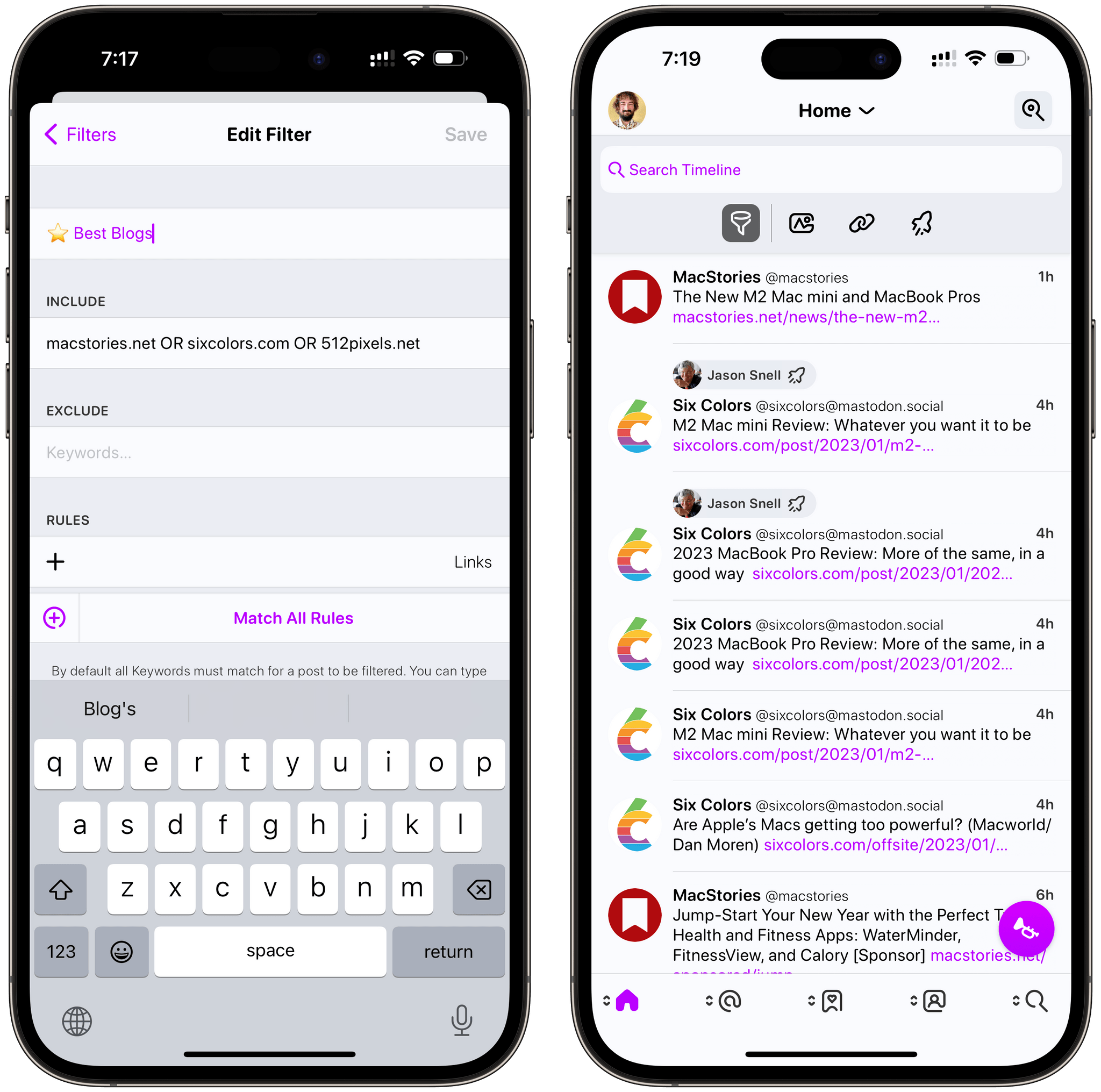
Use keywords to filter domain names. I was playing around with custom filters in Ivory and wondered if I could find a way to make a filter that would only show me posts from a subset of domains. That’s totally doable in Ivory, as it turns out. As you can see in the screenshots below, I used domain names as keywords, and I separated them with the OR operator so that the filter would match links from MacStories, Six Colors, or 512 Pixels. Then, I excluded mentions from the filter and that was it. The result is a nice, filtered view of my timeline that only shows me links from the best blogs around.
Change how rules are matched in custom filters. When you’re putting together a custom filter, remember that you can have it match any or all rules from the filter. To change the matching method, tap the ‘Match All Rules’ button at the bottom of the list of rules and you’ll be able to alternate between Any and All.
Ivory 1.0
Maybe it didn’t happen in the best possible way or how we anticipated, but I feel like we’re being granted the opportunity to rethink our approach to social media, online presence, and ownership of content shared with a network thanks to Twitter’s implosion and Mastodon’s sudden growth. Sure, Mastodon is only one piece of a bigger, and much more exciting puzzle, but regardless: it’s the Twitter alternative millions of people – especially in the tech community – are seeking out these days. For all those people, a high-quality, native, well-designed app for their iPhone or iPad can make or break the experience. This is where Ivory comes in.
Ivory is not a “finished” product. It’s not the most customizable client around (be on the lookout for Mona on that front) and it’s lacking several Mastodon features that can be found in other existing clients. I would have liked to see support for pinned local timelines in this version, as well as the ability to render links to posts as “fake” quoted items, and a better multi-column view on iPad. And I’ll add this: I’ve been reviewing Tapbots apps for over a decade on MacStories, and, if you exclude the context around it, Ivory isn’t as revolutionary as Tweetbot was when it debuted in 2011. By and large, Ivory isn’t inventing anything new, nor does it drastically differ from Tweetbot at a glance. But that line of thinking misses the bigger point.
You can’t ignore the context and the current landscape surrounding Ivory. Until a few months ago, no one would have expected that Tapbots would be given the opportunity to start over and bring their expertise to a brand new social network – let alone one that isn’t controlled by a single entity anymore and is actually welcoming third-party developers. Or that they would have to do this in just a few months, with a rushed deadline at the very end.
What Ivory accomplishes goes deeper than a bland comparison with Tweetbot: the app makes Mastodon friendlier and more palatable to people who, like myself, are approaching the network for the first time now. Tapbots is setting up a sustainable business model for the app (a basic Ivory subscription will cost $14.99/year), and I’m certain that will give them the resources needed to continuously iterate on the app going forward.
Ivory raises the bar for what a Mastodon client on Apple platforms can be; it’s providing thousands of potential new Mastodon users with a better, more elegant way to get started with the service. Thanks to Ivory, thousands of iPhone and iPad users will have a better, more consistent first-run experience with Mastodon than they would with Mastodon’s website or native apps alone.
Ivory is a new app, but it’s got the style and confidence of a veteran of the App Store. It’s a 1.0 that’s been refined for over a decade. Ivory makes Mastodon a joy to use, but more than that, it shows that Tapbots are back. And like 12 years ago, I want to be along for the ride.
- How nice would it be if iOS allowed you to pick a system-wide accent color this way, like on macOS? ↩