Today, we’re announcing our first-ever Club MacStories Membership Event and Discount. I’ve got more details below, but the highlights include 20% off on all annual Club MacStories plans plus special columns, a live Discord event, giveaways, deals, downloadable content, and more every day through October 31st. There’s a lot going on, so let’s look at the details.
To take advantage of the discounted plans, please use the coupon code CLUB2023 at checkout or click on one of the buttons below.
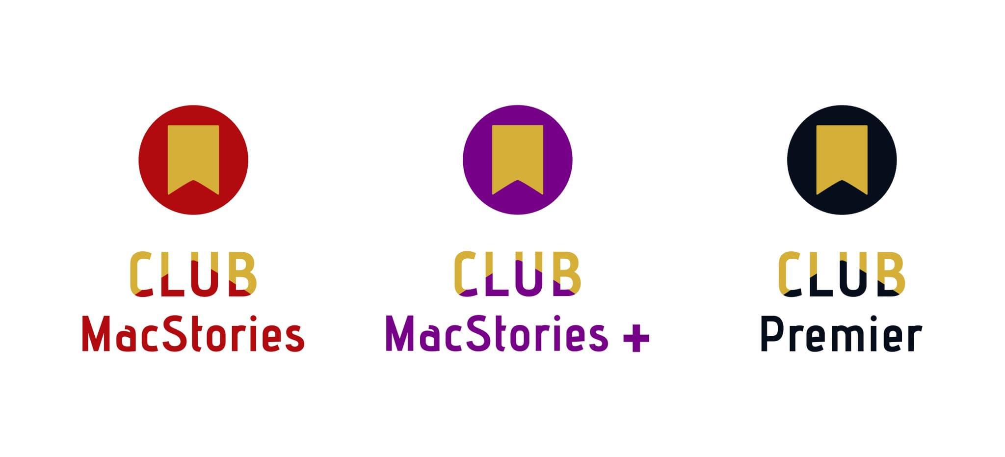
Join Club MacStories:
Join Club MacStories+:
Join Club Premier:
Club MacStories has become a big part of MacStories. The Club has grown steadily every year since it was started in 2015, and every plan is packed with more of what you love about MacStories. With this month’s event, we want to accomplish two things:
- Thank our current members with two weeks packed with what makes the Club special
- Offer a special 20% off on annual plans to grow the Club further and make switching to a higher-tier membership more affordable for existing members.
The support of Club MacStories members is the foundation of MacStories. It’s given us the freedom to expand, focus on our in-depth stories and reviews, and build a closer relationship with readers. And most recently, while websites are shutting down and laying off staff due to plummeting ad revenue, we’re growing and have plans to do even more in the coming year. That wouldn’t have been possible without the Club.
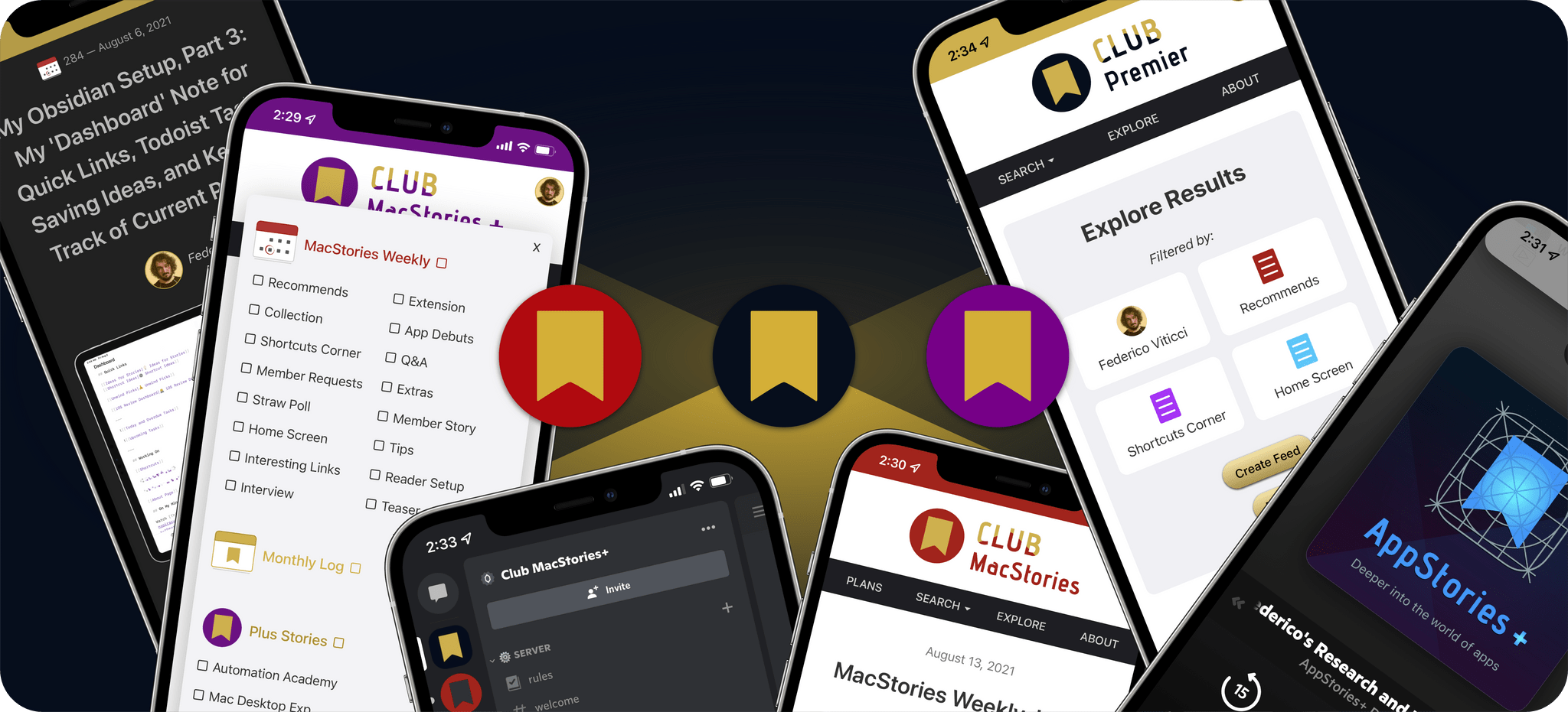
What’s unique about Club MacStories is that it’s the perfect complement to MacStories.net. If you’re a fan of the site, you’ll find that the Club is a natural extension of what you already love, with more of everything.
That’s been the case since the Club launched over eight years ago. We didn’t hide MacStories content behind a paywall when the Club was started. Instead, the Club has always been designed to supplement MacStories with more app coverage and complex automations, longer podcast episodes, and more. Then, with the introduction of Club MacStories+ and Club Premier, we built on that model further with a vibrant, respectful Discord community of app and automation fans who help each other get the most out of their technology.
We know that folks are inundated with subscriptions these days, which is why we work hard to offer what we think is a great value at every tier of the Club. Our eight-year track record of consistency and content, which includes nearly 500 issues of our newsletters, speaks for itself, but we also realize that committing to an annual plan is still a lot. So that is why we’re excited to offer the biggest discount on Club MacStories plans we’ve ever done. Here’s a breakdown of each tier and the discounts we’re offering through October 31, 2023:
|
Normally |
Through Oct. 31 |
|---|
| Club MacStories |
$50/year |
$40 |
| Club MacStories+ |
$100/year |
$80 |
| Club Premier |
$120/year |
$96 |
If you’re not familiar with the Club, you can learn more and compare plans side-by-side here and read our FAQ page.
These discounts are available to anyone signing up for one annual Club membership for the first time, reactivating an expired plan, or upgrading a current plan.
To take advantage of the discounted plans, please use the coupon code CLUB2023 at checkout or click on one of the buttons below.
Join Club MacStories:
Join Club MacStories+:
Join Club Premier:
As a thank you to members, we’re also rolling out daily content, giveaways, deals, and more over the next two weeks, starting with a new addition to our Club MacStories+ and Club Premier app discounts page, which we’ll reveal tomorrow on Mastodon and Threads. Then on each day for the next two weeks, we’ll have columns, giveaways, a special Discord audio event, eBooks, and more, so keep an eye on the MacStories and Club MacStories Mastodon accounts and the MacStories Threads account every day to hear what’s coming next. We’ll be sure to keep any giveaway entries open throughout the fall Membership Event, too, so no matter when you join, they’ll be available.
Thanks again to our many loyal Club MacStories members, and welcome to everyone joining for the first time. You’ve all helped us grow MacStories, launch new projects, and build MacStories on a strong foundation while staying independent and true to our editorial values. We look forward to bringing you even more of what makes MacStories special for a long time to come.


 for more details on each Club option.](https://cdn.macstories.net/ivborw0kggoaaaansuheugaac50aaajwcayaaaakgq9xaaaacxbiwxmaaastaaaleweampwyaaam-1629596463664.png)