Apple itself is hailing watchOS 10 as the largest software update since the introduction of the Apple Watch. I’m not sure I quite agree with that characterization, but it’s certainly the biggest update we’ve seen in many years. The tenth iteration of watchOS includes an exciting fresh take on some of its core interactions, including a reassignment of the hardware side button and a brand-new widget interface. Apple has released the watchOS 10 public beta today, which you can access as part of the Apple Beta Software Program.
There’s a lot to dig into here, but we’ll leave most of the digging for my official watchOS review later this year. For now, let’s take a look at the highlights of watchOS 10, what exactly has changed, and what seems to be working after just a few weeks of usage.
The very first thing you’ll notice after installing watchOS 10 is the new post-update onboarding experience. It is unskippable, which initially annoyed me before I realized the extent of the interaction changes.
After greeting you with a full-screen “Hello”, your Apple Watch will instruct you to press the Digital Crown while explaining what this will do (open the view to all of your watchOS apps). Once you do this and see the app screen for a few seconds, the onboarding experience returns and tells you to press the Digital Crown again to return to your watch face. Next, it will instruct you to spin the Digital Crown to access the new widgets view, and finally to press the side button to access Control Center. I don’t have an Apple Watch Ultra, but I presume the experience would step through the Action button as well if you have one.
I was initially bothered by the onboarding experience forcing me to slowly press the Digital Crown twice — with seconds of delay in between — in order to get to my apps screen and back. These interactions haven’t changed, and thus I already knew what was going to happen. Once I got to the Digital Crown and side button though, I was actually thankful that watchOS forced me to undertake these actions slowly, while reading exactly what they were going to do, because I otherwise would have been confused when my hardware buttons no longer worked as I expected them to. Instead, I actually understood exactly what the update had changed without having to experiment a bunch to try to figure it out.
Hardware Reassignments
This is not the first time we’ve seen reassignments of hardware buttons on the Apple Watch, but it is the first time in a number of years. Spinning the Digital Crown hasn’t had a significant role on the main watch face since Time Travel was dropped, and the side button’s last reassignment was to switch from the Friends interface to the Apple Watch Dock. Both of those changes occurred in watchOS 3.
The tenth version of watchOS is as good a time as ever to rethink these hardware interactions once again. I’ve never found the Apple Watch Dock to be particularly useful, and making the Digital Crown do nothing except trigger a few fun yet frivolous watch face animations was always a bit of a waste. I’m not sure that the new interactions are perfect, but at least it’s good to see Apple experimenting with the Apple Watch again.
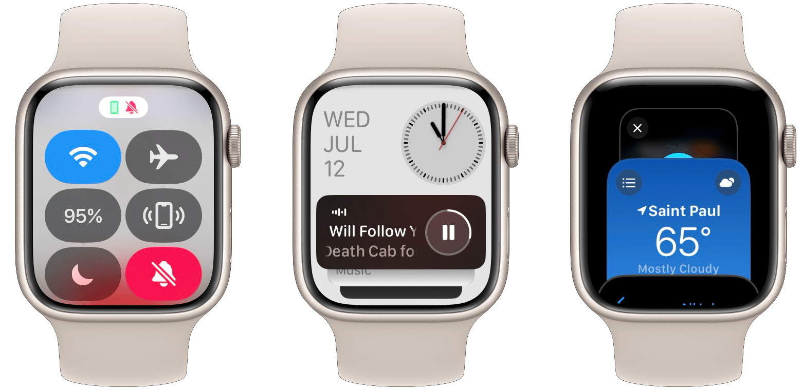
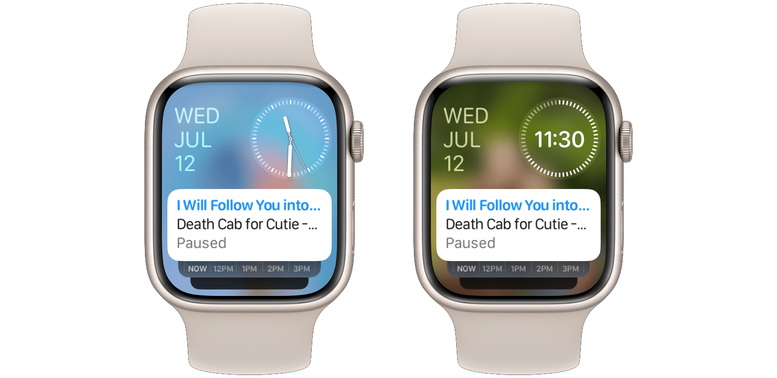
In watchOS 10, Apple has assigned Control Center to the side button. This moves it from its previous position just below the watch face, opening that spot up for the all-new widgets interface which Apple has dubbed the “Smart Stack”. The Smart Stack can be accessed by swiping up on the watch face — just like Control Center was previously. However, it can also be accessed by turning the Digital Crown upward, a new interaction for the watch face which Apple presumably added to improve discoverability of the new interface.
This shuffle has displaced two other interactions: the handful of watch face animations that were triggered by spinning the Digital Crown, and the Apple Watch Dock. The former is still available on watch faces that support it, but you now have to manually tap on the watch face a single time to switch into an animatable mode, at which point spinning the Digital Crown will control the animation rather than open the Smart Stack.
Tapping the Metropolitan face transitions from the first image to the second, at which point you can spin the Digital Crown to stretch or squish the numerals.
The Apple Watch Dock, while still available, has been relegated to a double-click of the Digital Crown in watchOS 10. I think Apple may be letting this feature live solely as a benefit to power-users, because that interaction was not even covered in the onboarding experience. Furthermore, in various places of Apple’s marketing materials for watchOS 10, the Dock has been stripped of all honor and title and is simply referred to as a list of recently used apps. The ‘Dock’ section of settings in the Watch app for iOS 17 has also been removed, meaning you can no longer manually set which apps show up in it — it’s always just a list of recent apps now.
I still need some time to sit with all of these hardware changes, but my first impression is that I really like the placement of the new Smart Stack, but I think Control Center continues to occupy far more valuable real estate than it deserves. I have been arguing this since Control Center was first added in watchOS 3 seven years ago, and every word of that original argument still stands today.
In particular, I still wish Apple would bring back the old Now Playing screen and place it at the very top of the Control Center interface — just like it is on iOS. This would elevate Control Center from a feature I only use occasionally (just like in 2016, I continue to almost solely use Control Center to ping my iPhone when I can’t find it) to one that I use frequently every day.
Barring a Now Playing screen addition, I wish Apple would consider moving Control Center to a split swipe-down approach, in which swiping down from the left side of the watch face would open Notification Center, while swiping down from the right side would open Control Center. I don’t necessarily love the finickiness of that interaction, but I think users would find it familiar since it would directly mirror iOS. This would keep Control Center accessible while freeing up the side button to become a customizable Action button just like on the Apple Watch Ultra (Ultra users would thus get two different customizable buttons rather than one).
Smart Stack
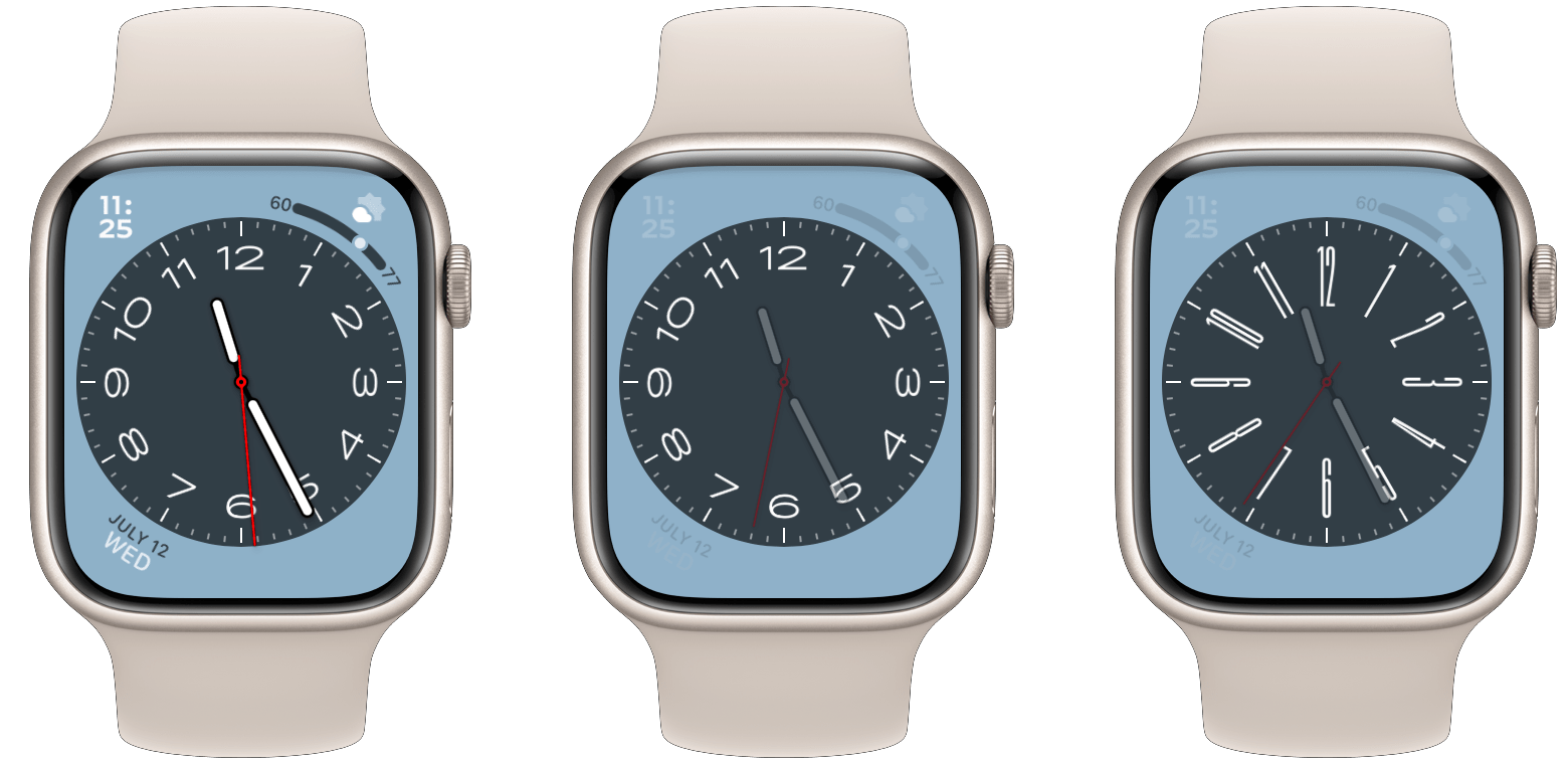
With the interaction shakeup out of the way, let’s take a brief look at the interface. The Smart Stack is explained quite easily to any long-time watchOS observers: Apple has taken all of the good ideas of the old Siri watch face and put them into a new interface which is easily available from every other watch face. This essentially wipes out all of the drawbacks of the Siri face: its boring look, lack of complications, and purely machine-learning-based card sorting. The look and the complications no longer matter since you don’t have to choose this as your actual watch face, and the Smart Stack lets you manually pin widgets that you want to always be available close to the top.
Left: the old Siri watch face. Center: the new Smart Stack. Right: scrolling through Smart Stack widgets.
In a word: excellent. I love the Smart Stack, and I think this new feature will be opening up a flood of increased usage of Apple Watch apps throughout the system. That said, at this point in the beta cycle, I still mostly have first-party watchOS apps in my Smart Stack. Not being able to see data from the many third-party apps that I use every day is a significant limitation in assessing just how useful this feature will be.
My only real complaint about the Smart Stack so far is that it displays either an analog or a digital time based on which watch face you are currently using. I generally like a digital time, but also generally prefer analog watch faces for their visual appeal (I usually add the digital time as a complication somewhere). I’d love for Apple to add a setting to manually set the Smart Stack to show either the analog or digital time, regardless of which watch face you’re currently using.
Analog and digital variations of the Smart Stack, which are currently chosen automatically based on which watch face you’re using.
Once third-party apps arrive in the Smart Stack, I think there’s huge potential for this feature to bring in a new era of watchOS. I can’t wait to see how it evolves going forward, and I’m sure I’ll have a lot more to say about it in my watchOS 10 review later this year.
App Redesigns
Throughout the system, watchOS 10 introduces a new design language in Apple’s first-party apps. Interfaces have been expanded to make much better use of the larger displays of modern Apple Watches. Apps feel more spacious, and include new buttons which hug the rounded edges of the display. These buttons are positioned similarly to the corner complications that we’ve seen on watch faces for years now, which makes them seem instantly familiar as user interface elements.
Once again: excellent. Across the board, these changes have resulted in better app interfaces which feel almost luxurious in their designs. I am loving this for first-party apps, and I’m so excited to see third-party developers start working with these new building blocks.
Watch Faces
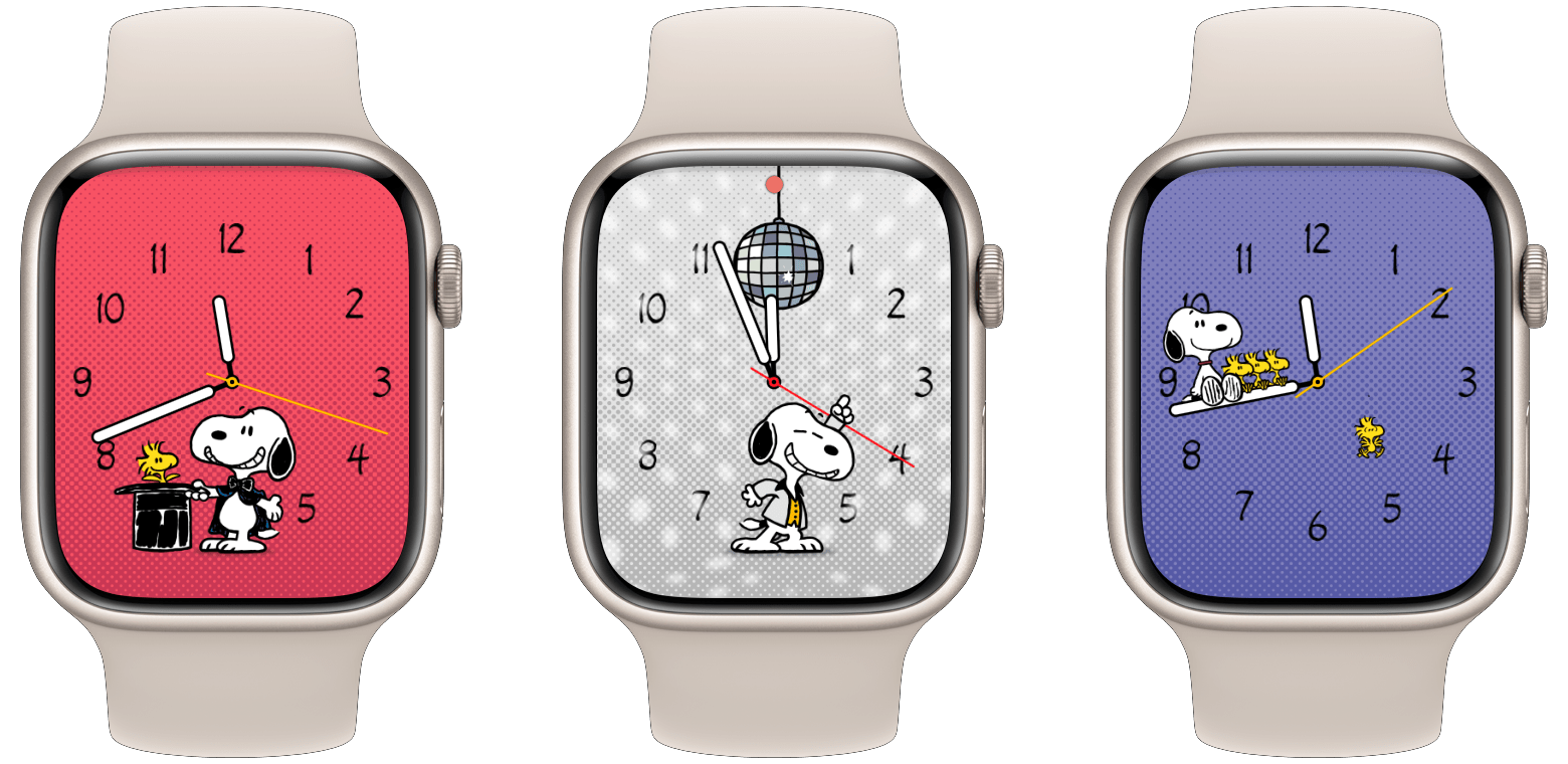
So far at least, there are only two new watch faces in watchOS 10. Palette is a straightforward face with concentric circles of varying colors that change further as the second hand spins. Snoopy, however, is a truly whimsical new experience.
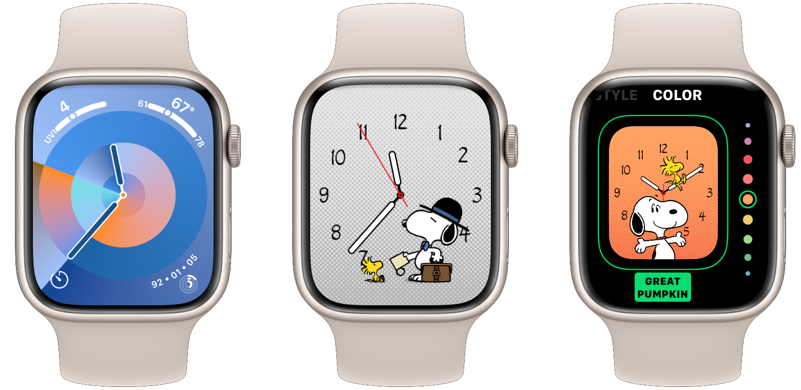
The Snoopy face will not be for everyone, probably myself included, because it only supports the analog time and includes no complications at all. However, Apple has outdone itself here. The Snoopy face shows animations of Snoopy and Woodstock each time you raise your wrist, and these animations actually interact with the watch hands. Snoopy may be falling asleep on a watch hand before slipping off of it, or tossing a wadded up piece of paper which bounces off one of the hands. There are dozens of animation options — I am still finding new ones after days of full time usage of this watch face.
There are quite a few color options for the background of the Snoopy face, and the colors are delightfully named using references to the Peanuts comic strip. The default option is “Sunday Surprise”, which appears to be identical to the “Newspaper” color. However, I have not yet been wearing this watch face on a Sunday, and as such I am very much looking forward to next Sunday to see what magic Snoopy and Woodstock have in store for me.
Conclusion
I love examining sweeping new interface and interaction changes, which makes watchOS 10 the most exciting update I’ve seen in years. I’m still not sure Apple made all the right decisions, but this is certainly an improvement over where watchOS was at before. The Smart Stack in particular is a promising new interface which I think will propel the Apple Watch to new heights of usefulness. I can’t wait to get my hands on more third-party widgets and put its “smart” sorting to a true test.
There’s much more to cover in watchOS 10, including the usual batch of great new health and fitness features, some improvements to communication apps, and an app grid that now only flows in a single axis so that it can be scrolled with the Digital Crown. I’ll be hitting all of these aspects and more in my watchOS review later this year.
In the meantime, if you want to take the new Apple Watch features for a spin, the watchOS 10 public beta is available today.
You can also follow our 2023 Summer OS Preview Series through our dedicated hub, or subscribe to its RSS feed.