Never before have the iPhone, iPad, and Mac been as interconnected as they are today. It wasn’t that long ago that the iPhone was, well, the iPhone, the iPad was essentially a big iPhone, and the Mac was off doing its own thing. Now, the iPad has its own OS, the Mac is running on a whole new chip architecture, and the design and functionality of virtually every bit of UI and system app of every device have been realigned along a more rational continuum, making it easier than ever to move among them.
A big part of reshaping macOS involved updating system apps to match the functionality available on Apple’s other OSes. That work is largely finished, which leaves us entering a new phase of macOS’s evolution. Instead of playing catch-up to iOS and iPadOS, macOS is moving along the same path, with a collection of genuinely useful new features coming this fall that I’ve been testing as part of Apple’s developer beta program. Now, you too can join in the testing if you’d like because today, Apple released its first public beta of macOS Sonoma as part of the Apple Beta Software Program.
We’ll have full reviews on MacStories of each OS when the final versions are released this fall. However, after about a month of using Sonoma daily, I wanted to hit the highlights of what’s in store this fall for any readers who might be thinking of joining the public beta.
Is It Safe to Install the macOS Sonoma Public Beta?

If you want to try the beta features of macOS Sonoma before they’re released this fall, and you’re willing to put up with some bugs, go for it. Macs and the apps people use on them vary a lot, but for what it’s worth, I’ve been using Sonoma since I got home from WWDC, and it’s one of the most stable beta releases in recent years. Sure, I’ve run into some things that don’t work quite right, but I haven’t had my Mac crash or restart, I haven’t lost any data, and with the exception of Rogue Amoeba’s apps and Logic X, which won’t save projects, every app I regularly use works.
However, every time you install a beta, you should have a ‘Plan B’ in case things go terribly wrong, whether that’s a backup strategy, a second Mac, or another plan. That’s just common sense. However, the conventional wisdom that macOS betas are somehow different than iOS or iPadOS and that you should wait to update macOS until at least the third public point release is old thinking that doesn’t hold water anymore. Being careful and cautious is good; blindly following dogma, not so much.
What’s in It for Me?
This is a preview of macOS Sonoma, not a review, so this isn’t a comprehensive look at every new feature, change, and detail you’re likely to find this fall. After all, we’re still in the early weeks of the beta period, and I expect Sonoma to continue to change and be refined throughout the summer. Instead, I’m going to hit the highlights of the public beta because those are what most people weigh when deciding if it’s worth installing a beta and putting up with the inconvenience of bugs.
Compared to recent years, Sonoma’s changes to macOS are less extensive, but that doesn’t mean there aren’t features you might want to get an early look at. In fact, this year’s updates are focused on core system apps that have already made a meaningful difference in how I use my Mac, making Sonoma one of my favorite macOS betas. It’s a focused list of high-impact changes that I expect will improve how nearly all MacStories readers use their Macs.
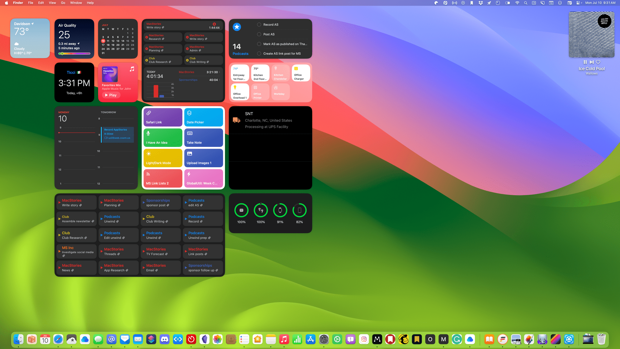
Interactive Desktop Widgets
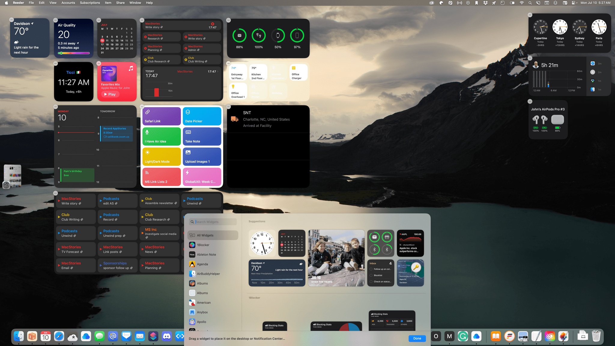
No single Sonoma feature has had as immediate an effect on how I use my Mac as interactive desktop widgets. I’ve never been a fan of the way macOS Big Sur put widgets in Notification Center, an offscreen panel that is only accessible by clicking on the clock in the menu bar. That’s still available, kind of how the Today view is still a feature of iOS, but migrating widgets to the desktop from Notification Center makes them infinitely more useable.
There’s a lot more going on with widgets in Sonoma. The most obvious change is that they can be placed on your Mac’s desktop. To add a widget to the desktop, you can drag it out of Notification Center or click on ‘Edit Widgets’ at the bottom of Notification Center, find the widget you want, and drag it onto your desktop.
Widgets can be placed anywhere you like, but as you drag one close to another widget on your desktop, you see an outline in the shape of the widget that guides you to place it on an invisible grid system that lines your widgets up in an orderly fashion. The placement feature is a nice compromise between an arbitrary system and maintaining a tidy desktop. If you’ve got files, folders, or Stacks on your desktop, they’ll move out of the way to make room if you want to place a widget in the space they occupy, with an animation that reminds me of reorganizing icons on an iPhone or iPad’s Home Screen.
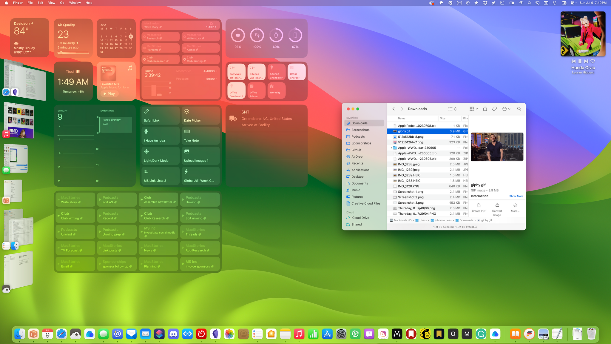
If you use multiple desktops, the widgets you place on one desktop will appear on all of them. Widgets appear in full color if there isn’t an active window on your screen. When a window is active, the widget’s color fades to a translucency that allows the colors of your desktop wallpaper to shine through by default. I like the effect a lot. Widgets are still readable but not distracting. However, you also have the option to use full-color widgets all the time by flipping a toggle in System Settings.
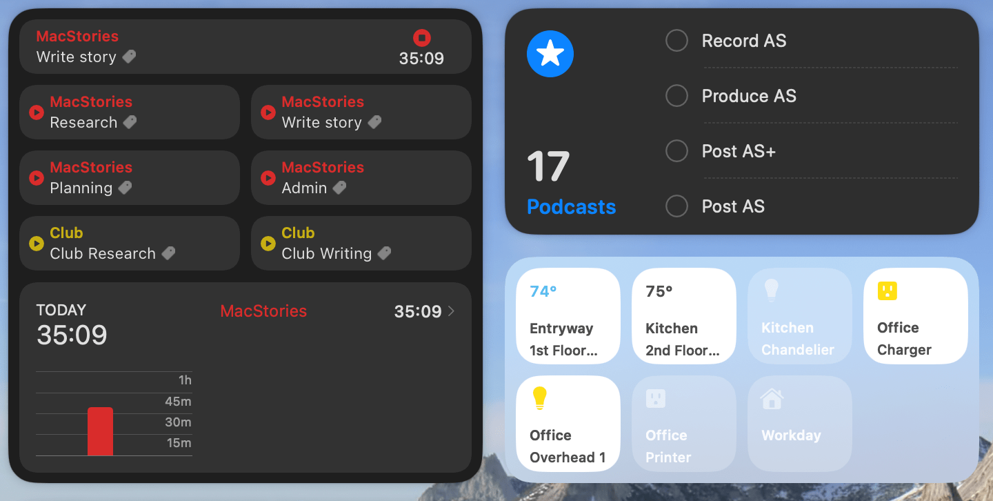
Like iOS and iPadOS 17, macOS Sonoma’s widgets are interactive for the first time, too, adding a new dimension of utility to them. For example, you can check off tasks as completed in Reminders, click on a light in the new Home widget to turn it on, or start and stop timers in the beta version of Timery without opening any of the related apps. For apps that only require quick interactions most of the time, widget interactivity is a game changer.
Desktop widgets work especially well with Stage Manager because clicking anywhere on your desktop hides all of your open windows and activates your widgets in full color. If you’re not a Stage Manager user, I’d suggest assigning a Hot Corner to show your desktop, which has the same effect. I’ve done this, even though I use Stage Manager full-time, for when my desktop isn’t showing at all.
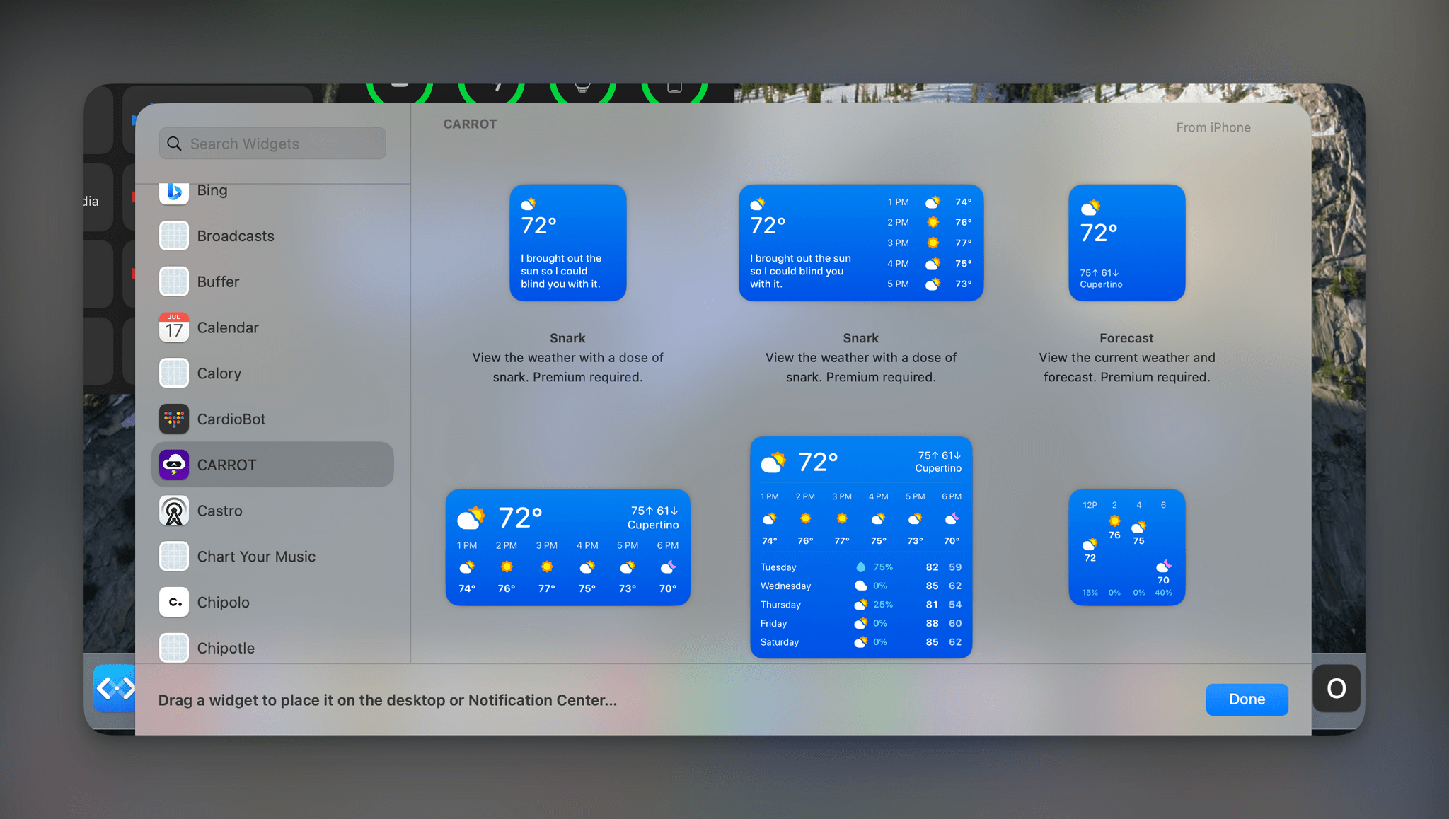
iPhone widgets like these from CARROT Weather can be added to the Mac and will update if your iPhone is on the same Wi-Fi network or nearby.
Finally, you’re not restricted to the widgets provided by the apps on your Mac. You can also add iPhone widgets to your desktop, and as long as the two devices are on the same Wi-Fi network or close to each other, they’ll update. So, for example, you can add a CARROT Weather widget to your Mac’s desktop, and in my initial testing, it will update within a second or two of any change to the widget on your iPhone. Oddly, though, you can’t add iPad-only widgets to the Mac’s desktop, which I hope changes before the fall.
Widgets’ new interactivity is fantastic, but simply having widgets on the Mac’s desktop is the biggest deal of all. There are lots of apps I open throughout the day just to see one piece of information. Sometimes that’s the checking status of a package in Parcel. Other times it’s checking the time in Rome, using Dato, or the air quality in Paku. There are still reasons to open those apps, but desktop widgets make them far more useful when I’m in the middle of something else. Judging from the early betas we’ve already seen, readers can expect a lot of interesting and innovative new widgets from third-party developers this fall, which we’ll be covering in-depth on MacStories.
Reminders
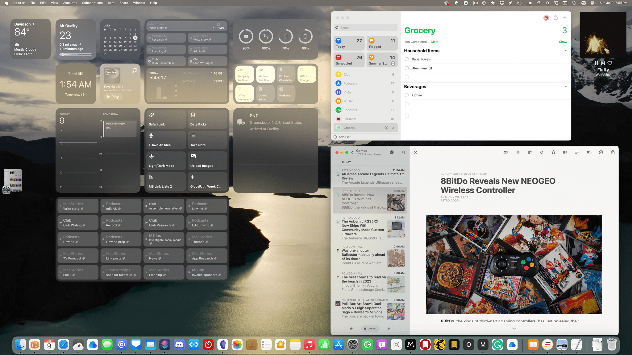
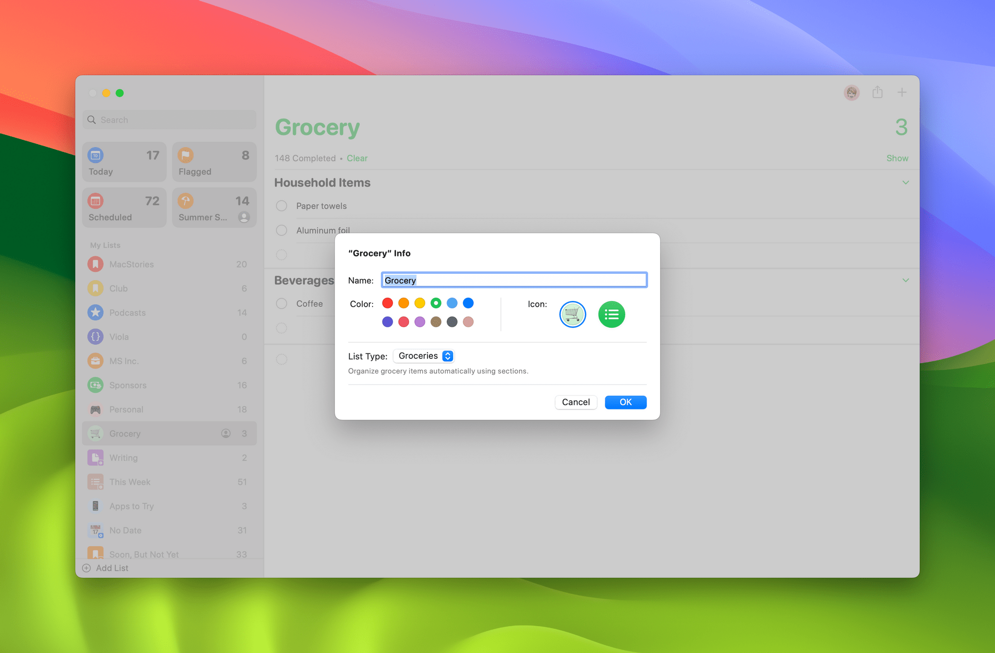
The greatest strength of Reminder is its ability to scale from a simple shopping list to a complex project. With Sonoma, users at every level will get a little something this fall.
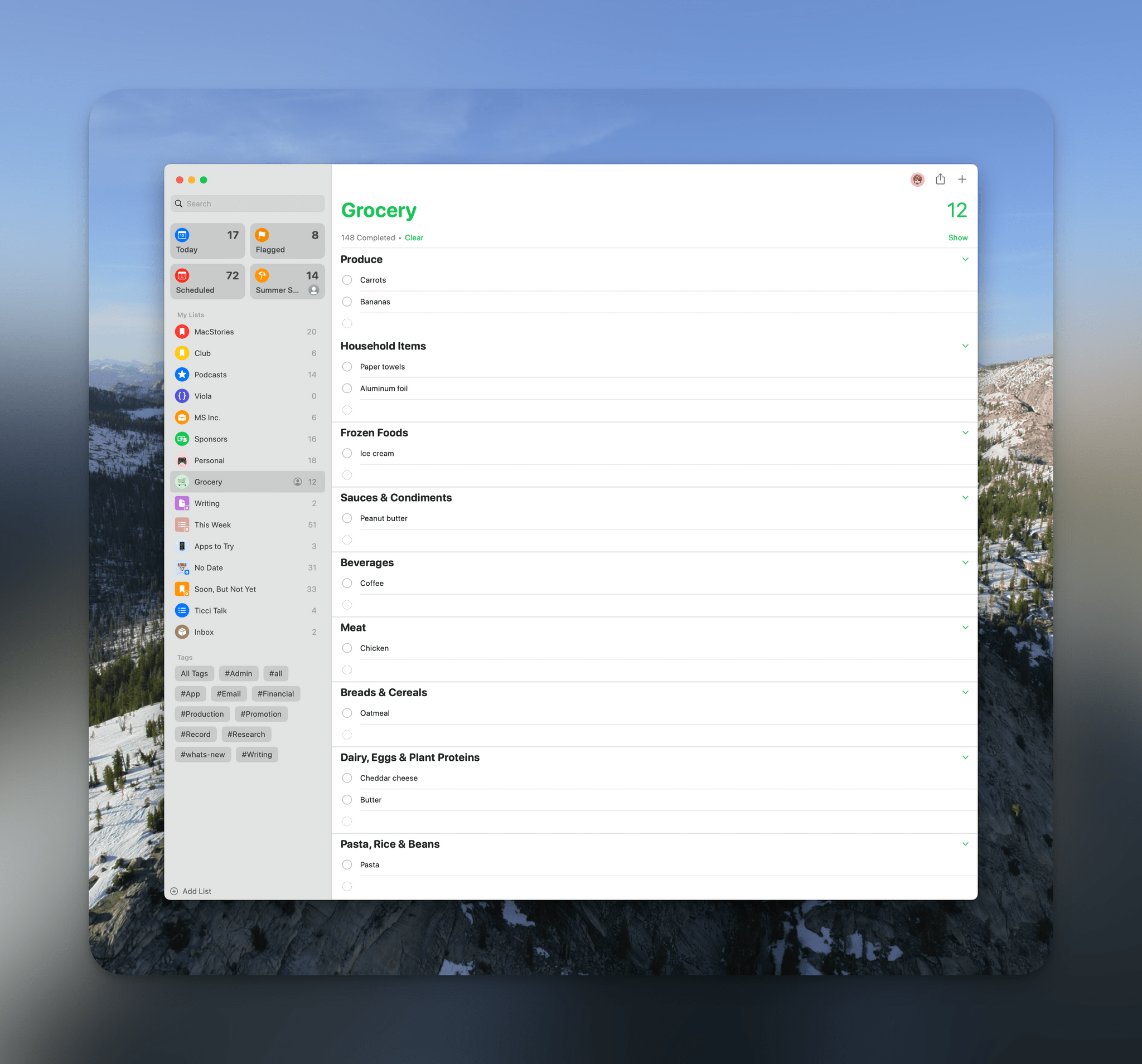
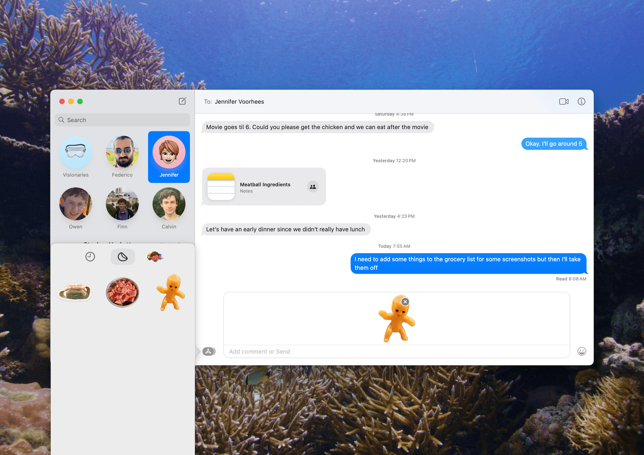
Even when I haven’t used Reminders as my primary task manager, I’ve continued to use it for grocery shopping because its shared lists work so well. With Sonoma, grocery lists are a special type of to-do list that automatically categorizes items by type as you add them to your list. That way, tomatoes and carrots will end up in a Produce section of your list, and eggs will be put in Dairy, Eggs & Plant Proteins.
Automatic categorization does a couple of things very well. First, it breaks up long lists into sections, making them easier to read. Second, everything is grouped in the way most supermarkets are organized, meaning you’ll wind up doing less in-store backtracking as you shop.
If you install the macOS Sonoma beta and share a grocery list with someone who isn’t on any of Apple’s betas, it’s not an issue. Their version of the list will appear as it always has as one long list. Items added using an older OS won’t be categorized on your list either, but you can always drag them into relevant categories manually if you want.
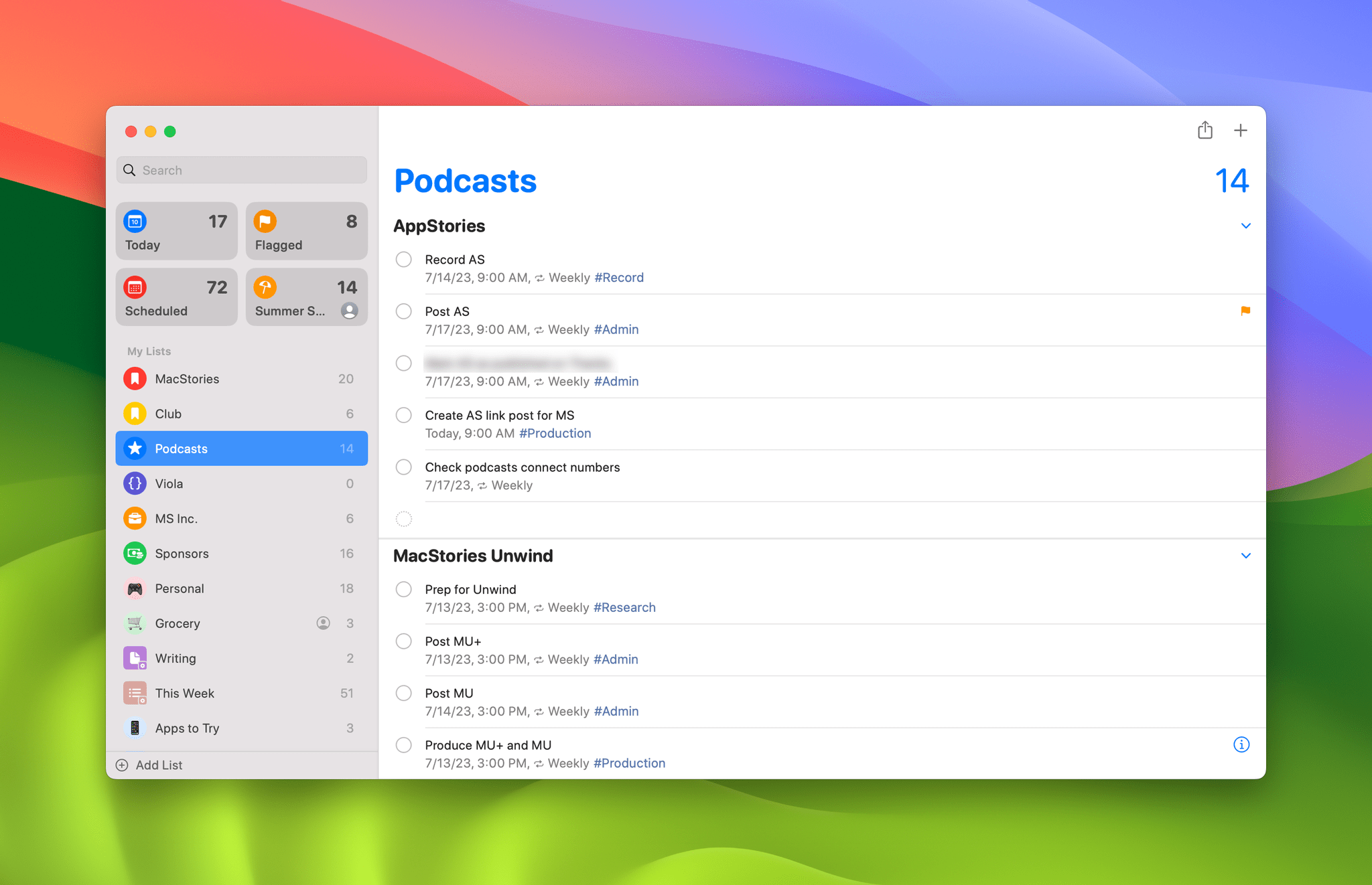
The sections used in grocery lists carry over to all Reminders lists minus the automatic categorization. Any list can be divided into multiple user-defined sections. The feature reminds me a lot of the sections feature of Things 3, which I like a lot too. It may sound like a small thing, but breaking up a long list into sections makes it a lot easier to navigate, read, and organize, allowing me to maintain one list for each broad area of my work, with sections serving as a way to organize sub-projects without creating an entirely separate list.
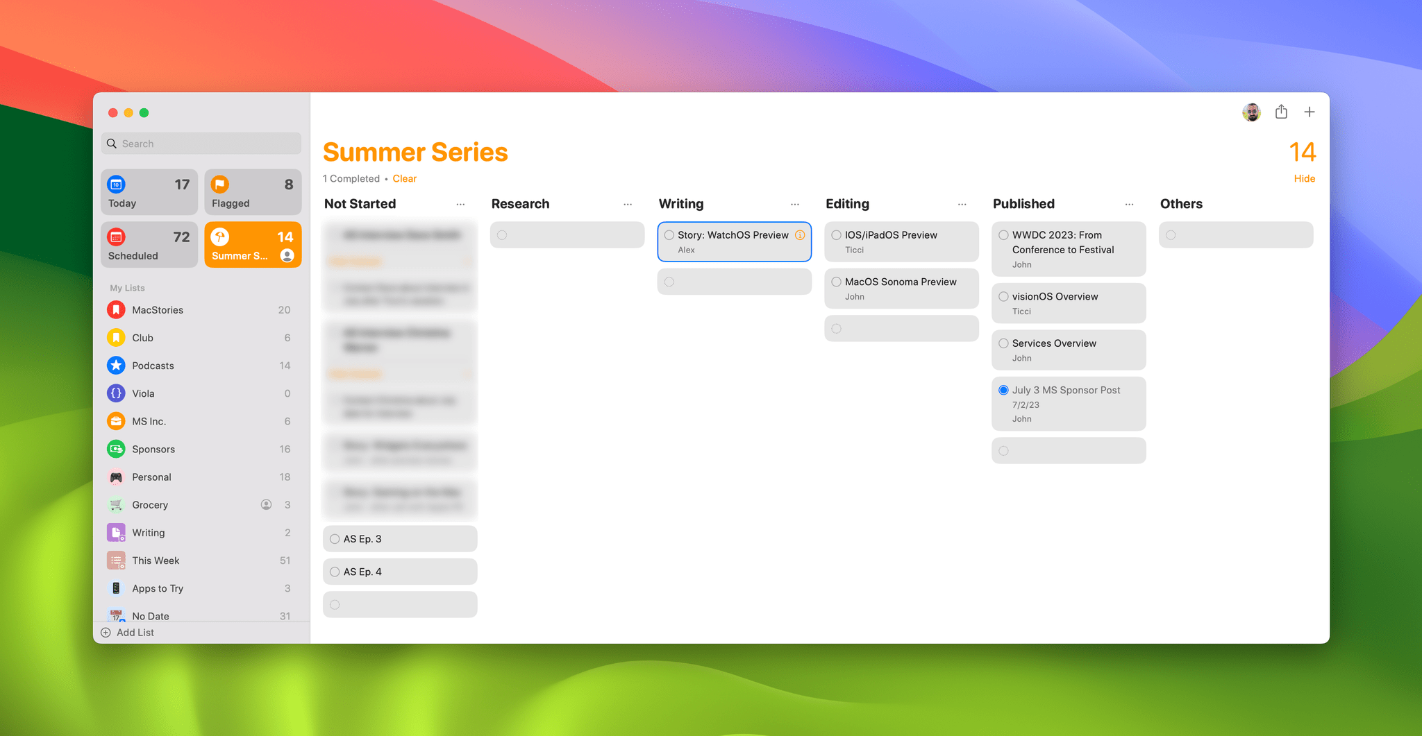
Sections are also how Reminders implements a new column view that can be used as a simple Kanban board. When you switch to column view, each of a list’s sections becomes a column that includes all of the items in that section. Any tasks that aren’t assigned to a section are added to a column labeled ‘Other.’
One way I’ve been experimenting with column view is to create a project for our OS Summer Preview Series that I shared with Federico. The two of us can add items to the list and move them from column to column as articles move from research to writing to editing, and podcast episodes move from preparation to recording to production. I’m not sure yet if I’m going to use column view a lot, but I’m glad it’s available. I just wish the built-in Scheduled Tasks list could be viewed as columns organized by date to make it easier to plan my week’s work.
Notes
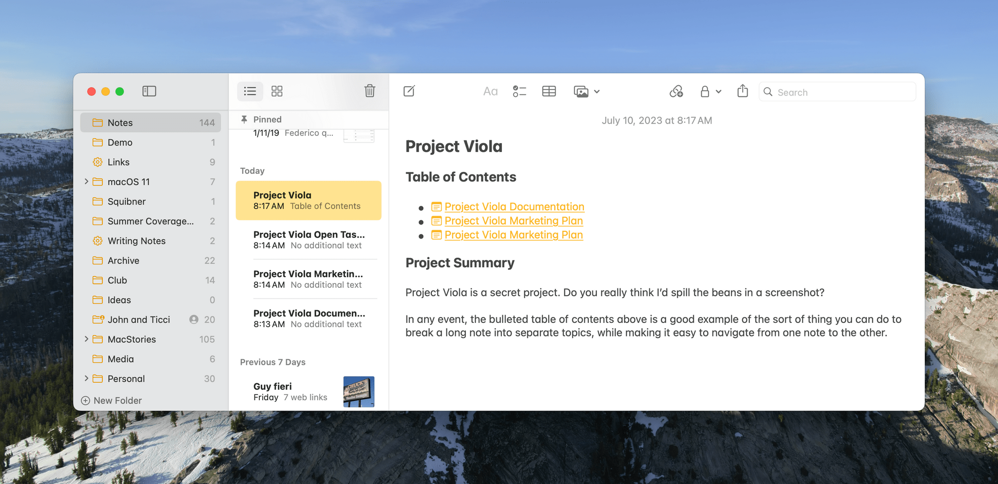
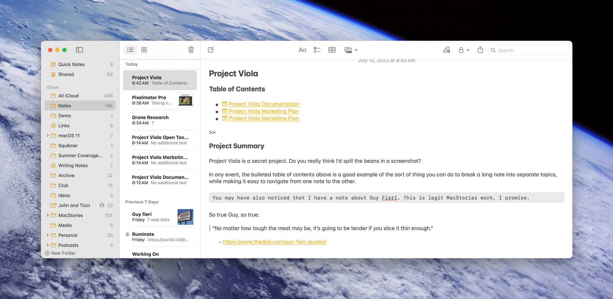
Internal linking between notes is coming to Apple’s Notes app this fall, and the implementation is excellent. One of the problems I’ve had with Notes in the past is similar to the problem of long lists in Reminders. Especially on smaller screens, a long list or note becomes its own worst enemy, making it hard to read and find things.
Unlike Reminders, Notes already had a way to break up a wall of text using headings and other formatting options. That goes a long way, but nothing beats links to separate, self-contained notes for skipping around in a long document. Instead of scrolling, links allow you to build a web of interconnected notes on related topics.
If that sounds a little like Obsidian and other ‘personal knowledge management’ apps, it’s because it is. One of the strengths of apps like Obsidian is their ability to connect related materials.
However, Notes takes a different tack than apps like Obsidian. Notes’ links are one-way, meaning when you visit a linked note, you won’t automatically see which other notes that link to it, a feature Obsidian calls back-linking. There are advantages to back-linking, but having used Obsidian for a couple of years, 90% of the value I’ve gotten from linking notes is from one-way links, not back-links. That’s not true for everyone, of course, but I think it was the right move for Notes to stick to one-way linking.
With linking, Notes is far more useful for creating reference materials. Whether it’s documenting a complex procedure you use at work or planning a vacation, subdividing a long note into independent, linked notes can keep things more organized and easier to digest. I’ve only just begun experimenting with linked notes, but I expect that they will allow me to use Notes for certain things where I’ve relied on apps like Notion in the past.
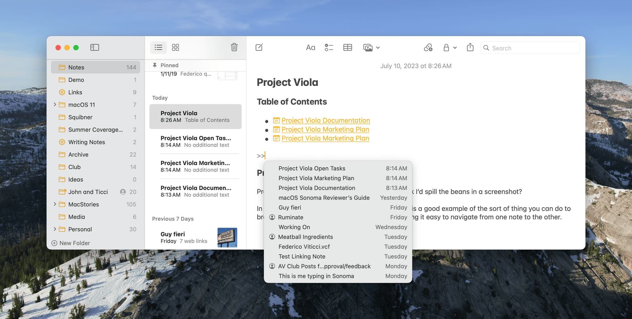
Creating a link is simple. Highlight text in your note, press ⌘K, and start typing the name of a note. You’ll immediately see search results of notes to which you can link. Alternatively, you can type >>, and a list of the dozen most recent notes you’ve edited will appear. You can also paste a URL into Notes’ Add Link window if you want to link to a website.
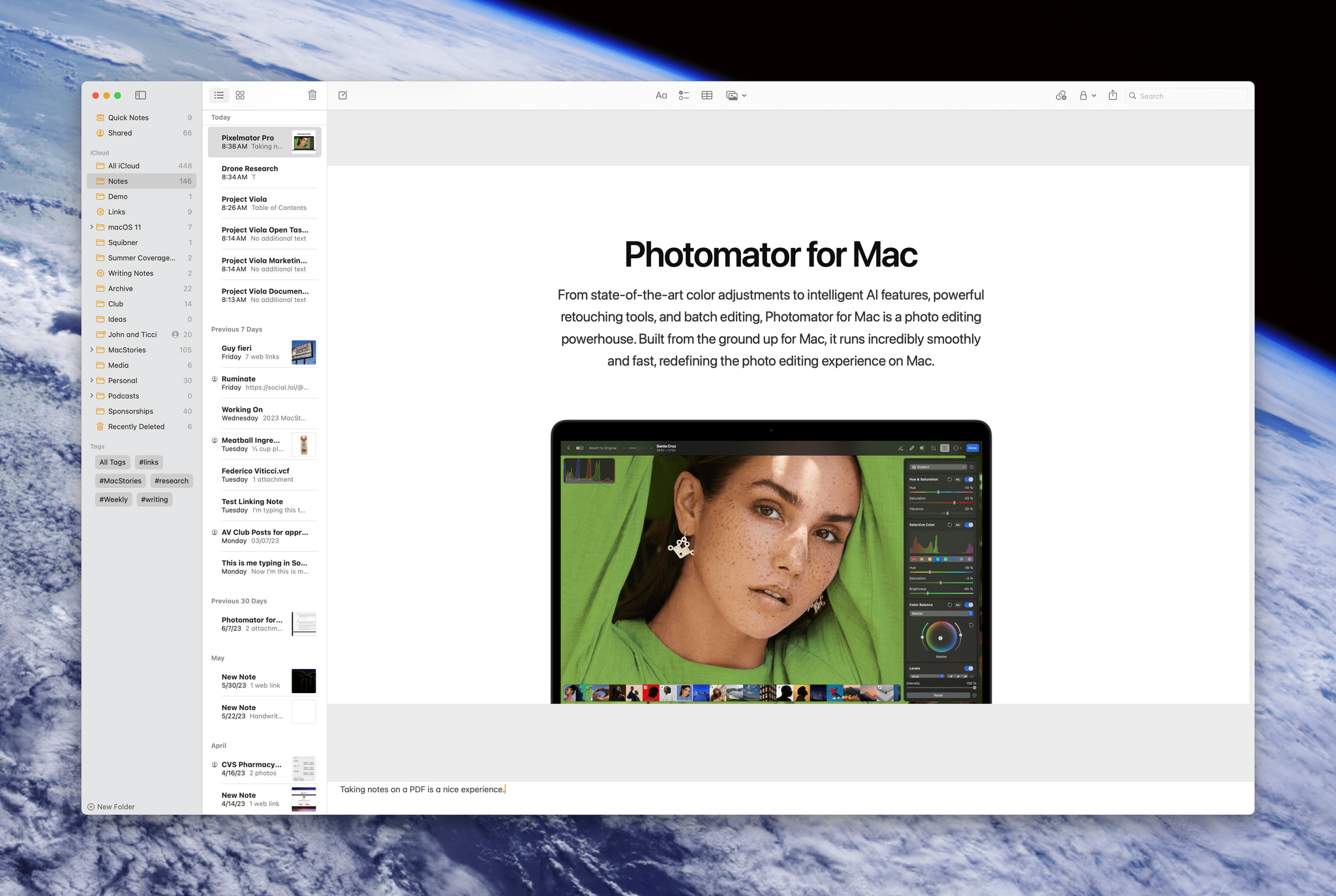
The other big addition coming to Notes is improved PDF handling. Dragging one or more PDFs into a note displays them as a horizontal strip of pages that you can swipe among to navigate. Alternatively, you can click ‘Show Thumbnails’ and skip around from page to page that way. You can also pinch and zoom or drag from the edge of a PDF to resize it.
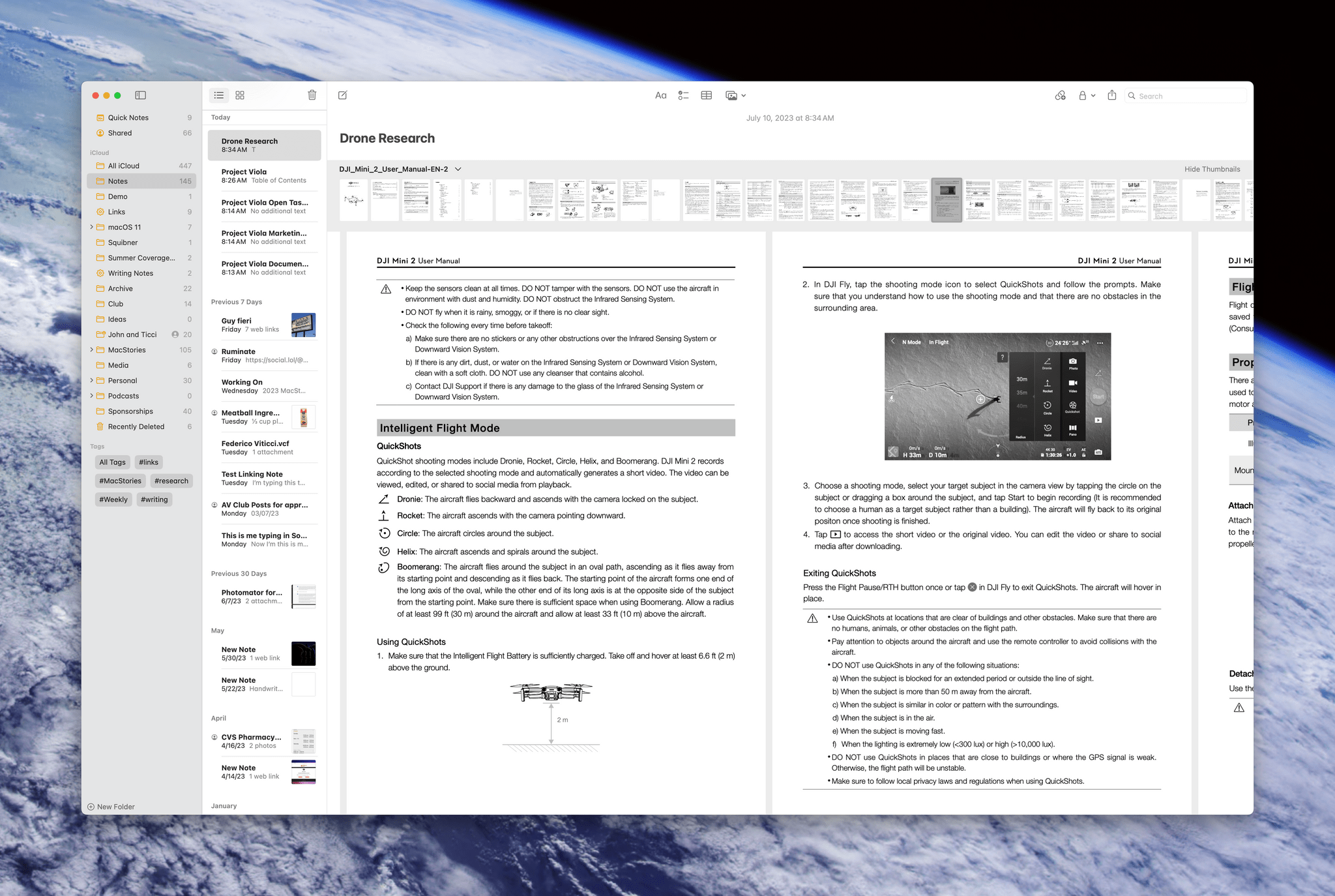
There are multiple ways to navigate a PDF, including by a thumbnail strip along the top of the document.
You cannot annotate PDFs in Notes on the Mac the same way you can on an iPad, where an Apple Pencil is a great way to mark up PDFs. Still, it’s disappointing that the full set of annotation tools that are available in an app like Apple’s own Preview app isn’t part of Notes too. That said, the ability to swipe through a PDF taking notes under it is a big upgrade from Ventura and prior releases of macOS, which supported PDFs, but required them to be opened in Preview for reading.
Notes will gain a couple of new formatting options this fall, too: block quotes and a monospaced typeface. As someone who likes to use notes to store code snippets for MacStories, the monospace font is an addition I’ll use a lot. Quotes will be excellent for research projects too.
Finally, it’s worth noting that you can export a note from Apple Notes to Pages to take advantage of that app’s deeper formatting options. Keep in mind, though, that this is not a sync feature. Once a note is in Pages, it’s a Pages document and doesn’t sync with Notes. Nor can a Pages document be opened in Notes.
Safari
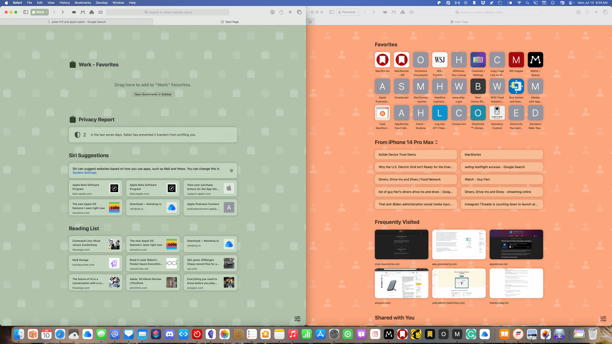
There are a few big-ticket items coming to Safari in the fall, including single-site web apps and profiles. Of these, I’m probably most excited about web apps. The feature isn’t something particularly new. There are many third-party apps that can create a standalone web app from a website, but most offer more customization than I need.
What I love about Apple’s single-site browser apps is that there’s virtually no work involved in setting one up. Just navigate to the site you want to turn into a web app, select ‘Add to Dock’ from the file menu, an option we first saw with the introduction of Shortcuts to the Mac, and that’s it. You can change the name of your app if you’d like and add a custom icon if you don’t like the default, but that isn’t necessary. Once you’ve got your web app, you can remove it from the Dock if you’d like and trigger it with a launcher app like Raycast or open it with Shortcuts or Spotlight because it behaves just like any other app on your system.
One of the benefits of creating siloed web apps like this is privacy. Each app is sandboxed, so it doesn’t have access to your other web browsing. I’ve also found that some services seem to run better as web apps. For example, Mailchimp is a notorious resource hog, but for whatever reason, it consumes far less memory as a web app, which is where I’ve now quarantined it.
I’ve also set up web apps for Instagram, the read-later service Matter, Grammarly, MacStories’ internal image uploading app, the WordPress admin panel for MacStories, our homegrown Club MacStories CMS, and a new web-based app I’ve been testing. It turns out I use more web-based services than I realized, and although I have simply pinned some of them as tabs in Safari in the past, I think of them as separate tools, which is why I like that they’re now separate apps.
Profiles let you create separate Safari identities, each with its own set of web service logins, extensions, Tab Groups, favorites, histories, and cookies. Profiles can be tied to Focus Filters and sync across the Mac, iPhone, and iPad too.
This feature would have been great back in the days when I worked at a big company if they would have let me use a Mac, which they wouldn’t have. Nowadays, I don’t have a use for profiles, but I still understand their utility. For a lot of people, they’ll be great for keeping work and personal web browsing separate. The same goes for freelancers who want different setups for each of their clients or students who want a separate schoolwork mode on their Mac. My life doesn’t split neatly along lines that could be defined by profiles, but they’re a great addition to Safari that I expect a lot of users will appreciate.
Messages and Videoconferencing
Messages on macOS will get some of the new features the app is getting on iOS and iPadOS 17, but not all of them. The most disappointing omission in the current beta is that there’s no way to create stickers on the Mac. Perhaps that will come in a later beta update, but currently, you can copy the subject of an image and share it, but there’s no option to save it is a sticker. However, the stickers you create on iOS and iPadOS will sync to Messages for Mac for use there too.
Another caveat is that effects added to a sticker don’t translate completely to the Mac. For example, if I make a sticker shiny on my iPhone, it creates a holographic effect that shimmers as I tilt my phone. On the Mac, you can tell the effect has been added, but it’s completely flat looking and doesn’t change as you change your viewing angle. Hopefully, more robust sticker support is something that will come in a later beta release because it’s okay to have fun on your Mac too.
In addition, Messages for Mac will gain search filters for people and file types such as photos and links. This has already come in handy when I know who I had a conversation with because it allows me to search only messages sent between the two of us. Swipe to reply will also be available as part of Sonoma.
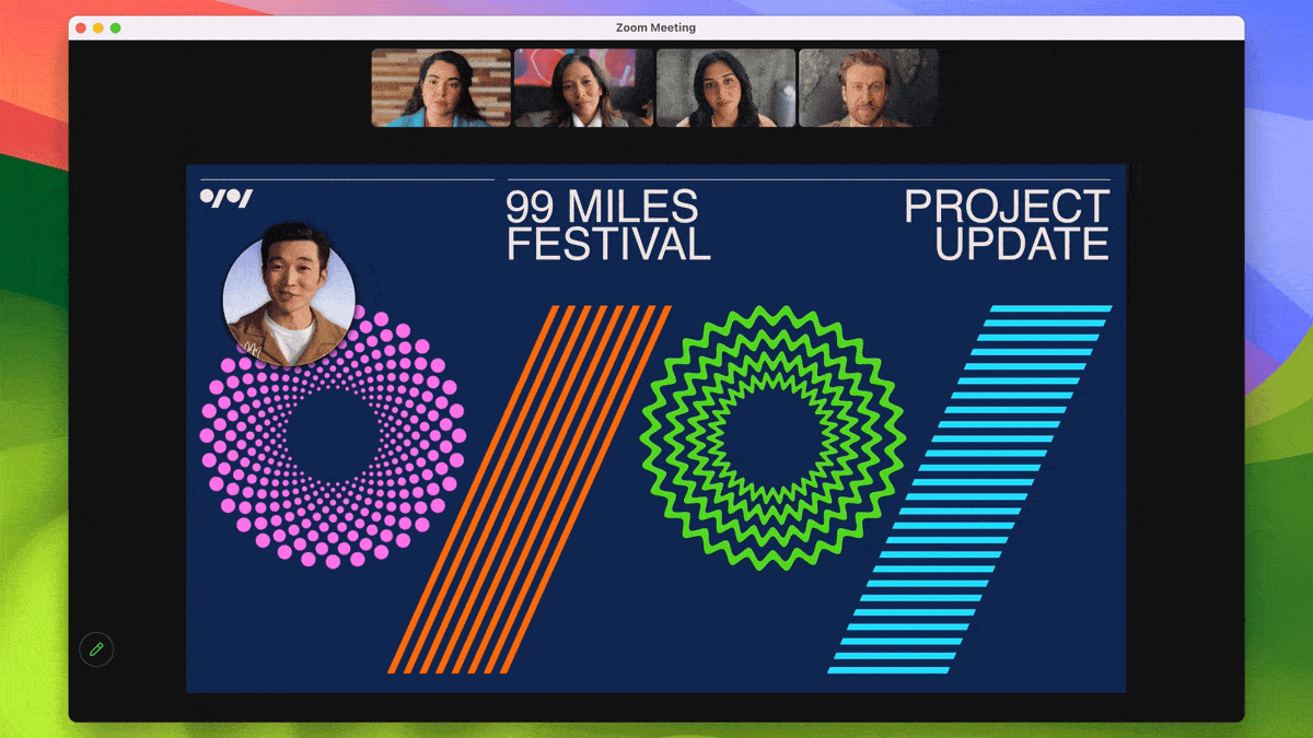
Videoconferencing is getting a big update with Sonoma too. I don’t particularly care about videoconferencing, but video calls are a fact of life for most people, so it’s nice to see some useful new features coming this fall, along with some fun touches. These features will be available in any videoconferencing app that uses the relevant APIs, and I can confirm from my initial testing that the new gestures for Reactions already work in both Zoom and Webex, as well as FaceTime.
Reactions are like a combination of Messages’ Tapbacks and message effects. They allow you to convey meaning without interrupting someone and can be triggered using hand gestures or manually. There are a total of eight reactions, including thumbs up, thumbs down, rain, fireworks, lasers, confetti, hearts, and balloons. Reactions can also be triggered from the new video item that appears in your menu bar when you open a compatible video conferencing app. From the menu item, you can also turn off Reactions entirely.

I’ll probably turn off Reactions and toggle them back on only when I want to use one. The reason is that the way I discovered that reactions already work in Webex was by mistake. I was waiting for a video call to start, moved my hands into the view of my Studio Display’s camera, and sent an inadvertent thumbs up to myself, which I didn’t expect. That’s the kind of thing that might get more finely tuned during the course of the betas, but reactions aren’t a feature I see myself using frequently anyway.
The new videoconferencing features that I find more useful are Presenter Overlay and new ways to screen share. Presenter Overlay allows Apple silicon Macs to put you in an onscreen circle alongside the content you’re sharing during a video call or superimposed on top of the content, separating you from your background, which is replaced by whatever you’re showing off.
Presenter Overlay is just part of a collection of new screen sharing features coming to macOS Sonoma. Screen sharing is more flexible because Sonoma will let you share your entire screen, a single window, multiple windows, and multiple apps. Sonoma will even let you share a window from the menu that appears when you hover over a window’s green ‘stoplight’ button.
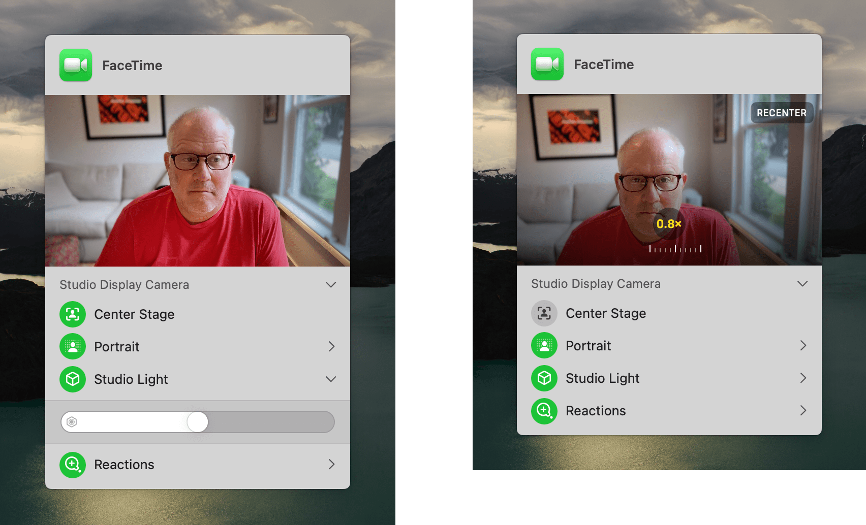
Videoconferencing controls have been consolidated in a dedicated menu bar item that appears when you start a video conferencing app. Click on it to get a preview of what your viewers can see and adjust effects, including Center Stage, Portrait, Studio Light, and Reactions. There is more control over effects too. If you turn off Center Stage, you can control the level of zoom, pan and zoom the camera, and recenter it. The Portrait and Studio Light effects have sliders, so you can adjust their intensity too. It’s a one-stop destination for setting up a call for anyone who, unlike me, is picky about how they look on video calls.
There’s also a supercharged version of screen sharing coming to Sonoma for connecting to your Mac remotely over a high-bandwidth connection. Apple says the feature, which only works on Apple silicon Macs, uses the M-series chips’ media engine to create a high-resolution, highly responsive remote working environment. This sounds a lot like a feature created for Apple’s engineers to work at home during COVID that’s now being rolled into macOS Sonoma. Whether that’s the case or not, having a remote connection that’s closer to working in person will be a great option for anyone who has found themselves going into the office just to use a more powerful Mac.
Gaming
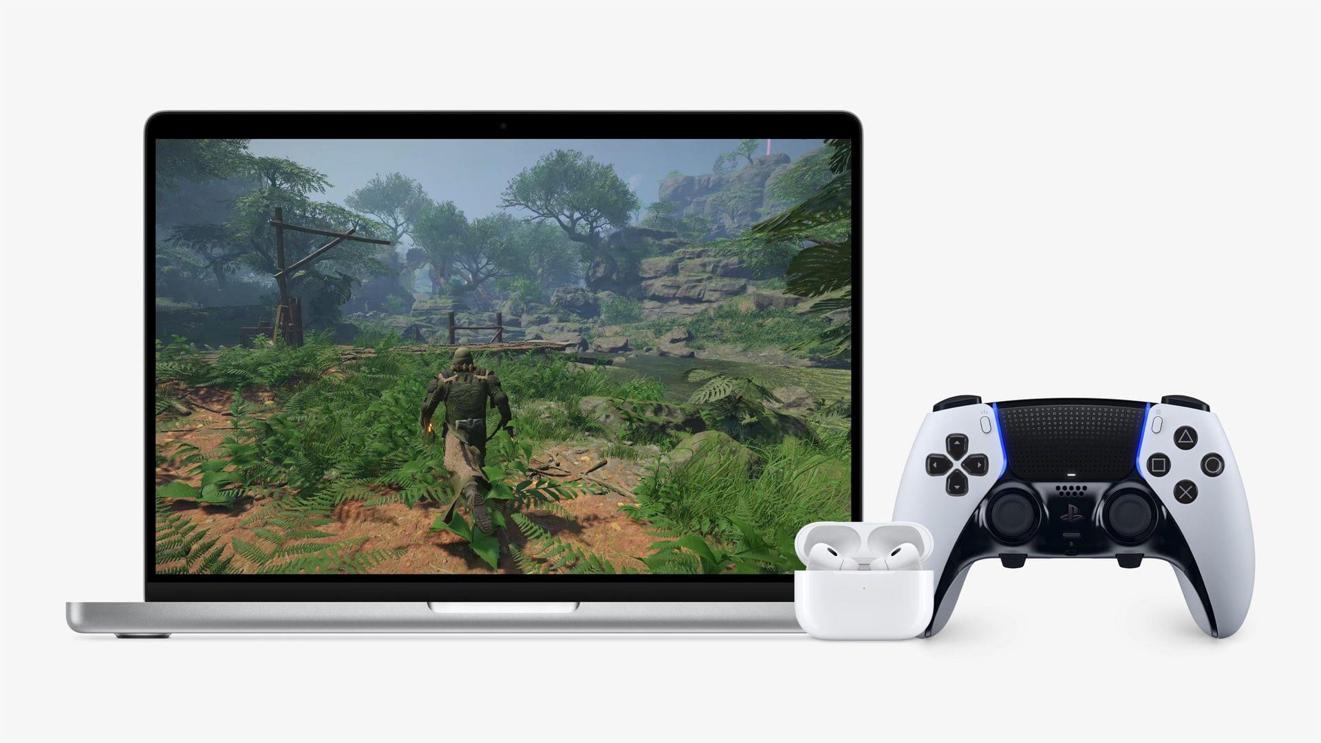
It remains to be seen whether Apple can attract day and date releases of AAA videogame titles. Mac hardware is faster than ever, and Apple’s announcements at WWDC this year and before show it’s interested in gaming, but the Mac market is still relatively small, and its chip architecture is substantially different than other systems game developers build against. So, as much as I like what I’ve seen and am encouraged by Apple’s commitment to making the Mac a better gaming platform, I’m a skeptic and will remain one until those day and date releases start rolling in. I hope they do, but in the meantime, macOS Sonoma will bring meaningful updates to playing games on your Mac that you can take advantage of now during the public beta.
The big change in Sonoma is Game Mode, a collection of under-the-hood improvements that improve the gaming experience on Apple silicon Macs. Game Mode kicks in automatically when you start a game, prioritizing its CPU and GPU needs over other processes that might be running in the background. This isn’t something I’ve had a meaningful way to test since I don’t have two M1 Max Mac Studios to make side-by-side comparisons (I wish), but if it works as advertised, Game Mode should result in more stable, consistent frame rates and overall better performance.
Sampling rates for third-party controllers connected to your Mac will be doubled when running Sonoma too. Audio latency has also been reduced for AirPods, which along with the controller updates, should make games more responsive.
The best part of Game Mode is that it isn’t something you have to turn on, and it works with any game. You’ll still have the ability to tweak settings in individual games to your heart’s content, but at least as far as system optimizations go, they should just work out of the box.
In addition to Game Mode, Apple has continued to release updates to its underlying gaming frameworks and tools like its new Game Porting Toolkit to make it easier for game developers to bring their games to the Mac. You may have seen Reddit posts and websites dedicated to running some of the most demanding PC games on various Apple silicon Macs. These experiments are cool, but it’s worth keeping in mind that the Game Porting Toolkit is designed for developers to get a sense of how well their games run on the Mac without any optimizations and how much work would be required to adapt them to Apple silicon. I don’t think the Game Porting Toolkit is a sign that Apple plans to build a consumer-facing compatibility layer that works like Proton does on the Steam Deck, even though the underlying technologies are related. I do hope, however, that the toolkit will encourage more developers to test the Mac waters.
Everything Else
This is just a preview of macOS Sonoma – a taste of what is to come this fall. I’ll have a lot more to say about all of Sonoma’s features in my full review. In the meantime, here are some of the other big features coming to which I’m looking forward.
Passwords, Privacy, and Security
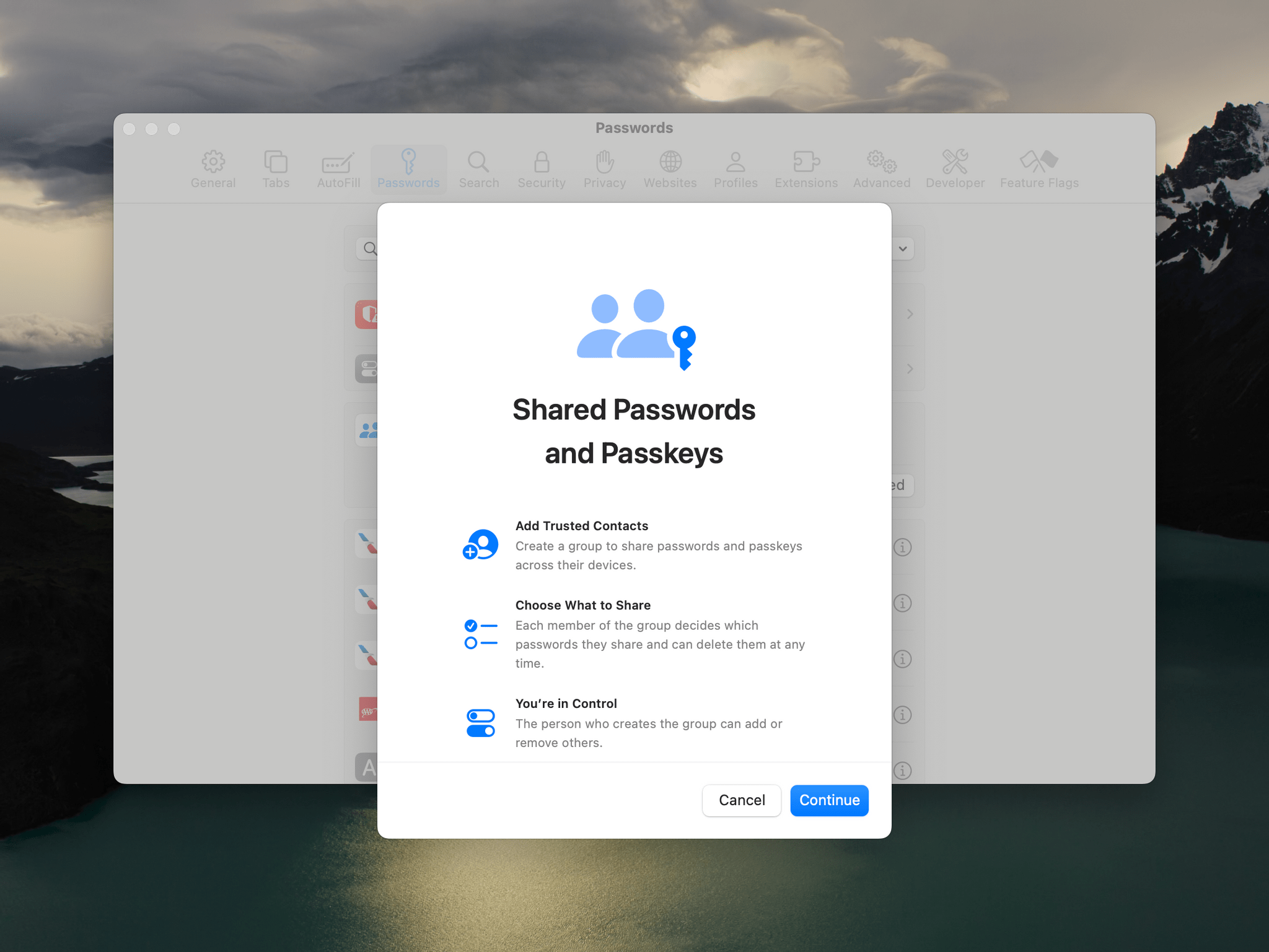
Are passwords exciting? Maybe not in and of themselves, but anything that makes managing them easier is a win from my perspective. With Sonoma, Apple is introducing shared passwords, which will allow you to share passwords with your family, friends, co-workers, or anyone else you trust with them.
I haven’t set up a shared password group yet, because, other than Federico, no one I’d share passwords with is on any of the betas. However, I expect that this feature may be the last one needed to convince many people to switch from a dedicated password management app to Apple’s system. There will still be features in third-party apps that Apple won’t offer, but the advantage of having the feature built into the operating system is not having to convince someone you’re sharing passwords with to pay for and install a dedicated app.
I’ve gotten to the point where I’m beginning to wonder if I’m using a separate password manager simply because I always have. That’s usually a sign that it’s time to tear down my system and try something new, which is what I plan to do once everyone in my life is on the latest OSes this fall.
There are other privacy and security features coming to Sonoma too. In addition to shared passwords:
- Safari will lock private browsing sessions by default
- Mail and Messages will strip certain tracking parameters from URLs automatically
- Calendar and Photos will get updates to make it clear what you are sharing with third-party apps and restrict apps from seeing all of your calendar events
- Communications safety to protect kids from sensitive photos is coming to AirDrop, FaceTime, Photos, and Contacts, and adults will have the option of receiving sensitive content warnings too
Wallpapers, Screen Savers, and the Lock Screen

Not every cool part of an OS update is about productivity. A fresh coat of paint is always welcome too. A new batch of wallpapers and screen savers is par for the course when a new version of macOS drops, and this year will be no exception. In fact, Apple has gone further than usual.
There’s a bright new abstract Dynamic Wallpaper that changes depending on things like the time of day and whether you’re using light or dark mode, which can also serve as your desktop wallpaper.
More impressive, though, is the large collection of aerial screen savers and wallpapers that are reminiscent of the Apple TV’s screen savers. There are four categories: landscape, cityscape, underwater, and Earth. Some of my favorites include:
- Grand Canyon
- Patagonia
- Yosemite
- London
- California Kelp Forest
- California Dolphins
- Caribbean Day
When your screen locks and the screen saver kick in, each high-resolution, slow-motion video begins. When you log back into your Mac, the screen saver continues for a couple of seconds more, creating a nice transition as your Mac wakes up. Each screen saver can be set as both a wallpaper and screen saver, or you can pick a screen saver that’s different from your wallpaper, although that isn’t currently working for me.
I’m also a fan of the new Lock Screen. This change is going to trigger anyone who thinks the Mac is turning into an iPad because it’s clearly inspired by the Lock Screens of the iPad and iPhone, but I like it a lot. You’ve got a lot of control over what shows up on the Lock Screen, which I’ll go into in more detail in my review, but I really appreciate that my Mac’s Lock Screen is now nothing more than a beautiful screen saver, plus the date and time.
Autocorrect and Autocomplete
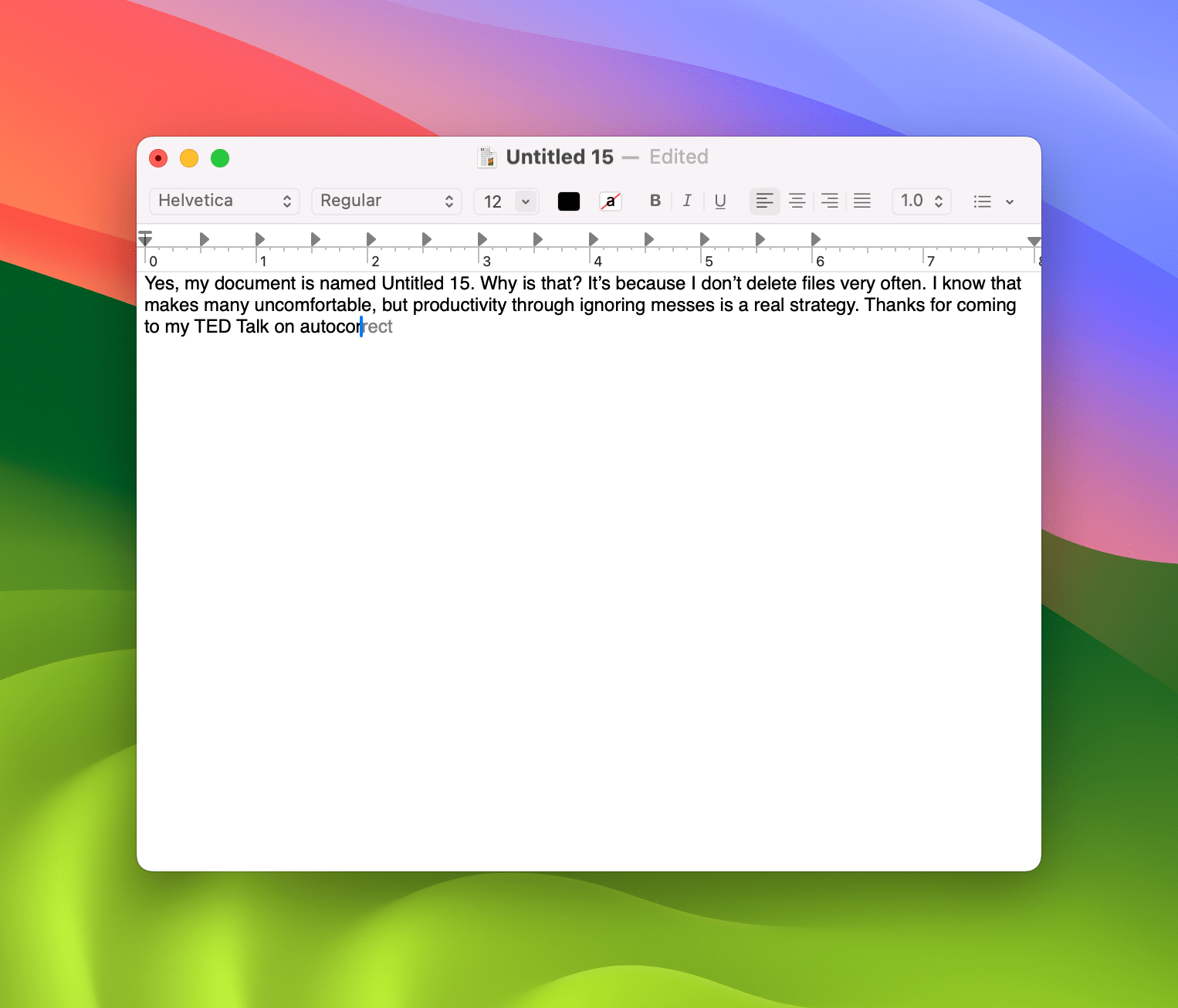
Yes, I’m excited about macOS Sonoma’s updated autocorrect and autocomplete system. It may not be a sexy feature, but everyone makes typing mistakes, and a good autocorrect system goes a long way toward making your life easier.
Apple’s new autocorrect system is orders of magnitude better than the old system on every OS. Apple is using a new, more accurate language model. The core system works a lot like the old one, but you’ll notice differences as soon as you begin to type in an app. As you go, Sonoma will also suggest the autocompletion of words, and event phrases.
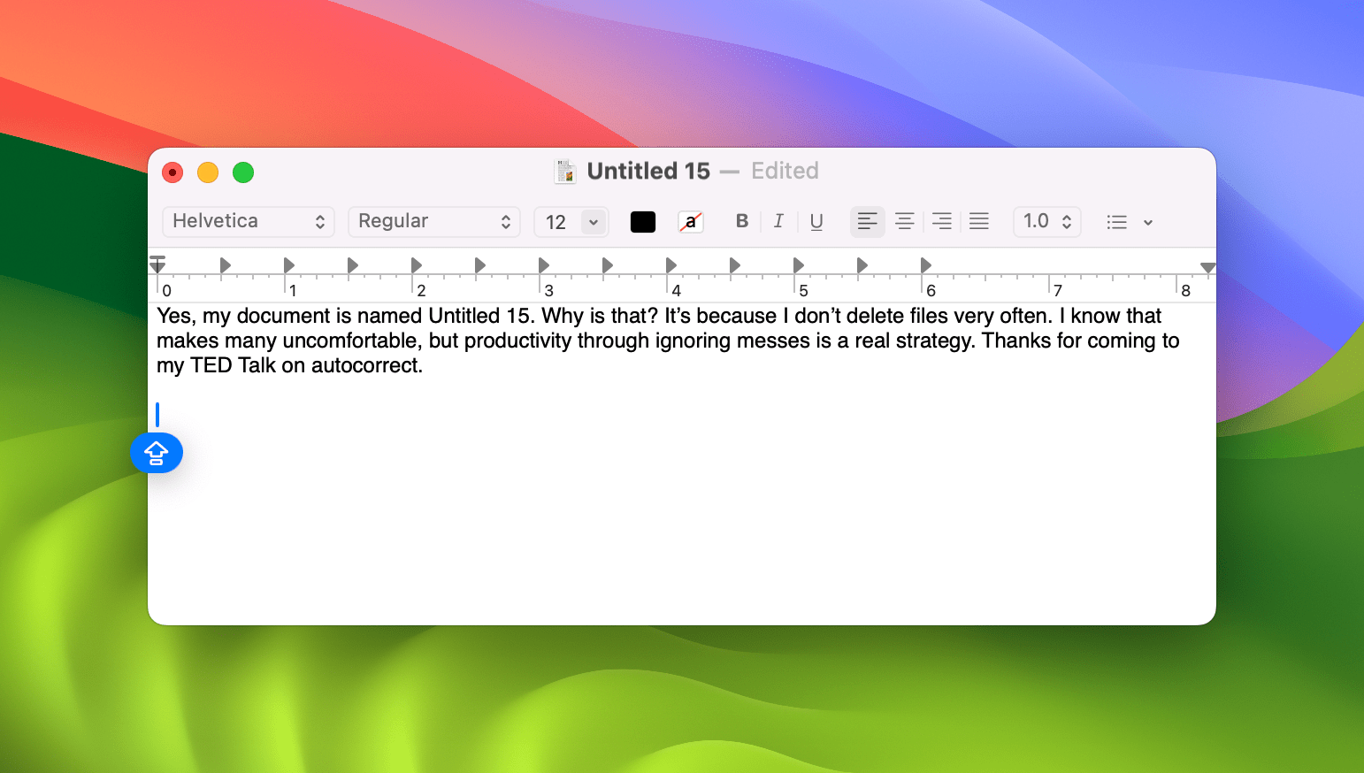
If autocorrect makes a change you don’t want, you can change it back, and the system will learn from your changes. The cursor has been updated as part of this autocorrect process too. The color of the cursor matches the dominant color of the app you’re using. An indicator appears if Caps Lock has been engaged, and a new mini emoji picker appears when you press the Globe key. Paired with more seamless transitions between dictation and typing, text input is receiving a nice bump with Sonoma.
I suspect for some people, seeing auto-completion suggestions pop up as they type will feel like a distraction at first, but I’ve found that I’ve gotten used to them quickly and use them regularly to save some key presses. Autocorrect and autocomplete are the very definition of small changes that add up to a big impact over time. If you type a lot – and really, who doesn’t? – I think you’ll settle into it and enjoy the system too.
My first impression of macOS Sonoma is that it’s a grab bag in the best sense of the word. There’s a big dose of productivity features mixed with some playful, fun features and visually striking interface updates.
A month into testing, I still have more to do, but the features I’ve come back to over and over are desktop widgets, Reminders’ new sections and grocery lists, Notes’ ability to create links between notes, and Safari’s web apps. The keyboard enhancements have improved my daily experience without me having to do anything too.
After several years of significant design and engineering changes that make Apple’s OSes feel like part of a coherent family, Sonoma’s refinements and more tightly targeted new features are a nice change of pace. I also appreciate that despite a narrower focus, there’s something in Sonoma for everyone, which I expect will make it a popular release.
As always, the rest of the MacStories team and I will have more to say this fall when the beta period is over and we’ve finished probing every corner of each OS. If you’d like to join us in kicking Sonoma’s tires, you can find the public beta on Apple’s website here.
You can also follow our 2023 Summer OS Preview Series through our dedicated hub, or subscribe to its RSS feed.