The Problems with iPad Multitasking
There are two key ideas I’d like to see as the guiding principles of future iPad multitasking features: flexibility and permanence. Users should be able to enjoy new ways of multitasking that go beyond what is currently possible in iOS 12; in doing so, however, Apple should also add tools to let them create and manage their favorite workspaces, allowing them to recreate specific combinations of apps with the same degree of freedom and control that is available on the Mac.
My main suggestions for iPad multitasking revolve around these two concepts, but obviously I also have a list of other improvements I’d like to see addressed.
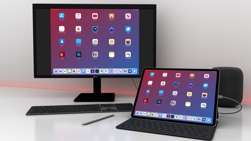
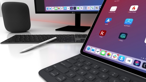
Create multiple “windows” or “views” per app. This is one of the highly rumored functionalities on tap for iOS 13, and I’m curious to see what Apple’s implementation will look like. In working on the 12.9” iPad Pro, I’ve often wished I could take advantage of its large screen to display two separate views from the same app at the same time. One of the tasks that immediately comes to mind is editing Markdown documents that later have to published on MacStories: I would love the ability to “split” iA Writer in two and have a text editor on the left and a live HTML preview on the right. Similarly, I imagine that I’d appreciate the ability to do this in Numbers, where I could take a look at two spreadsheets on screen at once, or Photos, where I could browse two separate albums simultaneously.
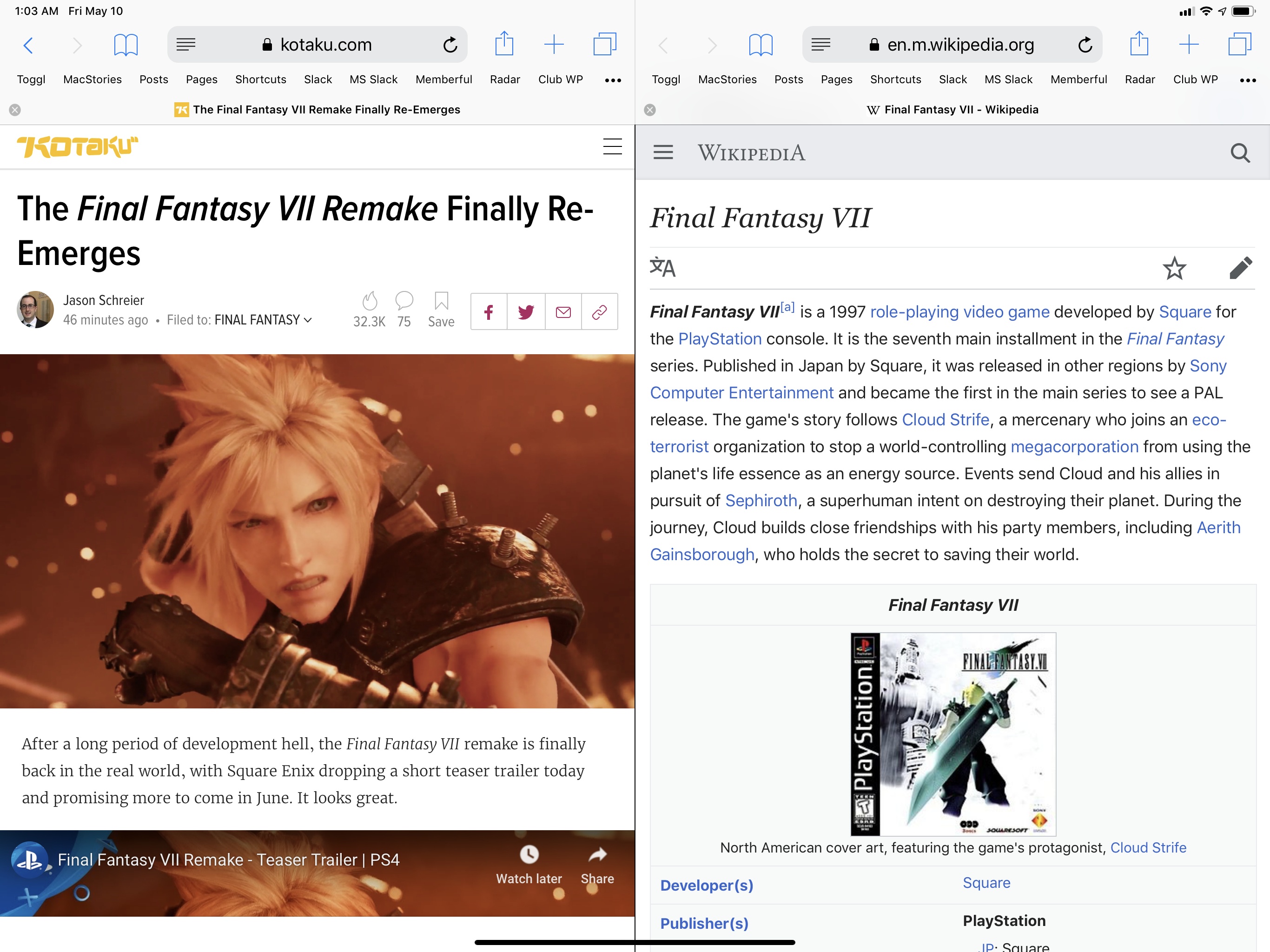
I suppose that nothing is stopping third-party developers from rolling their own custom version of this right now, but an official Apple API is going to feature better system-wide integration and a consistent set of gestures to activate the feature and manage onscreen views. This is already possible in Safari with its built-in split screen feature, which I’d like to become available for all apps.
Going beyond splitting the frontmost app window in two, it’d be interesting to consider a scenario where Apple would let multiple instances of the same app exist on the system. Think of app windows on a Mac: you can create multiple windows for the same app, open different documents/views in each window, and freely rearrange windows across spaces or combine them with other app windows in Split View. Could Apple follow the same approach on iOS and let users create multiple “windows” of the same app that do not have to be displayed as one entity at the same time? And how would that work in the app switcher, which currently has no Mission Control-like feature to group windows from the same app because, well, an app on iOS can only exist as one item?
It all depends on whether Apple believes the iPad is mature enough to withstand a more complex multitasking environment where the concept of app is fragmented and more similar to the Mac. I have no doubt that the latest iPad Pros are powerful enough to support multiple app windows scattered around the system, but I’m afraid that, conceptually speaking, proper Mac-like multitasking on an iPad could be a bridge too far for Apple. Perhaps it could work if desktop multitasking was also reimagined from a visual and touch interaction perspective? I guess we’ll see what happens in a few weeks; even without multiple windows, I’d still be happy if I could split an onscreen app into two separate views.
Create favorite combinations of apps and instantly relaunch them. I mentioned this missing feature when iOS 11 launched; two years later, I still think iOS’ multitasking system should include the ability for users to create “presets” for favorite workspaces and instantly recreate them with one tap or a keyboard shortcut.
As I mentioned in this chapter, while my usage of the iPad is flexible, I’ve identified specific pairs of apps like iA Writer/MindNode or Twitter/Messages that I tend to keep attached to each other in a space. I would like to see a way for users to more easily recreate their favorite workspaces without having to drag in apps and adjust their layout size manually. This wouldn’t need to be as complicated as, say, creating an app window macro in Keyboard Maestro for Mac: the existing Siri Shortcuts system could be extended to support re-activating a space made of two apps next to each other. Apple may even allow “pinning” shortcuts to recreate your favorite Split View pairs in the app switcher, and there could be keyboard shortcuts to reopen a specific space with a system-wide hotkey. This feature could go well with the ability to have multiple views/windows per app, and I could even see how the Shortcuts app may fit into all of this if Apple were to allow power users to manage and control their workspaces with automation.
Put more than two apps in Split View. If you’ve read this article so far, you must have seen this one coming: I’d love to see three active apps in Split View at once. The 12.9” iPad Pro is large enough to accommodate three apps in compact layout mode; I’d love to have something like a “TweetDeck for apps” with three columns shown at once that I could resize to go back to standard Split View for two apps.
I wouldn’t go as far as this concept and allow for an infinite carousel of apps in Split View, which I feel would be hard to manage if you have a lot of apps installed on your device. I would welcome a third app in Split View though, which would save me a lot of swiping and window re-positioning when I’m forced to use two apps in Split View and one in Slide Over.
A new visual indicator for the active app in Split View. Let’s play a game: when do you think I wrote this paragraph?
With the current Split View design, there is no strong indicator of which app is receiving input from the iOS keyboard. There is an indicator – the blinking cursor – but it’s not persistent or clear enough if you need to discern where the keyboard is going to type into.
Last year? Perhaps when iOS 11 launched in 2017? No. I wrote this in my iOS 9 review in September 2015, when iOS 9 first launched and before the original iPad Pro even came out – and this is still a problem today.
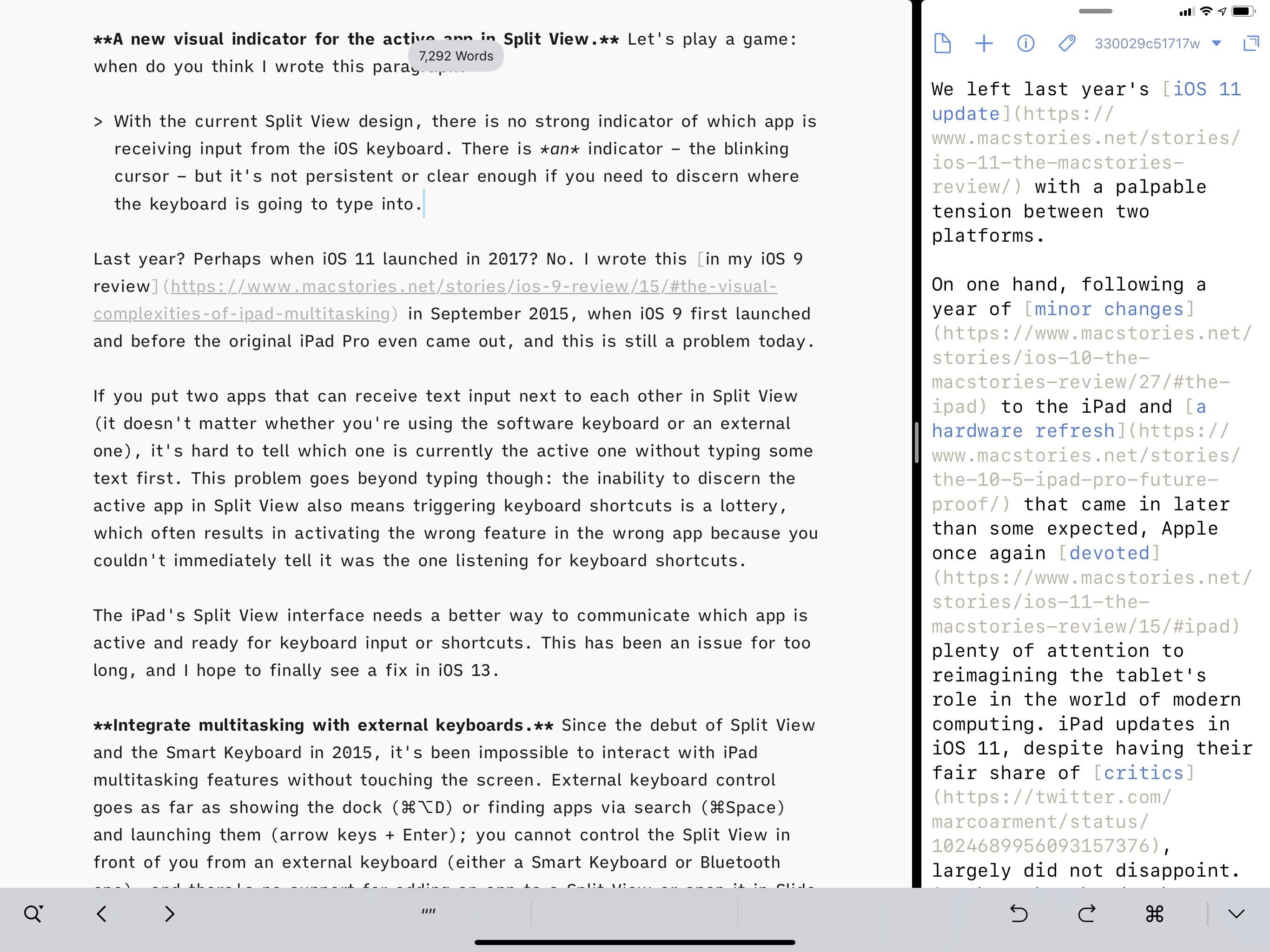
If you put two apps that can receive text input next to each other in Split View (it doesn’t matter whether you’re using the software keyboard or an external one), it’s hard to tell which one is currently active without typing some text first. This problem goes beyond typing though: the inability to discern the active app in Split View also means triggering keyboard shortcuts is a lottery, which often results in activating the wrong feature in the wrong app because you couldn’t immediately tell it was the one listening for input.
The iPad’s Split View interface needs a better way to communicate which app is active and ready for keyboard input or shortcuts. This has been an issue for too long, and I hope to finally see a fix in iOS 13.
Integrate multitasking with external keyboards. Since the debut of Split View and the Smart Keyboard in 2015, it’s been impossible to interact with iPad multitasking features without touching the screen. External keyboard control goes as far as showing the dock (⌘⌥D) or finding apps via Search (⌘Space) and launching them (arrow keys + Enter); you can’t control the Split View in front of you from an external keyboard, and there’s no support for adding an app to a Split View or opening it in Slide Over from search results.
I’d like to see Apple tackle this on two fronts in iOS 13: first, it should be possible to resize the Split View you’re currently using and invoke an app in Slide Over with a keyboard shortcut; second, there should be other keyboard shortcuts to add an app from search results to either side of a Split View or open it in Slide Over. I like what CGP Grey suggested on the Cortex podcast two years ago about this, and I think his ideas are still valid today.
More broadly, given how Apple itself sells a first-party keyboard for the iPad Pro, I think the company should focus on enabling full system navigation from an external keyboard. Every area of iOS and every app should be fully controllable from an external keyboard without having to touch the screen; this includes concepts such as selection and interaction with menus, which apps like Things and Agenda have implemented in a sensible way despite their limited resources. If Apple doesn’t want to go this far though, making multitasking play nice with external keyboards would suffice for now.
Background process API. When we think of multitasking on a desktop computer, we don’t just think of shuffling multiple windows around and using them in split screen, we also inherently assume that certain tasks can be executed by the computer in the background without our constant monitoring. Part of the fun (and power!) of multitasking on a Mac is the ability to have apps like Alfred, LaunchBar, Hazel, Keyboard Maestro, or TextExpander perform tasks, monitor for changes to folders, or listen for keyboard shortcuts in the background, ready to spring to action when necessary. I think it’s time for these kinds of apps to become available, through secure and power-efficient background APIs, on iPad as well.
Clipboard managers and Shortcuts would obviously benefit from the option of monitoring system changes in the background and running actions without being the frontmost windows. File management could also be sped up and made more versatile with the addition of folder-based rules for automatic filing of documents. More broadly, all apps could take advantage of a new background process technology that, perhaps with the aid of machine learning, could let them request more timely updates for new content.
Of course, in bringing real background processes to iOS, Apple must do so with a secure and efficient technology that takes into account the more limited memory of iOS devices; I don’t know if background processes should be exposed to and “managed” by users, Activity Monitor-style, but I’m optimistic that this is something Apple can figure out, just like they did for notifications and battery usage in iOS 12, which were also features we thought the company would never ship because they were “too Android-y”. Real background processes are one of the reasons working on a Mac can still be faster and less cumbersome than an iPad Pro these days, and I don’t see why Apple shouldn’t consider a similar functionality for iOS at this point.
Add a shelf or clipboard manager for drag and drop. Two years into iOS 11’s multitasking system, I remain convinced that Apple should add a shelf-like feature or a built-in clipboard manager to easily “park” bits of content fetched via drag and drop that the user isn’t sure where to put yet.
One of the biggest limitations of drag and drop on iOS, in fact, is that it’s a start-to-end interaction with no rest stop allowed in the middle: if you start dragging something then realize the destination app isn’t ready to accept the dropped item, or if you realize you have to do something else first, your only solution is to cancel the drag and start over. On the Mac, for better or worse, there’s the desktop acting as a natural parking spot for drag items that must go somewhere else later; on iOS, there is no such safe area where you can drop items without consequences. This explains the popularity of apps like Gladys and Yoink, which have capitalized on the lack of a universal drop area and mixed the functionality with traditional clipboard management features, also absent from iOS.
Sam Beckett and I mocked up what a “shelf” feature for iPad drag and drop could look like two years ago, and I continue to believe that something along those lines should be a system-level feature on iPad. Drag and drop still feels vastly underutilized by Apple and third-party developers alike; building a dedicated space to manage your dropped items – and, why not, perhaps even the system clipboard – could drive adoption of the feature even further.
Better visual indicators for drag and drop. Speaking of drag and drop, one of the problems with the current implementation is how you can’t easily tell at a glance which content from an app can be held and dragged away; similarly, it’s often unclear where you’re allowed to drop content in the destination app. Certain iOS developers have worked around these design limitations with their own drag indicators and custom drop zones, but I think it’s Apple that should provide native controls for apps to use if they want to make it more visually clear which items can be dragged and where they can be dropped. I’ve often found myself not considering drag and drop as an option because it wasn’t immediately obvious that it was supported in the app I was using; I suppose that Apple could facilitate adoption of the feature by adding more visual cues around it.
Make multitasking gestures easier to activate and understand. In a similar vein, I think Apple should improve how users can put apps in Split View or Slide Over with more forgiving gestures and a visual design that does a better job at explaining what’s going to happen.
Take a look at the two screens below: do you think the subtle change in window shading and the slightly different shape of the Yoink overlay are enough to tell the average iPad user which window will be in Split View and which one will be in Slide Over?
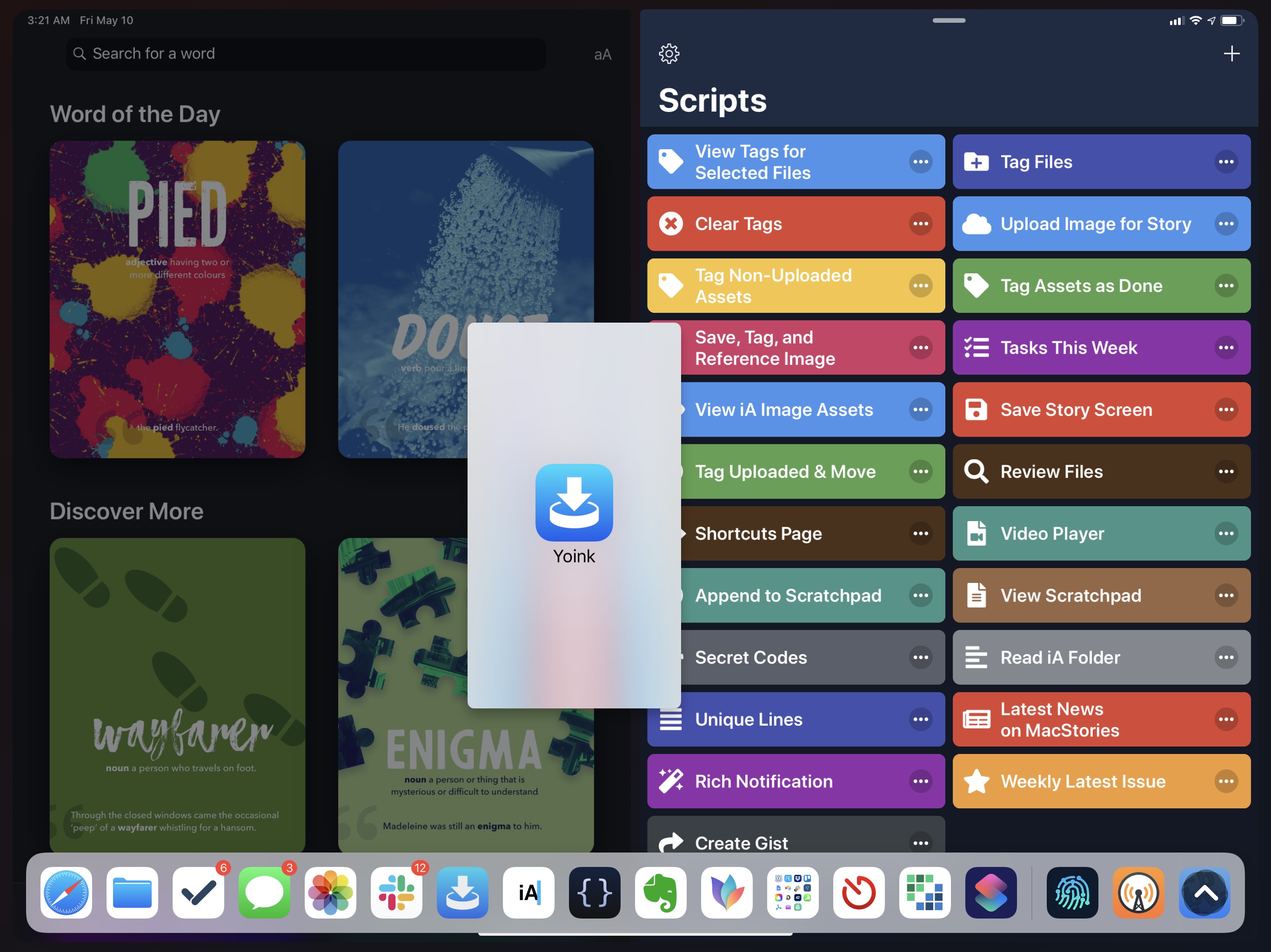
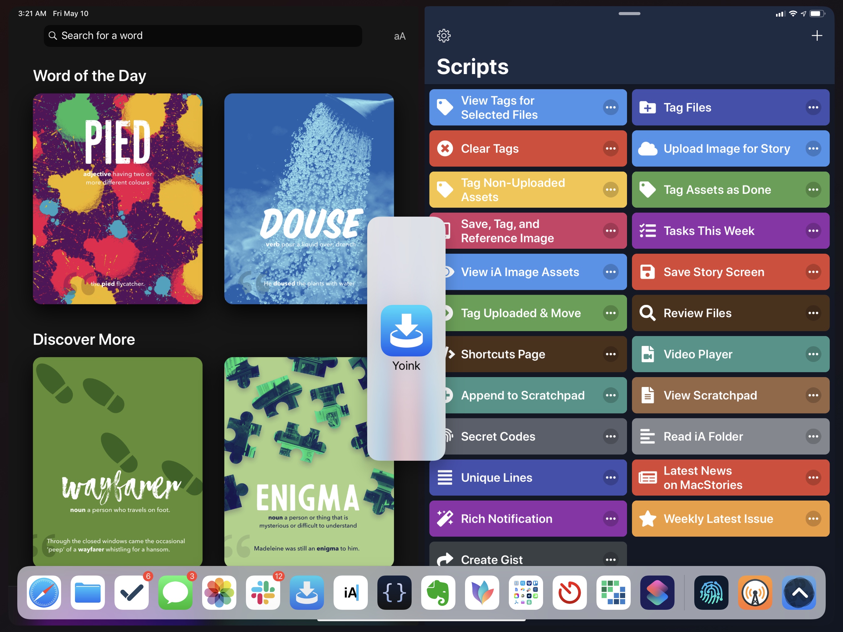
The only difference that governs either activation method is that thin strip of a few millimeters in the middle of the screen that dictates whether an app will activate in Split View or Slide Over. And I don’t think that’s intuitive or clear enough for people to discover.
This is just one of the usability issues of Split View and Slide Over that I think come up most often with folks who aren’t well versed in the intricacies of iPad multitasking. I’ve gotten used to these subtle visual differences over the years, so they’re not a problem for me personally, but I think Apple should do something to make the system more discoverable for everyone, not just power users.
Dismiss Slide Over on the left side of the screen too. The fact that an app in Slide Over can only be dismissed on the right side of the screen feels like a vestige of the pre-iOS 11 era that is still with us today because nobody cared to fix it. There is no particular reason for forcing Slide Over to be activated from the right side of the screen only: we can now put apps on either side of a Split View, and we can even flip them horizontally, and yet Slide Over can only be triggered from the right side. Users should be able to activate Slide Over from and dismiss it to the left side as well.
The iPad’s Split View and Slide Over multitasking system has served us well since its introduction in 2015; four years later, it feels like the right time to try something bolder and more powerful, which could add even more flexibility for advanced iPad users.
iPad multitasking doesn’t have to lean into the complexities of free-form windowing of the Mac; however, just like with file management, there are underlying concepts Apple could borrow from macOS and rethink around the iPad, such as multiple views per app, favorite workspaces12, and keyboard control. In doing so, the company may have a chance to rectify some of the quirks introduced with iOS 11, polish drag and drop interactions, and simplify the activation methods for Split View and Slide Over. As before, all of these proposed enhancements would be entirely optional, allowing users to continue using their iPads with one app at a time if they don’t need anything more from multitasking. But for those who do – the people who work on their iPad Pros with an assortment of apps every day – it’s easy to imagine the many directions Apple could take iPad multitasking next.
Inspired by the Mac, but still uniquely iPad: that’s what I hope will happen to iPad multitasking this year.
- Which is not a feature of macOS per se, but it can be done with automation. ↩