The State of Multitasking
This may be a controversial opinion among those who have been using an iPad as their primary computer for several years now, but I’m a fan of the changes iOS 11 brought to multitasking. The iOS 11 multitasking system (which is still with us today) isn’t without flaws, but I do not believe it over-complicated interactions to the point where the iPad is now “unusable”, as some may argue. It may have estranged a few people, but it also afforded greater freedom for the vast majority of professional iPad users. With some improvements in iOS 13, I think Apple could win everyone back.
I’m going to focus on two areas of modern iPad multitasking – Split View and drag and drop – but before I get to that, I want to provide some context around what certain users identify as the downfall of iPad multitasking. With iOS 11, Apple built upon the Split View and Slide Over mechanics introduced in iOS 9 with new interactions revolving around drag and drop for app icons. Gone was the separate app picker to put apps in Split View (which often confused users due to its seemingly random placement of app icons); instead, iOS 11 allowed users to drag any app to either side of the Split View, and even bring in a third one in Slide Over, by picking up apps from multiple areas of the operating system – from the Home screen, search results, and the new dock.
This newfound flexibility went in tandem with Apple’s decision to embrace a Mac-like model of multiple workspaces – not in the sense of separate desktops and Home screens, but with a system that created fixed pairs of apps every time you’d put two side by side in Split View.
Unlike iOS 9, where only one Split View could exist at a time, iOS 11 allowed the creation of multiple Split Views in “spaces” that could never be “destroyed” unless the user dragged in a different app or manually returned the Split View to a full-screen space. The idea was that casual iPad users could keep ignoring Split View and resizable app windows and use their iPads with one app at a time as always; thanks to these new features, advanced users could gain the added versatility of multiple app combinations for the multiple workspaces they often found themselves operating in. Always keep Safari and Mail next to each other? That can be a fixed Split View in iOS 11. Need to put iA Writer next to Evernote at all times for research purposes while still having that first Safari/Mail workspace active? Also possible with the new system. You get the idea.
iOS 11 was met with resistance from a portion of the iPad user base for a variety of reasons, and my understanding is that some were complaints about missing features, while others were actual criticisms of Apple’s design decisions. To this day, the most common objection to iOS 11 regards Apple’s reliance on fine gestures and the dock to engage with multitasking.
As I noted in my review at the time, Apple put great emphasis on the iOS 11 dock as the fastest, most convenient way to switch between apps and put them in Split View or Slide Over. The dock supplanted the dedicated iOS 9 Split View app picker, but it was limited to a finite number of apps, which meant that users had to rationalize how to separate between “important apps” to keep in the dock and “everything else” to access from Search and the Home screen. Some of them found the idea of holding and dragging an app icon from the Home screen or search results too slow, and thus decided to keep a collection of folders in their docks to speed up multitasking. This approach was called a failure on Apple’s part because users shouldn’t have been forced to work around the dock’s limitations through folders packed with app icons.
The other major complaint involves the precise nature of gestures required to initiate multitasking and put apps in either Split View or Slide Over. I believe there is some truth to this, and I agree that Apple could do a better job at surfacing these gestures and providing visual hints around them, but I also think calling the system “catastrophic” is an exaggeration. iOS 11 critics point to the difficulty of discerning between a long-press to start drag and drop versus a long-press to delete an app on the Home screen as proof of Apple’s badly designed multitasking feature; I think they may have a point about assigning multiple actions to the same gesture, but, frankly, this feels like a critique based on design theory rather than actual usage. In practice, and having used iOS 11’s multitasking system every day for two years, I’ve never felt like understanding drag and drop on the Home screen prevented me from being more productive or working with different apps on my iPad Pro.
In fact, it would be hard for me to imagine going back to a pre-iOS 11 system where I can’t add whatever app I want to a Split View or have the ability to create multiple Split Views across the system. The combination of the dock and Search (activated from an external keyboard) has greatly sped up how I navigate my workspaces and alter them on the fly by bringing in different apps with drag and drop. My belief that Apple’s design and gestures could be improved does not take away from my idea that, as iPad users, we’re better off with an overall more dynamic structure that has some imperfections rather than a “pure” and “minimalistic” multitasking approach that is limited and allows for little user intervention.
There’s a learning curve to the iPad’s current multitasking system, and I agree that Apple could do a better job at progressive disclosure of its different modes, but I strongly disagree with the notion that iOS 11 ruined the iPad experience. I’ve seen how iOS 11 has improved my iPad workflow because I’ve used it every day since 2017 and because I’ve worked on the iPad long enough to remember how slow iOS 9’s multitasking system used to be. Let me describe how this all worked out.
Using Split View, Slide Over, and App Spaces
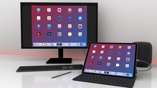
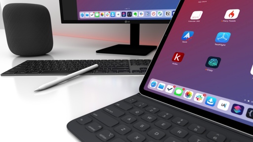
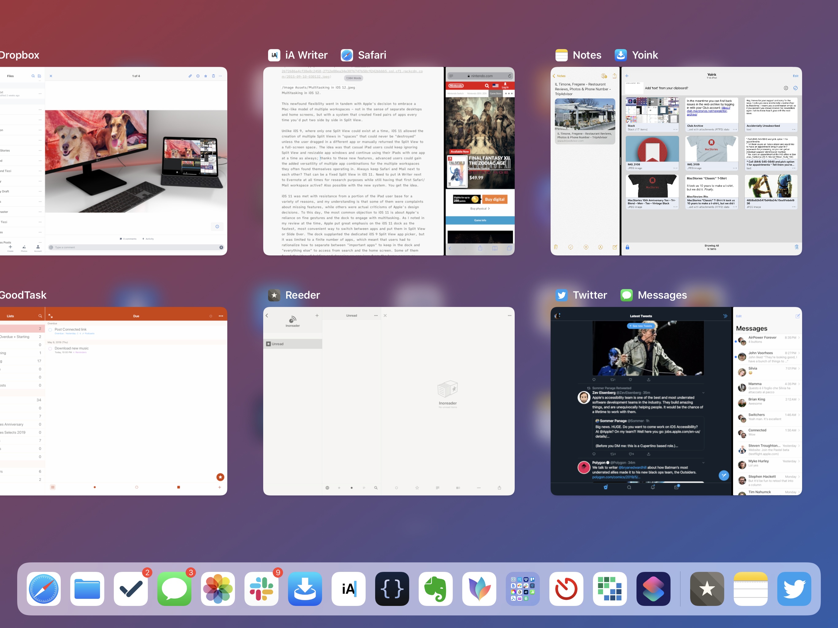
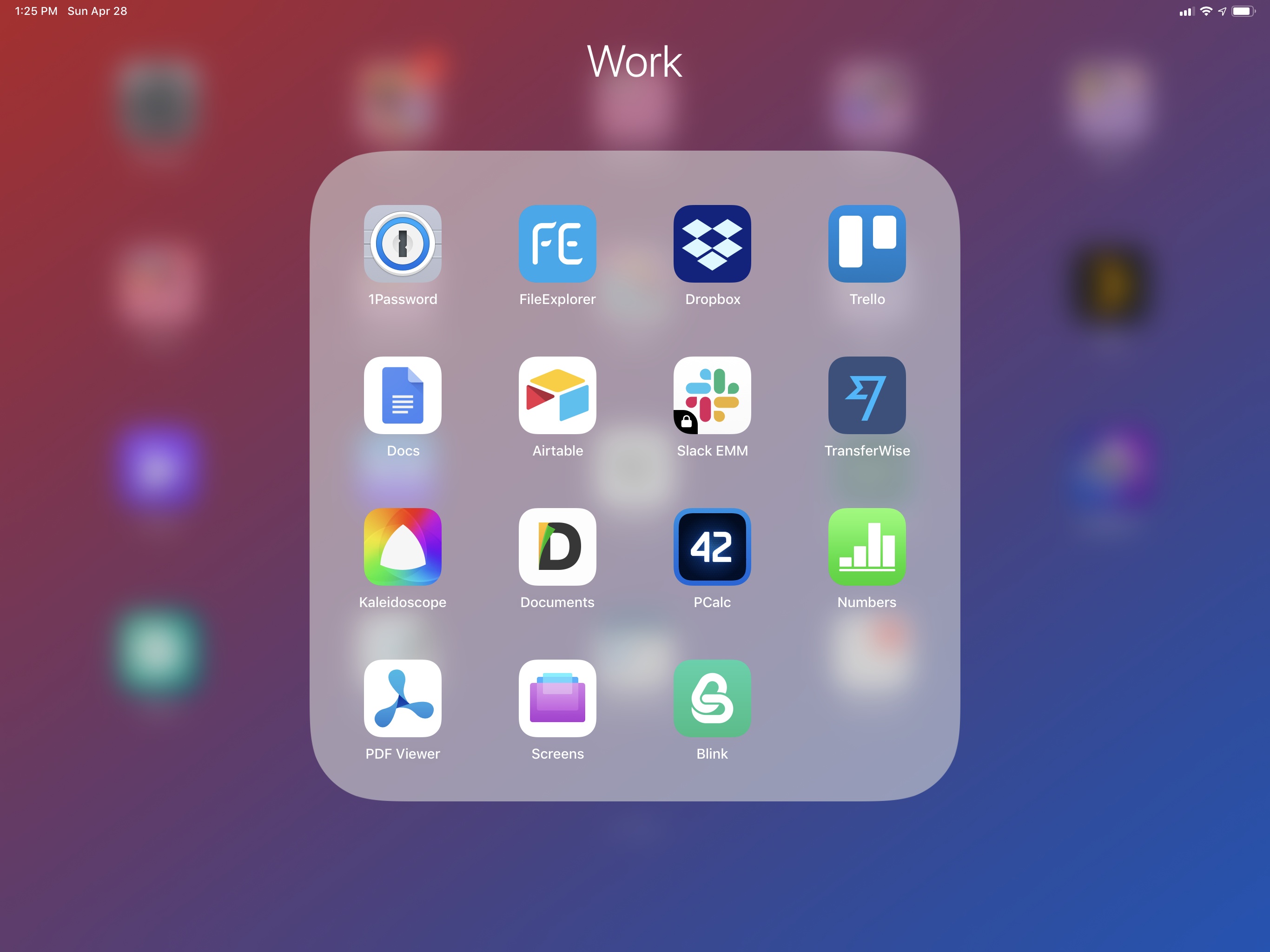
My iPad multitasking setup involves a mix of the dock, Home screen, and Search. I keep my essential apps in the dock, which has become my de-facto app launcher and starting point for multitasking; important apps stay on the first Home screen, which is what I usually see when I swipe from the bottom of the screen to exit an app I’m currently using; everything else – apps that I keep in folders or in other pages – is usually accessed via Search (⌘Space) because I always work with an external keyboard connected to my iPad Pro.
These are the apps in my dock:

As you can see, I have only one folder in my dock, and I keep suggested and recent apps enabled so I have a couple of extra slots for apps that I do not normally keep in the dock, but which I can still reopen with one tap. The ‘Work’ folder contains a collection of other slightly less essential apps that I still need to access more frequently than other apps on the Home screen:
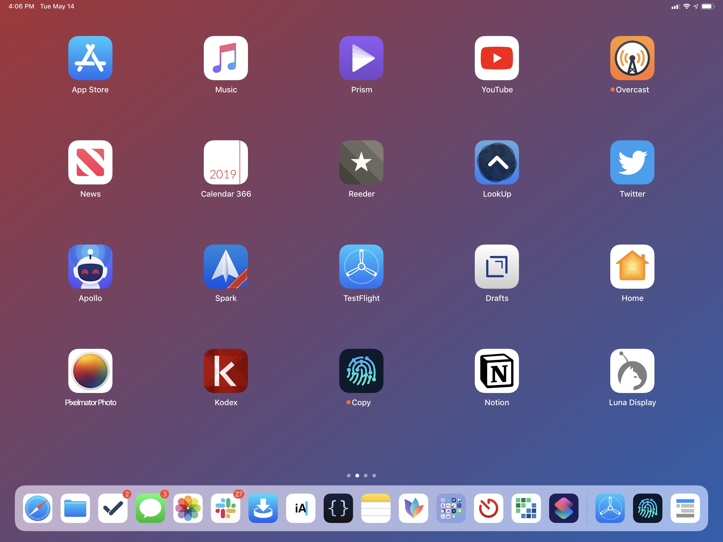
And these are the apps on my primary Home screen:
My philosophy for working with the iPad Pro’s multitasking environment is that I don’t want to force myself to choose One True Way of switching between apps and commit to it forever. I don’t want to artificially limit myself by putting all my apps in the dock, or launching everything via Search, or avoiding picking anything up with drag and drop from the Home screen. Instead, I’ve learned to take advantage of iOS’ multitasking flexibility to launch apps and modify Split View windows in all the different ways at my disposal. Most of the time I like to grab an icon from the dock and drag it across the display to create a Split View; other times I search for an app with the keyboard, pick it up, and drop it in the middle of the Split View divider to activate Slide Over; I often dispense with Split View altogether and go back to using full-screen apps when I want to focus more, and I use the dock as a launcher to move between them. Should I not want to use the dock, I can swipe up to reveal the multitasking app switcher and tap on app tiles there.
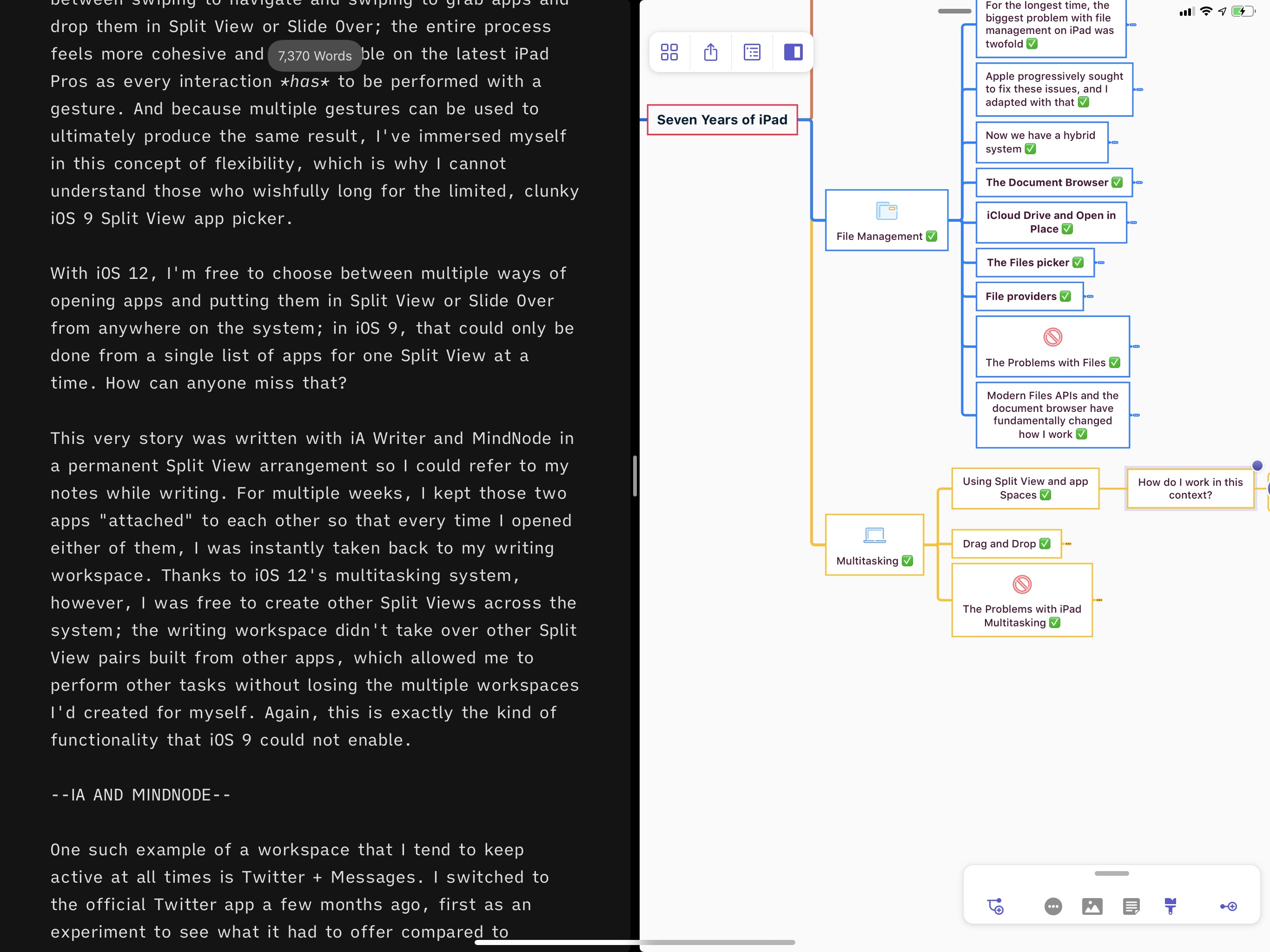
My most important rule for multitasking on the iPad is simple: there’s no single rule to follow at all times. The new multitasking gestures introduced in iOS 12 have played an important role in this: perhaps even more than on the iPhone, the ability to navigate the entire OS via gestures has made iPad multitasking more tactile, fun, and efficient. There is a stronger relationship between swiping to navigate and swiping to grab apps and drop them in Split View or Slide Over; the entire process feels more cohesive and approachable on the latest iPad Pros as every interaction has to be performed with a gesture. And because multiple gestures can be used to produce the same result, I’ve immersed myself in this concept of flexibility, which is why I cannot understand those who wishfully long for the limited, clunky iOS 9 Split View app picker.
With iOS 12, I’m free to choose between multiple ways of opening apps and putting them in Split View or Slide Over from anywhere on the system; in iOS 9, that could only be done from a single list of apps for one Split View at a time. The difference speaks for itself.
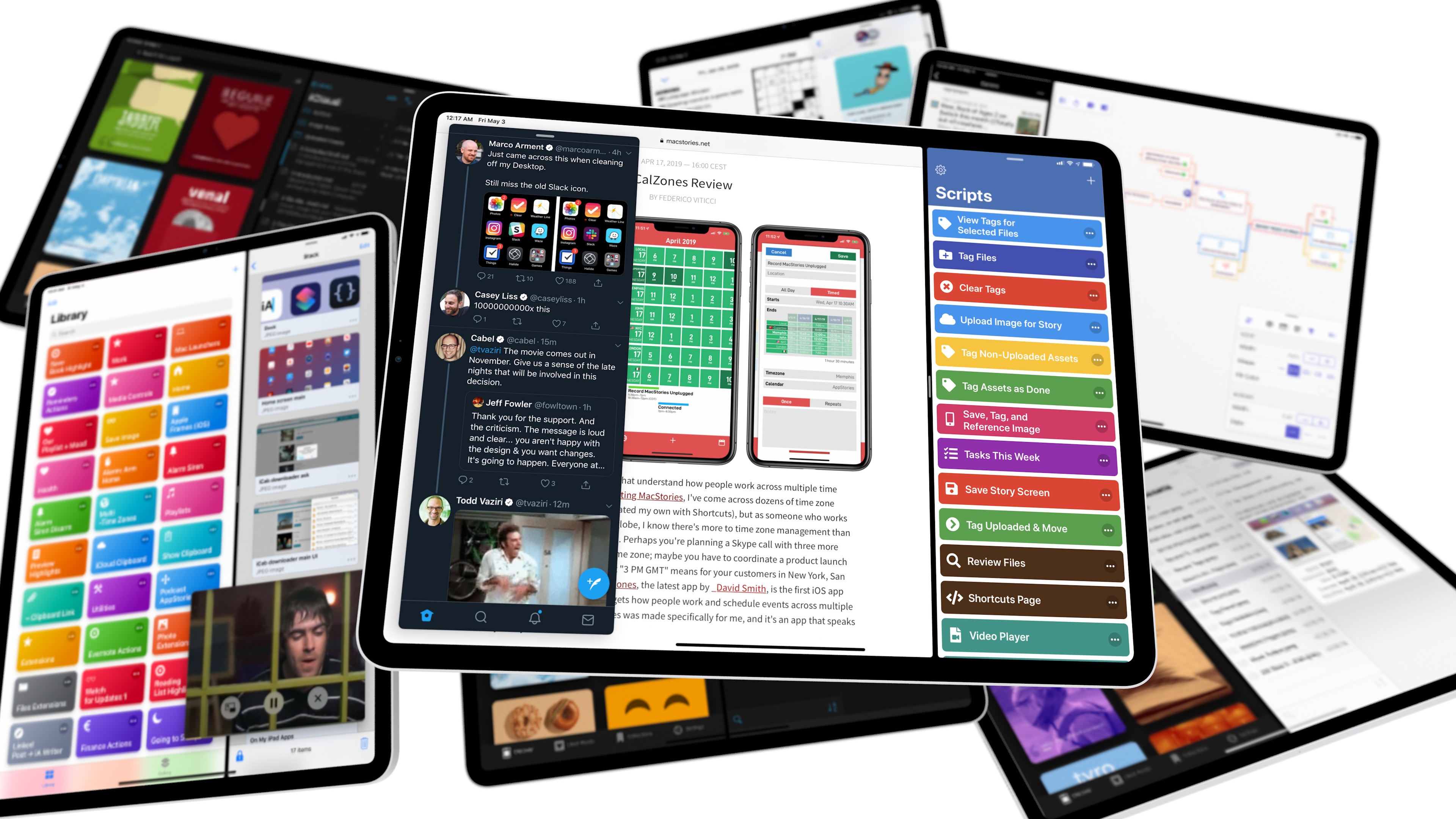
This very story was written with iA Writer and MindNode in a permanent Split View arrangement so I could refer to my notes while writing. For multiple weeks, I kept those two apps “attached” to each other so that every time I opened either of them, I was instantly taken back to my writing workspace. Thanks to iOS 12’s multitasking system, however, I was free to create other Split Views across the system; the writing workspace didn’t take over other Split View pairs built from other apps, which allowed me to perform other tasks without losing the multiple workspaces I’d created for myself. Again, this is exactly the kind of functionality that iOS 9 could not enable.
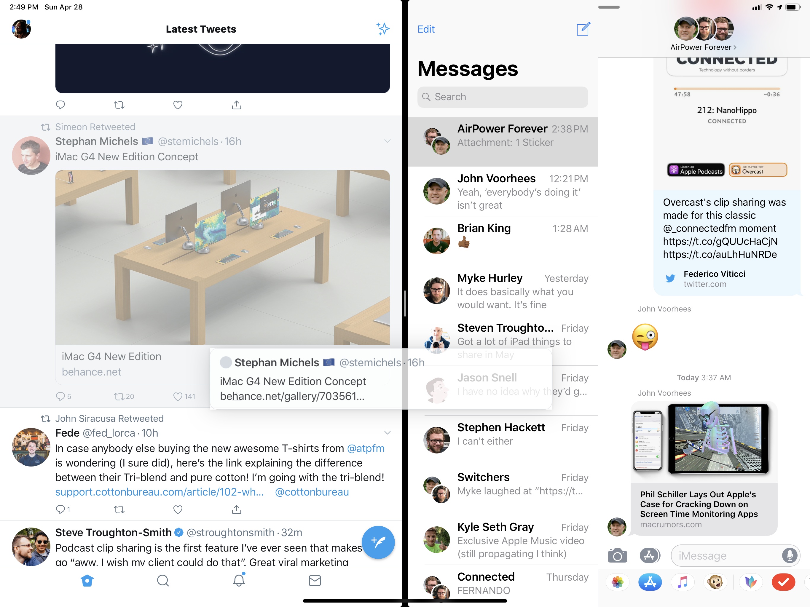
Another example of a workspace I tend to keep active at all times is Twitter + Messages. I switched to the official Twitter app a few months ago, first as an experiment to see what it had to offer compared to Tweetbot and Twitterrific, then permanently because I realized I liked many of the features of the first-party Twitter experience. Because I enjoy talking about tweets from other people privately with my friends in iMessage9, the Twitter + Messages app combo has become the “social space” where I hang out when I want to take a break from writing or editing a story. Having these two apps persistently paired means I’ve created a virtual watercooler using Split View, and I enjoy how easily I can pick up tweets and share them in an iMessage thread with drag and drop.
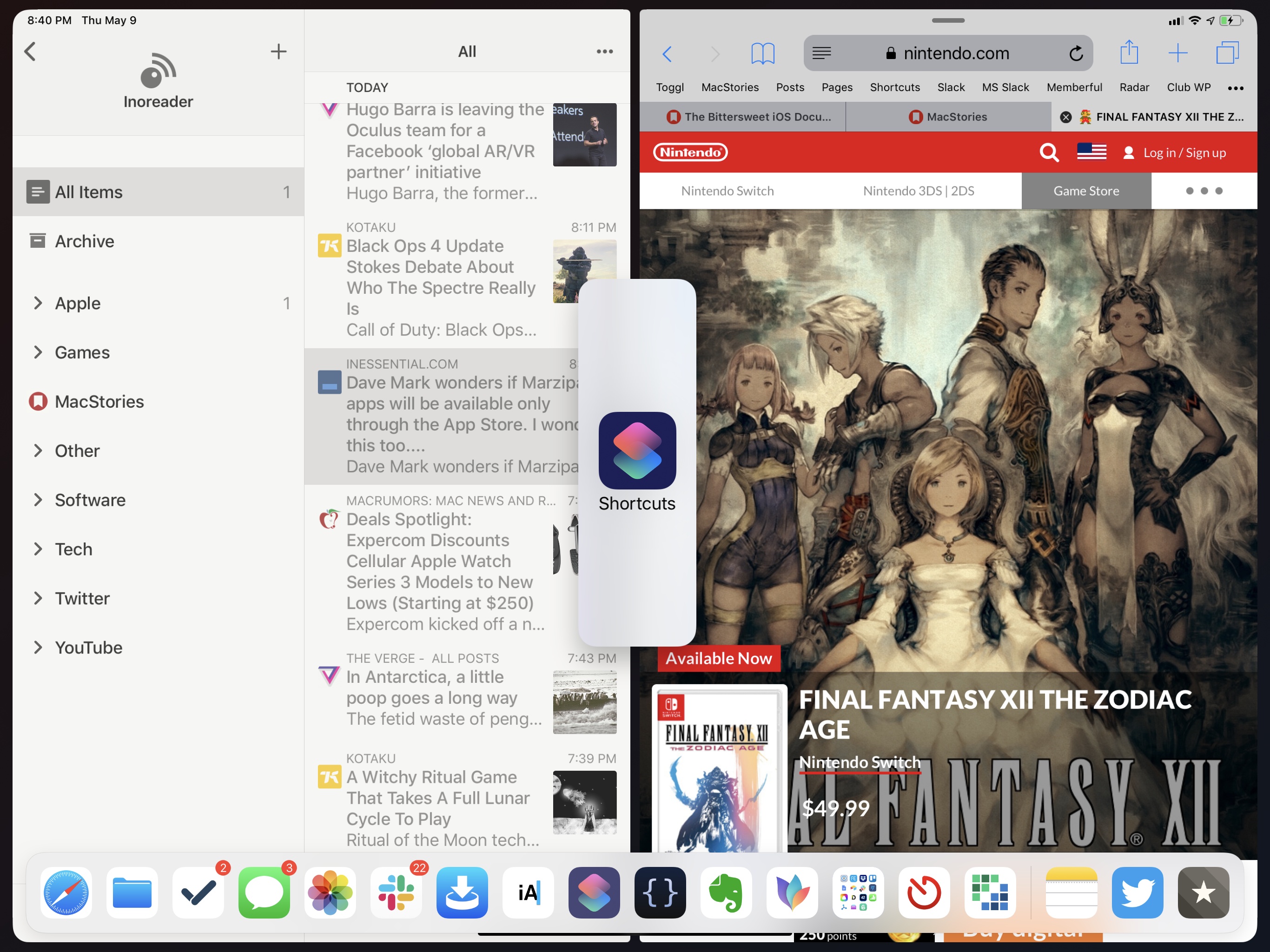
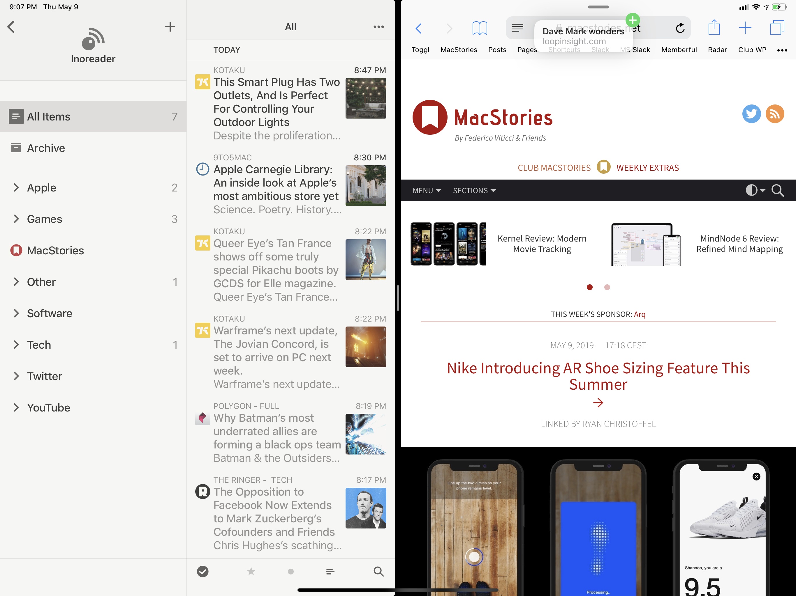
There are also workspaces I create on a per-task basis depending on what I’m doing on the iPad at any given moment. I usually keep Safari in full-screen or in Slide Over mode if I want to quickly open multiple links shared in an iMessage conversation, but when I’m going through my unread RSS items of the day, I put Reeder and Safari next to each other so that I can just long-swipe on an article and open it in a new Safari tab on the right. This is great for opening a handful of articles in just a few seconds without being taken out of Reeder.
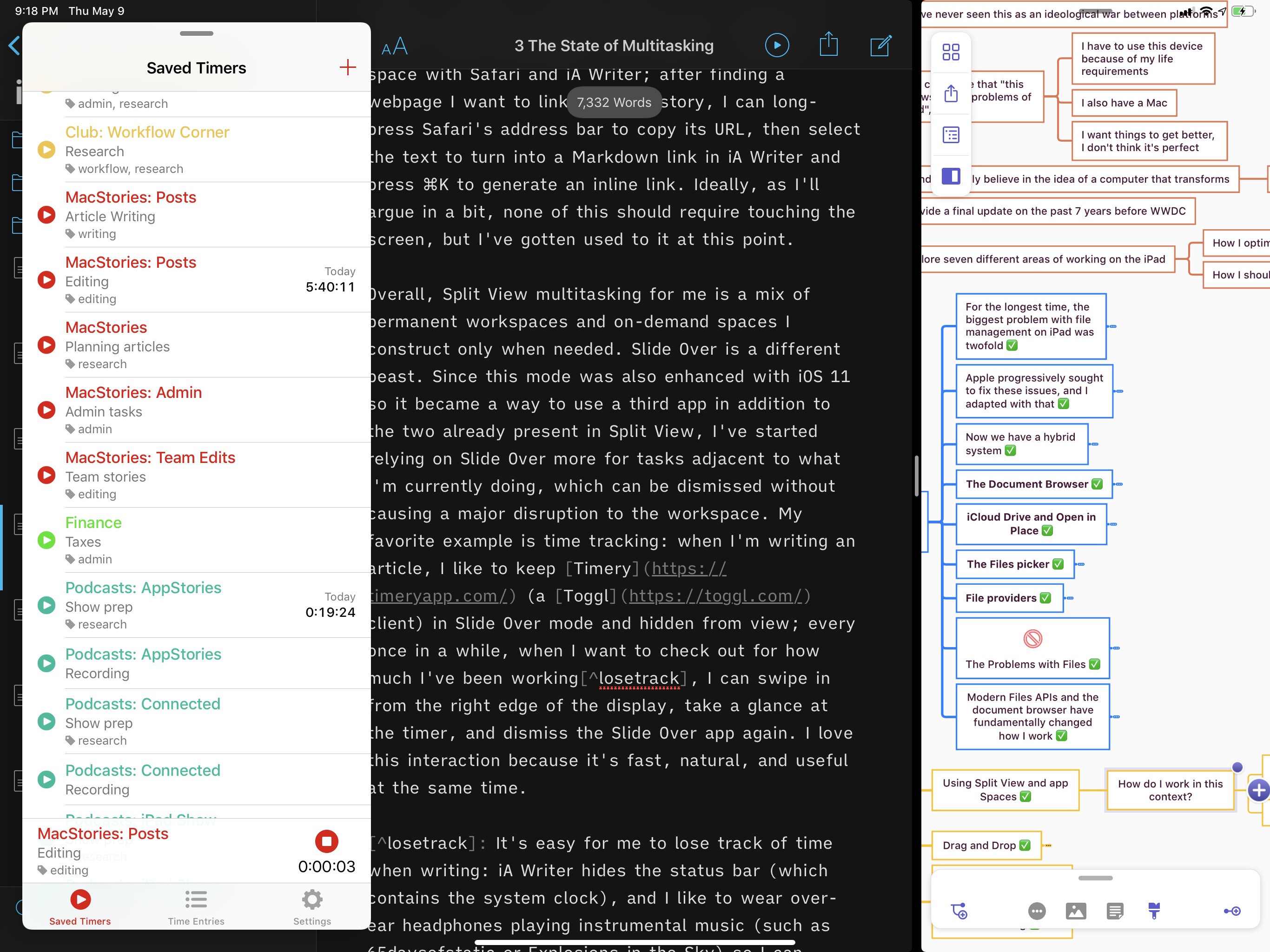
Another example is editing stories such as this one: when I want to add links to an article, I create a space with Safari and iA Writer; after finding a webpage I want to link from the story, I can long-press Safari’s address bar to copy its URL, then select the text to turn into a Markdown link in iA Writer and press ⌘K to generate an inline link. Ideally, as I’ll argue in a bit, none of this should require touching the screen, but I’ve gotten used to it at this point.
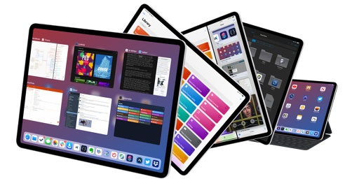
Overall, Split View multitasking for me is a mix of permanent workspaces and on-demand spaces I construct only when needed. Slide Over is a different beast. Since this mode was also enhanced with iOS 11 so it became a way to use a third app in addition to the two already present in Split View, I’ve started relying on Slide Over more for tasks adjacent to what I’m currently doing, which can be dismissed without causing a major disruption to the workspace. My favorite example is time tracking: when I’m writing an article, I like to keep Timery (a Toggl client) in Slide Over mode and hidden from view; every once in a while, when I want to find out how long I’ve been working10, I can swipe in from the right edge of the display, take a glance at the timer, and dismiss the Slide Over app again. I love this interaction because it’s fast, natural, and useful at the same time.
I’ve also gotten used to using Slide Over as a workaround for the inability to put three apps simultaneously in Split View. On modern iPads, it is possible to keep two apps in Split View and one in Slide Over active at the same time; this method has allowed me to rethink how more complex workflows can be completed in a single workspace without exiting it.
Consider the aforementioned editing workspace again: in addition to inserting links, during the editing process I also have to turn screenshots I’ve taken into links to images uploaded to our CDN. I have a custom shortcut that does this, and it can run from the Shortcuts extension in the Photos app. By putting the Photos app in Slide Over mode on top of iA Writer and Safari, I can swipe to reveal Photos when I reach a point in the article where I want to insert an image, then select the screenshot from Photos and trigger the shortcut to upload it. Once the image is uploaded, the shortcut opens its CDN link in Safari, which is already in Split View, so a new tab is created instantly. With one swipe, I can dismiss the Photos app again, paste the link to the image in the story, and continue editing. I didn’t have to switch between multiple apps to achieve this and I didn’t lose my context in iA Writer. Best of all, the next time I have to upload another screenshot, I can repeat the same operation because Photos will still be there, waiting for me in Slide Over.
(Tap to play)Replay
While multiple Split Views can co-exist in iOS 12, only one app can be put in Slide Over at a time. The idea is that while two apps in a Split View form a direct relationship with one another (and therefore multiple pairs of different apps can exist in the system), Slide Over is a system-wide “layer” that does not belong to any particular space. This means that the same app can be invoked in Slide Over on top of different spaces. One way I like to take advantage of this is by putting Safari in Slide Over when writing: if I need to double check some information, I can swipe to reveal the browser, search Google, and dismiss it again; when I take a break in the Twitter + Messages space, I can tap every link my friends shared and open them all in Safari, which will automatically swoop in from the right side to open new tabs.
Opening links with Safari in Slide Over.Replay
Another good use for Slide Over is assigning it to apps that you want to treat as background processes that do not require your full attention, but which you want to quickly re-activate when necessary. I do this for clipboard management with Yoink and podcast recording on iPad with Skype (more on this later). When I’m recording a podcast, I don’t need to keep the Skype window visible at all times; instead, I create a space with Safari (for instant research and the Relay live chat) and Google Docs (for show notes), and I put Skype in Slide Over so I can quickly text my co-hosts if I need to tell them something in the background.
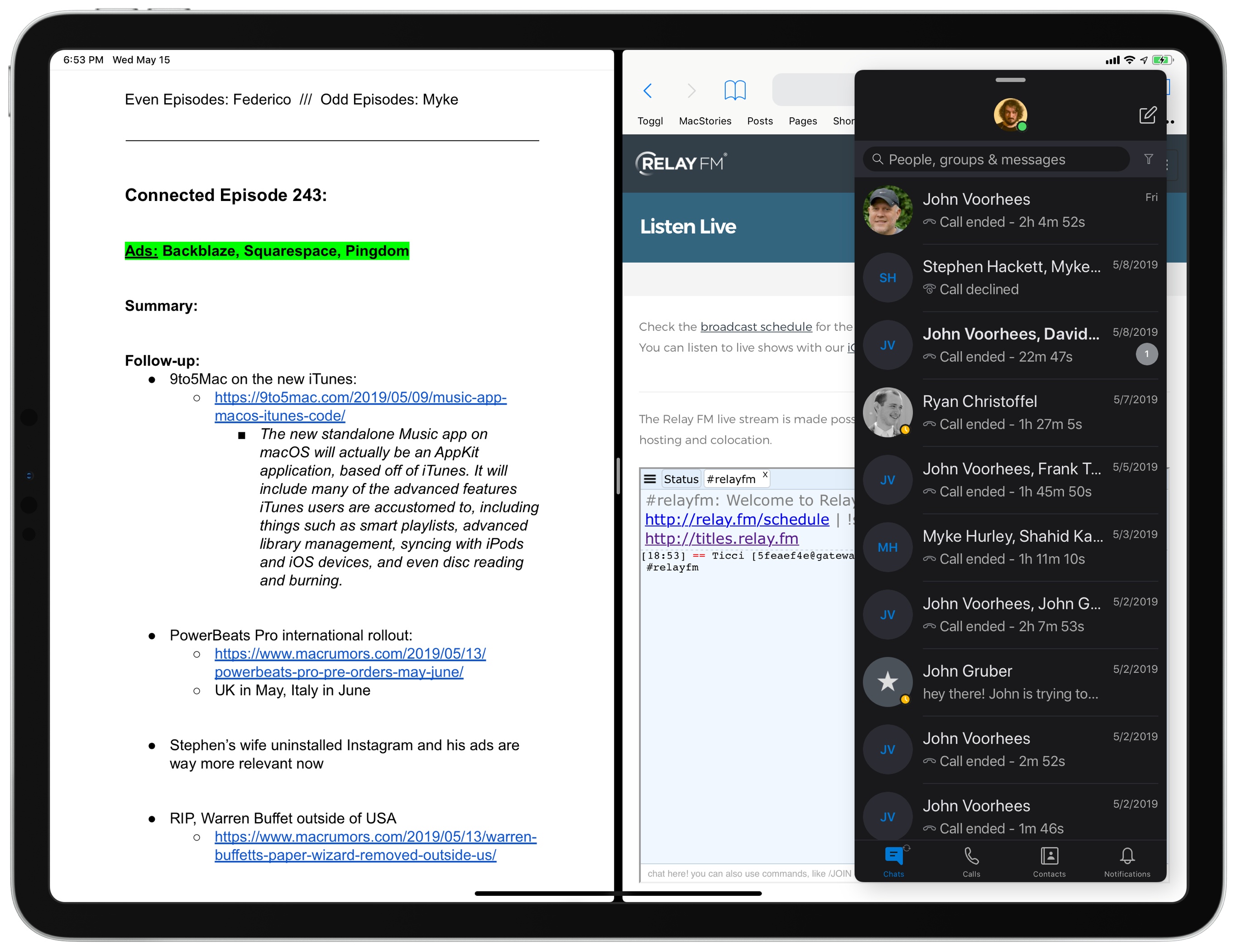
Clipboard management on iPad suffers from third-party apps’ inability to constantly monitor clipboard changes in the background, but I’ve found Slide Over a decent workaround until Apple provides a better system.11 By keeping Yoink (my favorite shelf app/clipboard manager these days) in Slide Over, I can copy bits of text, images, or links to the clipboard, swipe to reveal Yoink, save the clipping, and dismiss Yoink again. It’s not an ideal workflow – Yoink should be capable of automatically saving everything I copy in the background – but Slide Over’s easy activation and dismissal make it acceptable.
Essentially, if I could use three apps in Split View rather than two, I would, and I’d also welcome the addition of real background processes to capture data in apps without opening them. But until Apple extends Split View and builds a new framework for background tasks, Slide Over can be a useful companion for Split View, and one that I urge you to reconsider if you’re still under the assumption that it’s only good to keep an eye on iMessage conversations or Twitter replies.
Using Drag and Drop
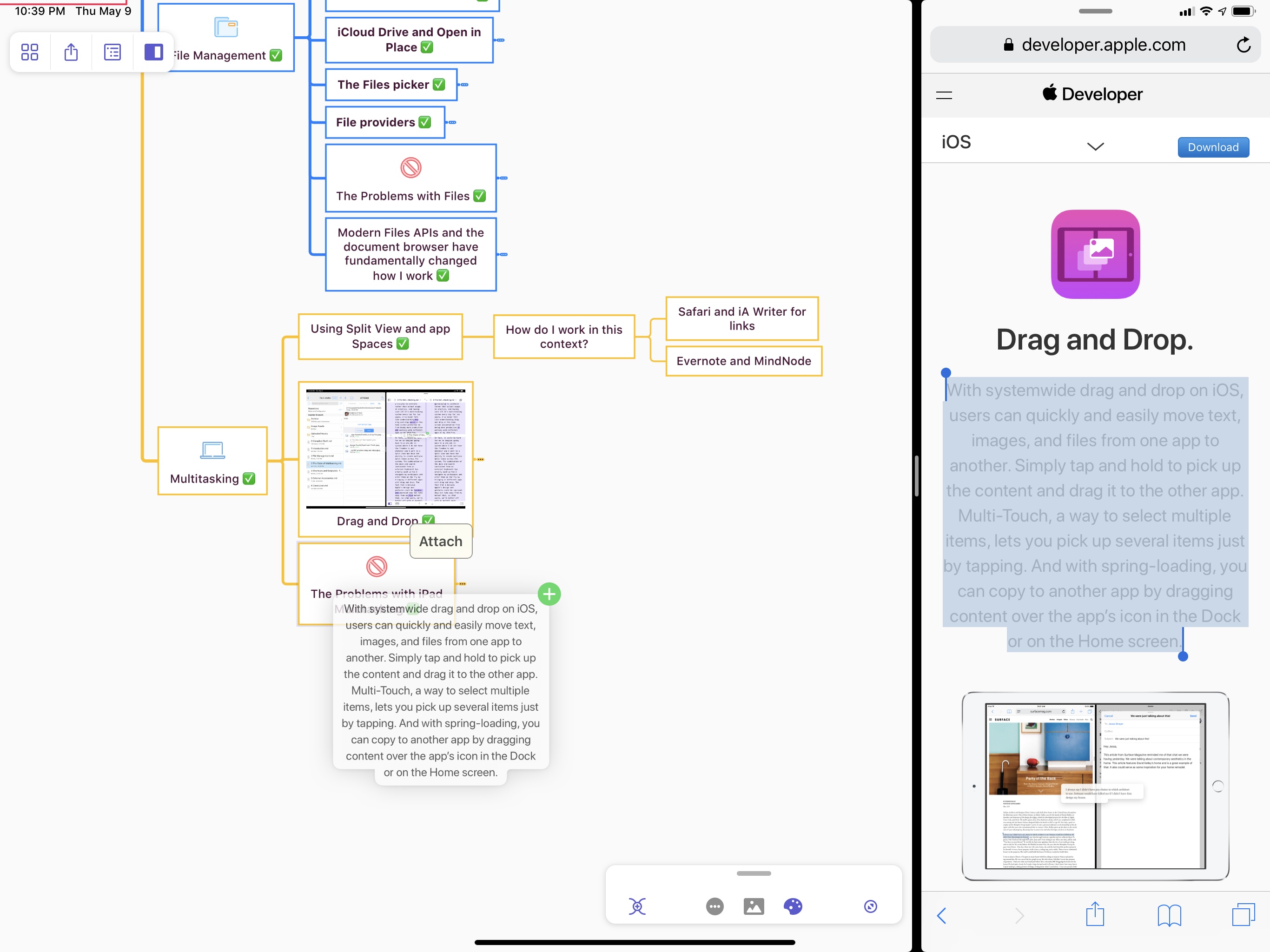
When I reviewed iOS 11 two years ago, I noted that drag and drop transformed “working on the iPad inside out – within an app and between multiple apps”. This feeling has only grown stronger with time, and I now consider drag and drop a natural component of the iPad’s multitasking experience.
One of the most obvious use cases for drag and drop is dealing with transferring files between apps. The simplicity of the drag and drop interaction and the fact that it requires no special interface has cut the number of times I share files with the share sheet in half. Let’s say I have to copy a handful of images from Photos to the Pixelmator Photo folder in iCloud Drive; instead of selecting them with buttons, then sharing and choosing ‘Save to Files’, I can just hold a photo, select others with multiple taps in rapid succession, and drop them into the destination folder in Files. The workflow is Mac-like in nature, but it also feels different thanks to the multitouch capabilities of the iPad, which is precisely the kind of balance I’d like Apple to continue striking in the future.
As I argued two years ago, the greatest advantage of the drag and drop framework for iPad is how it was built with multitouch in mind so it never blocks interactions with other UI elements; because drag and drop can co-exist with the different flavors of multitasking as a super-layer of the iOS interface, you can even start a drag with one hand and navigate between apps with the other.
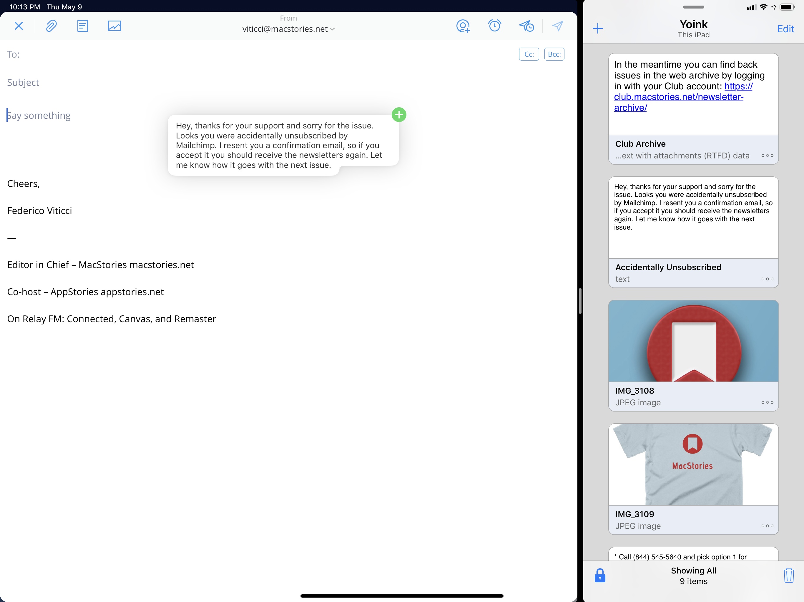
I’ve been using Yoink as the shelf app/clipboard manager where I hold text clippings, links, and image assets I have to share with readers and Club members on a regular basis. With Yoink in Slide Over, I can swipe to reveal the app and start dragging a paragraph of text I want to send in response to an email; on the left side of the screen, while I’m still holding the clipping from Yoink with my right index finger, I can scroll my Spark inbox and hit Reply to a message; then I can finally let go of the Yoink item I was holding, which will be inserted in the body text of the email I’m composing.
iPad drag and drop can go well beyond these basic interactions when you’re using modern apps that support this feature well. For example, drag and drop can also be activated from custom keyboards, allowing you to drag any kind of content from an onscreen custom keyboard into the content area of an app you’re using. I know what you’re thinking: you’re a professional iPad user, and you have a physical keyboard constantly attached to the iPad Pro, so why would you want to use a custom software keyboard instead? But here’s where things get interesting: certain hardware keyboards, like the Brydge one I used to type this story, have a dedicated function key to display the software keyboard even if a hardware one is connected to the iPad Pro. Once the software keyboard is shown, you can then use the ⌃Space system-wide keyboard shortcut to cycle through all the software keyboards (including the custom ones) you have installed on your device.
Dropping files from the Yoink keyboard.Replay
I combined this technique with the Brydge keyboard and my usage of Yoink: now, instead of having to keep Yoink in Slide Over or opening the full Yoink app, I can reveal the Yoink keyboard without lifting my fingers off the Brydge keyboard; once Yoink’s shelf is displayed in the bottom half of the iPad’s screen, I can reach out with my hand, grab the items I need, and drop them into the app I’m using. Once I’m done, I can cycle back to the English keyboard with ⌃Space and hide it again with the dedicated keyboard button.
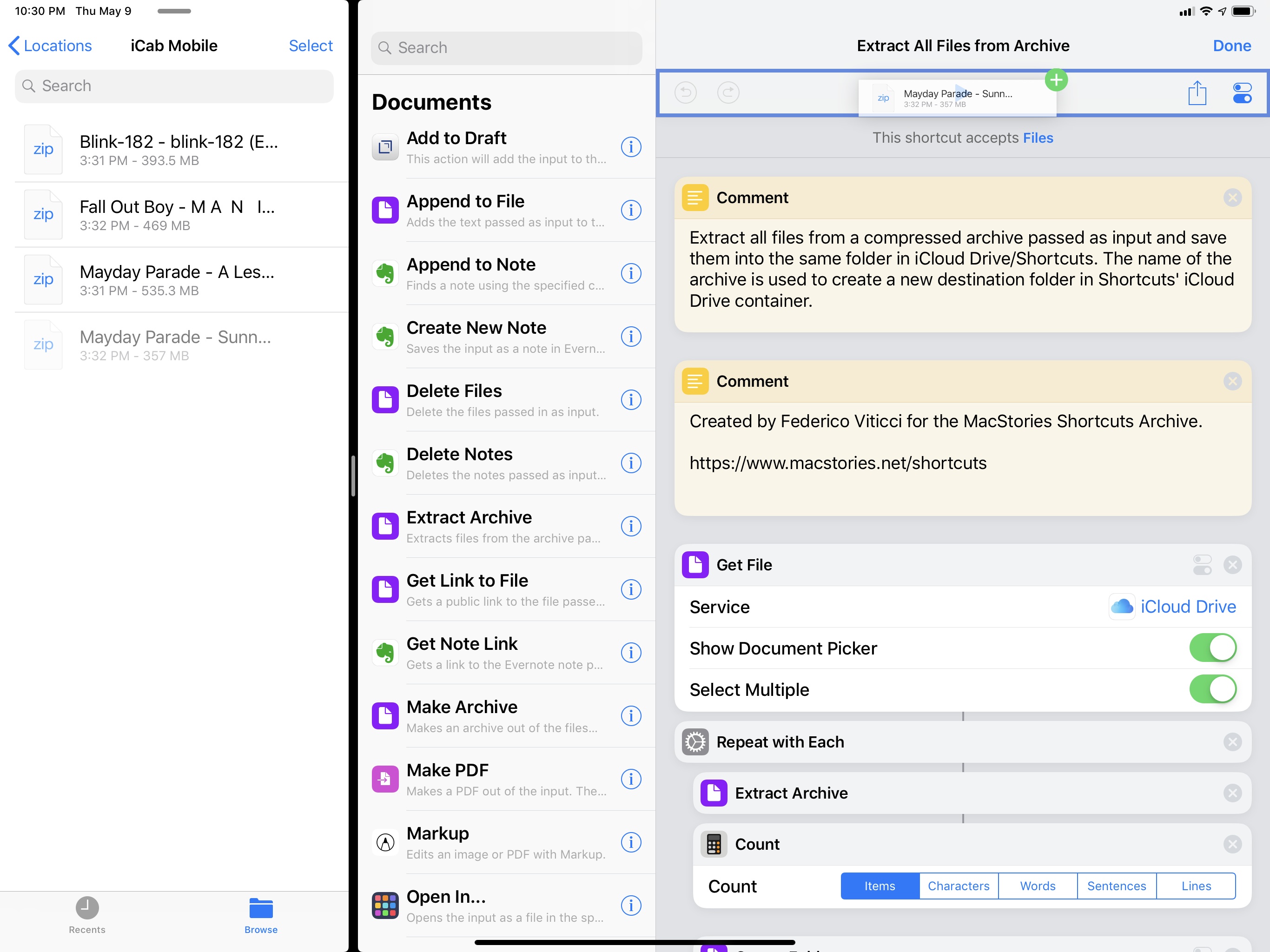
There are other advanced use cases for iPad drag and drop I ought to mention. With Shortcuts, you can drop any string of text or file on top of a custom shortcut and use that item as input. I do this to quickly unzip archives and extract their contents as a folder located in iCloud Drive/Shortcuts; all it takes is dropping a .zip file onto a shortcut and waiting for the confirmation message at the end.
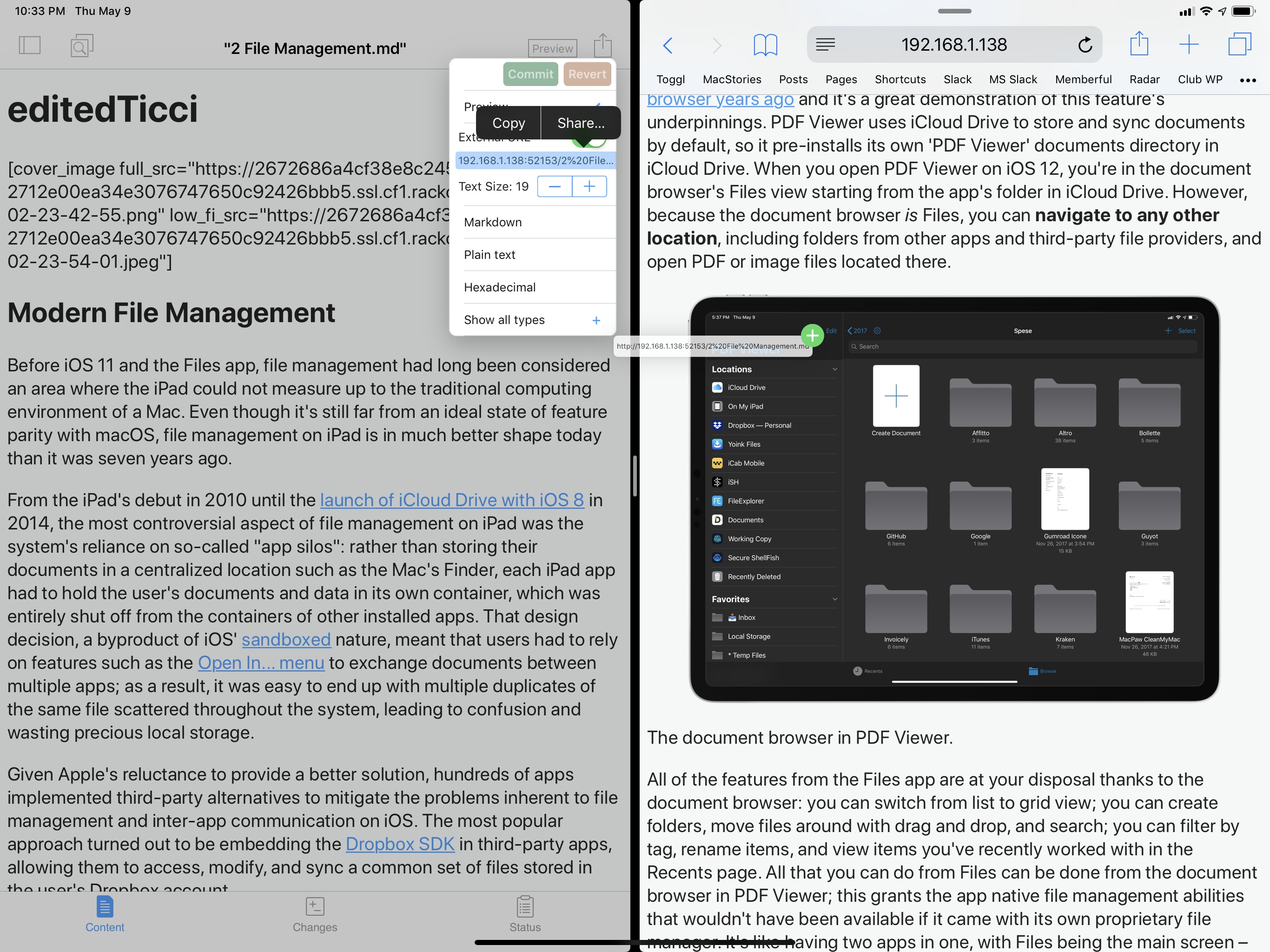
Also related to drag and drop is Working Copy’s HTML preview mode for Markdown files. When previewing Markdown documents as HTML, Working Copy creates a local web server to display the HTML page on-device. The URL of this web server is exposed in a contextual menu in the app, and it is draggable, so you can drop it into Safari’s address bar if you want to load Working Copy’s preview in an external browser.
Working Copy has another remarkable implementation of drag and drop on iPad: each commit (version) of a file is a standalone item that can be grabbed and dropped into other apps. Combined with Kaleidoscope, this allows me to generate a good-looking diff between two versions of a Markdown draft entirely via drag and drop. Take a look at the beautiful efficiency of this workflow:
Comparing diffs with Working Copy and Kaleidoscope.Replay
Lastly, I want to point out how transformative drag and drop has been for putting together mind maps of my iOS reviews and other in-depth stories such as this one. With MindNode, I can drop any kind of content into the map, whether it’s an image or text, and have it become either a new node or an attachment to an existing node.
This workflow has proven essential for me when I’m in the process of making sense of all the screenshots and notes taken at WWDC about the new version of iOS. From Apple Notes (where I typically take my notes and add screenshots), I can drag bits of text and images into MindNode’s canvas, where they become nodes and are given structure depending on where they’re dropped in the map. The utter simplicity of this inter-communication between two apps is something that would have never been possible before iOS 11, and it sums up the benefits of drag and drop quite nicely.
Looking back at the pre-iOS 11 days and scrolling through my reviews of iOS 9 and iOS 10, I have a hard time believing I got work done on iPads that didn’t support multiple Split Views or couldn’t easily exchange data between apps with drag and drop. While some people may not be enamored with the changes that iOS 11 brought to their workflows – and perhaps, more specifically, iOS 11’s visual design or gestures – it’s undeniable that the iOS 11 multitasking system has unlocked a new class of tasks that were previously exclusive to desktop computers.
Whatever Apple has in store for iOS 13, I hope they don’t go back to the drawing board and completely repudiate what they built with iOS 11. I hope Apple iterates on the foundation laid by iOS 11 because, with the right improvements, it could propel iPad multitasking even further, possibly eclipsing the versatility of macOS.
- Don't judge me. We all do it. ↩
- It's easy for me to lose track of time when writing: iA Writer hides the status bar (which contains the system clock), and I like to wear over-ear headphones playing instrumental music (such as 65daysofstatic or Explosions in the Sky) so I can further concentrate on writing and shut myself off from the outside world. ↩
- I hope Apple makes Background Services an API third-party developers can use in iOS 13. Macs with less powerful hardware than today's iPads supported proper background services over a decade ago. ↩