 MacStories Weekly: Issue 92
Apple Releases iOS 11 and iPad How-To Videos

Apple has published a series of six short videos to YouTube highlighting the marquee features of iOS 11 on the iPad. Each of the how-to videos is about one minute long and shows how to use a new feature:
- ‘How to harness the power of the amazing new dock’ demonstrates how to add items to the dock, access recent files, and drag files into apps like Messages.
- ‘How to mark stuff up with Apple Pencil’ shows how to mark up notes from the lock screen, Mail attachments, photos, and screenshots.
- ‘How to manage and fly through your files with iOS 11’ is a quick tour of the new Files app, including how to use recents, favorites, and various cloud services.
- ‘How to effortlessly scan, sign, and send a document with iOS 11’ shows someone scanning, signing, and sending a lease using the the Notes app.
- ‘How to get more things done more quickly with multitasking with iOS 11’ explains how to share images in a Keynote presentation in Messages using Slide Over.
- ‘How to get the most out of your hands with iOS 11’ demonstrates how to use two hands to drag and drop multiple images.
The videos do an excellent job of describing and demonstrating each new feature quickly and simply. With iOS 11 just weeks away, a little pre-launch education about its new capabilities on the iPad is a smart move by Apple.
You can view each of the videos after the break.
Transmit 5 Review
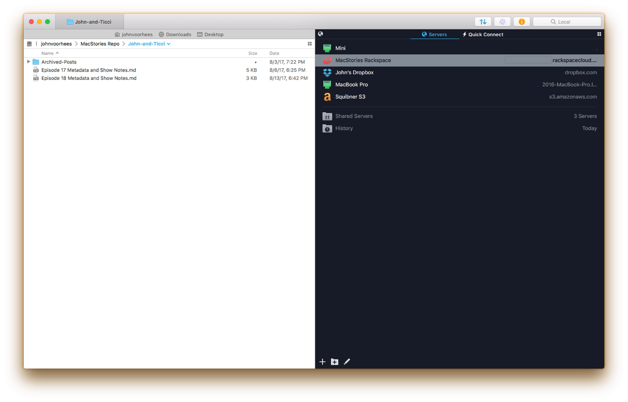
If you’ve used a Mac for a while, you’ve likely come across Panic’s file transfer app Transmit. Not long ago, I would have probably still described it as an FTP app even though it’s handled things like Amazon S3 file transfers for a while. However, with the recent release of version 5, Transmit for macOS has become much more than an FTP client adding support for ten cloud services. Moreover, Panic has taken the opportunity to rewrite its file transfer engine so that it’s faster, tweak virtually every feature, and update and streamline the app’s design. The result is an all-new Transmit that is both familiar and more capable than ever before.
Tim Cook Responds to Events in Charlottesville in a Message to Employees
BuzzFeed reports that Apple CEO Tim Cook sent an email message to employees yesterday responding to recent violence between hate groups and counter-protestors in Charlottesville, Virginia, and to subsequent statements by US President Donald Trump. Calling hate a cancer that ‘left unchecked … destroys everything in its path,’ Cook wrote that:
I disagree with the president and others who believe that there is a moral equivalence between white supremacists and Nazis, and those who oppose them by standing up for human rights. Equating the two runs counter to our ideals as Americans
The message goes on to call on all employees, regardless of their political views, to stand together for equality:
As a company, through our actions, our products and our voice, we will always work to ensure that everyone is treated equally and with respect.
Cook also announced $1 million donations to the Southern Poverty Law Center and Anti-Defamation League and that it will match employee donations to those organizations and others two-for-one through September 30th, and offer a way for customers to donate to the Southern Poverty Law Center via iTunes in the coming days.
The full text of Tim Cook’s email message to employees is available on BuzzFeed.
BuzzFeed separately reports that Apple has also disabled Apple Pay support for a handful of websites that sell Nazi paraphernalia.
Neo Angle Review: No Turning Back

You might be tempted to feel confident after the first few levels of Neo Angle, the follow-up game from Blyss developer Dropout Games. After all, you just have to move your triangle to a certain spot on the grid, occasionally picking up small fuel cells along the way. Early on, the most challenging part may be refraining from bobbing your head to the music.
ESPN for Apple TV Launches MultiCast Feature, Enabling Multiple Simultaneous Streams→
Todd Spangler has a story for Variety on an improvement to the ESPN Apple TV app that should make the most avid sports fans very happy.
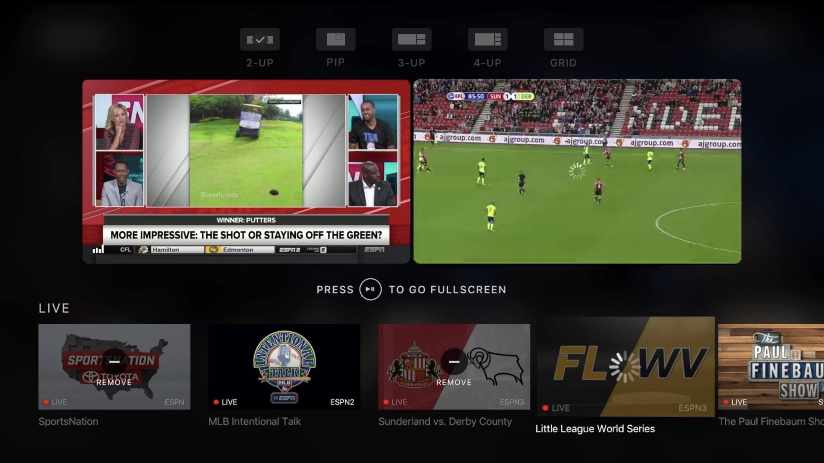
A new version of the ESPN App for Apple TV’s tvOS, available Wednesday, includes a feature called MultiCast that provides the ability to view up to four simultaneous live streams at once. On any given day, ESPN users can choose from 30 or more live events airing across its networks.
From everything I’ve seen, the implementation of this feature appears well designed and well thought through. As seen at the top of the image above, MultiCast makes a number of different customization options available to users. You can watch anywhere from one to four different streams at once, and depending on the number you have playing, the screens are resized and optimized for the best viewing experience.
While I don’t see myself using MultiCast often, I know there are bigger sports fans than me who constantly flip between different games at certain times of year, such as during the upcoming college and professional football seasons.
Twitter for iOS Adds Topic Feeds to Explore Tab
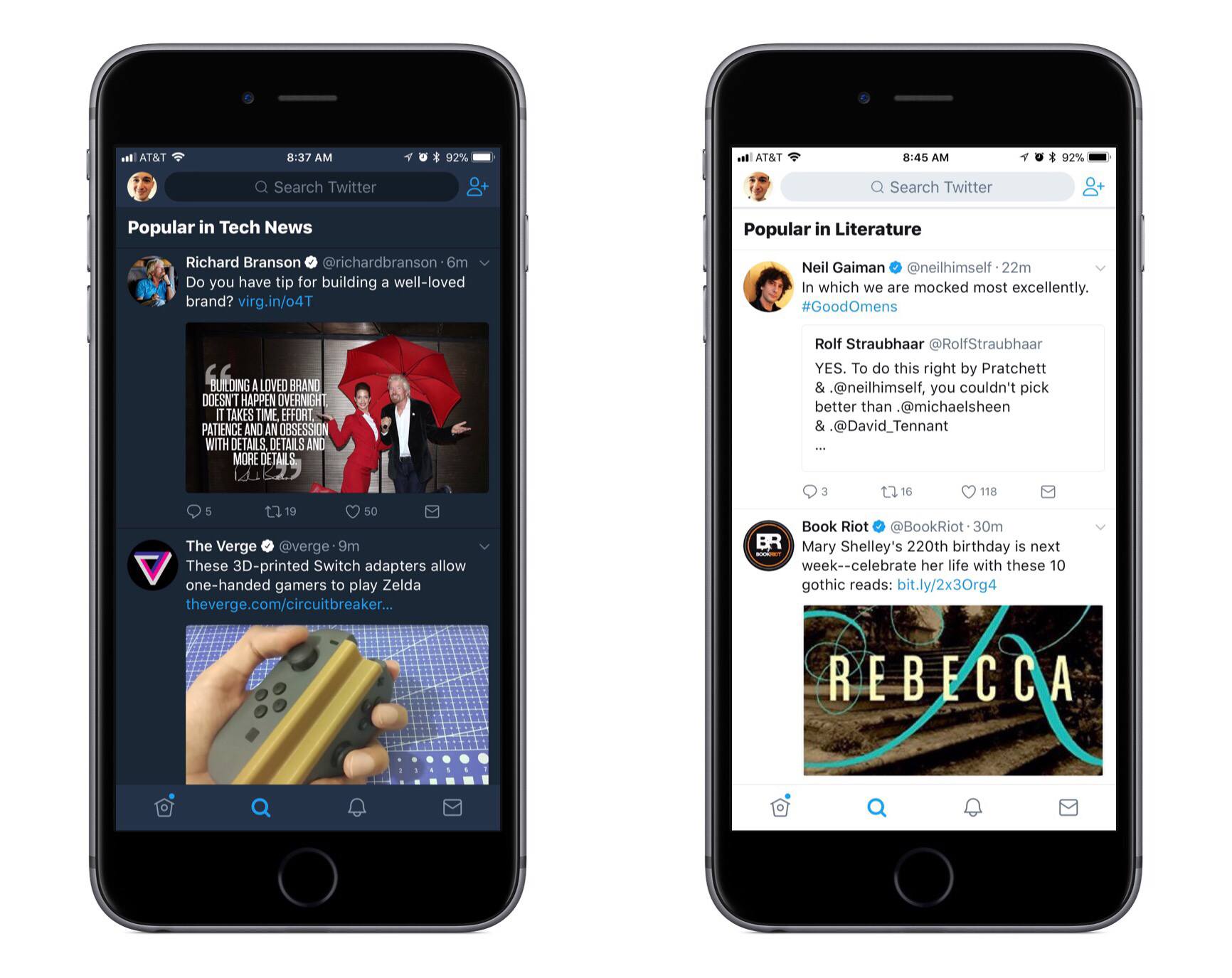
Alex Kantrowitz of BuzzFeed shares news on a feature Twitter recently rolled out in its iOS app:
Now you can view tweets sorted by topic, without having to follow anyone, right in Twitter’s Explore tab…Twitter’s algorithms will show you these topics based on what they know about your interests. Eventually, the platform will give users more control over what they see, the spokesperson said. The company will roll out controls that allow people to tell it they don’t like a topic, which will inform Twitter’s decisions on what to show them.
These featured topics are the first major addition to Twitter’s app since it launched a refreshed design earlier this summer; combined with those previous changes, topics make the Explore tab a more attractive place than ever to visit. As the home to search, Moments, trending hashtags, and now tweets organized by topic, Twitter has created an information hub worthy of one of its four primary tabs.
My favorite tidbit from the Buzzfeed piece is that Twitter plans to give users more control over which topics they see. Hopefully this isn’t limited to simply disliking certain topics, but instead will extend to offering full control of topics you want to see. There are certain topics I’d love to keep up with, but that I don’t necessarily want to follow specific accounts for, so a full-fledged list of topics to choose from – whether those topics relate to accounts I’m currently following or not – would be great.
Walmart’s Vudu Streaming Service Launching Apple TV App Soon→
Dani Deahl reports for The Verge:
Walmart has confirmed a native app for Vudu, its video streaming service, is set to become widely available on Apple TV beginning August 22nd.
Vudu is one of the major players in the video streaming space, so its arrival on Apple TV is welcome. What that arrival will look like, however, remains to be seen. The service offers a digital marketplace where users can buy or rent films, but it’s unlikely those options will exist on Apple TV due to Apple’s policy of taking a 30% cut of all In-App Purchases. More likely, the new app will simply serve as a way to play films that are already in your library.
Unobstruct Clears a Path to a Better Web Reading Experience
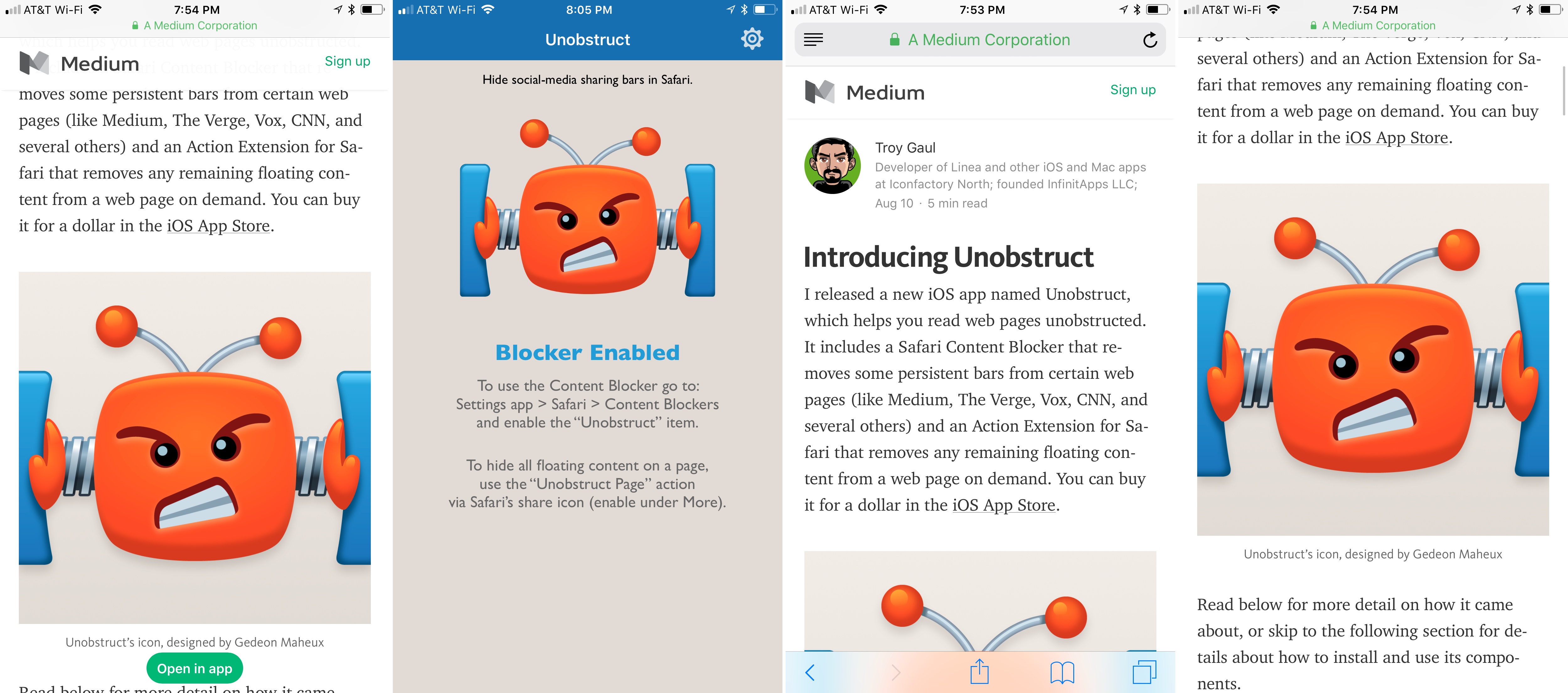
Too many websites wreck the reading experience by floating interface elements on top of articles. One of the worst offenders has been Medium, which John Gruber called out on Daring Fireball recently. Medium has made some improvements since then but didn’t eliminate floaters, and there are many other sites with social media buttons, branded navigation bars, and other material that hovers over webpages even as you scroll down the page. The practice makes it especially hard to read on the smaller screens of mobile devices.
Inspired by the Daring Fireball article and a JavaScript bookmarklet to which Gruber later linked, Troy Gaul, a developer at The Iconfactory, created Unobstruct, a Safari content blocker for iOS that eliminates floating bars, buttons, and other UI elements. The simple app, which Gaul fittingly announced in a post on Medium, removes any HTML that is set to sit on top of a site’s content and not scroll.
Unobstruct doesn’t hide persistent navigation bars by default because doing so would make it impossible to get around some sites. Instead, you can use the app’s action extension from the share sheet to hide the bar. Later, if you need the navigation bar, you can simply reload the page to get it back.
I love Unobstruct’s colorful and feisty robot icon. It adds a bit of fun and whimsy to an otherwise utilitarian app. For insight into the icon’s design, be sure to check out Ged Maheux’s blog post, in which he details how he started the design by making rough sketches in The Iconfactory’s drawing app Linea, then moved to Adobe Illustrator after Gaul had picked his favorite.
Unobstruct doesn’t block as broad a variety of webpage elements as some content blockers, but its singular focus on floaters pays off. In my testing, the app worked flawlessly to remove floating buttons automatically, as did the extension for eliminating navigation bars. Branding and sharing are important to websites, but they shouldn’t get in the way of the core experience – reading. The trend of obscuring content with floaters is a shame, but I’m glad I have Unobstruct to make browsing those sites a little nicer each day.
Unobstruct is available on the App Store.