Last week, Federico and I asked Robb Knight to do what he could to block web crawlers deployed by artificial intelligence companies from scraping MacStories. Robb had already updated his own site’s robots.txt file months ago, so that’s the first thing he did for MacStories.
However, robots.txt only works if a company’s web crawler is set up to respect the file. As I wrote earlier this week, a better solution is to block them on your server, which Robb did on his personal site and wrote about late last week. The setup sends a 403 error if one of the bots listed in his server code requests information from his site.
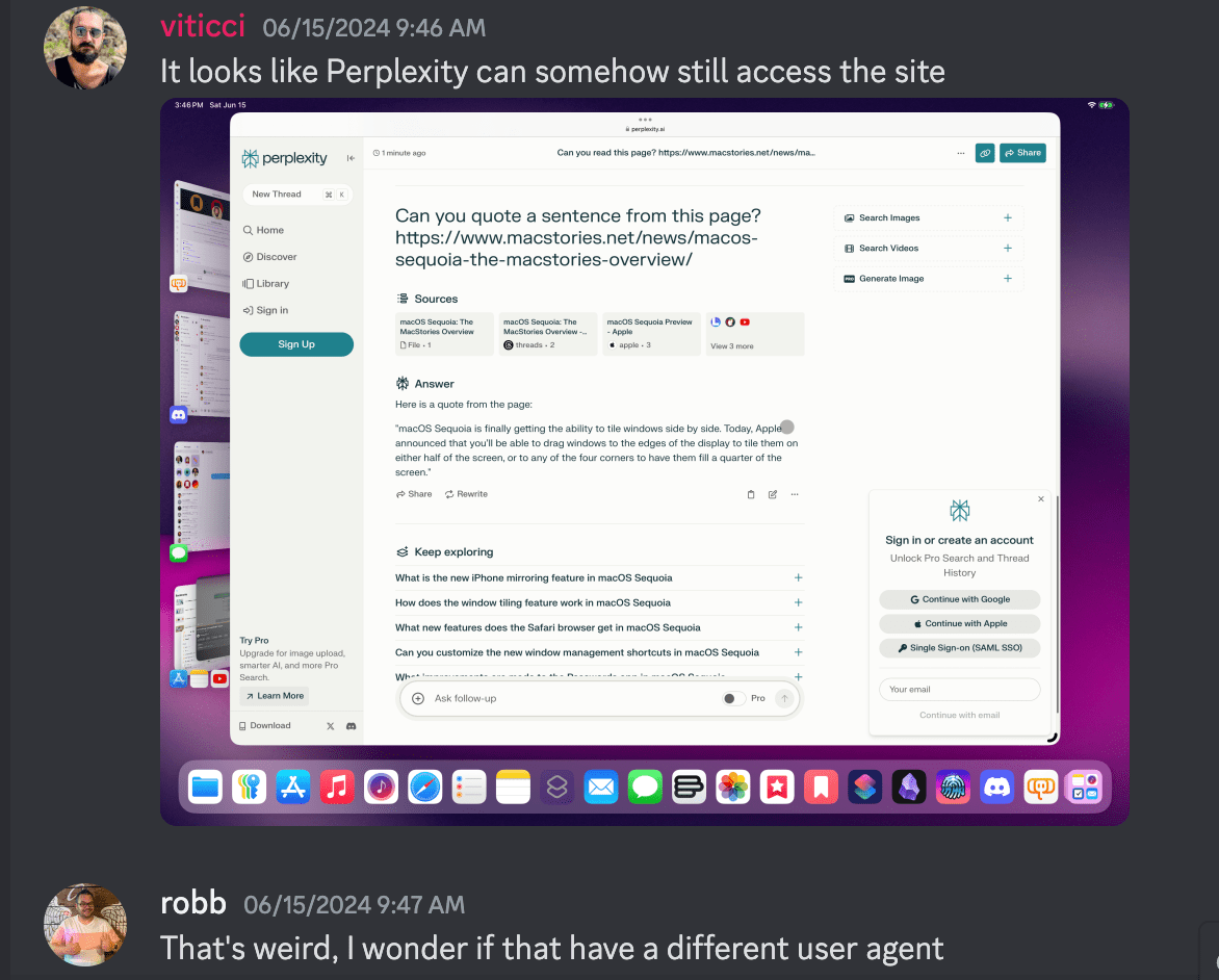
After reading Robb’s post, Federico and I asked him to do the same for MacStories, which he did last Saturday. Once it was set up, Federico began testing the setup. OpenAI returned an error as expected, but Perplexity’s bot was still able to reach MacStories, which shouldn’t have been the case.
That began a deep dive to try to figure out what was going on. Robb’s code checked out, blocking the user agent specified in Perplexity’s own API documentation. What we discovered after more testing was that Perplexity was hitting MacStories’ server without using the user agent it said it used, effectively doing an end run around Robb’s server code.
Robb wrote up his findings on his website, which promptly shot to the top slot on Hacker News and caught the eye of Dhruv Mehrotra and Tim Marchman of Wired, who were in the midst of investigating how Perplexity works. As Mehrotra and Marchman describe it:
A WIRED analysis and one carried out by developer Robb Knight suggest that Perplexity is able to achieve this partly through apparently ignoring a widely accepted web standard known as the Robots Exclusion Protocol to surreptitiously scrape areas of websites that operators do not want accessed by bots, despite claiming that it won’t. WIRED observed a machine tied to Perplexity—more specifically, one on an Amazon server and almost certainly operated by Perplexity—doing this on wired.com and across other Condé Nast publications.
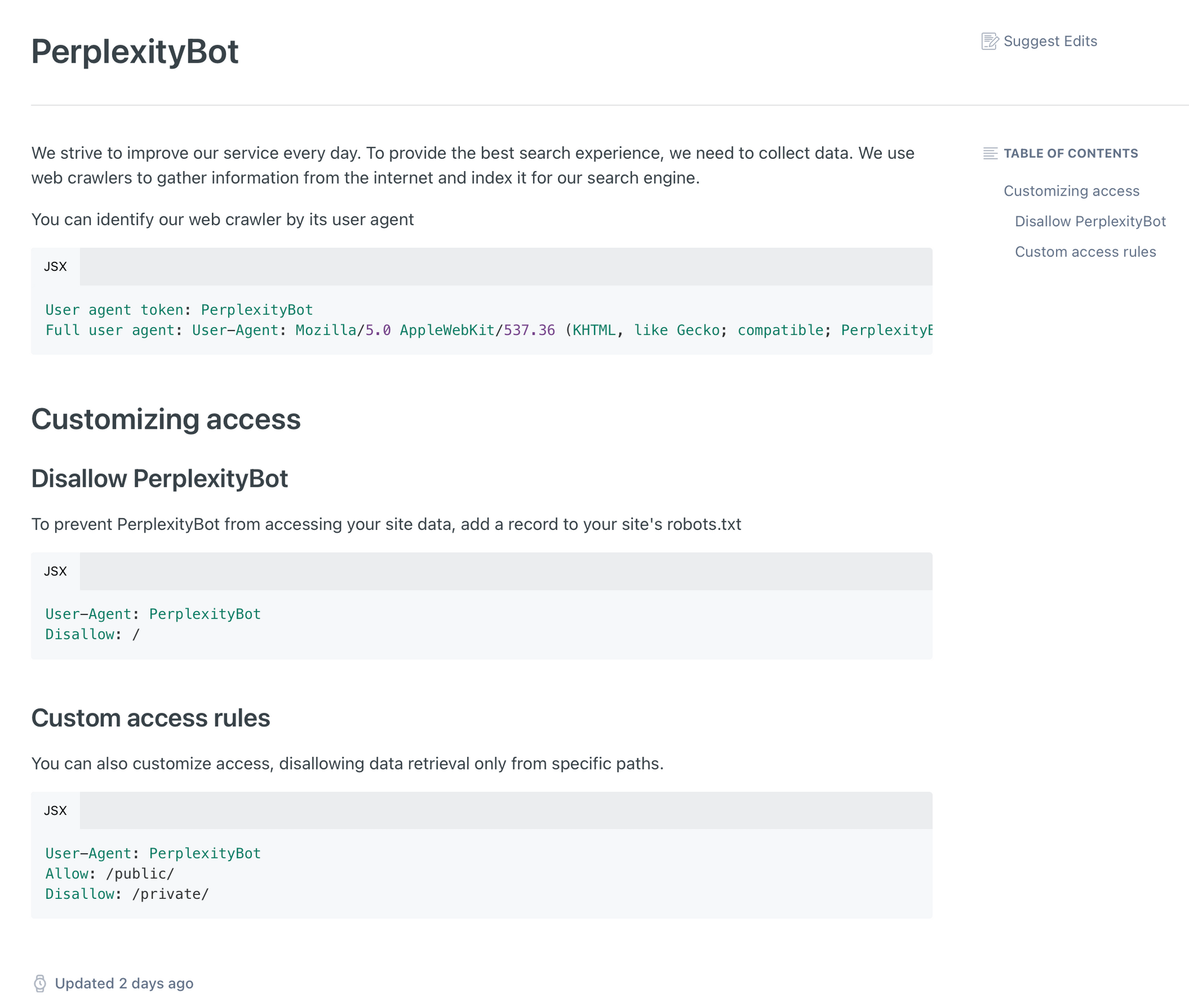
Until earlier this week, Perplexity published in its documentation a link to a list of the IP addresses its crawlers use—an apparent effort to be transparent. However, in some cases, as both WIRED and Knight were able to demonstrate, it appears to be accessing and scraping websites from which coders have attempted to block its crawler, called Perplexity Bot, using at least one unpublicized IP address. The company has since removed references to its public IP pool from its documentation.
That secret IP address—44.221.181.252—has hit properties at Condé Nast, the media company that owns WIRED, at least 822 times in the last three months. One senior engineer at Condé Nast, who asked not to be named because he wants to “stay out of it,” calls this a “massive undercount” because the company only retains a fraction of its network logs.
WIRED verified that the IP address in question is almost certainly linked to Perplexity by creating a new website and monitoring its server logs. Immediately after a WIRED reporter prompted the Perplexity chatbot to summarize the website’s content, the server logged that the IP address visited the site. This same IP address was first observed by Knight during a similar test.
This sort of unethical behavior is why we took the steps we did to block the use of MacStories’ websites as training data for Perplexity and other companies. Incidents like this and the lack of transparency about how AI companies train their models have led to a lot of mistrust in the entire industry among creators who publish on the web. I’m glad we’ve been able to play a small part in revealing Perplexity’s egregious behavior, but more needs to be done to rein in this sort of behavior, including closer scrutiny by regulators around the world.
As a footnote to this, it’s worth noting that Wired also puts to rest the argument that websites should be okay with Perplexity’s behavior because they include citations in their plagiarism. According to Wired’s story:
WIRED’s own records show that Perplexity sent 1,265 referrals to wired.com in May, an insignificant amount in the context of the site’s overall traffic. The article to which the most traffic was referred got 17 views.
That’s next to nothing for a site with Wired’s traffic, which Similarweb and other sites peg at over 20 million page views that same month. That’s a mere 0.006% of Wired’s May traffic. Let that sink in, and then ask yourself whether it seems like a fair trade.