Solar Dial
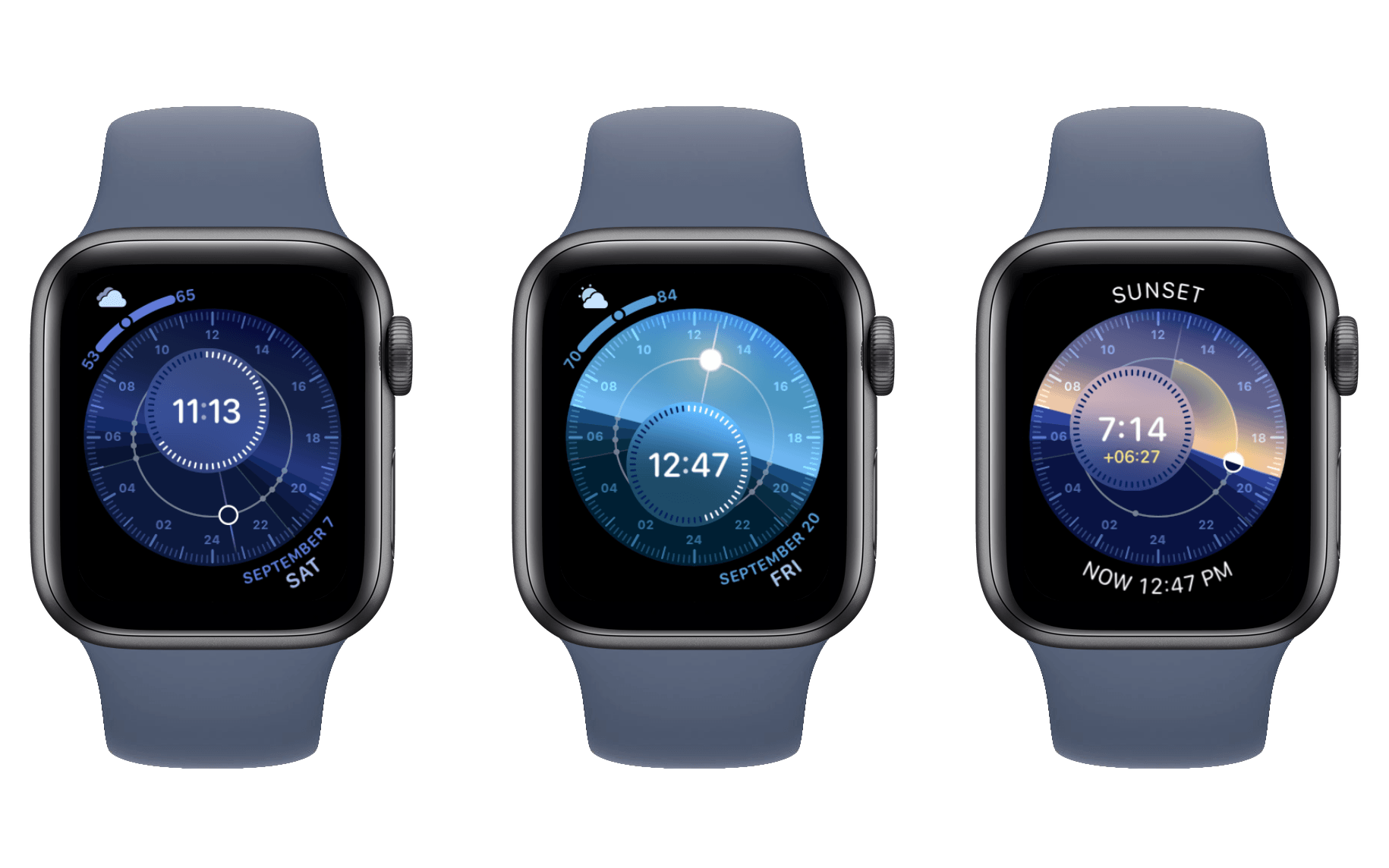
Solar Graph (that’s Graph, not Dial) is a classic watch face6 which doesn’t offer much in the ways of complications or customizations, but it is one of the nicest looking digital faces available. You can spin the Digital Crown to get a fun animation of where the sun will be throughout the day, including sunrise and sunset times. With watchOS 6, Apple is introducing a new addition to the Solar family: Solar Dial.
This new face has a similar underlying gimmick to Solar Graph: spin the Digital Crown and watch the dial spin around and animate the position of the sun. This animation shows the earth and the sky, and as the sun moves the sky changes from dark to light and back again. Solar Dial takes sunrise and sunset times to the extreme, showing astronomical dawn and twilight; nautical dawn, dusk, and twilight; civil dawn, dusk, and twilight; and sunrise and sunset. I don’t know what any of these mean, and prefer the simplicity of Solar Graph’s unadorned dawn, twilight, sunrise, day, sunset, dusk, night timeline. That said, I’m sure there are people out there who will appreciate Solar Dial’s specificity.7
Beyond the animations, Solar Dial is just a really nice looking watch face. It supports four corner complications of the modern and spacious Series 4 variety. Its center dial area can be set to either an analog or digital time. I use the digital time, and appreciate that the time is never obscured as the face rotates throughout the day.8
Where Solar Dial falls down for me is that I don’t really like its bright blue look during the day. As the dial changes color with the sky, its unfortunately color-matched complications change as well. I don’t think the result looks as good as other faces during the daytime, but I think it looks incredible with its dark blue hues at night. The complications are highly readable with that color scheme, so the color matching doesn’t even bother me much then. I suppose the solution is obvious: day watch face and night watch face.
In all seriousness, I think Solar Dial is a pretty solid option that is worth your consideration. It’s ultimately not for me, but it really looks great at night.
Modular Compact
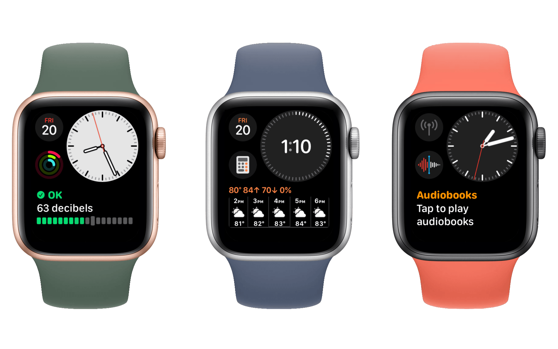
Modular Compact is an odd new face. It supports both analog and digital time, but places them within a clock that takes up only around a third of the screen. The clock is located in the top right, and along its left side are two of the expanded circular complications. Across the bottom is a single large complication which stretches to both edges.
I’ve never been a big fan of these largest of complication styles, but they are able to provide a significant amount of information at a glance. This watch face feels designed for those who require one of those large complications, but also like an analog time. It seems to me that if you want to use the digital time version of this watch face, you’re better off just using the standard Modular face. Modular supports a digital time only, but is less space constrained by not having to place those digits within a giant circle. That trade off allows it to have four circular complications rather than Modular Compact’s two, while also still including a large edge-to-edge complication in the middle.
For its analog version, I think Modular Compact actually looks quite good. It also supports the Series 5’s transition from white face plate to black for its clock to save power. You can choose to have a constantly black face plate as well, and set the color of your complications to something other than their multicolored defaults. While it isn’t really my style, Modular Compact is a well-designed addition to the lineup which I think may find a solid niche.
Meridian
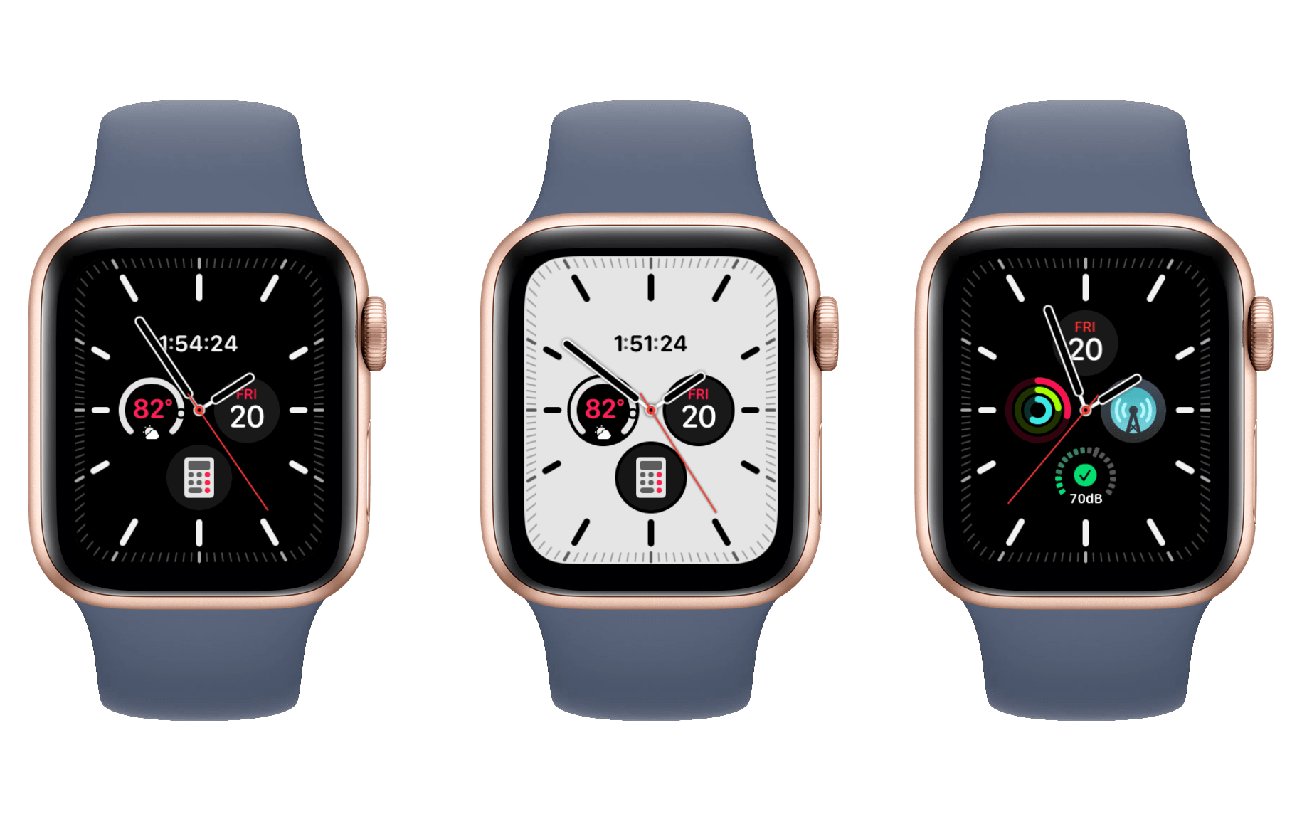
Added late in the beta cycle – only after the Apple Watch Series 5 was announced – Meridian is a gorgeous sight. The face displays analog tick marks around the very edges of the screen, ringing four circular complications within its center. It is the expanded California Dial design, but without the wasted central space or the ugly tick mark style options. Meridian’s complications are the expanded, spacious type of circular ones. They’re big enough to display information and icons readably, unlike the constricted corner circles I’ve criticized above.
Meridian is restrained in its options, almost to a fault. I’d love to see this face atop the striking blue background of California Dial’s default. Unfortunately, we only get to pick between a white background and a black one. Despite this, the white Meridian is quite striking itself. The black option is a bit plainer, and I’d take Infograph’s black over this one. Meridian’s black was built to conserve power while the always-on Apple Watch Series 5 lies dormant. Raising your wrist with that device would bring the brilliant white bursting back to the screen. If the white is too bright though, Meridian’s black can be set as your constant option.
Beyond the two face plate colors, Meridian allows choosing a color scheme for its complications. I’m pleased to see that the top option allows complications to be multicolored, which means they get to use their own color schemes. As I’ve already noted above, there are other watch faces that I think would greatly benefit from this exact option. I’m unsure why Apple keeps it confined to Meridian alone, and I hope we will see it spread in the future.
Surprising myself, I actually find the matching color options to look better upon Meridian’s clean white faceplate. I think the face’s extreme simplicity makes the matching colors feel more at home than they do elsewhere. This will of course be highly dependent on your personal complication choices and color preferences. For mine, I find the Hibiscus color the most striking against Meridian’s white (sorry, Papaya).
My one lingering complaint lies in the watch hands, which continue to obscure Meridian’s complications periodically throughout the day. I would almost rather remove the hands entirely, leaving the digital time at the top to tell it, while keeping the surrounding tick marks just for show. It would be better if Apple could come up with a way to just fix this problem with clever UI.
Meridian is one of my favorite watch faces overall, and an excellent addition to the lineup. It’s only available on the Series 4 Watch and later, but if you have one of these then you should certainly give it a look. It seems like a particularly strong contender for the Series 5, where its nice transitions between white and black can come into play.
No Changes to the Siri Watch Face
For the past few years it’s felt like Apple was gearing up for the Siri watch face to be a huge part of the watchOS story. The face was introduced as a major new feature in watchOS 4 and received significant attention in watchOS 5. Last year Apple was pushing third-parties to integrate with the face and investing in its machine learning capabilities. As I discussed in my watchOS 4 review and reiterated in my watchOS 5 review, the promise of the Siri face was great but the implementation was far from functional.
The Siri face’s machine learning has historically been highly ineffective for me, but the idea of a watch face that intelligently surfaces the data you’re looking for at the time you’re looking for it is incredible. If machine learning could successfully execute that ideal then it would be an amazing solution to the difficulty of navigating an operating system on such a tiny screen. I criticized Apple in the past for hyping up the Siri face when it was so clearly not ready to live up to its own pitch, but I’ve also repeated that I believed in the idea. My expectation has been that Apple would continue pushing forward until it got this right, but this year it looks like they may have given up the ghost.
watchOS 6 doesn’t seem to include any change to the Siri watch face whatsoever. The absence of apparent development work on this two-time headlining feature feels conspicuous to me. It’s only one year off right now, so we could still see the Siri face picked back up next year, but perhaps Apple is finally admitting defeat on its unsuccessful machine learning digression.
I hope that’s not the case, but as I’ve stated before, I’ve never really felt like the Siri watch face was solving the problem in the right way. If it truly lived up to its expectations then the Siri face would sanitize the Apple Watch experience. Everyone would have to use it or else sacrifice major functionality. While I think machine learning could be a huge boon to the Watch, I want to see Apple focus those efforts on complications.
One of the reasons I constantly gripe about watch faces with few complications is that I think complications have the potential to be an integral part of the Apple Watch experience. Rather than us picking static complications for static watch faces, I think we should pick a face and perhaps a set of complications, and the face should then intelligently surface complications at valid times.
I’m under no impression that this is an easy ask. To pull this off properly would be extremely hard, but I think there are some simple steps that wouldn’t be too difficult. For instance, if I have a Now Playing complication on my watch face, but nothing is playing, that complication should just be cycled out for something else that may actually be useful. As it stands, the Now Playing complication just shows the words “Tap To Open” when nothing is playing, and tapping that opens a screen with a link to open the Music app. By the simplest of logic we could automatically swap Now Playing out for a complication that directly opens the Music app, but I think Apple could do even more than that in this area.
The Siri face may not have been exactly what I was looking for machine learning-wise, but I’ve been pleased the last couple years to see that Apple was at least hard at work on something related. I’m disappointed to see no such sign this time around, but we can hope that work is underway for a big machine learning update which just couldn’t get done in time this year.
A Brief Interlude to Shower Infograph with Praises
I wasn’t able to touch on the Infograph watch face in my watchOS 5 review last year because it was only included on the Series 4 Apple Watch, which wasn’t yet released at the time of the review. I discussed it theoretically in my Apple Watch Series 4 overview, and thought it had great potential. Since then I bought a Series 4 and got my hands on Infograph. Even though it was really a watchOS 4 feature, I can’t go without touching on it in an official review.
The Infograph watch face is spectacular. It’s highly customizable with up to eight complications, but does not color-match so each one can have its own distinct look. Apple’s promotions all showed Infograph’s eye-catching white face plate, but I love the plain black with white tick marks. The face is extremely simple and gets out of the way, but looks really nice and lets me round things out with interesting complications. It supports three compact circular complications in the center, plus a fourth that can be circular or text or both. Around the edges are four of the modern Series 4-style corner complications which I’ve been lauding throughout this review.
I’ve been running Infograph for almost a year now and I haven’t looked back. Utility,9 my previous favorite, looks like a dinosaur in the age of Infograph. Sadly the face is only available on the Series 4 Watch and later, but if you’re running a Series 3 or earlier and feeling the watch face woes, just know that there’s light at the end of the tunnel when the time eventually comes to upgrade again.
- It was one of the original batch of watch faces way back in watchOS 1, which as far as the Apple Watch goes is deserving of the "classic" moniker. ↩
- Okay I'm not actually sure, but, probably? ↩
- I still don't understand why five years later we still have complications on "analog" watch faces obscured by the hands throughout the day. Interface-wise this is not a trivial problem to solve, but it's certainly doable in some ugly ways and I believe Apple could find an elegant solution. If they can't, I'd still prefer an ugly way over dealing with the date sometimes being covered when I want to look at it. ↩
- Another classic watch face! ↩
