Watch Faces
A watchOS release would be incomplete without a handful of new watch faces, and watchOS 6 is no exception. This year’s update adds nine new faces to the mix, the most we’ve seen since the round that debuted on the original Apple Watch. I find most of the new options to be fatally flawed in one way or another, but there are definitely a few gems among the bunch. With so few good faces to choose from, every well-designed new challenger that approaches is a huge bonus.
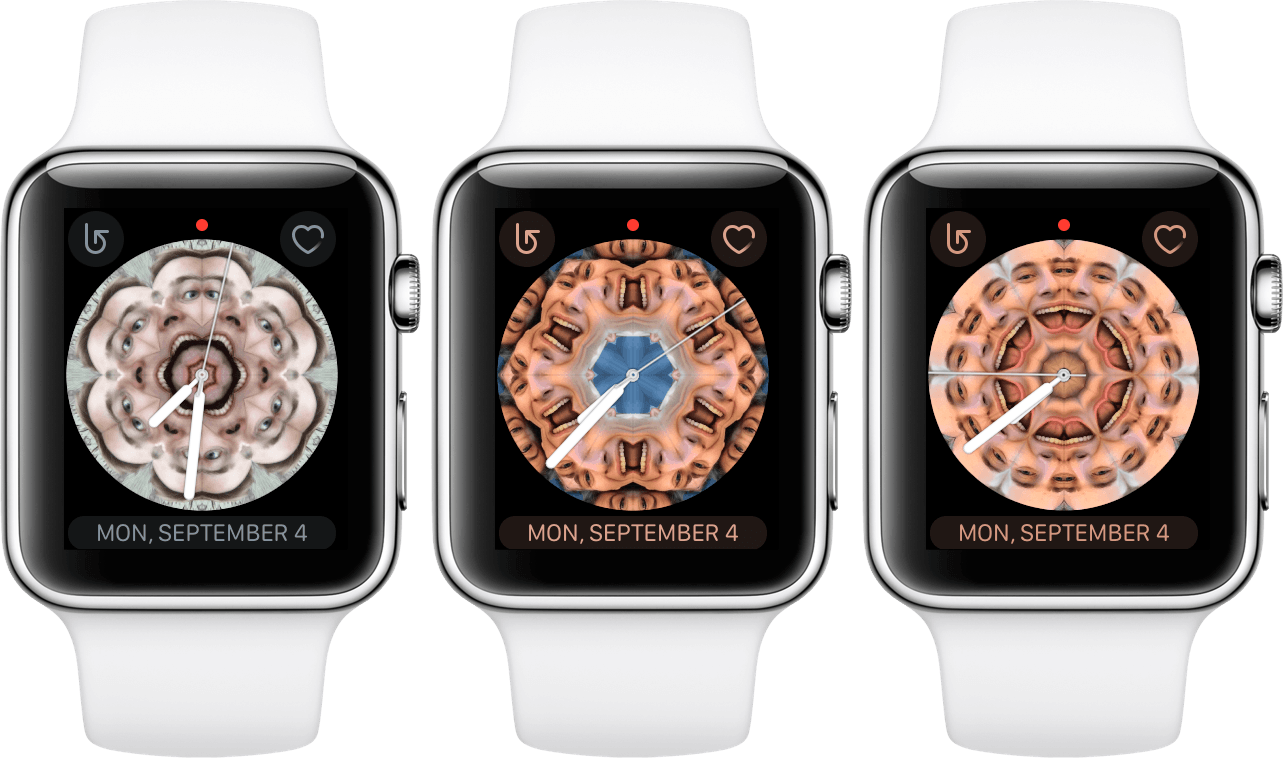
Gradient
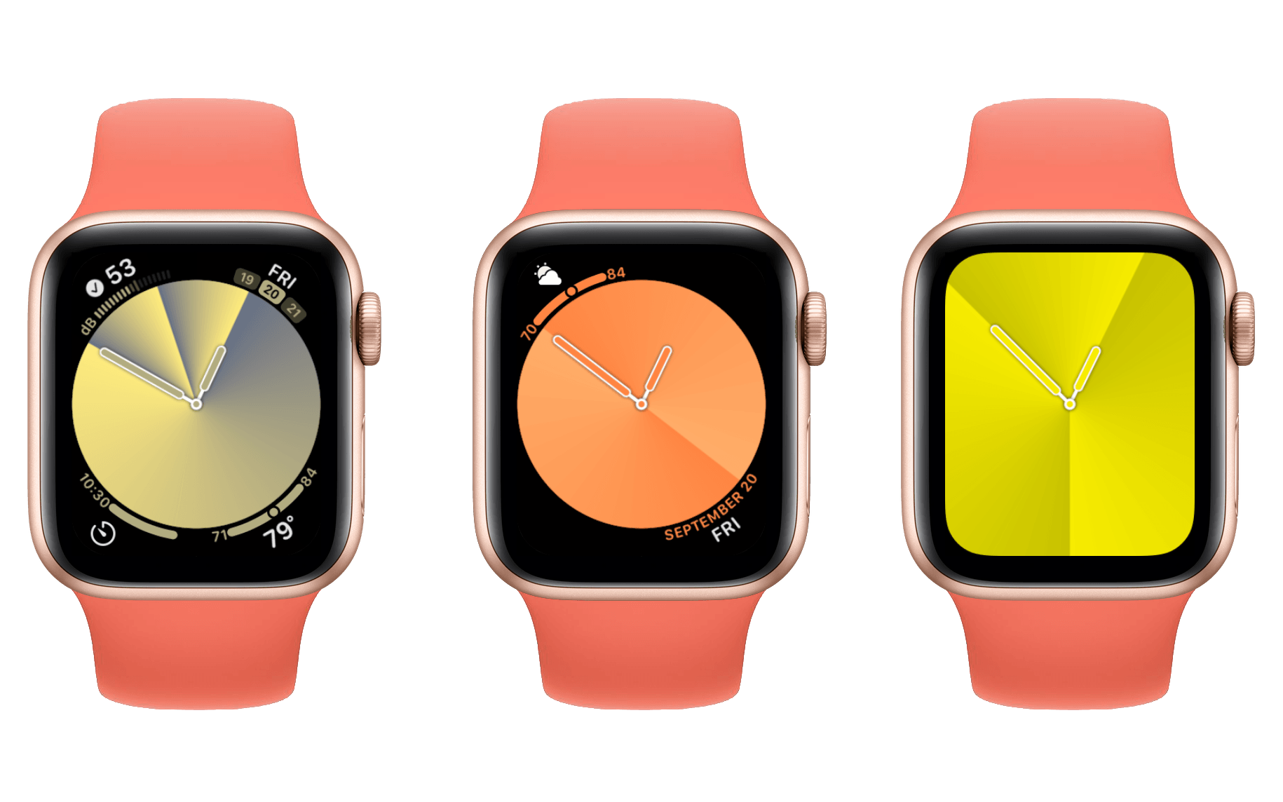
The Gradient face is not interesting. It is just like the kaleidoscope face, except this one is a plain gradient background that you can’t do weird things with. Gradient includes more options than it has any right to: you can select how many lines of gradient there are, you can pick the color of your gradient from a set of 62 colors 3 (also four multicolored options, most of which are terrible), and you can choose whether to obscure the entire screen with blinding gradience or just an interior circle. If you choose the circle then you get to add up to four complications around the borders.
If you’re someone who for some reason likes the full screen style of the Color face then maybe the Gradient face will make your face choices more interesting (see below for a sad comparison). Otherwise, it’s a boring face made more boring by forcing all complications to be color-matched.
If you have a weird thing for gradients, this is the watch face you’ve been waiting for!
Numerals Duo and Numerals Mono
At first I thought Apple might be going for an accessibility angle with these additions to the Numerals family of watch faces. Both of these faces show a giant digital time across the entire face of the Watch, with Numerals Duo including the minutes while Numerals Mono shows only the current hour. For Apple Watch users with poor eyesight, this may be a good way to make the current time as easy to read as possible. After more consideration though, I don’t really think this is the case. The X-Large face serves the same purpose, but actually displays the hours and minutes in an extremely clean and readable font. These new Numerals faces use an excessively thick and curved font which I don’t actually think is easy to read for certain characters.

Without even being a good option for accessibility, there’s very little here with these faces. You have the option to display the giant numbers in standard Arabic, Arabic Indic, or Devanagari formats. Numerals Mono also supports Roman numeral format, in case next time someone calls it the “iPhone Ex” you want to show them your watch and ask whether they also think it’s “ex o’clock.” Got ‘em!4 I don’t know why these options are a thing, but here we are.
You can change the style of the numerals to be either filled in or just an outline,5 and you can set the color using the same huge color list as Gradient (go with Papaya). Neither of these watch faces support complications, so don’t expect any useful information to exist around the edges of your illegible numbers.
Pride Analog and Pride Digital 2019

The Pride faces are a ton of fun. Both consist of a series of rainbow colored lines which will gleefully writhe amongst each other whenever you tap them or spin the Digital Crown. The effect looks incredibly cool, and is really enjoyable to play around with. Sadly, the complication options on both faces are terrible, and Pride Digital has so little contrast as to be almost illegible. Apple has snatched defeat from the jaws of watch face victory once again.
Pride Digital came out last year as just “Pride,” but has been updated with a new “2019” version and renamed to “Digital” to account for the introduction of Pride Analog. The Pride Digital watch face supports two complications, which I don’t think is nearly enough for a digital-style watch face. This problem is shared with several of the older digital faces, and I’ve been complaining about it for years now. We’ve seen Apple add more complications on a few faces, but I think there should be even more. The space is there, why not use it?
It gets worse though, because the Pride Digital complications are text-style, and that text is overlaid directly on top of the rainbow lines. This makes both complications almost entirely illegible without really concentrating. The digital time itself is also overlaid on the lines, and while its bigger font somewhat improves legibility, it’s still far more difficult to parse than it should be. This face fundamentally fails to perform its most basic operation. If the lines weren’t so fun to play with, it would be downright offensive.
With the above said, the Pride Digital face does have something other than its cool lines going for it. Last year’s “2018” style is still available as an option in the customization settings, but it has received a few updates of its own. Pride Digital 2018 collapses its lines into six distinct columns. The columns fade out at the top and bottom, and tapping them or spinning the Digital Crown makes them explode into the crazily moving individual lines that the default face is fully composed from. Last year’s version of this face would just black the screen out and have the lines animate back in each time you tapped it, and spinning the Digital Crown had no effect. The new animations are far more fluid and delightful.
The benefit of using thick lines separated by thick black bars is that the legibility of the time and complications on the 2018 variety of Pride Digital is significantly improved. I actually think this face looks pretty great, and may be a legitimate option if you want a simple look. Personally I want more than two complications, and I also really dislike the text-style complication in general. It requires you to read a whole line of text to get the same amount of information that the more compact complication styles provide at a glance. Bad complications eliminate Pride Digital 2018 from the running for me, but it’s still a beautiful face with an awesome effect (the lines actually jiggle a bit every time you raise your wrist, so you get a consistent hint of the fun without having to manually make it happen). If you care less about complications than I do then this might be a fun option.
The Pride Analog face has a similar line pattern to Pride Digital 2019, but it doesn’t ruin everything by putting non-contrasting text directly on top of it. If you don’t want any complications at all, Pride Analog can be set to consume the entire screen like Gradient and many other options. While I never like the absence of all complications, I have to admit that Pride Analog’s rainbow lines look fantastic when filling up the whole screen on a Series 4 Apple Watch. Spinning the crown makes them go absolutely insane, undulating all over the place in a truly fascinating manner. I also love that every time your screen turns off, the next time you look at it the order of the colors has shifted (this is not the case for Pride Digital).
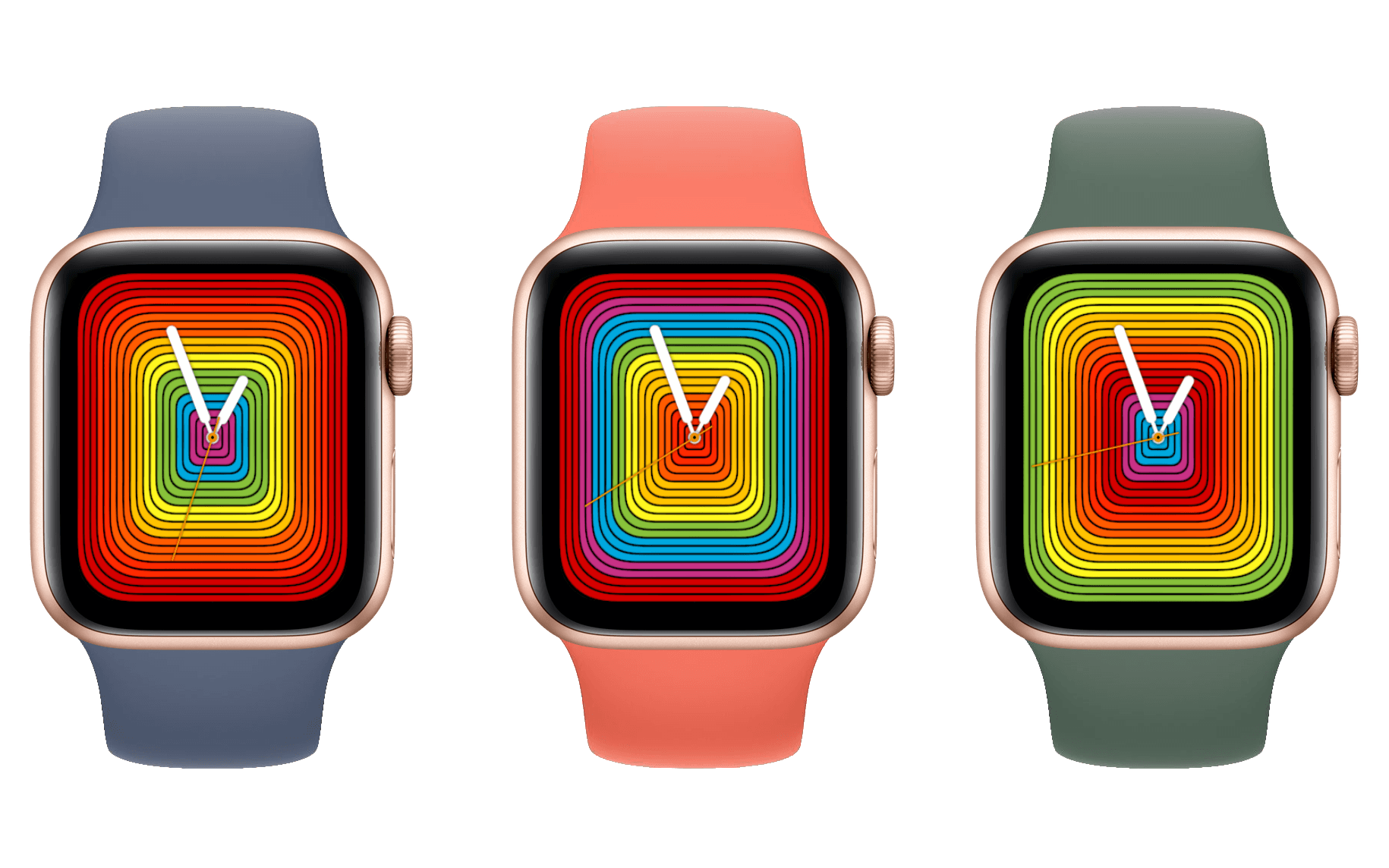
Pride Analog also supports a collapsed style where its lines only occupy a circular area. This allows four complications to be placed around the edges of the pattern. Unfortunately, the complications are of the most compact possible circular style, which means they’re minuscule and nearly unreadable on a 40mm Apple Watch. I don’t understand why Apple is still making new watch faces that use this style of complication, because last year’s Series 4 Apple Watch introduced a far better style which actually utilizes the increased screen real estate of the new device. Pride Analog’s eschewance of modernity here is disappointing.
On top of the bad complication styles, Pride Analog also color-matches the complications to whichever color is at the edge of the circle on each wrist raise. Legibility-wise, some colors make it a lot easier than others. When the complications show up in red, orange, or purple I find it really hard to parse them. Blue, green, and yellow are a lot easier to read, but the inconsistency pushes me to never rely on them. If your preferred set of complications are all just app launchers which don’t directly display information on the watch face, this might not an issue for you.
I wish Pride Analog would allow me to not color-match the complications at all. I generally don’t prefer color-matched complications on any watch faces (although the new Meridian face is a notable exception). The uniformity removes any ability for the icons to be distinct from each other, making it difficult to quickly parse which is which. I assume Apple does this because it thinks that matching the color with the rest of the face makes the complications fit in better, but in my opinion it also reduces the distinctiveness of the face. Apple should add an option on every face to allow complications to display in their developers’ chosen color schemes; being concerned about option-overload pretty much went out the window when they added 62 different color choices.
Maybe I’m being too harsh on Pride Analog, but I just can’t help but imagine what this watch face could have been. In an alternate timeline, Pride Analog always fills the full screen, but adding complications results in the line pattern flowing around their borders. I could particularly see a set of central complications in the style of the new Meridian face (we’ll get to this below) or the Infograph face. I haven’t mocked this up so maybe it wouldn’t look as good as I think it would, but either way I’m certain that there exists some way to style this face which doesn’t use a complication layout from watchOS 1.
My qualms aside, both Pride varieties do include that immaculate animation. If your complication preferences aren’t as…complicated as mine then one of these faces might find a home on your wrist. Just please not Pride Digital 2019.
California Dial
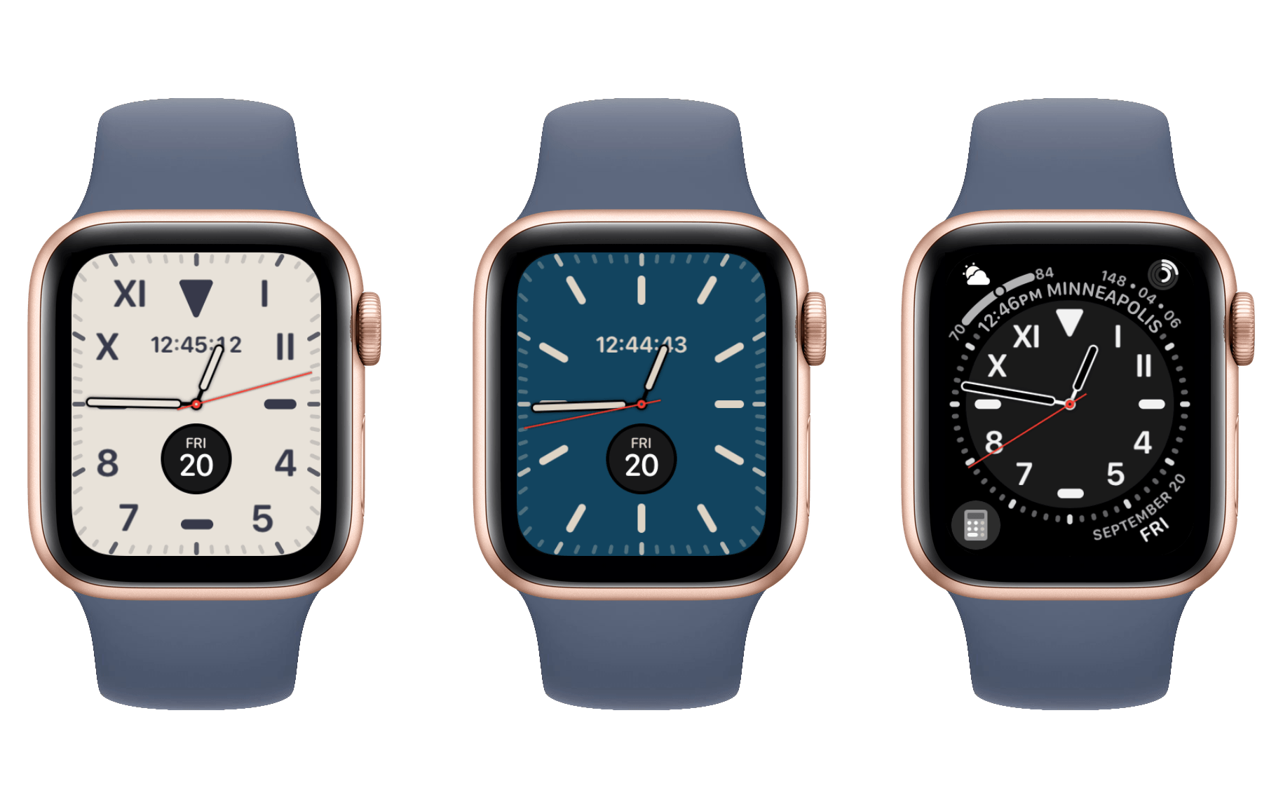
The California Dial face is an interesting option. Its full-screen variety is easily one of the best looking watch faces available. In my opinion it looks so good that I might even consider using it as a “special occasion” face. If I have an event that I want to look my best for, California Dial is the first face I might bother to pull out as a finishing touch. For me, this requires switching to the “pills” option for the tick marks, as I find the Roman, California, and Arabic styles to be too busy. There’s also Arabic Indic and Devanagari, which both actually look pretty good if that’s your thing.
Full-screen California Dial allows two complications slots. I like to see both the digital time and the date on my analog watch faces, so both slots are taken by those defaults for me. The result looks amazing though, particularly with the default Navy Blue color option. Cream looks pretty great too, but feels excessively bright at night. You can also go with Black and then pick from the standard set of colors for the markings, but I think there are better options for a black background watch face (like Infograph). If you’re using a Series 5 Apple Watch, the colored versions will revert to black when the screen is inactive.
While California Dial looks incredible across the full screen, its complications are too sparse to be my daily watch face. California Dial supports the option to reduce it to a circle and open the corners for complications, but I don’t think this looks nearly as good as full screen. Switching to circular also removes both of the central complications. The corner ones are thankfully the modern Series 4-style complications, so they make great use of space and are nice and readable instead of the tiny compressed circles that Activity Analog uses. I wish they weren’t color-matched to the rest of the face, though.
There’s also a fifth complication supported around the outer rim of the dial when the face is set to its circle style. This text-style complication shows up at the top of the circle. Due to the color matching, if you have complications in either top corner I find it becomes difficult to parse the differences from all the same-colored text and symbols.
If you can get by with the two complications in fullscreen mode, California Dial might be what you’re looking for. If you’re giving its circular version a look, Infograph is probably a better option. Finally, if you like the expanded version but can forsake its excellent deep blue background, Meridian is a better way to go. California Dial is almost great, but I think its lunch is being eaten by other faces with fewer drawbacks.
- That's right, I counted them. Judged them too. Even the six extras they tried to sneak past me in the GM build. Here's some hot color tips: if you're looking for pink, go for Dragon Fruit. Don't be fooled by Electric Pink, it's actually orange. Cocoa is a lie, it's clearly gray. Use Beryl at your peril. I don't know what's going on with Mellow Yellow, but it's wrong. Whoever named Mist Blue needs to see an eye doctor. Papaya is perfect. ↩
- Even a broken joke is right twice a day. ↩
- As we've recently discovered, the outline styles exist to save power on the Series 5's always-on face. ↩
