This Week's Sponsor:

Copilot Money

Copilot Money, The Best Money Tracker, Launches on the Web – Limited-Time: Get 26% Off + 2 Months Free


Posts in reviews

JotAgent 2: Quickly Save Notes In Dropbox or Evernote

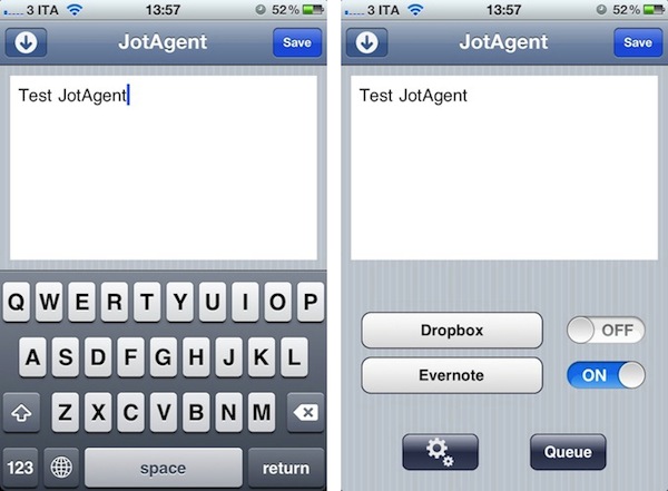
Last year, I reviewed JotAgent, a quick and easy way to save notes in your Dropbox account with a few taps. JotAgent 2, released earlier this week, improves on every aspect of the original app, adding support for Evernote and a refreshed user interface both on the iPhone and iPad. Just like the first JotAgent, you can configure the app to save text notes in your Dropbox account (you can pick your own folder for notes); in this version, you can also log in with your Evernote credentials, and select a notebook where new notes will be saved. If you configure both Dropbox and Evernote, you can easily de-activate one of the two services in JotAgent’s main screen, which has got service, settings, and queue icons in the lower section.

As soon as the app launches, you can begin writing. When you’re done with a text note, you can hit Save to send it to Dropbox or Evernote – the saving process will require a few seconds depending on your Internet connection. If you’re offline, JotAgent allows you to queue notes for later, and upload them when you’re back online. Two interesting features of JotAgent are TextExpander support for snippets and title formatting: the latter lets you change the default template for your notes’ titles, and you can choose between a nice selection of modifiers available on JotAgent’s website. Thanks to these modifiers, I’ve been able to customize the way notes are saved in my Evernote account to show only the month and day of creation.

JotAgent 2.0 doesn’t want to be a full-featured text editor as its focus is completely different. It’s a lightweight app to quickly send a note or idea to the cloud – as I wrote last year, it’s like Captio for text notes. You can get JotAgent 2.0 now at $0.99 on the App Store, or jump after the break to enter our giveaway. Read more


Magical Weather: A Beautiful Weather Station For Your iPad

When Sophiestication invited me to try a beta of her upcoming weather app, I was curious to see how the typical style of Sophia’s apps (Coversutra, Articles) would fit with this kind of software – I’m no Ben Brooks, but I’ve tried several weather apps for iOS in the past year, and I know that putting too much focus on the presentation, rather than data, can be counterproductive for the developer and an app’s success. That’s one of the reasons why apps like Weather HD quickly sold thousands of copies on the App Store, but never really got the weather geeks’ attention and long-term usage.

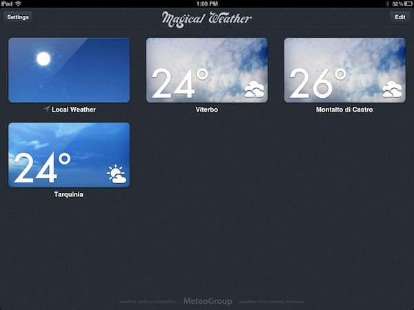
Magical Weather by Sophiestication might just hit the right spot between available weather data and attention to beautiful pixels. When you start the app for the first time (Magical Weather is iPad-only for now), you’re presented with a grid of thumbnails for different cities, labelled with their names and current temperature. You may notice the thumbnails are actually generated in real-time based on weather conditions, but more on this in a bit. The first item in the grid is “local weather”, which is obtained by default. You can add new locations to the app’s main screen by searching (city, ZIP and Airport codes are supported) and, with the Edit button, you can remove locations at any time. From the Settings popover in the upper left corner, you can set the temperature to Celsius and Fahrenheit, and tweak Wind Speed to the unit you’re more comfortable with.

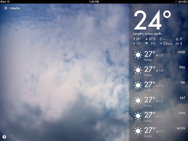
When you tap on a location, the app brings you to a full-screen view of the current weather conditions. This new screen is gorgeous: Sophiestication built in several different animations that look great, and provide an instant summary of what’s going on. If it’s raining, you’ll see dark clouds and rain; if there’s a thunderstorm, you’ll see thunders animated on screen. But the real treat isn’t the weather animation itself – it’s the combination of beautiful artwork and data in the right sidebar.

As you open a location, in fact, Magical Weather will launch a weather animation and a sidebar containing a forecast, current temperature, and the following data:

  • Current temperature with today’s high and low
  • Relative humidity
  • Probability of rain
  • Atmospheric pressure
  • Wind speed (in Beaufort, knots, mph, kph, or mps)
  • Change in temperature since yesterday
  • Current UV index

If you don’t understand the icons displayed on screen, you can hit the “?” button to make a handy guide appear explaining all the data points offered by Magical Weather. This sidebar, however, offers two additional views: you can “hide it” by dragging it at the bottom of the screen – thus displaying only the current temperature in a corner – or expand it by revealing an additional section with a hourly forecast. Weather icons and typography are extremely clear and legible, and look elegant no matter the background they’re visualized against.

At $0.99 on the App Store (limited time offer), Magical Weather is a great piece of work with beautiful graphics and data that doesn’t confuse the user. The app isn’t complex and doesn’t require a learning curve, it’s fun and intuitive to use. Magical Weather may not be enough for the uber-geek, but it’s a fine weather app for everyone else. Get it here.


RestoreMeNot Disables Lion’s Resume For Individual Apps

One of Lion’s biggest changes for geeks and average OS X users alike has been its Resume functionality, which combined with Auto-Save ensures your documents are always saved in the background, and their application windows restored after you reboot your Mac, or quit an app. Whilst Lion’s window restoration may come in handy if you don’t want to lose your Safari browsing session or writing point in TextEdit, the opposite can also be true: automatic window restoration can be annoying for scratch documents that you don’t want to see again, in apps that perhaps you think should always start up fresh and uncluttered.

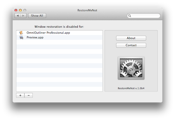
In our OS X Lion review, we detailed how it’s possible to decide to “quit and discard windows” every time by pressing the Option key alongside the usual CMD+Q combination – but wouldn’t it be nice to automatically disable window restoration forever in a specific app? In the days following Lion’s release, a number of Terminal hacks surfaced indicating that it was indeed possible to disable window restoration on an app-by-app basis. RestoreMeNot, a free System Preferences panel covered by Lifehacker earlier today, gives these Terminal hacks a graphical user interface that lets you choose apps you don’t want to restore windows with.

The app is extremely simple. Once installed, it’ll ask you for apps from your Finder. In my workflow, I always find myself hitting Command+Option+Q to quit and discard windows in Preview and OmniOutliner, so I might as well add them and go back to my usual Command+Q shortcut. RestoreMeNot does exactly this – it basically overrides the standard “Quit” command with “Quit and Discard Windows” and it’ll make sure your selected apps will launch window-free when possible (TextEdit, for instance, will create an “Untitled” document every time). Don’t worry though – this won’t disable auto-save: I tried with TextEdit, and whilst its windows wouldn’t be restored, the contents of a modified document were still correctly saved by Lion.

If you’re looking for a more advanced way to tweak your OS X Lion’s behavior, TinkerTool recently added an option to individually control Resume for apps as well. You can download RestoreMeNot for free here.


QuickCal 3.0 Gets Redesigned UI and BusyCal Support

Back in May I reviewed QuickCal for Mac, an iCal add-on that, through a very straightforward interface, allowed you to create new events in iCal using “natural language input”. With a combination of keyboard shortcuts and direct iCal integration, QuickCal let you write down events in plain English (example: Lunch with Cody tomorrow at Italian restaurant), and have them automatically formatted as new entries in iCal, which would then sync them to a MobileMe or online service of choice. Alternatively, QuickCal also featured native Google Calendar support, so events didn’t have to go through iCal first to be synced online. With a clean menubar list of upcoming events, support for to-dos and smart reminders, I was quite impressed by QuickCal as an iCal add-on for desktop users.

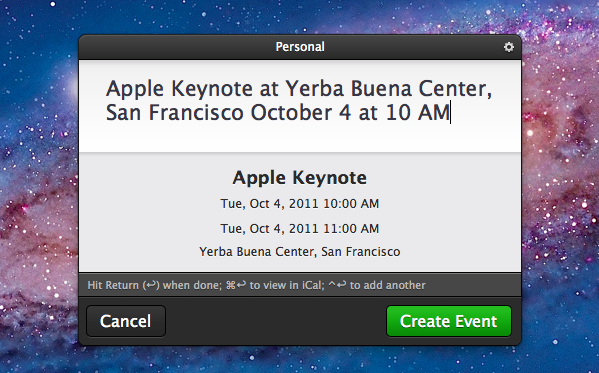
With the 3.0 update released today, QuickCal adds a completely redesigned UI, a new dynamic dock icon, and a series of improvements throughout the interface. As with the previous version, QuickCal can be invoked by pressing a keyboard shortcut (mine is Control+Shift+Q), which will open a floating panel (think OmniFocus’ quick entry/Alfred/NotifyMe) to start writing down a future event. Focus is immediately placed on the text cursor; the new QuickCal entry box design is nice to look at, and it retains the underlying simplicity of the older versions. As you type, text is automatically formatted to reflect an event’s data points like date, location, and duration. For instance, “Meet with Chris at Apple Store, Viterbo tomorrow from 5 to 6” will result in an event called “Meet with Cris”, with location, date and duration fields automatically filled in. This hasn’t changed from the old QuickCal.

QuickCal 3.0 has a beautiful dock icon with a dynamic date on it (like iCal), although unfortunately, due to Apple’s rules with menubar apps and Lion, you’ll have to manually drag it from Launchpad or the Applications folder onto your dock if you want to see it. Once it’s there, you’ll be able to click on it to open the quick entry panel, and drop text on it as well. If you don’t want to use QuickCal’s own quick entry box, you can make its natural language input work with popular application launchers such as Alfred and LaunchBar.

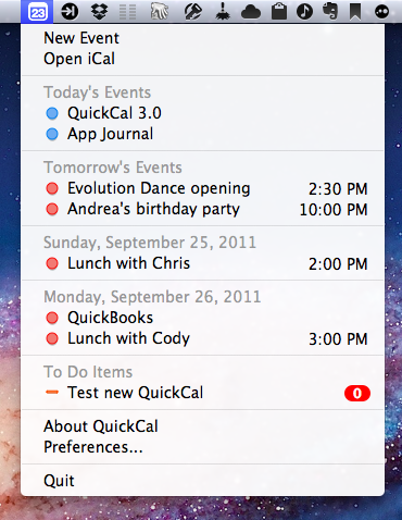
Other features of QuickCal 2.0 have been maintained and refined in this 3.0 release. The app can still create to-dos in a specific calendar with the “todo” prefix – this works nicely with iCal’s Reminders in Lion. QuickCal also provides a summary of upcoming events and to-dos in the menubar, and you can play around with the app’s preferences to tweak sorting options, days to show, and completed events. You can set a default calendar for new events and to-dos, enable Google Calendar sync in the second tab of the Preferences, and, as with version 2.0, activate automatic conflict resolution, so the app will turn red if you’re creating an event that’s overlapping an existing one.

One of my favorite features of QuickCal 2.0 has been ported over to 3.0, and that’s Smart Reminders. With this functionality, you can set the app to automatically apply certain alarms for events that are a day, week, or month away. This way you’ll always have a reminder available and different depending on the kind of event you’re assigning it to.

QuickCal 3.0 comes with native BusyCal support, but I haven’t been able to test this. I’ve only tested the app with MobileMe and iCloud calendars, and I’ve noticed QuickCal still isn’t completely independent from Apple’s iCal in that it requires iCal to be open to sync events to the cloud. With iCal closed but QuickCal running, new events will be saved in QuickCal, but they’ll only be synced after you launch iCal. Another app with natural language input for events, Fantastical, comes at a higher price on the App Store ($14.99), but it syncs events immediately to the cloud thanks to native CalDAV sync support.

QuickCal 3.0 is a simple and effective companion for iCal, now with a nicer UI. I prefer to call the app an add-on, rather than a mini-calendar replacement, as it requires iCal to be open to sync events to iCloud/MobileMe, and it can’t live on its own unless you’re a Google Calendar user. Natural language input is certainly more reliable than iCal’s in Lion, and the interface is unobtrusive enough to be there to assist you, but get out of the way as you don’t need it. If you’re an iCal user and you’re looking for a quicker way to enter events in plain English, QuickCal is only $2.99 on the App Store (a free 14-day trial is available on QuickCal’s website).
Read more


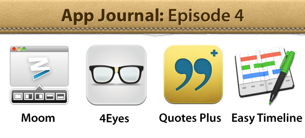
App Journal, Episode 4: Moom, 4Eyes, Quotes Plus, Easy Timeline

App Journal is a weekly series aimed at showcasing apps we have enjoyed using on our iPhones, iPads, and Macs, but decided not to feature in a standalone, lengthy review here on MacStories. App Journal is a mix of classic reviews, weekly app recommendations, and a diary of our experiences with apps that still deserve a proper mention.

For this week’s App Journal episode, I asked my fellow writers Don, Chris, and Graham to come up with iOS and Mac apps to highlight in our weekly roundup. The result has turned out to be “quite a team effort” and, as I was reminded in our internal chat group, I still needed to come up with a proper introduction for the episode. So there you have it: window utilities, text-based search tools for iOS, timelines and famous quotes – there’s a variety of apps in App Journal Episode 4, and we’re increasingly looking forward to the updates and new apps the release of iOS 5 with iCloud support will bring.

Stay tuned for more App Journal episodes in the next weeks.

Don: Moom

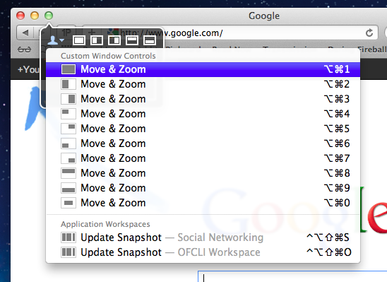
Moom is a utility for moving, resizing, and manipulating application windows. It uses a mixture of pre-defined and user-defined window settings which are accessible by hovering over the green zoom button or through customizable keyboard commands. This is one of those apps that I didn’t think I needed until I gave it a chance. I was happy using a set of AppleScripts to move the front window to pre-defined locations but the problem was it only worked with applications that supported window bounds in AppleScript. This left Twitterrific and Preview out in the cold. Thankfully Moom has no issue working with these applications.

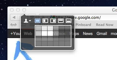
When using Moom there are two types of controls: Mouse and Keyboard. The keyboard controls are undeniably more powerful because of their speed and plethora of alterable configurations. Despite that I still found that the mouse features were treated with equal attention. Hovering over the green zoom button displays a beautiful transparent popover that has five pre-defined and extremely useful shortcuts.

Below the five icons lies a grid that can be used to dynamically draw out where you want the window to be located. The grid must be enabled under Mooms Mouse preferences. There you will find options to adjust the size of the grid as well as an option to enable access to your custom keyboard controls. Another great mouse feature is the ability to move windows across displays with nothing more than a gesture (clicking down on an icon and dragging it towards the second display).

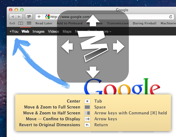
The keyboard functions are also quite interesting. There are basically two types. The first type allows you to define window positions and set them to a keyboard shortcut. It is the reason I bought the program and it did not disappoint. The ability to use a keyboard shortcut to resize a window to fill half the screen or even just a quarter of it depending on the situation is invaluable. The second type is a keyboard mode which is triggered by a hotkey and allows you to move a window around with your arrow keys for more granular on-the-fly positioning.

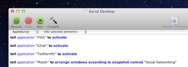
The real gem of this program is its ability to save window layouts. It basically memorizes the current positions of your windows and it saves a snapshot of them so it can restore those windows to their exact locations by way of a keyboard shortcut or from the mouse-based pop-over menu. If that wasn’t cool enough, they even added AppleScript support so you can call those saved layouts from a script!

Example: I like to keep a Desktop just for social networking applications. Now with Moom I can automate the process of opening all of my social apps and then arranging them instantly by calling the saved layout I created called “Social Networking” from an AppleScript.

The last feature I wanted to mention was its ability to run in what Moom refers to as Faceless mode. This is a mode with no dock icon and no menubar icon. Moom can also be set to show the settings panel on launch which is perfect when calling Moom from a program like Alfred. No icons to stare at and quick access to Moom’s settings from a launch bar, what could be better?

Overall this app has great functionality and a very pleasant interface, all for a conservative price. $4.99 on the Mac App Store. Read more


FaceMan, Unofficial Photo Booth for iPhone, Gets 3.0 Update

Here’s a fun app that, for some reason, Apple still hasn’t delivered to iPhone and iPod touch users. FaceMan, created by fellow Italian developer Libero Spagnolini, is an unofficial alternative to Apple’s Photo Booth, which allows users to apply funny effects and distortions to their faces in real-time using the iPhone’s rear or front-facing camera. I first reviewed the app in January, but since then lots of work has been put into FaceMan – and a major 3.0 update released today adds a completely redesigned UI, a faster engine, and many optimizations to the code.

The new FaceMan lets you scroll between effects at the bottom (with live previews both on the effect’s thumbnail, and the bigger camera view at the top), and swipe vertically to change between effects, camera controls, and intensity slider. A new effect has been added, camera controls now rotate properly in landscape mode, and recording performance (FaceMan does both photos and videos) has been improved by 200%, the developer says. I haven’t been able to verify such percentage, but it’s clear FaceTime 3.0 is faster than the previous version on the same hardware (my iPhone 4). The app runs on the iPhone 3GS and iPod touch 4th generation, too, and requires iOS 4.1 or later. I have tested the app on iOS 5 beta 7, and it worked with no issues, although the developer told me more iOS 5-related fixes are on their way.

It’s not completely clear to me why wouldn’t Apple create a simpler port of Photo Booth for the iPhone and iPod touch. The software was previewed at the March 2 event as an addition to iOS for the iPad 2, and has proven to be a fun and delightful way to snap and share silly pictures with friends and family. The iPad 2 runs on Apple’s faster A5 processor, however, so that might be the reason why Apple’s official Photo Booth app hasn’t made it to existing A4-based hardware yet.

Still, FaceMan works nicely on the iPhone 4, and the new interface is fast and fluid at applying and switching between effects. If you’re looking for a Photo Booth alternative now, you should give FaceMan a try. It’s only $0.99 on the App Store.


Instagram 2.0 Now Available: Live Filters, New Camera UI, Faster Engine

Instagram, the iPhone-only social network for sharing photos with your friends, has released a major new version of their app today, which reaches version 2.0 and adds a number of new features, updated interface design, and a new icon.

The most notable change in Instagram 2.0 is the implementation of live filters. In previous versions of Instagram, every time you took a new photo with the app’s dedicated camera UI you had to apply a filter after the photo was taken, and if the filter was not okay for the photo, you were obviously forced to go back to main screen and re-shoot. Having to retake a photo to make it play nice with a selected filter could lead to several problems – your favorite “moment” may be gone forever, and you’d end up with multiple shots to choose from. In Instagram 2.0, the camera screen has been completely re-imagined to accomodate live filters and tilt shift – meaning, you can see how a filtered photo will look like before you take it.

Thanks to iOS’ powerful live image editing and photo-taking functionalities, the developers have been able to develop a solution that lets you instantly see how filters will apply to your photos – no need to shoot and apply separately.

From this new camera view, you can scroll filters at the bottom, or play with a series of buttons along the top. These buttons let you snap a photo without borders, activate/disable flash, swap cameras, or tweak live tilt-shift. The latter option is particularly amazing when seen in action, as it updates the camera view in real-time with different types of tilt-shift as you tap on the screen.

Alongside being able to see how filters will look like before taking a photo, Instagram version 2.0 comes with four new effects (Amaro, Rise, Hudson, and Valencia). Users can still decide to take a photo without effects and apply them later (simply don’t tap on the filters icon in the toolbar), but from what I’ve seen so far, performances of this update on the latest iPhone hardware really make for a fast and smooth experience when playing with live filters. We tested the feature on an old iPhone 3GS and the transition between effects was very smooth on that device, too. The Instagram developers say the new filter engine is up to 200 time faster than before.

Since the day we launched, one core part of the app has remain largely unchanged: the camera. In the past, we’ve added filters & tilt-shift, but the base technology has never evolved. Today that all changes as we introduce a complete upgrade to Instagram’s camera with a brand new technology layer.

See the world through Instagram’s stunning effects before you even snap a photo. Simply select a filter, hold the camera up to the scene and see the world through Instagram’s visual effects. We’ve re-written your favorite Instagram filters to be over 200x faster so even after having taken a photo, switching between them takes no time at all.

The new Instagram is also geared towards giving users more control over how their photos are snapped, and shared with the world. Besides being able to remove borders and rotate a photo after it’s taken, photos are now saved at much higher resolution in a device’s library – photo size has been increased from 612x612 to 1936x1936 on the iPhone 4 (1536x1536 on the iPhone 3GS). This was one of the biggest complaints with the original Instagram, and the developers are surely on the right path to deliver an app that’s equally fast at sharing photos, and saving them at high quality.

As the service is now nearing 10 million users, it’s interesting to look back at my initial review of Instagram last year and see how much has changed. In spite of the new features introduced today – a refreshed interface, live filters, higher photo sizes – Instagram is still the same app that allows users to share photos with a new “social paradigm”. Instagram has reinvented the way photos can be “beautified” and shared on mobile devices to multiple social networks, ultimately building a social network on its own that’s now attracting millions of users and popular brands.

You can find Instagram 2.0 on the App Store.


Agenda 2.0 Gets Native, Elegant iPad Version

Back in June I reviewed App Savvy’s Agenda, an elegant and intuitive calendar app for the iPhone that was “powered by gestures”. Unlike Apple’s recent experimentations in UI design with interfaces resembling their real-life counterparts (Address Book, Lion’s iCal, the iPad’s Calendar), Agenda wanted to be an app that looked like your old “paper calendar”, in a way that wouldn’t feel awkward or “over-designed” on the iPhone’s screen. That made Agenda an easy-to-use application with the focus on beautiful typography, navigation, and “one hand usage”. Agenda can be used with single swipes to the left or right to switch between monthly, weekly, and daily views.

With a free 2.0 update released today, Agenda becomes a Universal app that runs natively on the iPad. I’ve been able to beta test it in the past weeks, and I’m impressed by how Agenda made the leap from the iPhone to the bigger screen of the iPad. Everything in Agenda 2.0 – navigation, views, event creation – benefits from the added pixels and updated interface, which takes advantage of the iPad’s landscape orientation to beautifully lay out year, month, week and day views with the same attention to simplicity and typography seen in version 1.0. On the iPad, you start in a day view with a sidebar, and scheduled events on the right. The bottom toolbar contains buttons to snap back to “today” in the sidebar’s scrollable list, jump to a specific day, or change the view to day/week/month/year. The day view’s sidebar automatically updates the translucent top header as you scroll back to previous months, and a search bar along the top lets you look up single events in your calendar. Agenda supports all calendar protocols integrated with iOS, and calendars are automatically imported from Apple’s Calendar app (you can choose which ones to enable, and the app works with no issues with iCloud).

Tapping on events in the day view will reveal a popover with additional details, whilst swiping vertically in this section will navigate between days. Similarly, tapping on days in the sidebar will scroll the right panel automatically. At the top of day view, Agenda displays a mini-calendar for the current month; tapping on it will bring you to the month view, which is fairly standard but gets the job done. Events can be given colored dots for the calendar they’ve been assigned to, and today is highlighted in red. Again, scrolling vertically in this view will automatically advance to the next months, and update the header at the top.

Agenda for iPad also offers a year view, which has to be scrolled horizontally, and provides some basic “heat map” functionality in that thanks to colored dots you can see at a glance which months are the busiest. Year view displays six months at a time – a clever choice that allows each panel to have bigger fonts for months and days. Tapping on a day in year view will jump back to day view.

My favorite feature of Agenda 2.0, however, is the week view on the iPad. See, when I use a calendar application, I like to know what’s going on this week. Week view allows me to instantly see my schedule for the week, and I love how Saturdays and Sundays (my non-work days) are smaller than regular week days.

I spoke to App Savvy’s Ken Yarmosh about Agenda 2.0, and he told me that, in a small way, the Mac influenced the design of Agenda for iPad. As I mentioned above, the iPad’s bigger screen makes for a more comfortable calendar experience and, personally, I think Agenda would be great as an alternative to iCal on my desktop. Agenda works with Apple’s standard EventKit framework for event creation, and the app is already running smoothly on iOS 5. I also asked Ken about the design decisions behind Agenda for iPad: unlike several calendar apps on the App Store, Agenda only works in landscape mode. Ken explained that, while designing the app for a different form factor, they had to look at how a regular calendar is used in real life, and found out that most “sizes” of a paper calendar are closer to the iPad’s landscape mode. I agree with Ken when he says that portrait views in calendar apps for the iPad are usually difficult to use and navigate. More importantly though, he confirmed my general feeling of “less swiping, more tapping” on the iPad version of Agenda – in designing a native experience for the iPad (and not a simple “port” of the iPhone experience) Ken and his team correctly assumed that the iPad implies different usage scenarios than the iPhone, and being forced to constantly swipe on the tablet’s large screen can be tiresome.

The new Agenda comes with a few more fixes and minor changes for the iPhone version, too. Agenda 2.0 is a delightful way to manage your calendars on the iPad – and app that focuses on content and an elegant presentation of events, weeks, and months. Agenda is currently on sale at $0.99, and you shouldn’t miss it.


App Journal, Episode 3: Dolphin Browser HD, Showreel, Faveous, ifttt

App Journal is a weekly series aimed at showcasing apps we have enjoyed using on our iPhones, iPads, and Macs, but decided not to feature in a standalone, lengthy review here on MacStories. App Journal is a mix of classic reviews, weekly app recommendations, and a diary of our experiences with apps that still deserve a proper mention.

As developers put the finishing touches to their iOS 5 and iCloud-based new apps and updates, this past week has been relatively slow in noteworthy App Store releases and features. Fortunately, I’ve dug up some gems worth mentioning, and I’ve been playing with the amazing If This Then That, now out of beta and open to the public.

Stay tuned for more App Journal episodes in the next weeks.

Dolphin Browser HD

I was a little skeptical when I first heard about Dolphin Browser for iPad, a port of what appears to be a fairly popular browser for Android devices. Furthermore, the app is free, and I always wonder how it’s going to play out in the long term without a business plan. Still, I have to say Dolphin Browser is pretty good. Mind you, it’s no Grazing, but I was surprised to see two features cleverly implemented: gestures, and the “webzine”. With gesture support, you can assign any URL to a custom gesture you have to “draw” so you’ll be able to launch your favorite websites by simply performing the gesture on screen. There’s a set of built-in gestures for Facebook, Twitter, and other websites, but you can create as many as you want by opening a new URL, and choose “gesture for this page”. A new window will open, asking you to draw the shape with a single stroke – after that, the gesture will be assigned to the URL and saved in the Gestures area of the app. Gesture recognition is pretty good, and you don’t have to be an artist or get really precise down to the pixel for the app to see what you want to launch. Overall, it’s a quite clever idea that, however, might use a more universal access without having to open a dedicated Gestures overlay (I’d like to draw directly on the webpage, if that makes sense).

Second is the webzine, basically a Flipboard-like magazine interface that, however, resides right within the browser and not in a standalone app. Dolphin’s main page, in fact, lists a series of speed dials on the left (think frequently accessed websites) and the “webzine” on the right, pre-populated with blogs you might want to read in a more uncluttered fashion. The thing with the webzine in Dolphin is that you’re not really forced to open this “start page” every time – once you visit a blog, say MacStories, Dolphin will ask you if you want to read it through the webzine UI. When a website gets passed through the webzine, a nice and fluid animation brings text in the foreground with articles and images as big squares – again, it resembles Flipboard.

The big difference is that Dolphin’s webzine doesn’t fetch entire articles and images – the actual webpage is loaded behind the webzine page, and you can jump to it (to see the rest of a story, images, or videos) with a single tap. It’s still unclear to me whether Dolphin’s webzine fetches articles via RSS (I assume it does), but I find it surprising the developers didn’t implement a refresh button (just last night I was reading MacStories through the webzine, and two articles I had just posted weren’t showing up).

Dolphin is a decent browser for the iPad with two really neat functionalities. You won’t find the “power user” aspect of Grazing and iCab in here (Dolphin doesn’t even have contextual menus for links), but overall, it’s a good free browser. Get it here. Read more