This Week's Sponsor:

Copilot Money

Copilot Money, The Best Money Tracker, Launches on the Web – Limited-Time: Get 26% Off + 2 Months Free


Posts in reviews

App Journal, Episode 6: NotifyMe, Whale Trail, Twittelator Neue, BBC iPlayer

App Journal is a new series aimed at showcasing apps we have enjoyed using on our iPhones, iPads, and Macs, but decided not to feature in a standalone, lengthy review here on MacStories. App Journal is a mix of classic reviews, weekly app recommendations, and a diary of our experiences with apps that still deserve a proper mention.

With iOS 5, iCloud and the iPhone 4S now out in the wild and available for all users, App Journal gets back to its regular programming schedule and we couldn’t be more excited to start trying new apps that fully take advantage of the new features offered by iOS 5 and iCloud services. This week, Graham takes a look at the global version of iPlayer, while I try to set a personal record in Whale Trail (thanks to our friends at The Next Web for writing about this gem), experiment with a new Twitter client for iPhone, and enjoy the comfort of a quick-entry panel in a Mac app that creates reminders, but it’s not Apple’s Reminders.

We think this week’s selection is pretty great. Stay tuned for more App Journals in the next weeks.

NotifyMe

With iOS 5, Apple introduced Reminders, and as I wrote in my overview of the app, I’m glad they did. Reminders makes iOS as a platform more efficient and productive, allowing users to forget about having to purchase a standalone to-do app because now the functionality is integrated right into the system. But as I also wrote, it’s not like Reminders aims to replace more complex solutions like OmniFocus, Todo or Things: Reminders is very simple and aimed at people who don’t need advanced personalization of their to-do lists or project management features. Reminders targets the average iOS user that has always wished his iPhone would let him create reminders for when he gets home or needs to take out the trash. With Siri integration, Reminders gets even more accessible thanks to voice-based input.

There will always be room for third-party apps in the iOS ecosystem, and even if Apple “borrows” basic functionalities from third-party software every once in a while, developers always find a way to give their apps a reason to exist and prosper. Just take a look at Instapaper, Grazing, or Fantastical.

NotifyMe, a set of apps by PoweryBase, is an interesting and powerful alternative to Reminders for those who wish they could do a bit more with their to-dos and, more importantly, have them synced back to a native Mac app. NotifyMe is very similar to Reminders in its underlying concept: you create to-dos and they’re synced to the cloud. Unlike Reminders, NotifyMe doesn’t use iCloud – instead the developers have built an infrastructure called the NotifyMe Cloud that keeps iPhone, iPad and Mac clients always up-to-date with a free account you can create at notifymecloud.com. Syncing is free, with no subscriptions – but you’ll have to buy the iOS apps separately on the App Store (no universal version yet) and if you want to have to-dos on your desktop as well, NotifyMe for OS X on the Mac App Store.

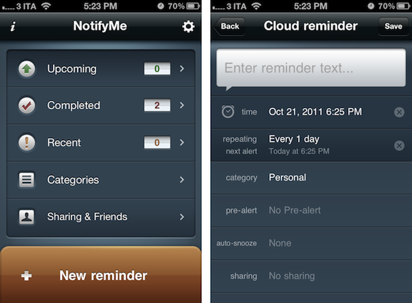
Where NotifyMe really stands out is customization. You can assign reminders to specific categories and create new ones from scratch choosing a custom icon. On iOS, you can pick a melody for NotifyMe alerts, set a [Category] prefix in the notifications that you’ll get from the app, and choose whether or not you want the app to default an “auto-done” state for non-repeating reminders. Furthermore, you can set auto-snooze, customize the app’s badge type to overdue+today or overdue+all upcoming, and select a category for shared reminders added by your friends. NotifyMe makes it easy to curate a personal list of friends and family members that you want to share reminders with – just head over the Sharing & Friends tab in the iOS app, and send a request via email to another NotifyMe user. Friends can create shared reminders, but they can’t browse your whole account and see the reminders you’ve chosen not to share.

Both on the Mac and iOS, the app’s interface is easy to use and focused on lists and the “New reminder” button. Lists include your upcoming reminders, completed and recent ones, as well as your categories and Sharing. On the iPad and Mac you’ll see categories (and to-dos assigned to them) right in the left sidebar, whereas on the iPhone you’ll have to tap on Categories first to navigate to another view. NotifyMe also comes with a web app for those who don’t own a Mac, which you can find at webapp.notifymecloud.com.

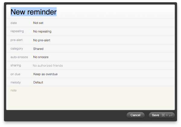
NotifyMe’s reminders don’t have location features, but they have some other options worth mentioning. You can set repeating reminders and pre-alerts; pick a category, set auto-snooze, sharing and melody on a reminder basis and attach notes. The biggest advantage of NotifyMe over similar to-do software for iOS is that its Mac app enables you to create reminders with an OmniFocus-like quick entry panel, which can be assigned a systemwide keyboard shortcut and optionally expanded to reveal more settings as you write. The quick entry panel is possibly the single best feature of the Mac app that justifies the (steep) price if you’re going to create many reminders on your desktop, and have them always available through the cloud.

NotifyMe works reliably, and in some areas it offers more customization options than Apple’s Reminders for iOS 5. The full set of apps (iPhone, iPad, Mac) doesn’t exactly come cheap, so consider the purchase if you’re really going to use the Mac’s quick entry functionality and iPad client a lot. Read more


The Early Edition 2 Review

When the original iPad came out last year, it was immediately clear the device would be great for reading. As I outlined in my Instapaper 4.0 review, those who followed the launch of the device in April 2010 may recall that there was little doubt the iPad was going to change our reading habits: from the comfort of a couch or during a daily commute, the iPad’s bigger screen would provide a better alternative to web articles, RSS  feeds and eBooks than the iPhone’s 3.5-inch display. How reading was meant to be changed and enhanced, exactly, wasn’t really clear from the start.

The following months saw the rise of “social magazines” like Flipboard and Zite, a plethora of RSS apps – most of them abandoned now – and variations on the theme of “visual news” that would see developers building apps with a unique, at least initially, spin on the classic visualization of headlines. Among the pioneers of “iPad reading” was Glasshouse Apps, makers of some fine software for iOS devices like Barista and Gift Plan. Last year, Glasshouse Apps released The Early Edition, possibly the first popular app to take on the concept of RSS feeds rendered as a newspaper on the iPad’s screen. Whilst many would later try to copy Flipboard and come up with similar ways to build “social magazines” off your Twitter and Facebook streams, I remember The Early Edition was among the first apps to deliver a fresh RSS experience that turned RSS items into visually-appealing headlines with page layouts, subtitles, bold headlines and summaries. The Early Edition was capable of importing feeds from your Google Reader account and manually managing them inside the app, but it couldn’t sync with Google’s RSS service. The fact that, without any major feature or UI updates, The Early Edition is still in the Top Paid iPad News chart as of this morning is telling of the app’s quality. Overall, The Early Edition was a nice way to read RSS feeds in a different format; perhaps it was overshadowed by Flipboard (which also gained Google Reader capabilities later on), but it’s still a fine piece of software.

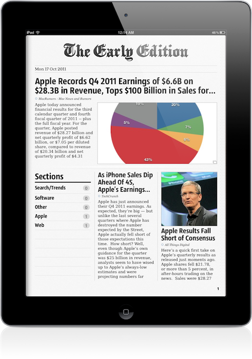
The Early Edition 2, released today as a separate app, improves on every aspect of the original application. The interface has been redesigned, the sharing menu completely rebuilt; the app can now sync back to Google Reader (while still offering you an option to manually manage feeds out of Google’s system) and it’s incredibly fun to use, as before.

One of the big advantages of TEE 1 over its many competitors, in fact, was that it was fun. As the iPad as a platform, TEE relied heavily on swipes and taps to let you navigate between articles and sites, with beautifully crafted graphical elements and page turning animations to help convey the feeling of a “real” newspaper on your iPad. The Early Edition 2 builds on the skeuomorphic guidance of the previous version: the sharing menu is a yellow envelope you send out to the world; a wooden background adorns the newspaper’s pages and columns and becomes your coffee table as the newspaper rolls back, revealing its sections. Pages turn faster, and the new Featured Feeds section resembles a newsstand you’d pick your favorite newspaper from while holding your morning coffee on the way to work. Even the Clippings section – the one that holds your “favorite” (starred) items – has been designed as an inbox that sits on your desk, right below your personal newspaper.

Some might say that The Early Edition 2 is over-designed and that it’s blindly following Apple’s trend towards real-life interfaces with textures and materials and physical metaphors – but I like it. Unlike, say, Lion’s iCal or Address Book, I think The Early Edition’s design is functional to what the app does and, ultimately, it’s got personality.

An obvious feature of digital newspapers is that, unlike physical ones, you can customize them. In The Early Edition 2, you can browse All feeds, Unread ones and Today’s only, and note that if Google Reader sync is active, unread items will change their status on all your connected Reader clients, such as Reeder for Mac or Mr. Reader for iPad. In this regard, The Early Edition has proved to have reliable sync: as soon as I scrolled past an article, that was marked as read and changes were synced back to the cloud. Sync is relatively fast, but the app will need a few extra seconds to “assemble your newspaper”, which includes deciding to preload pictures, finding Trending Words in article, and picking a position for Favorite items (which you can choose to display in the newspaper’s Front Page). Search and Trending words in particular provide a nice way to quickly skim through a freshly built newspaper, see what’s most talked about in your sections, or simply find something specific you’re looking for (you can save searches for future usage as well). Another way to customize the newspaper is to browse recent items from single sources: from the Feeds sidebar, the app will let you tap on a website to read its latest entries, but this screen won’t share the same interface design of the “regular” newspaper. It is, however, a nice option to have. You can filter feeds or browse by section, too.

Article reading view has been redesigned from version 1.0. Typographic choices look better on the eye, and the overall page design feels cleaner and more elegant. The app will fetch article information such as publishing date, author and website’s name when refreshing feeds, and as you read an article the page “disappears” underneath the main header – it’s a very nice effect. Along the top of the page, there are buttons to open an article’s web view, share it, increase font size, and email the link or open it in Safari. The reading view is extremely simple, and you can swipe between pages without going back to the main newspaper view.

The Early Edition 2 has also been enhanced with gestures to simplify navigation and provide quick access to often-used sections. Besides swiping to turn pages and navigating image galleries, you can swipe with two fingers to reveal the Browse sidebar, or swipe with three fingers horizontally to skip a section you don’t want to read. A rotate gesture with two fingers gives you access to the Featured Feeds at any time, whilst the Clippings can be accessed with a swipe up from the main view. The app offers a quick recap of available gestures through the Help menu in the toolbar (which you can reveal by swiping down), and I believe that if you’re going to spend a lot of time reading in TEE, gestures will make you save a lot taps (and thus, precious seconds).

Other miscellaneous notes about The Early Edition 2:

  • You can subscribe to feeds, manage your subscriptions, reorder items, and move them around between Google Reader folders
  • Font size controls
  • Hardware brightness controls
  • Double-tap images to enter gallery view (perfect for photography and design blogs)
  • You can “star” items and mark them as unread on Google Reader
  • You can customize Google Reader sync and how items are marked as read
  • OPML import

Overall, The Early Edition 2 is a good app – but the question is, why would you use this over your regular RSS reader or Flipboard? I think there are a few aspects to consider before dismissing The Early Edition or quickly hitting the Buy button. First, unlike Flipboard, The Early Edition bets heavily on the concept of “digital newspaper delivered to you every morning”, whilst Flipboard is more of a social-media powerhouse with support for Twitter, Facebook, Instagram and Google Reader items all displayed through a “magazine view”. Whereas Flipboard is deeply social both in the way it gets content and allows you to share it, The Early Edition feels to me more like an app you’d use once a day to read what’s new and relevant in the feeds you curate. Flipboard, too, enables you to subscribe to sections and feeds, but clearly its focus is on items shared by your friends, displayed through a better view than a web browser. And this is where the difference between The Early Edition and a regular Google Reader client kicks in: assuming that you’re an RSS “geek” with at least 50 subscriptions and hundreds of unread items per day, The Early Edition 2 positions itself as a nice way to read, and not skim, articles from your sources. I don’t know about you, but I use my main Google Reader clients to see what’s up, and other apps to read the good stuff that I missed while I was skimming through. With dynamic page layouts, The Early Edition 2 is also smarter than a normal RSS client, as it’s got an algorithm that decides which stories are more important than others and how they should be displayed. So here’s a first difference between the digital newspaper and a list of unread items. But the opposite is also true: what if you only subscribe to a few feeds, and you get your news via Twitter all day? In that case, you’re likely to use a Twitter client or, again, Flipboard. But when it’s time to read those few feeds, why use a client (which I believe is normally meant for heavy RSS users) when you can have a beautiful app like The Early Edition deliver them for you? It’s an interesting scenario that once again proves how the selection of iPad apps for reading web articles is changing our reading habits and empowering us to choose how we read. There’s one more possible usage scenario: assuming you use your “social magazine” for your “social news” and you don’t have a Google Reader account or even know what RSS is, The Early Edition’s standalone mode (no sync, no Google Reader integration) offers another way to manage the websites you like, not the ones recommended by your friends.

I believe RSS clients and apps like Flipboard and The Early Edition can coexist, but it depends on how you choose to read your news and feeds you care about. The Early Edition 2 is a beautifully designed app, which takes advantage of iOS 5 and nicely integrates with Google Reader.

The Early Edition 2 is propagating in the App Store right now. You will find the app here. Check out a gallery of screenshots and a promo video after the break. Read more


Fantastical 1.1 Brings Editing, Deleting, Notes and Full iCloud Support

With the release of the iPhone 4S and Siri, Apple is putting much focus on natural language input and the concept of “personal assistant”, a technology the company first explored almost two decades ago, which was impossible to implement until today. With faster processing power, persistent Internet connections and better voice recognition, Siri is perhaps the most impressive feature of the iPhone 4S and one that Apple will undoubtedly promote heavily in the next months.

On the Mac, of course, the situation is quite different. Whilst one of the new functionalities of Siri on the iPhone is being able to create and schedule calendar events, on OS X we’ve had calendar apps with natural language support for quite some time, such as Fantastical and QuickCal. And today Fantastical, which I first reviewed here, has received a major update that adds two of the most requested features: event editing and deleting.

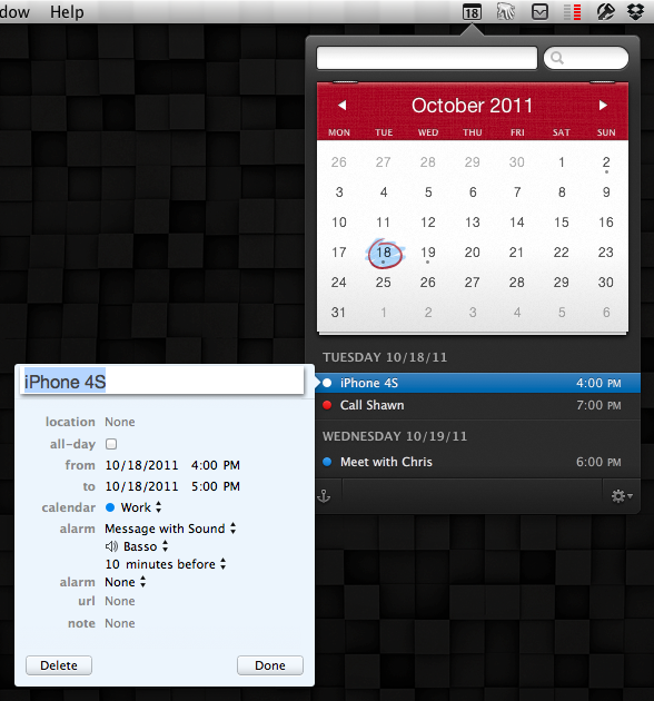
With Fantastical 1.1, you can edit and delete events without jumping to your main calendar app, like iCal. Now, instead of having to launch iCal to make edits to something you entered through Fantastical, you can simply double-click on an event to start modifying it in a separate popup window. The interface is the same you already know for calendar events; you can also delete an event and add notes, which will be synced across all your devices and, if configured, iCloud. Option-double-clicking an event still opens it in your favorite calendar app – remember, Fantastical supports BusyCal as well – and anchor mode can now be toggled with a keyboard shortcut.

Another big improvement in Fantastical 1.1 is full iCloud support. The app already supported iCloud calendars, but now that Apple’s service is public the app has been specifically optimized to take advantage of its new push technology for calendars and events. And because Fantastical features direct CalDAV integration, everything you enter in the app will be immediately synced back to the cloud, without having to open iCal (or letting it run open in the background). In my tests, iCloud integration has been extremely reliable, allowing me to enter an event (or make edits) in Fantastical and see the results appear in real-time on iCloud.com and all my iOS devices.

Fantastical was already a great app, and now that it’s gained editing, deleting and notes it really can be used as a calendar replacement, which thanks to natural language input will also act as your personal “calendar assistant”. Fantastical is available at $19.99 on the Mac App Store.


iPhone 4S Review

iPhone 4S: MacStories Review

iPhone 4S: MacStories Review

It’s been over a year since Apple launched the iPhone 4, and in the meantime Apple has been busy preparing iOS 5, iCloud, getting deals for iTunes Match, and integrating voice technology into their next generation smartphone. iOS 5 has already captured 25 million users in less than a week as iPhone, iPad, and iPod touch owners update their devices to take advantage of free syncing technologies and a revamped notification system. Apple’s iCloud recently went live, syncing data, contacts, and other information between Macs, iOS devices, and Apple’s servers. Hardware remained in Apple’s sights as well — the iPhone 4S launched with brand new guts and was available in white from day one. It’s been a very busy year for Apple, but you’re all here for one reason:

What’s the iPhone 4S like?

Read more


Instacast 1.4: This Is What iCloud Can Do

Instacast with iCloud

Instacast with iCloud

If you have a day job and had just started upgrading your iOS devices when you got home yesterday evening, it’s likely haven’t even spent a few hours with iCloud yet. The premise is pretty amazing, even if the initial majority of it is between iOS devices. If you think automatically syncing spreadsheets and documents across iCloud from your iPad to iPhone is cool, that’s just the tip of the iceberg. Beyond document syncing, iCloud opens up a world of added convenience that wasn’t available previously. Just think about being able to sync your Angry Birds progress between devices. But we can take that even further. What if we could sync something like RSS feeds between devices? Now you’re thinkin’.

Instacast goes beyond simply syncing your lists of podcasts. It remembers to update which episodes you’ve marked as played, it remembers to add new podcasts you’ve subscribed to across devices, and it even remembers what episode you were listening to. The last item is the magical part: it syncs track position and loads that episode you were listening to in the now playing window if you pause the podcast and want to pick up from another device later. Resuming a podcast is as simple as tapping the up arrow after a refresh. Now this? This is amazinger.

This is one of the best use cases for iCloud. Instacast syncs lots of data to keep everything in sync. While there’s not much I can add beyond Martin’s blog post on Vemedio, the wow-factor can’t be emphasized enough.

With the amount of data being synced, there are some things to remember about Instacast’s iCloud sync. Geeks will immediately try, two devices in hand, to see how instant syncing is. If you don’t allow Instacast to get its data in the cloud, you may run into conflicts where your impatience could overwrite the changes you wanted to save. I imagine this is more true for big podcast libraries. You treat it like you treat Tweet Marker — it’s all designed to be very casual. With that said, syncing shouldn’t take five minutes, but I wouldn’t expect it to be split-second instant. A pull-to-refresh will sync changes down from iCloud while uploading takes place automatically.

Instacast 1.4 has a new audio engine inside for iOS 5 compatibility, bringing back scrolling titles on the lock screen (a bigger deal if you were an early iOS 5 adopter) and adding Apple TV support for AirPlay. If you want to get caught up on what Instacast does and how great it really is, check out our previous reviews.

You can read more about the 1.4 update on Vemedio, and download the update for free from the App Store (it’s only $1.99 for new customers).


Safari 5.1.1: iCloud Ready, Performance Heavy

For persistent fans, it’s the features you likely already know about that make Safari a keeper. While I could blabber on about how Safari’s design far outpaces Google Chrome or Firefox in terms of both good looks and usability, Safari’s main assets are simply iCloud related.

The Reading List, revealed as a hidden side pane coated with a fresh paint of white linen, syncs saved websites to your iOS devices almost instantly over iCloud. Added to Safari earlier this year, Reading List is a sort of quasi-replacement for bookmarks. Bookmarks are useful for certain things: recipes, websites with code snippets, or perhaps a photography tutorial you came across online. References. But for things like articles and news you intend to read later, saving those pages as bookmarks often means they’ll be forgotten about and get lost in the clutter. Reading List attempts to alleviate this problem. If you’re reading an article in Safari on the iPad on the train and need to jump off at the next stop, you can save the page to the Reading List and it’ll be available on your iMac once you reach the office. I’ve always said it wasn’t an Instapaper killer — it’s a temporary container for items I want to read now, but am expecting some sort interruption during. Instapaper items are of course read in the evening, either on the iPad or Kindle. Talking about bookmarks, those get synced over too.

One feature I do want to see in the future is the ability to sync open tabs across OS X and your iOS devices. This seems like a no brainer to me, especially if Apple can work their magic in remembering what tab you had open and your page position.

Outside of iCloud, it’s the same ol’ Safari you’re used to. Safari 5.1.1 includes a slew of stability fixes and improved javascript performance, alleviating a lot of the bugs introduced with Lion and 5.1. Still, there’s room for improvement. More importantly, Apple needs to kill automatic tab refreshing. There’s just no need for it on a desktop OS.

Safari has a warm place in our hearts as Mac users, but the recent iOS-ificiation of the browser is turning away once loyal fans. The animations are fluid, page sliding is unique and thoughtful, and iCloud integrations carry over bookmarks and ‘read later’ items for consumption on any device of your choice, but it’s the automatic tab reloading and poor performance that overshadows great features for fear of lost productivity. I was hoping that Safari, improved in 5.1.1 with several bug fixes, performance enhancements, and iCloud integration, would be worth returning to to take advantage of everything Apple has to offer between iOS and the desktop. Unfortunately, the basic problems (or perhaps principle) of Safari’s mirroring with iOS features remain.


Apple’s Cards Makes Sending Memories Simple and Easy

Send beautiful letterpress cards to your friends and family with your iPhone or iPod touch via Apple’s Cards, the surprise app unveiled last week during the iPhone 4S keynote. Cards, now available on the iTunes App Store, features a series of thankful, seasonal, celebrational, and  travel templates which you can browse via a carousel. New cards slide into view as you navigate the app with your finger, with incomplete cards being saved to a drafts area which can be accessed through the navigation bar.

Presented cards are customizable, enabling users to change the title information, the inside of the card, and the envelope before sending their card for $2.99 within the United States, and $4.99 internationally. Unique edit views make the customization process feel on par with the editing techniques seen in iWork. Pictures can be taken on the fly or chosen from your photo library, then cropped and resized on the card face. Text can be completely rewritten for a personal touch on the inside of the card you’ve chosen, allowing you to personalize messages for a truley unique card.

Cards is a free download in the iTunes App Store.


AirServer 3.0 Brings AirPlay to the Mac With Full iOS 5, Lion Support

When I first reviewed AirServer for Mac back in May, what I saw was a very simple and fairly stable utility that allowed users to transmit audio, photos and videos from an iOS device to a Mac’s screen on a local network. Since the launch of AirPlay in November 2010, a number of unofficial apps and hacks have surfaced enabling users to enjoy Apple’s streaming technology on otherwise unsupported devices: AirServer aside, we’ve seen other apps to turn iOS devices into AirPlay receivers and even popular apps for the Mac adopt AirPlay’s streaming for music.

AirServer, initially released as a simple menubar app, has always been the app that aimed at bringing “AirPlay for everything” to the Mac since its first version. Whereas similar hacks from other developers focused on turning the Mac into a receiver for photos or video, AirServer has been improving on the concept of a standalone solution for sending anything via AirPlay from iOS to OS X. The app eventually made the leap to iOS for jailbroken devices, and gained initial iOS 5 and Lion support earlier this year.

With AirServer 3.0, released yesterday, the developers have completely re-engineered AirServer to fully take advantage of iOS 5’s AirPlay and Lion compatibility. I’ve tested the app last night, and it’s already working fine on the Golden Master releases of iOS 5 and OS X 10.7.2. Once you’ve installed AirServer 3.0 as a preference pane (it’s also got a new iCloud-like icon) and assigned a name to your Mac (the one that will show up in the list of AirPlay devices on iOS), you’ll be able to send music, photos and videos to your Mac. Unlike the previous versions of the app, however, support for AirPlay streaming has been dramatically improved: music never dropped on my connection, not even once, and it’s possible to send photos and music at the same time. Thanks to iOS 5, AirServer has integrated seamless streaming transitions between photos, slideshows and videos – the app supports AirPlay slideshows from the Photos app on iOS, including animations that will be displayed on your Mac’s screen as AirPlay switches between photos. The transition between songs, photos and slideshows is smooth and much more natural than AirServer 2.

The big change in AirServer 3.0 is video streaming. With the new version the developers have replaced QuickTime Player with their own video player based off Perian, which is optimized for network streaming and multiple displays. I have tried the new AirPlay video streaming with several videos from my Camera Roll, YouTube and Safari, and it’s incredibly better than the old QuickTime-based streaming. The player looks nice, but more importantly it’s fast and loads videos coming from an iPhone or iPad much quicker than before. You can use the video player in full-screen mode, or resize its window to fill a portion of the screen.

At $7.99, AirServer is a complete solution to turn your Mac into an AirPlay receiver for music, photos and videos. Get it here.


Verbs IM Client Gets Native iPad Version

Since the original iPad came out last year, we’ve seen the device’s app platform mature and evolve into a rich marketplace for desktop-class apps like OmniFocus, 1Password, Reeder and Twitterrific. However, for as much as there are hundreds of thousands of apps for the iPad and many of them are fantastic pieces of software, users have always felt the lack of a beautiful, functional IM client for the iPad. There’s a number of apps in the Store to access AIM, Facebook Chat and Google Talk from a unified interface, but none of them have sported the typical attention to detail, simplicity and intuitive interface that you would expect from a native Apple app, in our case the iChat for iOS that was never released.

Verbs, the IM app that we’ve covered several times in the past here on MacStories, gained a universal iPad update earlier today, adding a new, great-looking iPad UI that will feel instantly familiar if you’ve used Verbs for iPhone.

Verbs for iPad retains the same interaction schemes, color palette and features of its iPhone counterpart. You can log in with Google Talk, AIM, MobileMe and Facebook, and set up multiple accounts; you can configure file sharing through CloudApp or Droplr so you’ll be able to upload images from a chat, and have them available elsewhere as well. You can browse your buddy list in a sidebar or inside a popover menu (Verbs for iPad supports both landscape and portrait orientations) and tap on a contact to start chatting. You can pinch on the chat window to open the Chats view, which lets you swipe between multiple open conversations so you can stay on top of everything. And just like the iPhone app, Verbs for iPad sells you a $4.99 in-app “Pro” purchase to unlock notifications and idle times up to 7 days. With the upcoming iOS 5 and Notification Center, receiving push notifications from an IM app like Verbs doesn’t sound annoying at all – Notification Center will help you keep track of all your missed chats. And if you’ve already purchased Verbs Pro on the iPhone, you can unlock it for free on your iPad too.

All the other features of Verbs for iPhone have been ported to the iPad: you can email conversations, send links to Instapaper, and view iWork documents right within the app.

Verbs is the only IM client I use on my iPhone, and starting today I’ll be keeping the app on my iPad’s home screen. Verbs looks great, it’s easy to use and doesn’t overwhelm you with information; it also lets me share files with my coworkers on the go thanks to CloudApp integration. I have no doubts many have been looking forward to today to start using an IM client on their iPad. Verbs is only $0.99 on the App Store.