This Week's Sponsor:

Copilot Money

Copilot Money, The Best Money Tracker, Launches on the Web – Limited-Time: Get 26% Off + 2 Months Free


Posts in reviews

Review: World Atlas For iPhone

Good design certainly is not all to care about. Sometimes, a nifty UI can solve many problems or even hide certain failures in functionality. But it can be as perfect and unique as conceivable — if a product doesn’t work at all, good design cannot change that. Unfortunately, I came across a very good example for this: World Atlas by Technoplus. I only tested the iPhone version, so I cannot tell anything about the usability of the separately sold iPad app yet. But on the iPhone, it’s easy to sum up World Atlas as a well-designed, yet pretty useless app, coded without real care for good UX and features. Read more


iTranslate Voice: A Siri-like Translator Powered by Nuance

According to Apple, Siri, the iPhone 4S’ virtual voice-based assistant, will gain support for additional languages in 2012. While international users are still waiting for Siri to support the creation of reminders, events, and messages in their preferred language – not to mention all the other functionalities that Apple enabled in the first “beta” of the assistant – it is still unclear if Siri will ever officially support a feature that has always seemed perfect for voice input and interactions: translations. iTranslate Voice, a new utility by Sonico Mobile, wants to fill this void with a Siri-like interface for an iPhone app powered by the same tech behind Apple’s solution: Nuance.

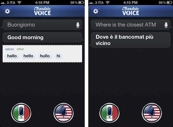
If Siri could do voice translations, I imagine they would look exactly like iTranslate Voice, as Sonico’s app borrows heavily from Siri in terms of overall interface design and style. Like Siri, iTranslate Voice displays ongoing voice interactions as conversations between you and the software; like Apple’s assistant, conversations are initiated by tapping on a circular, glowing microphone button that, however, in this app has been styled with flags. Conversations can be scrolled vertically, and tapping on single “bubbles” will you give you options to copy, share, or “speak” the words you dictated again. By tapping and holding the latest entry in a conversation, you can directly modify the words you said using the iPhone’s keyboard – this can be particularly useful to refine text input in case the app didn’t get some details right.

iTranslate uses Nuance’s speech recognition software to recognize and translate voices. iTranslate supports 31 languages, but only some of them support both voice recognition and text-to-speech. A complete list of supported languages (which also includes dictionary definitions, automatically displayed inline when available) is available on the developers’ website. Like Siri, iTranslate Voice requires an Internet connection to operate – something that, I presume, is related to some heavy server-side processing and sampling the app does in order to deliver high-quality and timely results without wasting the iPhone’s local storage.

In my tests, iTranslate Voice has been extremely accurate and reliable. I was surprised at first, but on second thought I realized that the fact that Nuance is delivering good translations in seconds as you talk to your phone shouldn’t really be a surprise at this point. I have tested the app with Italian-to-English translations (and vice versa), and the results have been more than decent – I actually think they are the best ones I have found on iOS to date, and this speaks clearly of Nuance’s strong position in the market. I don’t know if the developers are also enhancing Nuance’s results with their own engine of sorts, but the end result is what matters, and iTranslate Voice doesn’t disappoint here. The app recognized first names and terms like “ATM”, handled common expressions well, and it even understood spoken punctuation in Italian (“virgola” for comma, “punto interrogativo” for question mark, and so forth), adjusting the sentences and tone of software accordingly. Results are delivered in seconds both on WiFi and 3G, and the app also does a good job at detecting end of speech if you enable the option in the Settings.

I won’t judge Sonico’s decision to make iTranslate Voice look like Siri, but I will say that the system undoubtedly works, and makes it easy to speak to your phone to get instant, spoken translations. I can’t shake the feeling that this, like Siri, feels like the future of human-to-computer interactions being built right now, and regardless of whether Apple and Nuance will eventually bring this feature to Siri, iTranslate Voice is impressive and you can get it today.

iTranslate Voice is available on the App Store at $0.99.


The Magic Of Words, Or: Why I Am Addicted to SpellTower

I still remember the day when Chris recommended this game to me – SpellTower. When I looked at the game’s website for the first time, I asked myself whether it could be a new subject for my Inspiring UI series. Although I concluded that it would not fit the series, the website nevertheless looked like the game could be worth my time. Zach Gage, the developer, promotes SpellTower with a nice scrollable site, containing some lovely designed icons and symbols, large, mono-colored backgrounds, and some moving CSS3 flavour. It is a lovely website you should take a look at – whether you’re interested in games or not – just for the sake of admiring Zach’s work as a web designer.

But since I am interested in iOS games and I was curious to see if the game could live up to the site’s promise, I downloaded SpellTower for the ludicrously low price of $1.99 (actually, it’s currently on sale for $0.99, so please head over to the App Store to get it first, then continue reading afterwards). Allow me now to shortly recap what playing SpellTower is all about (the app features a one-minute tutorial, which also interactively explains the game’s concept). To summarize it in one sentence: to me, SpellTower is like Tetris with words.

Random blocks with letters arranged in twelve rows cover the screen, and you have to connect letters located abreast of each other. Some letters need to be included into certain minimum lengths, indicated by a small number in the top right of their square block, and words touching black boxes without letters will delete them. Blue colored letters included in a word (these are letters which are hard to incorporate into words, like “Z” or “J”) delete a whole row and generate a lot of points. Apart from those special features, the game follows one simple rule: the more letters a word has, and the more rare those letters are (a “Q” is obviously more valuable than an “E”), the more points you earn. That’s all there is to say about the game’s concept: you can start playing SpellTower within seconds, a prior condition a game needs to get you addicted to it.

This principle is translated into five different game modes, two of which you can unlock by reaching extraordinary results in the two basic ones: tower mode, where the screen is completely filled up with letters and the goal is to make as many points with them as possible; and the more tactical puzzle mode, which starts off with five rows, adding one row for each word you spell until the letters reach the top and the game ends. You can also play rush mode, which is the closest match to the idea of Tetris: rows add over time (whether you spell words or not), and you need to quickly eliminate them to prevent a letter from reaching the top. While I’m not the best at puzzle and rush mode — I do not even reach the 1000 points mark, and to unlock the fifth mode you need more than 2000 points — playing the tower mode always is a lot of unconstrained fun and makes me coming back again and again.

So, how exactly is this addiction accomplished? I think it’s a combination of three factors that Zach managed to mix perfectly: UI design, highscore competition, and a vocabulary learning process. Read more


Latest Evernote Updates Show A Promising Future

Yesterday, Evernote rolled out two major updates for its iOS and Mac apps. As a daily Evernote user who relies on the app to research posts, save PDFs, annotate images, and generally archive just about anything through IFTTT, I was pleased to see the improvements made in these versions are taking Evernote into a direction I like.

First, the iOS app. Focused on iOS 5 and the iPhone version, Evernote 4.2 brings a more accessible way of applying rich text and switching between editing and composing. Prior to version 4.2, users had to select text and hit a button in the top toolbar to bring up rich text editing – a process that was cumbersome and not as responsive and stable as one would expect from a top-notch iOS app. Evernote 4.2 abandons the separate text editing workflow and interface for a better, more integrated way of displaying text controls alongside the system’s keyboard. A new button will now let you easily switch between typing and editing, while retaining the same options that made Evernote a must-have among note-takers looking for rich text support. I like how selected text will remain selected if you switch between the keyboard and text formatting panel; surprisingly, however, Evernote still hasn’t managed to fit a Cancel button into the note editing screen. Read more


Instacast 2.0: Still the Best Podcatcher, with Pro Features

It’s not hard to talk about the latest and greatest features of Instacast 2.0 when the developer has dutifully written his own epic walkthrough of his app’s new features. Instead of having to decipher release notes and a summary of bullet point features, Martin Hering of Vemedio has already published an in-depth write-up of everything “version two” has to offer, which includes a couple pro-tips here and there for those who aren’t skimming paragraphs and looking for bolded words. The mini-manual will be a handy reference for getting adjusted to Instacast’s tap-and-hold friendly UI and advanced features.

With the features already explained in great detail, I don’t feel the need to recap everything Instacast 2.0 has to offer or explain how it works, but I do want to share some of my experiences with the app post-upgrade. There are lots of little changes that have been made and thus lots of little habits that had to be relearned. While some of the changes take some getting used to, others have been improved upon so well that I could not think of going back to an older Instacast. Upgraded player controls, playlists, and bookmarks add a new pro-layer of control without dampening the player’s aesthetic or user experience. Additional sharing features strive to strengthen online discussion around podcasts thanks to commenting and an HTML5 audio player.

Read more


Archive Blood Pressure Results Easily With Bloodnote

Nobody likes being ill, but thanks to software, nowadays we have a series of better options and tools to ease the process of logging our health. When it comes to heart attacks and related issues, obviously the first thing to measure is the blood pressure. It lays out the overall situation of our body and is a good measure to compare the health over time. Most people who need to check their blood pressure over a longer period of time use paper notebooks or little post-its for that — at some point this method is doomed to result in chaos. To ease up this process of archiving blood pressure results and to allow for easy comparisons, Peter Bajtala and Matt Ludzen developed Bloodnote for iPhone.

Bloodnote is designed as minimalist and simple as possible and does not need any big tutorial or explanation for its feature set. It saves your blood pressure results for later and you can fetch them again, whenever you like or need to. It features the standard division into systolic and diastolic pressure as well as the pulse frequency. You can flick through the past results and view them with a single tap. These are basically all features the app has to offer; they’re certainly useful, but when reviewing Bloodnote for a design series, it’s much more interesting to analyze how these features are embedded into the app’s UI.

The three values are displayed using differently colored (red, blue and green), nearly full circles. The whole app is — besides the colored circles — designed in various shades of beige, and within the circle, a darker area is indicating optimal results as a benchmark. A legend at the bottom of the screen connects the color to their respective values (red for systolic, blue for diastolic pressure and green for pulse frequency). Tapping and holding one of them dims the colors of the other circles to focus on one specific value. To enter a new value, you just tap the respective circle, drag up or down until the indicator (which automatically pops up) shows the right value. The dragging interaction is sensitive and pretty smooth, and it’s very easy to get exactly your currently measured value. Tapping the date indicator at the top brings up a slide calendar to move to a specific date in the past and take a look at the respectively measured results.

Bloodnote is a really thought-out iPhone app. Its design just serves the functionality and makes it both simple and — if you can say that — fun to a certain extent as well. It makes recognizing the different values as well as changes over time very easy, and therefore is a very good and time-saving way to enter and archive blood pressure results. You can get Bloodnote for $1.99 on the App Store.


Review: TouchArcade for iPhone

Part of Arnold Kim’s other sites, AppShopper and MacRumorsTouchArcade is one of my favorite weblogs: I  read it every day. Whether I’m reading about upcoming iOS games, news, or searching the forums, TouchArcade is simply one of the best resources for iOS gaming available. They’ve been around for 4 years, and for a website that’s a lifetime. I jumped when I was asked to help be part of the beta team for an iPhone version, and today, TouchArcade has released their very own iPhone app with the help of Flexibits and Bartelme Design.

When you first launch the TouchArcade app you will see a featured story on top along with a navigation list below for News & Reviews, Top Reviews, Hot New Games, Watch List, and Forums. On the right is a flickable list of their Hot New Games section with icon previews, and this is one of my favorite features of the app. If you’re looking for a great game to purchase this is the first place to look, and the list is constantly being updated too.

Read more


Invy Is An Iconic Date Planner For iPhone

What do you prefer when it comes to apps: functionality or ease of use? Most people would answer “a combination of both, a good compromise”. It might be true in many cases, but sometimes the balance between those two sides is not the right goal, and to meet a specific niche you need to move into more extreme directions. Invy, a new iPhone app by Bread & Pepper, helps you to set up meetings or dates and inviting friends, family or colleagues to them, and it’s a good example how such a hard decision can turn out pretty well.

Creating appointments and inviting other people to them is nothing new; it’s more or less integrated in any sophisticated calendar or even mail application. Because of this, often developers cannot focus on functionality while creating new apps in this area anymore; they either need to create a gorgeous design to convince users to buy their product, or they need to make one specific feature a must-have. Here lies the reason why I chose writing about Invy: it has got both.

When firing up Invy for the first time, you’ll need to register your email address from which you’ll send out invites to other people. To create a new event, just tap the create button at the top, set the date’s description and location, invite recipients, set day and time and hit send. Within seconds, everyone you invited will get the same information in their inbox (emails are designed similarly to the app; see image below). Invitees can accept or refuse to participate: those who have Invy installed on their iPhone will be brought to the app, while everyone else can confirm the date via the Invy website.

All your set dates are displayed in a very elaborately designed list view in the app’s main window. By tapping one of them you can investigate all the attached details and how many people already answered the invite. If you set up the date, you can modify and fix it, and Invy automatically saves the appointment in iCal — and thus on every device with iCloud sync. Invy is intuitive and serves exactly one need: setting appointments and dates easily, and with style.

Responsible for Invys good UX is its clean and bright design, which is centered around the use of big, colored sans-serif typography and white background to automatically focus on the most important information: the dates you set. The big date descriptions change their color when they go through the process of sent invites, answered invites and fixed dates moving from a light blue (just sent) to red (fixed and saved date). This doesn’t just look good, it also ensures a fast recognition of whether a date already is important to you or not.

So Invy is a great date planning app, but nothing more. It has a really focused feature set, and serves those features in a fast, easy and good-looking way. I recommend Invy as a way to plan dates within small groups of people, like in businesses or families, especially when all members have got an iPhone and are likely willed to pay $1.99 for Invy on the App Store.


Mirroring Multiple iOS Devices To A Mac: Comparing AirServer and Reflection

In my review of AirFoil Speakers Touch 3.0, I wrote about AirPlay:

Ever since developers started reverse-engineering the AirPlay protocol that Apple introduced with iOS 4.2 in November 2010, we have seen all kinds of possible implementations of Apple’s streaming technology being ported to a variety of devices, for multiple purposes and scenarios. From tools to turn Macs into AirPlay receivers for audio, video, iOS Mirroring sessions, then a combination of all them, to more or less Apple-approved “AirPlay audio receivers” sold in the App Store, then pulled, then released in Cydia, the past two years have surely been interesting for AirPlay.

The past few months have indeed seen a surge of AirPlay-compatible desktop utilities and apps that take advantage of Apple’s technology for audio and video streaming. From games enhanced with AirPlay to enable new controls and interactions, to several desktop utilities that are now connecting Macs and Apple TVs with AirPlay, there’s plenty of options out there to beam images and audio to devices running iOS or OS X.

AirServer was one of the first applications to bring proper AirPlay support to the Mac, initially only with audio and video, then iOS 5 and Lion, and, around the time Reflection also came out, AirPlay Mirroring. Recently, the AirServer team made some major changes to the way AirServer handles AirPlay Mirroring (our overview) on OS X with multiple iOS devices, so I thought it’d be appropriate to give the app a second try. At the same time, I figured I hadn’t used Reflection much since it came out two months ago; I installed both the latest AirServer and Reflection on my iMac and MacBook Air, and tested multiple iOS devices with AirPlay Mirroring enabled at the same time. Read more