This Week's Sponsor:

Copilot Money

Copilot Money, The Best Money Tracker, Launches on the Web – Limited-Time: Get 26% Off + 2 Months Free


Posts in reviews

EverClip and EverWebClipper 2.0

EverWebClipper

EverWebClipper

Earlier this month I reviewed EverWebClipper, an iOS app to quickly beam webpages and URLs to your Evernote account using a bookmarklet in Safari. I wrote:

Where EverWebClipper really wins over Evernote’s standard clipper (not optimized for mobile and terrible to use in Safari) is the actual clipping process. It’s entirely automated: you can install a bookmarklet in Safari and save webpages with one tap. This happens thanks to the app’s Automation settings, which enable you to tap on the bookmarklet, and have Safari automatically return in the foreground while EverWebClipper completes the saving process. You can return to Safari “immediately” or “after clipping” — if you choose immediately, the app will send a local notification when it’s done clipping.

Yesterday, EverWebClipper received a major update to version 2.0, which adds some powerful new functionalities to the app, including the possibility to clip multiple pages one after the other without waiting for completion. With a new Tasks area in the bottom tab bar, EverWebClipper now lists tasks (clippings) that have been completed (and thus sent to Evernote) and those that are still running. Once clipped, the app will display an ambient notification, or fire off a local notification if you’re not inside the app.

More importantly, the new support for multiple clippings is also reflected in the app’s own engine: EverWebClipper now comes with a background monitoring option that allows you to clip links or HTML content (text) without switching to the app. Using iOS’ own background monitoring API (which lets third-party apps run a background process for roughly 10 minutes), the app will detect any “copy” command and ask you if you want to clip that content by tapping on a notification. You can ignore the notification and the copied content won’t be clipped, or you can tap on it and EverWebClipper will perform as usual. This option is pretty neat – the obvious limitation, though, is that it can’t run in the background all time, so, eventually, you’ll have to go back to the app, either by launching it or using the bookmarklet.

EverWebClipper

EverWebClipper

I think EverWebClipper 2.0 is a great update – I only wish that it handled copied URLs and HTML better in the title field: right now, it uses “Untitled” and “Copied HTML”, which isn’t really convenient in Evernote.

Last week, I was also recommended to check out EverClip, a similar application that can send text, photos, and clippings to Evernote. Unlike EverWebClipper, EverClip doesn’t come with a bookmarklet, which is a fairly big downside for my workflow. The app only works with a background monitoring system: it runs in the background for up to 10 minutes, theoretically looking for things you copy to store it in its own clipboard, ready for uploading to Evernote. In actual usage, the app failed to grab text or images I copied on multiple occasions, but at least it played a sound effect when I hit “Copy” inside other apps.

EverClip

EverClip

EverClip

EverClip

EverClip isn’t as automated and immediate as EverWebClipper – in fact, you’ll have to manually upload items to Evernote with a Send button. You can add tags and titles to keep notes organized, but on iOS, I’m looking for a fast clipper, rather than another Evernote organizer (for that purpose, I think the Evernote app is pretty good).

There are two things I like about EverClip: it can merge multiple clippings in a single note, and it’s got a URL scheme for Launch Center. The first option is very welcome and I think more apps should adopt it, the second one is nice to have, but it doesn’t support Launch Center’s clipboard and input prompts yet (therefore making it kind of useless right now).

EverClip is $1.99 on the App Store, and I’m looking forward to future updates.


Browsing Instagram and Facebook Photos with Cooliris

Cooliris iPad

Cooliris iPad

Formerly known as PicLens, I used to rely on Cooliris years ago to browse images and slideshows on the Internet in a more visual interface. Resembling a virtual wall with great focus on large, neatly arranged thumbnails for web content, Cooliris has always been one of the most interesting experiments in terms of browser integration and overall presentation. For the past few days I have been using Cooliris’ latest iteration, a universal app for iOS, and I am quite impressed with the results.

Cooliris also developed Discover, a Wikipedia app for iPad that turned articles into magazine-like layouts. The standalone (and free) Cooliris application is a new take on the old browser plugin, but it shares the same attention to detail and care for interface design of Discover.

Cooliris has always been about browsing photos, and this new iOS version is no exception, only it’s a more modern app that takes into account the changes that have happened to social photo sharing on the Internet in the past years. Read more


WriteUp 3.2 Adds Swipe Selection On iPad

WriteUp

WriteUp

WriteUp is one of my favorite text editors. Since I published my comparison of text editors for iOS – with a focus on the iPad –the app has been vastly improved thanks to a major 3.0 update that added iCloud sync, a split browser, and possibility to “pin” notes and folders and mark them as favorite. While other text editors like Writing Kit may have better researching tools, or serious automation features like the macros of Nebulous Notes, I still like the streamlined UI of WriteUp to easily navigate across my Dropbox folders (the app can open any folder or sub-folder in your Dropbox) and create notes that require copy & paste from a webpage.

When version 3.0 was released, I wrote:

With strong sharing options, support for Versions (another feature most iOS text editors are lacking), images, custom CSS previews, and all the other features of version 2.0, WriteUp 3.0 has still some rough edges, but shows an incredibly promising, and possibly even more powerful text editing future.

With version 3.2, released earlier this week, WriteUp aims at making its text editing more “powerful” by addressing a popular concern of users of iPad text editing apps: text selection. Inspired by the Hooper Selection concept video that made the rounds back in May, WriteUp 3.2 allows you to move the cursor on screen by swiping with two fingers on the virtual keyboard. You can also swipe with three fingers to select text.

While slightly different from the concept video (apparently, several developers have struggled to find ways to activate the text cursor or iOS text selection with gestures performed directly on the content area), WriteUp’s implementation is still solid and, in my opinion, one of the best so far (a number of iPad apps followed up in recent weeks with similar takes on cursor navigation and text selection, all of them implementing two-finger swipes in different ways).

The fact that WriteUp’s swipe selection happens on the keyboard doesn’t, however, trigger keystrokes, and it can be used both vertically and horizontally. In my workflow, this is particularly useful to navigate Markdown list-based documents I create in Nebulous Notes (thanks to macros) and make changes without having to manually (and slowly) select everything. Most of all, I like how WriteUp’s swipe selection doesn’t get in the way with a custom UI and additional virtual trackpads (like other apps do).

WriteUp 3.2 also adds new features like research bookmarks and history suggestions, and new fonts. It’s a good update, and I recommend it. Get the app here.


Alfred 1.3 Improves System Navigation with “File Buffer”

Alfred 1.3

Alfred 1.3

Released yesterday, Alfred 1.3 is a major update to the popular desktop application aimed at “increasing your productivity” on OS X. Started as a simpler app launcher, Alfred has, in fact, evolved into a much more powerful – yet always accessible – solution that goes beyond the simple definition of a “launcher”, like Spotlight would be. I use Alfred on a daily basis to browse my file system, compose email messages,  search the web and even look for my favorite songs on Rdio. Alfred was once a launcher, now it’s much more. In my workflow, it’s an app that makes the core features of OS X work better for me.

I particularly appreciate the improvements brought in version 1.3 as they address a usage scenario I often find myself dabbling into: selecting multiple files in the Finder to move them to another location. For instance, in writing my Mountain Lion review, I took a lot of screenshots; those images had to be cropped, resized, and re-composed to fit the layout of my article. Once edited, I had to move them from the Desktop – where OS X creates my screenshots – to a sub-folder in Dropbox, which, through a custom script, they are uploaded to our CDN, returning a URL. With Alfred’s new File Buffer functionality I saved precious minutes I would have otherwise spent opening the Finder and navigating with the trackpad.

The File Buffer is basically a virtual “shelf” that can temporarily host files you want to act on. Configurable in Alfred’s Preferences, you can set the Buffer to be cleared after actioning items, or after five minutes if items you selected haven’t been used.

Alfred File Buffer

Alfred File Buffer

File selection is integrated with Alfred’s existing navigation capabilities. In Alfred, you can browse your Mac’s file system with the keyboard, finding documents and folders you need and choosing from a set of actions to do stuff with them. These actions include, by default, an Open command, Reveal in Finder, Copy Path, Move, Copy, and more; they are entirely actionable with the keyboard, so you’ll be able to, say, unzip a folder and forward its contents via email to a contact without lifting a finger from the keyboard. Furthermore, you can assign favorite locations – in my case, Desktop and Dropbox – to a hotkey, and tell Alfred to open them in its own navigation, rather than the Finder’s.

With the Buffer, you can now select multiple files and act on them at once. So while writing, I was able to bring up the Desktop in Alfred, select multiple screenshots, move them to Dropbox, then launch the .txt file where image URLs get appended to. The Buffer was a huge timesaver, and, for the future, I hope Alfred will make it easier to create custom actions (right now, here’s how you can do it) and specify custom locations for the Copy and Move commands (you can type a folder’s name to instantly bring it up).

When working with the File Buffer, I often select images that I want to move or delete. Alfred’s navigation window features a thumbnail preview for files, but sometimes that’s too small to really see whether or not I’ve selected the right file. Thankfully, version 1.3 introduces support for Quick Look through the Shift key or by hitting Command-Y on a selected file. Quick Look works both in default results and the File System navigation.

Alfred Quick Look

Alfred Quick Look

Version 1.3 brings many other features, improvements, and fixes as well. There is now better integration with 1Password, a new way to show more results, a compact mode, and a “quit all” command to quit all running apps. Make sure to check out the full change log for a complete list of changes.

Alfred has become an essential piece of software in my daily workflow, and I’m glad I decided to give it a chance two years ago. You can download version 1.3 from Alfred’s website, and unlock all the app’s functionalities by purchasing the Powerpack.


Checkmark Review

When iOS 5 came out last year, I wrote about location support in Reminders:

One of Reminders’ key features is its location-based alert system. Thanks to Apple’s geo-fencing technology introduced in iOS 5 — and open for third-party developers to create apps with — the app can send you an alert when you’re about to “arrive at” or “leave” a particular place. This can be useful if you, say, want to be reminded of groceries when you arrive at the supermarket’s parking lot, or don’t want to forget about those documents when you’re leaving the office. There’s a caveat though: you can’t manually type an address as Apple chose to restrict this feature to a “contact location”. This means the address will have to be already attached to a contact in your Address Book, which can be inconvenient if you don’t want to keep the supermarket among your friends and family contacts. On the other hand, I assume Apple has done this for two reasons: saving users the time of typing addresses, and providing a familiar way to access often-used locations.

For the most part, Reminders works fine as a lightweight todo manager synced across devices and platforms. However, if you’re serious about location reminders and would like better control over how geofencing is triggered, Apple’s software won’t cut it. Because of Apple’s implementation – restricted to addresses associated with entries in your Address Book – iOS’ Reminders effectively forces you to create new contacts for places that you might need someday. So if you’re planning on setting up reminders for when you leave the grocery store, the office, the local coffee shop, or your friend’s house, you’re going to have to configure those in Address Book. Which, if you want to set up quick reminders for tasks that you won’t repeat on a daily basis, is a rather cumbersome process.

Furthermore, Apple’s Reminders isn’t the most streamlined application when it comes to the number of taps required to create a new item with due dates or alerts. Especially for location, in Reminders you’ll have to:

  • Create a new reminder and type;
  • Hit Return;
  • Select the reminder;
  • Tap “Remind Me”;
  • Select “On Location”;
  • Choose “When I Leave” or “When I Arrive”;
  • Tap “Location”;
  • Choose an address;
  • Go back and hit Done.

A 9-step process (10, if you want to pick an address from your Contacts) to create a reminder with attached location data. Can it be done better?

For the past month, I have been testing Checkmark, a highly-hyped and recommended new app developed by Snowman aimed at simplifying and speeding up the process of creating reminders on your iPhone. I found Checkmark to be a great replacement for Apple’s Reminders, and the kind of app that fits with my way of thinking, rather than forcing me to understand its rules and patterns.

Checkmark creates location and time-based reminders. It is a third-party app, so it won’t sync with the official Reminders app, nor will its reminders show up on the iPad or other devices (Checkmark is iPhone-only for now). When you open the app for the first time, you’re greeted with a first-launch tutorial that will teach you the basics: you can save favorite locations, view your current and completed items, or create a date/time based reminder if you don’t want to be reminded at a specific location. That’s it.

The main screen sports an intelligent design that trumps Apple’s design in terms of usability and speed. It is organized in two tabs – Where and When – that make it instantly clear which kind of items you can create, and how you can navigate between them.

The problem with Apple’s Reminders, as I outlined above, is that location is relegated to second class citizen spot inside the Address Book, rather than being displayed front and center in the app. Attaching location alerts to a reminder takes too many taps; a todo manager – no matter what kind of tasks it supports – should be fast, easy to use, and capable of receiving new items quickly. For this reason, the Checkmark developers organized the location screen as a grid of places: these are your favorite locations, they’re easy to tap on, and they are displayed through custom icons and names you can choose from a location’s settings.

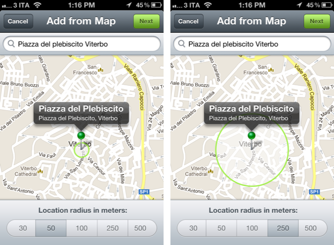
Checkmark is smarter than Apple’s Reminders: when you add a new location, you can use your current location, add an address manually from the integrated map view, and only as a last option you can import a location from your contacts. In the map, you can drag and drop the pin to adjust the position, and choose a location radius to tweak the behavior of the geofence – should the app remind you when you’re 30 meters from home, or 250? These are functionalities that Apple’s software is still suspiciously lacking, even in the upcoming Mountain Lion (except for manual addresses, which Apple seems to have implemented in 10.8).

My favorite feature of Checkmark is its streamlined way of adding new location reminders. From the main “Where” screen, you can tap on a location to view all the reminders associated with it; tap the + button in the upper right corner, and create a new one with a title and (optional) notes. Set arrival or departure – depending on whether you want to be alerted when you arrive at a place, or leave it – and hit Save. Done. Unlike Apple’s app, it takes me 10 seconds to set up a new location reminder in Checkmark.

Checkmark also combines a timer functionality with geofencing. Say you want to be reminded about today’s meeting 30 minutes after you arrive at the office; or perhaps you want to be reminded about buying milk 15 minutes after you leave while you’re on your way home. In the Details screen of a location reminder, Checkmark lets you set a timer for 5 up to 60 minutes “after” you leave or arrive at a location.

Another nice touch of Checkmark is how the app calculates the distance from a location. Similarly, I am a fan of the custom sound alert the app uses for Notification Center; notifications (reminders, sound alerts, text alerts, and badge counts) can be configured in the app’s preferences inside Settings.app.

Being a utility that runs in the background all the time through Location Services, when I first installed Checkmark I was concerned the app would use too much battery. After weeks of testing, I can say that with the “normal” accuracy I haven’t noticed a substantial drop in battery life. This comes, however, at the cost of precision with location alerts, which sometimes went off a minute later than expected. By setting accuracy to “best”, precision got considerably better but I noticed the app was draining too much battery.

Checkmark isn’t just a prettier Reminders app, it is a better take on a concept that Apple first explored but somehow failed to properly implement on iOS. Checkmark won’t sync to your iPad or Mac, so here’s to hoping the new Event Kit framework for reminders in iOS 6 will allow its developers to turn Checkmark into a new interface and experience for iCloud reminders. Checkmark doesn’t work with Siri either, so if you rely on the voice assistant to quickly create reminders, you might want to reconsider your workflow and the importance of Apple’s Reminders before making a decision. However, right now, I find Checkmark to have powerful features for location and time-based reminders, and I highly recommend it.

Only $0.99 on the App Store.


Tweetbot for Mac: Public Alpha Review

Today, Tapbots released the first public alpha of Tweetbot for Mac. This is not a final review of the app: being in the development stage – albeit ready to be tested by the public – Tweetbot for Mac is still lacking several features that will be available in the final Mac App Store version (such as iCloud sync and Notification Center support), and for this reason I’ll save my full analysis of the app for the future.

However, I have been testing Tweetbot for the past week, and I can say that it already is the best Twitter client available on the Mac. Read more


Twitter, Twitter 4.3, and The Mixed Message

The new Twitter recap

As I was telling a fellow compatriot on Twitter, the Twitter apps exist as the gateway drug. Twitter’s app isn’t for the Tweetbot socialites who are connected to their timelines 24/7, nor is it for the Twitterrific users who treat Twitter as the break room water cooler. While many writers were waxing poetic on a disappointing update following the leave of Loren Brichter from Twitter, I tried to look at how Twitter was making their experience friendlier for everyone, and not just for the power users (who have, admittedly, established Twitter as what it is today).

Twitter’s focus shifted to answer two questions, “How do we retain users who leave because they don’t get Twitter, and how do we make money?“ The Twitter app exists not to serve people who want to mange their timelines, but for people just joining the service. It exists to show new users what Twitter is all about: this was made obvious with the Connect tab ousting Direct Messages. Its sole admission is to help newcomers get accustomed to finding and following people, things, or companies they are interested in. Then there’s Promoted Tweets which insert themselves into your timeline — it’s as intrusive as an advertisement but so far minimally impacts the experience. Twitter’s app is designed to show what you can do in (what I think) is an aesthetically pleasant package. It’s not for you, Tweetbot users.

Trying to defend Twitter gets people upset. Most everyone who read MacStories and are interested in tech want features — they want the Twitter emblematic of Tweetie and Tweetbot, not of the new Twitter. And I certainly understand that Twitter took away what was once an optimal experience for lots of people. In my approach, I understand that while Twitter shunned power users (which Tweetie users happened to be), they’re trying to make something everyone can use. It’s not an app fraught with finicky settings, but rather an app that provides a simple, core experience. I initially reviewed Twitter from a perspective of a newcomer — I think the app looks nice and for what functionality it does provide, that functionality works as intended. Unfortunately for Twitter, this message isn’t getting across. The audience Twitter wants (the audience I tried to put myself in) isn’t as vocal as the established user base is.

Let’s be honest: even I, despite trying to account for what new Twitter really is, use Tweetbot — heck, I still go back to my old favorite Twitterrific from time to time. And I don’t think anyone should mind that Twitter’s app exists as-is if Twitter is presenting their app as the gateway, and not as the path. I’m in agreement with what Twitter is trying to do as long as their app coexists peacefully with 3rd party Twitter clients. However, I’m not going to continue making my claim for why Twitter’s experience is okay if they’re shunning 3rd party developers and sending mixed messages in the process. I’m not okay with Twitter’s experience being the only experience.

Read more


Guitar Pitch Pipe Lets You Quickly Tune Your Guitar

News from Hypercompact, the software company whose logo has inspired designer Evgeny Skidanov to create one of the most beautiful 3D animations I’ve ever seen. If they had published their app Guitar Pitch Pipe just one week earlier, I definitely would’ve integrated it in my story about the current state of music-making on the iPad — filed in the “small tools” sections. This guitar tuner is a perfect example for a small, reliable companion for guitarists on the road.

The App Store is flooded with guitar tuners. Apps like the UltimateGuitar tuner or Gibson’s effort are very prominent and elaborate apps — why considering this one then? Well, because it has one thing these other apps most of the time do not have: an innovative and simple UI. Guitar tuner apps are generally cluttered with features just a few percent of guitar players need like alternative tunings or the ability to change the tuning frequency; unfortunately, they are placed as prominently in the app as the standard tuning. This makes many tuner apps unnecessarily complex.

Guitar Pitch Pipe is different from that. Using a single main window, it plays back the six notes of the basic, 440Hz EADGBE guitar tuning with two different sounds: pipes (being the more unusual sound, and therefore integrated in the app name) and “classic” strings. The selected one is displayed in a visual interface, including tappable strings or pipes with the note characters on them. The currently playing pipes or strings are indicated by a closed pipe illustration or a cool 3D movement respectively. You can switch between these two layouts using the button in the top right corner.

You can either let Guitar Pitch Pipe play a note twice with a little pause in between for tuning, and then move on to the next one, or manually choose a string using the on/off switch at the bottom. The app then plays it until you move to the next one by tapping the respective string or pipe. The app constantly plays a note, there is no way, you could make it silent. Because of this you are more or less forced to only open it up when you really want to tune a guitar, otherwise it quickly becomes pretty annoying. This ensures a quick and focused use of the tuner, and makes it unobtrusive and functional.

The output sounds are very accurate, fitting to tuning both electric and acoustic guitars, and therefore make the app a very useful tool. The second reason for me using the Guitar Pitch Pipe guitar tuner from now on is its UI. We recently covered WTHR, a Dieter Rams inspired, minimalist weather forecast app for the iPhone. Guitar Pitch Pipe is quite similar to it. The app features no instructions or settings (because it doesn’t need any in its current state), it is colored beige, and uses skeuomorphed, plastic switches. The fretboard with strings and the pipes are crafted with love for detail; they are gloomy and very polished. It also features a cool icon but has a confusing description: “Super Quick”. The user could believe that the app is super quick, but without remembering which kind of app is behind the icon, it is very confusing.

However, while using the app for the first time, I immediately thought “Man, you could do much more with this design”. Retrospectively, this is still totally true: this app has potential to be enhanced with many new features while still maintaining its usability and simplicity. You could just add a second button, let’s say in the top left corner, make it trigger a pop down menu (which obviously needs to correspond with the rest of the app’s design), and let the user switch to alternate tunings like Drop D or C, or maybe even let them change the frequency. You wouldn’t need to change anything in the main screen design, just the sounds and the letters on the pipes or next to the strings to indicate different notes. This would make the app an even more complete and functional guitar tuner, suited for every type of guitarist — traditional (using standard tunings), metal and rock (dropped tunings) and progressive and experimental players (open and alternate).

But don’t get me wrong — Guitar Pitch Pipe already is a very good guitar tuner for the iPhone. Its output quality is outstanding, it’s fast and reliable, perfect for quick access, and does everything you need for tuning your guitar in standard tuning. There is just one thing that really annoyed me in its current version: sometimes, for instance when you use dropped tunings (which I personally use very often), you need some time to get back to standard tuning, especially on the lower E string. When you’re using Guitar Pitch Pipe’s automatic mode for that, the app plays each string just twice and then moves on to the next one, which is way too short in such situations. Users definitely must have the option to adjust how often single notes should be played back in auto mode. Otherwise, I absolutely recommend Guitar Pitch Pipe for any guitarist who is still searching for a good guitar tuner for his iPhone. Get Guitar Pitch Pipe for $0.99 on the App Store.


Quickly Send Webpages To Evernote with EverWebClipper

As I explained in my previous look at my writing workflow, I use a selection of tools to save notes and other bits of text to Dropbox and Evernote. While such array of applications and utilities is ever-changing due to the very nature of the App Store, the core intent of being able to distinctively store text in separate locations stays true regardless of app updates and new releases.

I use Evernote as long-term storage for a variety of text and media that isn’t necessarily an article I need to work on inside a dedicated text editor. I keep images and PDFs that I may want to reference in the future in Evernote; I archive my own tweets and favorite tweets in two separate notebooks using IFTTT (thanks to Evernote’s search, I consider this a DIY alternative to Cue, which I also use); I keep digital scrapbooks with screenshots, design inspiration material, and app documentation stored inside Evernote, and often shared with colleagues. Dropbox is for text; Evernote is for other kinds of text and more.

It doesn’t happen very often, but sometimes I want to archive webpages or links in Evernote as well. On my Mac, I use a couple of AppleScripts put together by our Don Southard to quickly archive URLs or text-based versions of webpages in my Evernote inbox for later processing. On iOS, I have been using a simple tool called EverWebClipper to instantly beam webpages from Safari to my Evernote account.

EverWebClipper isn’t pretty but it’s functional. Furthermore, it’s one of those tools that you don’t really need to look at, as much as you need to ensure it can work reliably in performing the functionality it was made for.

The app can be used to save webpages as URLs, styled pages, or “simple” ones. The styled option will try to preserve the original design of a webpage while allowing you to still edit text and other elements in Evernote; the “simple” clip style will strip out graphics and other elements from webpages, trying to focus on text and hyperlinks.

In actual testing, I found the styled setting to work reliably for minimalist sites like ShawnBlanc.net and Marco.org, suffering a bit in rendering graphics afterwards with sites like ours, or The Verge. However, it’s very convenient to be able to archive webpages “as they are”, even if some icons may be misaligned or missing. I’m not the biggest fan of Evernote’s “simple” mode for webpages, so I was bummed to see the app has some issues in saving the styled version of Instapaper-mobilized articles, which I prefer (and often convert to PDF on my iPad using Save2PDF).

Overall, I welcome the URL option; I like the possibilities offered by styled clips (though they’re hit or miss depending on the website); but I wish the “simple” setting would use a more capable parser like Instapaper’s.

Where EverWebClipper really wins over Evernote’s standard clipper (not optimized for mobile and terrible to use in Safari) is the actual clipping process. It’s entirely automated: you can install a bookmarklet in Safari and save webpages with one tap. This happens thanks to the app’s Automation settings, which enable you to tap on the bookmarklet, and have Safari automatically return in the foreground while EverWebClipper completes the saving process. You can return to Safari “immediately” or “after clipping” – if you choose immediately, the app will send a local notification when it’s done clipping.

There are other settings available in the app, as well as a manual mode to paste URLs and specify notebooks and tags every time, rather than through the bookmarklet.

At $3.99 for the iPad version and $2.99 on the iPhone, I don’t like EverWebClipper’s pricing scheme, and I think the developer should consider making a single universal version – especially considering the minimal differences in terms of features and design between the two. However, EverWebClipper provides a better experience than Evernote’s own bookmarklet for grabbing entire webpages (not portions of them) on iOS, so you should check it out if you’ve been looking for a solid mobile Evernote clipper.