This Week's Sponsor:

Finalist

A paper-inspired daily planner with notes for iPhone, iPad, Mac, and now Apple Watch. A day you design your way.


Posts in reviews

Jasmine: Free, Elegant YouTube Client for iPhone and iPad

In my ongoing coverage of YouTube apps for iOS (a rising trend following the removal of the official YouTube app from iOS 6), I have been able to test Jasmine, a new YouTube client developed by Jason Morrissey, creator of Alien Blue.

If you’re looking for a YouTube app that’s elegantly designed, easy to use, and that runs both on the iPhone and iPad, I think Jasmine is your best option for now. And knowing Jason, I believe the app will soon get better with fixes, more features, and improvements to the interface. I’ve been testing Jasmine for the past two weeks, and especially on the iPad, the app has become my go-to client when I want to sit back and watch some videos on YouTube.
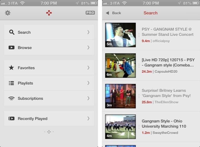
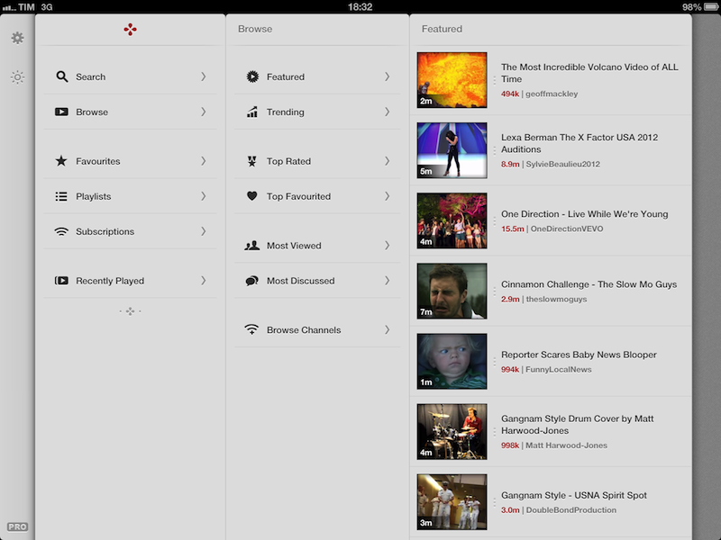
Both on the iPhone and iPad, the app has a light gray color scheme with font and menu navigation choices somewhat reminiscent of Morrissey’s work with Alien Blue; the app is fast at moving between sections, and you can tap on the status bar to switch to a “night mode” that makes the entire UI black. On the iPad, the app makes use of a Tweetie-inspired panel navigation, both in portrait and landscape mode; the performances are good, and panels contribute to facilitating the process of instantly seeing whether a video belongs to a playlist or a search query. Speaking of search, one of Jasmine’s nicest touches is the search field, which rotates and expands inline with a cute animation. I’d like to see search suggestions in a future update, though.

In Jasmine – like any other client these days – you can log into your YouTube account, or use the app to just search and browse YouTube content. The main screen/panel features shortcuts for search, browse, favorites, playlists, subscriptions, and recently played videos. The latter is just a local collection of videos you’ve watched on your device – it won’t sync with History on YouTube.com or another instance of Jasmine on another device (idea: iCloud sync could be used to sync videos across devices). The “Subscriptions” section, on the other hand, does synchronize with channels you’ve subscribed to through YouTube’s website (or another app), and lets you watch videos on a single channel basis, as well as a list of “latest videos” from all subscriptions – a useful feature to catch up on every new upload. Furthermore, if you want to discover more channels, you can search, enter a specific username, or check out YouTube recommendations in-app.

As I used Jasmine, I noticed I kept coming back to the “Browse” area. I don’t typically do this on the (cluttered) YouTube website, but I found myself casually checking out YouTube’s Featured and Trending videos a lot more with Jasmine.
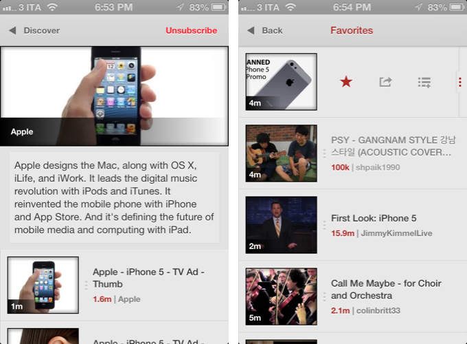
Both channels and videos are presented with their own custom page. Videos have a large thumbnail at the top (which you can tap to play), and more actions below, such as comments (you can leave new ones), a link to the uploader’s page, description, ratings, related videos, mark as favorite, add to playlist, and share. Sharing supports the services iOS natively comes with, and is presented through the new iOS 6 share sheet. There is no option to set a specific streaming quality (like in Tube+), but there’s a setting you can turn on to be asked every time which kind of quality you’d like to load a video with (medium, 720p, etc).

If you don’t want to open a video page to share or mark as favorite, you can swipe on a result to bring up an action bar with buttons to share, add to playlists, and star. The same can be accomplished by tapping & holding a video, and I wish this feature also allowed me to quickly open an uploader’s page, like FoxTube does.

There are some things I wish Jasmine did better. For instance, I can’t find a section to catch up on the videos I “saved for later” on YouTube; and speaking of available sections, I think that, on the iPad, the larger screen could allow for an option to save personal shortcuts (say, to a playlist or search) in the sidebar.

On the surface, Jasmine looks extremely simple. But don’t let the app’s clean design and no-clutter approach fool you: Jasmine packs a lot of YouTube functionalities as well as nicely implemented little touches (the pinch-to-close gesture to dismiss panels on the iPad, the custom pull-to-refresh animation) that make for an intuitive and pleasant YouTube experience on iOS. And like I said above, if you own an iPad and have been looking for a great YouTube client, you should check out Jasmine.

Jasmine is free, with an in-app purchase to unlock parental controls and support the development of the app.
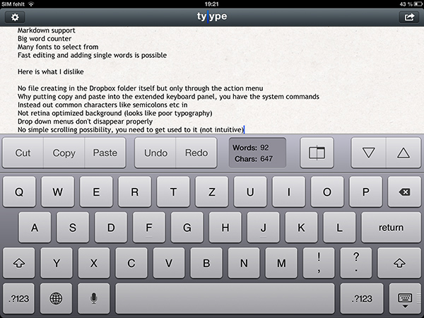
Review: Tyype HD for iPad

Text editors on iOS are always difficult to review. More or less everyone who writes on a computer or other digital device has a favorite mobile and desktop text editor, and is accustomed to the workflows connected to it. To give an example, I am totally in love with iA Writer. Its easy iCloud sync options, readable typography, and Focus Mode fit my needs. I don’t need Markdown, lots of different fonts, or an extensive amount of settings. I just want to write, and with iA writer I found the perfect, distraction-free environment to do so.

However, when I recently discovered Tyype, a new iOS text editor by Polish app development company Appvetica (who also developed apps like QRSight, an OS X QR code scanner), I got curious. Their clean, minimalist website and product video promise a text editor with easy text navigation, selection, and copying using custom gestures. Its interface seemed easy to understand, and the icon looks gorgeous. So I went ahead, downloaded Tyype HD for the iPad (which I’ll refer to as “Tyype”) and starting writing with it. Unfortunately, I have to say that Tyype does not work as great as it is shown in the demo video on the app’s website. But it’s certainly not a bad app either. Read more


Some Brief Thoughts on Apple’s New EarPods

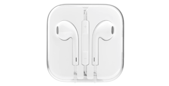
Apple's EarPods in their packaging

Apple’s EarPods in their packaging

They’re the most comfortable pair of earbuds I’ve owned. I feel like the EarPods were shaped just for my ears. The buttons on the remote are fatter and have a satisfying click. There’s some bass where there really wasn’t any before. Mids and highs sound balanced, even if detail found in more expensive in-ear headphones is lacking. Comparatively to Apple’s old buds they’re much better. Personally I think they look sharp — it’s like having two tiny spaceships dock with your aural receptors.

The EarPods’ design gives it a unique benefit over traditional earbuds: they block more outside noise and are similar to in-ear headphones in this manner, which provide complete noise isolation by the means of fitted plugs. My ears are small, and I’ve had consistently bad luck with in-ear headphones, the smallest plugs always being too large and uncomfortable. Plus, I’m not one who sits still — noise from brushing the headphone cable bothers me. With the exception of maybe the old stocky earbuds that came with the iPod video, Apple’s earbuds have been the most comfortable for me. The new EarPods don’t leave my ears sore after a few hours of wearing them while writing, doing chores, or whatever. A good in-ear pair of headphones (even a pair of $99 Shures from Best Buy) will likely be much more impressive sounding for discerning music lovers, but I’ll take comfort over the omg-my-ears-feel-stuffed-and-my-head-is-going-to-split-open feeling. Everyone’s ears are different (e.g. they fit loosely in Gabe’s ears.)

I’m not a fan of how Apple wraps their cable at the plug and (now at) each stem of the EarPods. The small gray sleeve wrapping around the rubber cable still feels thin and will eventually tear as they have with all my older Apple earbuds, whereas the latest Apple Dock Connector to USB Cables have thick textured end sleeves that feel tough and durable.

Apple’s EarPods are convenient, add extra thump to bass and drums in your music, and come bundled with a new iPhone 5, iPod touch, or iPod nano. Are they worth $29 by themselves? When my current pair wears out or if I lose them, I’ll buy a new pair (I haven’t worn anything else that’s as comfortable). Although you should probably listen to the technology savants from The Wirecutter if you want to save some money or equip yourself with better sounding buds. My choice simply comes down to comfort and having headphones for when I’m traveling, need my hands free during a private call, and for when I need to tune out or not disturb someone else from something.


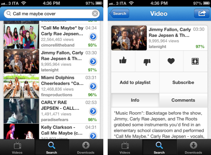
Tube+ Is A Clean and Fast YouTube Client for iPhone

With Apple removing the built-in YouTube app from iOS 6 and Google releasing its own (pretty good) official app on the App Store, we should expect a renewed interest in third-party YouTube clients offering alternative features and designs. Tube+ is one of the first apps to hit with the “new wave” of YouTube clients, and I like it.

Developed by Chocomoko, Tube+ is simpler, both in terms of design and functionalities, than YouTube’s own app, or my favorite third-party client to date, FoxTube. You shouldn’t judge Tube+ by its streamlined appearance, however, as the app has access to some features and options that not even the official YouTube app has (for now). You can use Tube+ with or without a YouTube account; if you log in with your credentials, you’ll gain the possibility to check out your subscriptions, favorites, watch later videos. and uploads. If you don’t log in, you’ll still get access to regular search, Featured, Top Rated, Top Favorites, and Most Popular videos. To get the best experience, I obviously recommend logging into the service with your account.

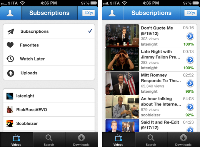
The interface of Tube+ revolves around three tabs: Videos, Search, and Downloads. I’d like to focus on Downloads right away: unlike many other apps that had to remove a similar functionality, Tube+ (still?) allows you to download videos and keep them in a local cache so you can watch them offline. And the best part is, when you hit the download button on a video page, you’ll be asked to choose the “format you prefer” – you can download at 360p, 720p, 1080p, and all the in-between options YouTube provides. Tube+’s offline caching functionality is simple and effective, but you won’t be able to organize downloaded videos in local playlists or folders.

The main tab, Videos, is where you’ll spend most of your time. Here, you have various options to navigate around YouTube content using the top bar, which, similarly to Tweetbot, is actually made of buttons to change sections. The left button, a profile icon, is used to switch between public contents-only or your account; the button on the right lets you choose the default quality of YouTube videos you’ll stream, from 240p and up to 1080p with an “auto” option that loads videos depending on your Internet connection. Last, the main area of the top bar lets you switch between the aforementioned supported YouTube sections, your subscriptions, and videos you’ve liked or saved for later.

What I like about Tube+ is the control it gives me over the quality of videos I stream and download, but, more importantly, its speed and responsiveness. Tube+ is fast: sections load in a snap, video thumbnails load instantaneously when searching. There is a “load more” button to fetch more content from search, and the developers implemented the new iOS 6 pull-to-refresh mechanism to make it easy to check for updates or simply reload a page (note: Tube+ requires iOS 6). Alongside with notable performance, I appreciate the decisions behind the feature set of Tube+: again, it’s not as rich as YouTube or FoxTube, but you can still subscribe to channels and add videos to playlists, share videos with your friends, write comments, like, dislike, and mark a video as favorite.

There are some things I think Tube+ could do better. Firstly, I don’t like how, when sharing on Facebook or iMessage, the app uses its own short URL instead of regular YouTube links. This is particularly inconvenient for services that generate thumbnail previews only for YouTube URLs, like Twitter and Facebook. Second, I’d like to see an option to easily open an uploader’s video page – this is something that FoxTube still gets perfectly right in my opinion.

Overall, Tube+ offers a clean and fast experience – particularly if you use search a lot, you’re going to notice the speed of the app compared to Google’s official YouTube client. Tube+ doesn’t have the same amount of features YouTube and FoxTube have (for instance, there’s no separation of videos and channels in search results), but at $0.99 with offline caching, a good feature set and an elegant design, you should definitely consider Tube+.


iOS 6: Mail, Phone and Safari Feature Additions

Mail, Phone and Safari have all been around since the original iPhone launched in 2007. They all have seen subtle changes here and there over the years and in iOS 6 that trend continues but with the addition of some really neat new features.

The big new thing for Mail is VIPs which gives you more control over how you deal with your inbox and who you pay most attention to – but there’s also the addition of the pull to refresh gesture and the ability to add images directly to a new message. Phone gets two really useful and practical features: the ability to reject a call and then quickly reply to them or set a reminder to call back, and the new “Do Not Disturb” feature. Finally, the core of what made the iPhone a ‘smartphone’ in the early days, Safari, gets a new full-screen landscape mode, the ability to sync tabs across devices, upload photos and videos, and offline mode for Reading List.

To get the full overview of these new features and some neat tips, jump after the break.

More iOS 6 coverage here.

Read more


Hands On with iOS 6 Maps

When Apple launched the iPhone in 2007, Google was a partner and not a competitor. Apple’s Maps, with data supplied by Google, was famously demoed by Steve Jobs when he searched for nearby Starbucks establishments and made a prank phone call with a tap of his finger. When Apple unveiled their iPad three years later in 2010, Steve Jobs was equally delighted to show off Maps, as he pinched the display to get a bigger overhead view of the Eiffel tower.

Initially, Maps was a simple mobile companion to Google Maps. Standard, hybrid, and satellite views were there, as was the ability to show traffic congestion and get driving directions between two locations of interest. It wasn’t until just over a year later with iOS 2.2 that Maps was improved with walking directions, public transit information, and street view. On the iPad, a terrain view was added. Alternate routes for directions came later in iOS 5 alongside estimated time of arrival and the ability to print directions via AirPrint. Over time, it became a robust Maps application that was better than Google Maps on the web.

What Apple did with Google Maps was pretty incredible when it was first introduced with the iPhone and later on the iPad. In contrast to using sliders and buttons on the web, Apple demonstrated that maps could be intuitive to navigate with just your fingertips. Panning around a map with your finger, tapping on search results to pull up business information, and navigating the world with Street View simply felt right on a touchscreen. Google provided often accurate search results and map data, while Apple provided a delightful interface to show their world through.

Today, using maps on our smartphones to find our way is an everyday habit. Frequent fliers rely on their smartphones to find their way in new locales, while city dwellers actively use smartphones to request public transit information. The convenience offered by our smartphones makes it possible for us to actively plan our days around city schedules, plan road trips, and get directions to a business for an all important interview. Beyond Apple’s Maps, companies like TomTom, Garmin, and Navigon added to the iPhone’s capabilities by providing real-time navigation and voice-guided directions through apps from the App Store. Yet competitors, such as Android with Google Maps and Google Maps Navigation, and Windows Phone 7 with Bing Maps and Nokia Drive, were offering GPS navigation on their ecosystems for free. For iOS 6, the missing piece to be filled-in for Apple’s Maps would have to be such a feature.

In iOS 6, Apple’s Maps is a headlining feature. During this year’s WWDC 2012 Keynote on June 11th, turn-by-turn navigation was showcased for Apple’s brand new Maps application in concert with the display of real-time traffic conditions. Apple added interactive 3D views and Flyover to select cities, giving maps a 3rd dimension on top of a traditional satellite view. As impressive as Apple’s demonstrations were, the most interesting feature are Apple’s new vector based maps, completely redesigned “from the ground up” as a replacement for Google’s Map data.

Read more


Uberlayer Is A Handy Tool For Pixel-Perfect Design

Twelve Twenty, the Dutch maker of the print-size checking OS X app Will It Fit and the iOS calendaring tool Get Together, recently published their third app, Uberlayer. Uberlayer is a small tool for UI and web designers on Mac OS X to quickly overlay images of a new design work onto your desktop.

Let’s say you just designed a mockup of an update to an existing website or application. Drop it onto Uberlayer to bring it on the screen. Using shortcuts you can move it around in pixel steps, make it more or less transparent, and activate click-through options. If you make the design half-transparent and you have the current version of an app or website just behind it, you can easily check how the current design changes will affect the overall look of the whole product. Using the click-through option, it’s easy to select certain parts you want to change to copy or delete them in the “real” version of your product.

I tried Uberlayer on my personal website by trying out a different style for an ad I currently have on it. This is what a half transparent “uberlayed” image looks like:

It’s actually pretty hard to describe how the app works using only words and pictures. If you’re curious, I recommend you head over the Twelve Twenty website and check out their Uberlayer demo video. I think Uberlayer can be a useful tool in a web or application designer’s workflow. Uberlayer is $1.99 on the Mac App Store.


App.net’s First Two iOS Clients: Rhino and Adian

Speaking of App.net, the developer community has been busy building iOS, Mac, and web clients for the service, which promises it’ll never try to purposefully harm or limit the third-party ecosystem. Of all the iOS and Mac clients currently in development (I’m testing a bunch of them, and good things are coming soon), two are currently available on the App Store: Rhino and Adian.

As John Gruber wrote in 2009, Twitter clients used to be a UI design playground for developers attracted to the service that was just about to become mainstream. The App.net clients available today sit in the middle ground of leveraging the conventions established by Tweetie, Twitterrific, and Tweetbot while working with a service that’s not nearly as popular as the Twitter of 2009, when third-party clients exploded in terms of popularity and usage.

Most of the App.net clients currently in development look and perform exactly like Twitter clients, but they are working with a platform with a much smaller scale, even by 2009 Twitter standards. This is perhaps indicative of the current status of App.net – a service that uses the foundation of Twitter while quickly adding its own unique features – and is undoubtedly helping with creating these clients (a smaller community means easier scaling and lots of feedback), but it also leaves a strange feeling of “seen that, done that”.

App.net clients will have to find their own identity just like App.net will have to grow into a different yet solid alternative to Twitter. Developers need time to figure this out. Read more


Living Earth HD — My First Mac OS X Weather App

I’ve never seen the need for a desktop weather application. I’ve always considered it way easier to fire up Chrome, go to the website of my favorite German weather forecast provider, look up the forecast, then get to work. So why should I clutter my menu bar or even my desktop with another app I have to update and look at to justify its purchase? On iOS the situation is completely different: I need a weather app on my iPad for quick glance without the hassle of typing in a web address into Mobile Safari.

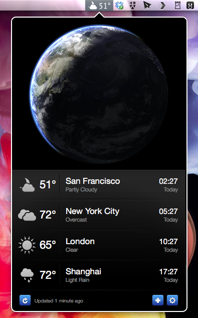
Living Earth HD is one of the newest iPad weather apps featuring an interactive 3D animated world globe with live weather forecasts. After testing it, I realized that this concept didn’t suit me on the road, although the app looked pretty awesome on a Retina Display. I want precise forecasts I could quickly glance at, just like Weather HD 2’s new Quick View feature. So although I like Living Earth HD for iOS, it didn’t have any chance to become my default weather app. Two weeks ago, Ryan and Moshen from Radiantlabs published a port of Living Earth HD to Mac OS X, which I will refer to as Living Earth Desktop throughout this review. I got curious and started testing it. After more than a week now it is still in my menu bar, right beside the Dropbox and Tweetbot icon, which means it’s a really good app.

Read more