Search results for "sofa"

iOS 10: The MacStories Review

Sometimes, change is unexpected. More often than not, change sneaks in until it feels grand and inevitable. Gradually, and then suddenly. iOS users have lived through numerous tides of such changes over the past three years.

iOS 7, introduced in 2013 as a profound redesign, was a statement from a company ready to let go of its best-selling OS’ legacy. It was time to move on. With iOS 8 a year later, Apple proved that it could open up to developers and trust them to extend core parts of iOS. In the process, a new programming language was born. And with last year’s iOS 9, Apple put the capstone on iOS 7’s design ethos with a typeface crafted in-house, and gave the iPad the attention it deserved.

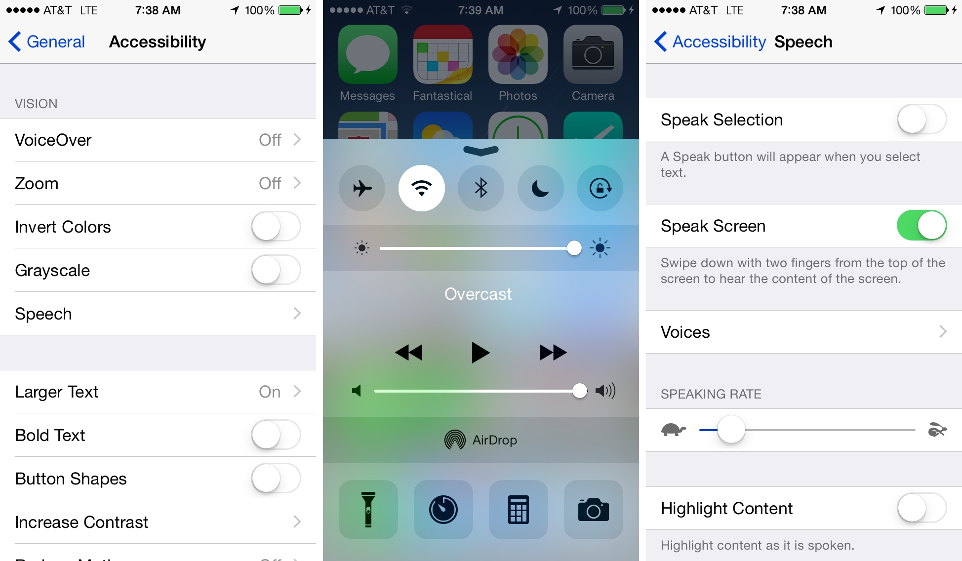
You wouldn’t have expected it from a device that barely accounted for 10% of the company’s revenues, but iOS 9 was, first and foremost, an iPad update. After years of neglect, Apple stood by its belief in the iPad as the future of computing and revitalized it with a good dose of multitasking. Gone was the long-held dogma of the iPad as a one-app-at-a-time deal; Slide Over and Split View – products of the patient work that went into size classes – brought a higher level of efficiency. Video, too, ended its tenure as a full-screen-only feature. Even external keyboards, once first-party accessories and then seemingly forgotten in the attic of the iPad’s broken promises, made a comeback.

iOS 9 melded foundational, anticipated improvements with breakthrough feature additions. The obvious advent of Apple’s own typeface in contrast to radical iPad updates; the next logical step for web views and the surprising embrace of content-blocking Safari extensions. The message was clear: iOS is in constant evolution. It’s a machine sustained by change – however that may happen.

It would have been reasonable to expect the tenth iteration of iOS to bring a dramatic refresh to the interface or a full Home screen makeover. It happened with another version 10 beforetwice. And considering last year’s iPad reboot, it would have been fair to imagine a continuation of that work in iOS 10, taking the iPad further than Split View.

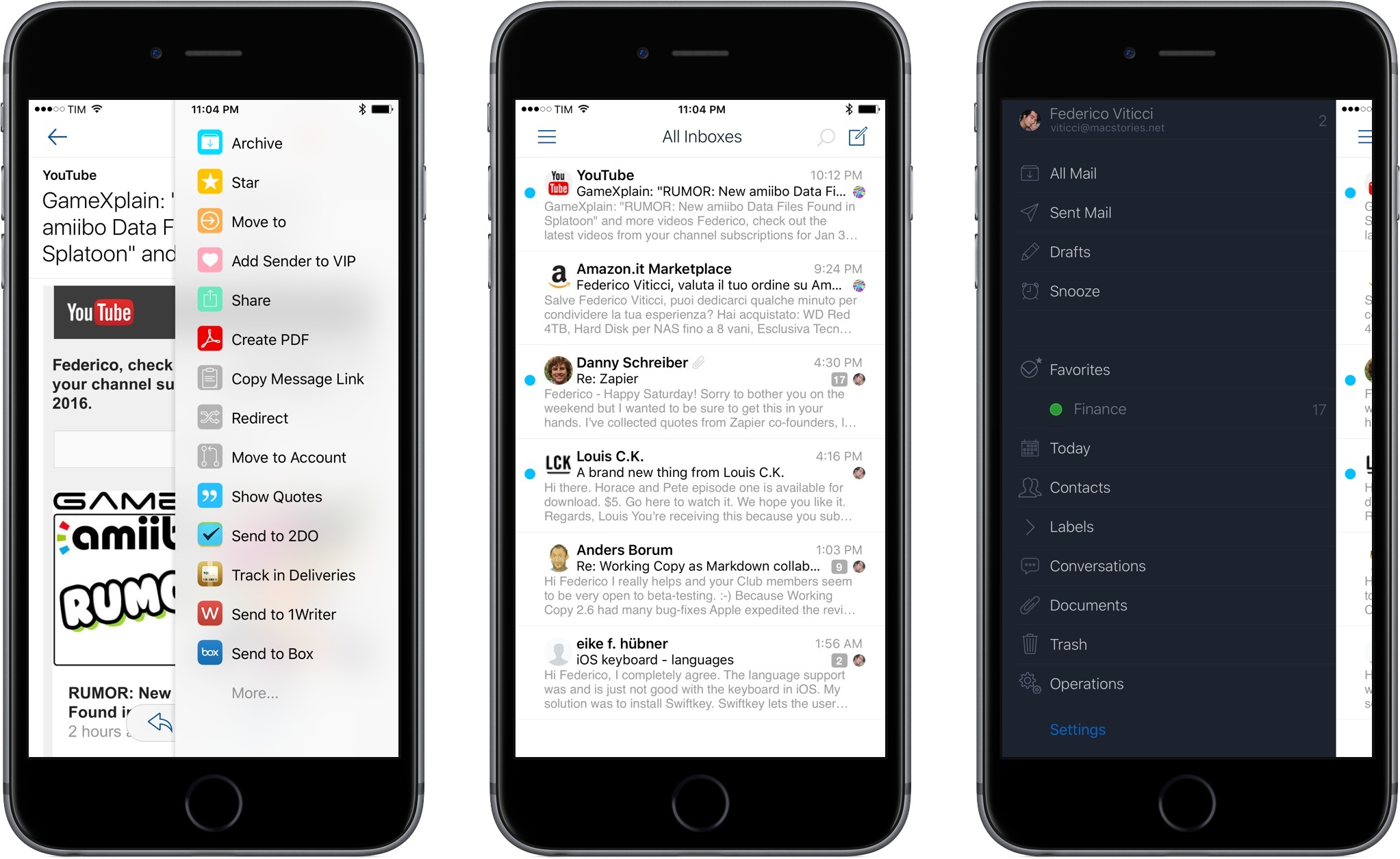
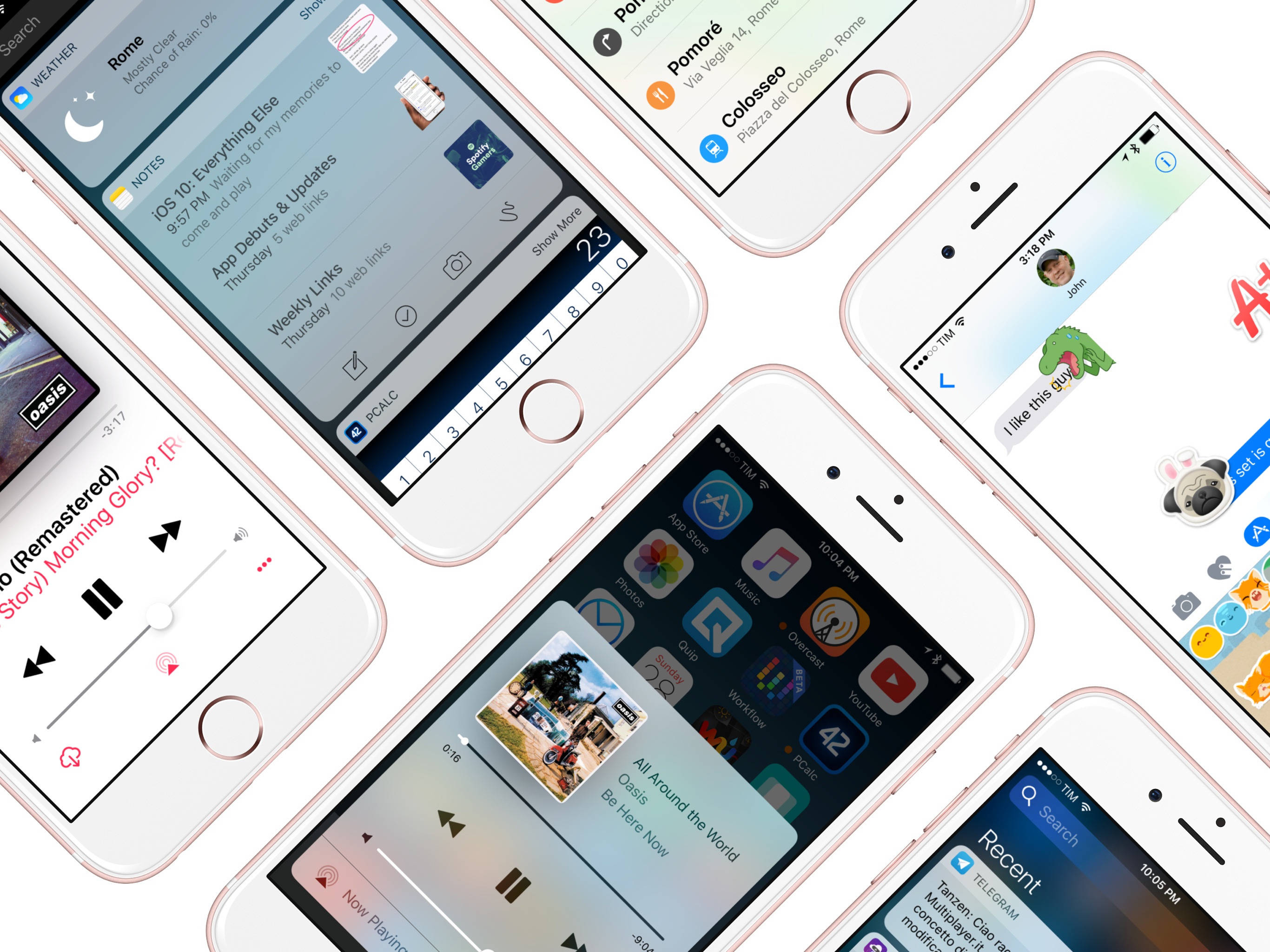
There’s very little of either in iOS 10, which is an iPhone release focused on people – consumers and their iPhone lifestyles; developers and a deeper trust bestowed on their apps. Like its predecessors, iOS 10 treads the line of surprising new features – some of which may appear unforeseen and reactionary – and improvements to existing functionalities.

Even without a clean slate, and with a release cycle that may begin to split across platforms, iOS 10 packs deep changes and hundreds of subtle refinements. The final product is a major leap forward from iOS 9 – at least for iPhone users.

At the same time, iOS 10 is more than a collection of new features. It’s the epitome of Apple’s approach to web services and AI, messaging as a platform, virtual assistants, and the connected home. And as a cornucopia of big themes rather than trivial app updates, iOS 10 shows another side of Apple’s strategy:

Sometimes, change is necessary.

Read more


    Airmail for iPhone Review: Power User Email

    If you want to drive an average tech nerd crazy, try to talk about email clients.

    Over the course of (almost) seven years of writing for MacStories, I’ve seen email pronounced dead (multiple times), reinvented, redesigned, and, most recently, made smarter with machine learning and cloud services. Email has been deemed unfixable, unmanageable, and unhealthy. And yet, for better or worse, we keep using it.

    Despite its archaic nature and stale protocols, email works – it’s the closest thing to a common standard for digital communication we have. Messaging services may rise and grow and fall and shut down, but email will always be there, humbly humming along, hoarding thousands of unread messages in your inbox. You have to believe that, if this planet were to end tomorrow, cockroaches and IMAP would survive it.

    I have written my fair share of email client reviews since 2009, and I’ve made my stance on what I’m looking for abundantly clear. I like my email client to bear the speed and polish of Microsoft’s Outlook, the clever touches and integrations of Dispatch, and, if possible, the smart options of Inbox and Spark. The fact that, eight years into the App Store, I’m still cherry-picking my ideal set of features for an email client says a lot about the landscape. Every time a new email client is released, you will find users who are perfectly content with it, others who prefer the built-in app on their devices, and some who are intrigued, but still unhappily waiting for the email client of their dreams to be made.

    In case you’re wondering, I’m that guy in the last group, assembling yet another email client review, making a list of ideal email features for an iOS app.

    And I actually love it, because the past 12 months have brought a ton of interesting changes in the email market for iPhone and iPad. Perhaps most notably, Microsoft surprised iOS users with a solid client, evolved from an acquisition and quickly improved to accommodate fast search and notifications, calendar integration, and full iOS 9 support. Outlook – a runner-up to my App of the Year in 2015 – is the email app I recommend to anyone who wants to try something different than Mail. Spark, launched by Readdle last year, has received a series of improvements with the promise of future Mac and iPad versions. The power-user oriented Dispatch has also continued to grow, with an eye for iPad users adopting iOS 9. And, reinvigorated by the demise of Mailbox, dozens of other developers have tried (or have kept trying) their hand at improving email on iOS. There was a time when Apple didn’t even accept third-party email clients on the App Store; today, you can find hundreds of similar and drastically different takes on email on the Store.

    Developed by Italian indie studio Bloop, Airmail was first released on OS X in early 2013, capitalizing on the shutdown of Sparrow with a design reminiscent of that popular client acquired by Google (which, in turn, borrowed heavily from Loren Brichter’s Tweetie, the grandfather of those kinds of interfaces). Through the years, Airmail has become one of the most powerful email apps for the Mac, with support for multiple accounts, keyboard shortcuts, and a long list of preferences to tweak the app to your needs. Airmail is up there with MailMate in the club of desktop email clients that allow you to configure and fiddle with settings to make email as welcoming as it could possibly be.

    Bloop is hoping to replicate its desktop success with Airmail for iPhone, launching today on the App Store at $4.99. I’ve been trying Airmail for the past couple of months, and it brings some unique features and options to the table, but, as usual, the road ahead is going to be long.

    Read more


    iOS 9 Goes to School

    I have been deploying and teaching with iOS in a 1:1 school for five full years now. A 1:1 school is a school where each student is provided with a computer in some form for their exclusive use. We started with the original iPad in August 2010 and now, five years later, are getting ready to refresh from our current 4th-generation retina iPad to whatever is current next summer.

    Over these past five years, we have seen iPad develop from an interesting device with some useful desktop-like apps in the iWork suite to a very powerful platform for student learning and creativity.

    I have often said that the iPad hardware matters only insofar as it enables you to have an excellent experience of software. Tablets and smartphones are as close as we can practically get to a pure software experience. This is one of the reasons why iPhone and iPad hardware is firstly so minimalist and secondly hasn’t changed much in all the years they have been sold. What matters about the iPad is that it makes the software fast, smooth, and powerful.

    We have seen many more changes in iPad software than we have in the hardware. We started with iOS 3.2 – a version before even multitasking arrived on iOS – and we are now looking at iOS 9. So what does iOS 9 bring for education?

    Read more


    Apple’s iOS 9 News App Review: Broken News

    Apple occasionally introduces new apps to iOS that come preinstalled on every device, and with iOS 9 they’ve done this again with the introduction of News. As you would expect from the name, News is, or at least tries to be, a one-stop shop for all your news needs. One way to think of News is a fusion of Google News (for the recommended articles), Flipboard (for the ability to follow publishers and topics), and Facebook’s Instant Articles (custom, gorgeous articles on mobile).

    The News app was, to me at least, one of the features of iOS 9 that I was most looking forward to using – I even put that in writing. I was excited about the News app because reading news on an iPhone, although it has improved over time, can still be a frustrating experience jumping from app to app. The experience is even worse with many news websites which chew massive amounts of data and obscure the small display with a myriad of annoying ads. News, as it was demoed at WWDC, offered a promising alternative: a one-stop app that would deliver “the articles you want to read in a beautiful and uncluttered format, while respecting your privacy”.

    Much like Apple’s past experiments in bringing news to iOS,1 the News app in iOS 9 fails to live up to its potential. The high hopes that I had for the News app have unfortunately been (mostly) dashed. Whilst there are aspects of great execution in some limited areas, huge aspects of News seem half-baked and confused.

    Read more


    Why Force Touch Matters for Accessibility

    Editorial Preview

    Aside from keeping our iPhones in our pocket more, I think the Apple Watch is compelling for another reason: communication. The ways in which Apple is allowing people to communicate via Apple Watch – taps, doodles, and, yes, even heartbeats – is a clever, discreet new paradigm that epitomizes the company’s mantra that the Watch is the most intimate and personal device they’ve ever created. I, for one, am very much looking forward to trying these features.

    What’s even more compelling, though, in my view, is the engine that’s powering the delivery of said communication – namely, the Taptic Engine. Beyond its use for notifications and communication on the Watch, Apple has implemented its Taptic Engine in one other form: trackpads. Apple has put the tech into the new MacBook and the refreshed 13-inch Retina MacBook Pro. I had an opportunity to play with the Force Touch trackpad (about 30 minutes) at my favorite Apple Store here in San Francisco, and came away very, very impressed.

    I find Apple’s embrace of haptic feedback fascinating and exciting, because the use of haptic technology has some very real benefits in terms of accessibility.

    Read more


    Looking at Accessibility in iOS 8

    Soon after WWDC ended in June, I wrote a piece for MacStories in which I briefly summarized all the new features Apple added to Accessibility in iOS 8. Since then, I’ve spent a lot of time with the iOS 8 beta builds over the summer, and have found several features and little touches – even some things that aren’t specific to Accessibility – that merit a more detailed look. What follows are my personal impressions of such.

    Read more


    Here’s to Another Five Years

    Apple wasn’t a brand that my friends and I conversed about in high school, our infatuation being PCs that weren’t Dell and graphics cards and the latest processors and Counter Strike. Apple was a part of my life insofar that they were the guys who made the cool MP3 players. I had an iPod video, and later an iPod touch, but I knew nothing of Steve Jobs. Macs were also unknown to me, but later I would realize that I used an iMac G3 with the weird puck mouse a few times in middle school. In my junior and senior years one of my classmates had the first iPhone, but it was just an iPod with a phone[1].

    It wasn’t until after I graduated that Apple became a thing. No one knew it at the time, but 2008 was the last year that Apple would offer the polycarbonate MacBook in black. I remember having this sort of sudden fascination with it: how simple[2] it was, how different it was. This would be my college laptop, despite being in a price range that was out of budget and running an operating system that I wasn’t familiar with.

    When the sales tax holiday came around, I made the decision to go all-in. I purchased the fully loaded MacBook in black, complete with an incredible 2.4 GHz Core 2 Duo processor[3], 4 GBs of memory, and 250 GBs of storage. Being my first laptop, I also purchased an AirPort Extreme so I could have Wi-Fi in the house. The Apple Store was accommodating between me and my overprotective bank, letting me use their phone behind the counter since my Nextel Motorola had no reception.

    While the purchase itself was an experience, it wasn’t until I got home that I fully began to appreciate what I had in my hands. Out of the box the laptop was charged and ready to use. There was a prompt to sign up for MobileMe, but otherwise the laptop had no stickers or bloatware. Everything about it was perfect[4].

    My MacBook, which I would come to call the BlackBook, had an unbelievable impact on how I thought about computers. It didn’t have the most powerful guts, but it had a great keyboard and trackpad, and the display was pretty good. I thought the MagSafe Power Adapter was brilliant, the magnetic connector certainly saving my bacon plenty of times in the classroom as the cord was sometimes yanked by a wild knee. The sleep indicator light became a reassuring delightful detail. All of those little details really added up.

    The BlackBook would be the computer that soldiered on. A hard drive died, a replacement solid state drive died[5], and I upgraded the memory to an unrecommended six gigabytes, keeping it current. I replaced the battery in its third year and I’m probably due for another replacement. The fan started making noises in its fourth year but it never ceased to function so I tolerated it. It didn’t run Mountain Lion, but it did run Lion and that was good enough until Mavericks[6] was announced.

    Thinking back, the black model was a good choice. Unlike the white MacBooks, cracks that developed in the surrounding bezel didn’t show as well. The black never did end up looking dirty, although fingerprints were constantly a problem. The oils from my wrists have stained the plastic making the black appear blacker and slick. It stood out from the crowd and it continues to look impressively modern. The keyboard, the trackpad, and the quality of the laptop itself far exceeded my expectations. The keys still feel just as good as they did when I first bought it. The trackpad’s button no longer has that new-click-feel, but it still works just as it always has.

    I’ve repaired a lot of laptops of all shapes and sizes for spare cash in college. In 2013, no one else does two finger scrolling well. Apple was getting it right in 2008.

    It was because of the BlackBook that I would eventually find myself watching Apple Keynotes in the back of the classroom while the professor was lecturing, and it was because of the BlackBook that I started creating my own WordPress site which eventually led to this one. Little did I know that I would end up using the laptop for an extended four years in college, and it was the machine I would continue to use for a year afterwards. Needless to say that it has been a significant part of my young adult life.

    As much as I don’t want to give it up it’s finally showing its age. I will open up the case and blow the dust out and replace the fan. I’ll reapply thermal compound to the processor and reassemble the heat sink so that the laptop runs cooler. It still has life in it.

    But it’s time to say goodbye. Five years is a long time to own a computer, and it’s impressive how well the BlackBook withstood the test of time. Apple is moving forward and I’m ready to embrace the latest they have to offer. Needless to say that Apple has made me a fan for life.

    Today I’m using a new Mac, the latest MacBook Air, and it’s even more wonderful than the first. It has backlit keys that adjust to ambient lighting and new function keys I’m not used to and an even better display. There’s no button on the trackpad and my headphones finally work with the combination headphone + microphone port. It has USB3 and Thunderbolt, significantly faster interfaces than USB2 and FireWire. And the battery life is amazing[7]; I can use my laptop for two or three days without having to charge it. It’s never gotten hot, and I haven’t heard the fan even after watching hours of streaming video from my favorite websites. Being my first aluminum Mac, I can’t help but appreciate what a marvel of engineering this is.

    Here’s to another five years.


    1. But it was just an iPod with a phone. Oh my god how naive! ↩︎
    2. I dismissed the Powerbook because I thought the keyboard looked weird and because the lid wasn’t magnetic. Because latches were so passé in 2008. The other alternatives were PCs that were running Windows Vista and underpowered netbooks. ↩︎
    3. Apple then released the aluminum MacBook in October that had an Nvidia chipset instead of the basic Intel chipset. Thus I learned a hard lesson in Apple release cycles. ↩︎
    4. The computer I had throughout high school was a Compaq desktop that my uncle had picked out and my grandmother then purchased when she visited in the summer of 2004. It was also quite the beast, having a 2.5 GHz Celeron D processor, one gigabyte of memory, and 40 GBs of storage. This was when ribbon cables were still the norm. It’s fitting that a Compaq was my first computer as Tim Cook is now the CEO of Apple. What a coincidence. ↩︎
    5. The MacBook had a first revision Serial ATA interface for the hard drive, so I couldn’t take full advantage of a SSD. However, the read and write speeds are still so much faster than a mechanical drive that it was like breathing new life into the machine. And to think today’s MacBook Airs have PCIe-based flash storage. ↩︎
    6. OS X Mavericks fixes all of the things that didn’t work quite right in Lion. ↩︎
    7. I swear that the battery on this MacBook Air lasts longer than my iPad. I can’t wait for this to be the standard. ↩︎

    Kickstarter: Snuglet Keeps the Latest MagSafe in Place

    Apple’s MagSafe 2 connectors and are probably the best thing we have going for laptops right now. Your dog can trip over the cable, get run over by the vaccum, or yanked out by kids running around the house, and the cord just magically detaches itself from the MacBook without sending the machine to the floor. Which is great — that’s exactly what we want.

    Unlike their first generation counterparts, the redesigned MagSafe connectors are not very forgiving when charging a laptop in your lap, on the bed, or on the sofa. In attempt to better balance the strength of the MagSafe connector, Tetrio has developed the Snuglet, a small ring that tightens the MagSafe connector just enough so that it stays in place when we’re using it, but is still supposed to come out of the laptop when it accidentally gets pulled. It pops into the charging port on your MacBook and is later removed with a removal tool (it looks kinda like a SIM tray ejector tool).

    I won’t lie. I’m admittedly super skeptical of this particular KickStater because if it fails to prevent a falling MacBook then it’s really not that useful. I would love to see a proper demo video showing that the MagSafe 2 still works to save your MacBook’s skin when the cord is tripped on, especially with a laptop as light as the MacBook Air.

    Tetrio are asking for $9,000 for their campaign, raising $2,977 so far. The first 250 backers can pre-order a pair of Snuglets for $12, while the second batch of 250 can pre-order it for $15. Everyone else can pledge $19 for their very own pair of Snuglets. Learn more about this Kickstarter and back the Snuglet here.


    Facebook 6.0

    Today, Facebook introduced version 6.0 of their iOS app for iPhone and iPad. The Verge has a solid overview of the changes (with a video as well). Unrelated to the iOS update, but still of note in regards to Facebook’s growing design teamAtebits’ Loren Brichter is now “helping out” at Facebook. Considering Brichter’s skills in graphics and animations and Facebook’s interest in physics engines with Chat Heads, I wouldn’t be surprised to hear Brichter is going to help the design team in that field.

    Facebook 6.0 for iOS is, essentially, a cleaner Facebook app with Chat Heads. The slide-out navigation is still there, but it has been tweaked to feature new icons, consistent with Facebook’s new take on News Feed; the iPhone app now comes with filters to browse specific feeds for photos, music, games, close friends, and more; the iPad app has a cleaner design for the News Feed with avatars on the left; and both apps come with Chat Heads, Facebook’s new floating bubbles for private messaging (or, as they call it, “private sharing”). The Chat Heads feature is still rolling out, just like the updated News Feed design.

    I’ve been able to try Chat Heads, which are enabled for my account. Unlike Facebook Home for Android, Chat Heads are limited to the Facebook app: per iOS’ architecture, Facebook can’t display Chat Heads anywhere in the operating system. The implementation of Chat Heads is consistent across the iPhone and iPad, but there are also some minor differences worth noting. Read more