There’s an elegance in simplicity that I value. I use plenty of complex apps, but there’s a certain satisfaction in finding one that fits your needs perfectly. One such app that seems destined to claim a long-term spot on my Vision Pro is Status Bar Builder, a customizable utility that displays useful information without taking up much space.
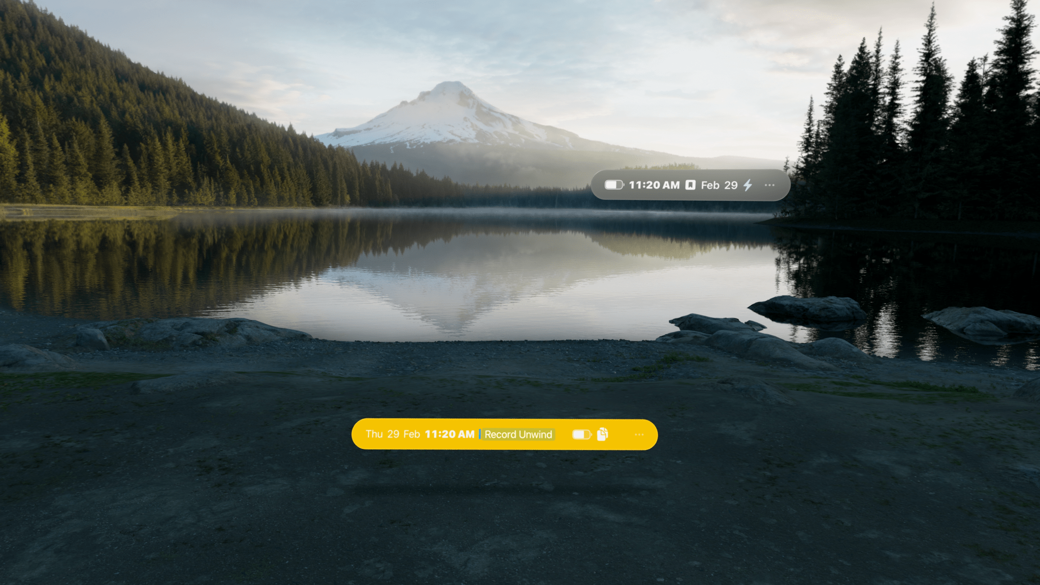
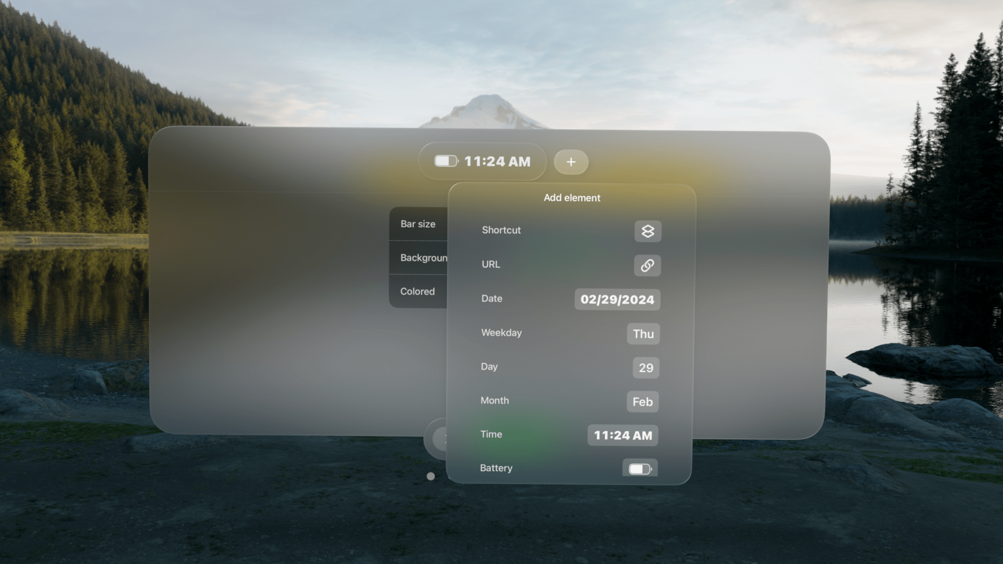
The app allows you to build status bars, which are narrow, horizontal windows reminiscent of the Mac’s menu bar that you can place around your environment. Status bars come in three text sizes and can have no background, be translucent, or use a colored background.
Regardless of the styling you pick, status bars can include:
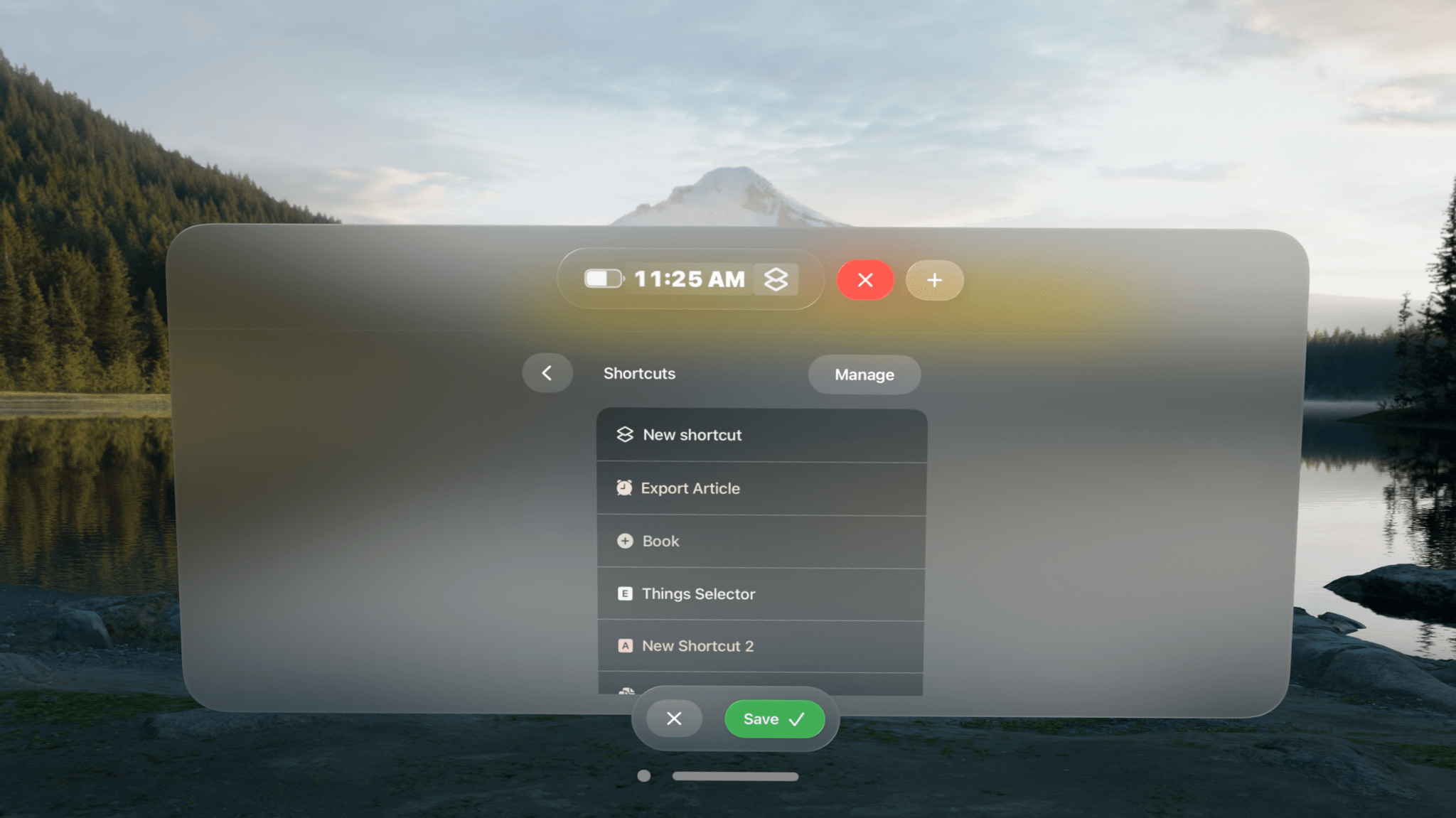
- Shortcuts
- Links
- Today’s date
- Weekday
- Numerical date
- Month
- Time
- Your calendar events
- A battery charge indicator
- A spacer
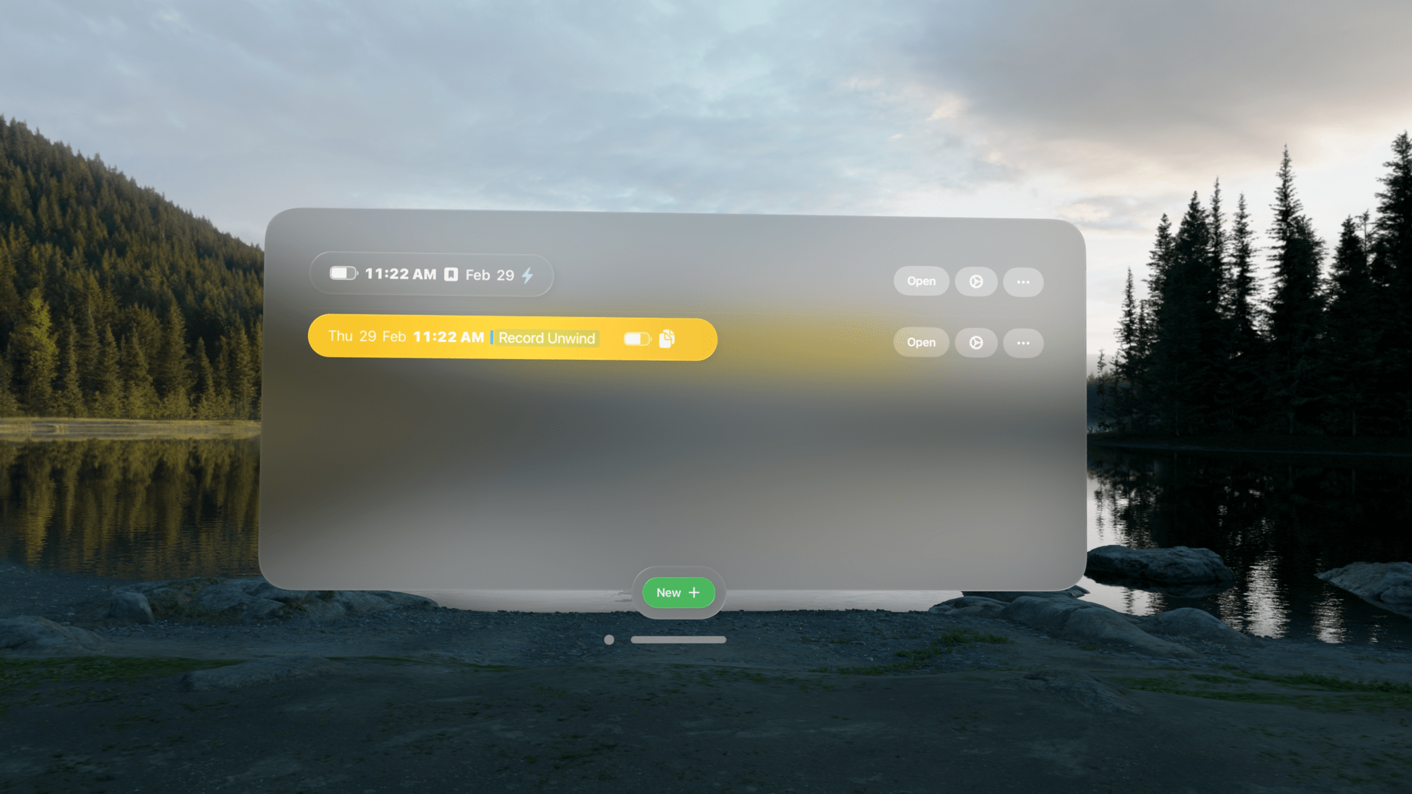
Designing status bars is easy. They’re created and stored in the app’s main window, which includes a preview of each along with buttons to open any existing status bars, make revisions, or delete them. At the bottom of the main window, there’s also a ‘New’ button to add to your collection.
You can make as many status bars as you’d like, sprinkling them around your room. There doesn’t seem to be a limit to how many items you can include in a status bar, either, but as a practical matter, if a status bar gets too long, it doesn’t look great, and some text will be truncated.
What’s more, you can add as many of each type of item as you’d like to a status bar. For Shortcuts, that means you can create a long list of shortcuts if you want. However, you better be able to identify them by their icons because the buttons in the status bar don’t include shortcut names or the colors you assigned to them.
Links work like a mini bookmark bar, allowing you to save frequently visited websites with a custom icon as a button in your status bar. However, like shortcuts, you’ll need a memorable icon because there are no link labels or other text to go by. Links support URL schemes too, offering additional automation options.
There are also a few other other item-specific settings available. For example, there are three sizes of spacers that can be added to a status bar, and calendar events can include the color of their associated calendars if you’d like. Plus, dates and times have formatting, color, size, and other style options. It’s worth noting that your next calendar event doesn’t include the scheduled time and events cannot be opened, both of which are things I’d love to see added to the app in the future.
Although you can overstuff your status bars with links, shortcuts, and other information, I’ve found that the best approach is to be picky, limiting yourself to a handful of items that make your status bars more glanceable. Then, if you find yourself adding more and more to a status bar, consider breaking it up into multiple status bars organized thematically. I find that works well and gives me more flexibility about where I put each.
I have to imagine that Apple will eventually release something like Status Bar Builder. It’s too easy to lose track of time in the Vision Pro. It needs a clock, battery indicator, date, and other basic data we’ve had on our iPhones since day one. Status Bar Builder fills that gap but goes one step further by adding links, calendar items, and shortcuts. I wouldn’t add a lot more to the app, but a weather item with the current conditions and temperature would be great. However, even though parts of Status Bar Builder may eventually wind up as parts of visionOS, I expect the app has a long and useful life ahead of it, thanks to the other components that go a step further than I expect Apple ever will.
Status Bar Builder is available on the App Store for $4.99.