I like trains. I like them so much that, despite being 27 years old now, I still don’t have a driving license. I travel by train and use public transit exclusively to get around in my daily life. The island where I grew up had none of that, and it has made the car a fundamental necessity for most inhabitants there. But I’m fortunate enough to live in continental France now, in a city where I can get anywhere pretty quickly by hopping on a bus, tram, train, or even a high-speed train.
The result is that I spend a lot of time on my phone on a daily basis looking up transit itineraries and glancing at waiting times. Like in most places in the world where public transit is a thing, you can use the transit authority’s first-party application or website to do this. There is a universal truth about those apps and sites, though: they are almost always really bad. They’re slow, confusing, and often bloated with useless information. This is why, for so many years now – since I first arrived in France in 2014 – I’ve been a huge fan of Transit.
Transit is an amazing app that lets you look up transit itineraries and will even guide you along as you travel to your destination. The app has been around for a long time, but my mission today is simple: I want to tell you why I believe Transit is still the best-designed transit app available on the iPhone right now.
Let’s get into it.
When you think about it, if you travel by bus, tram, or train every day, you pretty much know your way around the network already, especially when you just want to get to the places you visit frequently – that can be home, work, the city’s main train station, your favorite restaurant, or a friend’s place. This means that, most of the time, you are not necessarily going to need to look up an itinerary in a transit app. Instead, what you are going to need is an efficient way to evaluate your options. Which lines can I use from here? How long am I going to wait? Where is the station exactly?
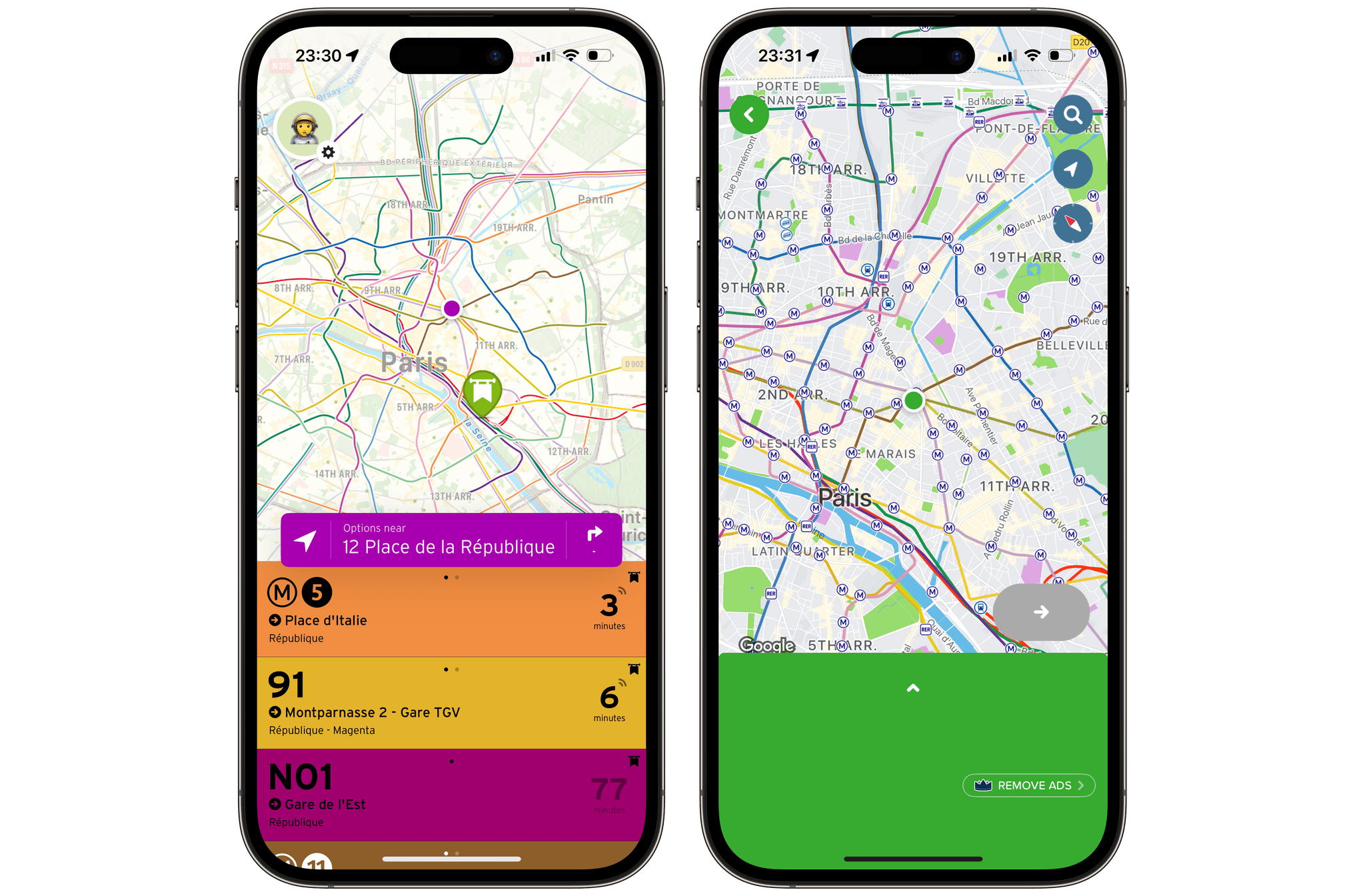
Transit’s competitors Moovit, Citymapper, and even Apple’s transit integrations in Apple Maps, have never clicked for me for this reason. They tend to want me to start typing a destination, or fumbling around the UI, instead of immediately surfacing this information. In Transit, on the other hand, the first thing you see when you open the app is the waiting times of all the running lines around you. This is absolutely what got me into using the app back in 2014, and it’s still the main reason why I love the app so much today. Wherever I am in the city, I can just tap the app’s icon on my Home Screen to instantly get a view of my options to get to my next destination, along with the real-time waiting times. Usually, I can handle myself from there, and I can close right out of the app. Other times, if I need more guidance, I can just tap on a line and follow the directions.
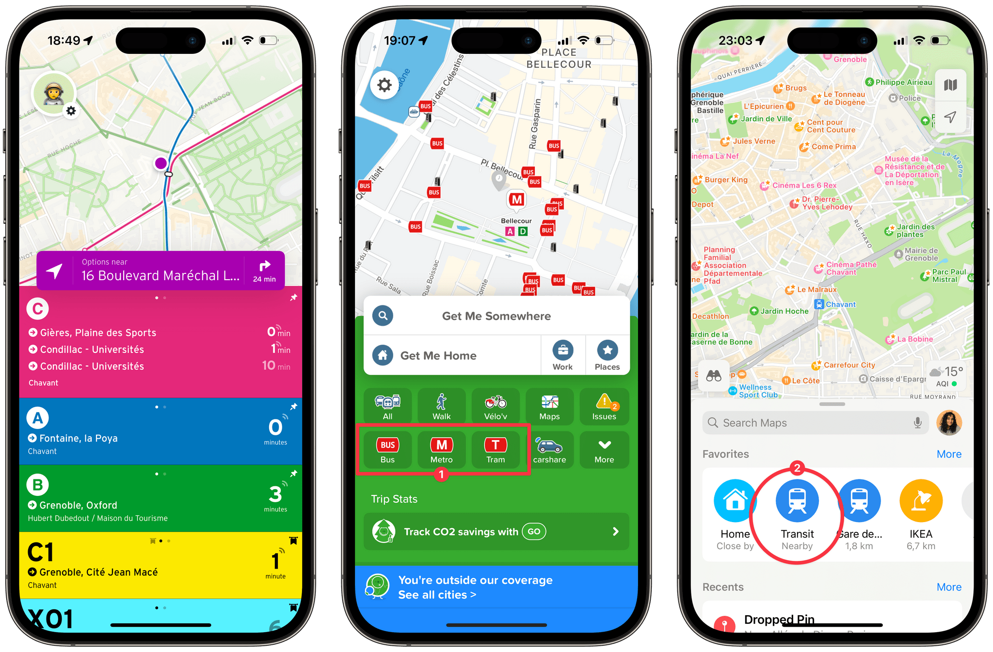
When you open Transit, you immediately get a view of nearby lines with their real-time waiting times. In Citymapper, this information is only available after you select one of the main ‘Bus,’ ‘Metro,’ or Tram’ buttons (1). In Apple Maps, it’s hidden behind a ‘Transit Nearby’ button (2).
For those times when I’m on a line that I don’t know well, or when I’m in the gigantic maze that is Paris, Transit is an app that I’ve come to rely on a lot. Over the years, the app has been pretty good at supporting the newest features in iOS, the latest of which is support for Live Activities in the Dynamic Island and on the Lock Screen.
Transit’s Live Activities are the best use of the Dynamic Island that I’ve seen to date. It’s the perfect use case for the feature. It happens to the best of us: you’re on a train, not necessarily paying attention to your surroundings, reading today’s headlines on your phone, so it’s easy to miss your stop. Seeing the number of remaining stops tick down at the top of the screen is incredibly useful for this. The Dynamic Island will expand on its own when you’re two stops away, then again when you need to get off.
To be honest, I even use this feature on the trips that I know by heart, just because it puts me at ease to know that the app has my back in case I get too distracted.
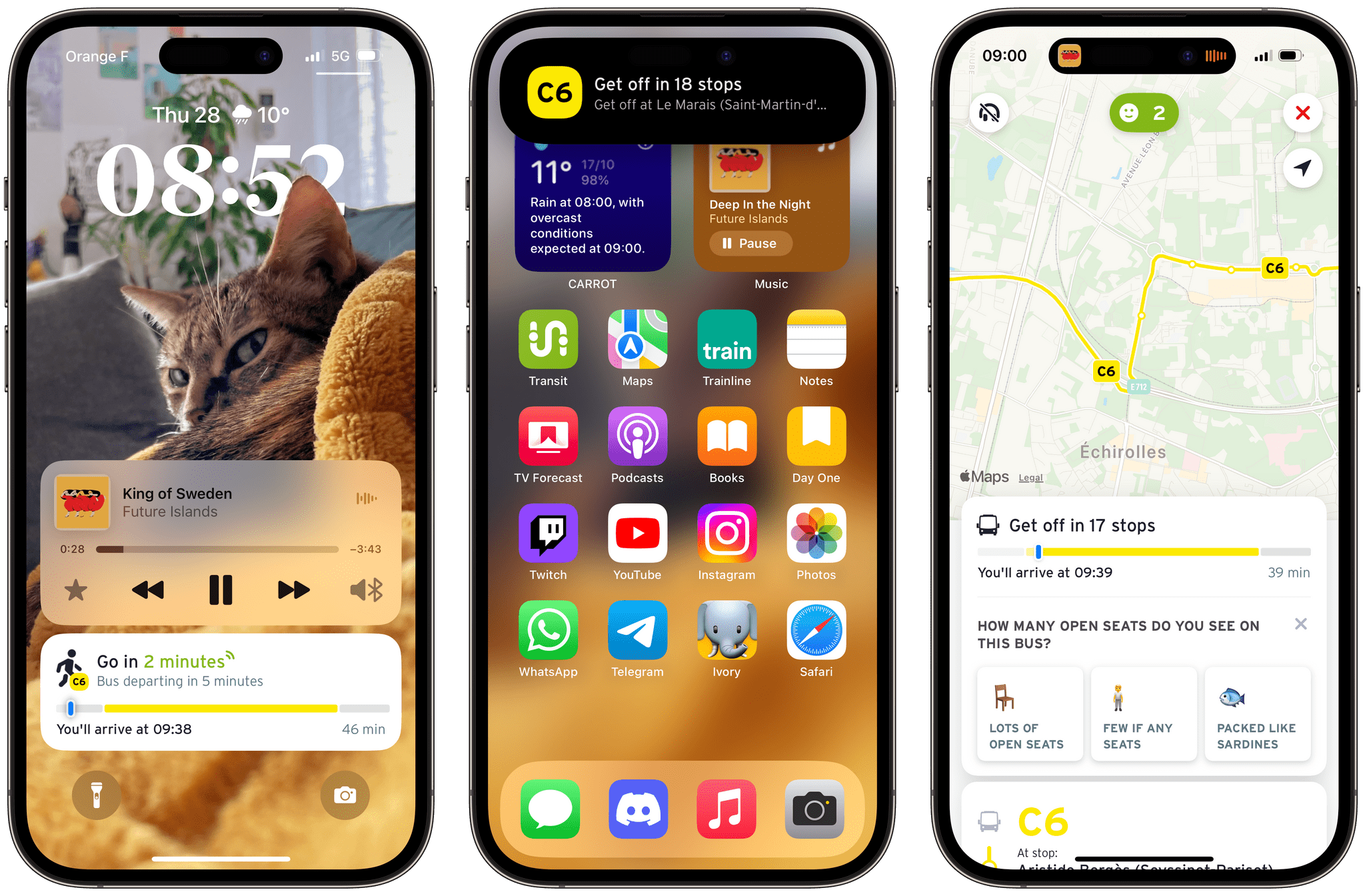
Transit’s Live Activities start running as soon as you tap ‘Go’ on an itinerary in the app. The Live Activity shows how many remaining stops are on the route and lets you know when to get off the vehicle.
Transit is a beautiful app in the way it combines satisfying animations, fast interactions, and super clever design. I first mentioned how the app’s main screen is a view of nearby lines and their waiting times. Something else in the app that’s both remarkably simple and smart is the way itinerary suggestions are presented.
When you pick a destination in Transit, the itinerary suggestions are shown on a timeline. For each suggestion, you can quickly see the number of lines you’ll need to use, the duration of each change, and the time it will take to walk to and from the stations. Most importantly, since the itinerary suggestions are all sitting on the same timeline, you can directly compare them. I have never been able to find another transit app that lets me find the best itinerary in this way. Sure, some of them may let you toggle a few preferences in the settings: would you rather walk or minimize waiting times? The issue for me is that it depends. At times, I’m fine with walking, but other times, I simply want to reach my destination quickly. Thanks to this clever design, Transit allows me to make that choice in the moment.
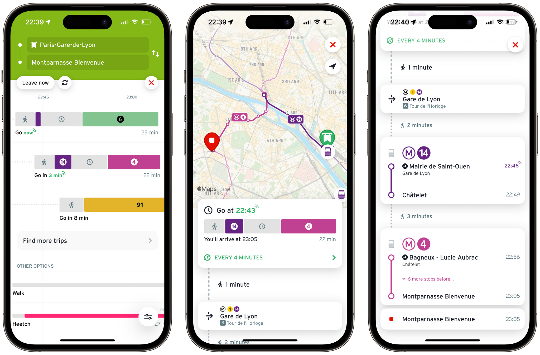
Searching for itineraries between Gare de Lyon and Montparnasse in Paris. Transit lets you compare its suggestions on a timeline (left). You can tap on any suggestions to preview it on the map (middle), and read a detailed breakdown of the itinerary (right).
This thoughtful design is present throughout the app. I find myself in awe of how every single data point has been carefully placed in the interface without ever feeling overwhelming. Your estimated time of arrival is exactly where you’d expect it to be (in the Live Activity, as well as at the top of the itinerary view). Gestures to navigate the app feel natural. Almost everywhere in the app, you can pull down on views to get back to the previous screen. This is complemented with a subtle use of haptic feedback that brings the whole UI together.
I have always found Transit’s performance to be significantly superior to its main competitor, Citymapper. A key example of this is each app’s map view. In Citymapper, navigating the map is a bit of a pain. You can’t get a clear view of the lines, location pins take a while to load, and panning the map is, at best, a 20 FPS experience. The main difference here is that Citymapper is using Google Maps as the map provider, while Transit uses Apple Maps. This is clearly making a huge difference: navigating the map in Transit feels super smooth in comparison. I encourage you to try out the two side by side; it’s hard to unsee.
To be fair, Citymapper isn’t available in my home town. The app can only be used in a handful of cities in France, which unfortunately doesn’t include Grenoble. I used it on a regular basis when I was living in Lyon a few years ago. But today, I am only able to use it when I’m in Paris about once a month. It is never a great experience for me, though. I struggle a lot with the information density in Citymapper.
However, I will concede that Citymapper is great at one thing: keeping you up-to-date on service incidents. Transit does integrate those in the app, but Citymapper lets you see all current incidents in one place, which is super handy. I’m also impressed with the amount of local transportation services that Citymapper always manages to integrate into their app. In general, the experience in Citymapper seems to be particularly well curated for the urban areas that it covers – which probably explains why it is not as widely available as Transit.
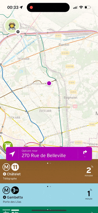
Still, Transit has always amazed me with its ability to scale up and down depending on where you are. The app’s UI is fast and simple, and that remains true whether I’m in Grenoble with its relatively small five-line tram network, or in Paris with the mind-boggling size of its Metro and RER network. Sure, when you are in the underground stations of the Paris Metro, Transit provides information that you wouldn’t see in a smaller town: which platform you need to get on, which exits you need to look for, and even on which end of the next train you should board to be closer to the exit upon arrival. These never feel out of place, though. They show up as needed, and they go away if you ignore them. And the UI, overall, remains just as intuitive and efficient.
While some of its competitors need to curate their experience for each city, the fact that Transit’s UI easily scales with no manual adjustments on the user’s part is a testament to its beautiful design. If you’re not already a fan, and if the app is available where you live, I strongly recommend giving it a try.
Transit is available for free in the App Store, with an optional $5 monthly (or $25 yearly) subscription to unlock more nearby lines in the main view, access to the full line schedules, additional app icons, and custom color themes.