Editor’s Note: Getting a Handle on Links By Treating Them Like Email is part of the MacStories Starter Pack, a collection of ready-to-use shortcuts, apps, workflows, and more that we’ve created to help you get the most out of your Mac, iPhone, and iPad.
I’ve had a link problem for a long time. Links accumulate everywhere: in Messages, mail clients, text files, Discord, Trello, research tools, and elsewhere else imaginable. If they weren’t digital, I’m sure I’d be tripping over links on my way to the kitchen for breakfast each morning.
Part of my problem is an occupational hazard. Links to apps, articles I may want to link on MacStories, images on our CDN, podcast episodes uploaded for publication, and materials from advertisers are just a small sampling of the links I deal with every day.
But links are part of everyone’s lives. Friends and family send us links to things to read, videos to watch, itineraries for trips, and a lot more. Companies send us links to things we buy online and deals we want to check out. Most of all, though, there are the many links we collect ourselves throughout our day. The Internet touches every aspect of our lives, which means links permeate every corner of our days, yet links are collected, organized, and processed haphazardly on an ad hoc basis by most of us.
Over the holidays, I sat down to think about links and how I deal with them. It didn’t take long to realize that thinking about links in the abstract is about as useful as thinking about email messages and tasks. The trouble is that links can represent almost anything from a short video that will take two minutes to watch to an expensive purchase that you will need hours to research. They vary widely in importance, the attention required to deal with them, and relevancy. As a result, it doesn’t do you much good to treat links without also considering what they represent.
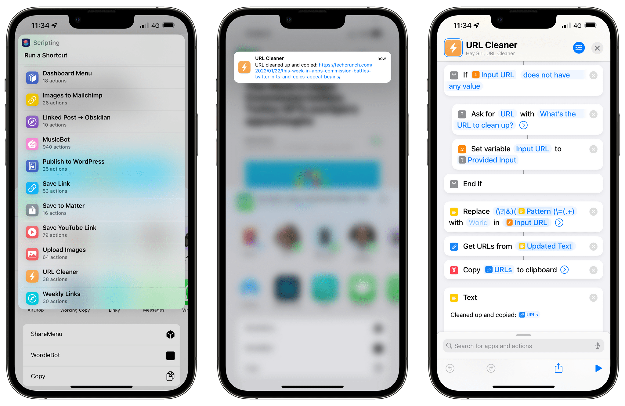
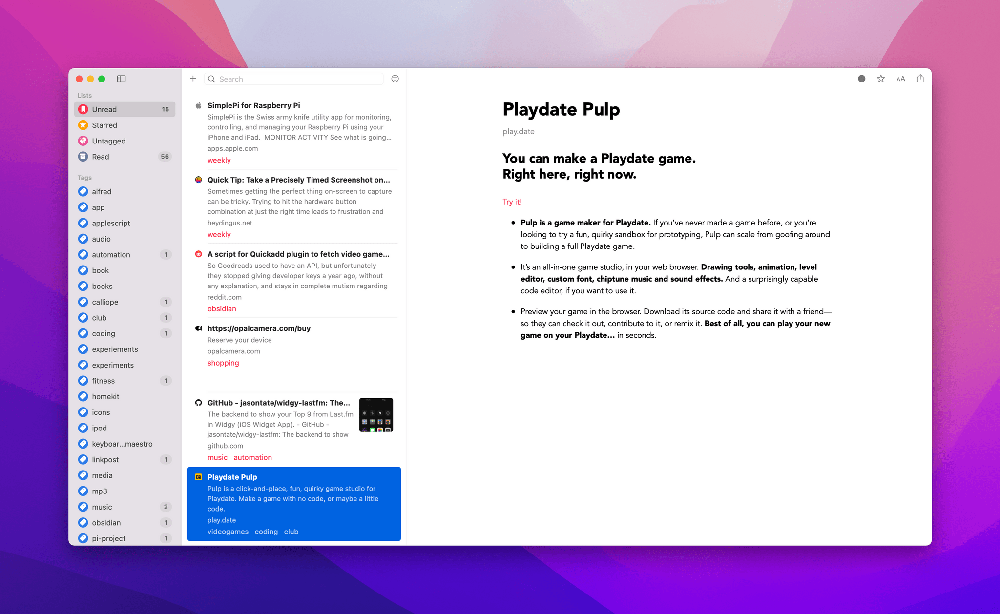
Leaving links locked inside the app where you found them isn’t much use either. I’d never considered that links could benefit from a more structured processing approach like email or tasks, but having just reorganized my approach to email, I realized that they absolutely can. The trick is to keep the system lightweight and flexible and to be willing to delete most of your links to avoid clutter.