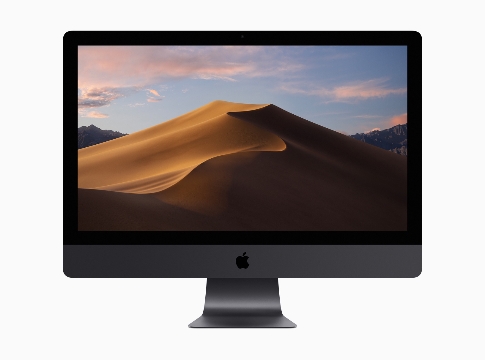
During its WWDC keynote presentation today, Apple took the wraps off macOS 10.14, also known as Mojave, which will be released this fall. One of the marquee features of the update is a completely redesigned Mac App Store, which we will cover in a separate article. In addition to a previously-leaked Dark Mode, the update will also include Finder, screenshot, and Desktop updates, the addition of several apps previously-available only on iOS, which Apple ported to the Mac using new frameworks under development for release in late 2019, and other new features.
Posts tagged with "featured"
macOS Mojave: The MacStories Overview
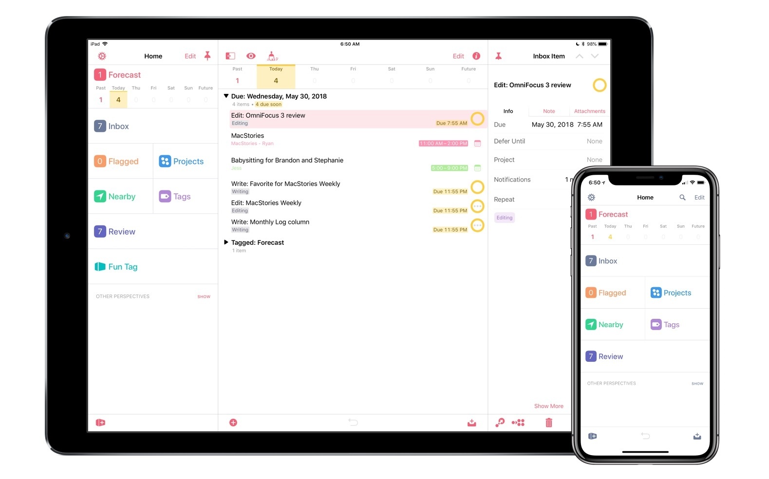
OmniFocus 3 Review: More Approachable and Powerful, All at Once
If you’re anything like me, you probably remain perpetually dissatisfied with your task management setup. You may have chosen an app and settled in with it, but some of its design choices don’t quite fit with your way of working, so you’re always keen to try the latest and greatest app that comes along. Realistically though, you’ve resigned yourself to the fact that the “perfect task manager” doesn’t exist, and likely never will.
Task management is a tough problem to solve, because every option out there is optimized for specific use cases, resulting in different complexity levels. Some aim to remain simple and user-friendly, while others try to put every tool at your disposal, endearing themselves to power users while scaring off prospective customers who need a bit less. On this complexity spectrum, OmniFocus has historically been the poster child for the weightier end: if you have a lot of complicated projects that need a high degree of structure, there’s no better place to start than OmniFocus; however, for lighter needs, I’ve always found its myriad of options too overwhelming to recommend.
OmniFocus 3, released today for iOS (and later coming to the Mac), adds even more power and options to the app’s existing toolset, yet rather than growing more complex in the process, it’s surprisingly become more approachable. This improved user friendliness is achieved thanks to a new level of flexibility that can, upon tweaking your ideal setup, obscure the app’s complexity in everyday use. In more ways than ever before, OmniFocus provides the tools to make the app your own.
Outside of a lovely new design, where icons and fonts are bolder and everything feels more fresh, my favorite changes in OmniFocus 3 are this increased flexibility, which encompasses a lot of new and updated features, and its excellent iPad improvements. Let’s dive in.
Things 3.6 Reimagines External Keyboard Control on iPad
Despite Apple’s message that the iPad Pro can be a viable PC replacement because, among other features, it natively supports a dedicated external keyboard, its software still isn’t fully optimized for keyboard control. This isn’t surprising at all: iOS was designed with multitouch in mind; as long as the iPad shares a common foundation with the iPhone, it’ll always be first and foremost a touch computer. The iPad Pro line, however, is nearing its third anniversary, and its external keyboard integration still feels like an afterthought that’s hard to reconcile with the company’s marketing.
Take multitasking for example: after three years, Split View, one of the iPad’s marquee exclusive features, still can’t be controlled from an external keyboard. If you buy an iPad Pro with a Smart Keyboard and assume that you’re going to be able to assign an app to a side of the Split View, or maybe resize it, or perhaps change the keyboard’s focus from one side to another…well, do not assume. As much as Apple argued against vertical touch screen surfaces in laptops years ago, the iPad Pro ended up in this very situation: if you want to take advantage of all the great features iOS 11 offers to pro users, you will have to take your hands off the Smart Keyboard and touch the screen. There are dozens of similar instances elsewhere in iOS. For the most part, the iPad treats external keyboards as inferior, bolt-on input devices.
It’s with this context that I want to cover Things 3.6, a major update to the task manager’s iPad version that gives us a glimpse into what Apple could do with external keyboard control on iPad if only they understood its potential.
I’ve been able to play around with Things 3.6 on my iPad Pro for the past couple of weeks. This isn’t another “keyboard-centric” update that only adds a handful of shortcuts to trigger specific commands. Instead, the developers at Cultured Code have focused on an all-encompassing keyboard control framework for the whole app, from task lists to popovers and multiple selections. With version 3.6, Things has the best implementation of external keyboard support I’ve ever seen in an iPad app.
Second Life: Rethinking Myself Through Exercise, Mindfulness, and Gratitude
“There’s something in your latest scan that we need to double check.”
Here’s what I’ve learned about cancer as a survivor: even once you’re past it, and despite doctors’ reassurances that you should go back to your normal life, it never truly leaves you. It clings to the back of your mind and sits there, quietly. If you’re lucky, it doesn’t consume you, but it makes you more aware of your existence. The thought of it is like a fresh scar – a constant reminder of what happened. And even a simple sentence spoken with purposeful vagueness such as “We need to double check something” can cause that dreadful background presence to put your life on hold again.
Spark 2 Hands-On: Email for Teams with App Integrations
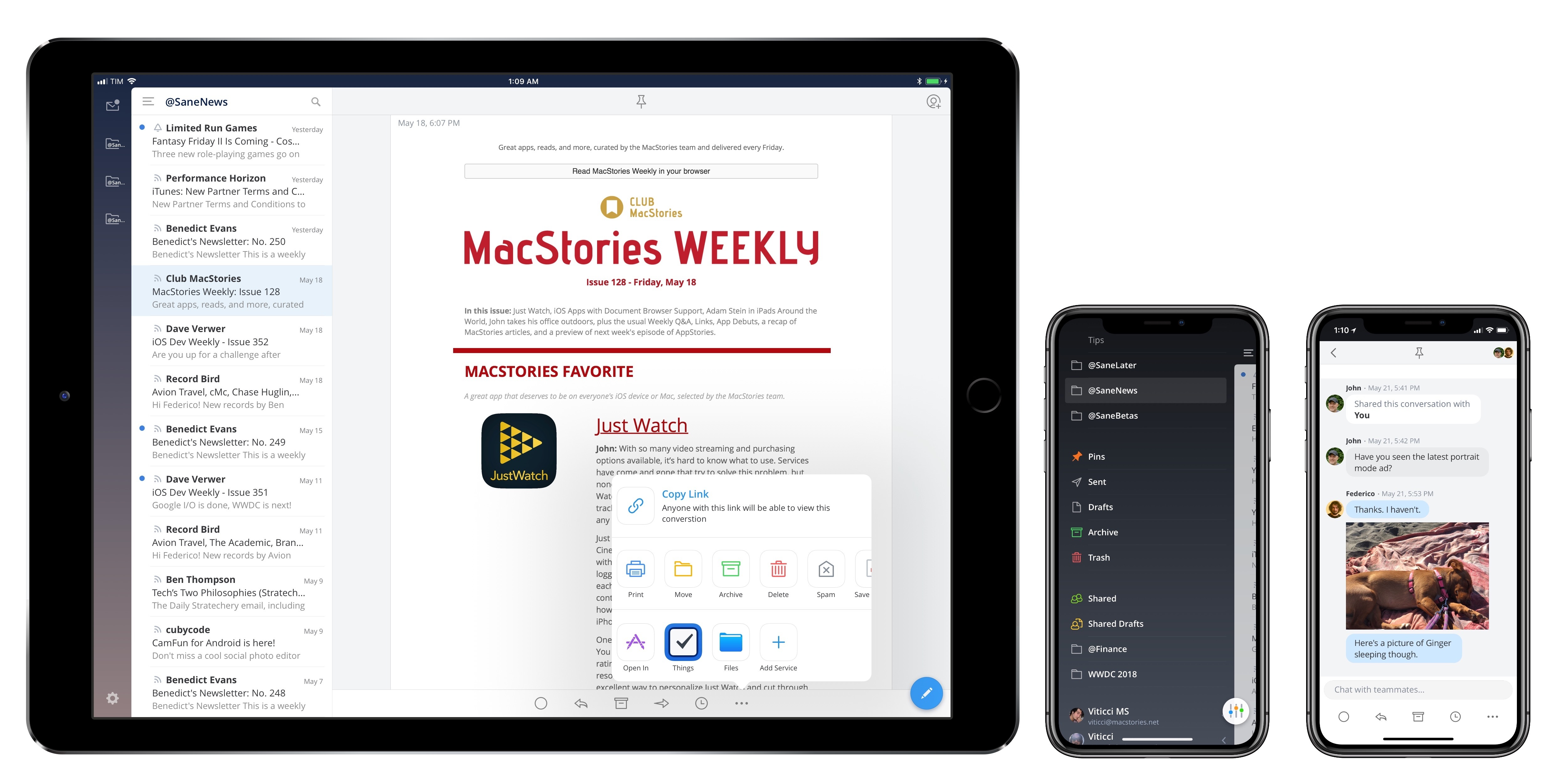
I’ve made no secret of my complicated relationship with email over the years.
While I’m always trying to optimize my email setup and finding new ways to spend as little time managing email as possible (for instance, I let SaneBox categorize emails on my behalf), my underlying problem lies in the scarcity of desktop-class email clients for iOS with specific features I’m looking for. As I shared in an episode of AppStories, these include: modern email options such as snoozing, read receipts, or “send later”; the ability to customize the app’s sidebar with mailboxes and saved searches; and app integrations to save messages into other iOS apps either as links or PDFs.
I’ve tried dozens of different email apps for the iPhone and iPad over the years. Some of them stuck for several months on my Home screen, like Airmail; some turned out to be ill-fated experiments; others were stuck in the old mindset of offering a “light” companion version on iOS and a “real” counterpart for the Mac.
Spark, developed by Readdle, has been at the forefront of innovation in email clients since its iPhone debut three years ago. In my original review, I noted how, despite several limitations (such as the lack of iPad and Mac versions) and an unclear business model, Spark was a new kind of email experience that felt refreshingly powerful, especially when compared to Apple’s stale Mail app. Spark gained a host of welcome enhancements in the past couple of years: in addition to being fully multi-platform on Apple devices, Spark is now capable of snoozing messages and sending them later; on the Mac, besides smarter search, Spark can even save messages into apps like Bear and Things.
I’ve gone back to Spark as my primary email app a handful of times over the past three years. Ultimately, I always stopped using Spark because it lacked feature parity with the Mac version (app integrations were never ported to iOS); most recently, I started using Apple Mail again because its drag and drop support in iOS 11 allowed me to “manually” integrate it with Things, Notes, and other apps.
This context is necessary to understand Spark 2, which is launching today on iPhone, iPad, and Mac, and which Readdle touts as the biggest update to Spark since the original app from May 2015. Spark 2 is a peculiar upgrade: on one hand, it won’t look that different to individual users, save for a couple noteworthy exceptions; on the other, it’s a major reinvention of Spark for teams, which explains why Readdle is hedging the app’s future on collaboration and a subscription-based business model (albeit with a generous free tier). The developers at Readdle are betting heavily on a vision that sees Spark as the centerpiece of email communication for teams – a platform in its own right, with all the upsides and potential issues that it entails.
For that reason, this can’t be a full, in-depth review of Spark 2. As a team, we’ve only had access to Spark 2 for the past three weeks, and we haven’t had a chance yet to test the app during one of the busiest periods of the year such as WWDC. I’m going to need more time for a full verdict and to understand how the MacStories team can be set up as a Spark organization. However, I believe that Spark 2 is the closest I’ve ever been to finding my ideal email client, and I want to explain why.
Castro 3 Review: The Castro You’ve Always Wanted
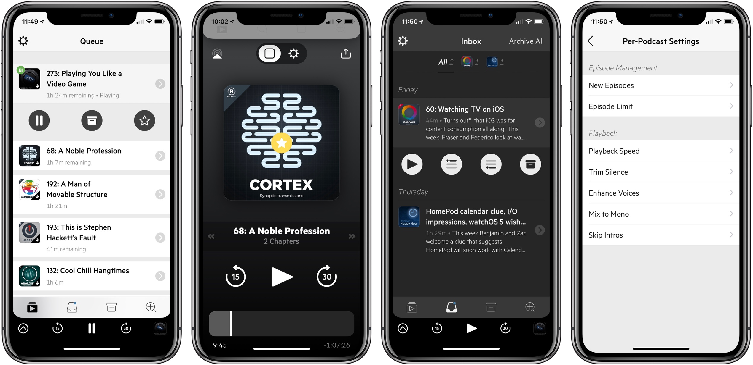
Castro has long been one of the premier podcast clients on iOS, and its excellent version 2 – with an innovative triage system and delight-inducing design touches – helped solidify it as such. Those strengths in 2.0, however, were mitigated in part by the absence of a few key features that competing podcast apps tout. That changes with Castro 3.
If you’re unfamiliar with the app, Castro’s centerpiece feature is a triage system involving an inbox and queue. The premise is that, with the rising popularity of podcasting, there are more great podcasts available than ever before. If you subscribe to lots of shows, the standard episode management tools found in competing apps likely aren’t sufficient. With Castro, by default new episodes of shows land in your inbox, and can then be sorted to the top or bottom of your queue and downloaded, or archived if they’re not of interest to you. It’s an elegant solution to the problem of podcast overload, and, thanks to customization options that allow you to make certain shows populate the top or bottom of the queue automatically, it’s a system that works for you, tailored to your listening preferences.
Castro’s triage system clicked with me the first time I tried it, and I used the app daily for nearly a year. Eventually though, I became more selective about the portions of podcasts I listened to, and Castro’s lack of chapter support sent me elsewhere. I’ve seen comments from other prospective Castro users who were similarly turned off from the app due to one missing feature – and often, this feature was different for different people.
If an absent feature ever kept you from sticking with Castro 2, that almost certainly won’t be a problem anymore. Castro 3 addresses nearly all of those “one missing feature” requests in a single release. Trim Silence is Castro’s take on Overcast’s Smart Speed; full chapter support is now present, as is a new Apple Watch app; the player screen has been fully redesigned; Mix to Mono improves stereo mixes that are hard to hear; and finally, there are excellent new per-podcast controls in a variety of areas. Perhaps the only thing still missing is an iPad app.
Castro 3 is everything Castro already was, but better. It’s the app that Castro fans have always wanted.
Tweetbot 3 for Mac Review
Tapbots has released Tweetbot 3 for Mac, which overhauls the app’s design, provides greater flexibility to manage multiple columns and navigate different parts of Twitter, and includes a dark mode. For the first time since it was introduced in 2012, Tapbots has also made version 3.0 a separate paid app, which means that existing and new users alike will have to pay $9.99 for the update.
Drafts 5: The MacStories Review
There are few apps I’ve ever used which made a lasting impact on my daily workflow. But for years now, the singular app that’s been the foundation of my iOS use has been Drafts. The app has lived in my dock since I first picked it up, it’s the single most important app I use on the platform, and it’s the only paid app I mandate to anyone looking for must-have apps on iOS.
Drafts is the bedrock app from which I build all my productivity. It’s the single point of text entry that shares to any app, whether through the share sheet, a simple action, or a custom and complex action. Any time I have an idea, I put it in Drafts. Tasks to add to my task manager? I do that from Drafts. Something I want to write about on my blog? That idea starts in Drafts too. It’s the focal point for everything I do.
But times change. Apps age. New features are added in the OS that need to be integrated, which cause some developers to pull the plug. So today, I’m saying goodbye to Drafts 4. And it’s getting replaced by the only app that could possibly replace it: Drafts 5.
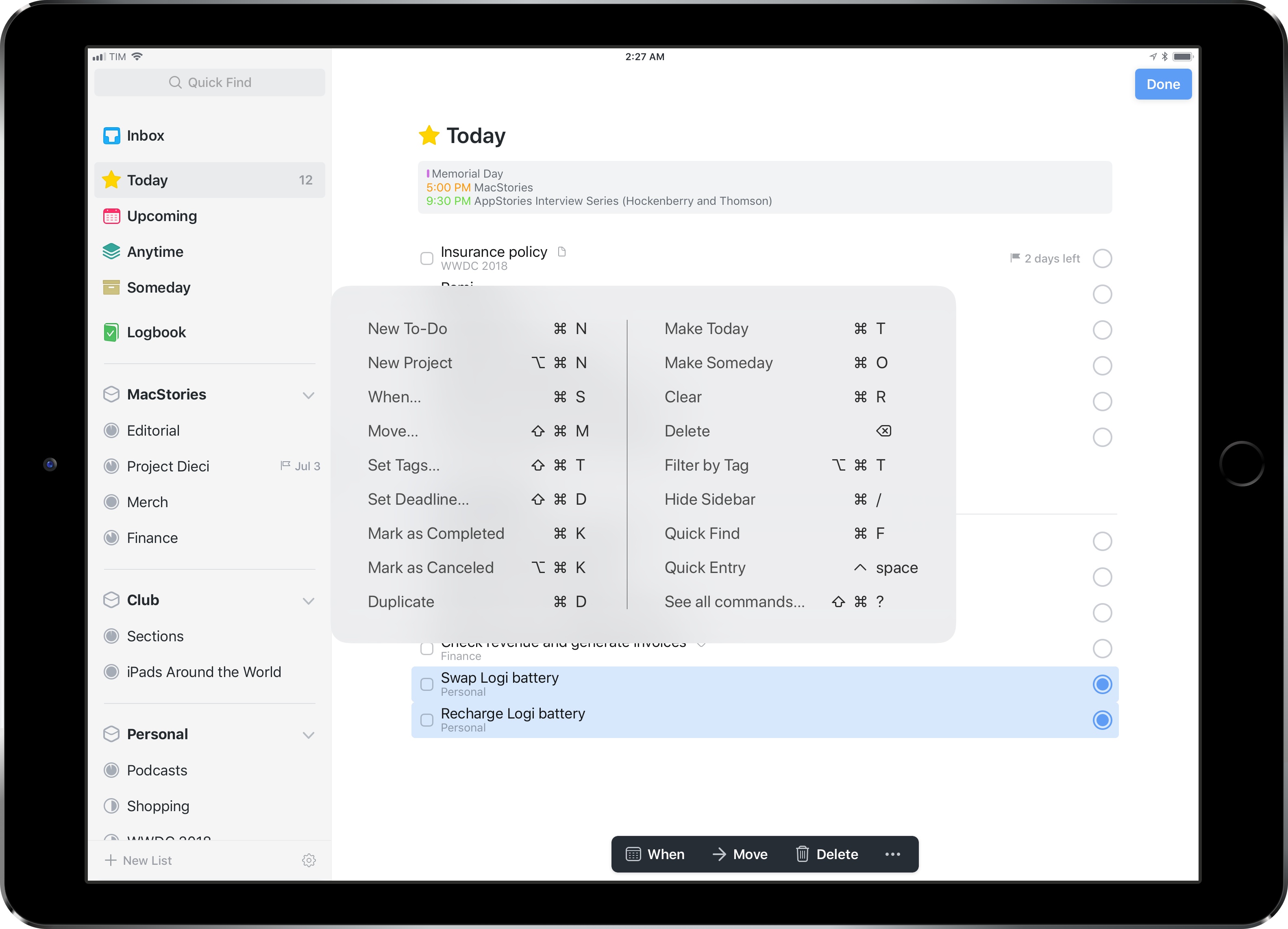
Things 3.5 Brings UI Refinements, Tagging and Automation Improvements, Clipboard Integration
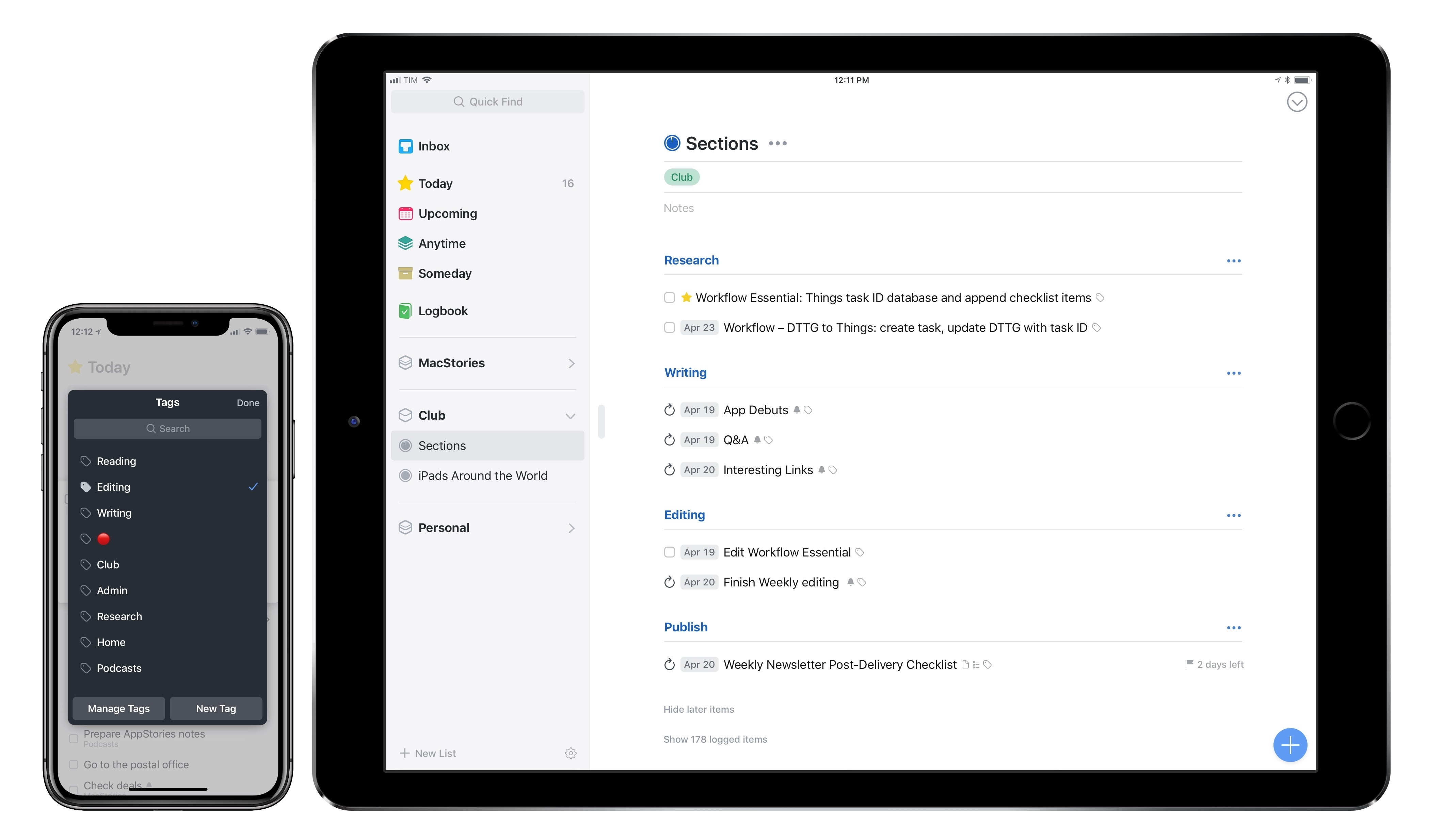
It’s been a busy 2018 so far for Cultured Code, makers of Things for Mac and iOS. Earlier this year, the company shipped Things 3.4, which, thanks to app integrations and a toolkit for third-party developers, propelled the task manager into the elite of automation-capable apps on iOS. It doesn’t happen very often that a task manager becomes so flexible it lets you build your own natural language interpreter; Things 3.4 made it possible without having to be a programmer by trade.
Today, Cultured Code is launching Things 3.5, a mid-cycle update that refines several aspects of the app and prepares its foundation for other major upgrades down the road. There isn’t a single all-encompassing change in Things 3.5 – nor is this version going to convince users to switch to Things like, say, version 3.4 or 3.0 might have. However, Things 3.5 is a collection of smaller yet welcome improvements that are worth outlining because they all contribute to making Things more powerful, intuitive, and consistent with its macOS counterpart.