Today Cultured Code launched the long-anticipated next version of its task management app, Things, for iPhone, iPad, and Mac. Things has been one of the go-to task managers on Apple platforms since its initial release in 2008, and for good reason; the team at Cultured Code is known for the thought and care they put into their apps. For much of its life, Things has been a shining example of quality iOS and macOS development.
Over the last nine years, Things has been quick to adopt the latest OS features introduced by Apple in an effort to keep the app current; more substantial updates, however, have been few and far between. It took four years for Things 1 to give way to Things 2, and the gap between versions 2 and 3 has been even longer. Many of the once-loyal Things users have moved on to newer, more modern options for task management. But now, Things 3 has finally arrived.
Was it worth the wait?
Design
One of the chief selling points of Things 3 is the way it looks.
An app’s visual design is, in many ways, a matter of preference. But as far as I’m concerned, you would be hard-pressed to find a better looking to-do app than Things. The first time I opened it on my iPad, I couldn’t help but pause a few moments to admire it. And while that initial sense of awe wore off after a few days of use, its residual impact can be judged by the way Things has ruined other apps for me. Things 2 looks archaic by comparison, and even more modern task managers like Todoist and 2Do appear dated after using Things 3. The only task manager I’ve come across that feels like it’s from the same design era is Microsoft’s successor to Wunderlist, To-Do.
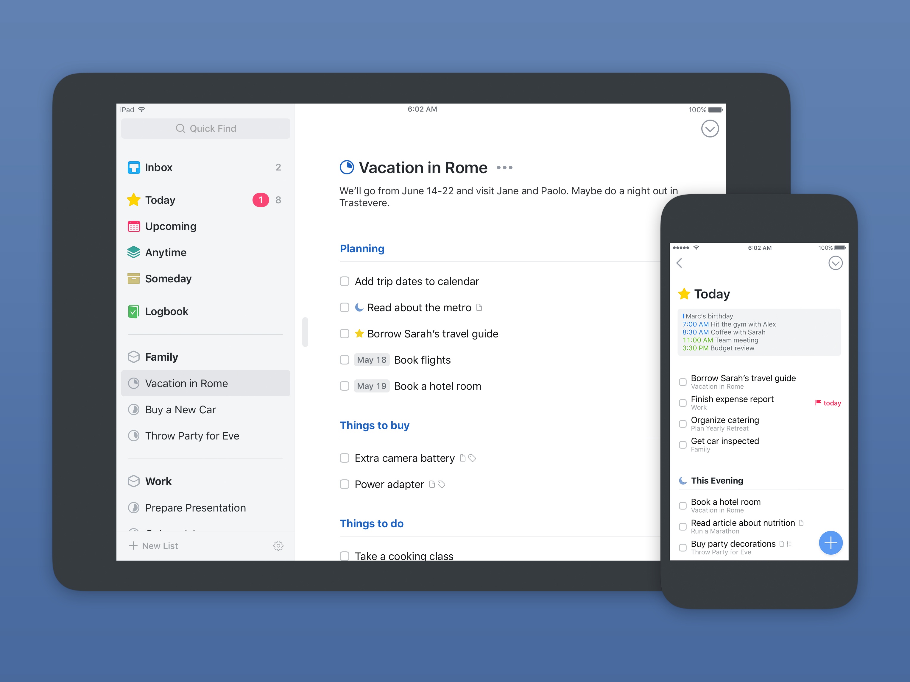
The app is dominated by white space, but it uses bold fonts, lovely icons, and thoughtful splashes of color to create a welcoming, easy-to-use environment. It’s simple, but beautiful in its simplicity. Screenshots don’t quite do it the justice it deserves.
Task Entry
Creating tasks is a key part of any task manager. Traditionally, most task managers lean in one of two directions when it comes to task entry. Some will optimize for speed at the cost of data, making it quick and easy to enter tasks, but not necessarily all the data that needs to accompany that task, such as due date, project designation, prioritization, etc. Task managers like this will often ask you to dump tasks in an inbox and sort them out later. On the other end of the spectrum are the task managers that optimize for rich data entry at the cost of speed. With these, hitting the plus button to add a task often presents a comprehensive sheet where you input all of the task’s accompanying data then and there. The best balance I’ve found between these two approaches thus far is Todoist, which allows you to use natural language to quickly create a task with a due date, assigned project, and more by typing in a single box. Things likewise tries to find a balance between the two extremes, but in a different and interesting way.
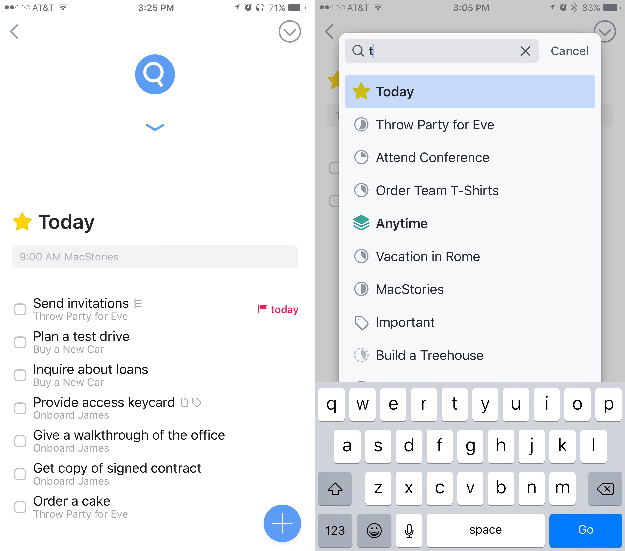
As with many other task managers, you’ll find a plus button in the bottom area of the screen to add new tasks. But in Things for iOS, that button has a special name: the Magic Plus Button.
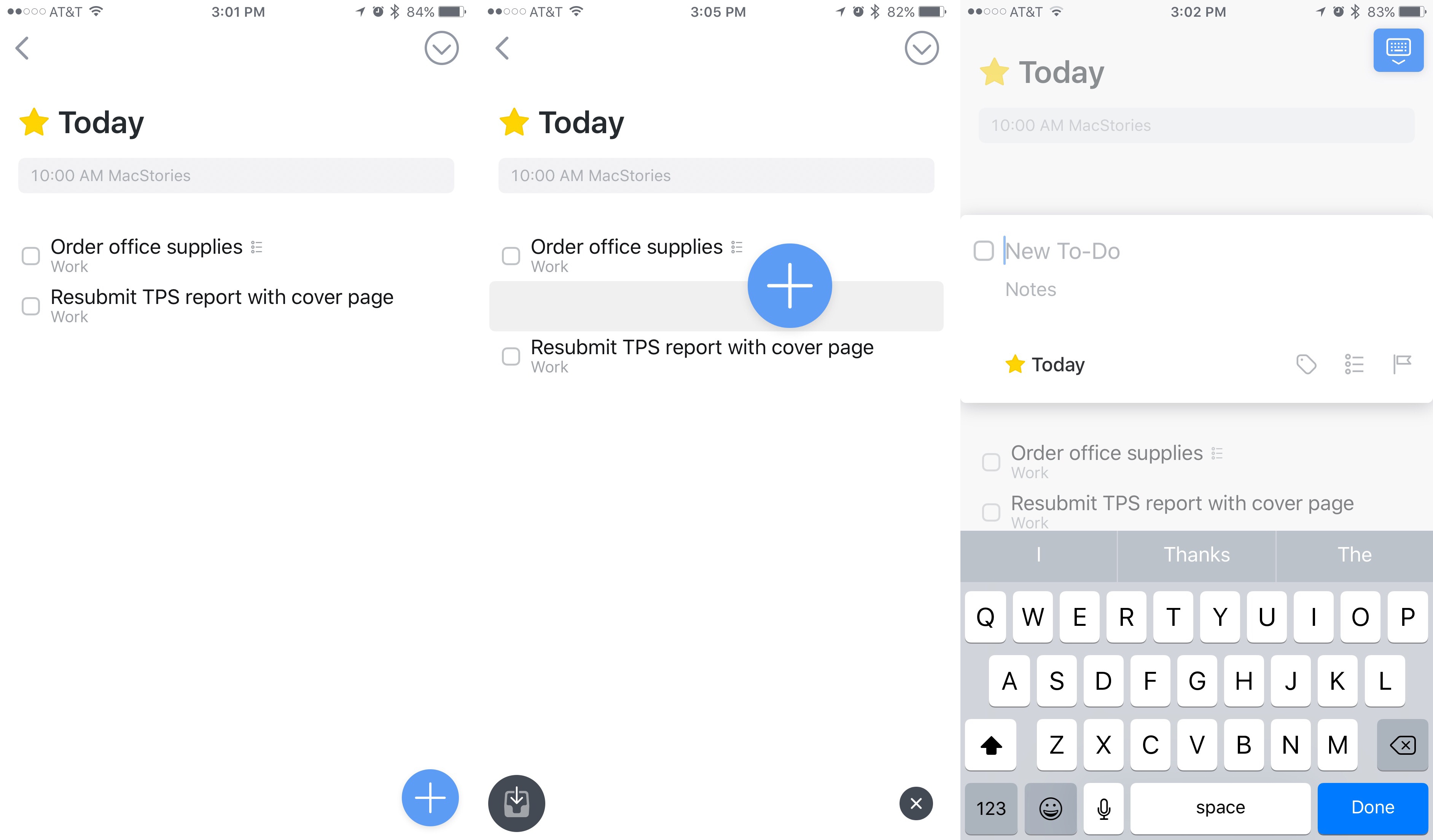
In one of the most clever methods of task entry I’ve seen, the Magic Plus Button can be dynamically moved around the screen as a way to add additional data. While its default location will always be the lower right corner, the button can be dragged and dropped into different spaces of the app to do different things. Tap and drag the button into your list of projects to create a new project. Drop it into a list of tasks in Today to create a new task in that exact spot. Drop it into the Inbox icon that appears in the lower left corner to create the task in your Inbox. And, my personal favorite, when viewing your Upcoming list, drag and drop the button on to the day when that task needs to be acted on, and you’ve just assigned its start date.
Once you’ve placed the Magic Plus Button where you want it, the task or project will just need a name filled in before it’s ready to go. Additional data can be added to the task’s card, but otherwise the task can quickly be saved with the essential information already taken care of.
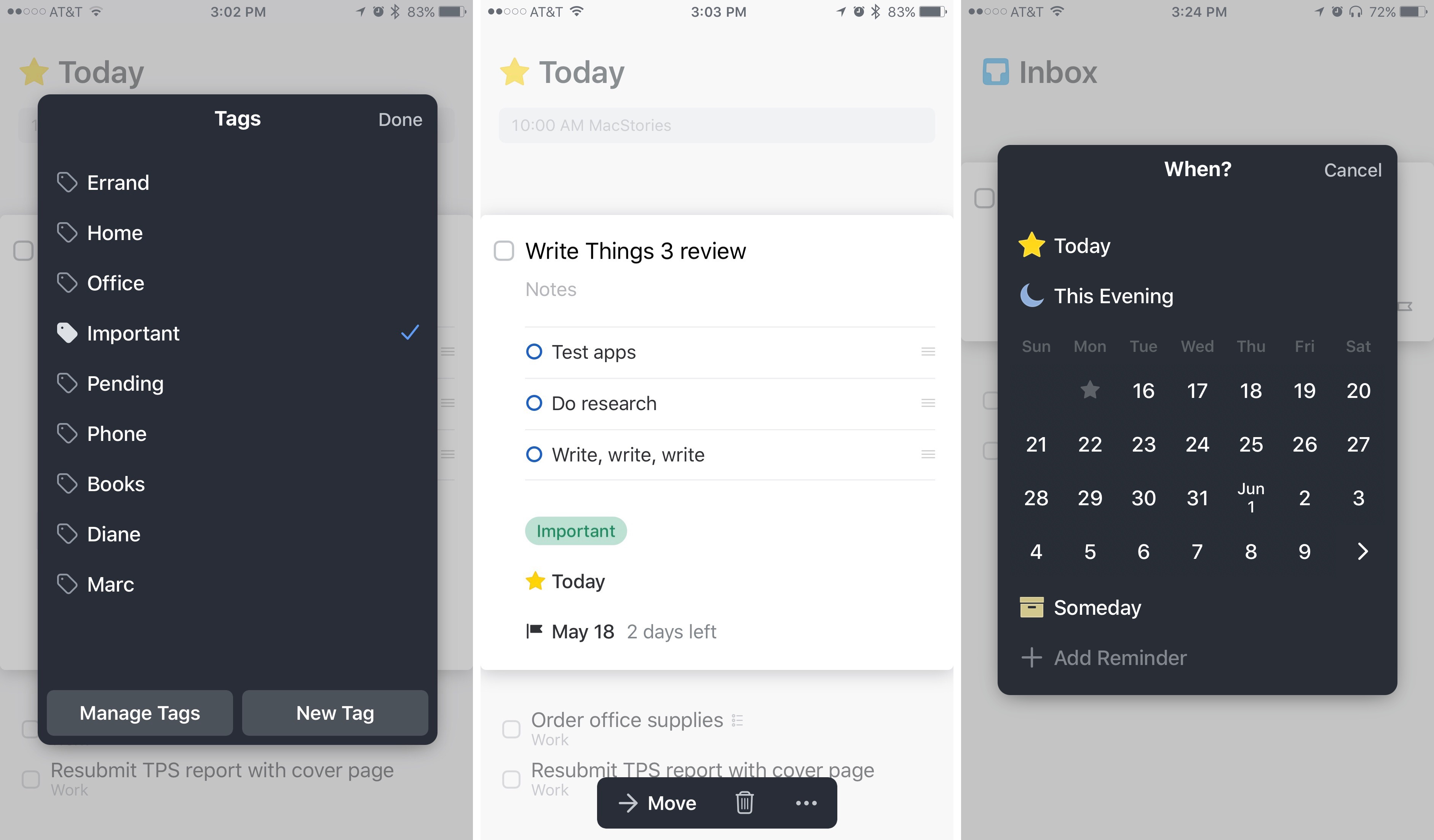
If you need to add more complex data to a task, Things offers support for the following data types:
- Notes
- Start dates
- Time-based reminders
- Tags
- Checklists
- Deadlines
Each of these lives within the card interface of a task.
A few points worth highlighting are that notes created on a task display in full on the surface of the card, making them prominently visible when you open the task. Likewise, the ability to create checklists is helpful, and the checklist displays in full on the card’s surface as well. I also appreciate the distinction in Things’ system between start dates, when tasks will appear in your Today view, and hard due dates, called Deadlines, when a task must be completed by. Time-based reminders are another nice addition; they can be created using natural language input, and will send you a notification at the requested time.
Things’ system for task creation may not be the quickest available – especially when creating tasks in bulk – but it’s simple and intuitive, and it still beats many competitors in the area of speed. The abilities of the Magic Plus Button also add a welcome element of delight to the job of task creation that isn’t found in other apps.
Tasks as Objects
One of the key concepts found in Things 3 is that tasks are not just simple text; they’re distinct objects. With a glance at your task list, each task will appear as mere text, belonging to a list of text, but there’s more behind the surface. Tap on a task, and it will pop out into a card-like form while the rest of the list fades into the background. This expanded card includes the full information about that task, all of which can be easily edited.
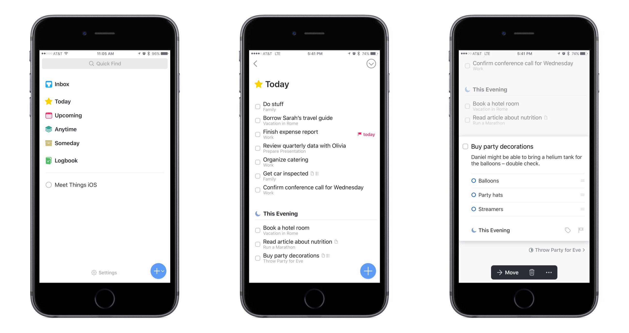
A second way that the task-as-object paradigm plays out is that you can long-press a task to make it pop out of the list so you can drag it elsewhere on the screen. You can’t change the task’s assigned project or area this way, but it is helpful for reordering your agenda for the day or rescheduling a task for a future date.
More familiar interaction methods are still present for when they would suit your needs best. You can swipe right on a task to quickly reschedule it, or swipe left on a task to select it. Once you’ve entered selection mode, additional tasks can be selected easily one at a time, or in bulk by swiping up or down on the selection of circles that appear, selecting or deselecting large groups at a time. Once a group of tasks is selected, you can reschedule, delete, or move them to a different list.
Like with the Magic Plus Button, the strength of these design decisions is not just in their functional purposes, but in the way they add a sense of fun to interacting with the app’s various elements.
Task Organization
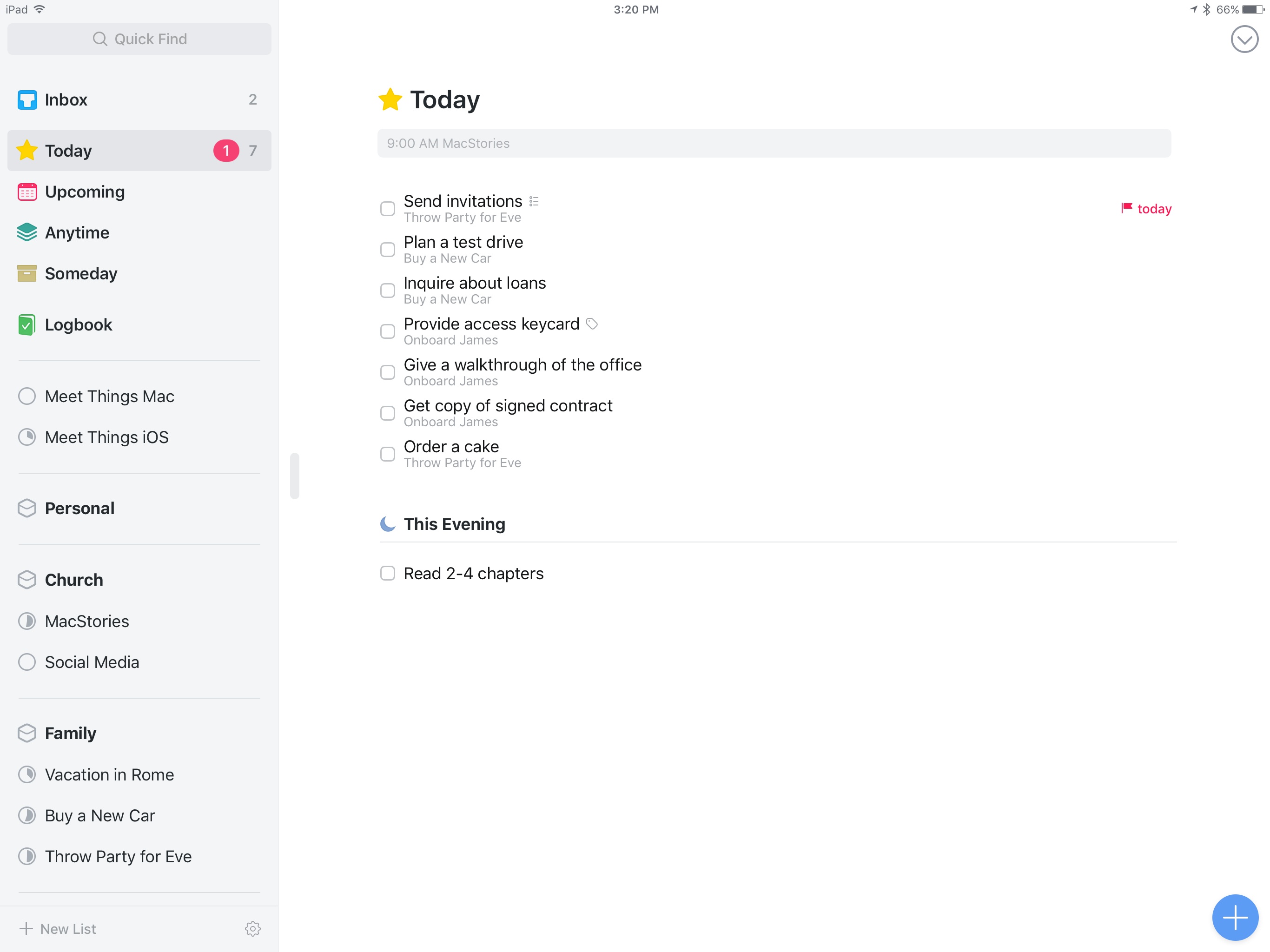
Things 3 carries over much of the basic organizational structure from Things 2, with a few substantial improvements. The Inbox, Today, Someday, and Logbook lists are still present, mostly the same as they were before. One change in Today is that it now includes a section called ‘This Evening’ that you can add tasks to, creating a distinction between daytime tasks and nighttime tasks while keeping them all in one screen.
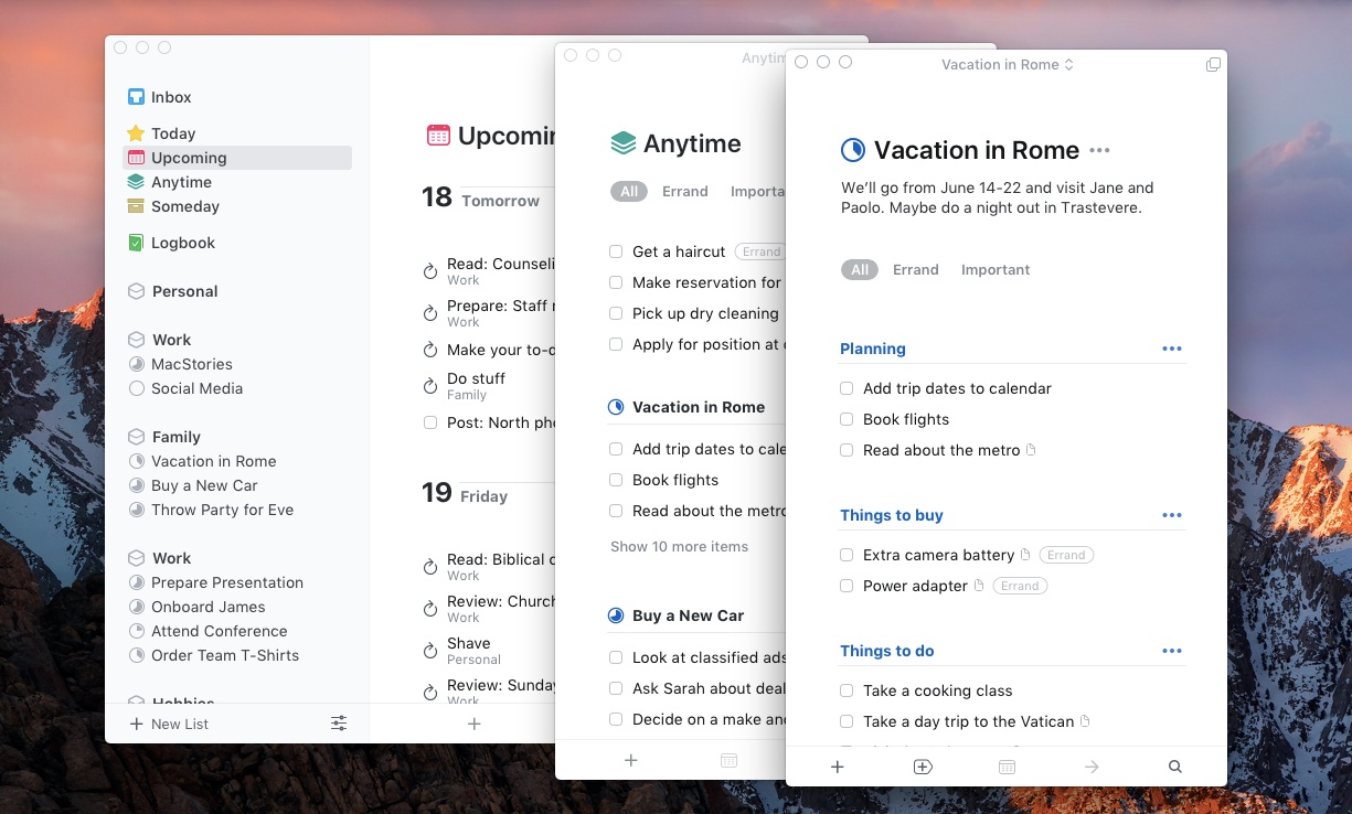
Upcoming is a new list found in Things 3 that replaces, in many ways, the Scheduled list from Things 2. It contains tasks assigned to specific dates in the future. The next seven days are each listed out individually, which serves as a helpful visual to indicate what your next week will look like. Beyond that, divisions of tasks are made on a week by week or month by month basis rather than day by day, allowing you to see a bird’s-eye view of tasks further out in the future.
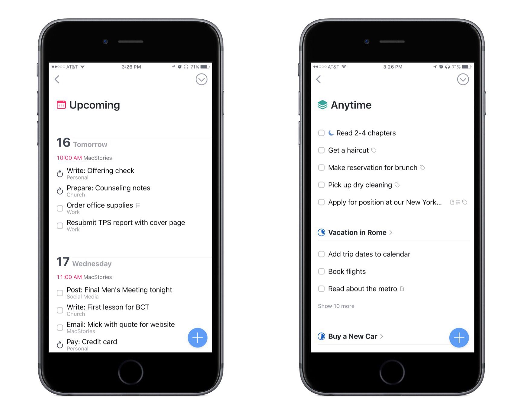
Anytime is another list new to Things 3, although it is primarily a rebranding of what was formerly called the Next list. Anytime combines all tasks from Today with all tasks that have no assigned start date (except for those found in Someday). Essentially, if a task is in Anytime, it’s something you should be able to work on whenever you have a free moment.
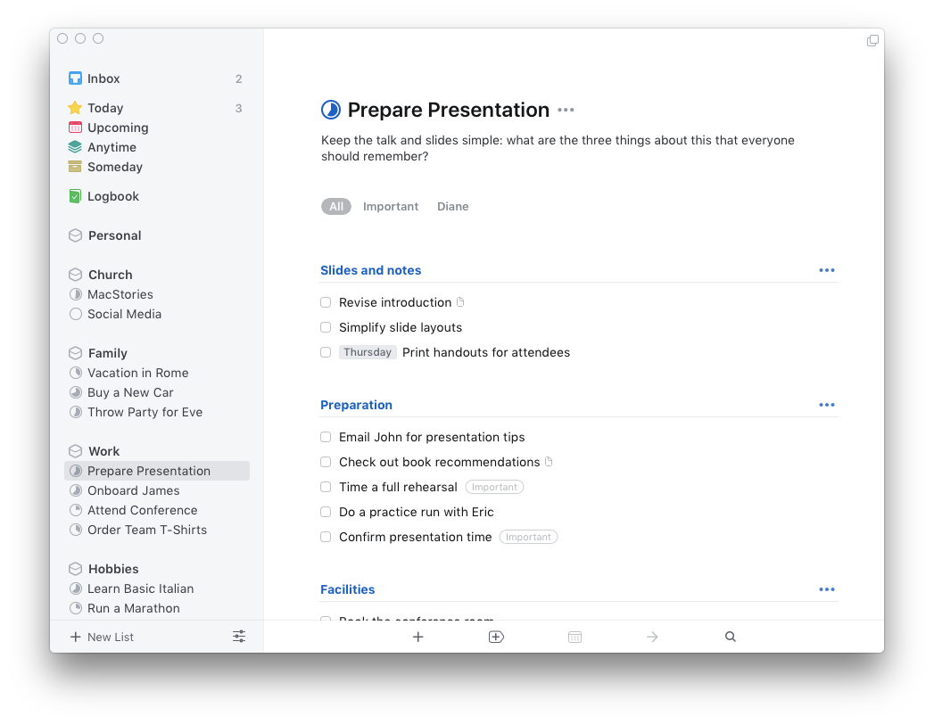
The difference between areas and projects is made clearer in Things 3 than it was in past versions. From the main navigation menu, areas are represented by bold text, while projects are listed below their accompanying areas in a lighter font. Areas can contain their own lists of tasks, independent of any projects, so in some sense you could use the two interchangeably depending on your needs. But working in conjunction, they serve as a helpful method of hierarchy. One functional difference between the two is that projects now contain a visual indicator in the navigation menu to show how near or far off the project’s completion is.
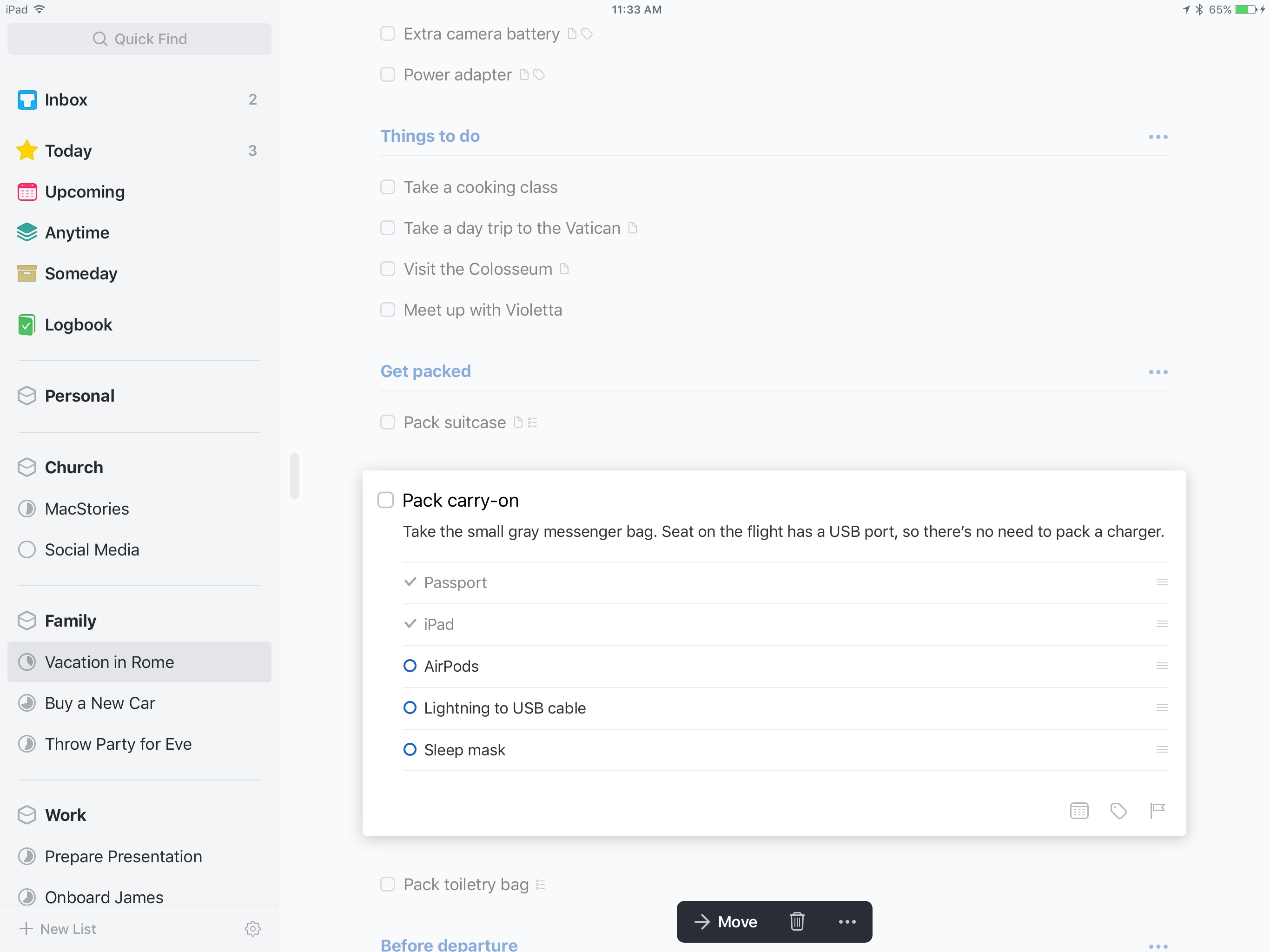
When it comes to the organization of specific projects you create, one of the unique additions in Things 3 is support for headings. These help make lists of tasks better organized and more aesthetically pleasing. Within a project, you’ll see the project’s title at the top, and immediately below that title you can add a note, or you could say a subheading. This is a useful place to store general information about the project that you’ll want to reference later.
Within a project you also add a variety of headings to encompass different groups of tasks. On iOS, tap the down-facing arrow in the upper right corner of the screen to see the ‘New Heading’ option, and you can get to work organizing different tasks from that project into logical groups. On macOS, this option is at the bottom of the screen next to the new task button. These heading options are complemented well by the note and checklist tools that can be added to individual tasks.
The system is built flexibly so you can use these headings in whatever way works best for you and makes the most sense for that project. For example, if you create a project dedicated to vacation planning, you may have a group of tasks that make up things you need to buy ahead of time, things you need to pack, things you plan to do on your trip, and an “Out the door” checklist to make sure you don’t forget any last-minute items.
Everything Else
Calendar Integration: You can now let Things access your calendars so that calendar events are listed inside the Today and Upcoming lists. As few or as many calendars can be added as you’d like, and each will display its events in that calendar’s assigned color. Events are listed above your list of tasks, and will turn grey in Today once they’ve passed. This is a helpful way to better keep track of your day’s agenda.
Search: Cultured Code has made search quick and easy in Things 3. On iOS, pulling down from anywhere in the app will engage the search box, allowing you to quickly find a specific task or navigate to a certain list or tag. As nice as this is, on macOS search is even better thanks to a feature called Type Travel. Wherever you are in the app, without engaging any type of search dialogue box, you can simply start typing to begin a search. As long as Things is the active window, all you have to do is type.
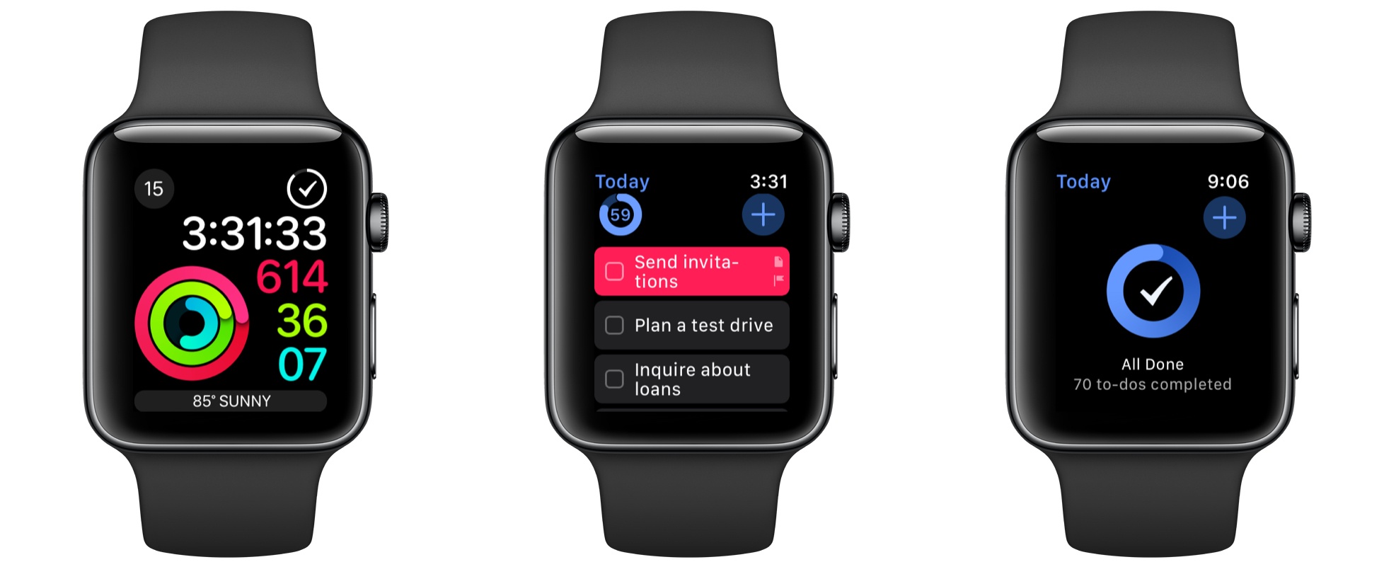
Apple Watch: Things’ Watch app is very simple, like every good Watch app tends to be. It contains all tasks from your Today list, each of which can be interacted with in a few ways. If the task contains a checklist, you can mark off those items. If it contains a note, you can read it. Or if it doesn’t, you can add a note to it, or a deadline. Tasks can also be assigned to later start dates or, of course, checked off once they’re completed. You can add new tasks through dictation; by default these tasks are added to Inbox, but you can hit a button to add them to Today instead. There are several styles of complications, including ones that show the Things icon accented by a progress ring around the border, indicating the status of your Today list, and others that display tasks from your Today list.
Multiple Windows: On the Mac, you can now easily open several windows of the app at once, so you can have multiple lists, projects, and other views all visible simultaneously. Clicking the icon in the upper right corner opens a new window, and you can then click on the title in the upper center of the newly created window to change its view to a different list.
Haptic Feedback: If you have an iPhone 7 or 7 Plus, Things takes great advantage of the Taptic Engine found in those devices. Even though that may be only a small subset of Things’ users, in many ways the app feels like it was built with haptic feedback in mind. Certain actions are well-suited for the added kickback of the Taptic Engine, such as picking up a task to drag it elsewhere, or interacting with the Magic Plus Button. Opening the search box by pulling down on the screen is another place where the pop of the interface forms a perfect marriage with haptic feedback. It makes every interaction with the app feel that much more real, and I sorely miss it when using the iPad version.
Touch Bar: Things includes basic Touch Bar support for actions like task creation, assigning start dates, moving tasks into a project, and more.

Limitations
My task manager of choice until this time has been Todoist, and while I haven’t quite decided whether Things will take its place going forward, there are a few limitations in Things that make it harder to commit to.
No Web API: Things is primarily designed as an app with a web backend, while Todoist is primarily designed as a web service with accompanying apps. Each approach has advantages and disadvantages, but the lack of a web API for Things, as exists for Todoist, makes automation and integration with other services severely limited.
No File Attachments: Todoist Premium allows you to add files to a task in the form of a comment, while Things doesn’t offer support for file attachments on iOS; macOS creates a direct link to any file you drag into a task’s note, but even then it’s not a native attachment. I will often attach photos or emails to tasks in Todoist when I’ll need to reference those things to accomplish the task at hand. The inability to do that in Things means I have to hunt that file down separately when it’s time to complete the task, costing me more time.
Keyboard Shortcuts: The macOS version of Things has excellent keyboard support, but sadly none of it has made its way to iOS. There is not a single shortcut, which is difficult for me personally as an iPad-first user. It’s surprising as well, since Things 2 at least had a handful of shortcuts on iPad.
Restrictions on Repeating Tasks: I have two primary issues with the way repeating tasks are currently handled in Things. One is that you cannot create repeating tasks inside of projects. Fortunately, Cultured Code says that option is coming soon after launch, and I look forward to its addition. The second issue is that repeating tasks cannot be marked as complete ahead of time. Often near the end of my day, if I finish the day’s tasks early, I will get a head start on the next day’s work. I can certainly do that in Things by looking at the Upcoming list, but I won’t be able to mark any of those repeating tasks as complete until the following day, which is an unnecessary limitation.
Things 3 is a difficult app to review in that it’s not really one app, but three. Although each app is largely the same, there are a handful of strengths and weaknesses unique to each platform. iPhone has the haptic feedback that perfectly complements the pops of different UI elements; iPad suffers from the lack of keyboard shortcuts, but has the Magic Plus Button like iPhone; Mac has the excellent Type Travel search feature and multiple window support, both of which should please power users. On one hand, I wish there was more uniformity, as the experience is slightly fragmented as-is. But at the same time, I wouldn’t want to sacrifice any of these features for the sake of uniformity; Cultured Code has done a great job taking advantage of each platform’s unique abilities, and I applaud them for that.
As an upgrade from Things 2, this new version offers a lot to love. Besides the beautiful visual updates and new features, Things 3 also has a different feel to it. Particularly on iOS, the app feels like it was built from the ground up for a touch-based interface. The common acts of creating new tasks, reorganizing them, checking them off, and engaging a search box all feel fundamentally designed for personal interaction; they give a sense of depth, of meaningful tactile engagement not found in Things 2, or even most other modern apps. These actions all work fine on the Mac as well, but on iOS – and especially the iPhone, thanks to the Taptic Engine – they shine most.
The app landscape has changed a lot since Things’ last major version launched. Competitors like Todoist have arisen, offering task management as a web service, with all the convenience and automation potential that comes along with that. Business models for iOS apps have gone through a shift as well, from paid up front to the increasingly common free with In-App Purchase, or in some cases monthly subscriptions.
In the face of that change, Cultured Code has stuck to its roots in producing a beautiful, well crafted, powerful yet elegant new set of apps. Perhaps there’s nothing revolutionary being done here, but that’s okay; Things is full of little delights – and we could all use more of those in our working lives.
Things 3 is a paid update for all users. It’s available on the App Store as three separate apps: iPhone with Apple Watch, iPad, and Mac. Regular pricing for each app is $9.99, $19.99, and $49.99 respectively, but until May 25 all apps will be discounted by 20%, making launch pricing $7.99 (iPhone), $15.99 (iPad), and $39.99 (Mac).