Today, Apple introduced four new iPhone models: the iPhone 15, the iPhone 15 Plus, the iPhone 15 Pro, and the iPhone 15 Pro Max. The new iPhones pack a wide array of new features to cover, so let’s dig in.
iPhone 15 and 15 Plus
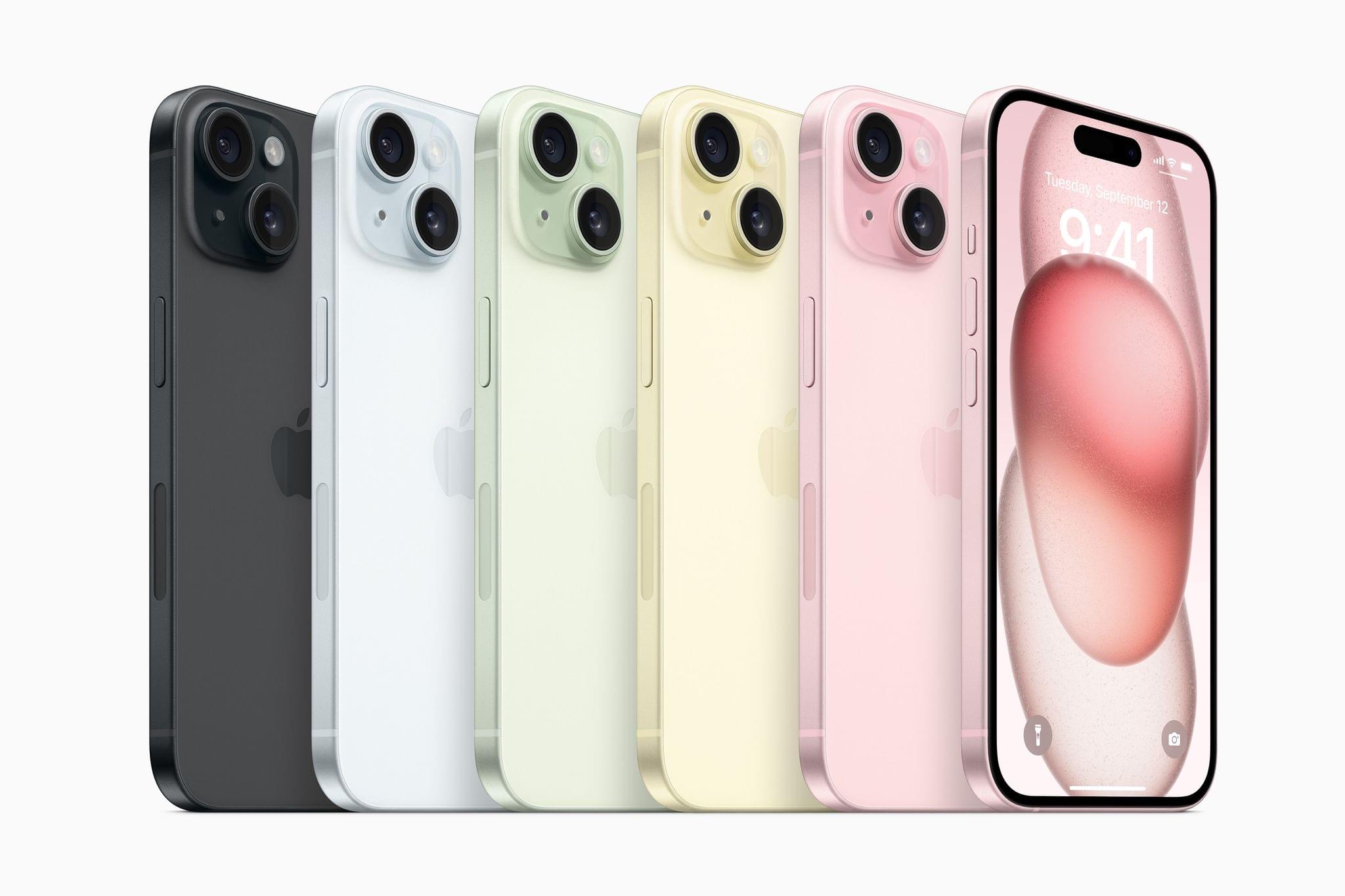
As in the past, the iPhone 15 and 15 Plus come in a greater array of colors than the iPhone 15 Pro or 15 Pro Max, with pink, yellow, green, blue, and black options this year. The design on the new iPhone 15 and 15 Plus is similar to last year’s models but with a new contoured edge and a glass back that embeds the iPhones’ color throughout the glass that’s etched for a matte finish.