This Week's Sponsor:

Listen Later

Listen to Articles as Podcasts


Posts tagged with "design"

Vidit Bhargava’s Design Concept for a Menu Bar and Multitasking on iPadOS

Vidit Bhargava, the developer behind the excellent dictionary app LookUp, has published a compelling design concept on Pixel Posts for bringing a menu bar to the iPad and modifying how its multitasking works.

Complex apps like Adobe Illustrator hide functionality behind multiple layers of obscure icons using floating palettes that can be hard to learn. As Bhargava explains:

They are powerful utility apps that some how [sic] struggle with providing a simple, easy to use and understand navigation for their actions. Actions are often hidden behind modes, strips of complicated icons or simply not available for the lack of space.

As a result, there’s no single location you can go to find all of the functionality an iPad app offers.

Bhargava makes a good case for a menu system on the iPad, using what he calls an Extended Status Bar that includes an app’s menu and a customizable control tray to access OS actions like Spotlight search and shortcuts. In addition to the Extended Status Bar, Bhargava imagines the App Library coming to the dock and the addition of floating windows for apps like Calculator.

I’m not convinced that Apple would adopt a system so similar to macOS, but I think Bhargava’s on the right track. As more complex apps are brought to the iPad, the lack of a universal way to organize their features means users have to learn a new system for every app, which hinders pro app adoption. If Apple brought Final Cut Pro or Xcode to the iPad, I think its engineers would quickly feel the same pain points with which other developers of pro apps are already grappling.

Permalink

2020 Apple Design Award Winners: The AppStories Interviews

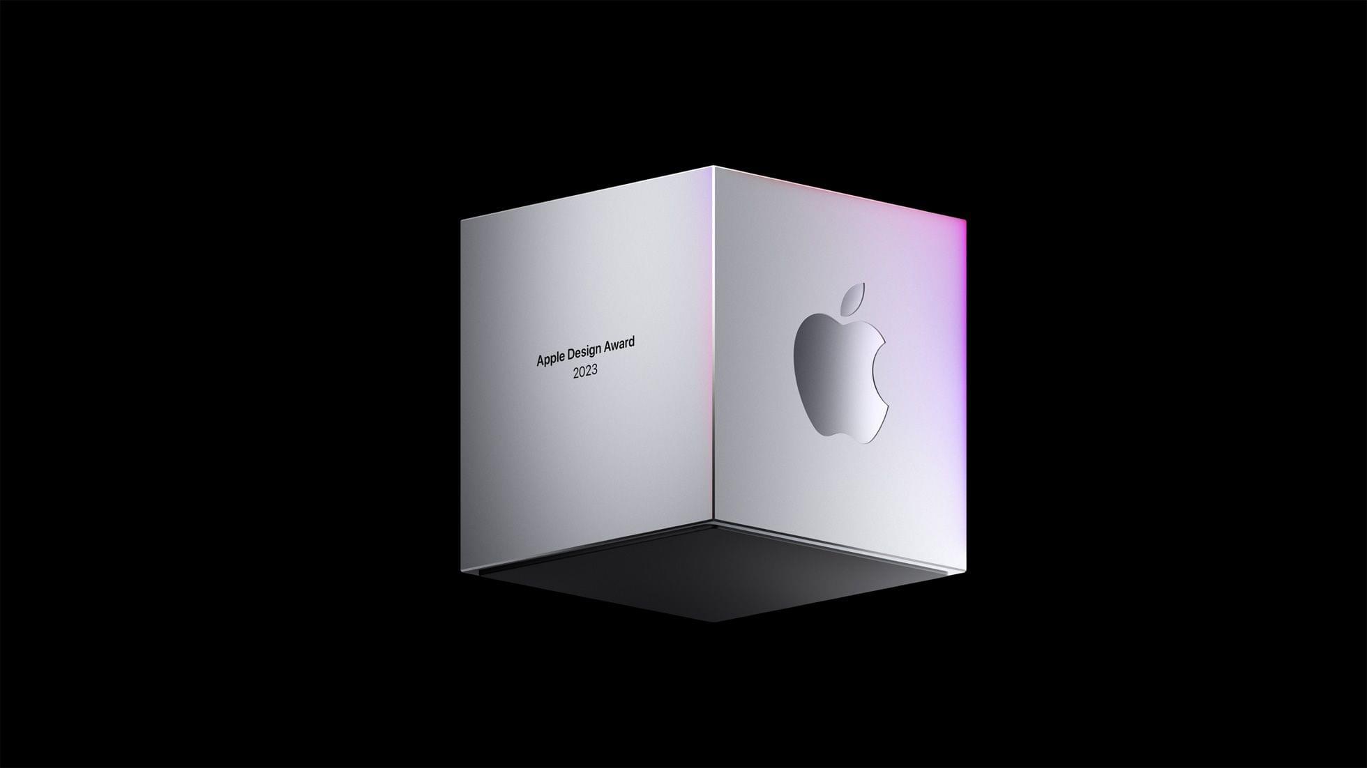
Federico and I had the pleasure of interviewing three of the 2020 Apple Design Award winners for AppStories. The awards, which were announced by Apple last Monday, recognize “outstanding app design, innovation, ingenuity, and technical achievement.”

For today’s special episode, we spoke with Majd Taby of Bergen Co., the creator of photo and video editing app Darkroom, Sam Rosenthal of The Game Band, the studio behind Where Cards Fall, which was a launch title on Apple Arcade, and Jenova Chen, of thatgamecompany and the creative director of Sky: Children of the Light, an innovative social adventure game. All three interviews are terrific conversations that reveal common threads of thoughtful design, innovative approaches that feature the latest Apple technology, and a deep understanding of their users.

Thank you to Majd Taby, Sam Rosenthal, and Jenova Chen for taking the time for the interviews, Apple for helping arrange them, and as always, thank you for listening to AppStories. We hope you enjoy the episode.


Permalink

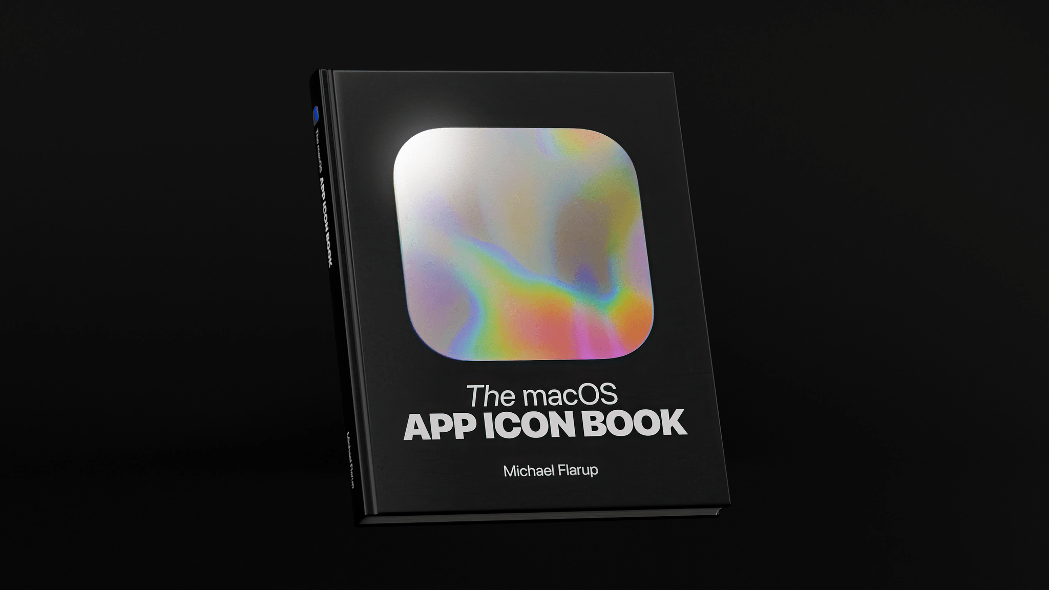
Michael Flarup on Big Sur’s New Design

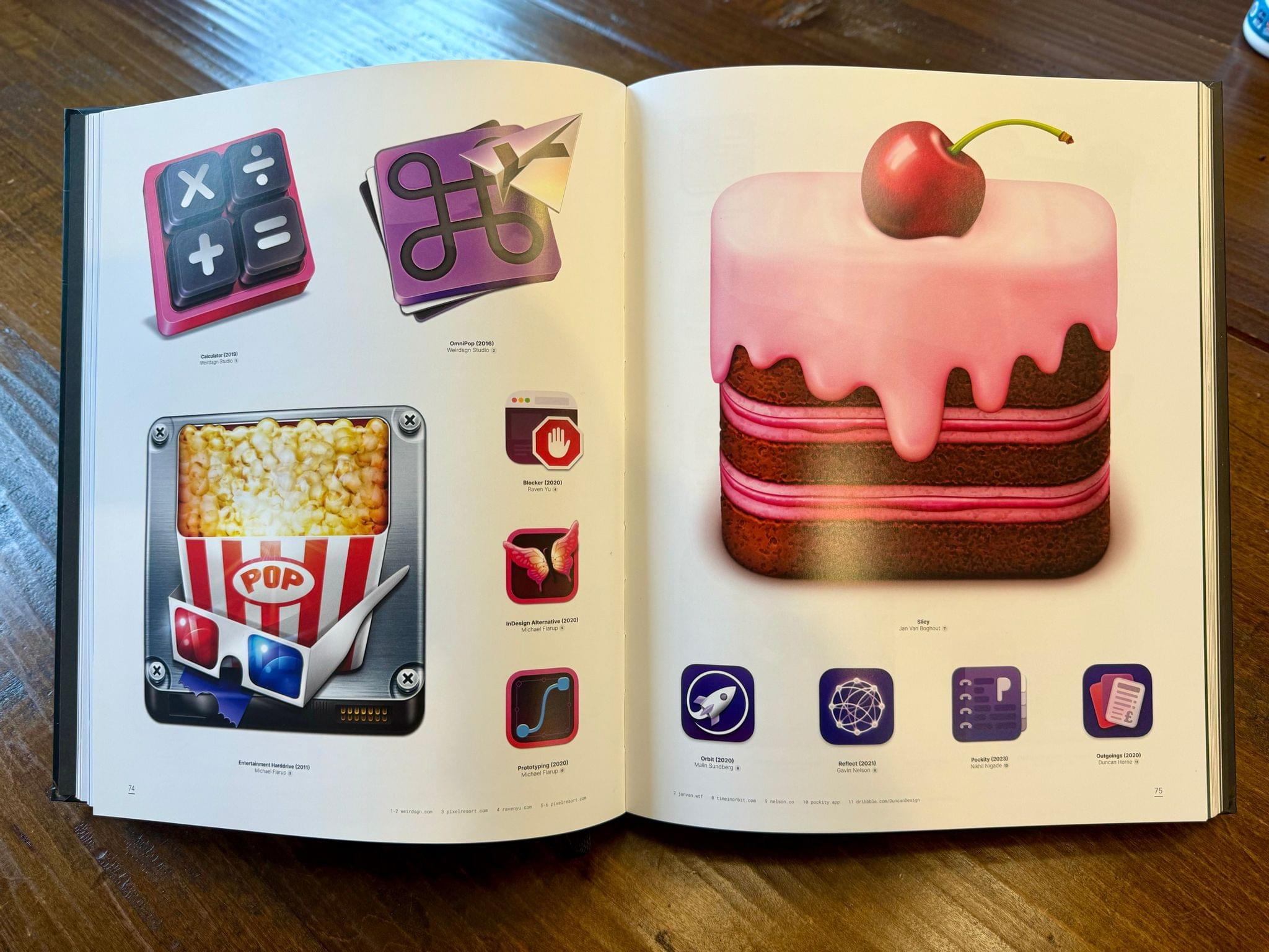
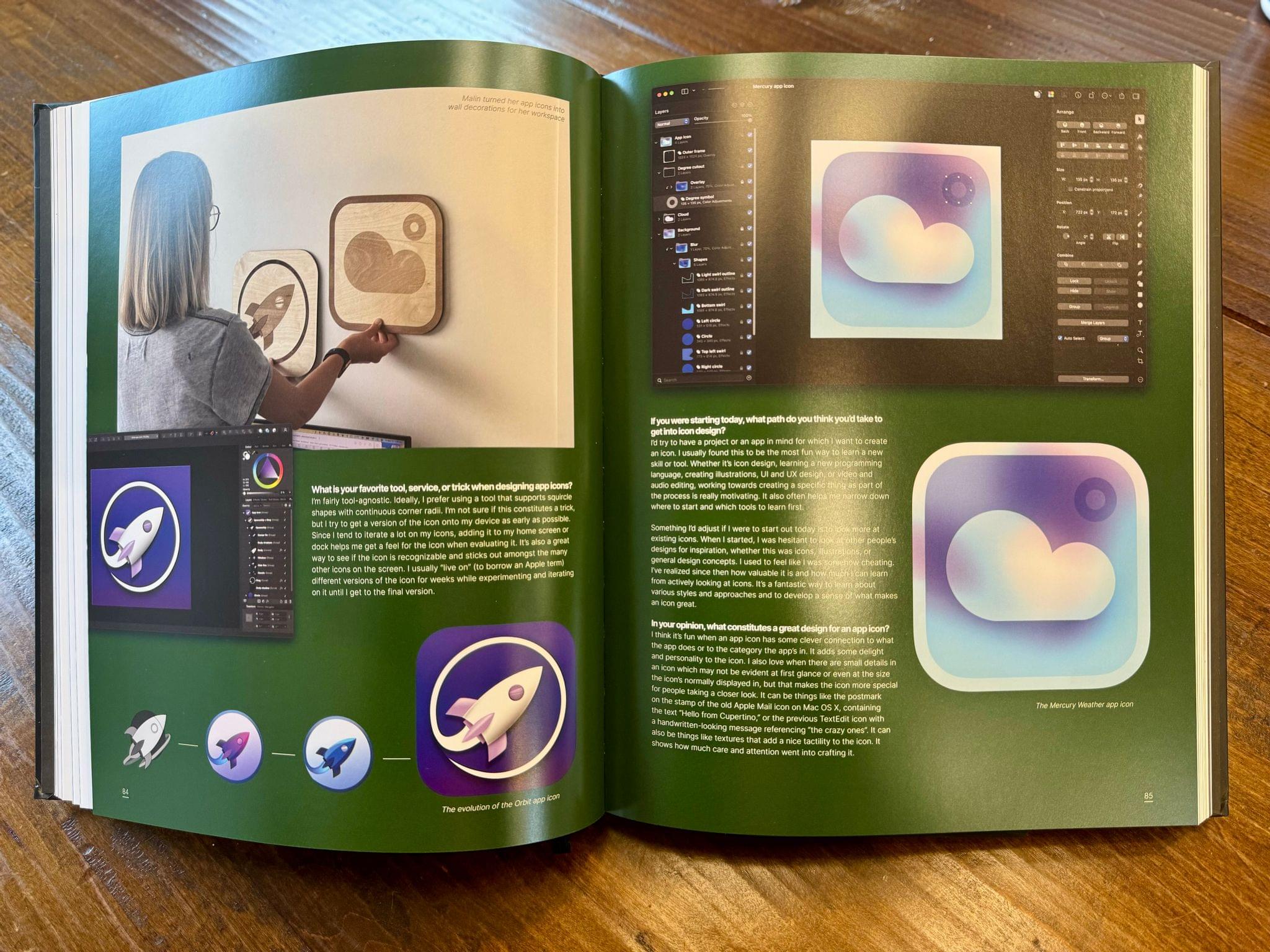
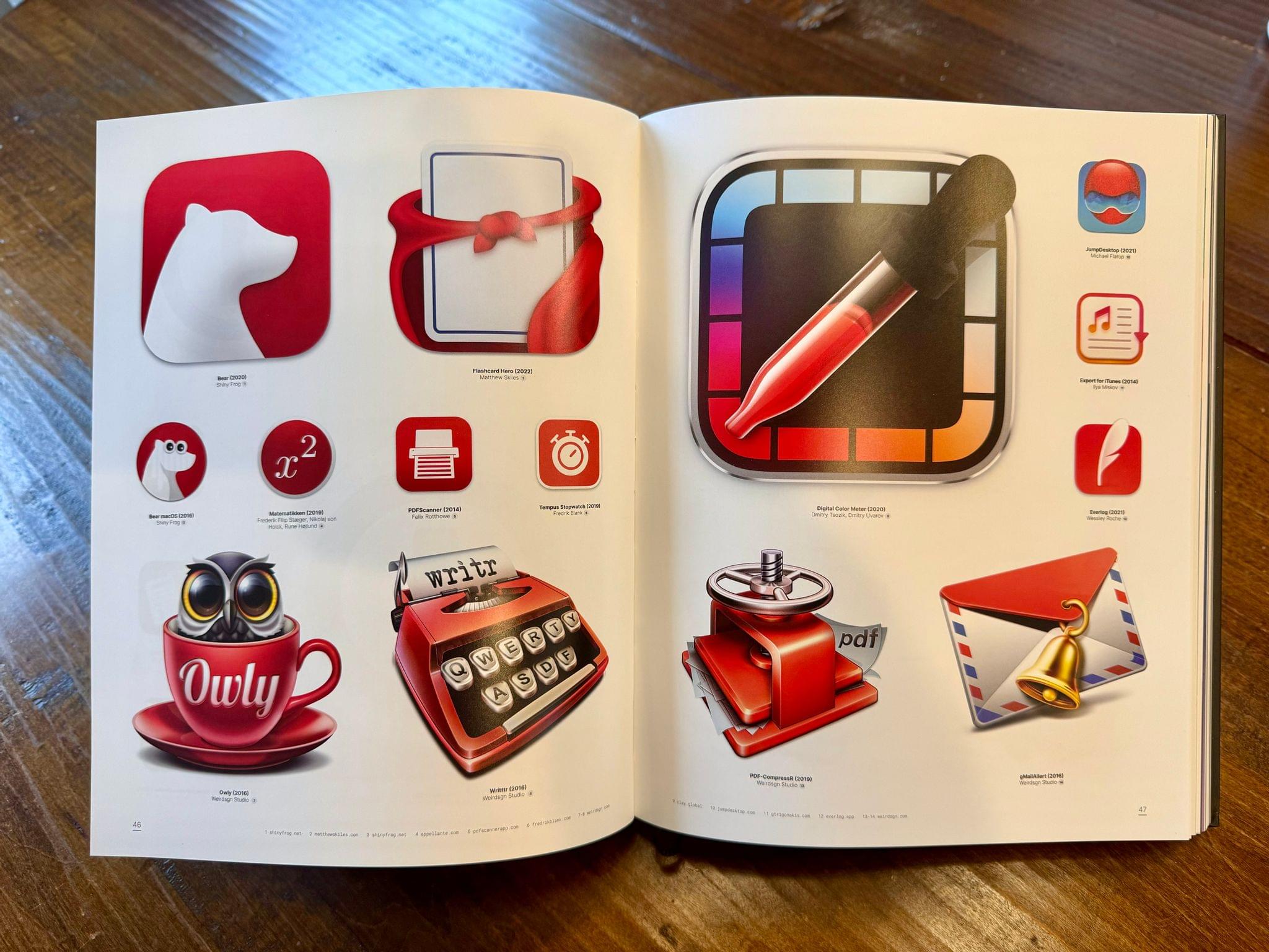
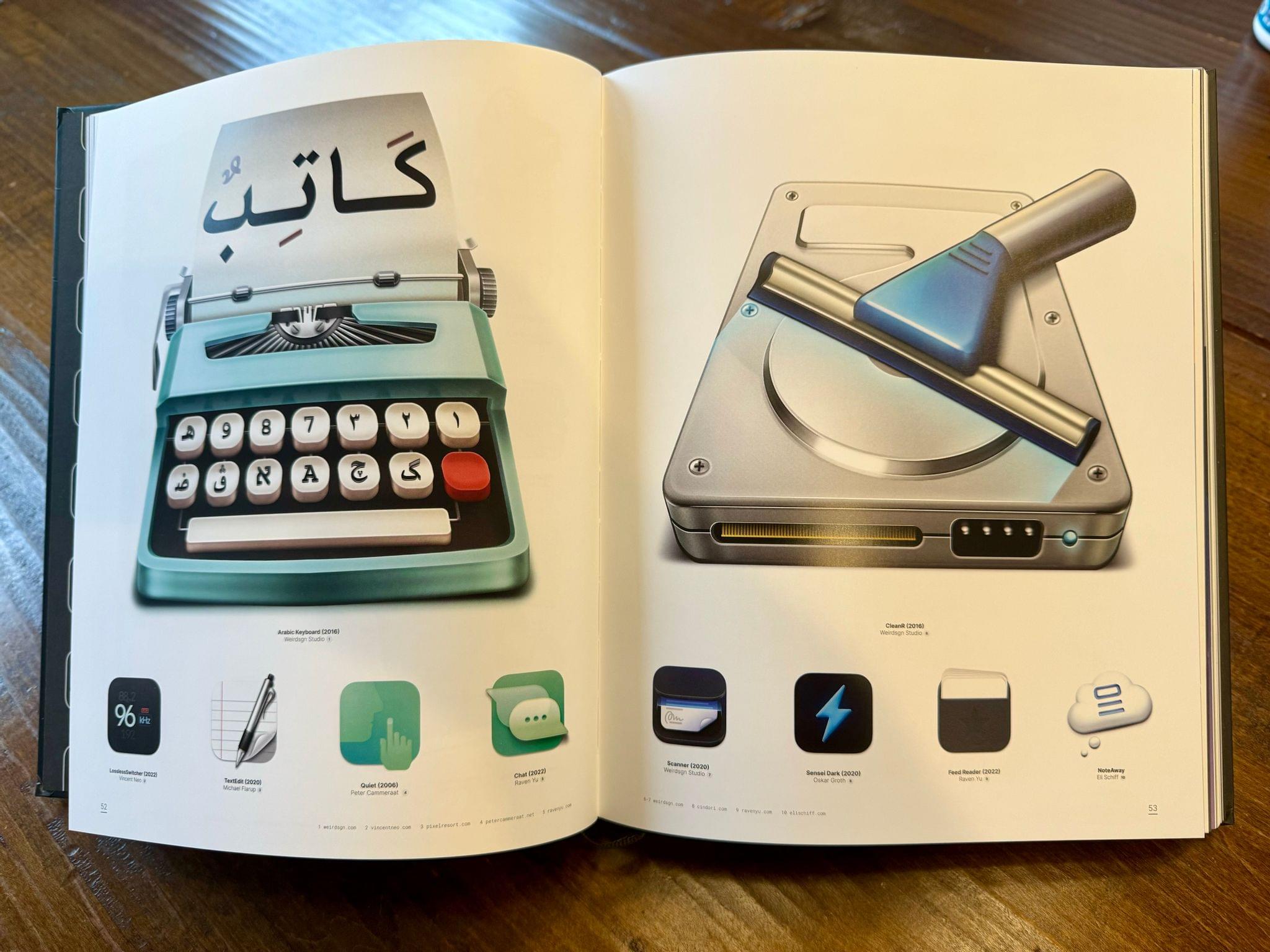
In the years since iOS 7 ushered in flat, minimalistic design, Michael Flarup has consistently pushed back, insisting that the trend had gone too far and there was still room for fun and expression in design. With the redesign of macOS 11 Big Sur, Apple surprised the design world by introducing a design that harmonizes macOS with the company’s other OSes, while providing room for expressiveness.

As Flarup explains:

Materials and dimensionality has made its way back into the interface —and every single app icon for every application and utility that Apple ships with macOS has been redesigned with depth, textures and lighting. This is a big deal. Probably bigger than what most people realise.

The post is a fantastic overview of where design stands on Apple’s platforms today and the influence that the company’s choices have on the design community. Whether intended or not, the unexpected design shift on macOS is one that Flarup expects to see radiate out to affect the design of iOS and iPadOS too:

With this approach Apple is legalising a visual design expressiveness that we haven’t seen from them in almost a decade. It’s like a ban has been lifted on fun. This will severely loosen the grip of minimalistic visual design and raise the bar for pixel pushers everywhere. Your glyph on a colored background is about to get some serious visual competition.

It’s interesting to consider where this new direction will lead. Big Sur’s iconography is part of a broad redesign on macOS that runs far deeper than the design changes made to iOS or iPadOS this year. Whether those platforms will follow the Mac’s lead in the future or take their own paths is something I expect to see debated a lot in the months to come. However it plays out, though, I’m glad to see the Mac retain character in its design as it heads into what promises to be a new era for the Mac.

Permalink

Apple’s WWDC 2020 Design Sessions

I’ve watched a lot of sessions this week. I’ve been impressed with the production quality of them all and the shorter, more condensed format of many of them. I’m still working my way through everything that has been released, but my favorite sessions by far have been the ones presented by Apple’s design team. Through a combination of under-the-hood peeks at how various design elements work and practical tips for implementing new UI controls, the sessions are terrific resources and provide fascinating insight into where design is heading across all of Apple’s products.

Probably my favorite session of the bunch has been Design for the iPadOS pointer. The session explains not only how the pointer works on iPadOS, but why it works that way through a technique called adaptive precision that accounts for the context in which the pointer is being used to define its level of precision. The talk also covers pointer inertia, magnetism, and interaction with controls and other screen elements. It’s an excellent place to start for anyone adapting an iPad for pointer support.

Designing for the unique characteristics of each platform.

Designing for the unique characteristics of each platform.

One of the big picture themes that I came away with from the design sessions I’ve watched so far is the emphasis on designing for the unique qualities of each platform’s hardware. As Design for iPad explains, this doesn’t just mean designing something in between a Mac and an iPhone for the iPad, it also requires developers to consider what makes using an iPad different from either of those platforms. Having used far too many iPad apps that feel like blown up iPhone apps in the past, I hope this session is watched by a lot of developers and designers. I also enjoyed the Design with iOS pickers, menus and actions session, which explains the migration away from (but not complete elimination of) action sheets and popovers in favor of pickers and menus.

Menus and Pickers.

Menus and Pickers.

Finally, I want to mention the SF Symbols 2 and the details of UI typography sessions. I’m a big fan of SF Symbols. I love the consistent look and feel they provide across UIs. This year there are over 750 new glyphs including Apple device, transportation, game controller, and human-related images, plus multicolored symbols for the first time.

As someone who looks at text all day, I also enjoyed nerding out on typography with the details of UI typography session. It’s a fun deep-dive into a subject that I don’t know well, but appreciate for what it adds to an app’s experience.

Even if you’re not a developer or designer, the design sessions at WWDC are some of the most accessible talks released this week. I highly recommend them to anyone who has any interest in how the apps they use are made and the care that goes into the process.


You can also follow all of our WWDC coverage through our WWDC 2020 hub, or subscribe to the dedicated WWDC 2020 RSS feed.


The Iconography of Apple Maps

Mercury Intermedia, in a post on Medium, shares its extensive documentation of Apple Maps’ iconography over the years:

A few years ago we published a post examining the point of interest (POI) icons within Apple Maps titled More Than You Ever Wanted to Know About Apple’s Spotlight Location Icons. POI icons have existed in Apple Maps since Google was the maps provider. But with iOS 6, Apple took full ownership of Maps and introduced a selectable, color-coded POI system with all new iconography.

We took particular notice of the icons included with iOS 8 when Apple began using larger versions of these icons at the system level as part of their new Spotlight search feature. Apple has continued to iterate on these icons and has made several additions and refinements. With iOS 10 for example, Apple redesigned the Maps app to use the larger POI icon set directly on the map itself. This post will examine how the system has grown and evolved over the past few years.

If you’re interested in design, iconography, or how these things have evolved over time in Apple Maps, the post is a fantastic resource and fun exploration of the little details that make a significant mark on user experience. For example, the article includes quotes from designer Scott Dunlap comparing Apple’s icon changes over the years and what purpose those tweaks served, as well as offering feedback for how Maps’ icon set could stand more improvement, particularly for greater clarity at small sizes.

Permalink

Jony Ive to Leave Apple to Form New Design Firm and Sabih Khan Named SVP of Operations

Tim Bradshaw of the Financial Times dropped a bombshell: Jony Ive is leaving Apple to start his own design firm called LoveFrom, and Apple will be its first client. Ive told Bradshaw:

While I will not be an [Apple] employee, I will still be very involved — I hope for many, many years to come,” Sir Jonathan told the FT in an exclusive interview. “This just seems like a natural and gentle time to make this change.

Ive’s transition from his role as Apple Chief Design Officer where he oversees the design of both hardware and software to his new company will begin later this year with LoveFrom launching in 2020. Marc Newson who has collaborated with Ive in the past will join him as part of the LoveFrom design team. In addition to continuing ongoing projects for Apple, Ive told the Financial Times he would work on unspecified ‘personal passions.’

Ive has led Apple’s design team since 1996 and is responsible for the company’s iconic product designs like the iMac, iPod, and iPhone. He also guided the design and construction of Apple Park. In a press release issued by Apple, Tim Cook said:

Jony is a singular figure in the design world and his role in Apple’s revival cannot be overstated, from 1998’s groundbreaking iMac to the iPhone and the unprecedented ambition of Apple Park, where recently he has been putting so much of his energy and care,” said Tim Cook, Apple’s CEO. “Apple will continue to benefit from Jony’s talents by working directly with him on exclusive projects, and through the ongoing work of the brilliant and passionate design team he has built. After so many years working closely together, I’m happy that our relationship continues to evolve and I look forward to working with Jony long into the future.

Apple has not announced a replacement for Ive. Instead, the company’s press release says that design team leaders Evans Hankey, Vice President of Industrial Design, and Alan Dye, Vice President of Human Interface Design, will report to Apple’s Chief Operating Officer Jeff Williams. Of the design team, Ive had this to say:

After nearly 30 years and countless projects, I am most proud of the lasting work we have done to create a design team, process and culture at Apple that is without peer. Today it is stronger, more vibrant and more talented than at any point in Apple’s history,” said Ive. “The team will certainly thrive under the excellent leadership of Evans, Alan and Jeff, who have been among my closest collaborators. I have the utmost confidence in my designer colleagues at Apple, who remain my closest friends, and I look forward to working with them for many years to come.


Separately, Apple announced that it has named Sabih Kahn as joined the company’s executive team as Senior Vice President of Operations. In a press release, Apple said that Khan who has been at the company since the mid-90s:

will be in charge of Apple’s global supply chain, ensuring product quality and overseeing planning, procurement, manufacturing, logistics and product fulfillment functions, as well as Apple’s supplier responsibility programs that protect and educate workers at production facilities around the world.

According to Apple CEO Tim Cook and Williams:

Sabih leads our Ops team with heart,” said Tim Cook, Apple’s CEO. “He and his entire worldwide team are committed to delivering unmatched experiences to our customers, treating workers everywhere with dignity and respect, and protecting the environment for future generations.

I’ve been privileged to work with Sabih for more than 20 years, and you won’t find a more talented operations executive anywhere on the planet,” said Williams. “He is a world-class leader and collaborator, and I have no doubt that he will be the best leader of the Ops team in Apple’s history.

This is a surprising turn of events. Ive will continue to work with Apple, but it clearly won’t be his sole focus anymore. He’s left a lasting imprint on Apple over the course of almost three decades and is leaving behind design team led by Apple veterans, which leaves the company in good hands. Still, it’s a shame to see Ive go.

The addition of Kahn to the leadership team who, along with the company’s two design leads, will report to Jeff Williams is interesting too. I wouldn’t be surprised if Williams is being groomed to take over as CEO someday.


Designing a Dark Theme for OLED iPhones

Vidit Bhargava, UI designer for the excellent LookUp dictionary app, details in a Medium post how implementing an OLED-friendly dark theme in an app is more complicated than one might think. For example:

When an interface that uses a black theme for its background starts displaying content on the screen, the pixels needs to switch on before they can display the content. So, when you’re scrolling through the content in a black background, the pixels find it hard to keep pace with your scrolling, resulting in a smear on the screen.

Bhargava uses the following tweet from Marc Edwards to illustrate this smearing issue.

The solution utilized in LookUp was making its black theme not entirely black, but a dark enough grey that it appears black in use.

The rest of the post outlines the impact of black, dark grey, and white themes on a device’s battery life, along with the readability challenges inherent to black themes. It’s a fascinating read, and goes to show that a quality OLED-optimized dark theme requires a lot of thought and care to achieve.

Permalink

An Interview with Khoi Vinh, Principal Designer at Adobe

Earlier this week I had the opportunity to sit down with Khoi Vinh, Principal Designer at Adobe who leads its Design Practices group and author of Subtraction.com. Vinh, who was in Chicago to speak at the HOW Design Live conference, talks about how Adobe is using Adobe XD to integrate UX and UI design and prototyping into the product creation process for everyone from freelancers to big companies. He also discusses designers’ role in addressing the problems social media is facing, how artificial intelligence is beginning to play a role in design, and his podcast, Wireframe.

(The following has been condensed and edited for readability.)

Tell me a little bit about what you’re working on at Adobe these days.

Adobe XD is one of the main priorities at Adobe. We’re really passionate about the experience design space; really passionate about how product designers, UX/UI designers, they’re really kind of leading the way for how professional creativity is changing and XD is more than just an app, it’s a platform to help us build what designers need. So we see it as more than just a design app. It’s also prototyping and sharing, and so it’s really meant to help designers, and also the people who work with them, get more value out of the design process and be more productive in general.

Read more


Jony Ive Reflects on the Design of the New iPad Pros, Apple Pencil, and MacBook Air in a New Interview

Jony Ive, Apple’s Chief Design Officer, sat for an interview with David Phelan of The Independent to talk about designing Apple products in general and the new iPad Pros, Apple Pencil, and MacBook Air in particular.

On redesigning successful products Ive said:

Because when a product has been highly regarded there is often a desire from people to see it redesigned. I think one of the most important things is that you change something not to make it different but to make it better.

If you are making changes that are in the service of making something better, then you don’t need to convince people to fall in love with it again. Our sense of habit and familiarity with something is so developed, there is always that initial reaction that is more of a comment on something being different rather than necessarily better or worse. In my experience, if we try very hard to make material improvements, people quickly recognise those and make the sort of connection they had before with the product.

Ive also revealed that the original iPad was designed to be used primarily in a portrait orientation, while the new iPad Pros have no orientation:

So, in the new iPad Pro, one of the things we’ve been wanting to get to for a long time is a sense that the product is not oriented in a primary and then, therefore, in a secondary way.

The first iPad had a very clear orientation which was portrait. It had the ability to be used in landscape, I think very well, but it was pretty clear how the product was designed. And I think with the first iPad you had the sense that it was a product made up of distinct and somewhat separate components.

What I think marks the new iPad Pro as particularly special is it doesn’t have an orientation. It has speakers all the way around the perimeter. By getting rid of the Home Button and developing Face ID, the tablet is able to work in all of these different orientations.

On the Apple Pencil, Ive describes how its design abstracts away the underlying technical complexity to focus the user on the task at hand:

I think the way it just snaps onto the side, well, that’s a nice example of a sort of that magical feeling. It’s unexpected, we don’t quite understand how it’s working and even more incomprehensible is the fact that it’s also charging. You can see how that’s aligned with this idea that you can just pick the product up and use it without thought.

Actually, you’re using it with tremendous thought, but it’s based on what you want to be doing rather than wondering if you’re holding the tablet the right way up.

Phelan’s interview is full of many other wonderful insights and tidbits about the products Apple revealed earlier this week in New York and should be read in its entirety.

Permalink