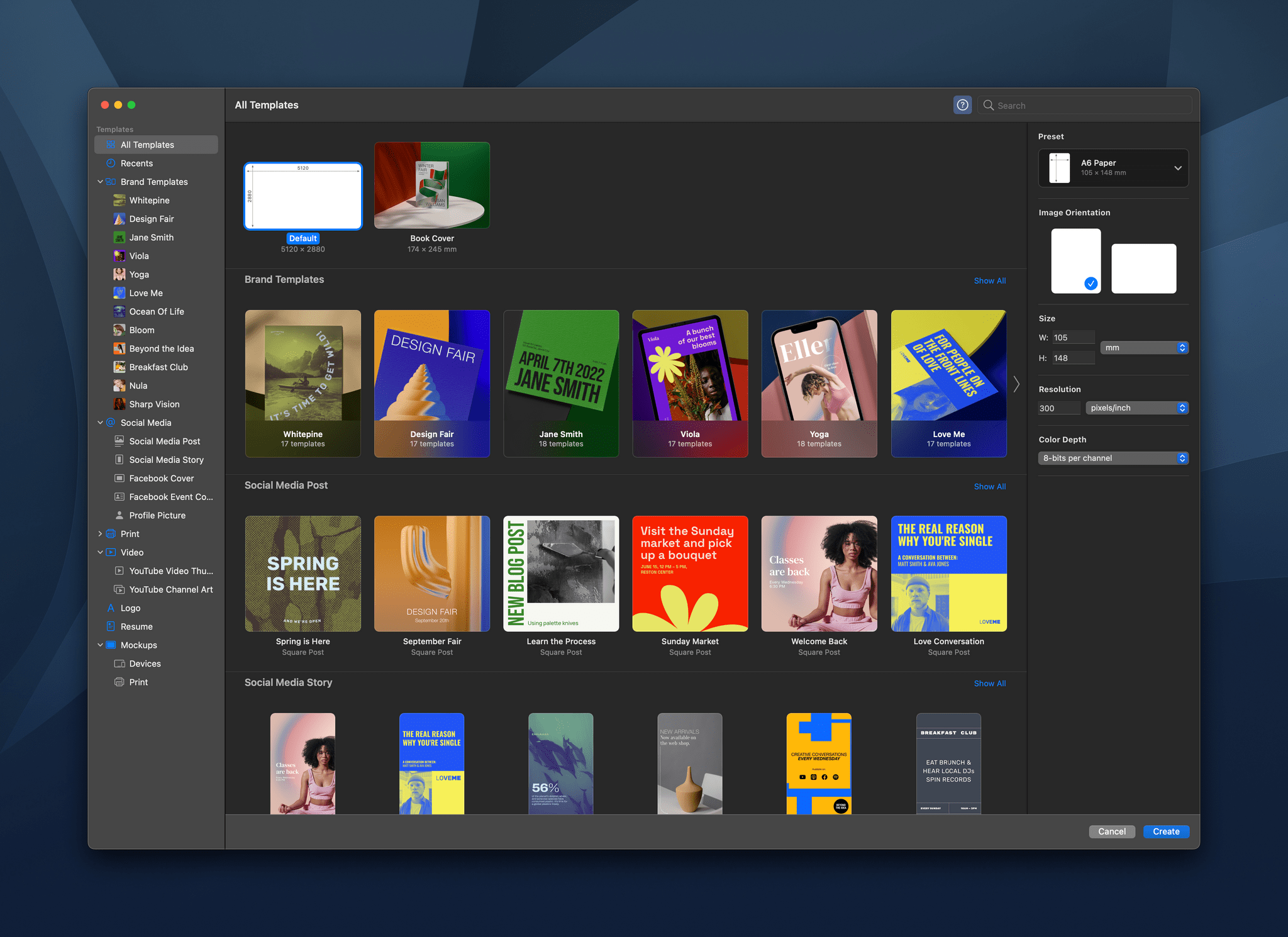
Templates are a great way to speed up your workflow and maintain a consistent design language and branding across everything you create. With Pixelmator Pro 3.0,, you now have over 200 professionally-designed templates for creating a wide range of documents and mockups. I’ve been playing around with the new templates for a few days, and they have a lot of potential.
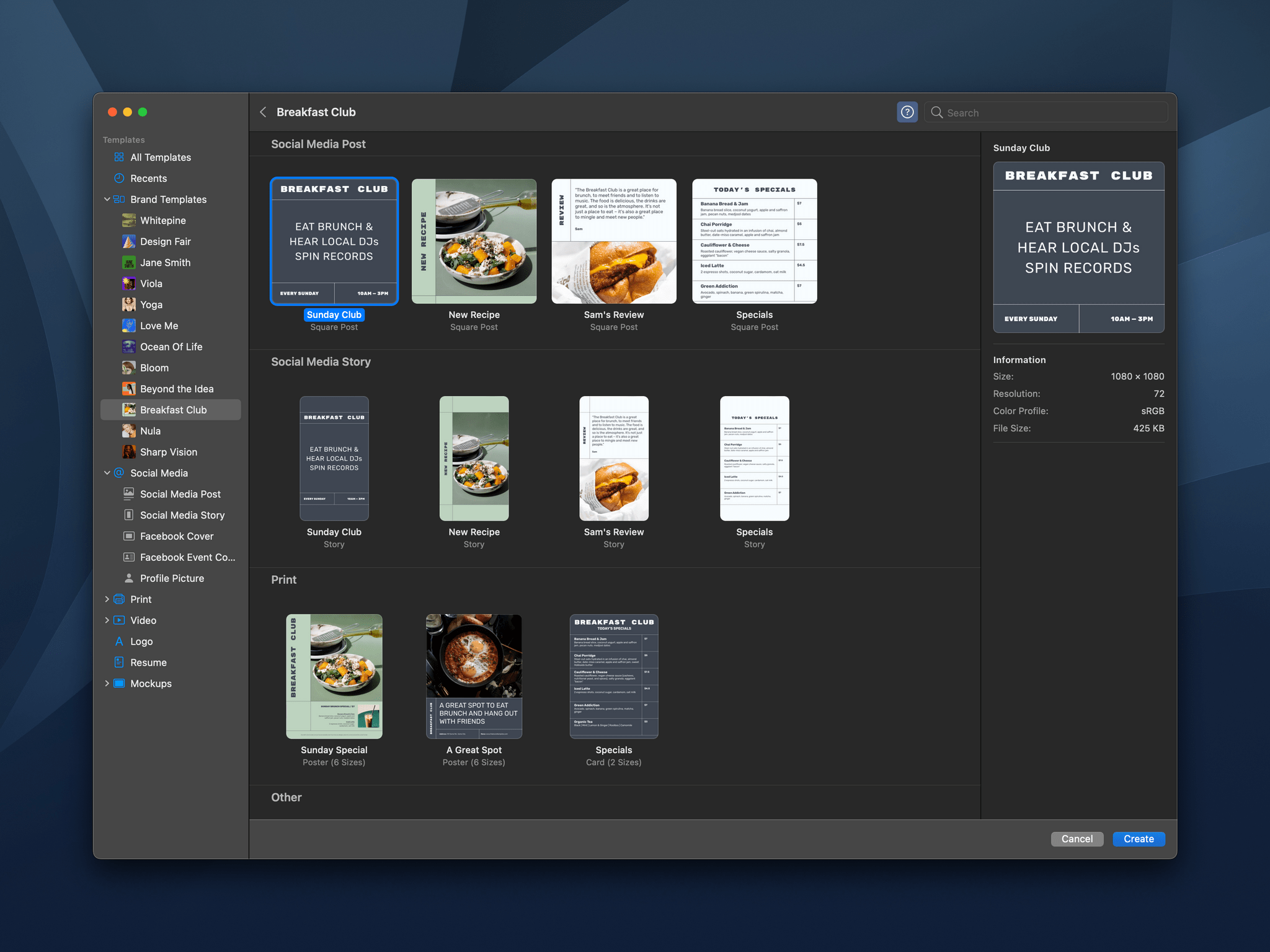
When you start a new Pixelmator Pro document, you’re presented with the app’s catalog of templates, which is broken down into several categories for creating social media, print, video, and mockup assets. There’s also a Brand Templates category that cuts across different template types, collecting templates by their branding style. There’s a lot here to browse, but like any app that offers templates, I quickly gravitated to a couple of looks that I particularly liked. You can also define your own templates using the app’s system for creating placeholders for various image elements.
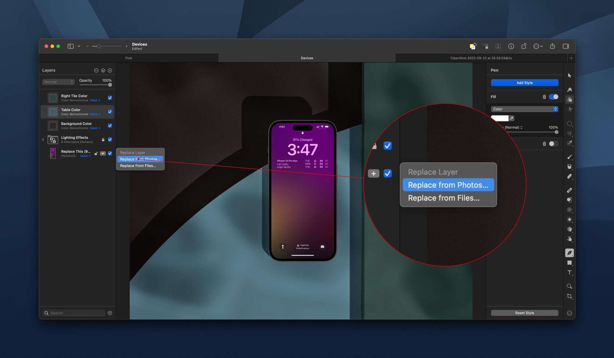
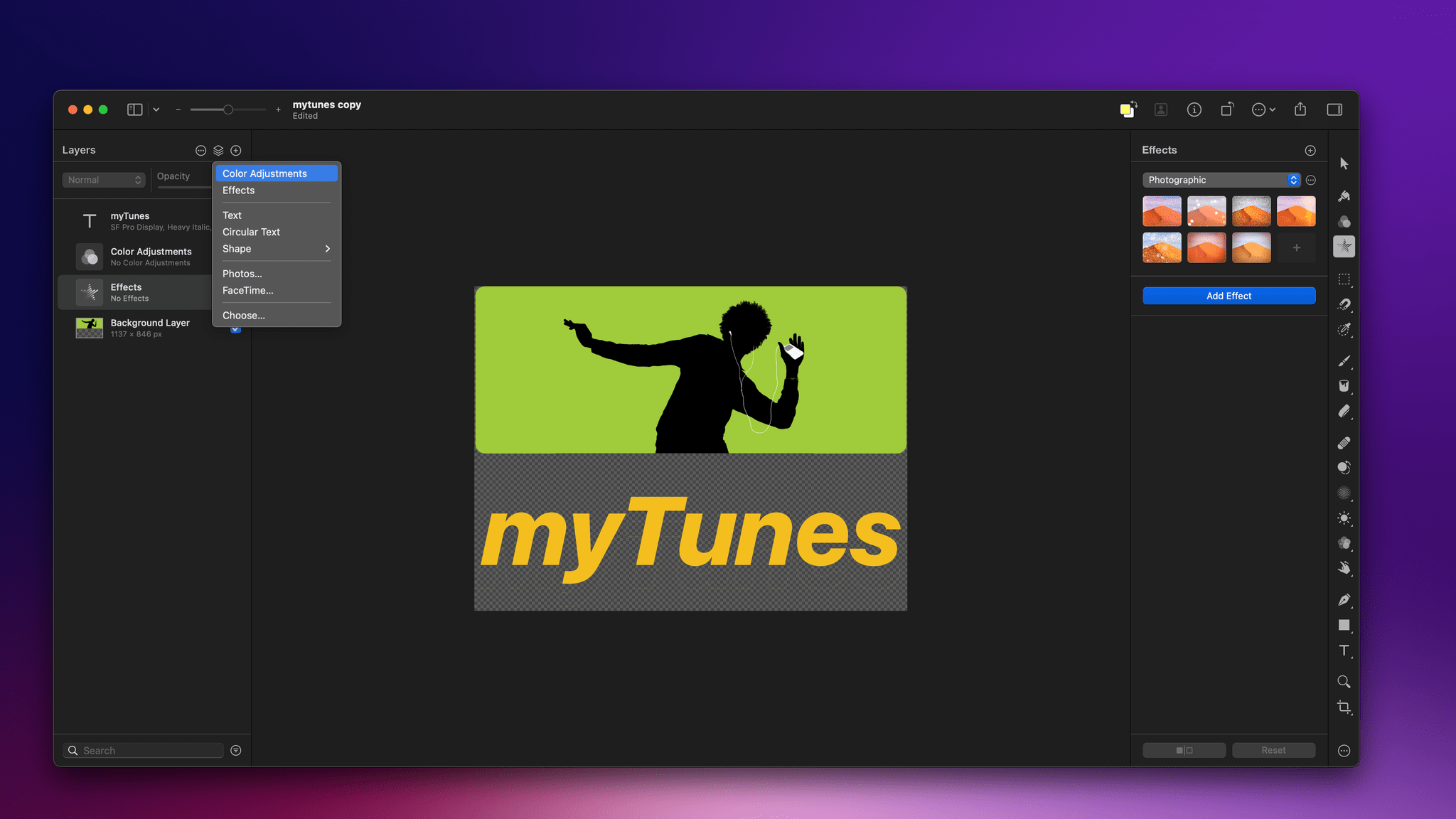
Once you open a new template-based document, tweaking it is easy. The options for each template vary depending on its design, but browsing through the layer navigator in the left sidebar, you’ll find controls to change things like lighting effects, placeholder images, colors, and more. The Pixelmator team says that for actions like replacing placeholder images, Pixelmator Pro uses the app’s machine learning engine to remove backgrounds, resize images, change their resolution, and place them properly in any frame.
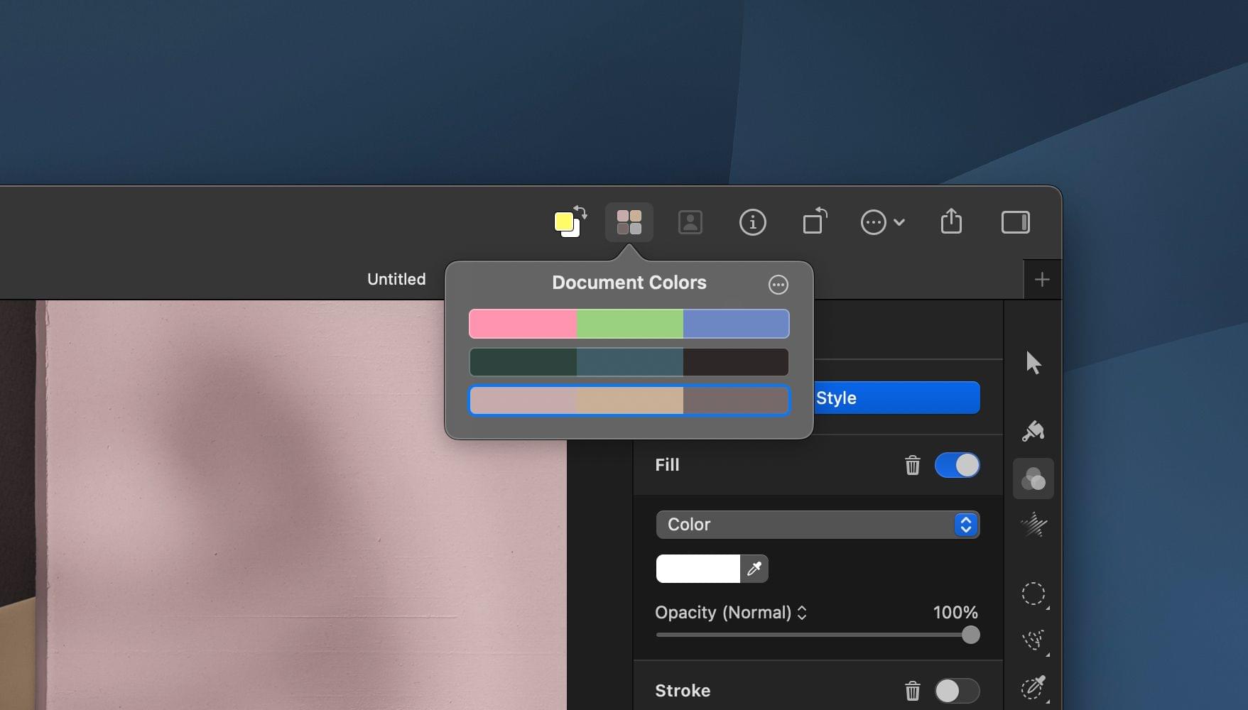
Pixelmator Pro 3.0 also introduces the concept of Document Colors, which are sets of colors that can be applied to a template. Each template comes with a few starter palettes to choose from, and you can create your own too. Click on a set of colors, and your template will be updated with the new color scheme all at once.
Overall, I like the new Pixelmator Pro templates a lot. It’s simple to get started and easy to adjust your creation. I also appreciate the wide variety of formats available for social media and other types of documents.
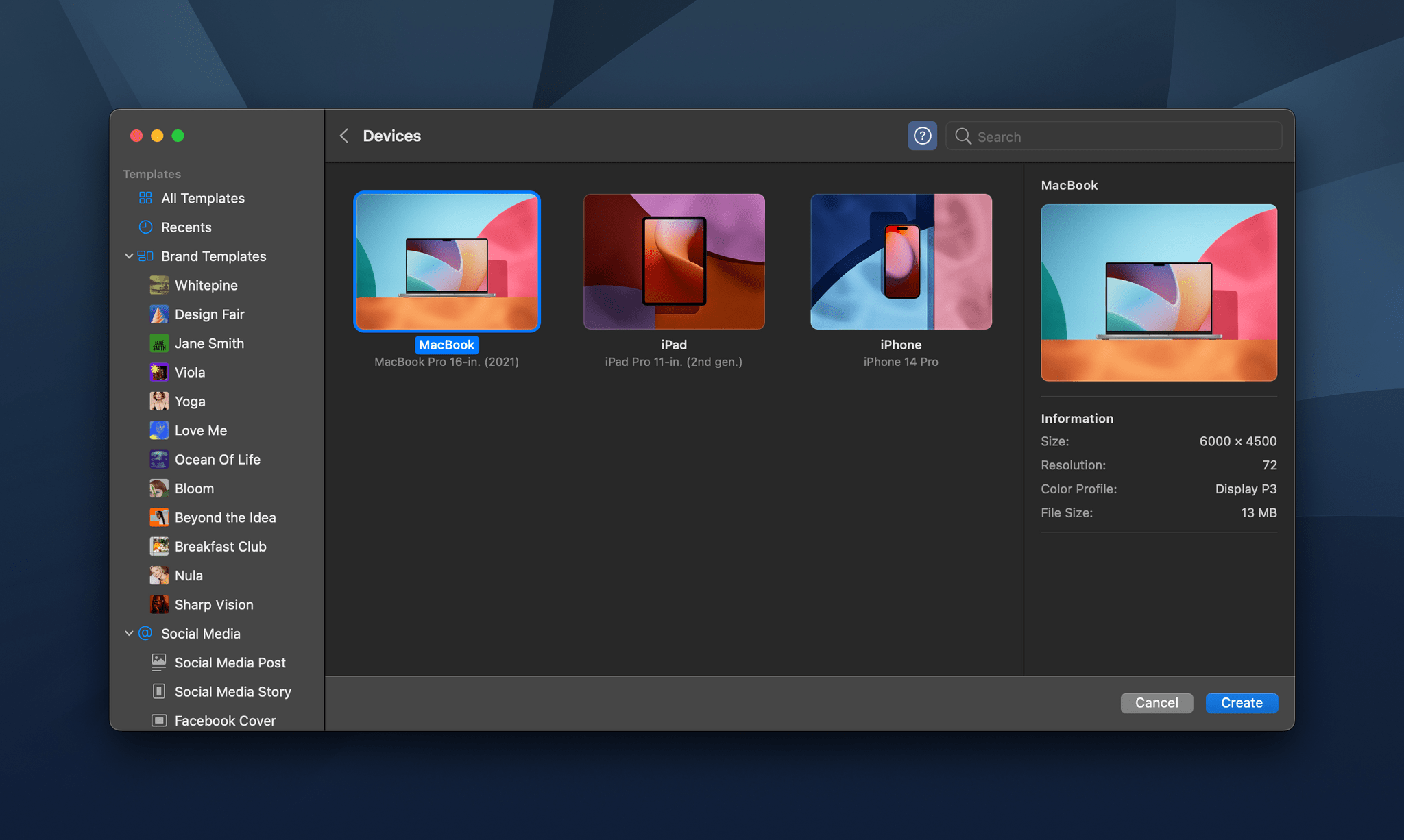
The iPhone, iPad, and MacBook mockups have potential too, but I found the lack of adjustments available for the device frames and backgrounds limiting, A bigger library of mockup styles would help, but more controls to manipulate device frames and backgrounds would be ideal.
Still, I like the direction Pixelmator Pro is heading with its templates. They’re easier to use than the systems used in other apps and should meet the needs of a lot of users.
Pixelmator Pro 3.0 is available on the App Store as a free update to existing customers.