Recently on AppStories, I asked listeners to suggest apps for creating gradients. I’ve tried a few, but none have grabbed me yet, so I’d sort of given up for the time being. But then a listener suggested something totally different and amazing: a prototype App Clip that uses your iPhone’s camera to create gradients.
It isn’t a complete app. For instance, you can’t save a captured gradient to your photo library; instead, you have to take a screenshot of the gradient. That isn’t ideal, but the lack of functionality doesn’t take away from the concept, which I love.
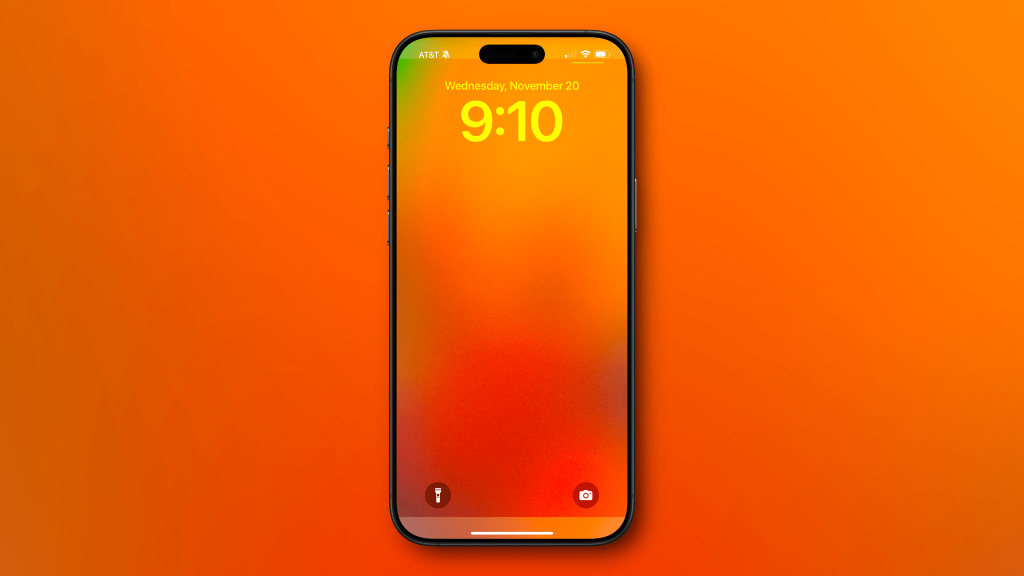
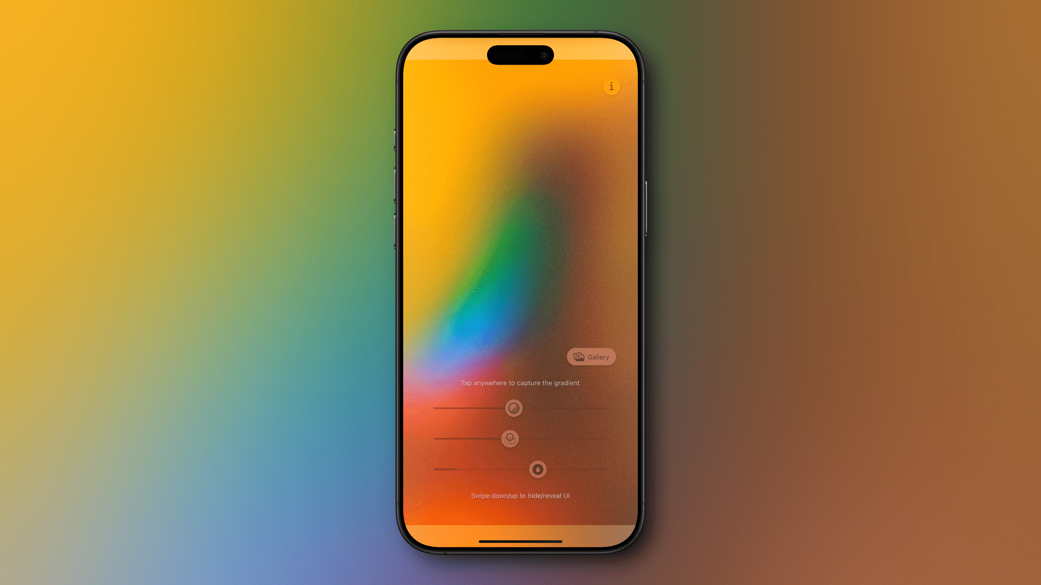
When the App Clip launches, it presents you with just three adjustable sliders that control things like the diffusion of the image your camera is recording and its saturation. Once you’ve framed a gradient you like, tapping the screen freezes the image so you can take a screenshot and start using the gradient as a wallpaper. Another option is to use an image from your photo library to create a gradient. Adobe has something similar baked into its Capture app for the iPhone and iPad, but it’s more complicated and only generates 640x640-pixel images that aren’t suitable to be used as wallpapers without doing additional work in another app.
The App Clip was created by Dominik Kandravy, a designer who is looking for a developer to turn the prototype into a full-blown app. I’m hoping Dominik can find someone to help because the simple elegance of the prototype is compelling.