Last week, Anthropic introduced Claude Design, a new research preview product from the equally new Anthropic Labs. Claude Design, which is currently available to Pro, Max, Team, and Enterprise subscribers through the Claude web app, can prototype apps and websites, design presentation materials, generate marketing materials, and more. As someone who has felt as though Claude’s design skills noticeably lagged behind its coding, I was eager to give it a try. So, over the weekend, I tasked Claude Design with coming up with a brand new progressive web app and helping me design a new feature for an existing project.
I’m always looking for a way to resurface articles, apps, products, and other links I save in a variety of places, so my first test of Claude Design was to build an iPad-first web app that would deliver those things to me automatically using a magazine-style design. Claude Design is organized into a sidebar and canvas with tabs in the sidebar for creating prototypes, slide decks, template-based designs, and blank designs. To get started, I named my project and picked a “high fidelity” prototype. Then, I dragged some screenshots of a similar AI assisted reading app I’d seen on social media into Claude Design and described what I wanted, answered some follow-up questions, and let Claude get at it.
In my opinion, Apple took on an impossible task: to add an icon to every menu item. There are just not enough good metaphors to do something like that.
But even if there were, the premise itself is questionable: if everything has an icon, it doesn’t mean users will find what they are looking for faster.
And even if the premise was solid, I still wish I could say: they did the best they could, given the goal. But that’s not true either: they did a poor job consistently applying the metaphors and designing the icons themselves.
It’s a brutal assessment of the sprinkling of iconography throughout Tahoe’s menu system that had me nodding along in agreement as I read it.
There’s no denying the inconsistencies in icon choices, their lack of legibility, and the overall clutter added to menus. Yet at the same time, I can’t say I’ve been terribly bothered by them either. That’s probably because I use keyboard shortcuts and launchers so much, rarely relying on the Mac’s menu system. At the same time, though, part of me wonders whether those tiny icons are at least partially what drove me to buy a bigger monitor recently. I don’t think so, but maybe?
In any event, if you care about design, Prokopov’s detailed and well-illustrated analysis of Tahoe’s menu icons is well worth your time.
Mark Gurman, writing for Bloomberg, reports that Alan Dye, Apple vice president of Human Interface Design, is leaving the company to head up Meta’s design team. Dye’s departure was confirmed by Apple to Bloomberg, with Apple CEO Tim Cook telling the publication that Steve Lemay will take over Dye’s role:
Steve Lemay has played a key role in the design of every major Apple interface since 1999. He has always set an extraordinarily high bar for excellence and embodies Apple’s culture of collaboration and creativity.
Dye, who led the rollout of Apple’s Liquid Glass design language across all of its OSes, will be in charge of hardware, software, and AI across Meta’s product lines. Billy Sorrentino, who worked with Dye, is also leaving Apple’s design group for Meta.
Dye’s departure comes at an interesting moment for Apple and Meta. Meta, which has seen some success with its Ray-Ban smart glasses, has struggled with other consumer product projects but clearly wants to do more with AI-infused hardware. Meanwhile, Apple has had trouble infusing its software and hardware lineup with AI and has experienced a rash of departures among its AI team and retirements within its executive ranks. 2026 is shaping up to be a year of change across much of Apple.
The Iconfactory’s Craig Hockenberry had an interesting post over the weekend on Furbo.org that struck a chord with me. The post explores the ‘why’ surrounding Liquid Glass contrasting the upcoming iOS 26 changes with the transition from iOS 6 to iOS 7. That earlier change was driven by a need to make app design accessible to more people, which, as Hockenberry explains, seems different from the motivation behind Liquid Glass:
I’m unaware of anyone outside of Apple who’s thinking “we really need to have more fluid glass in our designs”. Of particular note during the introduction is how much time they spend showing off glass blocks and talking about the physical effect itself. While not addressing the most important question: “why do we need this?”
And I’m pretty sure the answer is “we don’t”. The answer is “Apple does.”
Hockenberry thinks the switch to Liquid Glass is being driven by unreleased hardware very much like the iOS 11 safe areas that were instituted before the iPhone X’s notch and Home indicator debuted. It’s a great theory that could easily have people facepalming in the not-too-distant future. I hope he’s right.
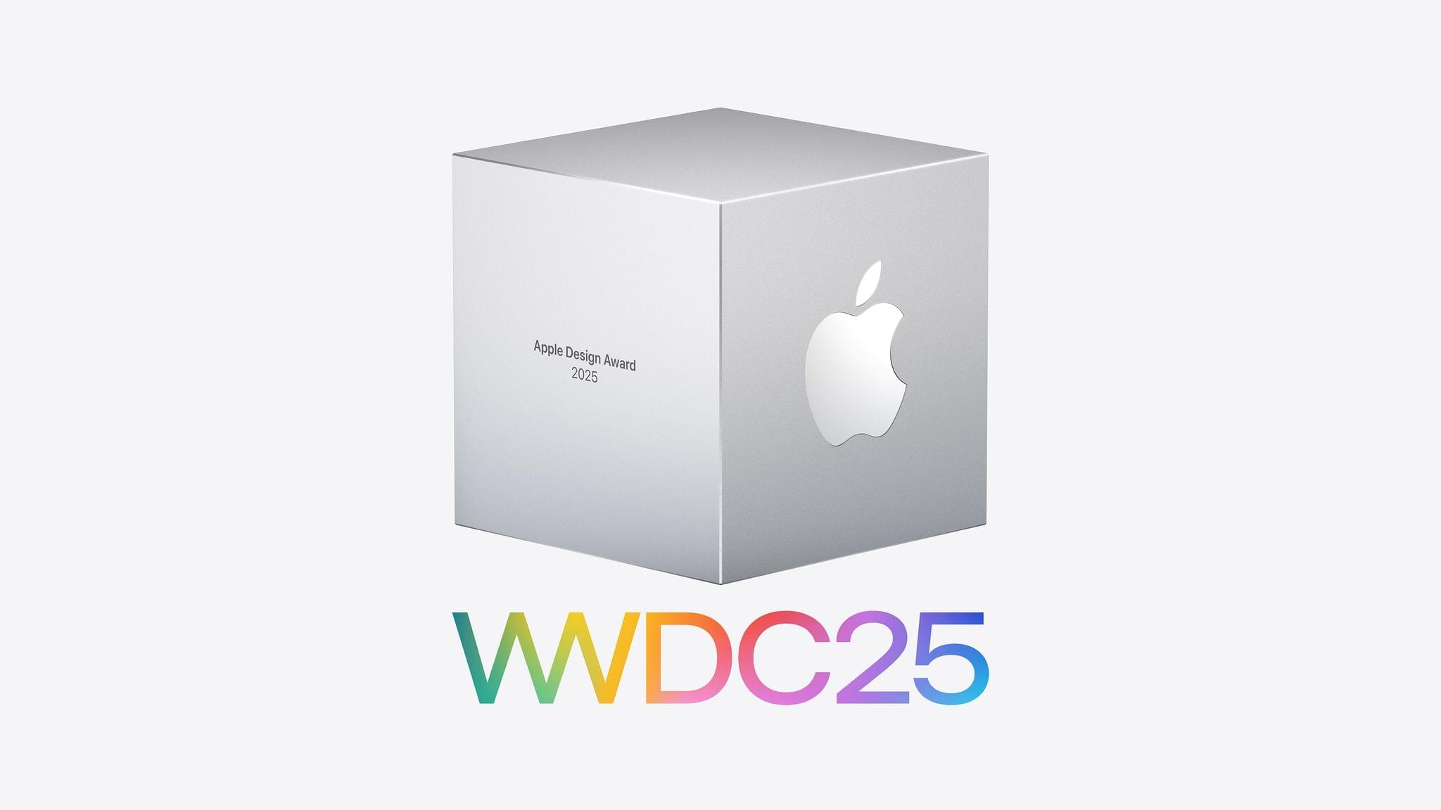
As WWDC approaches, Apple has announced the finalists for its annual Apple Design Awards, and in a departure from recent years, the winners too.
This year, there are six categories, and each category has a winning app and game, along with four finalists. Unlike last year, there is no Spatial Computing category this year. The 2025 ADA winners and finalists are:
The winners and finalists include a broad range of games and apps, including some from smaller developers including Lumy, DenimArt of Fauna, Skate City: New York, as well as titles from bigger publishers.
I’m glad that Apple has announced the finalists for the last few years. Winning an ADA is a big achievement for any developer, but it’s also nice to know who the finalists are because it’s quite an honor among the many apps that could have been chosen, too. Plus as a fan of apps, Apple’s longer finalist list always reminds me of an app or two that I haven’t tried yet. Congratulations to all of this year’s Apple Design Award winners and finalists.
The purchase — the largest in OpenAI’s history — will provide the company with a dedicated unit for developing AI-powered devices. Acquiring the secretive startup, named io, also will secure the services of Ive and other former Apple designers who were behind iconic products such as the iPhone.
The partnership builds on a 23% stake in io that OpenAI purchased at the end of last year and comes with what Bloomberg describes as 55 hardware engineers, software developers, and manufacturing experts, plus a cast of accomplished designers.
Ive had this to say about the purportedly novel products he and OpenAI CEO Sam Altman are planning:
“People have an appetite for something new, which is a reflection on a sort of an unease with where we currently are,” Ive said, referring to products available today. Ive and Altman’s first devices are slated to debut in 2026.
Bloomberg also notes that Ive and his team of designers will be taking over all design at OpenAI, including software design like ChatGPT.
For now, the products OpenAI is working on remain a mystery, but given the purchase price and io’s willingness to take its first steps into the spotlight, I expect we’ll be hearing more about this historic collaboration in the months to come.
Last week, I was in LA for Airbnb’s 2025 Summer Release. As part of the day’s events, Federico and I interviewed Jud Coplan, Airbnb’s Vice President of Product Marketing, and Teo Connor, Airbnb’s Vice President of Design, for AppStories to talk about the new features and app the company launched. It was a great conversation that you can watch on YouTube:
or listen to the episode here:
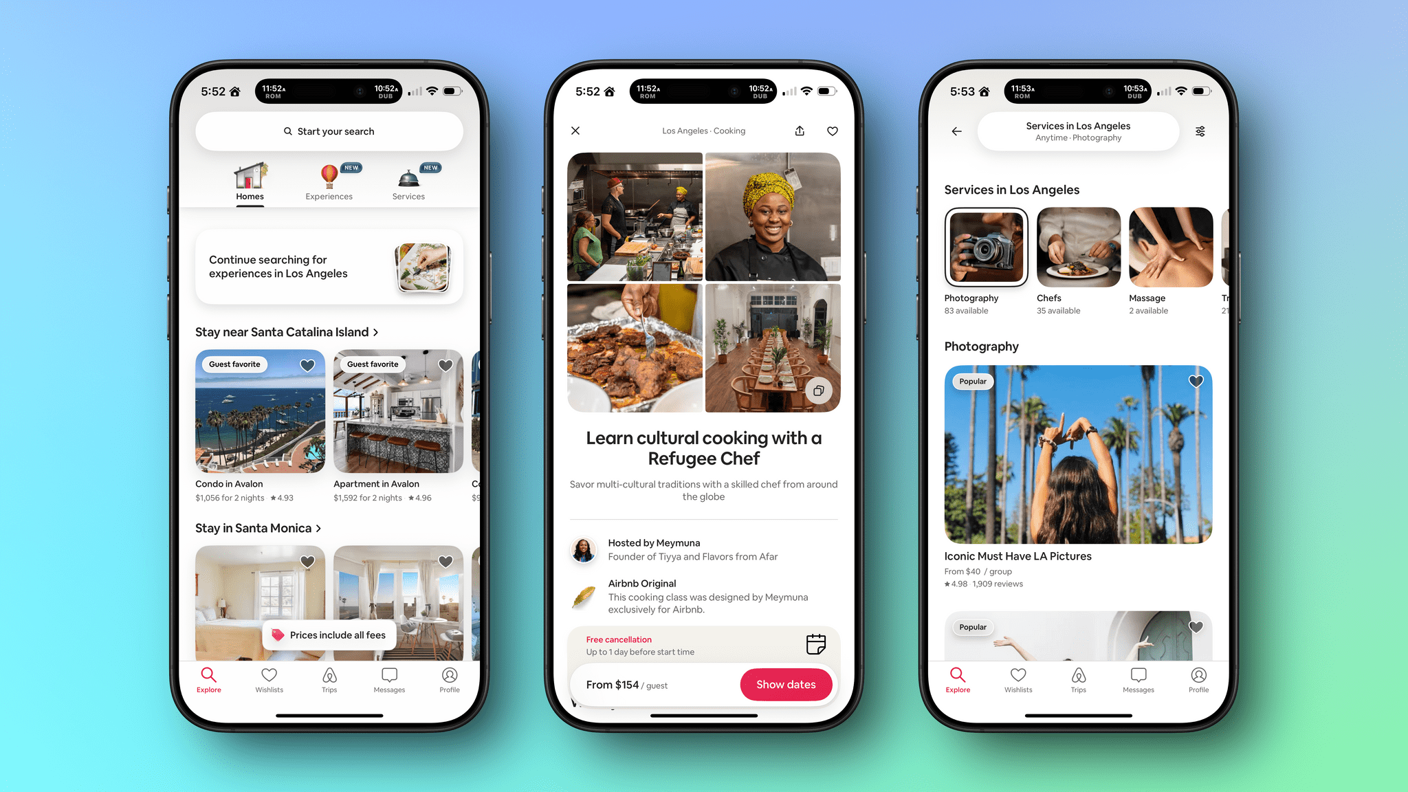
Last week’s launch was a big one for Airbnb. The company debuted Services and reimagined and expanded Experiences. Services are the sort of things hotels and resorts offer that you used to give up when booking an Airbnb stay. Now, however, you can book a chef, personal trainer, hair stylist, manicurist, photographer, and more. Better yet, you don’t have to book a stay with an Airbnb host to take advantage of services. You can schedule services in your hometown or wherever you happen to be.
Experiences aren’t entirely new to Airbnb, but have been expanded and integrated into the Airbnb app in a way that’s similar to Services. Services allow you to get the most out of a trip from locals who know their cities best, whether that’s a cultural tour, dining experience, outdoor adventure, or something else.
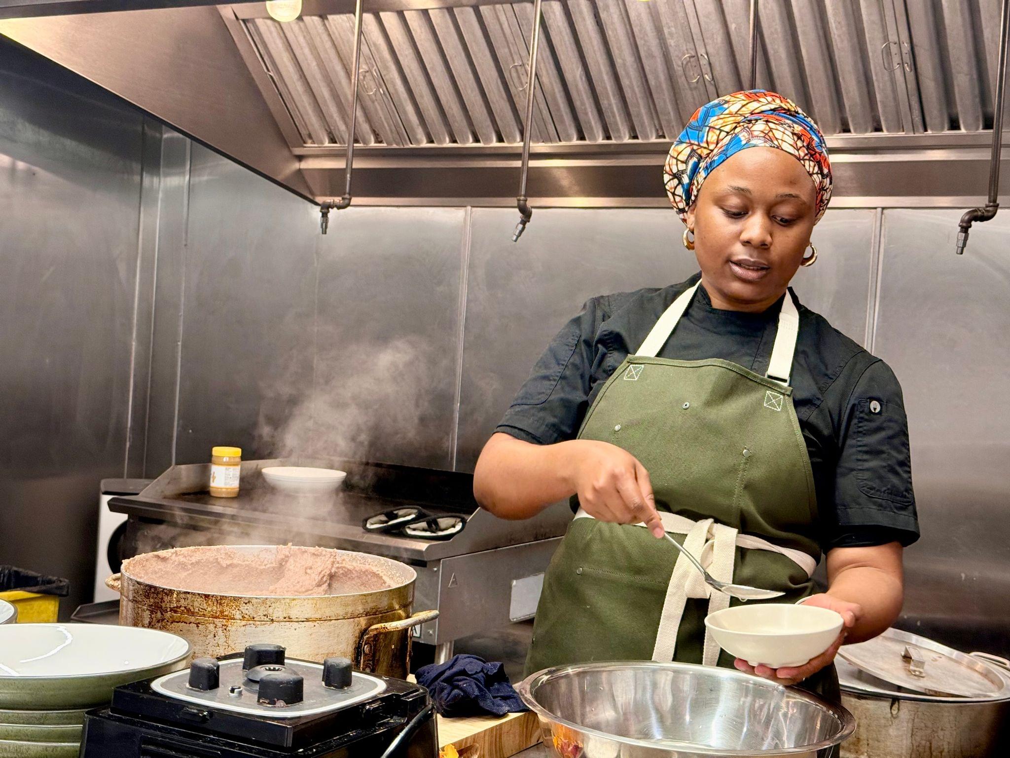
Chef Grace explaining how to serve sadza.
While I was in LA, I prepared a meal alongside several other media folks from around the world. Our instructor was Chef Kuda Grace from Zimbabwe at Flavors from Afar. We made sadza with peanut butter and mustard greens and then sat down together to compare notes from the day’s events, tell stories about our dining experiences, and get to know each other better.
The evening was a lot of fun, but what struck me most about it was something we touched upon in this week’s episode of AppStories. The goal of Airbnb’s redesigned app is to get you to leave it and go out into the world to try new things. It reduces the friction and anxiety of taking the plunge into something new and emphasizes social interactions in the real world instead of on a screen. In 2025, that’s unusual for an app from a big company, and it was fascinating to talk to Teo and Jud about how they and their teams set out to accomplish that goal.
I like Airbnb’s redesigned app a lot. It’s playful, welcoming and easy to use. What remains to be seen is whether Airbnb can pull off what it’s set out to accomplish. It isn’t the first company to try to pair customers with local services and experiences. Nor is it Airbnb’s first attempt at experiences. However, the app is a solid foundation, and if my experience at dinner in LA was any indication, I suspect Airbnb may be onto something with Services and Experiences.
Disclosure: The trip to LA to conduct my half of this interview was paid for by Airbnb.
Fascinating analysis by Allen Pike on how, beyond traditional chatbot interactions, the technology behind LLMs can be used in other types of user interfaces and interactions:
While chat is powerful, for most products chatting with the underlying LLM should be more of a debug interface – a fallback mode – and not the primary UX.
So, how is AI making our software more useful, if not via chat? Let’s do a tour.
There are plenty of useful, practical examples in the story showing how natural language understanding and processing can be embedded in different features of modern apps. My favorite example is search, as Pike writes:
Another UI convention being reinvented is the search field.
It used to be that finding your flight details in your email required typing something exact, like “air canada confirmation”, and hoping that’s actually the phrasing in the email you’re thinking of.
Now, you should be able to type “what are the flight details for the offsite?” and find what you want.
Having used Shortwave and its AI-powered search for the past few months, I couldn’t agree more. The moment you get used to searching without exact queries or specific operators, there’s no going back.
Experience this once, and products with an old-school text-match search field feel broken. You should be able to just find “tax receipts from registered charities” in your email app, “the file where the login UI is defined” in your IDE, and “my upcoming vacations” in your calendar.
Interestingly, Pike mentions Command-K bars as another interface pattern that can benefit from LLM-infused interactions. I knew that sounded familiar – I covered the topic in mid-November 2022, and I still think it’s a shame that Apple hasn’t natively implemented these anywhere in their apps, especially now that commands can be fuzzier (just consider what Raycast is doing). Funnily enough, that post was published just two weeks before the public debut of ChatGPT on November 30, 2022. That feels like forever ago now.