This Week's Sponsor:

Kolide

Ensures that if a device isn’t secure it can’t access your apps.  It’s Device Trust for Okta.


Posts tagged with "appjournal"

App Journal, Episode 10: Daedalus Touch, Lovely Charts, Inside the World of Dinosaurs, Skip Tunes

App Journal is a series aimed at showcasing apps we have enjoyed using on our iPhones, iPads, and Macs, but decided not to feature in a standalone, lengthy review here on MacStories. App Journal is a mix of classic reviews, app recommendations, and a diary of our experiences with apps that still deserve a proper mention.

After a two month period of inactivity, the App Journal is back and we’ve got some cool apps to share. From text editing to beautiful diagrams and (gasp) dinosaurs, make sure you don’t miss Episode 10 of App Journal, brought to you directly from the MacStories Team, good coffee, and, why not, Italy’s snow.

If you’ve got apps to recommend, our Tips inbox is just a click away up in the site’s toolbar. Enjoy!

Federico Viticci - Daedalus Touch

When Cody reviewed the first version of The Soulmen’s Daedalus Touch for iPad back in May, I was intrigued by the app’s unique take on portable text editing and document management, but ultimately didn’t pull the trigger on a purchase as I didn’t believe I needed yet another take on Dropbox and text editors. Cody wrote:

Daedalus is interesting. Everything you create in Daedalus becomes a sheet, which exists under a topic sheet that creates a stack. It reminds me of writing a screenplay or developing a report with a cover sheet, but what’s more interesting is how you navigate between these sheets. A majority of the interactions in Daedalus involve pinch-to-zoom actions, which is a bold navigation choice that’s almost pulled off perfectly. You zoom in and out of stacks, and are able to browse between multiple sheets with simple flicks.

After seeing The Soulmen release a couple of updates to bring new functionalities and improve support for things like external hardware keyboards and system clipboard, I thought I could give the app a shot, especially considering it’s on sale at $2.99 on the App Store. In our review, Cody detailed how Daedalus Touch is different from the majority of text editors available on iOS as it allows you to navigate multiple stacks of documents through touch-based interactions based off gestures such as swipes and pinches to navigate in and out of sheets and paper stacks. Having used Daedalus, I think what’s really cool is that – attention to detail and elegant design/typography aside – Daedalus allows you to sync different Dropbox folders independently, meaning you’ll be able to, say, keep your standard notes in a first stack and your book writing project (with additional notes, chapters, and maybe drafts) in another stack. What I’d like to see in a future version of Daedalus Touch is support for more file formats (.md would be a good choice) and automatic sync to avoid the need of hitting “Save” every time.

If you’re looking for a different take on Dropbox-powered text editing, Daedalus Touch is an interesting option at $2.99 for a limited time. Read more


App Journal, Episode 9: The World In 2012, Infinity Blade II, Stamped, VNC Viewer

App Journal is a new series aimed at showcasing apps we have enjoyed using on our iPhones, iPads, and Macs, but decided not to feature in a standalone, lengthy review here on MacStories. App Journal is a mix of classic reviews, weekly app recommendations, and a diary of our experiences with apps that still deserve a proper mention.

This week’s App Journal doesn’t really have a central theme, except for the fact that all these apps were either released or updated in the past week. This journal is written by Cody, Don and myself (Graham) with Federico taking a break from the App Journal this week.

The Economist: The World in 2012

It feels like just yesterday that I was celebrating the start of 2011, and yet we have already entered the final month of the year. Being December also means the start of reflecting upon the year that was, and what next year will hold for us all. As part of that, The Economist is publishing a special ‘The World in 2012’ magazine this month and has also released a companion iPad app which includes some of those articles plus a number of videos and other interactive features.

There isn’t anything amazing about the app, it’s just a standard magazine app for the iPad (in other words mostly just static images that you swipe to and from) but its the content that matters. The Economist is a favourite publication of mine that deals with a whole range of economic, political, social and technological issues in an informed and intelligent manner - this special edition is no different. Some of the feature articles included cover the technological battlefields of 2012 (they believe it could be mobile payments, location and augmented reality), the continued rise of social (particularly for the US 2012 Presidential Election), the ‘Arab Spring’ heading further south and political change in China amongst a few other articles.

Interspersed between the feature articles are these panels which review some of the people to watch in 2012, events that are set to occur in 2012, economic figures for 2012 and what each month of 2012 will bring. Most articles also come accompanied with video as well as a few standalone pieces of video interviews with a range of people from different parts of the world - asking them what they think 2012 will bring.

Even if you’re not a fan of ‘magazines’ for the iPad, this free app from The Economist is well worth the download - it’s got great content that will give you something good to read and watch over breakfast for the next week.

The Economist: The World in 2012 is available for free in the App Store.

By Graham

Read more


App Journal, Episode 8: Newstream, Audium, PopClip, Read


App Journal is a new series aimed at showcasing apps we have enjoyed using on our iPhones, iPads, and Macs, but decided not to feature in a standalone, lengthy review here on MacStories. App Journal is a mix of classic reviews, weekly app recommendations, and a diary of our experiences with apps that still deserve a proper mention.

This week’s App Journal is all about reading, text, and music. With the iOS reading scene going through some interesting shake-ups with Readability announcing a free service, Flipboard for iPhone coming soon and Evernote getting into the “distraction-free reading” business with Clearly, I take a look at two little gems from the App Store that offer their own take on RSS feeds and article consumption.

As the holiday season nears, developers are putting the final touches to the apps they’ll be selling for Thanksgiving and Christmas to new iPhone and iPad owners. Stay tuned for more App Journals in the next weeks.

Newstream

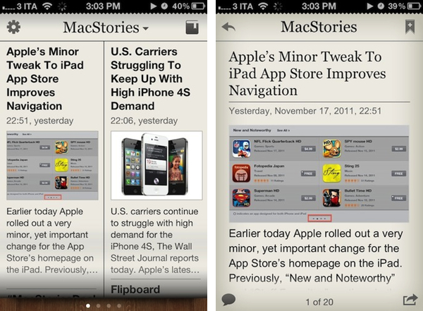
While we wait for Flipboard to arrive on the iPhone, Amazing Softworks’ Newstream offers an interesting solution to turn your favorite websites into newspaper-like reading experiences. Using regular RSS feeds to fetch a website’s latest articles, Newstream allows you to create a list of favorite sources that will be turned into virtual publications on a newsstand that you can swipe through. The app loads an article’s text and images, and lets you tap on headlines to read the full text in a single-article view. When you’re done, you can go back to the main screen, and swipe to another website. Alternatively, you can tap on a website’s name at the top and instantly jump to another one through a popover menu. Articles can be tweeted, shared on Facebook, emailed to your friends or added to the app’s own reading list. Unfortunately, there is no support for Instapaper or Read It Later in the app, which means the reading list won’t sync to other devices or services. The app doesn’t even sync or import feeds from Google Reader, which means you’ll have to add your favorite blogs manually.

I think Newstream’s limited feature set might also be its strongest selling point for people looking for a simple way to load a subset of RSS feeds into a separate app with an easy-to-read format. Newstream is $2.99 on the App Store.

Audium

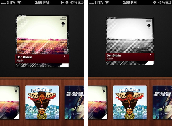
Developed by Michael Pringle, Audium is a beautiful, lightweight and gesture-based music player for your iPhone. Instead of imitating the Music app’s interface by adding a number of new features as many third-party music players do, Audium focuses on simplicity and ease of use. Audium doesn’t display a list for your artists and songs – instead, it visualizes artworks from albums you’ve synced on your device at the bottom of a wooden shelf. Swipe through albums, and double tap on one to start playing; double tap again to pause, swipe left or right to change song. It’s very simple. You can even swipe up or down to adjust the volume, and the app displays a tiny circular indicator rather than a classic progress bar to see how much time is left in a song.

Audium is a clever app that’s intuitive and fully takes advantage of the iPhone’s touch-based interface. It’s a $0.99 download from the App Store.

(album artwork via Aldrin)
Read more


App Journal, Episode 7: Muon, Flint, Sociable, CoinKeeper

App Journal is a new series aimed at showcasing apps we have enjoyed using on our iPhones, iPads, and Macs, but decided not to feature in a standalone, lengthy review here on MacStories. App Journal is a mix of classic reviews, weekly app recommendations, and a diary of our experiences with apps that still deserve a proper mention.

After the release of iOS 5, iCloud and the first wave of new apps that take advantage of Apple’s new OS and sync services, the App Store is quickly marching towards a holiday season that will be huge, both for hardware sales as well as app and game releases, software deals, and new retail features at Apple’s physical stores. While we wait for the craziness to begin later this month, we take a look at a cool music visualizer for the iPad, a finance app for the iPhone, a Campfire client and a utility to update your status on multiple social networks at once.

Sounds cool? Follow us for this week’s app collection after the break, and stay tuned for more App Journals in the next weeks.

Muon

I found out about Muon when I first saw an ad in our site’s sidebar. I don’t manage advertising on MacStories anymore, so the encounter was completely random, and the fact that the developers are advertising on our site didn’t influence my decision to mention their iPad app on the Journal. Just making things clear.

That said, Muon is a nice music visualizer for the iPad, kind of like iTunes’ own visualizer but with more effects and touch controls. The app can fetch songs from your existing Music library, and displays AirPlay-compatible controls as a translucent bar at the bottom. You can tap on a song’s name at any time to change artist or album or pick a playlist, but I don’t like the blue design of the music picker menu. Visual effects are obviously Muon’s main feature, and interestingly enough the app comes with settings to control the Audio, Drag and Mutate reactions of the Visualizer. You can tweak things like Orbital Speed, Life Span, Color Entropy and Zoom & Blur, and you’ll notice that modifying these parameters really changes what’s displayed on screen.

The developers claim Muon can move up to 500,000 particles on the iPad 2, with a complex visualization engine that makes effects evolve with the beat of you music and gradually form different shapes and patterns that you can capture as presets, or screenshots with the dedicated camera button. The app supports video-out and AirPlay Mirroring, as well as dual monitor setups and full-screen view on the iPad.

Overall, Muon comes with some fairly advanced control options but I simply prefer to keep it running and let it decide which effects to use according to the song that’s playing. Muon is $0.99 on the App Store for a limited time.

Flint

For our communication needs here at MacStories, we use 37signals’ Campfire. For those who are not familiar with the service, it’s a fantastic chat tool for teams that, among other things, allows you to upload files, manage chat transcripts for multiple rooms, and visualize media such as pictures and videos with inline previews. We use Campfire every day to quickly put out news, casually hang out, and assign articles to each other. There’s no doubt Campfire has become an essential tool for getting things done over here.

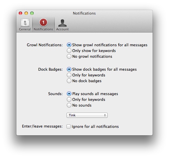
In the past months I’ve been testing Flint, a native Mac client for Campfire that’s available on the Mac App Store. It’s been hard for me to switch from the browser-based, pinned tab for Campfire, but Flint is simply fantastic. The interface is elegant, gets out of the way and nicely highlights conversations in a Campfire room. There are profile pictures for users, and a popover at the bottom lets you see all participants in a conversation. The app supports most of Campfire’s web functionalities (image previews, sounds, but no emoji), and more importantly it’s perfectly integrated with Growl on OS X.

This is the main reason I use Flint – with Growl integration, I can take a look at what’s being said without opening the app and, from the Preferences, control the behavior of sounds, dock badges, keywords and enter/leave messages. In the past weeks, the developers have also released an update that improves the reliability and speed of the app from the first version – so if you gave it a try initially and went back to Campfire on the web, now it’s time to fire up the app again and see if things have improved for you.

I, for one, will keep using Flint to catch up with my team and get work done. If you’re serious about Campfire and have a Mac, Flint is $9.99 on the App Store. Read more


App Journal, Episode 6: NotifyMe, Whale Trail, Twittelator Neue, BBC iPlayer

App Journal is a new series aimed at showcasing apps we have enjoyed using on our iPhones, iPads, and Macs, but decided not to feature in a standalone, lengthy review here on MacStories. App Journal is a mix of classic reviews, weekly app recommendations, and a diary of our experiences with apps that still deserve a proper mention.

With iOS 5, iCloud and the iPhone 4S now out in the wild and available for all users, App Journal gets back to its regular programming schedule and we couldn’t be more excited to start trying new apps that fully take advantage of the new features offered by iOS 5 and iCloud services. This week, Graham takes a look at the global version of iPlayer, while I try to set a personal record in Whale Trail (thanks to our friends at The Next Web for writing about this gem), experiment with a new Twitter client for iPhone, and enjoy the comfort of a quick-entry panel in a Mac app that creates reminders, but it’s not Apple’s Reminders.

We think this week’s selection is pretty great. Stay tuned for more App Journals in the next weeks.

NotifyMe

With iOS 5, Apple introduced Reminders, and as I wrote in my overview of the app, I’m glad they did. Reminders makes iOS as a platform more efficient and productive, allowing users to forget about having to purchase a standalone to-do app because now the functionality is integrated right into the system. But as I also wrote, it’s not like Reminders aims to replace more complex solutions like OmniFocus, Todo or Things: Reminders is very simple and aimed at people who don’t need advanced personalization of their to-do lists or project management features. Reminders targets the average iOS user that has always wished his iPhone would let him create reminders for when he gets home or needs to take out the trash. With Siri integration, Reminders gets even more accessible thanks to voice-based input.

There will always be room for third-party apps in the iOS ecosystem, and even if Apple “borrows” basic functionalities from third-party software every once in a while, developers always find a way to give their apps a reason to exist and prosper. Just take a look at Instapaper, Grazing, or Fantastical.

NotifyMe, a set of apps by PoweryBase, is an interesting and powerful alternative to Reminders for those who wish they could do a bit more with their to-dos and, more importantly, have them synced back to a native Mac app. NotifyMe is very similar to Reminders in its underlying concept: you create to-dos and they’re synced to the cloud. Unlike Reminders, NotifyMe doesn’t use iCloud – instead the developers have built an infrastructure called the NotifyMe Cloud that keeps iPhone, iPad and Mac clients always up-to-date with a free account you can create at notifymecloud.com. Syncing is free, with no subscriptions – but you’ll have to buy the iOS apps separately on the App Store (no universal version yet) and if you want to have to-dos on your desktop as well, NotifyMe for OS X on the Mac App Store.

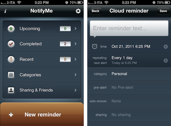
Where NotifyMe really stands out is customization. You can assign reminders to specific categories and create new ones from scratch choosing a custom icon. On iOS, you can pick a melody for NotifyMe alerts, set a [Category] prefix in the notifications that you’ll get from the app, and choose whether or not you want the app to default an “auto-done” state for non-repeating reminders. Furthermore, you can set auto-snooze, customize the app’s badge type to overdue+today or overdue+all upcoming, and select a category for shared reminders added by your friends. NotifyMe makes it easy to curate a personal list of friends and family members that you want to share reminders with – just head over the Sharing & Friends tab in the iOS app, and send a request via email to another NotifyMe user. Friends can create shared reminders, but they can’t browse your whole account and see the reminders you’ve chosen not to share.

Both on the Mac and iOS, the app’s interface is easy to use and focused on lists and the “New reminder” button. Lists include your upcoming reminders, completed and recent ones, as well as your categories and Sharing. On the iPad and Mac you’ll see categories (and to-dos assigned to them) right in the left sidebar, whereas on the iPhone you’ll have to tap on Categories first to navigate to another view. NotifyMe also comes with a web app for those who don’t own a Mac, which you can find at webapp.notifymecloud.com.

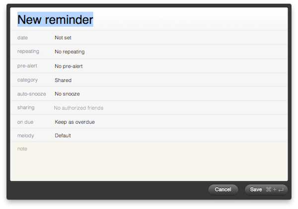
NotifyMe’s reminders don’t have location features, but they have some other options worth mentioning. You can set repeating reminders and pre-alerts; pick a category, set auto-snooze, sharing and melody on a reminder basis and attach notes. The biggest advantage of NotifyMe over similar to-do software for iOS is that its Mac app enables you to create reminders with an OmniFocus-like quick entry panel, which can be assigned a systemwide keyboard shortcut and optionally expanded to reveal more settings as you write. The quick entry panel is possibly the single best feature of the Mac app that justifies the (steep) price if you’re going to create many reminders on your desktop, and have them always available through the cloud.

NotifyMe works reliably, and in some areas it offers more customization options than Apple’s Reminders for iOS 5. The full set of apps (iPhone, iPad, Mac) doesn’t exactly come cheap, so consider the purchase if you’re really going to use the Mac’s quick entry functionality and iPad client a lot. Read more


App Journal, Episode 5: Mercury, MacHash, Music+, Worml

App Journal is a weekly series aimed at showcasing apps we have enjoyed using on our iPhones, iPads, and Macs, but decided not to feature in a standalone, lengthy review here on MacStories. App Journal is a mix of classic reviews, weekly app recommendations, and a diary of our experiences with apps that still deserve a proper mention.

Amidst iPhone 4S and Siri announcements, the sad news of Steve Jobs’ passing and iPhone pre-orders, App Journal took a break last week and is back this week with quick episode in preparation of the app releases that will follow after the launch of iOS 5 and iCloud on October 12th. You can expect a whole new category of apps for iPhone, iPad and Mac once iOS 5 and iCloud will be available to all users – developers have been spending all summer studying the new APIs, which include pretty neat things like Twitter integration, Newsstand, and iCloud Storage.

In the meantime, I’ve collected four simple apps that I’ve been trying in between Apple keynotes and iPhone 4S news. Check them out after the break, and stay tuned for more App Journal episodes in the next weeks. Read more


App Journal, Episode 4: Moom, 4Eyes, Quotes Plus, Easy Timeline

App Journal is a weekly series aimed at showcasing apps we have enjoyed using on our iPhones, iPads, and Macs, but decided not to feature in a standalone, lengthy review here on MacStories. App Journal is a mix of classic reviews, weekly app recommendations, and a diary of our experiences with apps that still deserve a proper mention.

For this week’s App Journal episode, I asked my fellow writers Don, Chris, and Graham to come up with iOS and Mac apps to highlight in our weekly roundup. The result has turned out to be “quite a team effort” and, as I was reminded in our internal chat group, I still needed to come up with a proper introduction for the episode. So there you have it: window utilities, text-based search tools for iOS, timelines and famous quotes – there’s a variety of apps in App Journal Episode 4, and we’re increasingly looking forward to the updates and new apps the release of iOS 5 with iCloud support will bring.

Stay tuned for more App Journal episodes in the next weeks.

Don: Moom

Moom is a utility for moving, resizing, and manipulating application windows. It uses a mixture of pre-defined and user-defined window settings which are accessible by hovering over the green zoom button or through customizable keyboard commands. This is one of those apps that I didn’t think I needed until I gave it a chance. I was happy using a set of AppleScripts to move the front window to pre-defined locations but the problem was it only worked with applications that supported window bounds in AppleScript. This left Twitterrific and Preview out in the cold. Thankfully Moom has no issue working with these applications.

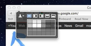
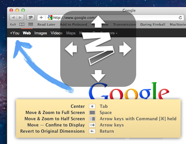
When using Moom there are two types of controls: Mouse and Keyboard. The keyboard controls are undeniably more powerful because of their speed and plethora of alterable configurations. Despite that I still found that the mouse features were treated with equal attention. Hovering over the green zoom button displays a beautiful transparent popover that has five pre-defined and extremely useful shortcuts.

Below the five icons lies a grid that can be used to dynamically draw out where you want the window to be located. The grid must be enabled under Mooms Mouse preferences. There you will find options to adjust the size of the grid as well as an option to enable access to your custom keyboard controls. Another great mouse feature is the ability to move windows across displays with nothing more than a gesture (clicking down on an icon and dragging it towards the second display).

The keyboard functions are also quite interesting. There are basically two types. The first type allows you to define window positions and set them to a keyboard shortcut. It is the reason I bought the program and it did not disappoint. The ability to use a keyboard shortcut to resize a window to fill half the screen or even just a quarter of it depending on the situation is invaluable. The second type is a keyboard mode which is triggered by a hotkey and allows you to move a window around with your arrow keys for more granular on-the-fly positioning.

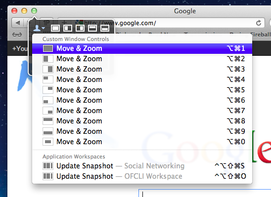
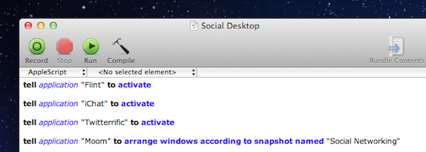
The real gem of this program is its ability to save window layouts. It basically memorizes the current positions of your windows and it saves a snapshot of them so it can restore those windows to their exact locations by way of a keyboard shortcut or from the mouse-based pop-over menu. If that wasn’t cool enough, they even added AppleScript support so you can call those saved layouts from a script!

Example: I like to keep a Desktop just for social networking applications. Now with Moom I can automate the process of opening all of my social apps and then arranging them instantly by calling the saved layout I created called “Social Networking” from an AppleScript.

The last feature I wanted to mention was its ability to run in what Moom refers to as Faceless mode. This is a mode with no dock icon and no menubar icon. Moom can also be set to show the settings panel on launch which is perfect when calling Moom from a program like Alfred. No icons to stare at and quick access to Moom’s settings from a launch bar, what could be better?

Overall this app has great functionality and a very pleasant interface, all for a conservative price. $4.99 on the Mac App Store. Read more


App Journal, Episode 3: Dolphin Browser HD, Showreel, Faveous, ifttt

App Journal is a weekly series aimed at showcasing apps we have enjoyed using on our iPhones, iPads, and Macs, but decided not to feature in a standalone, lengthy review here on MacStories. App Journal is a mix of classic reviews, weekly app recommendations, and a diary of our experiences with apps that still deserve a proper mention.

As developers put the finishing touches to their iOS 5 and iCloud-based new apps and updates, this past week has been relatively slow in noteworthy App Store releases and features. Fortunately, I’ve dug up some gems worth mentioning, and I’ve been playing with the amazing If This Then That, now out of beta and open to the public.

Stay tuned for more App Journal episodes in the next weeks.

Dolphin Browser HD

I was a little skeptical when I first heard about Dolphin Browser for iPad, a port of what appears to be a fairly popular browser for Android devices. Furthermore, the app is free, and I always wonder how it’s going to play out in the long term without a business plan. Still, I have to say Dolphin Browser is pretty good. Mind you, it’s no Grazing, but I was surprised to see two features cleverly implemented: gestures, and the “webzine”. With gesture support, you can assign any URL to a custom gesture you have to “draw” so you’ll be able to launch your favorite websites by simply performing the gesture on screen. There’s a set of built-in gestures for Facebook, Twitter, and other websites, but you can create as many as you want by opening a new URL, and choose “gesture for this page”. A new window will open, asking you to draw the shape with a single stroke – after that, the gesture will be assigned to the URL and saved in the Gestures area of the app. Gesture recognition is pretty good, and you don’t have to be an artist or get really precise down to the pixel for the app to see what you want to launch. Overall, it’s a quite clever idea that, however, might use a more universal access without having to open a dedicated Gestures overlay (I’d like to draw directly on the webpage, if that makes sense).

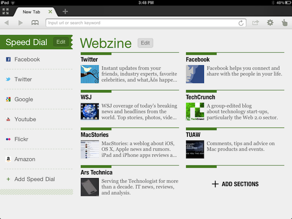
Second is the webzine, basically a Flipboard-like magazine interface that, however, resides right within the browser and not in a standalone app. Dolphin’s main page, in fact, lists a series of speed dials on the left (think frequently accessed websites) and the “webzine” on the right, pre-populated with blogs you might want to read in a more uncluttered fashion. The thing with the webzine in Dolphin is that you’re not really forced to open this “start page” every time – once you visit a blog, say MacStories, Dolphin will ask you if you want to read it through the webzine UI. When a website gets passed through the webzine, a nice and fluid animation brings text in the foreground with articles and images as big squares – again, it resembles Flipboard.

The big difference is that Dolphin’s webzine doesn’t fetch entire articles and images – the actual webpage is loaded behind the webzine page, and you can jump to it (to see the rest of a story, images, or videos) with a single tap. It’s still unclear to me whether Dolphin’s webzine fetches articles via RSS (I assume it does), but I find it surprising the developers didn’t implement a refresh button (just last night I was reading MacStories through the webzine, and two articles I had just posted weren’t showing up).

Dolphin is a decent browser for the iPad with two really neat functionalities. You won’t find the “power user” aspect of Grazing and iCab in here (Dolphin doesn’t even have contextual menus for links), but overall, it’s a good free browser. Get it here. Read more


App Journal, Episode 2: Boxee for iPad, Notesy, Note & Share, Writing Kit

App Journal is a weekly series aimed at showcasing apps we have enjoyed using on our iPhones, iPads, and Macs, but decided not to feature in a standalone, lengthy review here on MacStories. App Journal is a mix of classic reviews, weekly app recommendations, and a diary of our experiences with apps that still deserve a proper mention.

For this week’s App Journal episode, I’m taking a look at four iOS apps: Boxee for iPad, Writing Kit, Notesy and Note & Share. You may notice three of them are note-taking apps – in fact, I’ve been playing with several apps of this kind recently, and have yet to decide which one suits better my writing workflow when it comes to quick notes for, say, Dropbox, or longer pieces written in Markdown.

Stay tuned for more App Journal episodes in the next weeks. Read more