Posts tagged with "app store"

Apple Posts “Best Of App Store 2012” Lists

In today’s weekly refresh of the App Store, Apple posted a list called “Best of 2012”, highlighting the apps they “loved the most” this year. Day One, a journaling apps we reviewed on MacStories several times, wins as “Mac App of the Year”; “Deus Ex: Human Revolution” wins as “Game of the Year”. The Mac section is also viewable on the web here. On the iOS side, Paper for iPad and Action Movie FX win as Apps of the Year; Rayman Jungle Run and The Room win as Games of the Year for iPhone and iPad, respectively.

Over the past year, the Mac App Store was packed with impressive new apps and games. Some were dazzling debuts, while others were existing apps updated to leverage new features in OS X Mountain Lion or to take advantage of the Retina display of the new MacBook Pro. Browse the apps and games we loved most in 2012.

The list is organized in Runners-Up, Best Apps of 2012, and Best Games of 2012. Below, the full list, recompiled from the Mac App Store, iPhone App Store, and iPad App Store. My personal congratulations to the Day One team, an app that has completely changed the way I archive my memories on iOS and OS X.

Other notable winners in iTunes categories include:

Read more


Instacast 3 Review

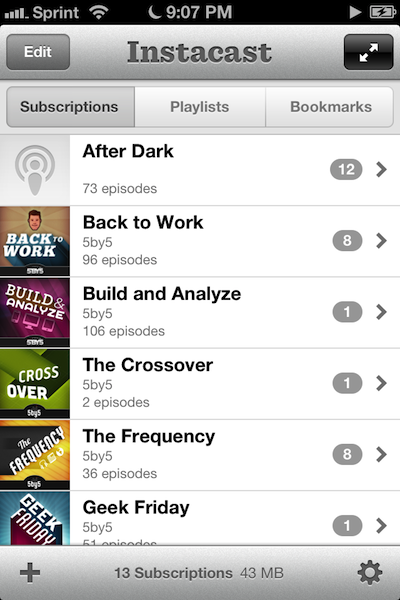
Instacast 3 is both iterative and something different. No longer divided into separate iPhone and iPad apps, Instacast 3 is universal, also eschewing the in-app purchase model introduced with Instacast 2. And at its core, iCloud sync has been gutted and replaced with Vemedio’s own syncing solution that’s faster and less error prone (an in-house solution that works with WebDAV.). On the iPad, Vemedio has completely redesigned their Twitter-for-iPad inspired interface in favor of a more parallel experience with the iPhone. Just as Apple makes small iterations to their hardware, Vemedio has made small iterations to their software.

Read more


Twitterrific 5 Review

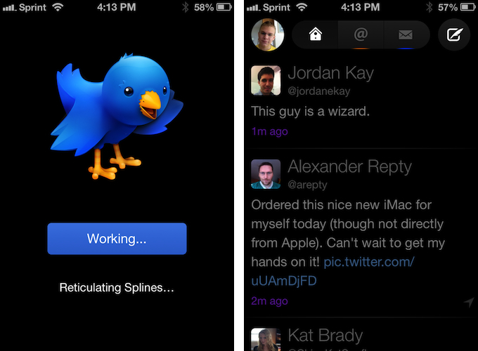
Twitterrific 5. It’s been fun to watch Twitter’s reaction to an app that I, and other writers, wanted to surprise the world with. Alas, it was bound to leak, unsurprisingly by Apple’s Japanese App Store. The Iconfactory’s latest iteration of their famed Twitter client is shockingly different isn’t it? The same gut reactions I watched unfold on Twitter could not better describe the same gut reactions I had when I first saw just how striking the new interface is.

Sharing the first pic of Twitterrific 5 with my coworkers resulted in an immediate, “Wow.” After a few more screenshots, “That looks like a Windows 8 app. Like Track 8.” It’s an absolutely fair assessment. And it’s one I’ve seen echoed on Twitter as I watched the tweets scroll by. Thankfully, Twitterrific 5 is as much of an iOS app as it ever was. No text hangs off the screen — no “CTURES” as Federico and I will joke.

Twitterrific 5 presents itself dressed in black with Helvetica accents and familiar shades of orange and blue for mentions and messages. It’s both instantly recognizable and obviously different. In contrast to colored entries and standard rectangular iOS elements, it is typography, floating buttons, and rounded corners that are pervasive in the new Twitterrific.

Read more


Gmail 2.0: A Year Later

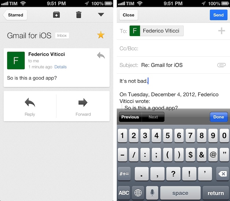
Despite Google’s persistence on adopting web views in an iOS frame, Gmail’s iOS app has been consistently improved since its inception. For the amount of ridicule Gmail for iOS has received, whether it be for its mobile web disguise or a lack of support for multiple accounts, it’d be a shame not to recognize some of the substantial improvements that have been made to the app. While I didn’t think Gmail was a great app, I didn’t think of it as a bad app, offering a native Gmail experience for account holders who want to take advantage of Google’s quick search capabilities, labels, and importance markers. On iOS, the main benefit is near instant notifications, something that Apple’s native Mail app can’t take advantage of unless Gmail is set up as an Exchange account. (And that notification sound? One of the best.)

Read more


Flipboard Adds iBookstore Section

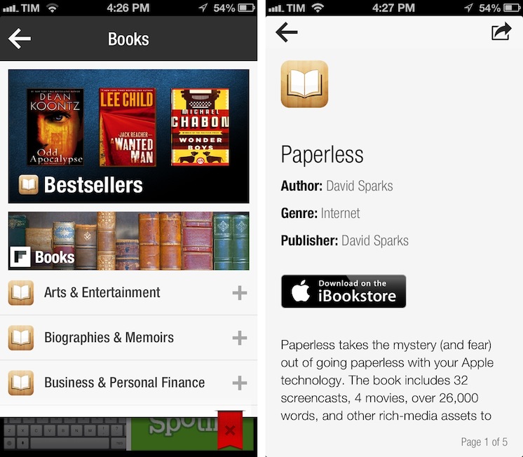
Mike Walsh reports at MediaPost (via The Next Web) about Flipboard’s latest section: Apple’s iBookstore. In an update to the in-app catalog released today, Flipboard is now featuring a “Books” category that embeds previews of books from Apple’s store, available for purchase upon clicking a “Buy” button in Flipboard.

The new section – spanning 25 categories including literature, travel guides, biographies and cookbooks – lets users flip through catalog-like pages of books, with brief descriptions and cover art images. Each title has a link to the book’s page on the iBookstore to streamline purchases from the Flipboard app on the iPhone, iPad, iPad mini and iPod touch. The new books section is available in 10 countries at launch: The U.S., Canada, the U.K., Australia, Brazil, France, Germany, The Netherlands, Italy, and Spain.

There are some points to be made about this interesting Flipboard initiative. Firstly, as we seen earlier this year with the Levis partnership, Flipboard has turned into a magazine of all-things Internet-related, rather than a prettier interface for blog posts and status updates. Flipboard supports articles, videos, audio podcasts, photography, social networks, and, now, Books. On the other hand, the launch of the Books section is reminiscent of an old rumor which claimed Flipboard was thinking about TV shows and movies; perhaps Flipboard was indeed considering that kind of media from iTunes, but went with Books first.

Books categories and descriptions have been redesigned for Flipboard: iTunes pages are stripped out of unnecessary clutter and they’re presented as elegant previews in Flipboard. The interesting detail is how Flipboard is requiring users to buy books: rather than using the new SKStoreProductViewController class of the StoreKit API in iOS 6, upon tapping the “Download on the iBookstore” button Flipboard will open a web view and ask the user to launch iTunes. It works, but it isn’t exactly the best purchasing experience when apps like Mail have showed it is possible to show a modal iTunes window to buy media without leaving the app, yanking out the user into iTunes.

Why doesn’t Flipboard follow Mail’s example and use an in-app iTunes window to let users buy books without leaving the app? I believe the reason lies in affiliate links: apparently, SKStoreProductViewController doesn’t work with affiliate links for now, and Flipboard is, according to The Next Web and MediaPost, using these links to generate a 5% commission off every sale made from Flipboard links. It is, essentially, a way to monetize the new section without asking the user for anything in return (we use affiliate links here at MacStories as well).

In trying the new section, I’m impressed by how iTunes content has been reformatted to fit Flipboard’s style; I’d only suggest to remove links to books made with iBooks Author from the iPhone version, as iTunes will report an error when trying to open them from an iPhone.

The new Books section doesn’t require an app update and is available on Flipboard now.


Apple Tweaks Design Of App Store Category Pages

In its weekly App Store refresh, it appears Apple has today tweaked the design of App Store categories to include the same design of the App Store’s home page. By heading to a category like Productivity or Utilities, both from an iOS device or Mac, you can see how Apple is featuring more apps with large banners across the top of a category page, smaller banners in the middle, and the usual “New and Noteworthy” and “Essential” collections that are updated on a weekly basis. Read more


Apple Changing App Store Prices for Several Countries

Section on VAT clarified, more updates at the bottom of the article.

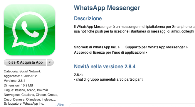
As pointed out by several readers on Twitter, Apple appears to be changing pricing tiers of App Store applications in several European countries. Specifically, the lowest price used to be €0.79, which has today been bumped to €0.89. We’ve been able to confirm this is indeed the case, as shown in the screenshot above, taken from the Italian App Store.

So far, we’ve received notices of App Store pricing changes in:

  • Italy
  • Spain
  • Netherlands
  • Portugal
  • Greece
  • Poland
  • Germany
  • France
  • Belgium
  • Austria
  • Czech Republic
  • Denmark
  • Luxembourg
  • Hungary
  • Russia
  • Ireland
  • Finland

Read more


“App Collections” Promoted To App Store Categories Menu

Since the launch of iOS 6 on September 19th, we’ve been tracking Apple’s efforts to promote a new section of the App Store called “App Collections”. In late June 2012, Apple launched  ”Game Collections”, which highlighted all the previous game “bundles” Apple had featured on the App Store. For the past couple of years, in fact, Apple has been handpicking apps and games and featuring them in standalone sections often promoted on the front page or elsewhere throughout the Store. For games, such sections included “Big Name Games” and “Benchmark Games”.

However, Apple often launched new sections while forgetting to add new content to existing ones; furthermore, there wasn’t a unified place to browse all the sections launched by Apple through the years. But we’ve noticed a change in the past months: with a revamp of the Editor’s Choice and App of the Week initiatives, Apple also started paying more attention to the curation and discovery aspects of sections. They started by adding new content and launching Game Collections in June; with iOS 6, they created App Collections and featured it in the App Store’s rotating banners; and now, they’re featuring App Collections directly in the Categories menu.

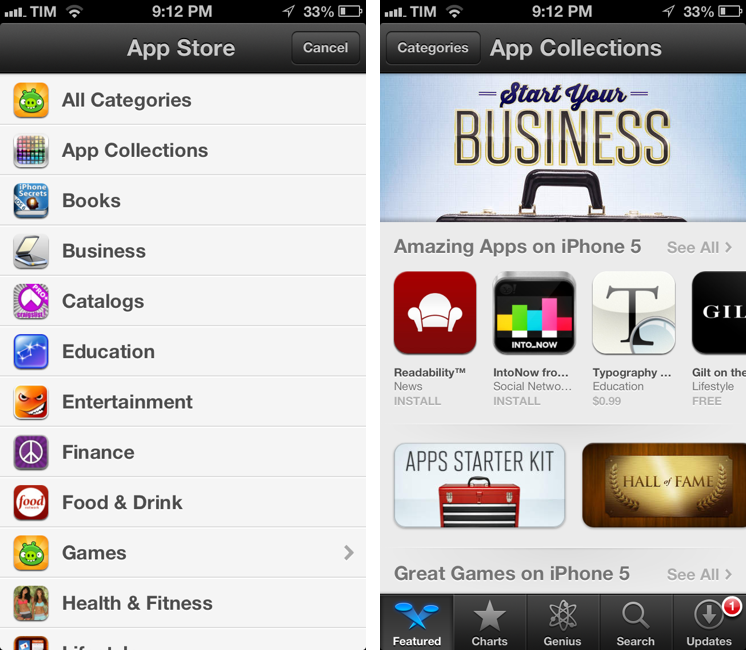
Both on the iPhone and Mac, App Collections are available from the Categories menu of the App Store. On iTunes, they are listed as “iPhone App Collections” and “iPad App Collections”. Interestingly, the iPad’s Categories still hasn’t been updated with the new option.

Apple’s description of App Collections makes it clear they are featuring apps that have been “personally tested”:

With hundreds of thousands of apps on the App Store, how do you find the apps you’ll love using? You’re in the right place – we’ve gathered our favorites here. Every app in these collections is personally tested and recommended by our editors. Whatever you do with your iPhone, iPad, or iPod touch – shopping, watching movies, editing photos, and beyond – you’ll find apps that work smartly and beautifully.

Right now, there are 20 sections inside App Collections:

This may appear like a minor change, but it is, in fact, a signal of a major shift that could soon happen to the App Store’s discovery dynamics. As the App Store grows bigger in terms of available content, it’ll become harder for users to find the app they’re looking for, just like Apple says. Search doesn’t help when you don’t know what you need yet, and there’s only so much space Apple can give to weekly “New and Noteworthy” apps on the Store’s front page.

An up-to-date, lovingly curated collection of app bundles may become the best way for users to discover new apps. More importantly, app collections will put the focus on what an app does, rather than how it performs in the charts. It is a profound change for developers and users.

In my iOS 6 review, I noted how categories had been given a more prominent spot in the App Store’s top toolbar. As I wrote:

The good news for developers is that, with iOS 6, browsing single categories (not their top charts) may now be more accessible and visible to the end user: whereas in iOS 5 some always ignored the Categories tab in the bottom bar, a button to access every category is now available directly from the front page

Essentially, Apple is now treating App Collections as a category that deserves a user’s attention just like “Games” or “Productivity”. It wouldn’t be a surprise, at this point, to see more options like filters coming soon to App Collections as Apple invests more in it.

Last, App Collections highlights the human aspect of apps that are tested and recommended by Apple editors. We’ve long debated the importance of human curation in the App Store, but I think The Iconfactory’s Craig Hockenberry summed it up best in our App Store overview from May: “A movie recommendation from Roger Ebert means a lot more to me than a computer generated ranking based on reviewer scores. Automated systems can help, but I think it’s the personal touch that’s missing”.


Average App Size Increased By 16% Since March

Average App Size Increased By 16% Since March

MacRumors points to new data by ABI Research, showing that, since March 2012, the average app size has increased by 16%:

The iPad 3’s Retina display and Apple’s more liberal submission policy have caused the file sizes of leading iOS apps to grow substantially, especially in games. The latest data from ABI Research shows that the global average app size across all categories was 23 megabytes in September, 16% more than in March.

On March 1, I wrote:

I see two solutions. Either Apple gets the carriers to agree to larger download sizes, establishing a new “average” that should work for most apps (let’s say 60 MB as Panzarino suggests), or they rebuild the download mechanism completely by allowing devices to “ignore” resources they don’t need. The second solution would be a “cleaner” approach, in that it would address the root of this likely scenario — that is, devices downloading apps containing all kinds of images and resources for Retina and non-Retina displays.

As we know, Apple decided to increase the maximum download size over cellular to 50 MB. This, combined with LTE networking, has allowed developers to be more relaxed in regards to their app sizes, and users to have reasonable download times on 4G (or DC-HSDPA). The solution I proposed earlier this year – a way to identify which assets to download for an app on a specific device – would still require a major rework of iOS.

Due to international pricing, this year I had to get a 16 GB iPhone 5. But I regret my decision. Something we’ve learned in the past two years (since the Retina display was introduced in 2010) is that that app sizes are only going up, and you’re never going to wish you got a device with less capacity. You’ll either be fine, or want more. With the iPhone 5 and Retina + Universal games, I find myself having to keep an eye on my available space, which is something I despise doing.

For the future, I hope 32 GB will become the new 16 GB, and I’m looking forward to 128 GB iPhones and iPads.

Permalink