Design: Optimizing for Modern Familiarity
At the heart of Big Sur is a refreshed design that touches every rounded corner of the updated OS. The depth of the changes can’t be understated and is fully apparent from the moment you’re greeted with the return of the Mac’s startup chime. Nothing has been left untouched. System sounds, icons, windows, toolbars, sidebars, buttons, the use of color and whitespace, and more have all been reimagined while remaining informed by and grounded in the Mac’s history.
The design of macOS 10 wasn’t broken, but it had become an island of Apple UI design, evolving on its own while new computing devices with OSes spun off from the Mac were introduced and more tightly integrated. Whether I’m using my Apple Watch, iPhone, or iPad, there are design cues that make moving from one to the other frictionless. That wasn’t as true when moving from those devices to a Mac running Catalina.
Despite their common technical underpinnings, switching from working on an iPad to a Mac running Catalina involved adjustments beyond those that can be explained by differences like macOS’s windowed environment and input methods. That’s not a problem if you primarily use just one of those devices, but many people use multiple devices or switch from one to another, and if they’re all made by Apple, there should be continuity among them, including with the Mac.
Design changes are also about sending signals and providing context. Of course, nothing says ‘new’ like a fresh coat of paint. However, the Mac is on the cusp of a major hardware and software transition. Soon, new Apple’s new M1 processors will allow Macs to do things of which only iPhones and iPads were capable. Those Macs will be able to run iPhone and iPad apps natively alongside apps built with SwiftUI, Mac Catalyst, and AppKit.
Big Sur’s design is certainly meant to convey newness, drawing inspiration from iPadOS, but chalking up the changes to little more than following design trends would miss the forest for the trees. Big Sur’s design also serves as a bridge from the Mac’s past to its future.
The result is a careful balancing act that pulls the Mac closer into the fold with Apple’s other devices without abandoning what makes the Mac special. The company’s designers have created familiarity through the use of fonts, glyphs, colors, whitespace, and other elements. Yet Big Sur also sets itself apart from Apple’s other OSes in the way it creates hierarchy fashioned from digital materials using depth, shadows, and translucency, which extends to everything from an app’s icon to its windows. Of course, there are areas that could stand improvement, but I’m impressed by how well Big Sur’s design delivers an OS that, in Apple’s own words, is ‘refined, familiar, and fresh.’
System Sounds
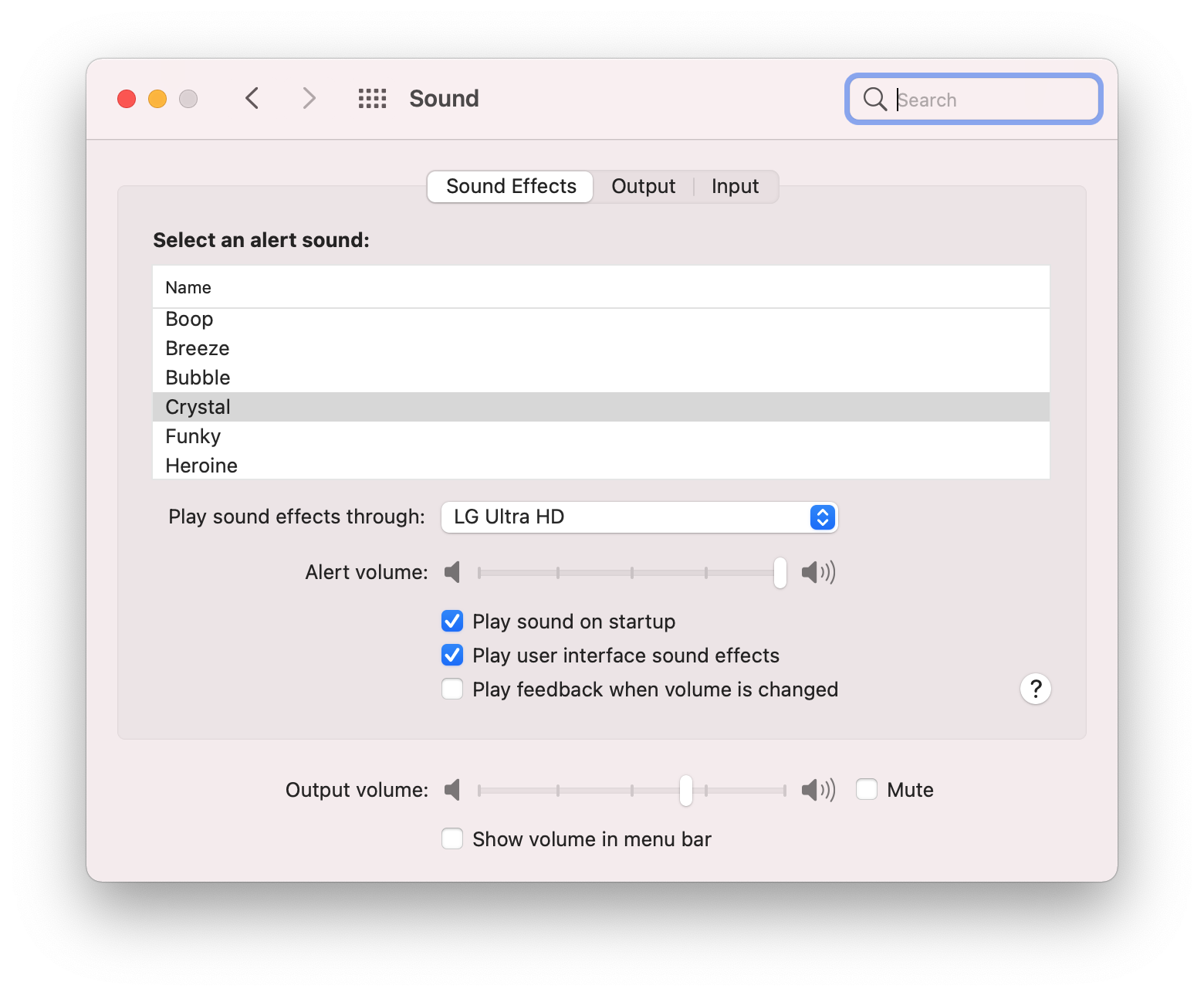
The Sounds panel in System Preferences includes the new alert sounds and an option to turn the startup chime off.
The first thing you’ll experience when you install Big Sur isn’t new at all. The familiar Mac startup chime is back, although it can be turned off in the Sounds panel of System Preferences. Interestingly, the chime has announced the startup of my Mac mini ever since I installed the beta on an external drive, including when I boot into Catalina with the SSD I use for Big Sur physically disconnected.
The startup chime disappeared with the introduction of the 2016 MacBook Pro. Although it was still possible to resurrect the sound with a Terminal command, for most users with a modern Mac, the startup process had become a silent affair.
Although it’s a small change, bringing back the startup chime is emblematic of one of the central themes of Big Sur: remixing the old and new with familiar elements from multiple sources. The startup chime makes the right first impression, greeting users with a sound grounded in the Mac’s past. For long-time users of the Mac, the return of the startup chime provides a dose of reassurance, even before Big Sur’s substantial UI redesign appears onscreen. For new users, the chime serves as the same cheerful welcome that it always did.
Sounds have been remixed and remastered throughout Big Sur. Everything from system sounds like emptying the trash and moving a file, to alerts like Glass and Pop, which are now called Crystal and Bubble, have changed. In most cases these changes retain elements of the original sound, grounding them in the past, while also refreshing the Mac’s soundscape. YouTube user Pomamitia made a couple of nice videos demonstrating the sounds side-by-side:
I’m glad the Mac’s startup chime is back. I usually work with system sounds turned down on my Mac, so they are barely audible over the music I’m listening to. As a result, I may not be the best judge of whether the new sounds are an improvement or not. However, I have found that the new sounds grew on me quickly. I appreciate their clarity, which allows them to be heard over the music or other ambient sounds. Plus, it’s just nice to hear something different after years of the same sounds.
The Desktop and Menu Bar
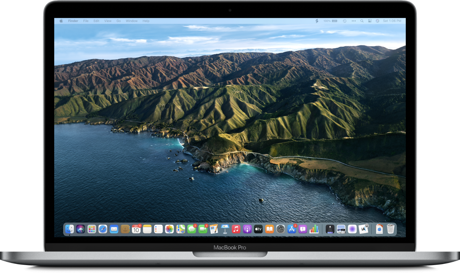
The new desktop features greater translucency and a Dock that floats above the bottom of the screen.
Hot on the heels of the startup chime, before you open a single app, is the next hint that Big Sur is different. Lined up along the bottom of the screen are the system app icons you’d expect, but now they share the same rounded-rectangular shape of iOS and iPadOS app icons and carry a fresh design. The orderly uniformity of the new icons provides an immediate hint about the origins of Big Sur’s design inspiration.
The other striking feature of the desktop is the aggressive translucency of the menu bar and Dock. In earlier versions of macOS, the more opaque menu bar and Dock, which was anchored along the bottom edge of the screen, made the macOS desktop feel a little like looking through a framed window. The menu bar and Dock served as the desktop’s chrome, defining and anchoring a portal in which to use apps.
.jpg)
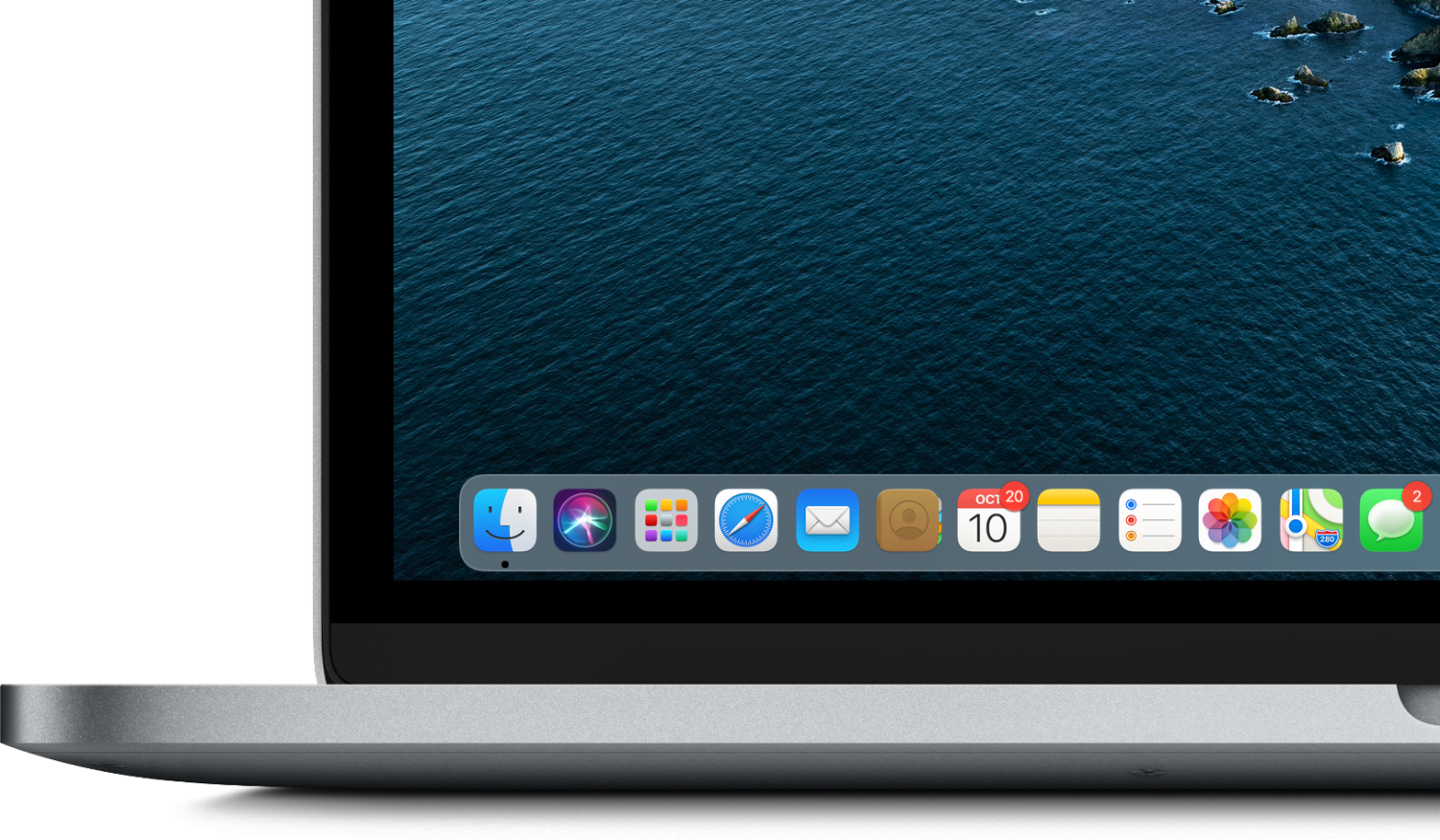
The changes to the menu bar and Dock in Big Sur are subtle, but the combination of translucency and uncoupling the Dock from the bottom edge of the screen makes the desktop feel more prominent. Instead of bracketing the desktop, the menu bar and Dock sit on it, more clearly defining the desktop as the base layer upon which other UI elements rest. The effect is reminiscent of an iPhone or iPad Home Screen while retaining the unique character of the Mac desktop, where a menu system and precise pointing device is always available.
%202.png)
