Apple’s Other System Apps
As with any update to macOS, Big Sur includes updates big and small to other system apps too. Some of the changes are primarily cosmetic to align apps with Big Sur’s new design, but even some of Apple’s more mature system apps received significant improvements to functionality. That’s not universally true, however, so let’s take a look at what has changed.
Reminders
On the surface, Reminders doesn’t look like it has changed much in Big Sur, but it has. The design changes are small. The iconography has evolved with the introduction of SF Symbols 2, and buttons have shed their outlines, but the rest of the app’s main window is the same. What’s changed is that Apple has added several improvements to the app’s functionality that makes it an excellent task management choice for many users.
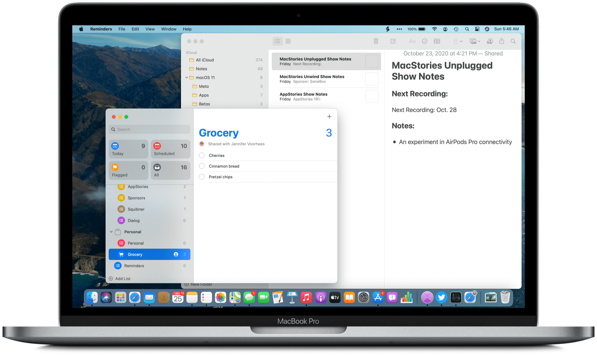
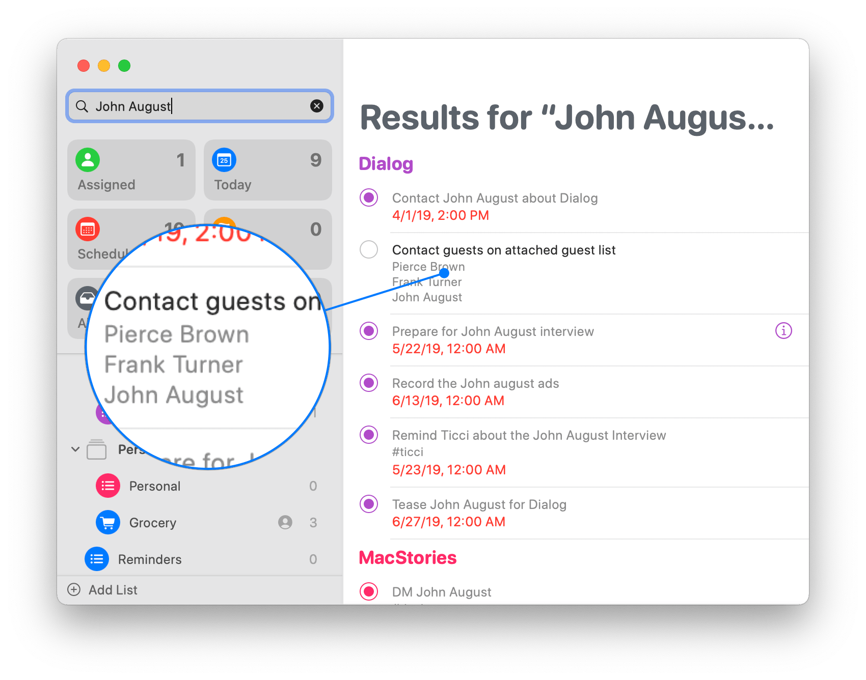
I spent most of 2019 and part of 2020 using a combination of Reminders and GoodTask, which builds on the Reminders database of tasks, as my task management solution. One of the things that frustrated me the most about Reminders in Catalina is that task lists could be shared but not assigned. For example, that meant that if I kept a shared list with Federico for MacStories projects we work on together, there was no clear separation of who was responsible for each task.
Shared lists are good for things like grocery lists that either of two people can complete. When coupled with iCloud sync, shared lists eliminate the need to constantly coordinate who has done what on a list. However, if you’ve decided in advance who is going to do something, it’s preferable to be able to assign the task.
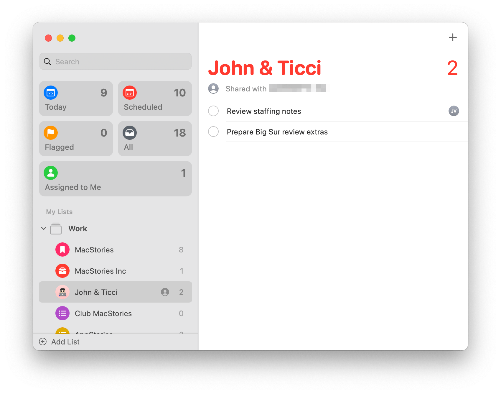
With Big Sur, Reminders has gained assigned tasks, which are labeled with the initials with the person to whom an item is assigned. I’m glad that shared lists are still the default for things like my grocery list, but assigned tasks are far more useful for my day-to-day work.
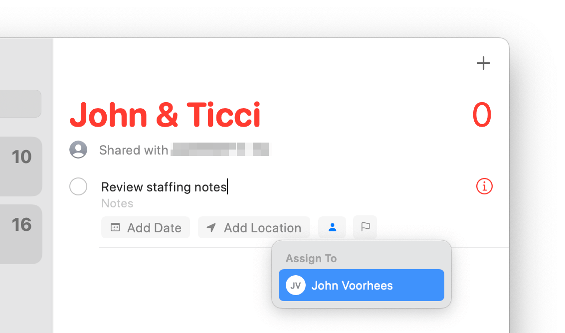
Reminders lets you assign a task in a shared list to yourself or a person with whom you share the list, which can be accomplished at the time you create a task as depicted in the screenshot above, or by clicking the info button next to any task in a shared list. Also, it’s turned off by default, but Reminders includes a new ‘Assigned to Me’ Smart List that can be displayed in the top section of the app’s sidebar, collecting your assignments.
Another nice touch added to Reminders is the ability to reorder the Smart Lists at the top of the sidebar by dragging them to the position that suits you. People use Reminders in all sorts of different ways, so it makes perfect sense to allow greater customization of the app’s UI. In addition to reordering Smart Lists, they can be hidden by right-clicking on the one you want to hide or going to the View menu.
Reminders has added a number of keyboard shortcuts too. The View menu includes commands to jump to any of the Smart Lists using the keyboard shortcuts ⌘1 - ⌘5. Unfortunately, when you reorder the Smart Lists, the numbered keyboard shortcuts don’t update, meaning if you move ‘Assigned to Me’ from the bottom of the list (position 5) to the top (position 1), the keyboard shortcut for the list remains ⌘5.
There are a number of other features that make Reminders more versatile too. Search has been improved to return results for people and locations as well as the content inside notes attached to tasks. Similarly, Reminders uses your past tasks to help create new ones, suggesting locations, dates, and times based on similar tasks you’ve completed. Siri suggests tasks that can be added to Reminders from inside Mail now too, which should be a handy way to add tasks without leaving Mail, although I haven’t seen suggestions in my usage of Mail yet.
You can bulk edit due dates now too. Reminders’ Edit and right-click menus include a ‘Mark Due Date as’ command that lets you set the date of a single or group of selected tasks as today, tomorrow, or next weekend. Each command also has an associated keyboard shortcut for rearranging due dates quickly.
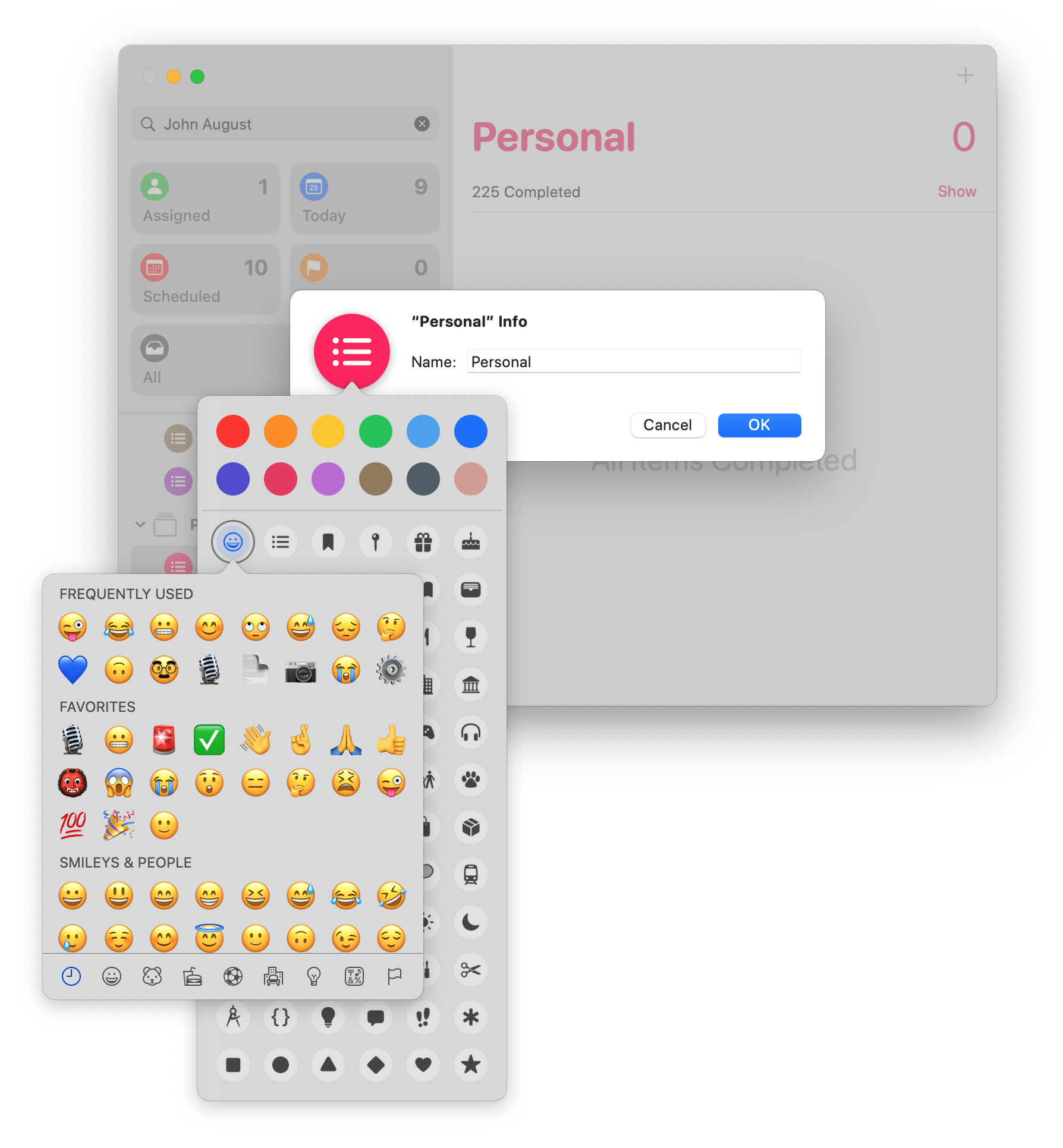
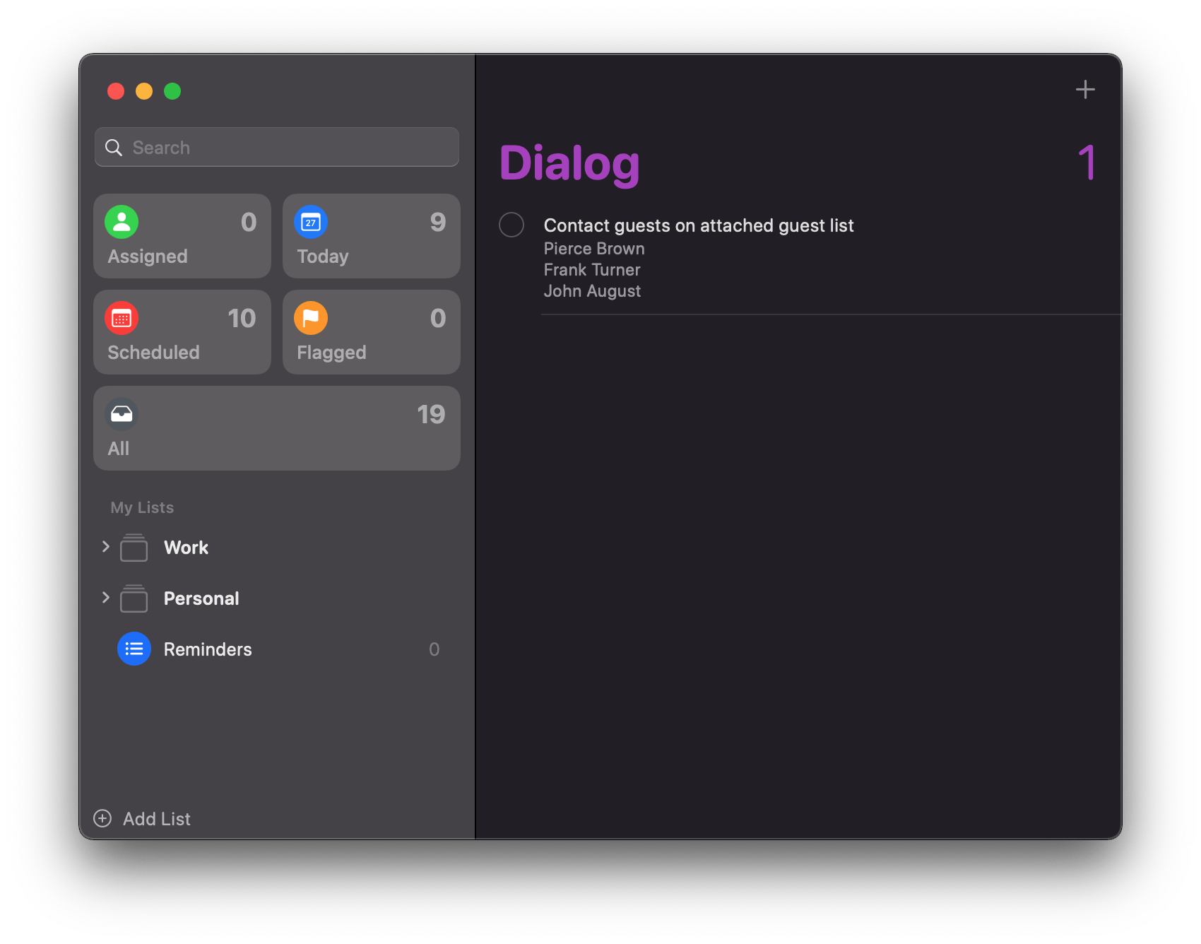
Reminders gives you more options for customizing your lists now too. The app already had a color picker and a fairly extensive set of SF Symbols to use when labeling lists, but now, you can use emoji along with 11 new SF Symbols too.
Reminders has evolved from a very basic list maker to a solid task manager. You won’t find some of the highly customizable advanced functionality of apps like OmniFocus and Todoist, but unless you are managing complex projects involving lots of people with multiple stages and dependencies, I always suggest trying Reminders first.
There are lots of terrific third-party task managers available, but the risk of using a task manager that’s more than you need is that you might fall into the trap of spending too much time setting up your app instead of completing tasks. With Reminders, that risk is minimized because the app does such a nice job of keeping its more advanced features out of sight unless you need them, making for an elegant, streamlined experience.
Notes
I use Notes a lot. I don’t have a hard and fast system for what goes in Notes instead of another app, but I usually use Notes for research, reference materials, and shared project notes.
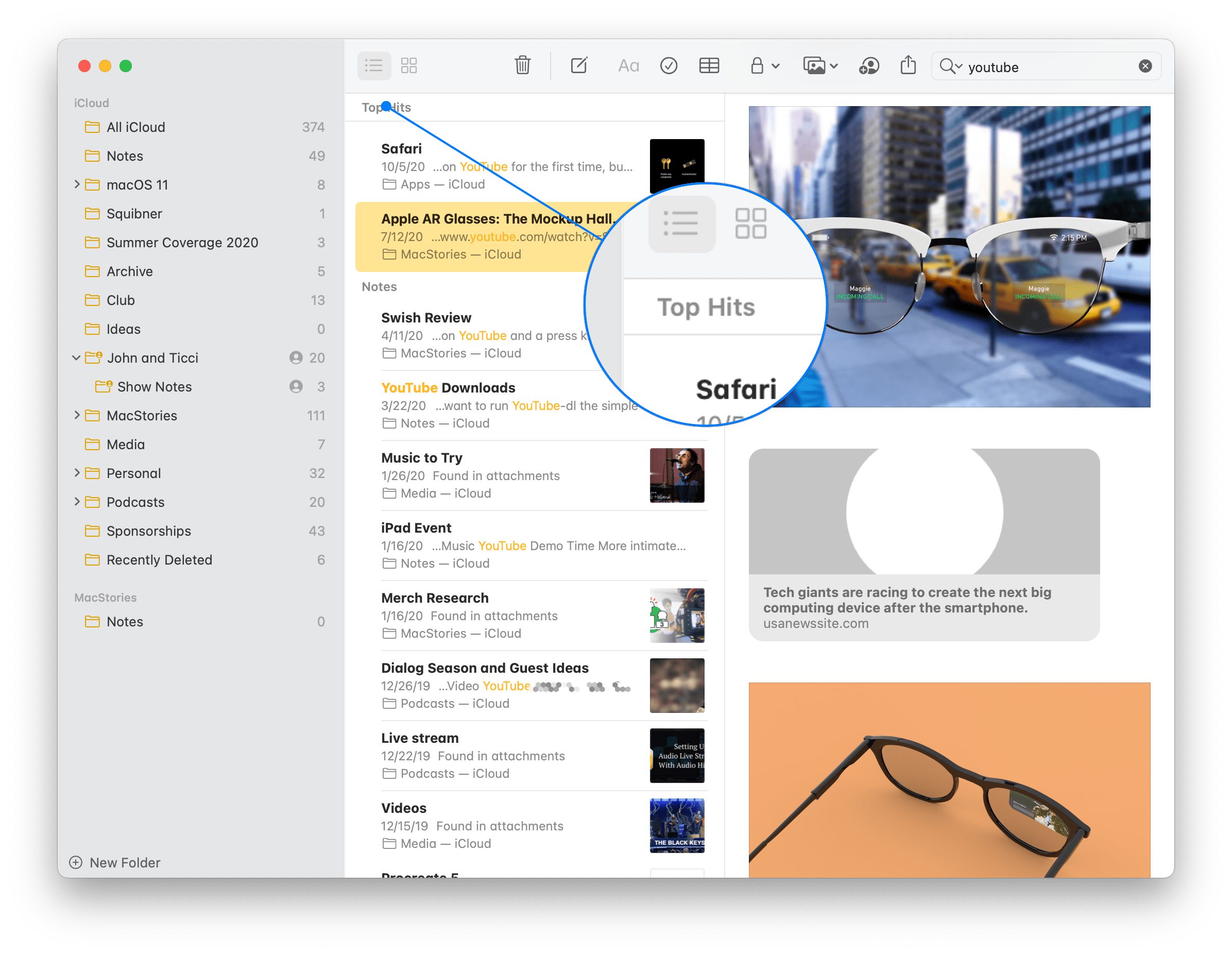
Notes is functionally simple and mature, so there aren’t major holes that needed filling. As a result, the changes this year are modest. Search has been enhanced with an on-device, machine-learning-driven ‘Top Hits’ section that sits atop search results. As best I can determine, the app seems to be using a combination of how often and recently the notes are accessed, edited, and the frequency of the search terms in the note to determine what a Top Hit is.
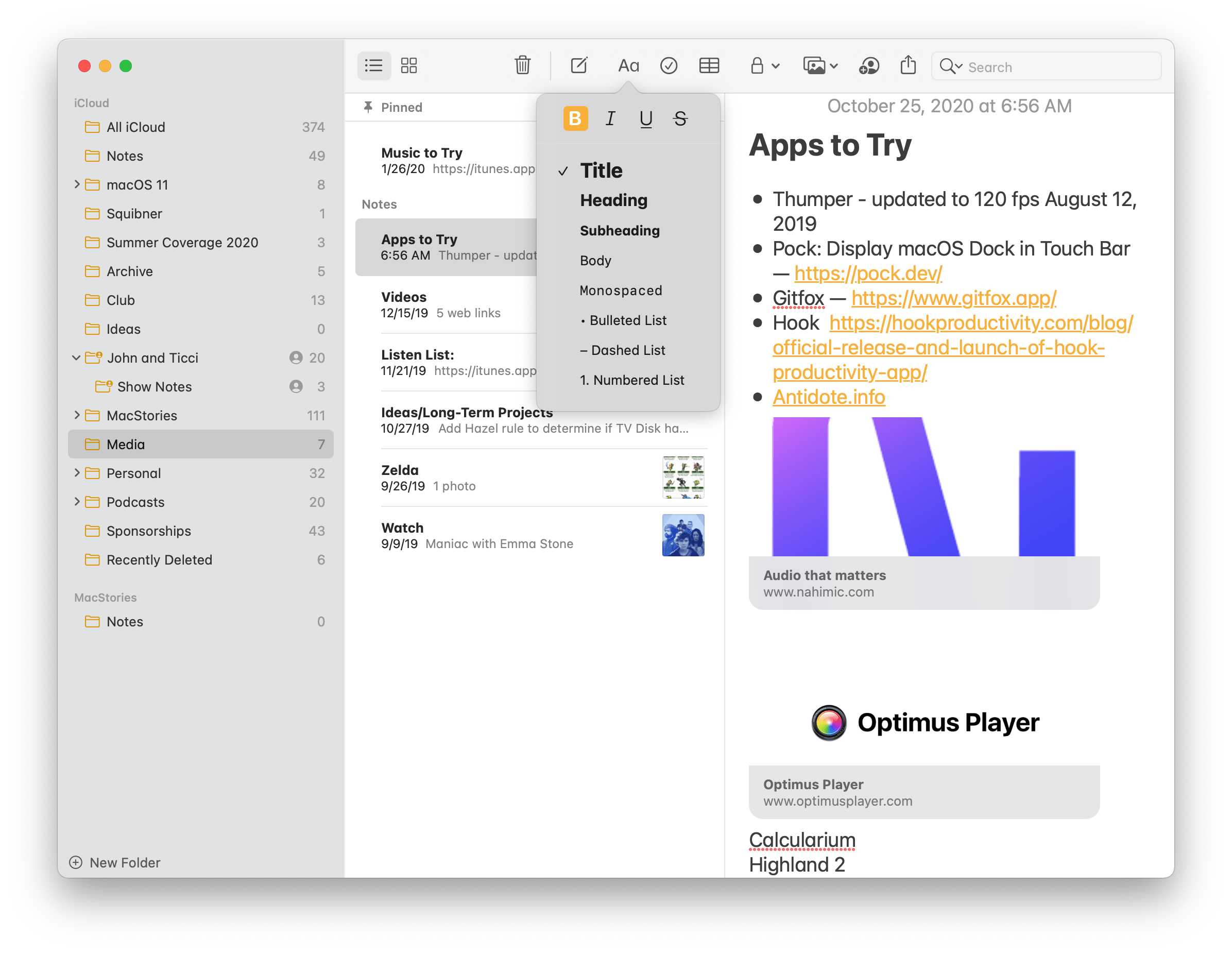
Notes has added buttons to apply bold, italics, underlining, and strikethrough to the ‘Aa’ button in the app’s toolbar.
Keyboard shortcut users will be happy to learn that shortcuts have been added for bulleted lists, dashed lists, and numbered lists. Apple also says that it has enhanced the scans taken with an iPhone or iPad using macOS’s Continuity Camera functionality with sharper scans and improved auto-cropping. Another nice touch is the addition of buttons to add bold, italic, underline, and strikethrough styling to the text of a note, which are accessed by clicking the ‘Aa’ button in Notes’ toolbar. The biggest disappointment with Notes is the inability to collapse lists of pinned notes, which was introduced on iOS and iPadOS this year, but isn’t available on the Mac.
Music
Last year, I was disappointed that Music didn’t become a Mac Catalyst app. The reason I had hoped for the transition was primarily based on the assumption that it would require Apple to jettison a lot of legacy code, which I believe is the source of a lot of bugs in the app. Although that didn’t happen with Catalina, Music has been behaving better for me under Big Sur. Troubles I had connecting to my office HomePod, freeze-ups, and other odd behavior I saw on Catalina have been greatly reduced. It’s still too early to say Big Sur’s iteration of Music is rock solid, but it’s off to a good start.
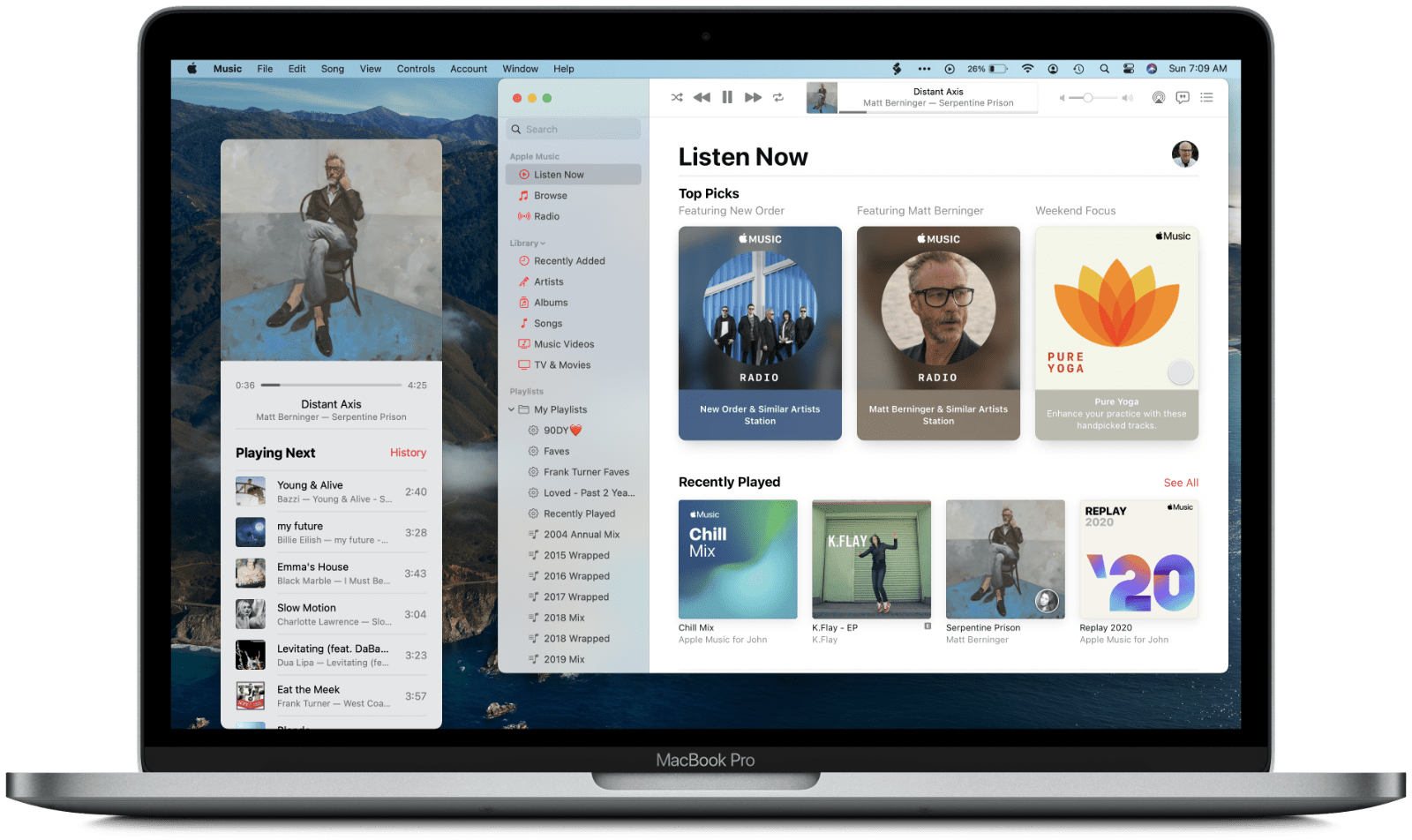
Music’s sidebar icons match the app’s icon, and instead of a Show/Hide button, the displayed sections of the sidebar are managed by Big Sur’s collapsible outline controls.
Like Apple’s other apps, Music has been redesigned to match Big Sur’s new look. Music already featured a sidebar that ran the length of the app’s window and a title bar-free toolbar. The arrangement of the toolbar has changed a little, but by far, the most noticeable change is the new app icon, which abandons Music’s multi-color branding for a uniform coral color. The same color is mirrored in the app’s UI, with the icons of the Apple Music and Library sections and other controls and iconography taking on the same color.
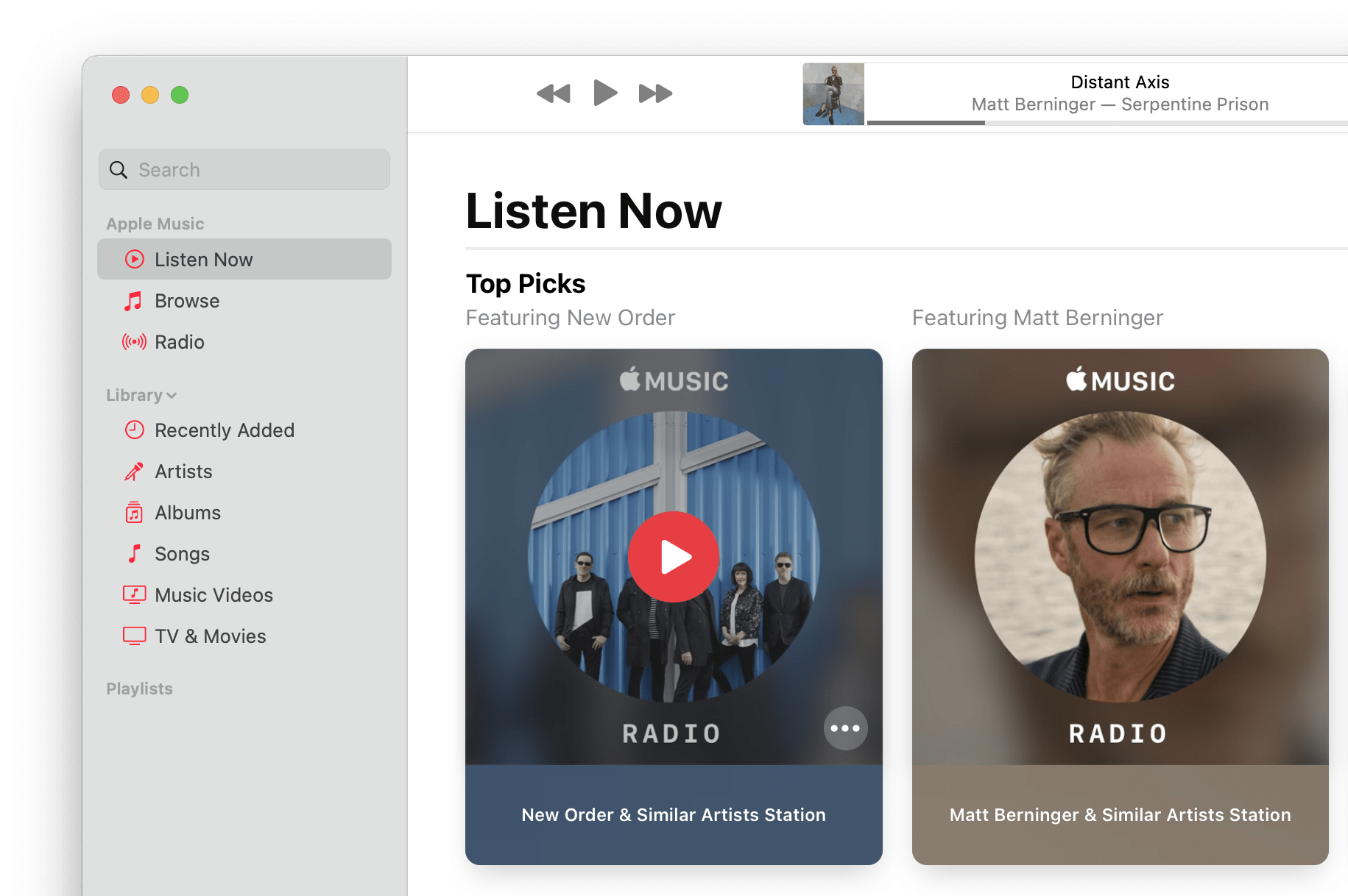
The Listen Now section has been reorganized and has added new elements that span the width of the content area, like this promotion for a YUNGBLUD interview.
The ‘For You’ section has been renamed ‘Listen Now’ and reorganized to feature a mix of vertically-oriented, card-like elements that suggest music. The top section of Listen Now is Top Picks, a mixture of Apple Music radio stations, playlists, and other content based on your prior listening habits. The remaining sections have been reorganized somewhat too, with ‘Friends Are Listening To’ being elevated to a higher position just before ‘Recently Played,’ for instance. The algorithmically-generated ‘Made For You’ playlists have a new look, too, with animated, abstract backgrounds. Apple has also added sections promoting parts of the Apple Music service that span the width of Music’s content area and surfacing your annual Replay playlists. The Browse section is identical to the Catalina version, but there have been some minor layout changes to Radio that echo the card-like UI elements of Listen Now.
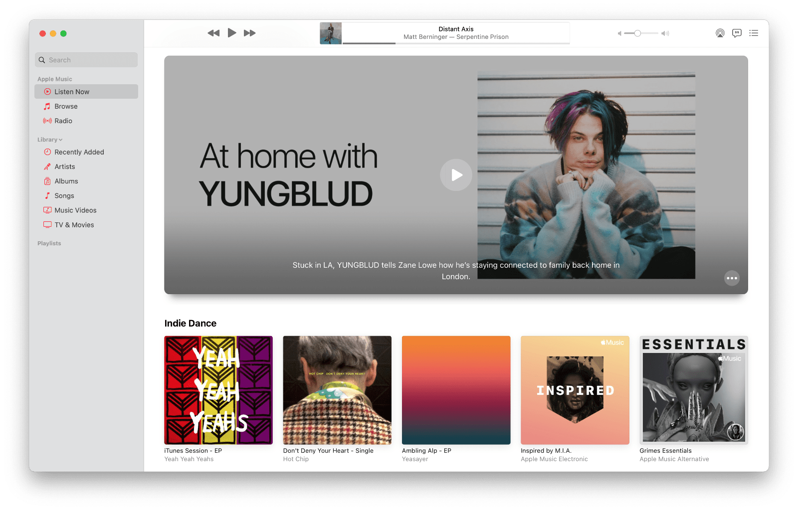
Music’s uninspired and bland search UI in Catalina (top) and Big Sur’s substantial improvement (bottom).
Like iOS and iPadOS, Search has been embellished with a collection of genre-based browse categories. These categories are similar to the categories of music that can be viewed from the bottom of the Browse section, but not identical. The browse categories listed in Search are more limited and appear to be listed by popularity instead of alphabetically. Search has also been enhanced with images that make it easier to pick out the artist or album you’re looking for. A new emphasis on album results is a welcome addition too.
Music on Big Sur is nearly identical to the iPad version. One disappointing omission, though, is the lack of the autoplay feature found in Music on iOS and iPadOS 14. If you’re listening to an album or playlist on an iPhone or iPad, turning on autoplay keeps the music going continuously, playing similar artists after the album or playlist is finished. It’s a small thing, but a feature I’ve enjoyed a lot on iOS and iPadOS. I can’t help but wonder if it’s the sort of feature that would have been more likely to get picked up if Music had transitioned to Mac Catalyst like Messages and Maps.
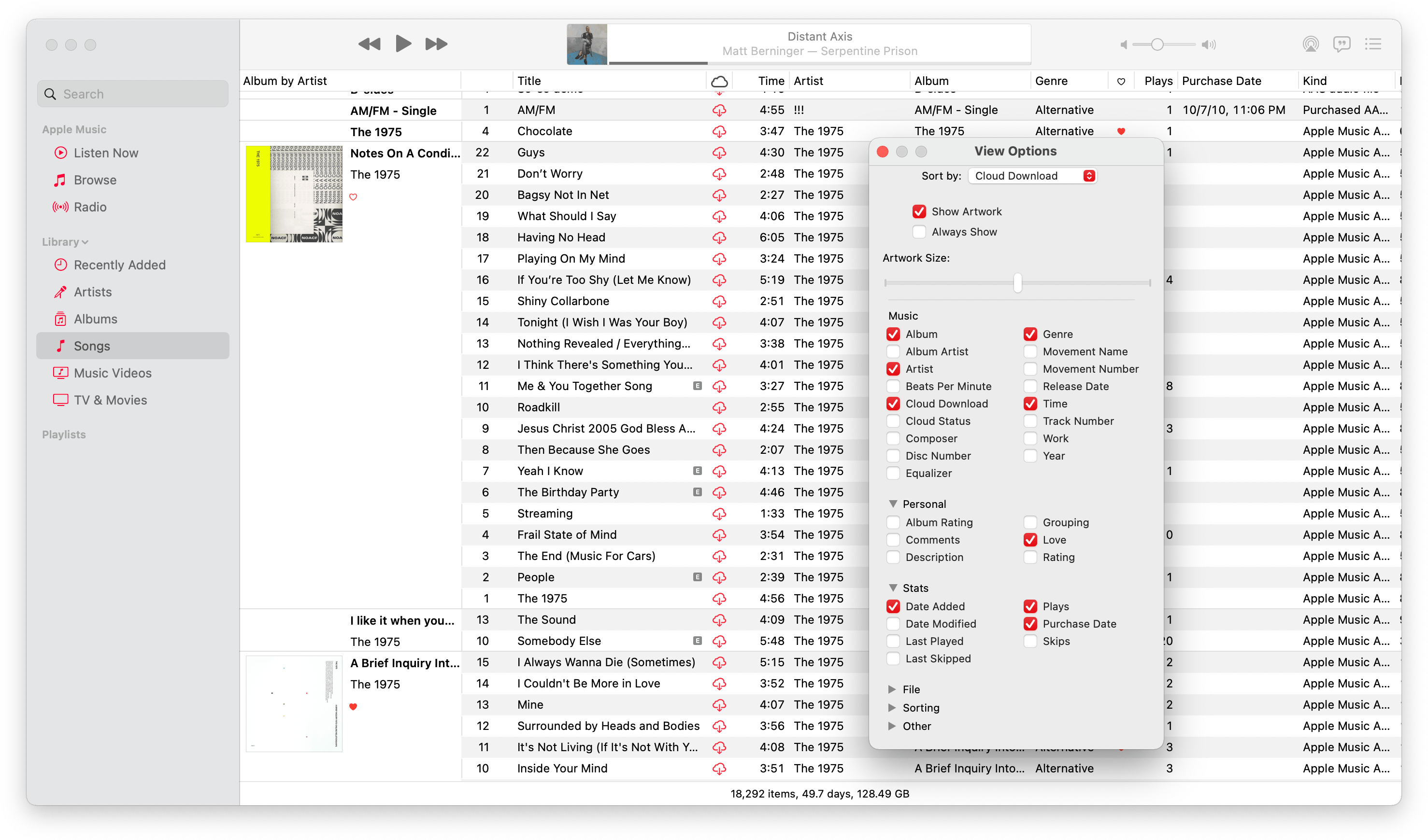
Apple has continued to add back features that some users missed from iTunes too. With Big Sur, that’s the ability to display album artwork in the Song list view of your library. The reintroduction of artwork in what is otherwise a spartan database-like view is a nice addition that adds a visual cue to identify albums.
The trouble with the Songs UI, though, is that it feels out of place with the rest of Music. Early betas of Catalina were a bigger departure from iTunes’ spreadsheet-like layout, but in a somewhat un-Apple-like way, the company has walked many of those decisions back, adding back the complexity of iTunes that was the result of having started life as an app for purchased and ripped music. The direction Music’s design has taken clearly favors music streaming, but for better or worse, that’s a future that appears likely to live side-by-side with locally-managed music files, which necessitates a more Finder-like UI for a long time to come.
