iPadOS
How do you follow up one of the biggest and most important software updates ever released for the iPad? Unsurprisingly, if you’re Apple, you don’t. Unlike its predecessor and its complete rethinking of multitasking and windowing, iPadOS 27 is a smaller release that only introduces a handful of iPad-specific changes and is instead focused on improving performance, tweaking Liquid Glass, and matching the other features introduced on iOS 27, such as Siri AI.
There is very little in the way of iPad-only functionalities this year, and I don’t think that’s going to shock anyone who’s spent any number of years working on the iPad. Historically, we have gone multiple years between iPad-focused updates – and that was before something as groundbreaking as iPadOS 26. I’m not saying that Apple isn’t capable of shipping major updates year after year; I’m simply arguing that, at this point, we know that the iPad’s typical cadence – including its 18-month refresh cycle for hardware – doesn’t lend itself to major platform updates every September.
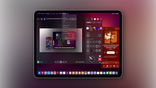
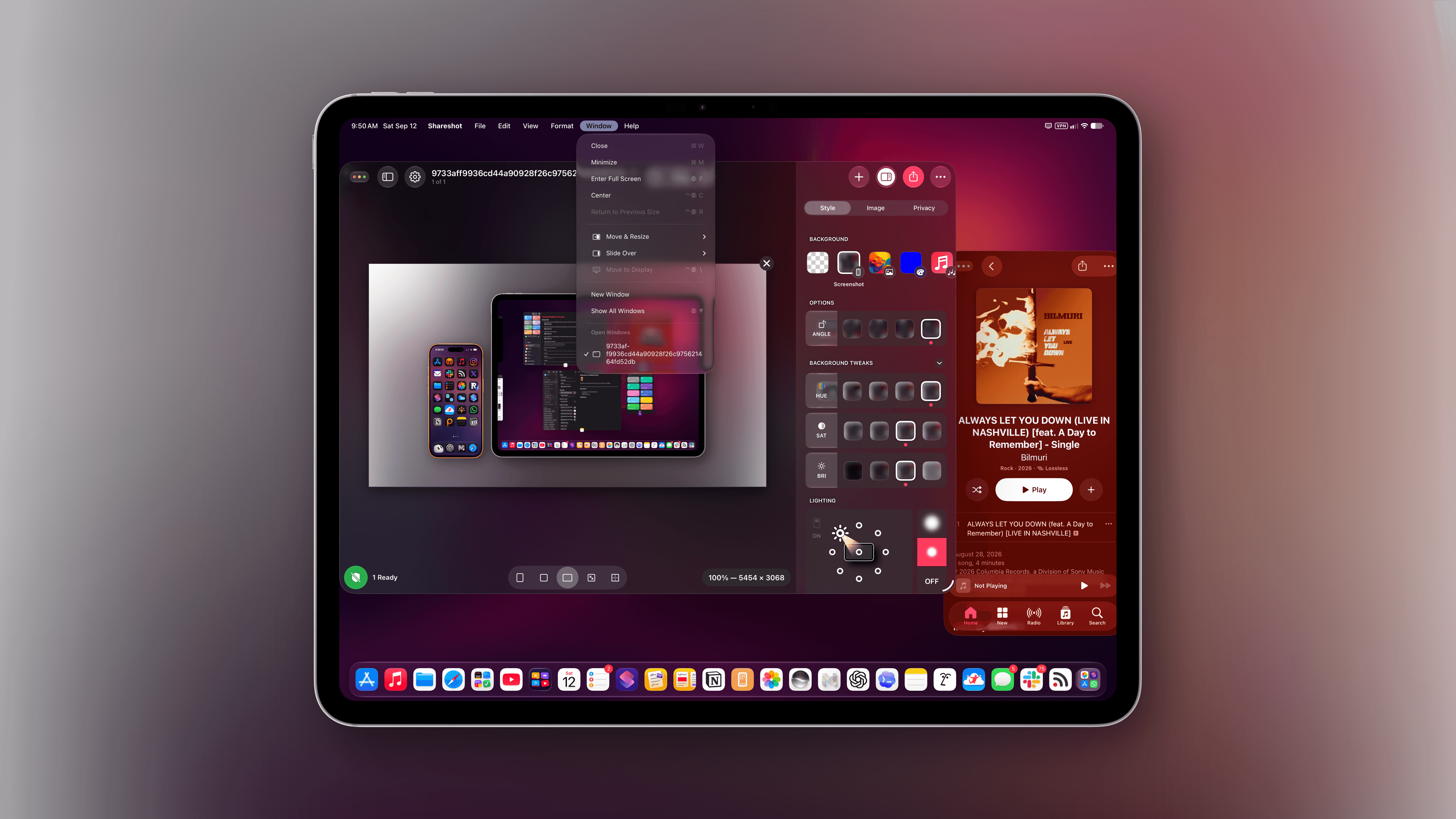
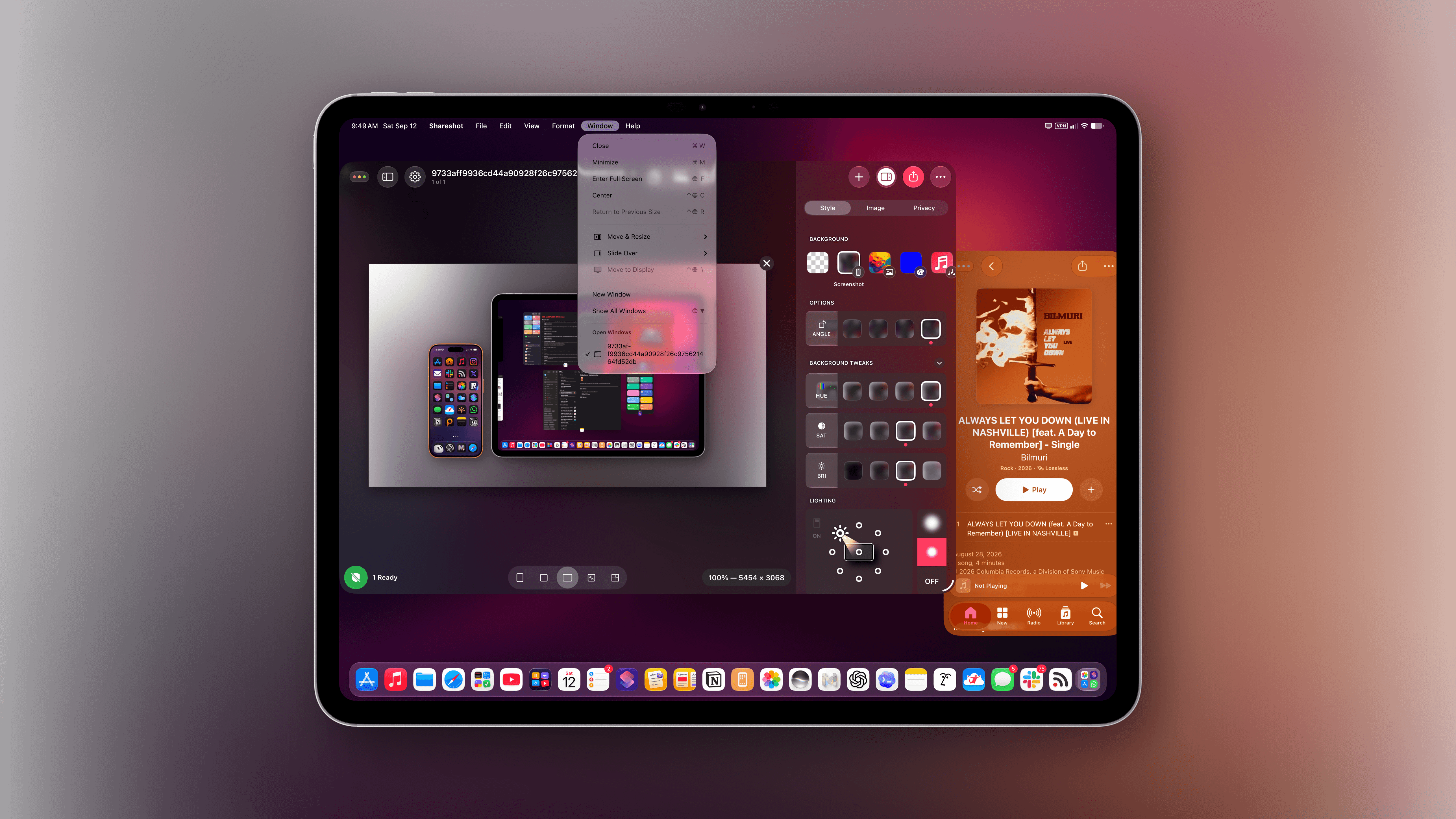
That’s not to say the journey toward making the iPad more like a laptop for professional users has stopped, despite the slower pace. The most relevant addition to iPadOS 27, in fact, is a reworked menu bar that behaves more like its counterpart on macOS now, in a couple of distinct ways. For starters, the name of the foreground app is now always shown in the top-left corner of the menu bar, right next to the date and time.
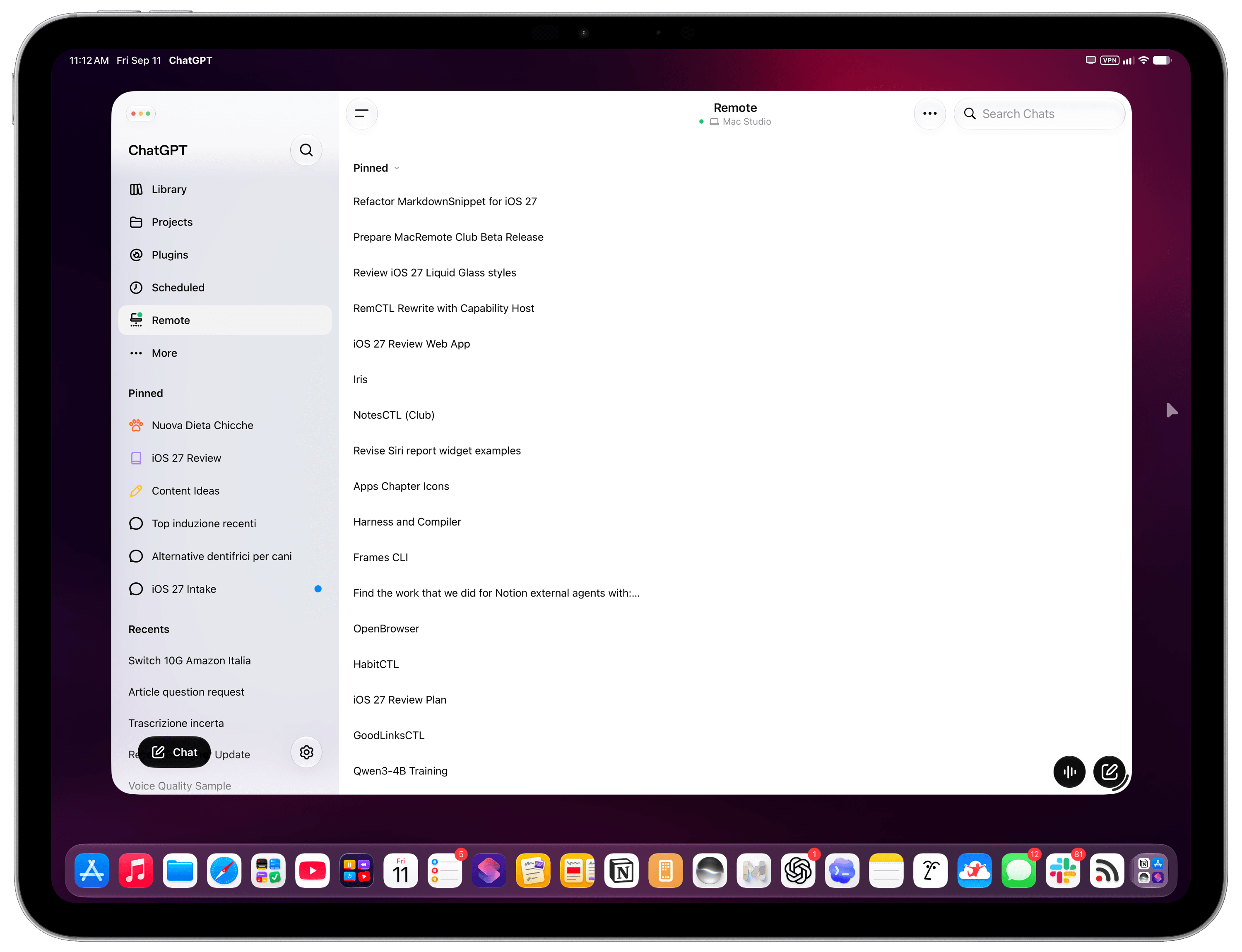
The name of the foreground app is now always shown in the menu bar. As you can see, the menu bar is also left-aligned now, just like on macOS.
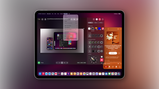
In addition to serving as a helpful visual aid for what is currently the active window in the foreground, the app’s name also acts as a pointer target to reveal the full menu bar on hover. Although this interaction was available before in iPadOS 26, I find hovering the pointer over the name of an app a more natural way of revealing the full menu bar than hovering over some empty space at the top and hoping it works.
Revealing the menu bar on hover.Replay
But that’s not all: you can now make the entire menu bar always visible by default, just like on a Mac. To turn on this option, head over to Settings → Multitasking & Gestures → Automatically Show and Hide Menu Bar and disable the toggle. Now, the menu bar will always be displayed in its expanded state with the classic ‘File, Edit, etc.’ menu items.
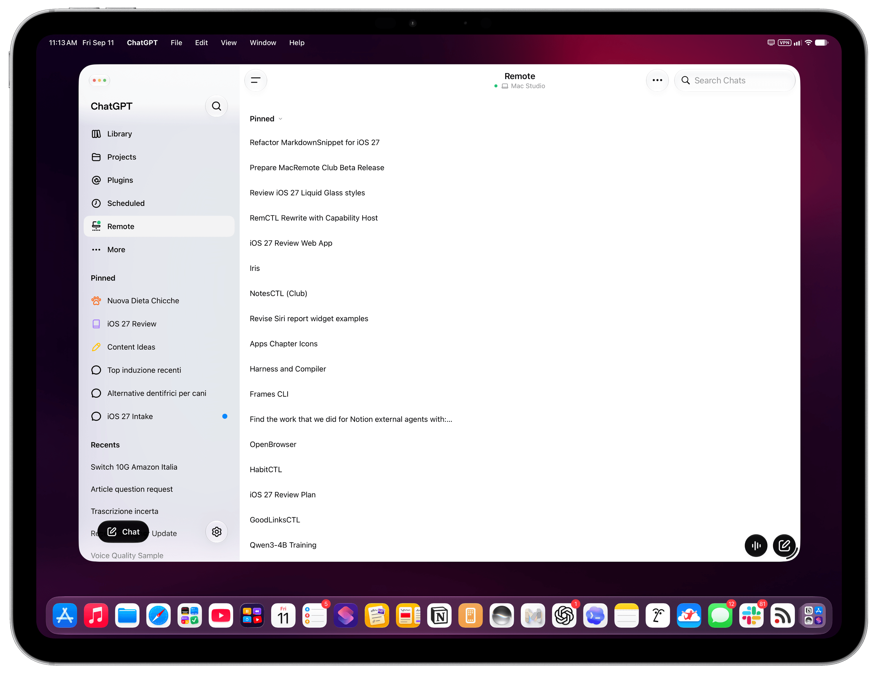
And speaking of those menu items, icons next to menu labels are now used more sparingly than before. This has been a contentious topic in some parts of the Apple community for the past year, and I don’t have a particular opinion about this since the icons never bothered me that much. That said, I will agree that the menus now look cleaner and less visually busy. But I’ll let John analyze this change in more depth in his Golden Gate review, since much of this debate originated with longtime Mac users. Overall, I’m a fan of the always-visible, left-aligned menu bar because a) it’s more consistent with macOS and b) it makes it easier to discover commands nested inside menus.
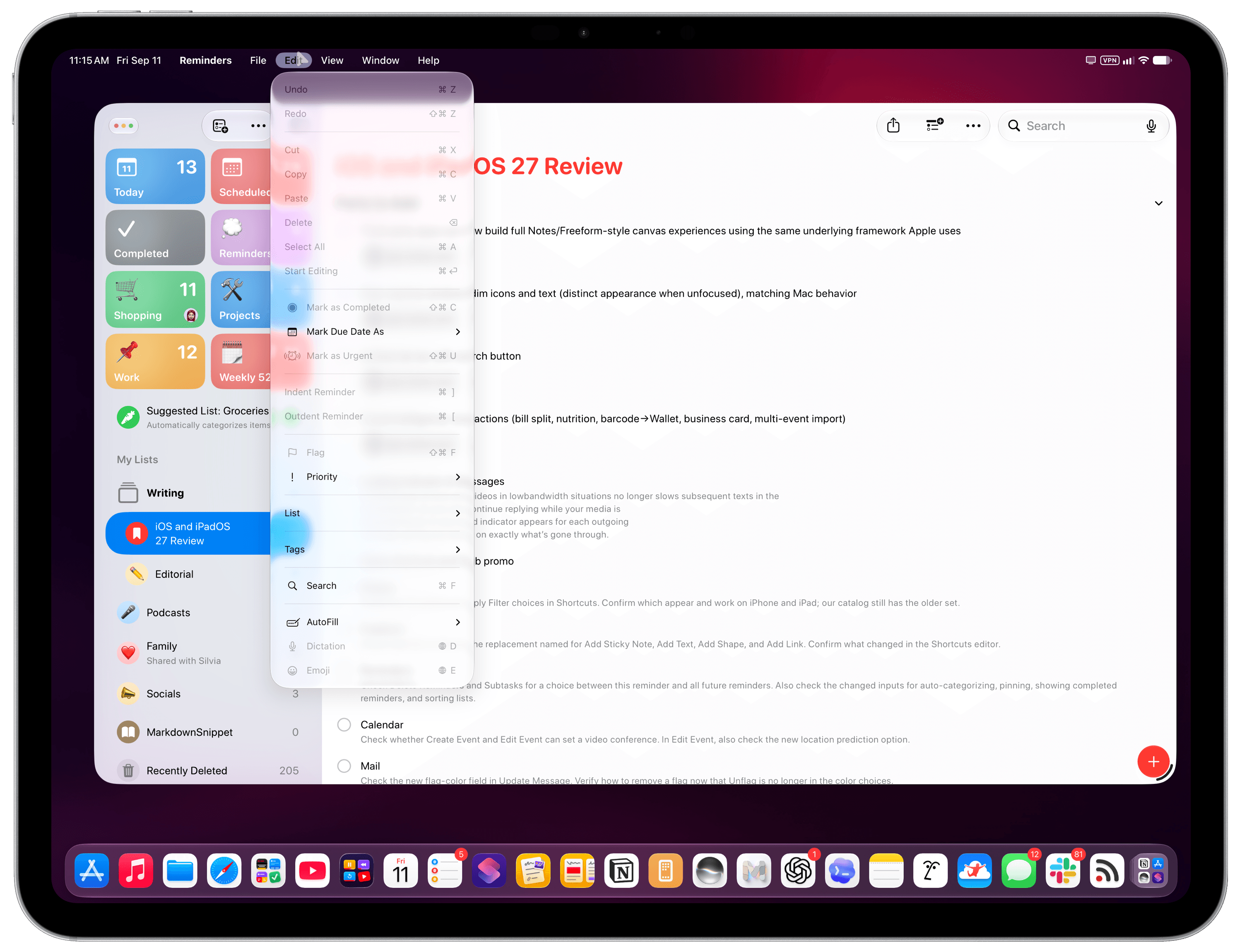
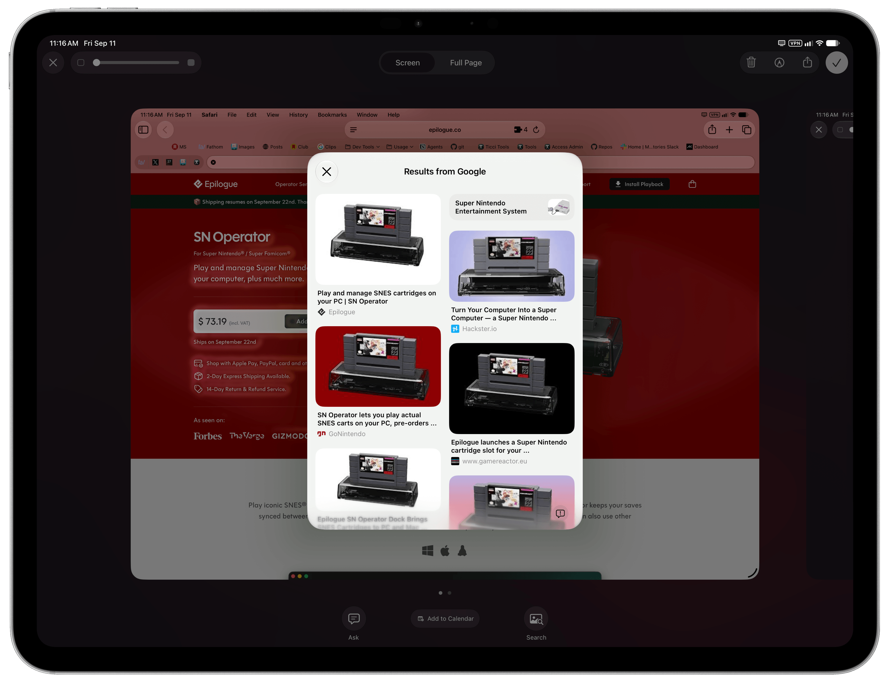
There isn’t much else to discuss about iPadOS 27 beyond the menu bar and changes that I’ve already covered in the Design and Siri AI chapters. In terms of iPad-exclusive features, Visual Intelligence has now expanded to the iPad, and it lets you circle elements in screenshots with the Apple Pencil to look them up using Siri AI. It’s very nicely done, but I don’t really use it.
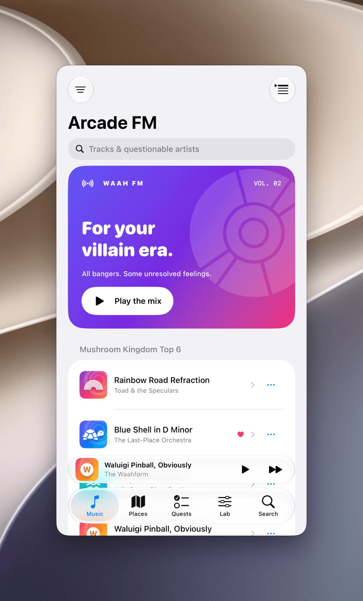
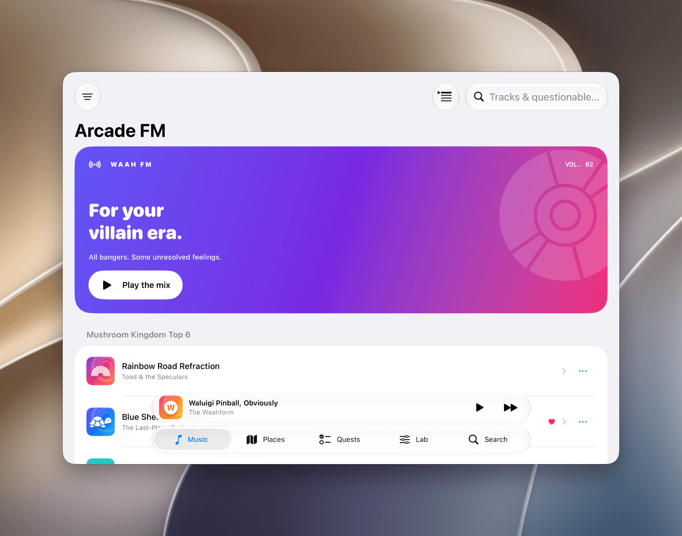
As everyone guessed months before the introduction of the iPhone Duo, the ability to resize iPhone apps running on the iPad was, in fact, a prelude to iOS apps expanding horizontally on a new form factor. Again, this one isn’t for me, since the apps I use have native iPad versions (essentially every iOS 27 app beta I tested was a Universal app with built-in iPad support). However, if you use an iPhone-only app on your iPad and that app updates for iOS 27, you’ll be able to resize it either on an iPad or in iPhone Mirroring mode on a Mac. Since I believe it’s more useful to do this on a Mac, I’ll let John cover this in his macOS Golden Gate review, too.
And to wrap up the list of iPad enhancements that are coming from macOS and will make more sense in the context of John’s review: the sidebars on iPad are no longer “floating” glass panels; they’re edge-to-edge again.
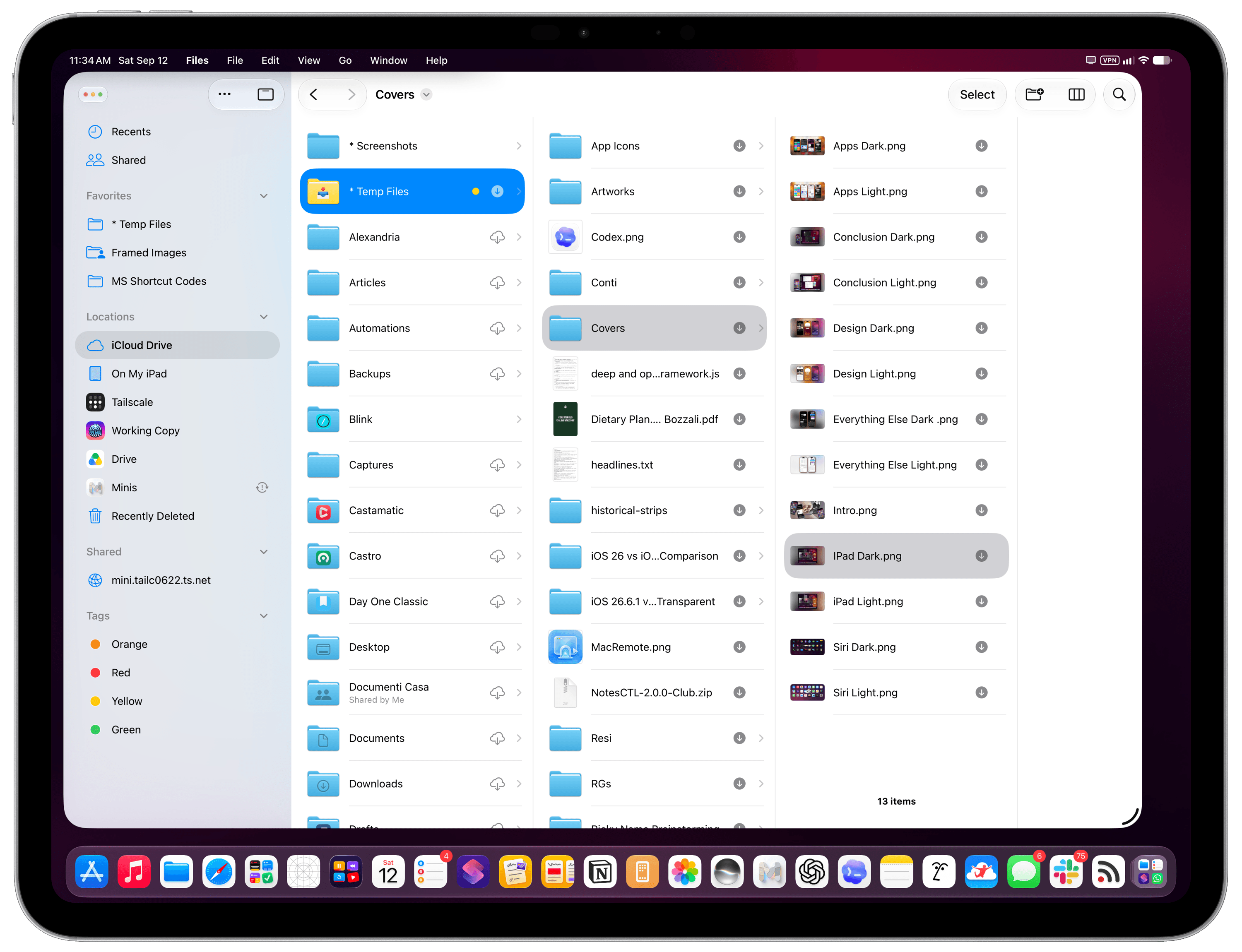
This was another heavily debated topic in the Mac community for the past year, and it’s actually a reversal I agree with. Sidebars are supposed to look edge-to-edge like this, and I never fully understood why Apple went with that look in iPadOS and macOS 26. I can’t wait to read where John lands on this one as a Mac user who actually didn’t hate macOS Tahoe as much as others.
And that’s a wrap on iPad-only changes for this year. I continue to believe that iPadOS would benefit from a stronger Spotlight with the same integrations seen on macOS last year, a clipboard manager, proper support for clamshell mode (especially now that Control Center can be invoked on external displays, also new this year!), and – a bigger conversation – a more vibrant app ecosystem in the age of AI.
Clearly, though, this was not the year for another iPadOS milestone at Apple. And given the excellent work the company has put into system performance, Liquid Glass improvements, and the launch of Siri AI after several delays, I can’t really blame them for it.