Extra Large Widgets on iPhone
It is quite funny that one of my favorite “small” additions to iOS 27 for iPhone users is called “extra large” widgets. As the name implies, this new size class lets you add widgets that take up an entire Home Screen page, allowing apps to use an expansive canvas for custom content and interactions that would otherwise have felt cramped on smaller widgets.
In Apple’s apps, you can now find extra large Home Screen widgets for:
- Calendar
- Home
- Music
- Notes
- Photos
- Reminders
- Shortcuts
- Stocks
- Weather
I know what you’re thinking: these widgets were designed for the inner display of the iPhone Duo, and you wouldn’t be wrong. As early marketing materials and hands-on impressions have shown, it should be very nice to keep a stack of XL widgets on one side of the inner Home Screen and regular icons on the other.
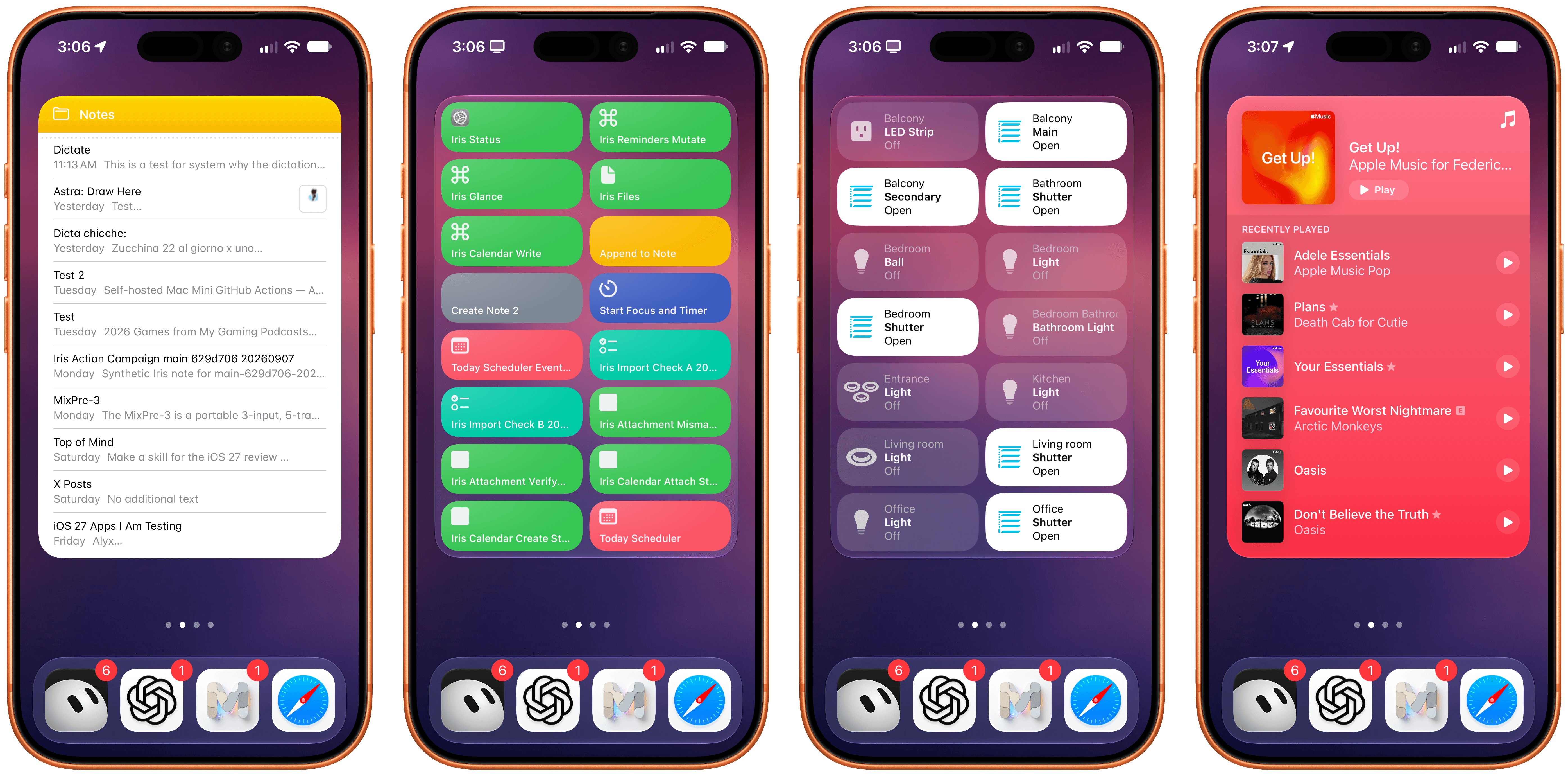
In my testing with the iPhone 17 Pro this summer, I’ve enjoyed this new widget family as a way to preview content that apps usually present as long lists. When I have a busy day with many events and tasks, it’s great to flick through the Calendar and Reminders widgets and get a complete overview of what’s coming up without opening those apps.
The new extra large widgets are also great as Home Screen-native control dashboards. Since the new size allows for multiple interaction areas in the widget panel, you can effectively have dozens of launchers or actions baked into the same widget. The Shortcuts XL widget, for instance, lets you run up to 16 shortcuts without launching the app; the Home widget lets you control up to 14 accessories or scenes from the Home Screen.
It’s no surprise, then, to see third-party developers jump at this opportunity to showcase even more content and actions from their apps on the Home Screen. The excellent dictionary app LookUp now comes with an extra large ‘Word of the Day’ widget that not only displays beautiful artwork for any given curated word but also embeds buttons to mark a definition as favorite, shuffle through words, and even listen to a word’s pronunciation from the Home Screen. The folks at Mercury Weather have shipped a stunning XL widget that’s not only tinted based on current weather conditions but also shows hourly and weekly forecasts in the same widget thanks to the increased content area. And, of course, apps like Launcher and Lock Launcher are taking advantage of the larger surface to embed even more app shortcuts on the Home Screen, effectively serving as quasi-replacements for the default Home Screen app launching experience.
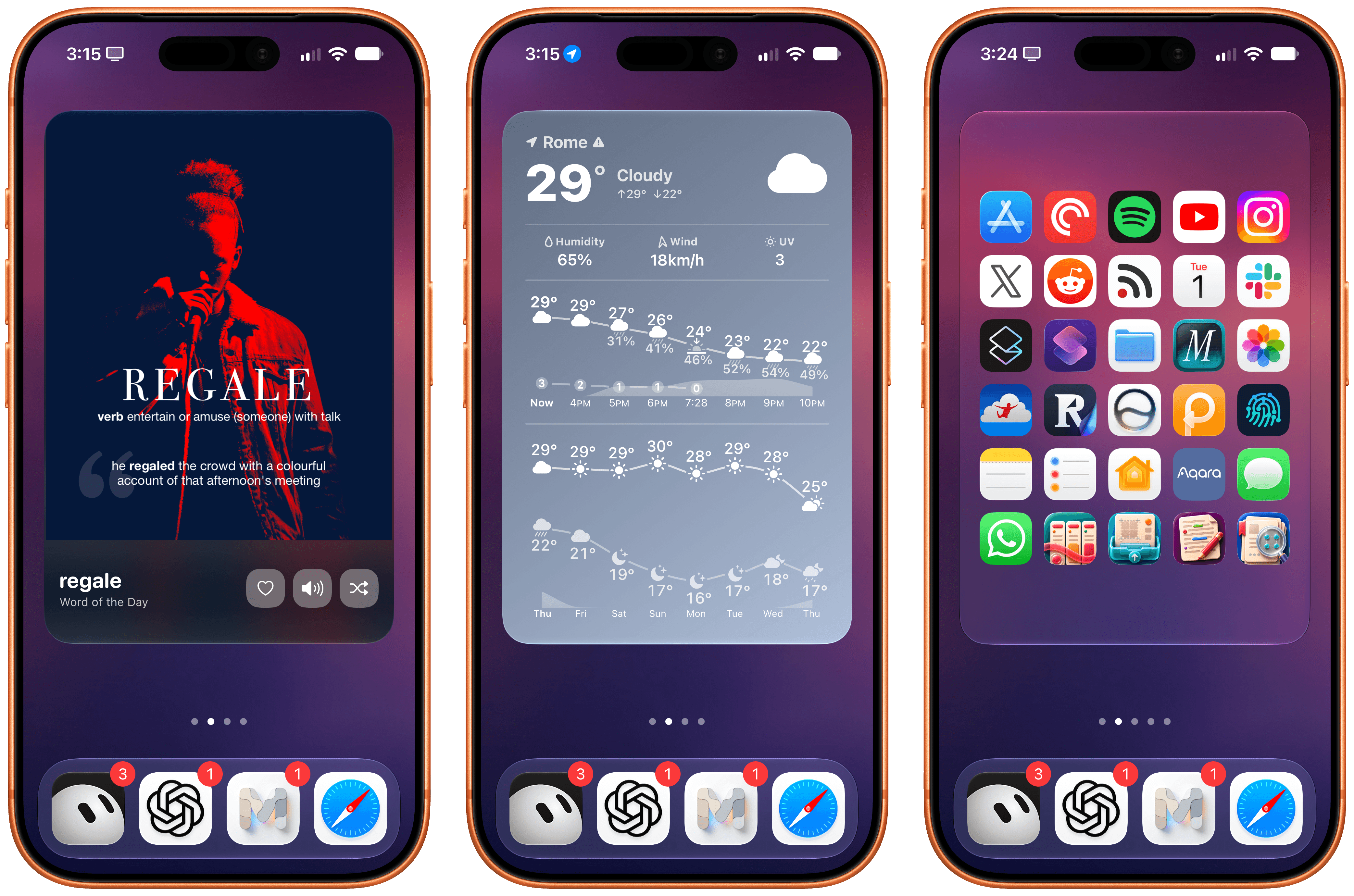
Extra large widgets are yet another step toward letting users have complete “mini app” experiences directly from the Home Screen – a trend that started years ago with the introduction of Home Screen widgets in iOS 14. I’m a fan of this new size, and I look forward to testing it on the iPhone Duo.
Lock Screen Changes
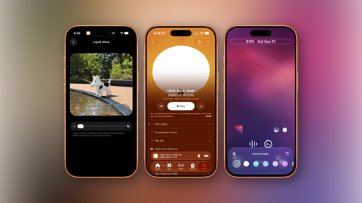
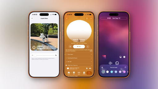
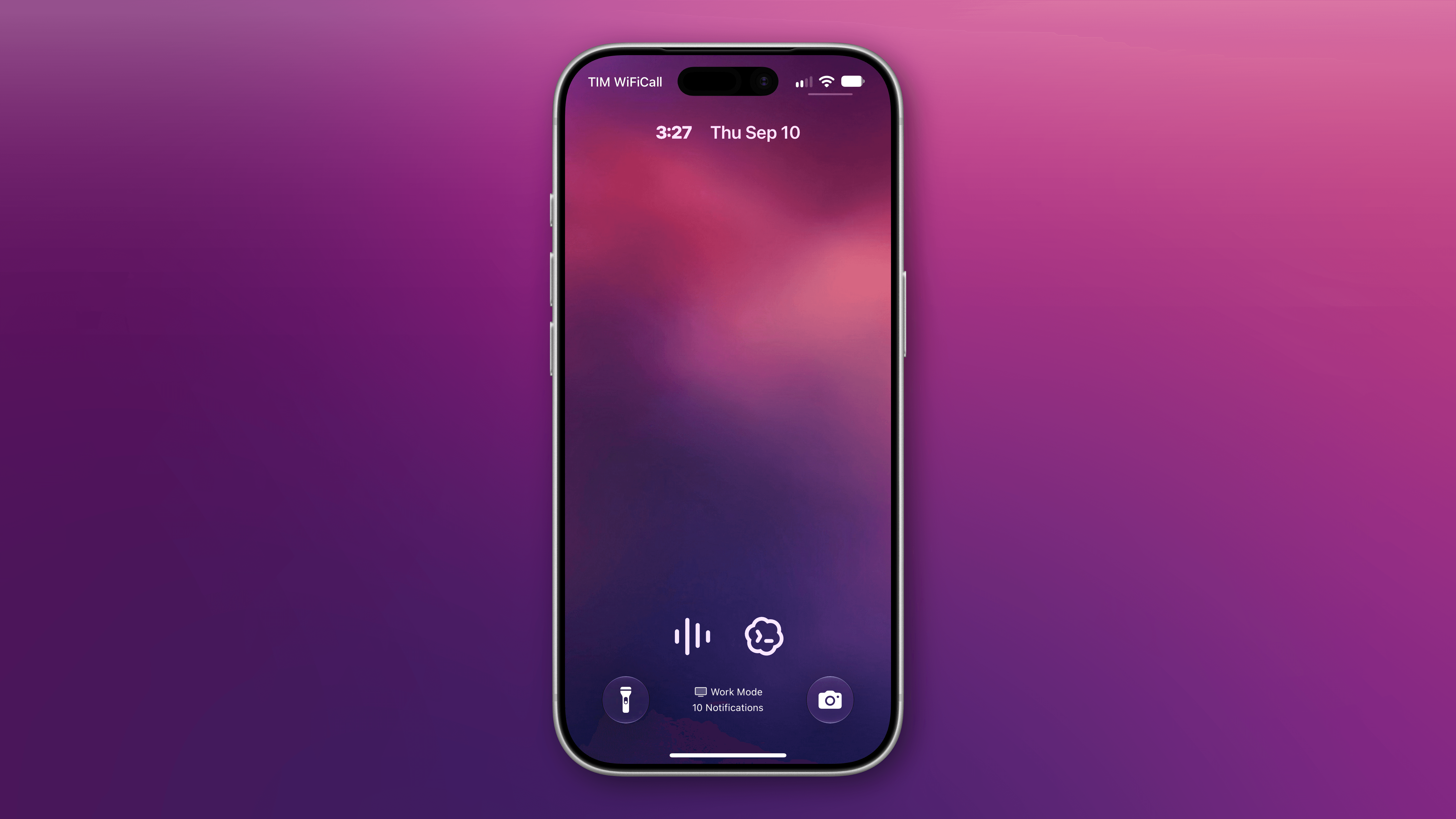
There are two changes worth noting to the Lock Screen this year. The first one is the complete opposite of extra large widgets: a minimized clock option that puts the current time next to the date at the top of the Lock Screen, right underneath the Dynamic Island.
To enable this mode, you can customize the Lock Screen, tap the clock to enter the ‘Font & Color’ panel, then tap the new symbol in the top-right corner of the panel to toggle between large and small clocks:
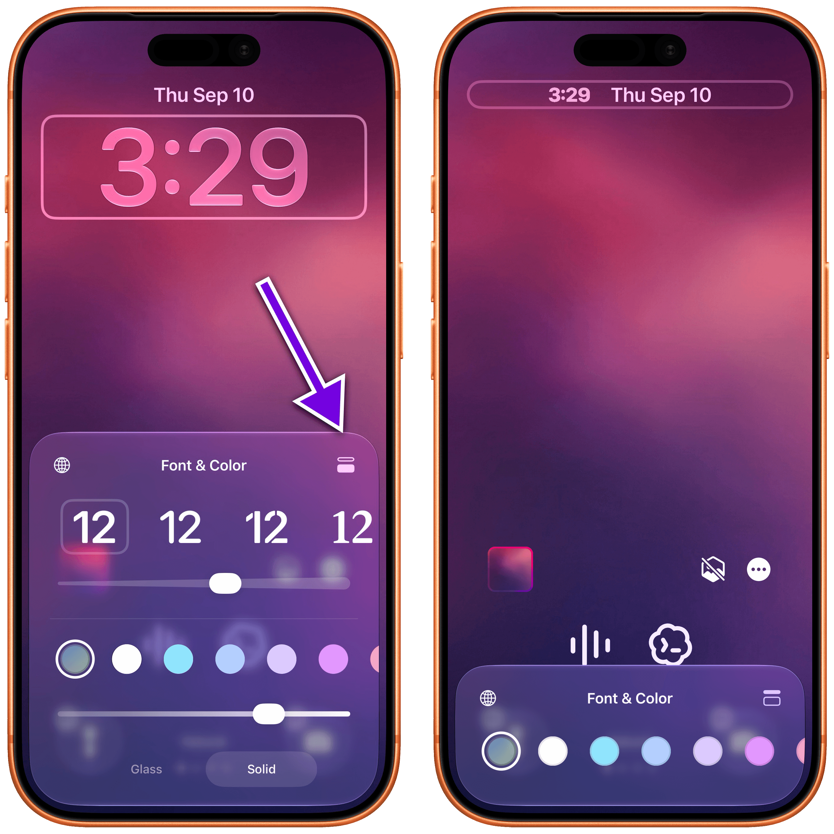
While I appreciate the addition of this option for minimalistic Lock Screen setups, it defeats the purpose of an always-on display for me. From my perspective, the point of having a modern iPhone with an always-on Lock Screen is to glance at the display from a distance and tell the time quickly if I’m not wearing my Apple Watch; the minimized clock prevents me from doing that. But I also know that this design makes more sense on the iPhone Duo and its smaller screen.
The other change is that you can now swipe away the system’s Now Playing control on the Lock Screen when something is playing. In iOS 27, swiping on the control will reveal a ‘Clear’ button that lets you remove the Live Activity from the Lock Screen:
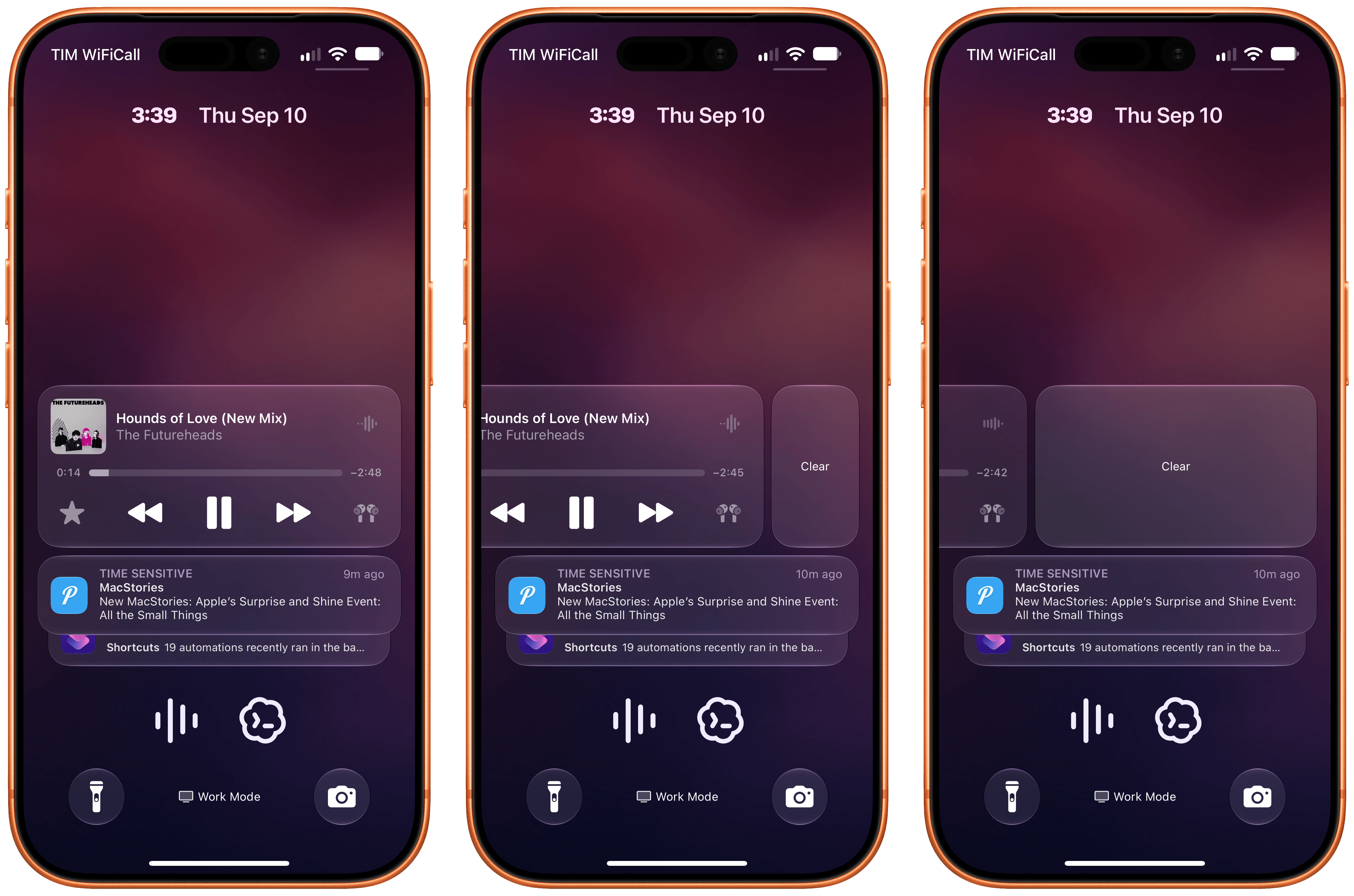
Notably, clearing away the Now Playing control also removes the activity from the Dynamic Island, but it does not interrupt or pause audio playback. It’s just a nice way to clear out the Lock Screen.
Icon Updates
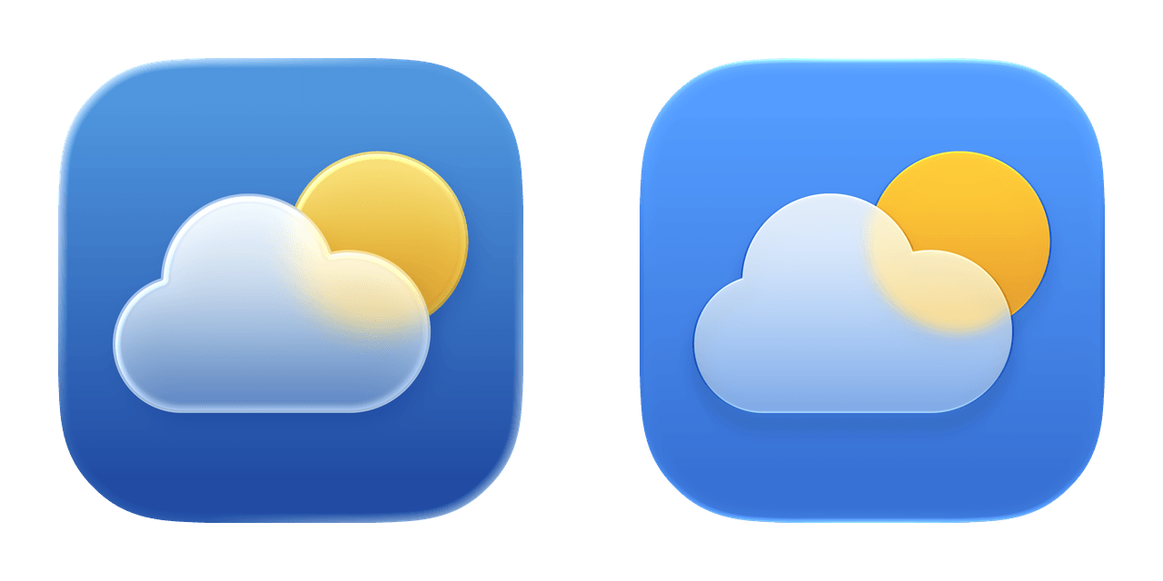
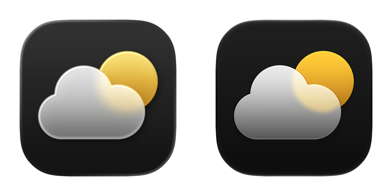
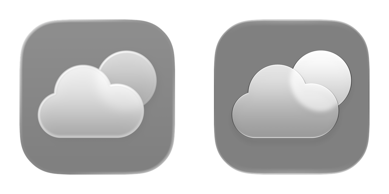
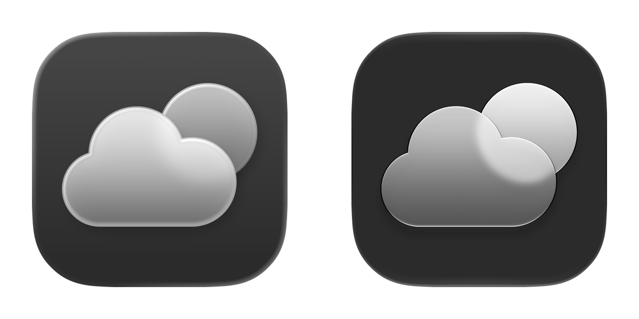
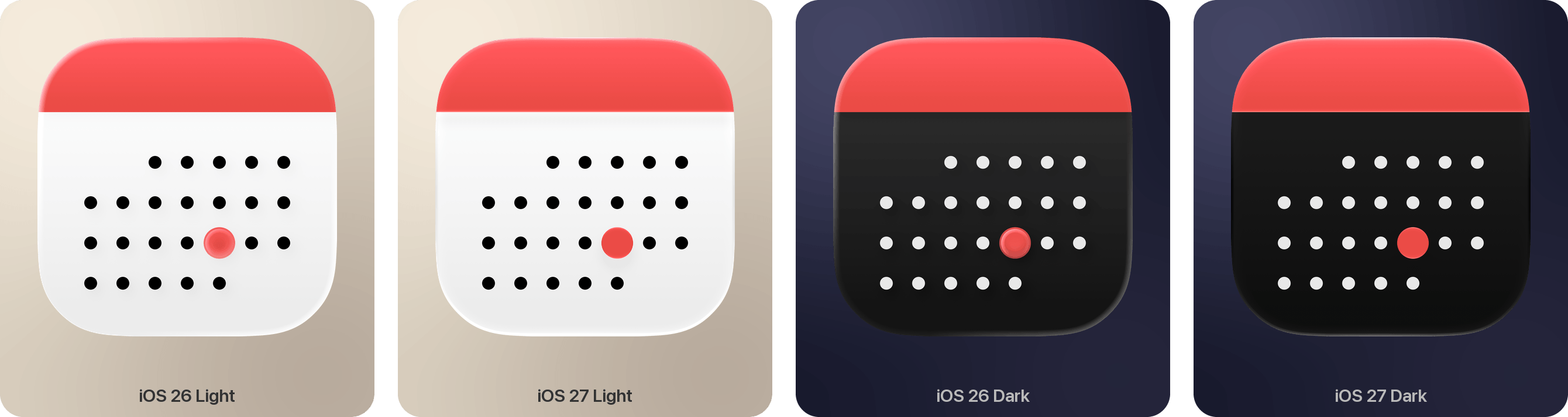
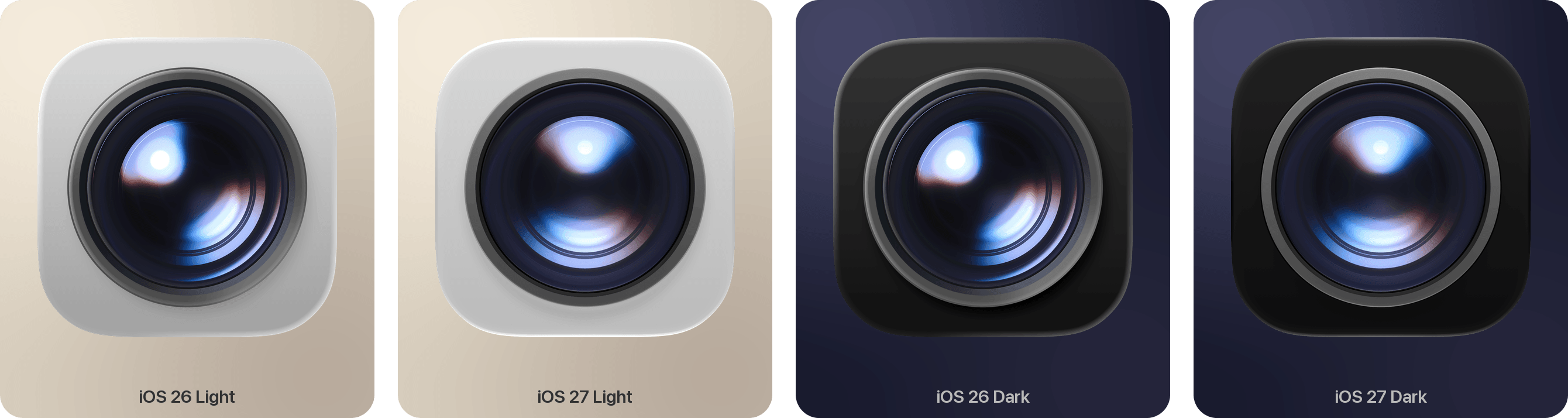
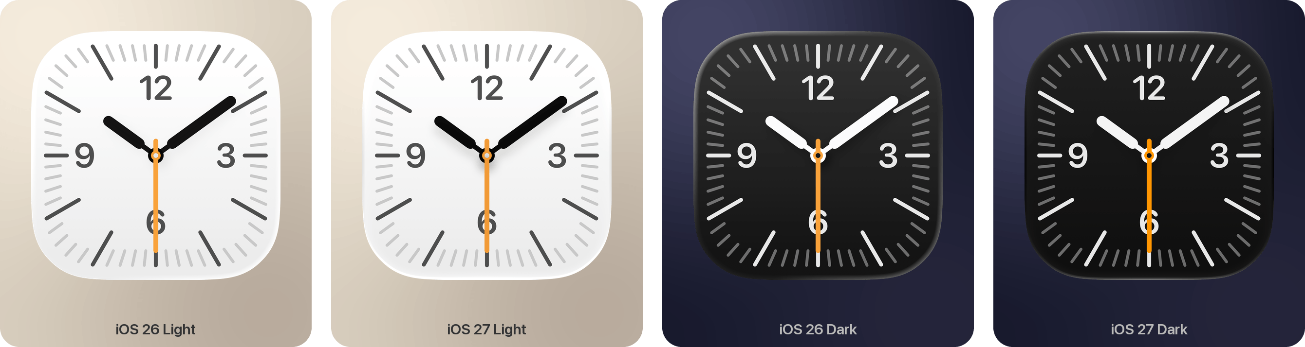
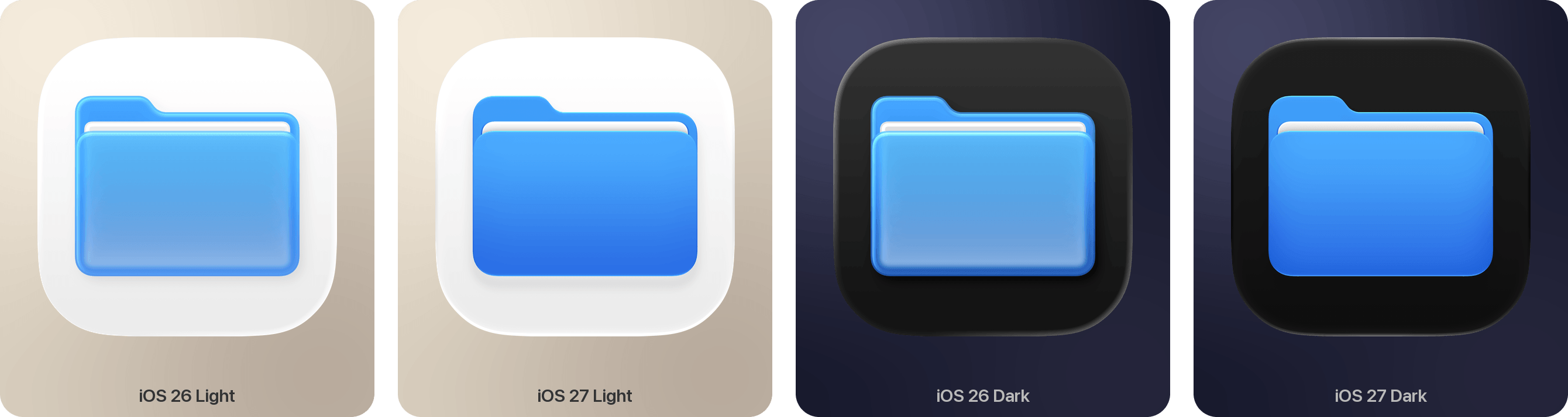
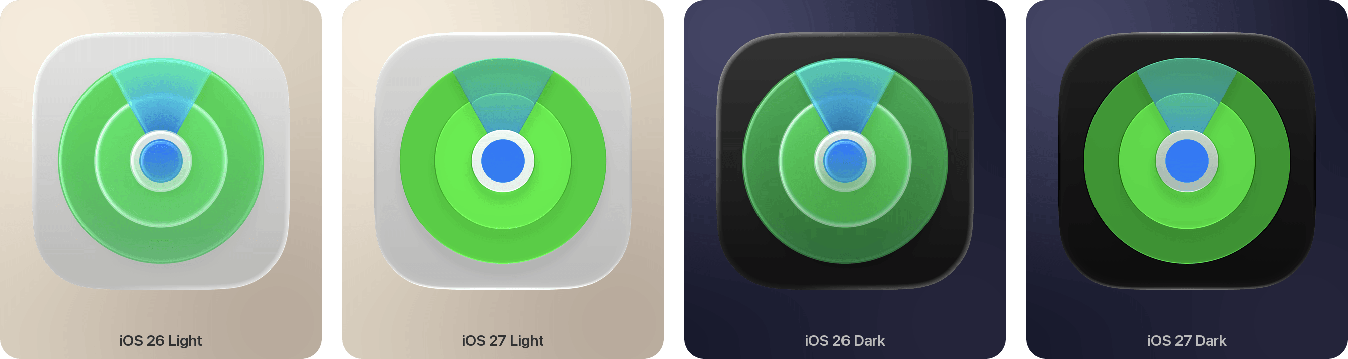
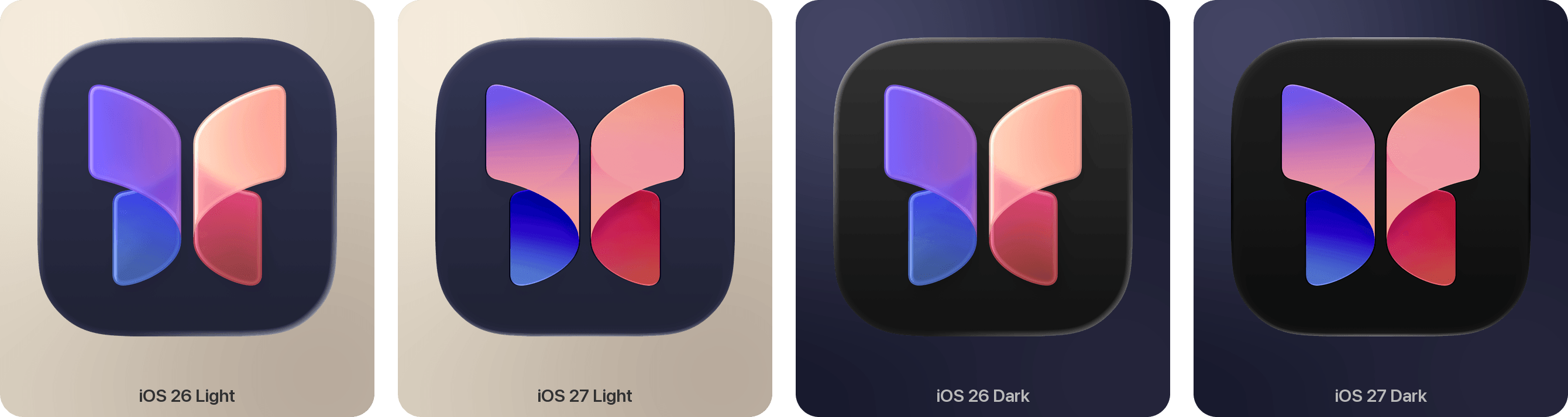
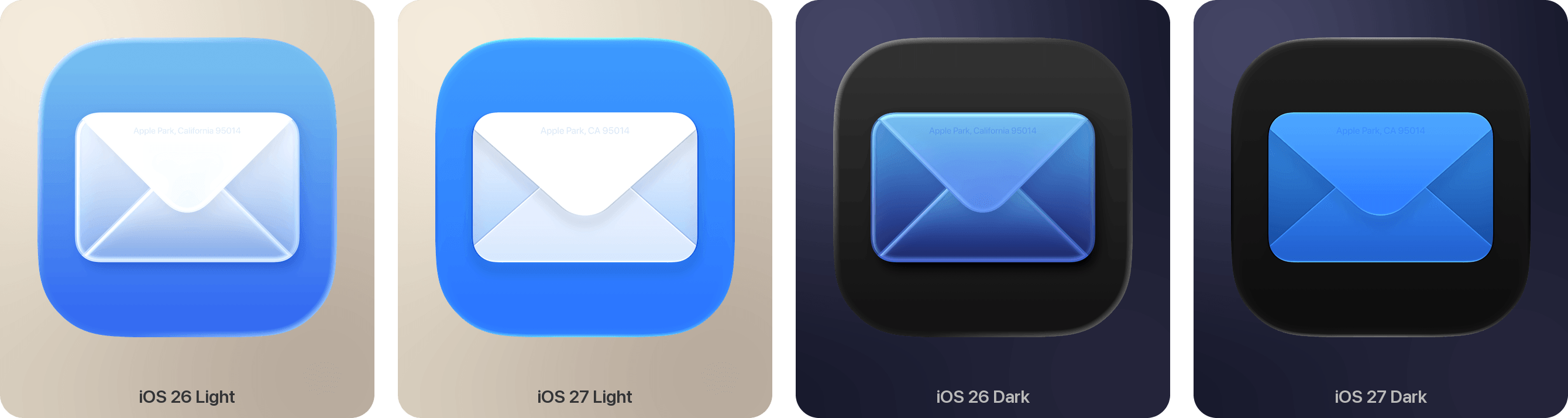
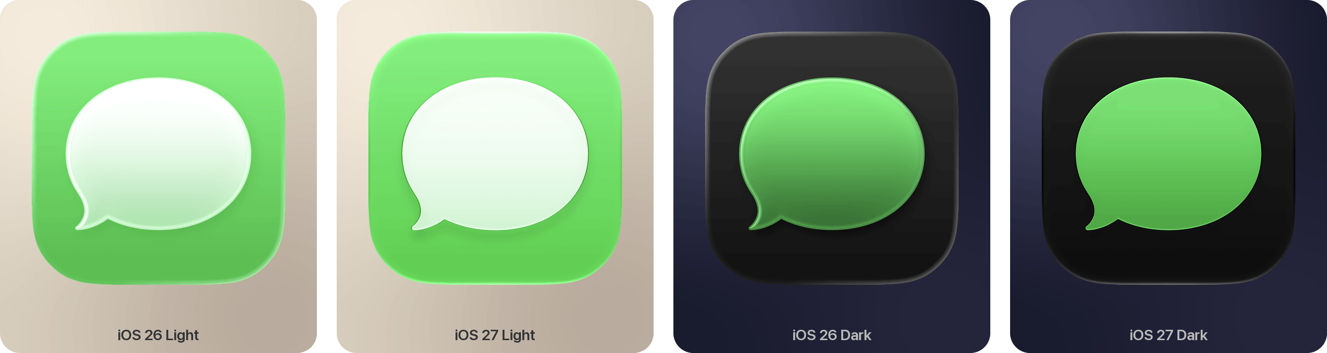
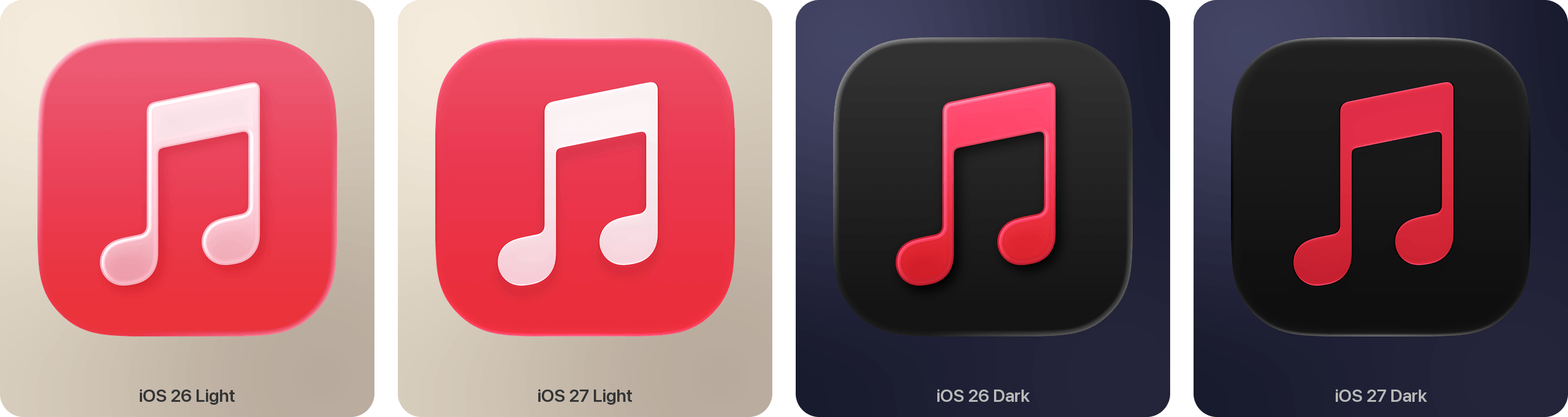
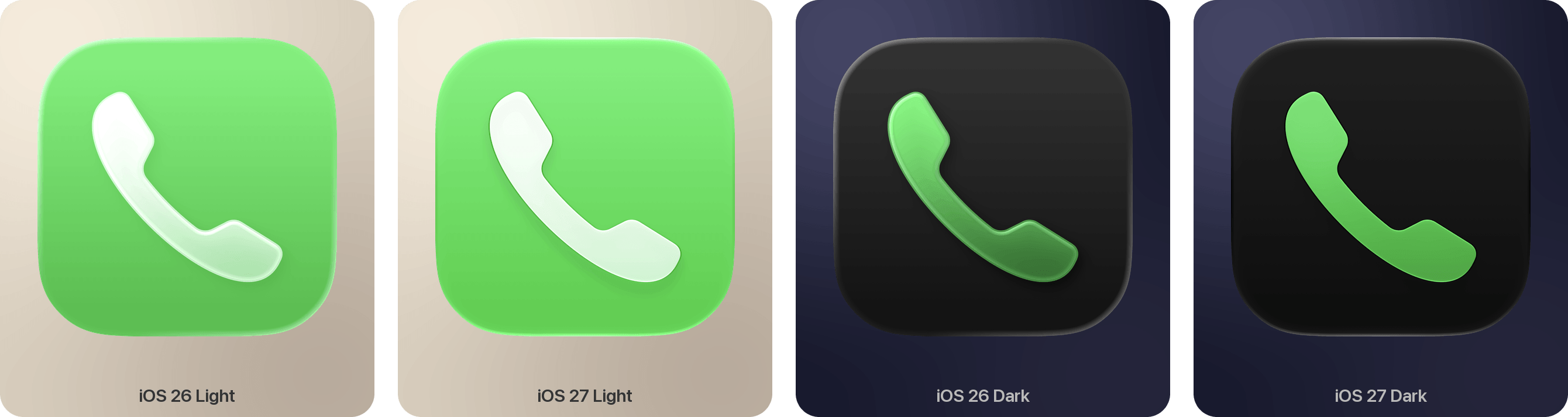
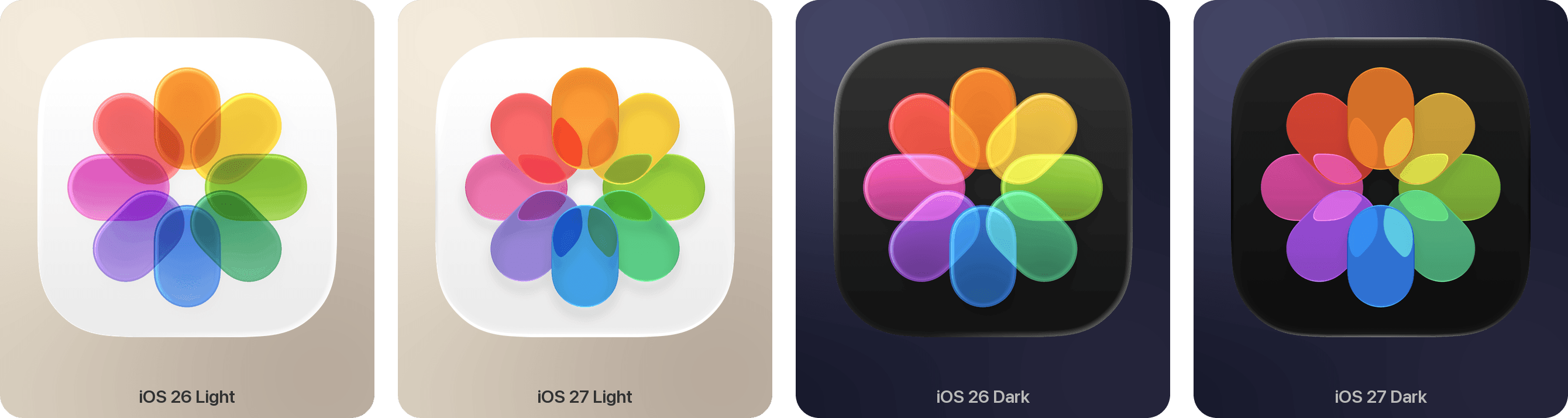
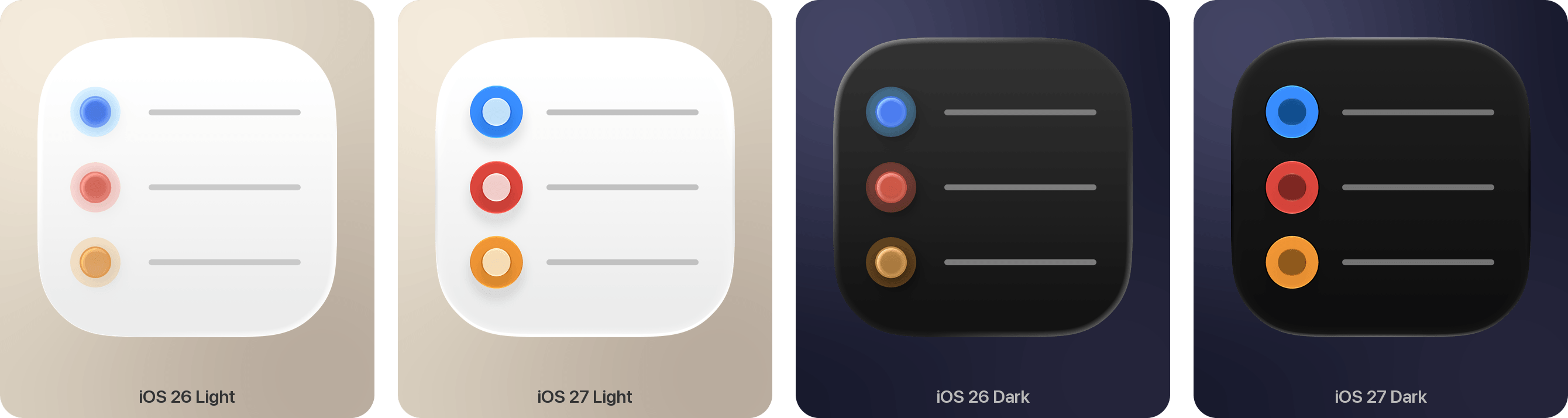
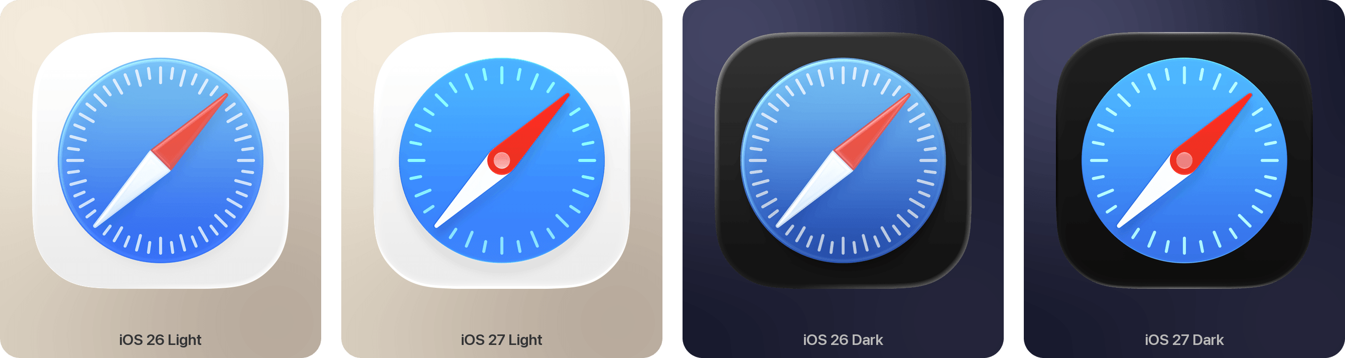
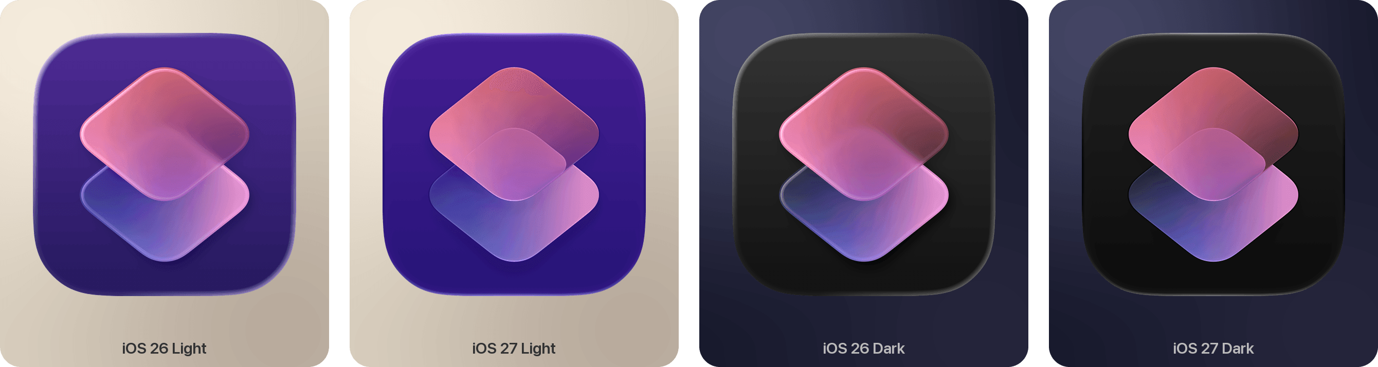
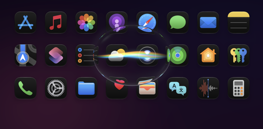
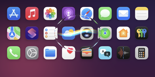
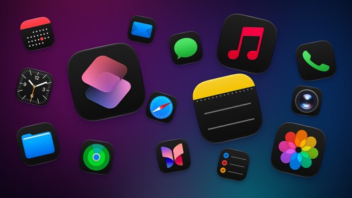
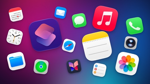
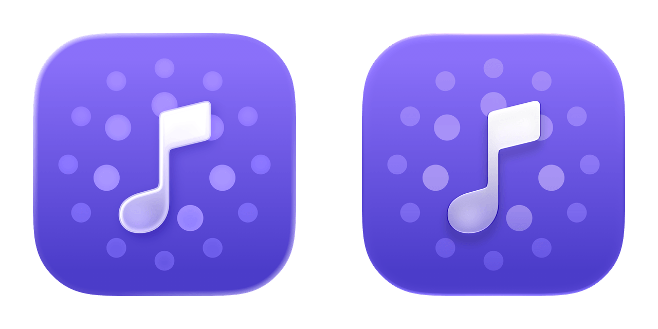
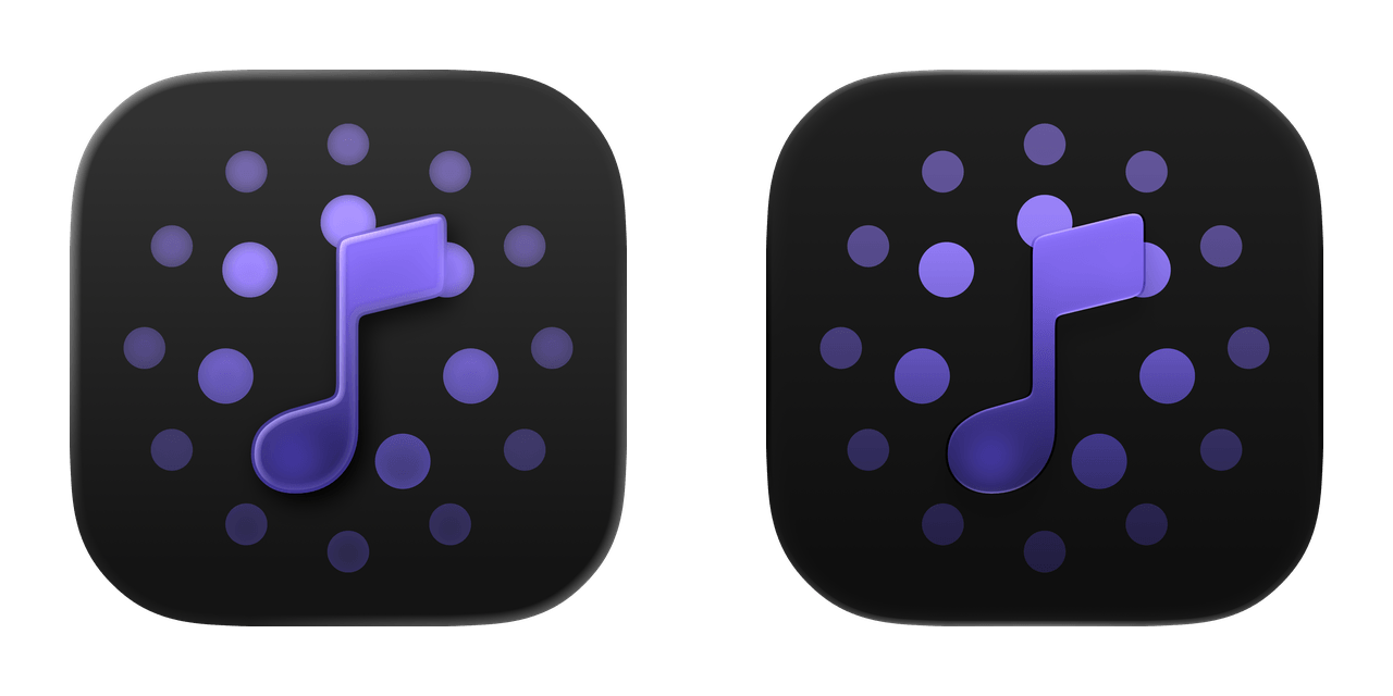
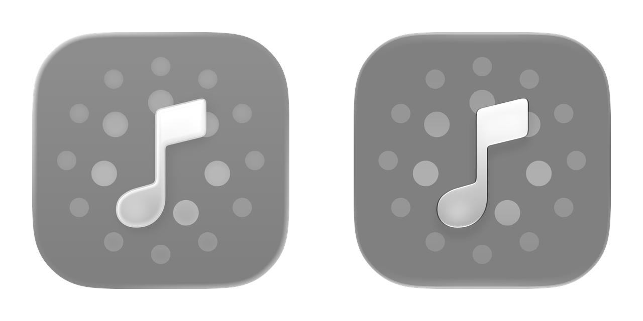
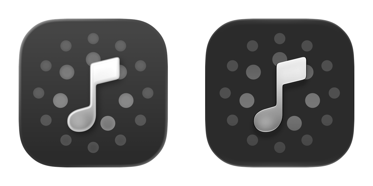
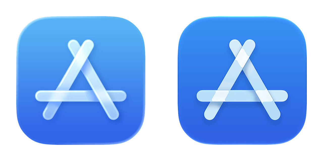
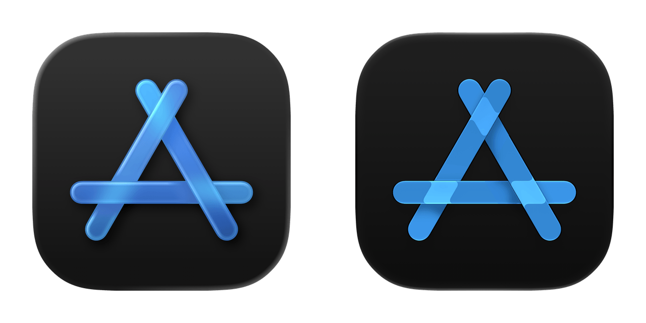
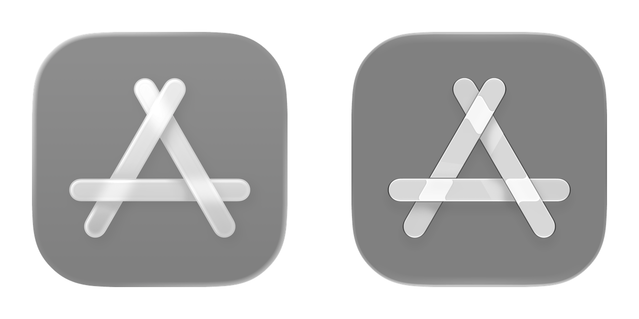
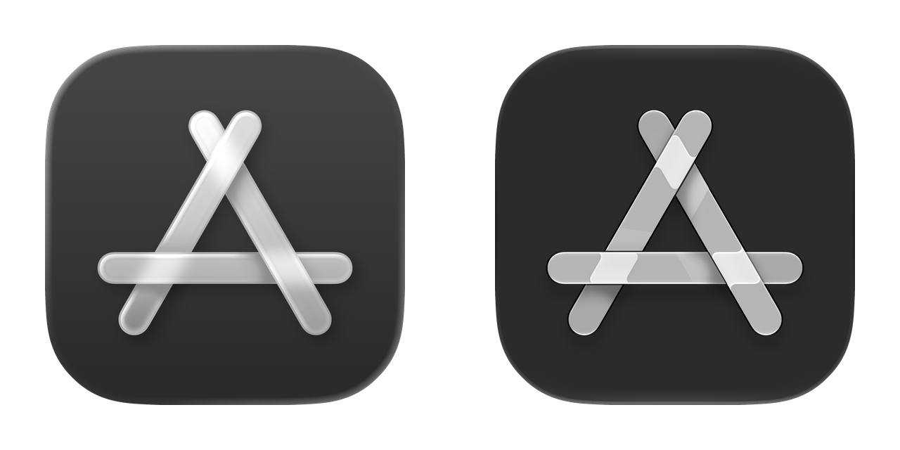
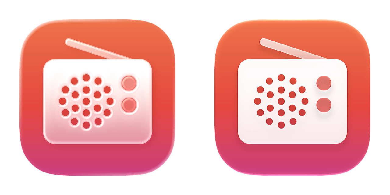
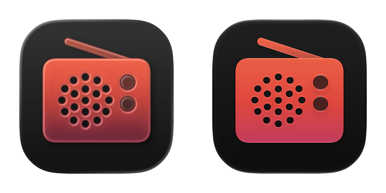
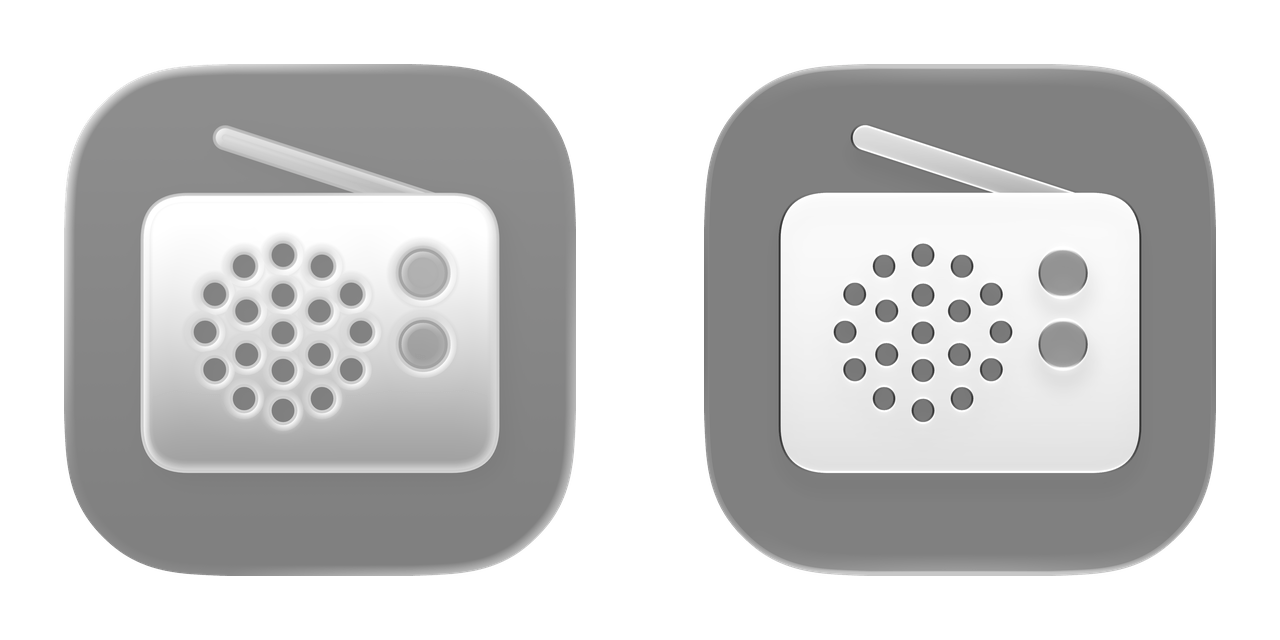
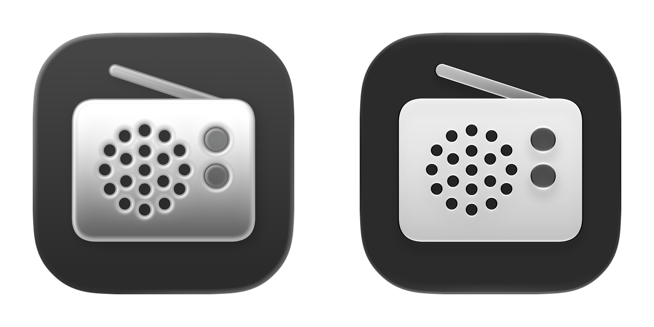
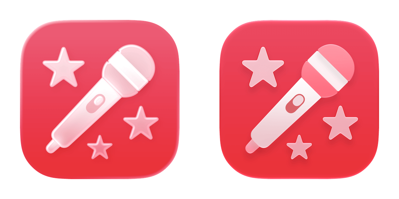
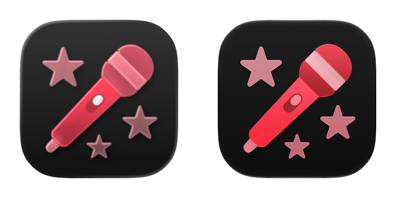
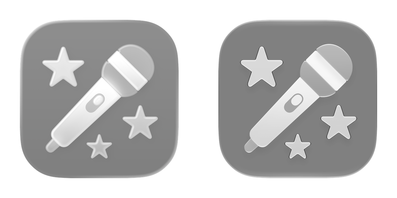
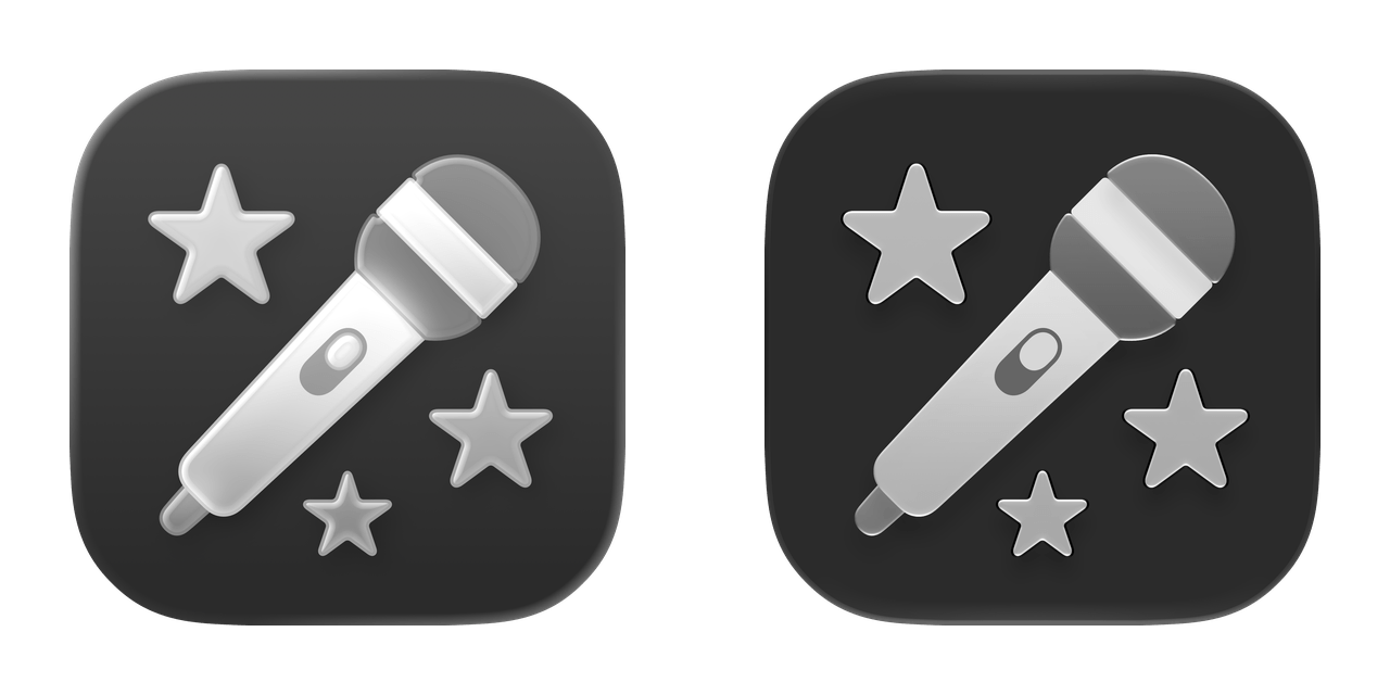
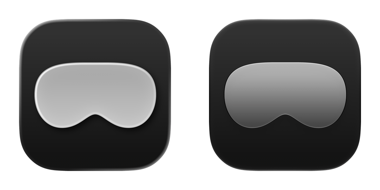
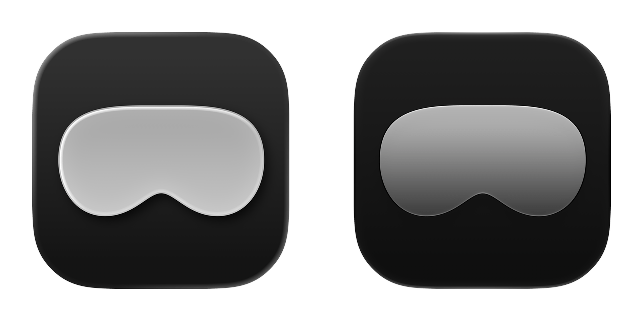
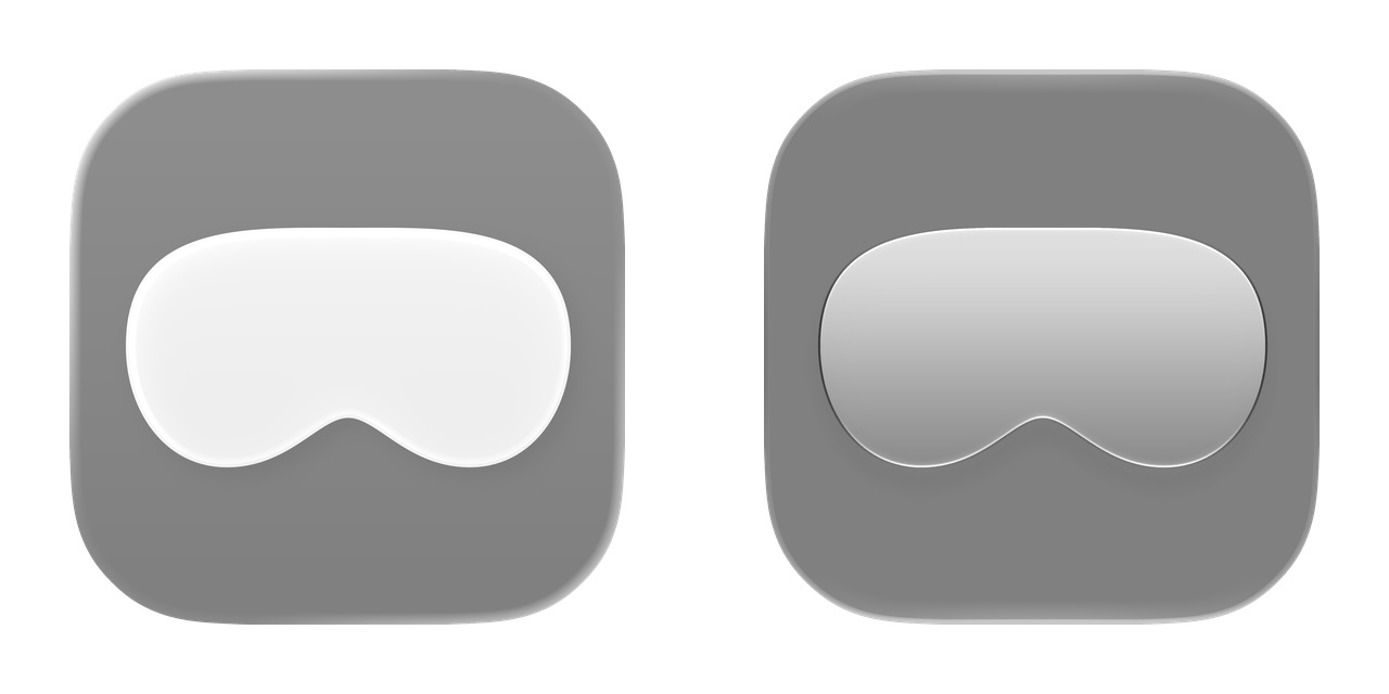
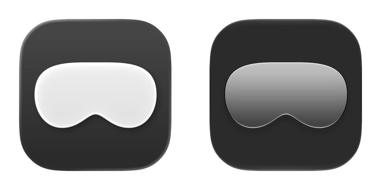
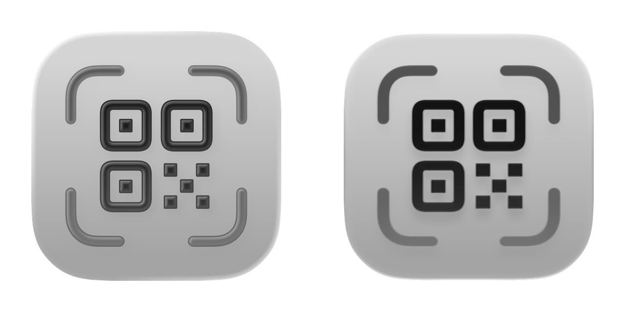
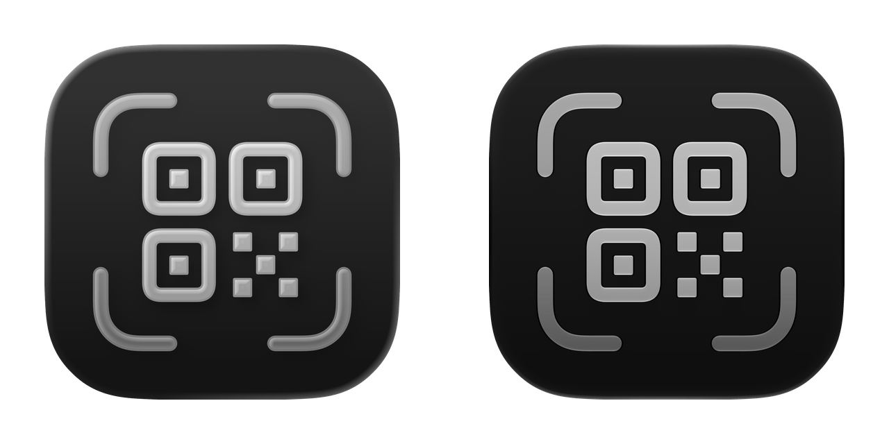
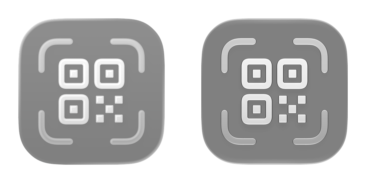
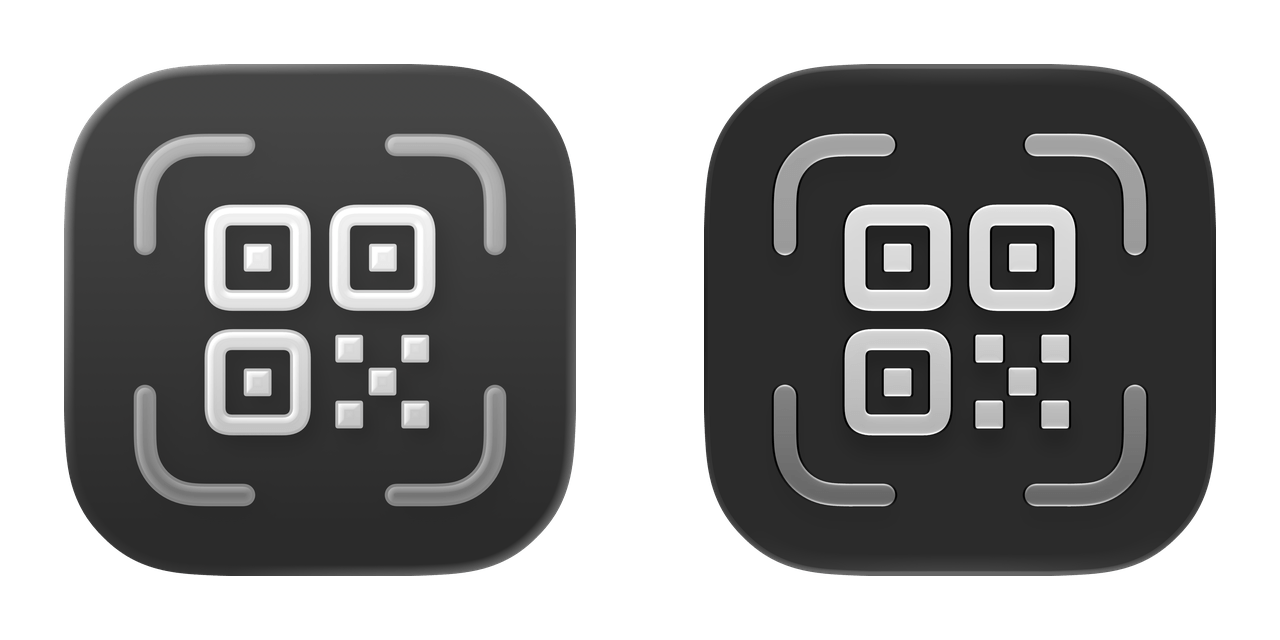
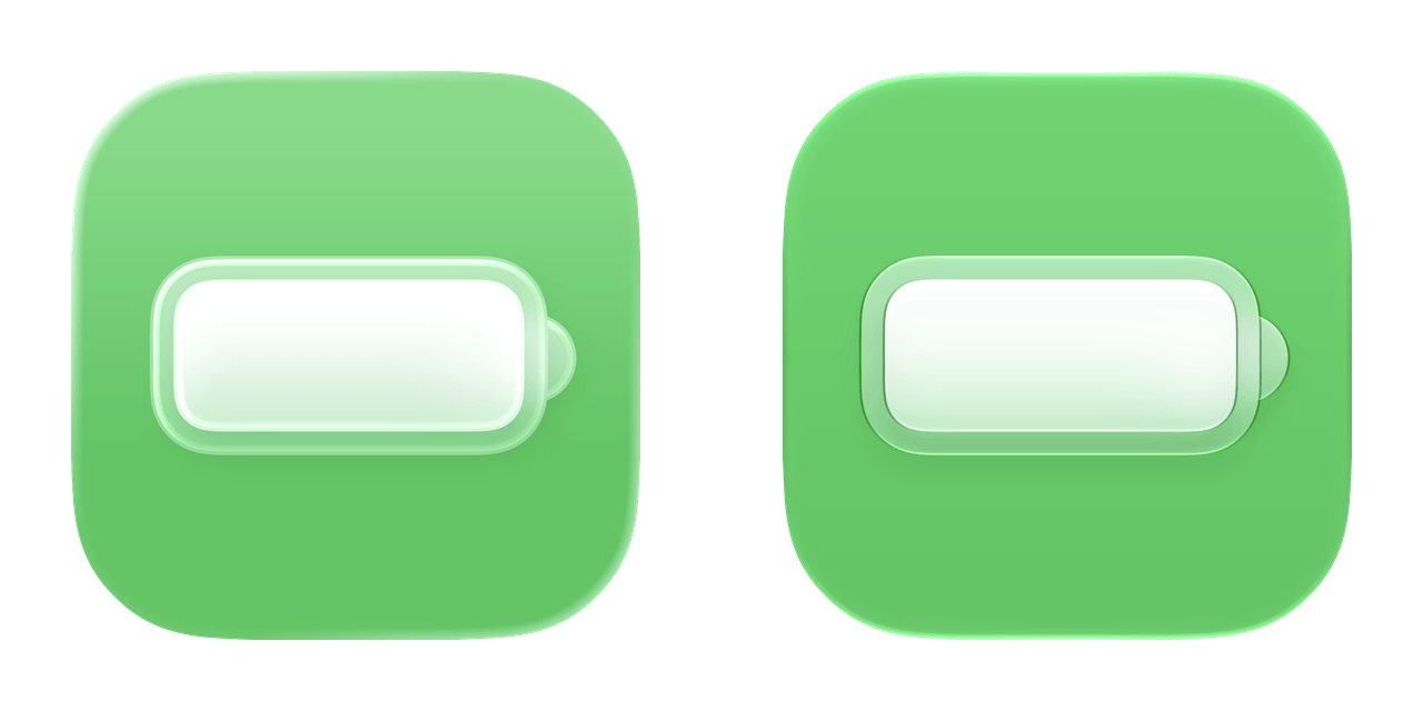
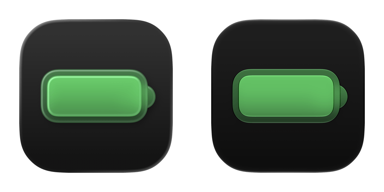
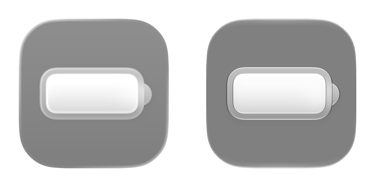
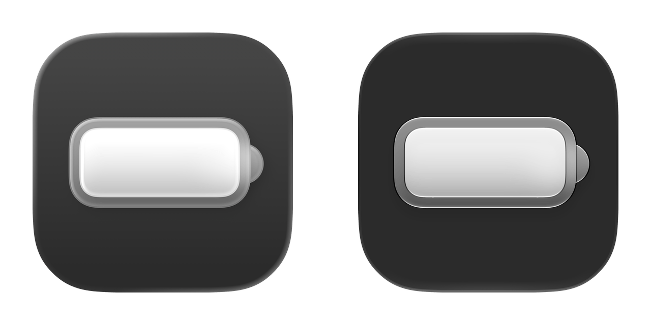
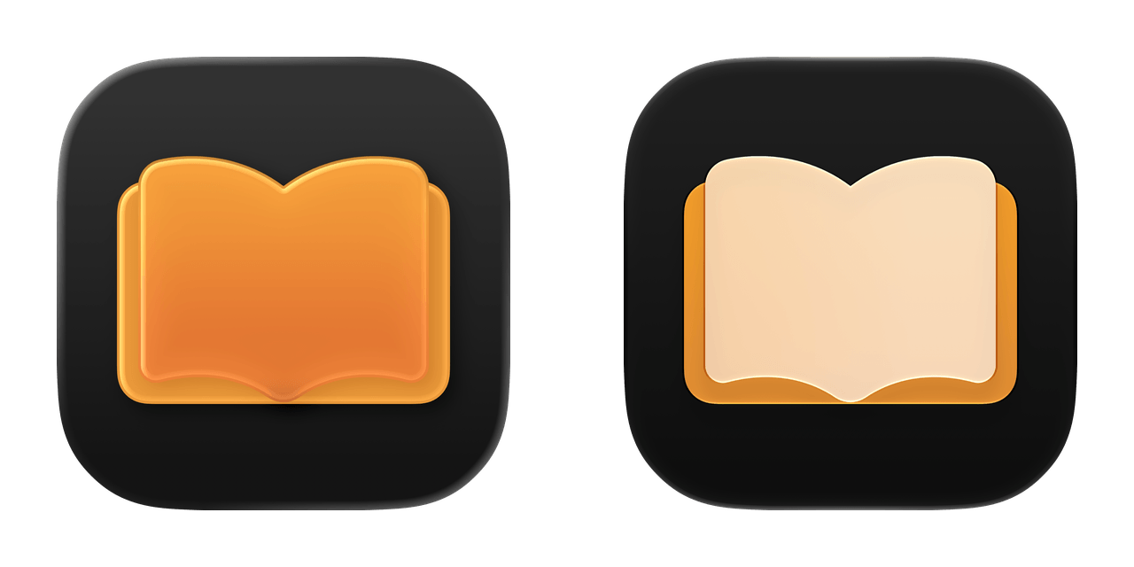
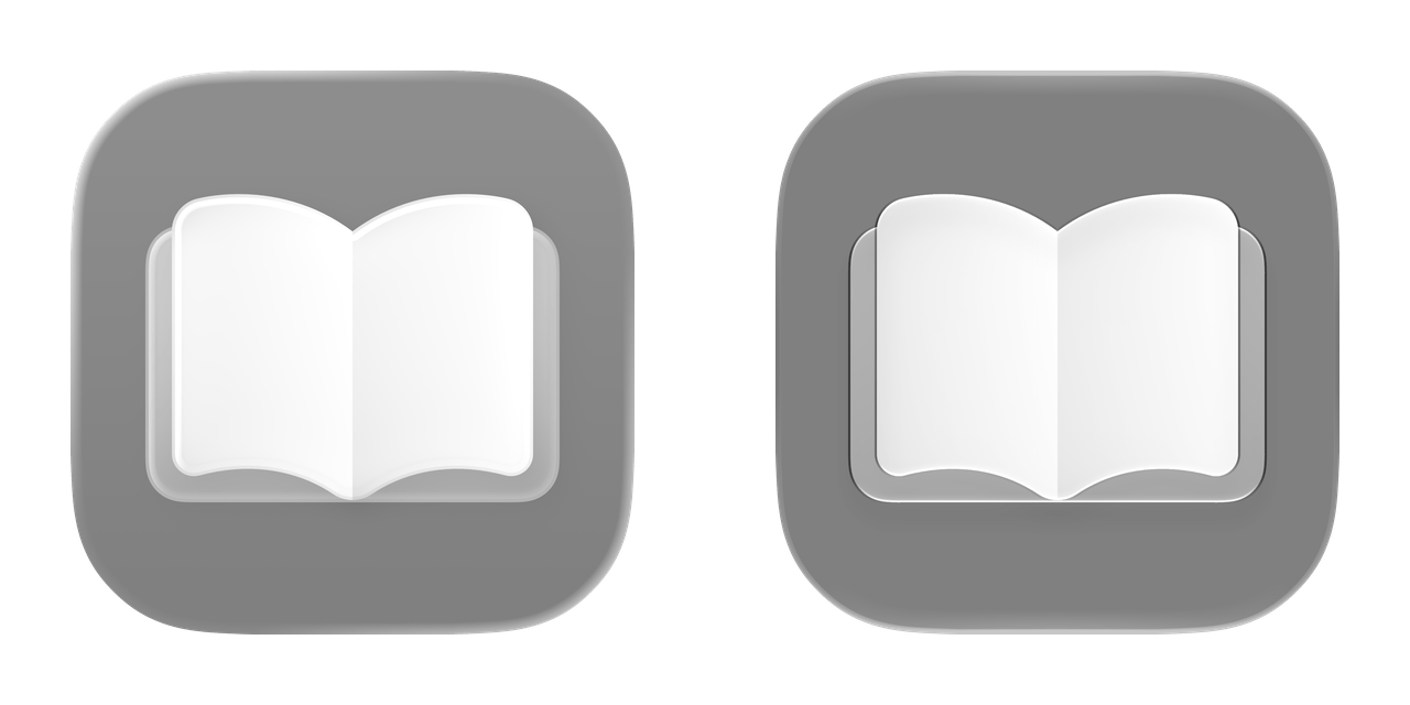
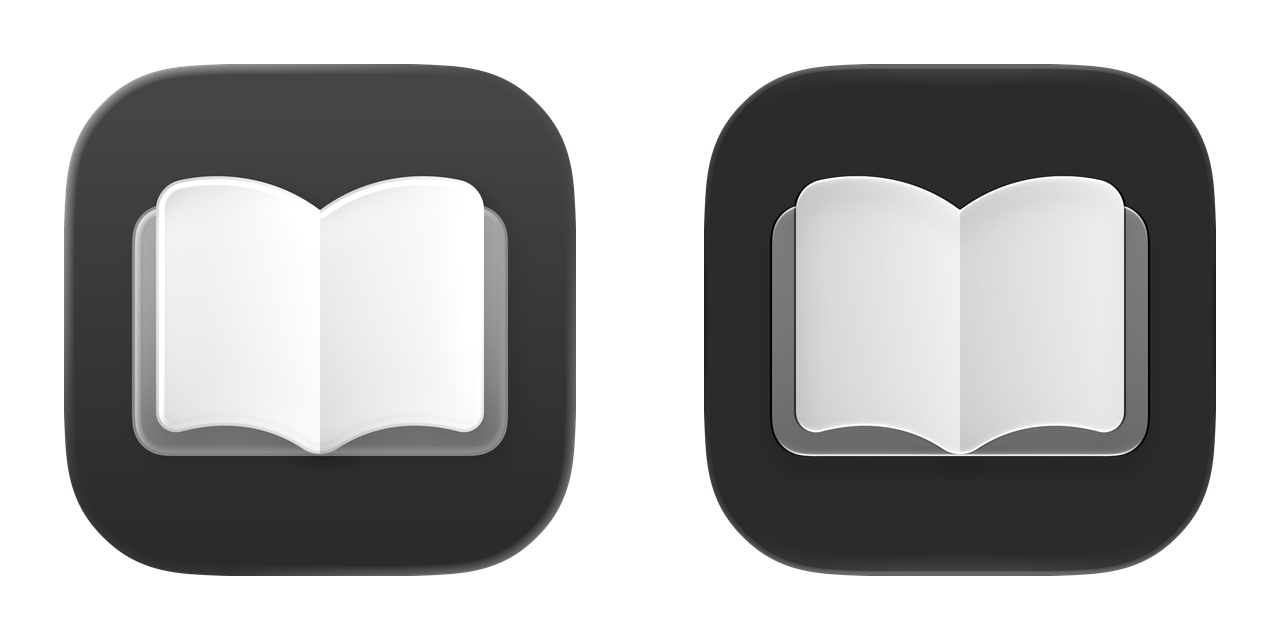
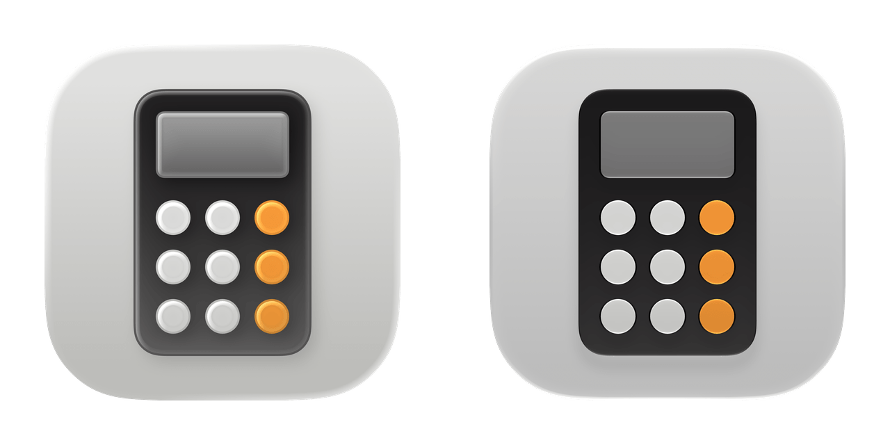
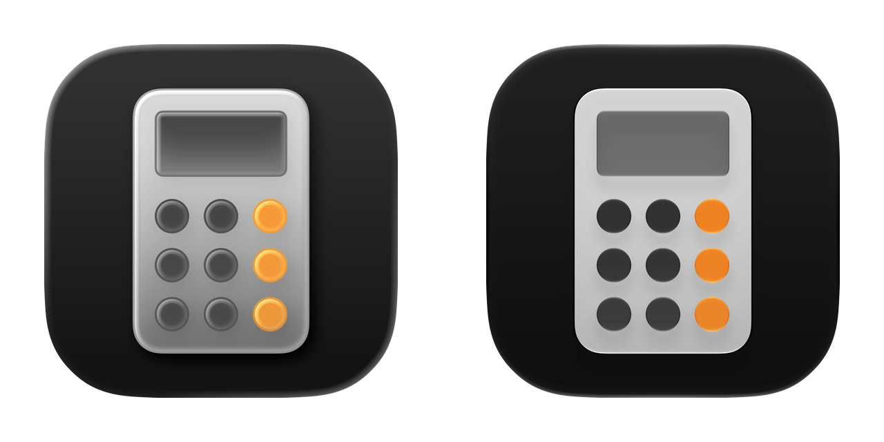
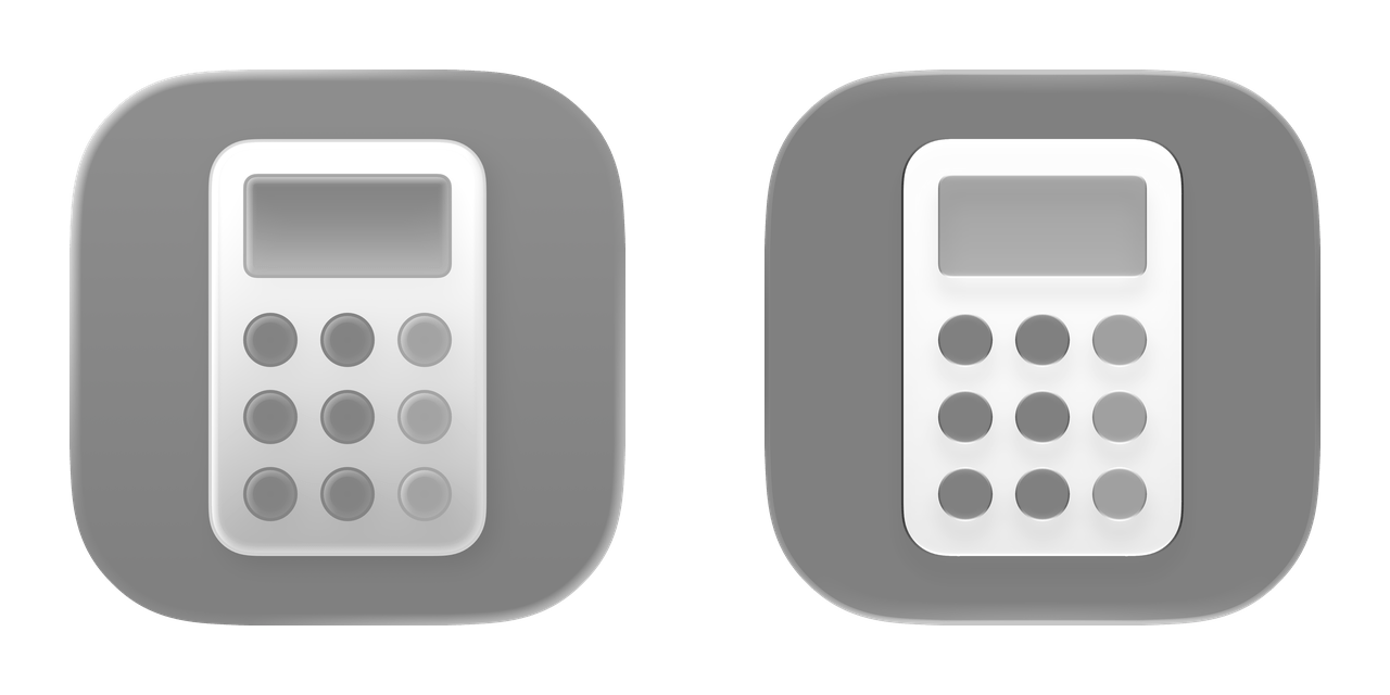
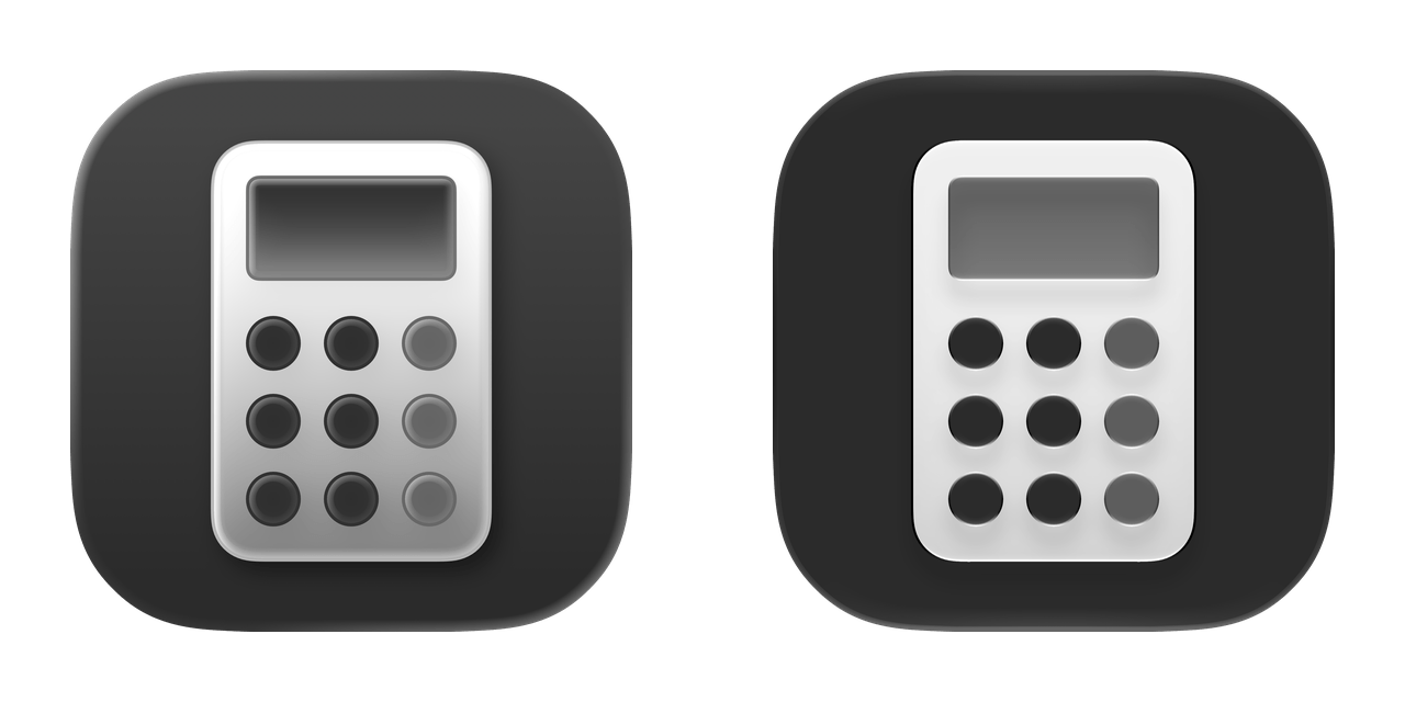
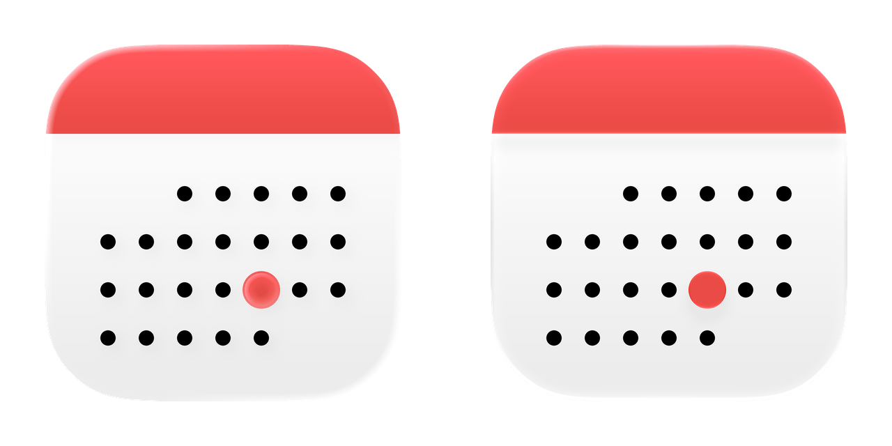
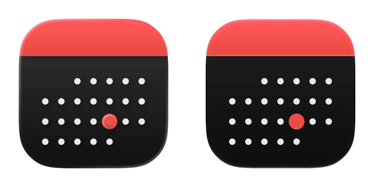
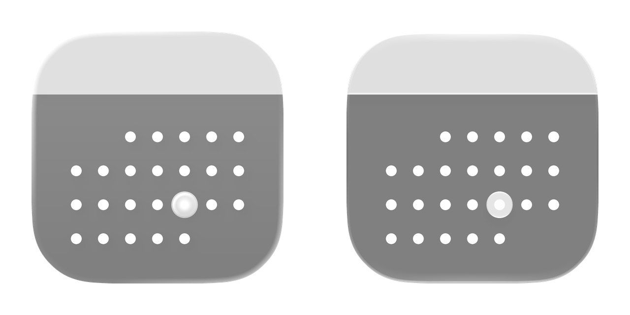
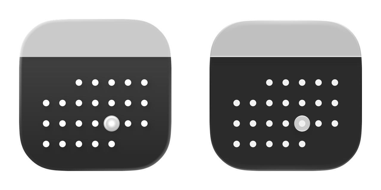
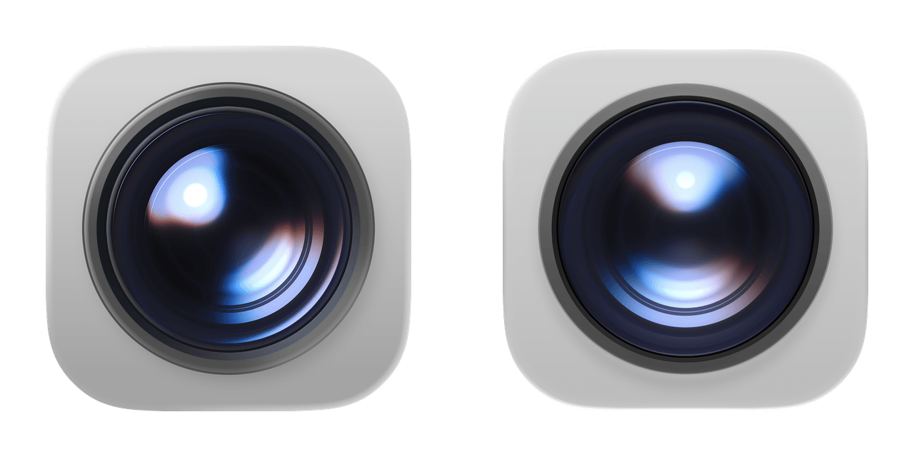
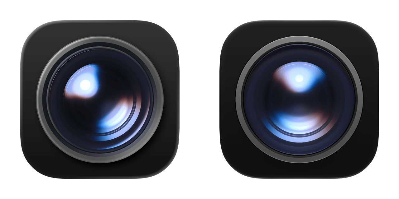
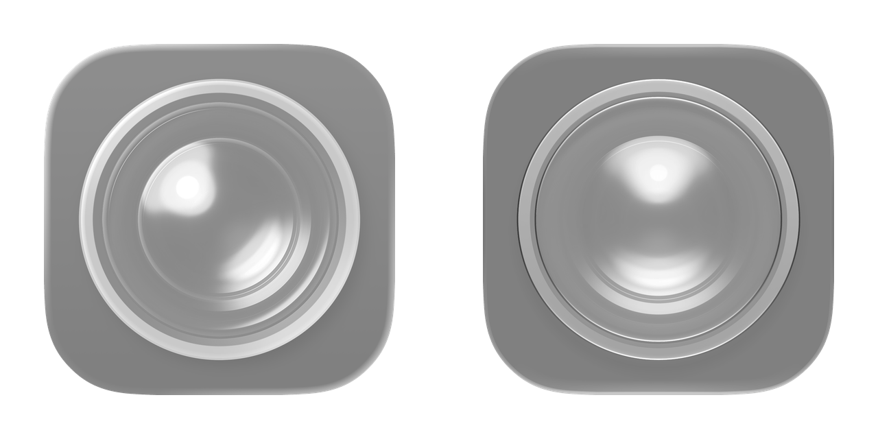
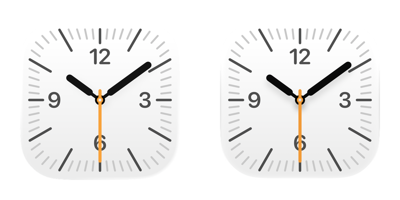
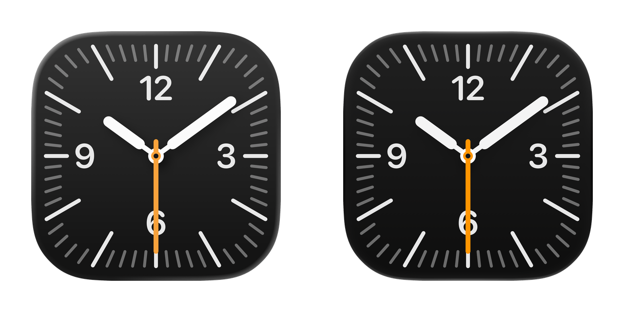
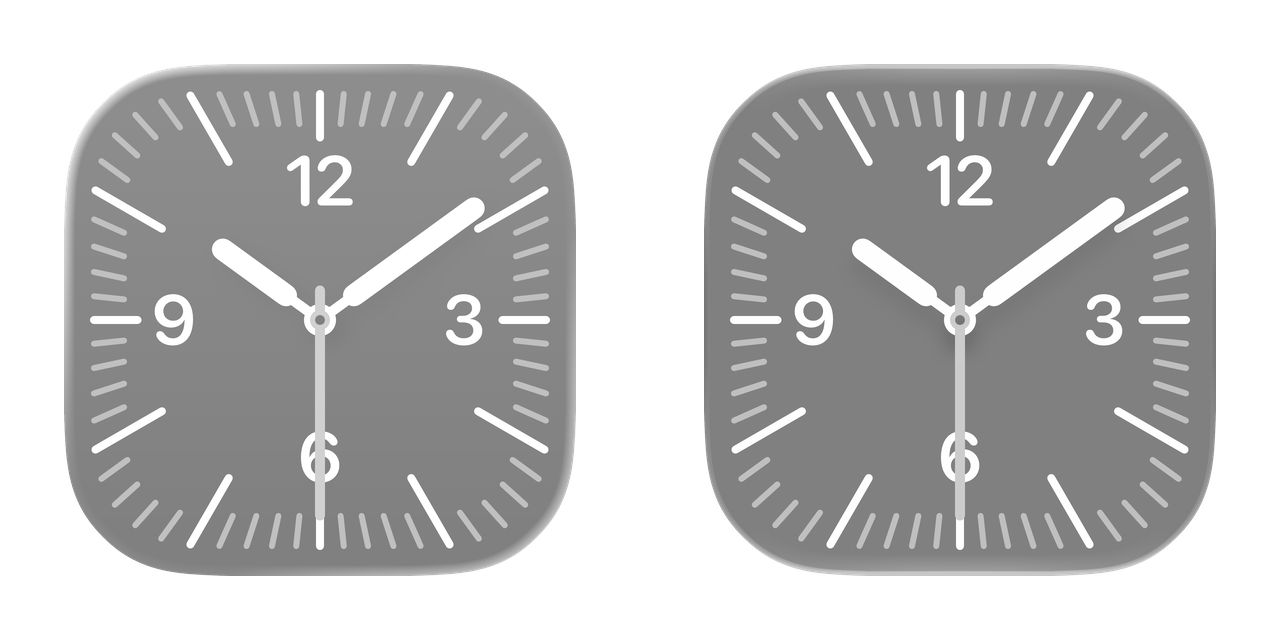
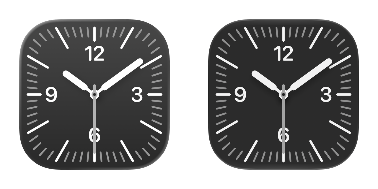
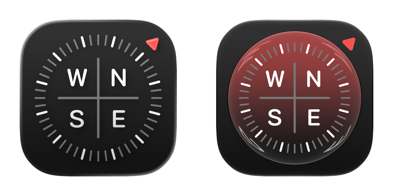
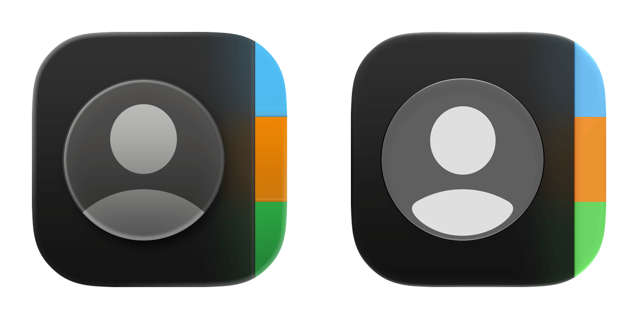
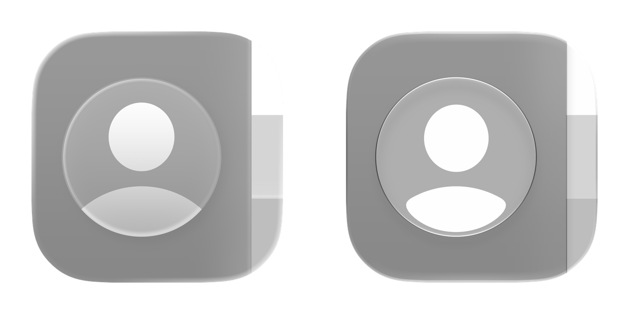
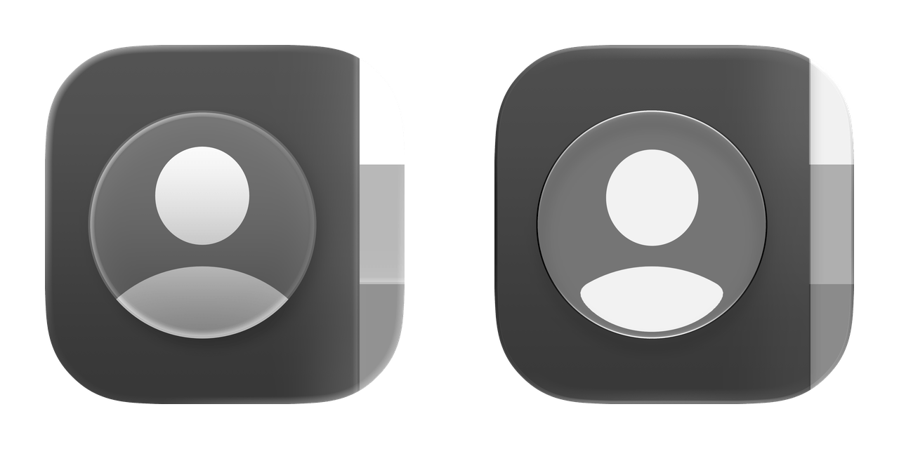
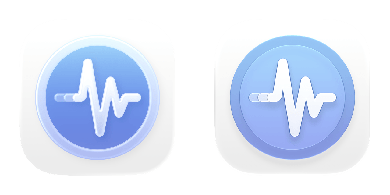
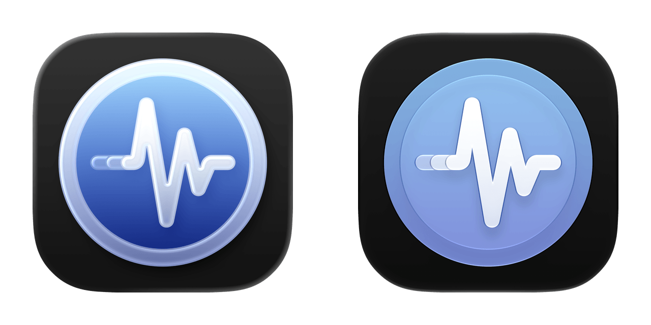
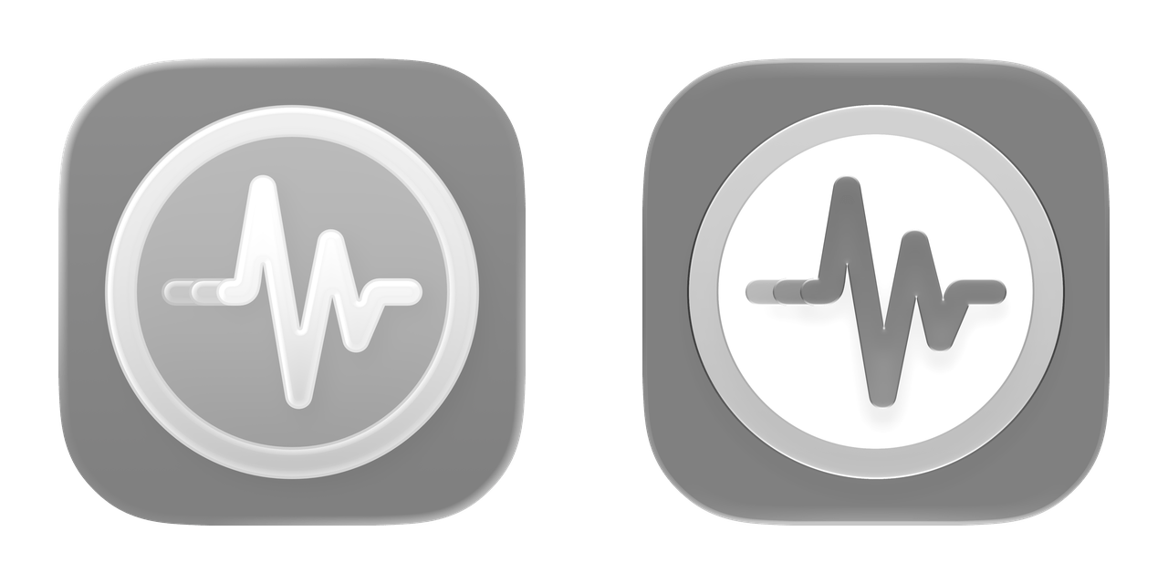
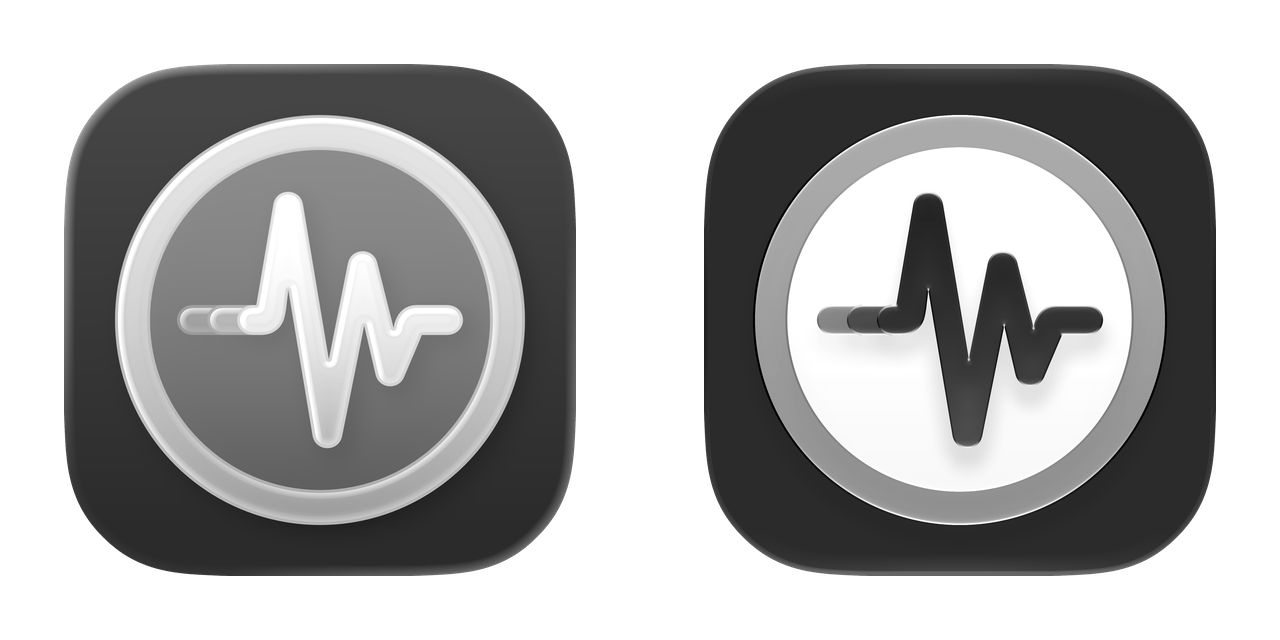
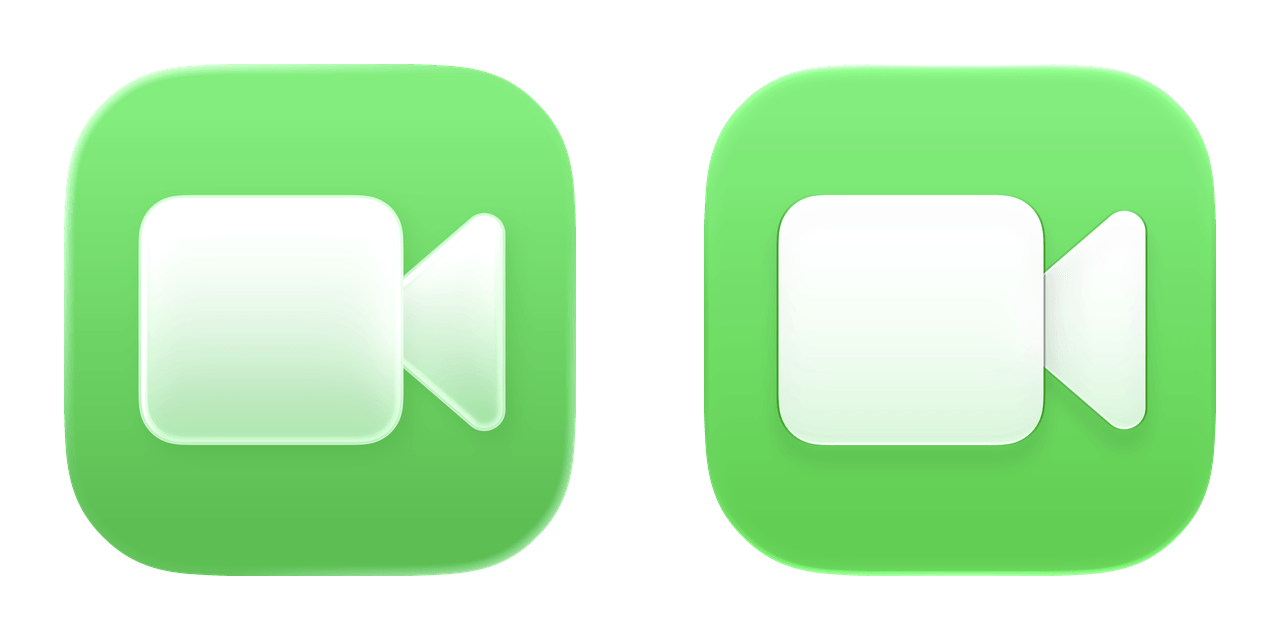
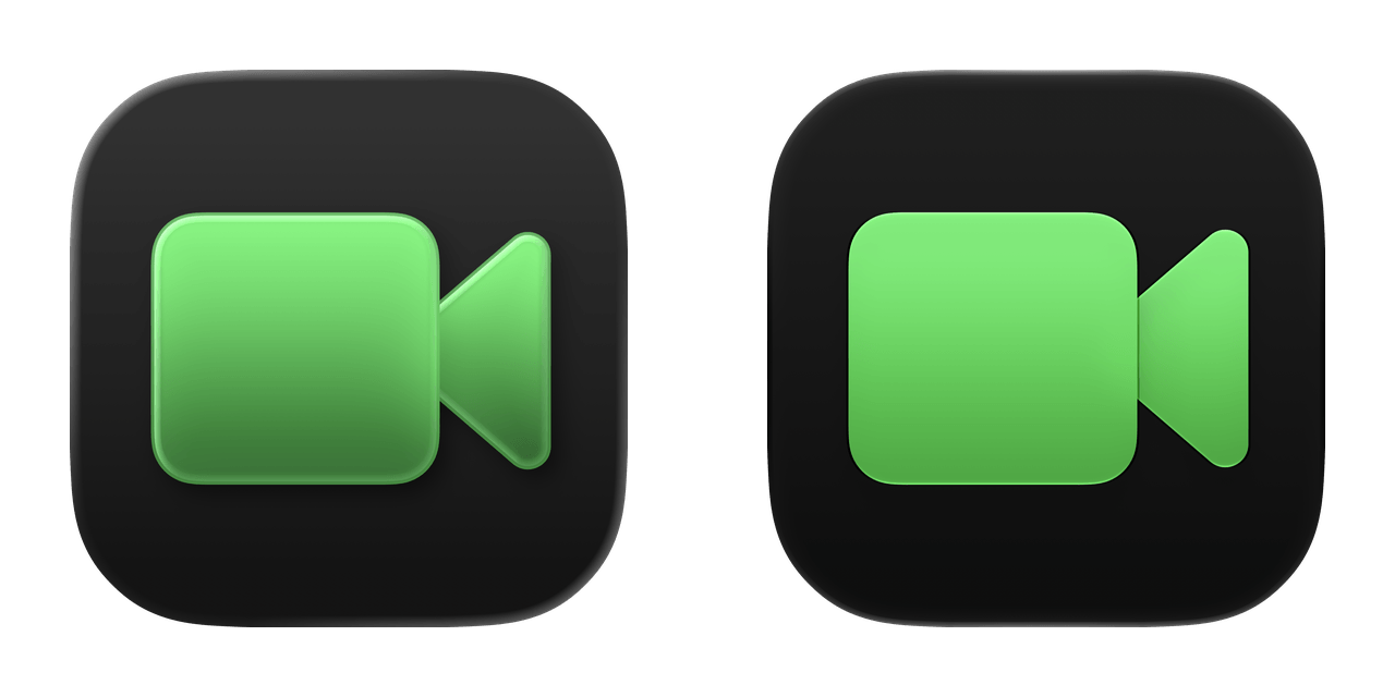
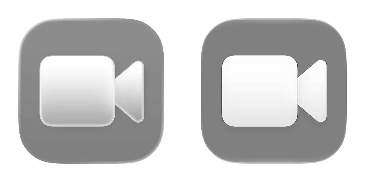
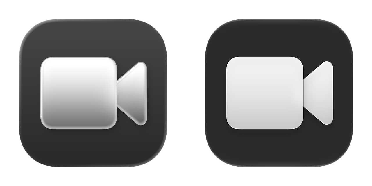
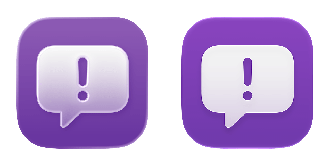
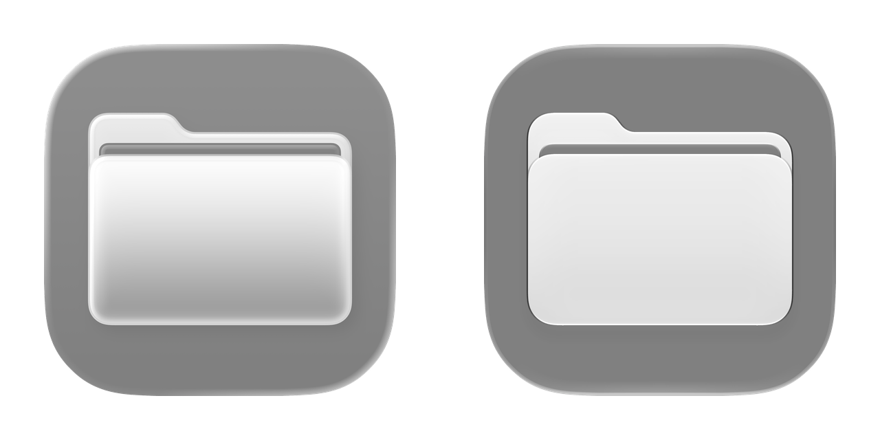
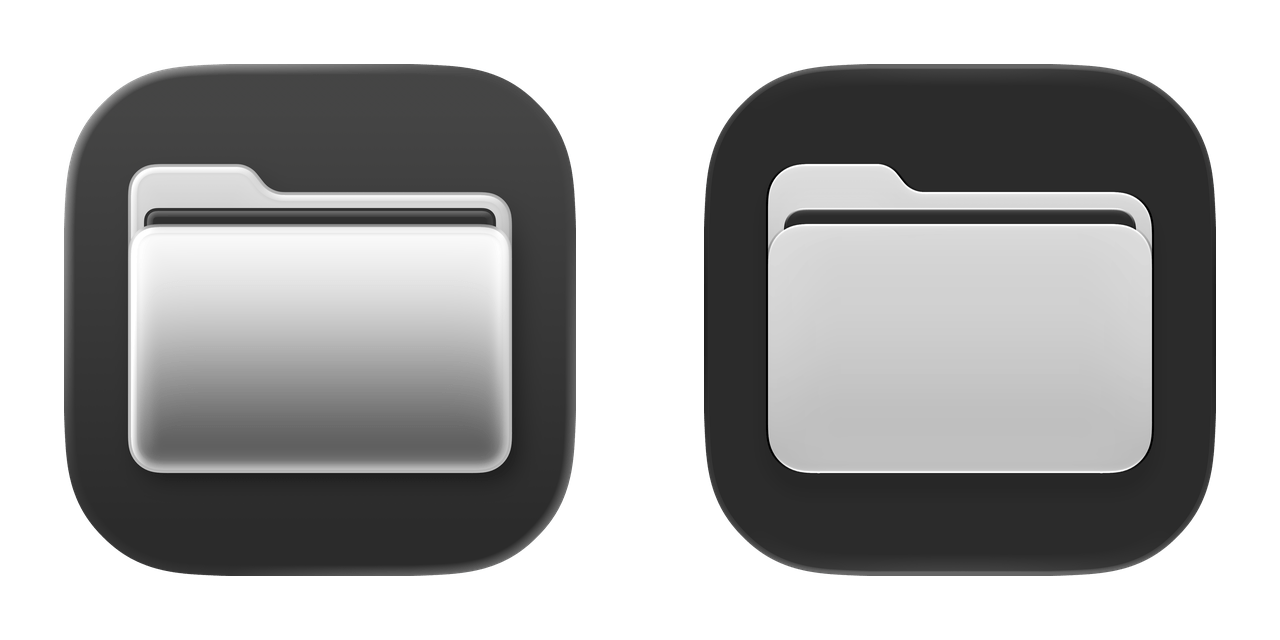
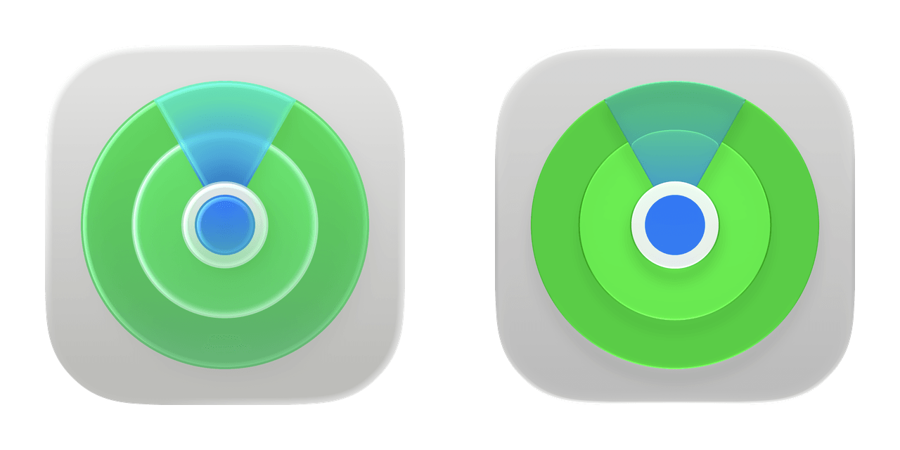
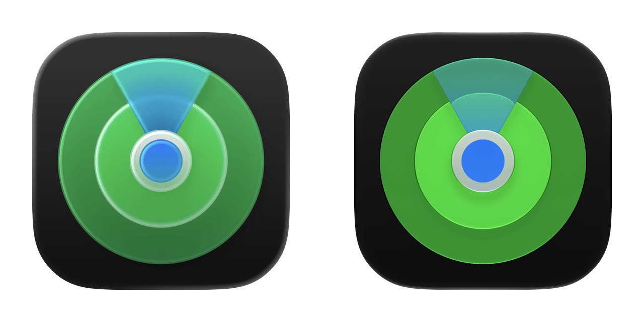
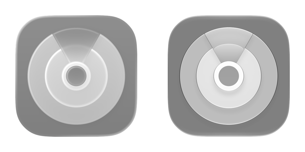
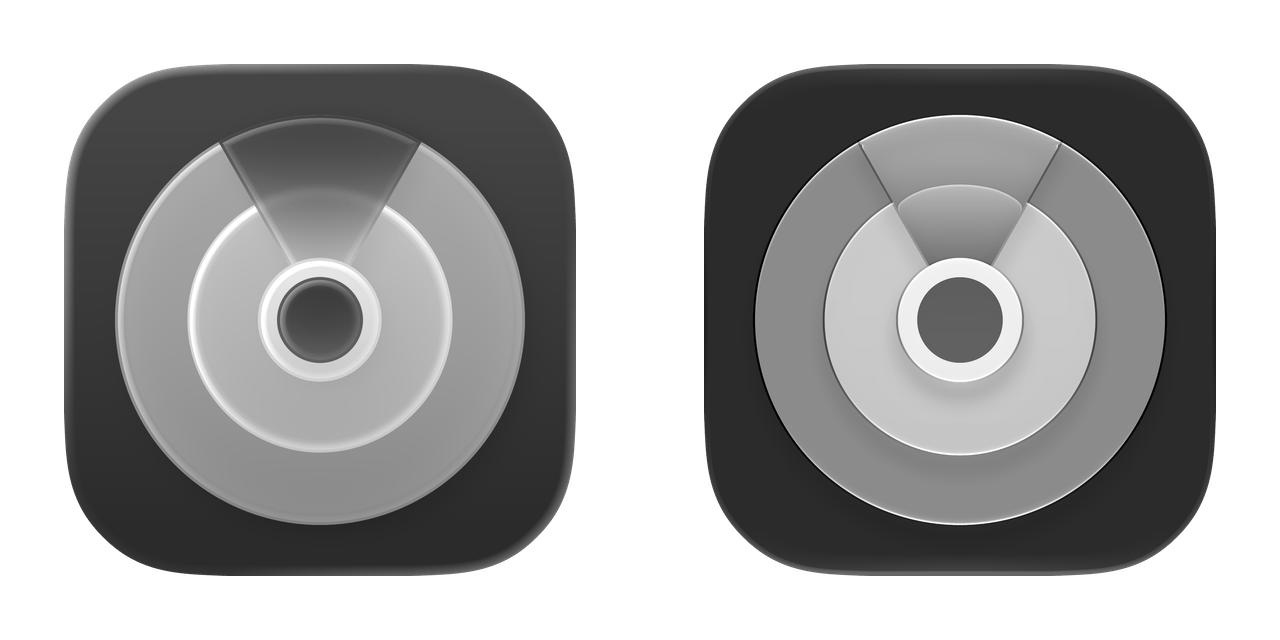
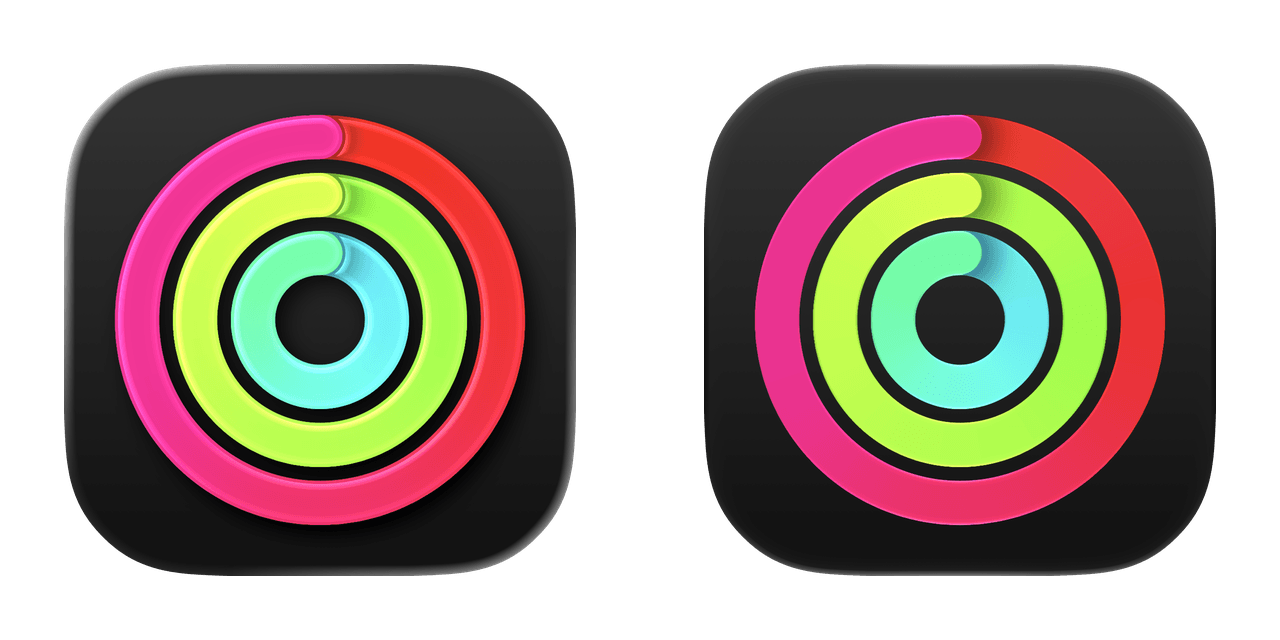
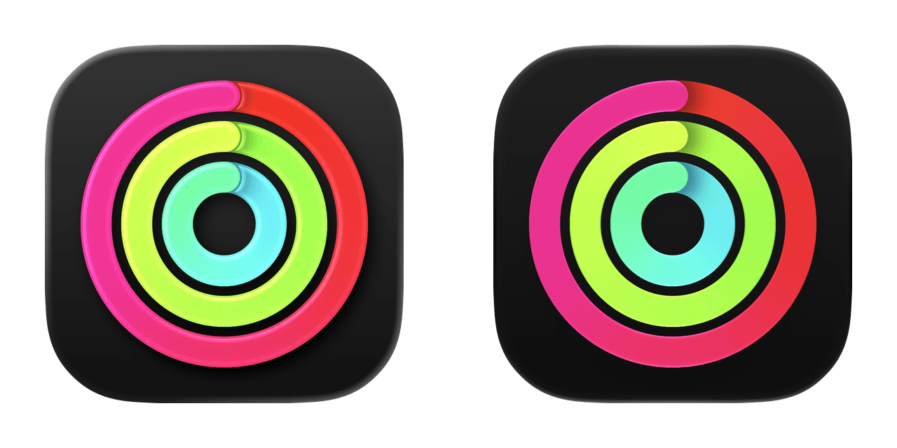
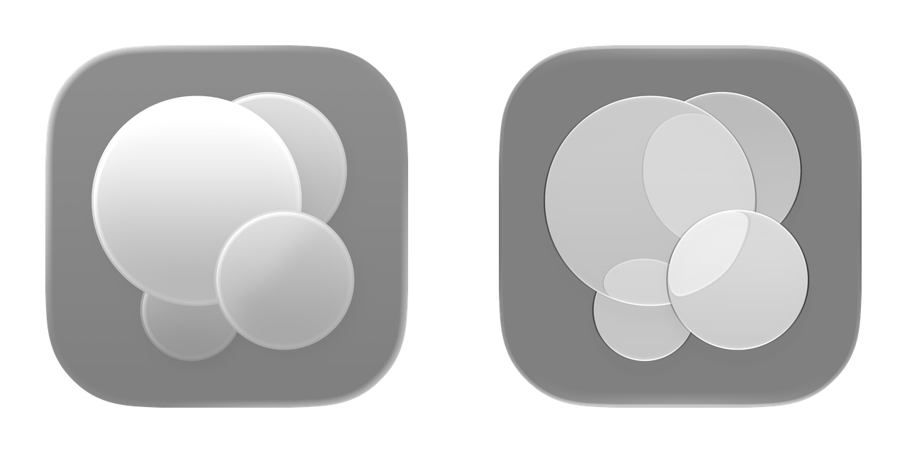
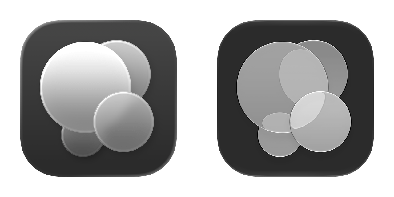
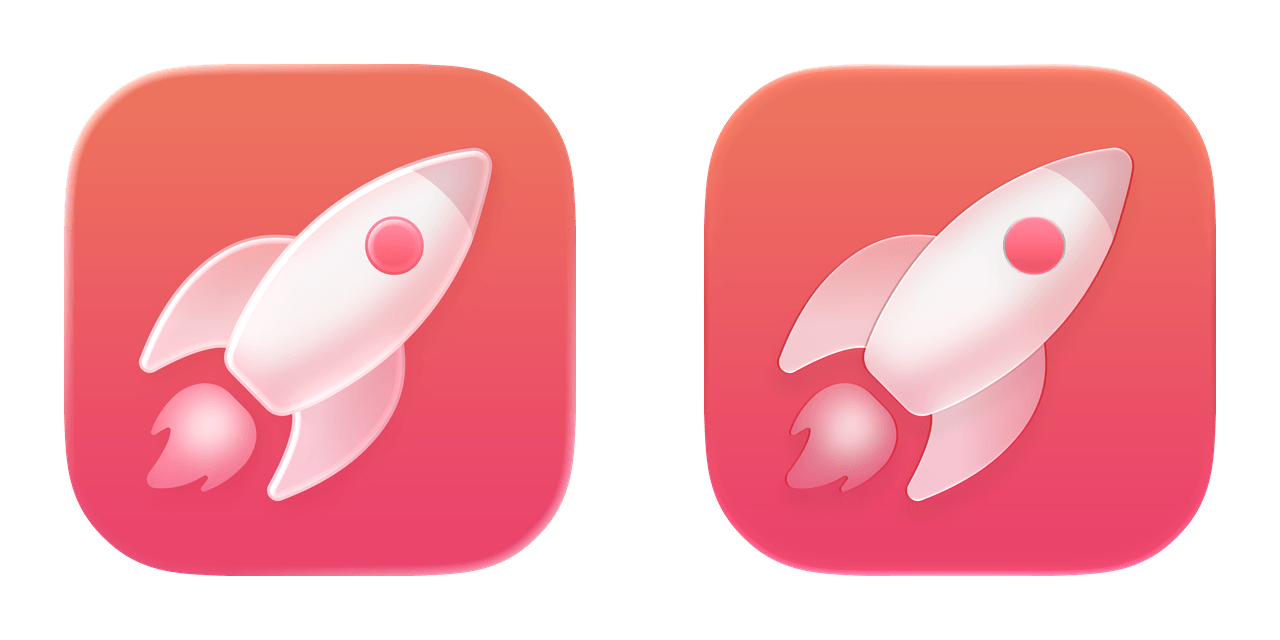
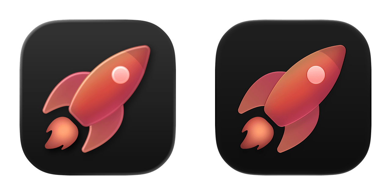
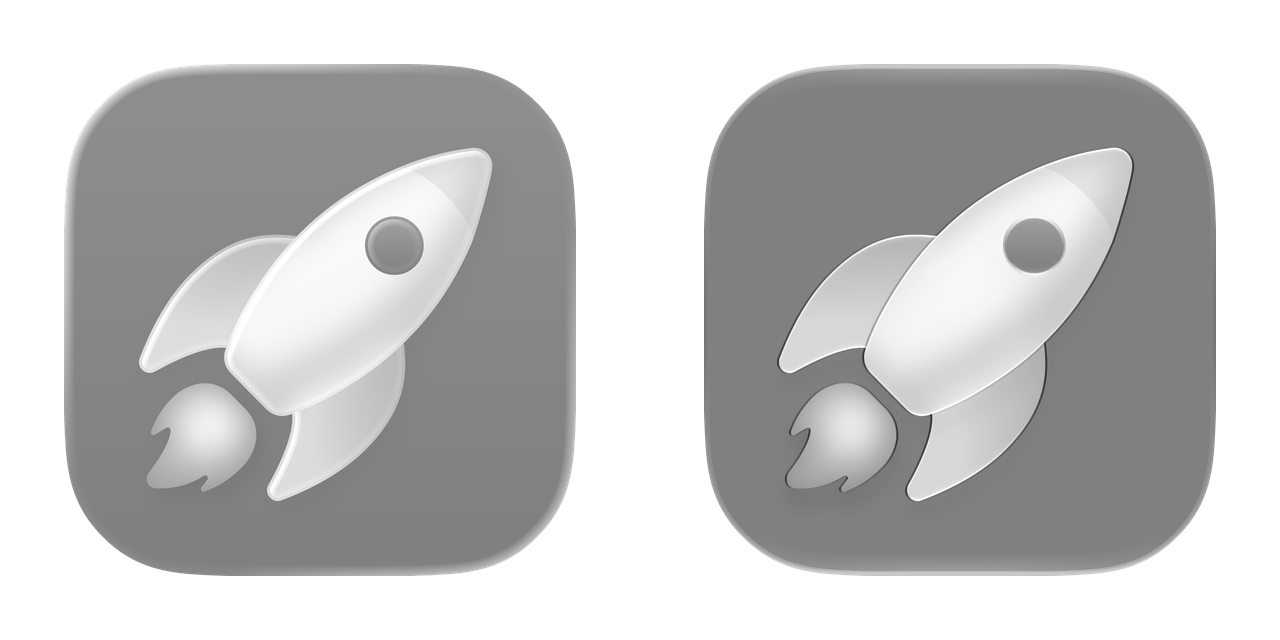
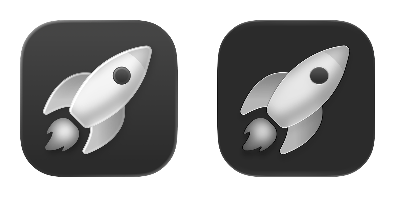
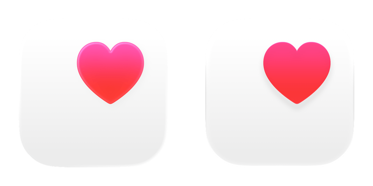
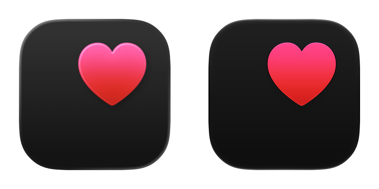
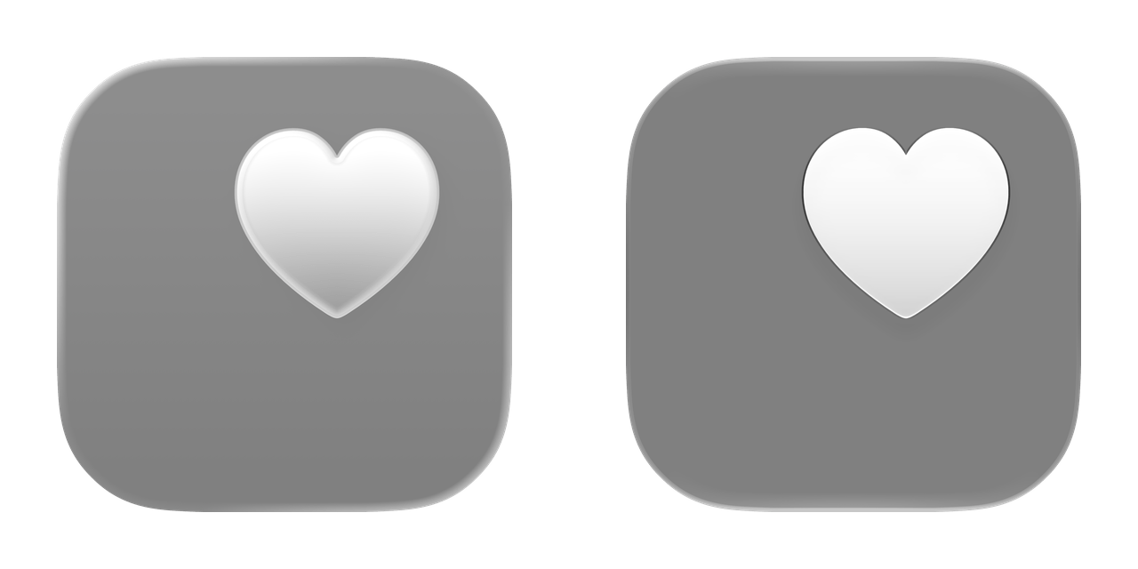
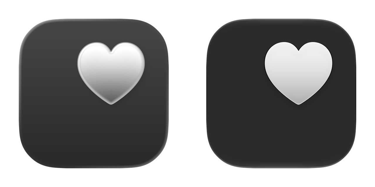
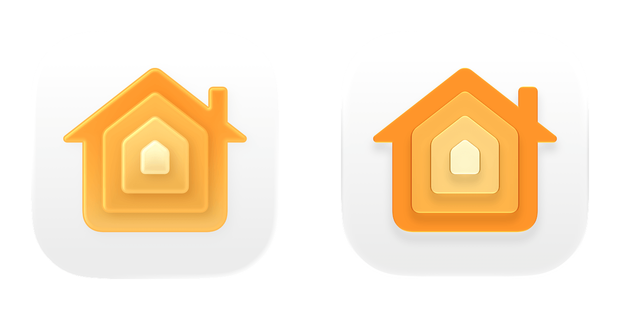
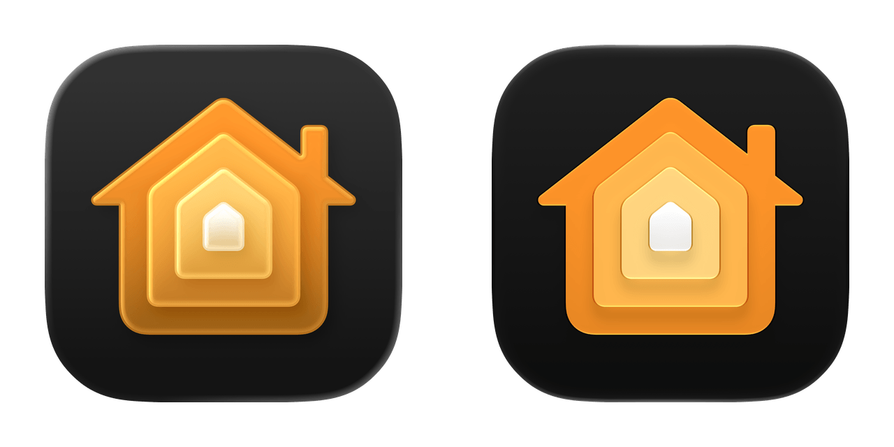
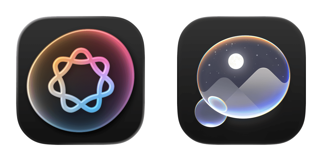
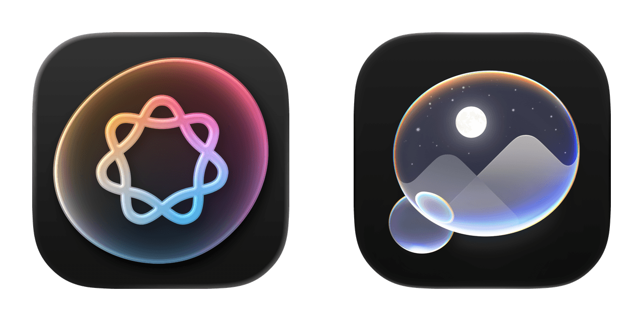
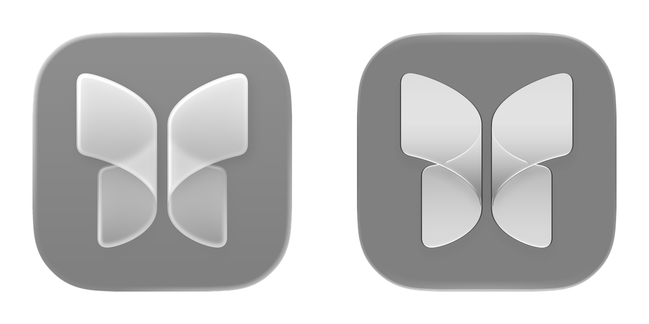
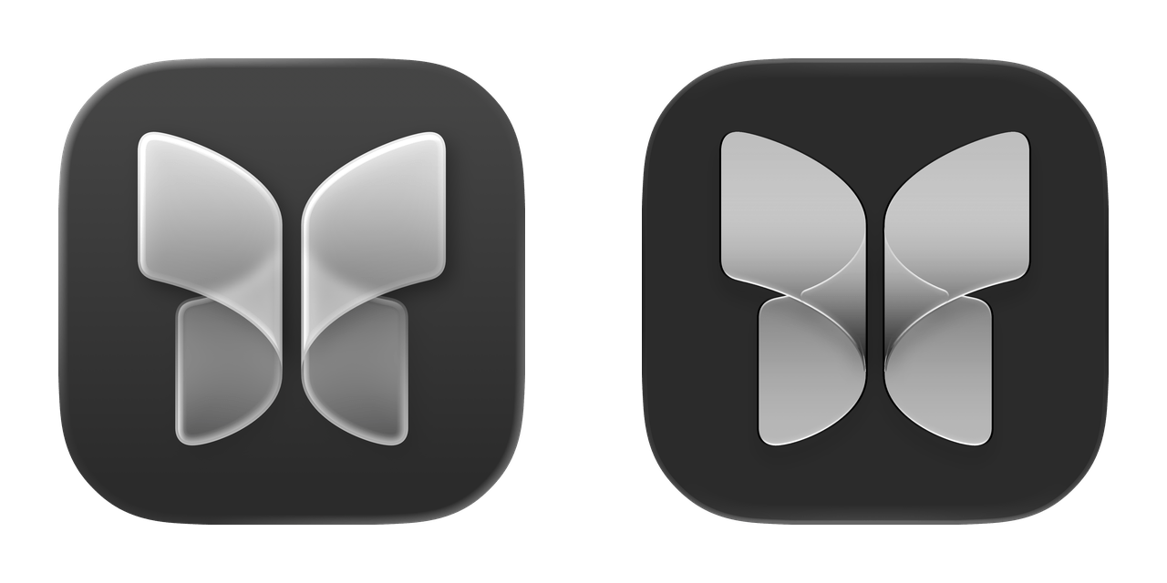
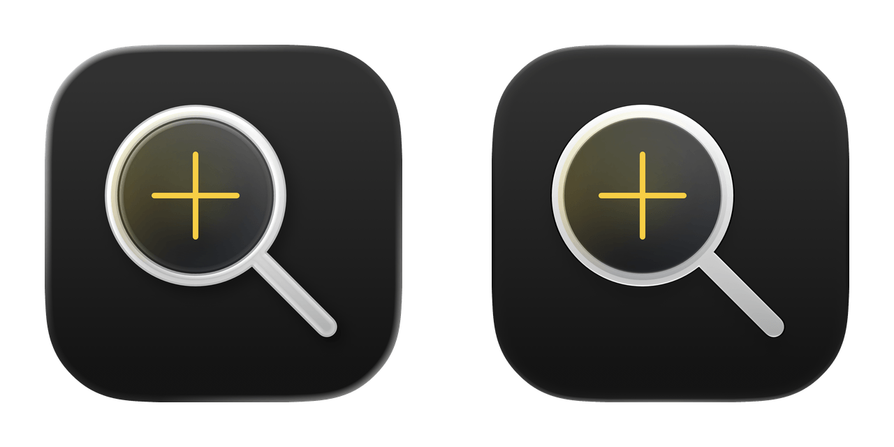
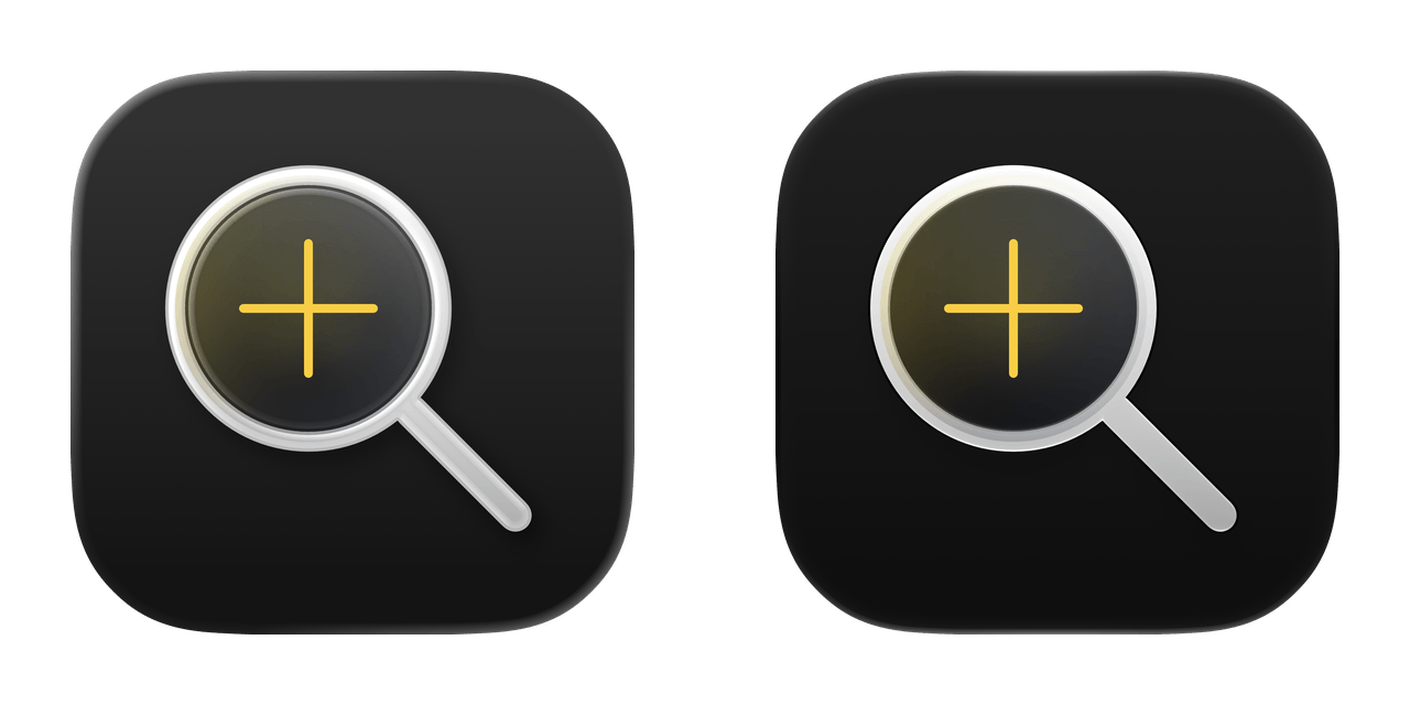
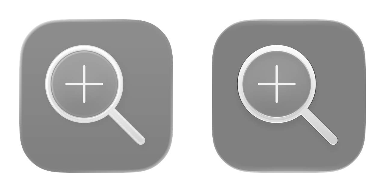
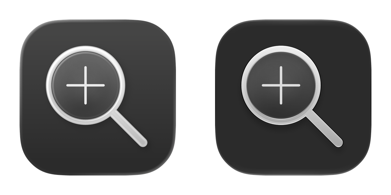
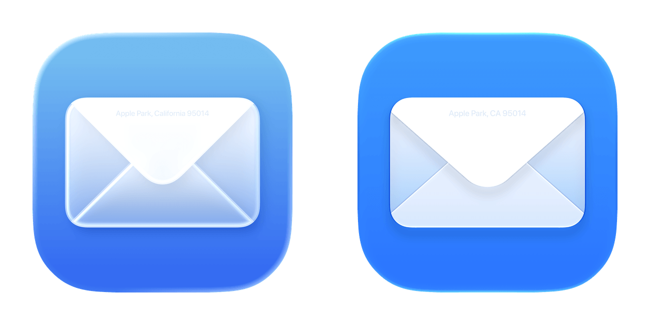
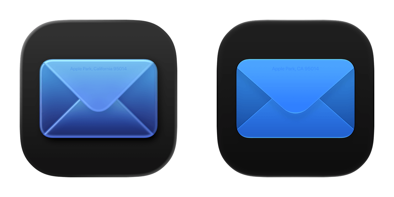
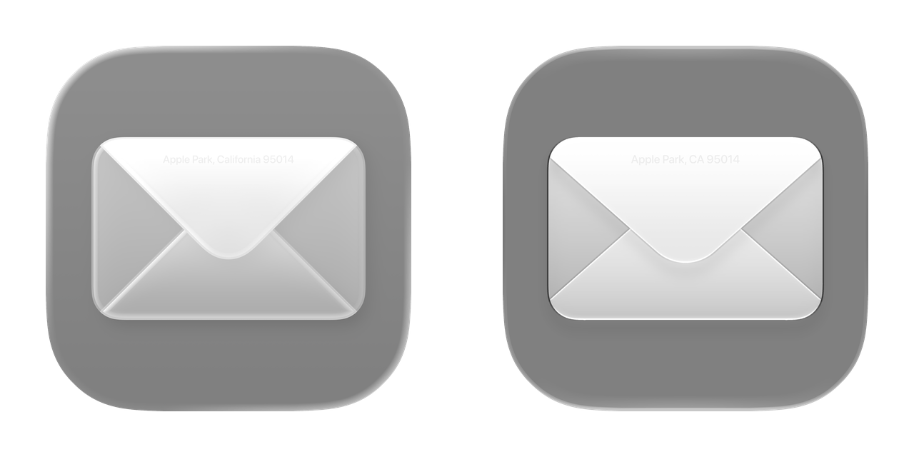
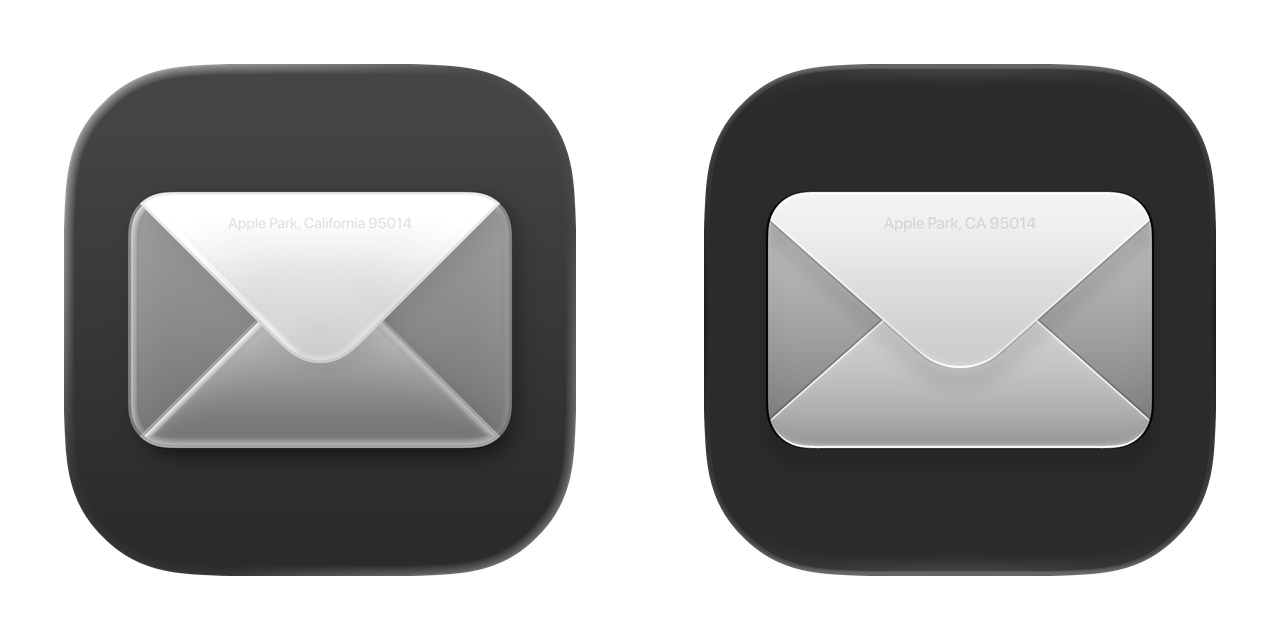
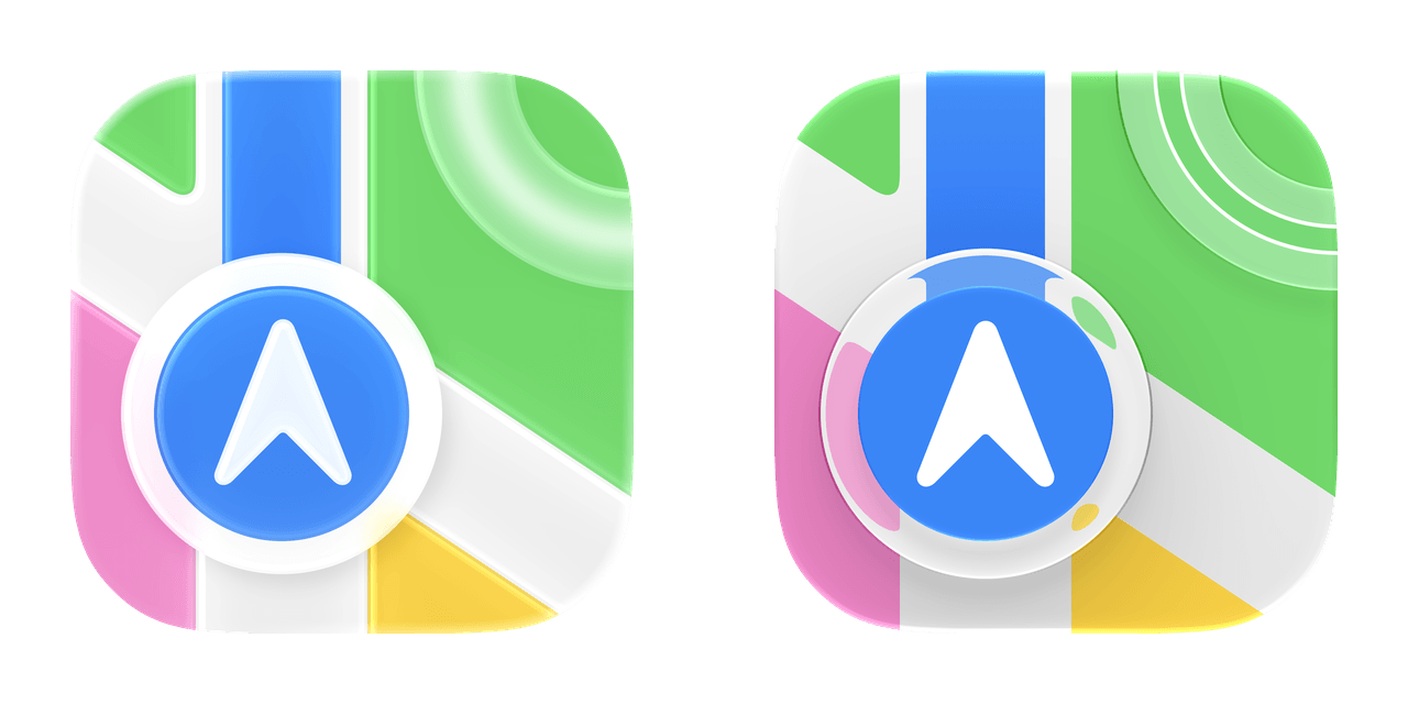
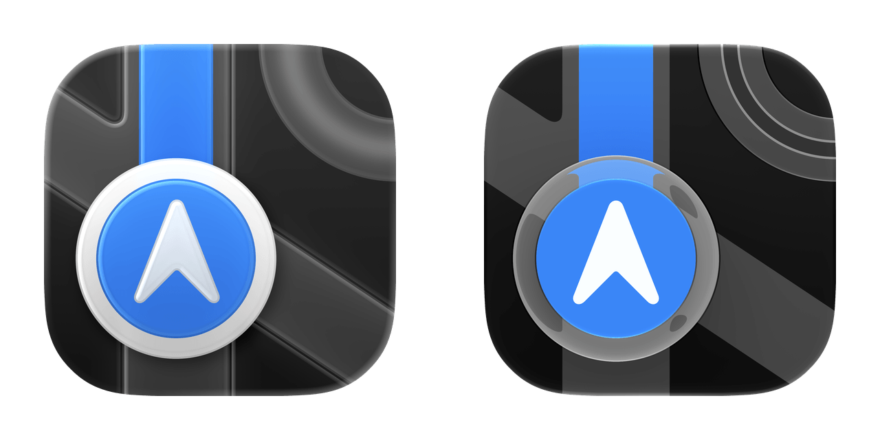
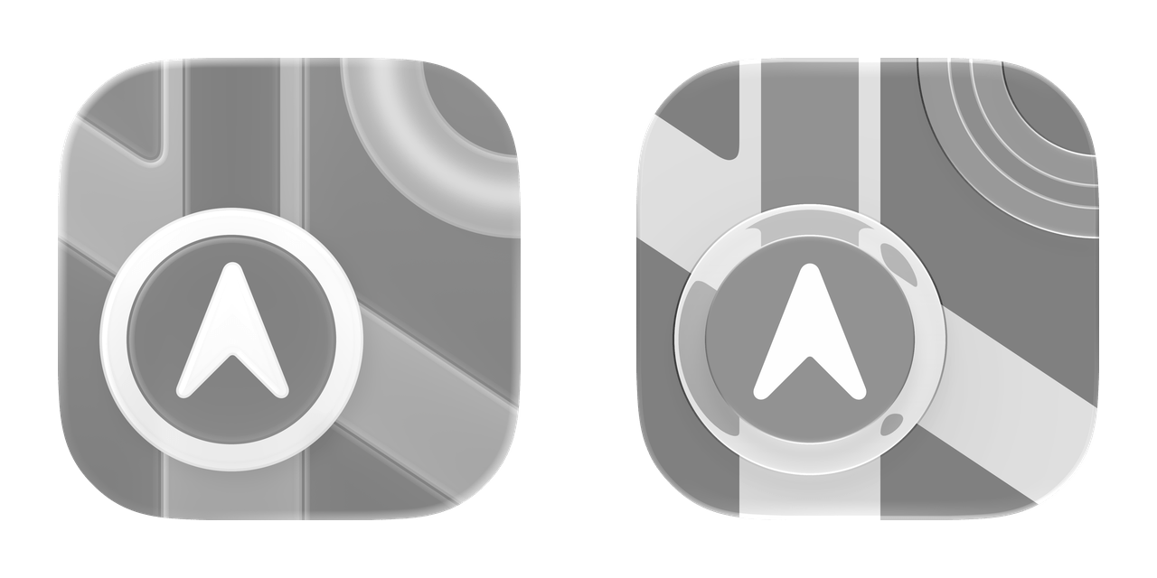
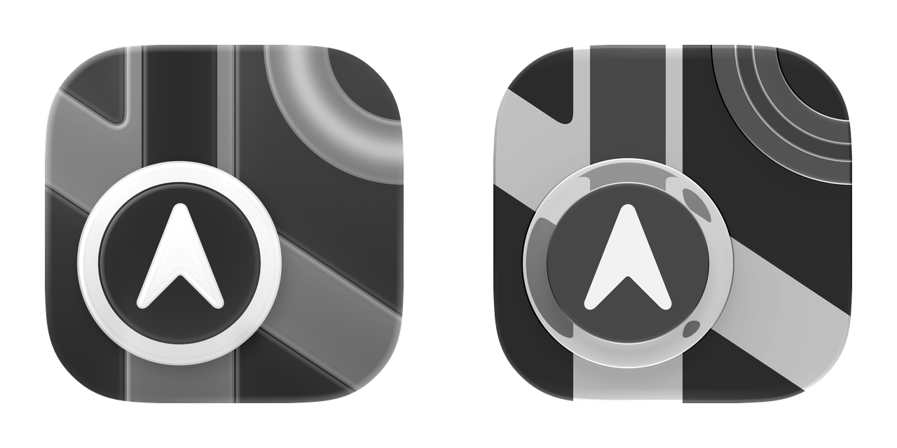
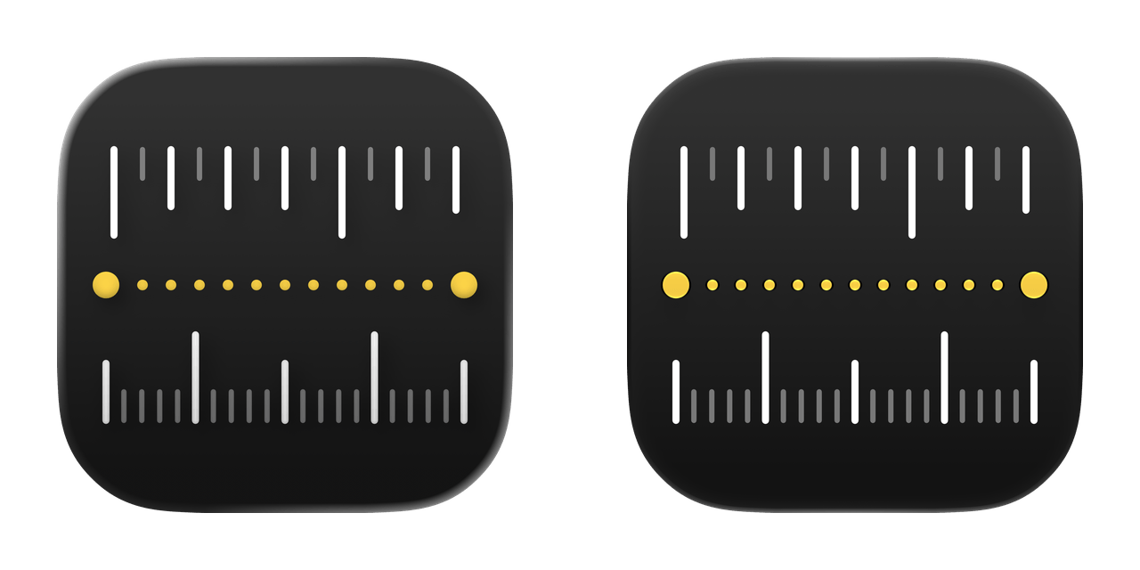
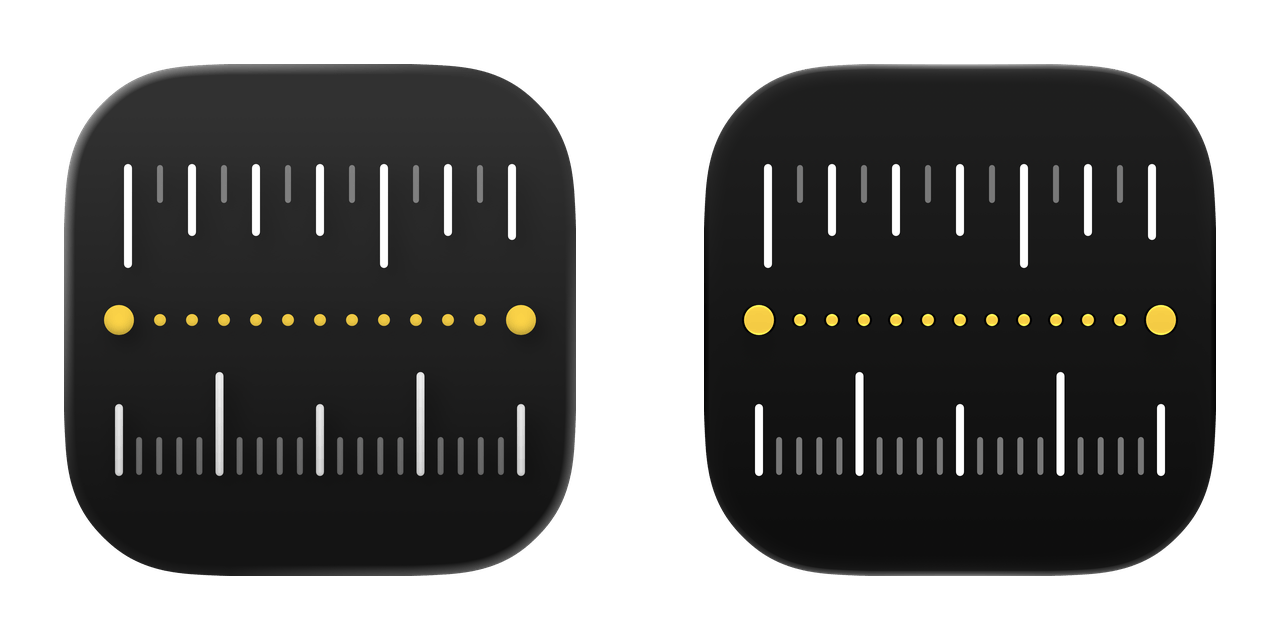
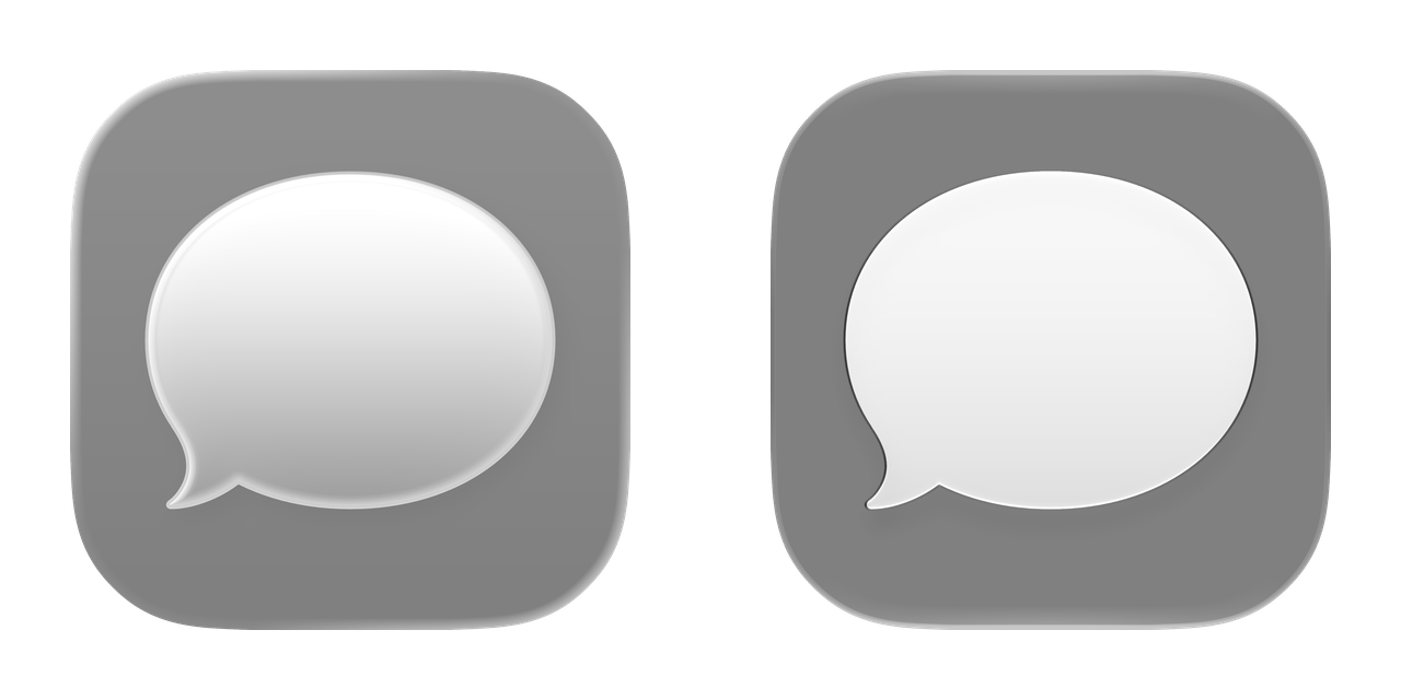
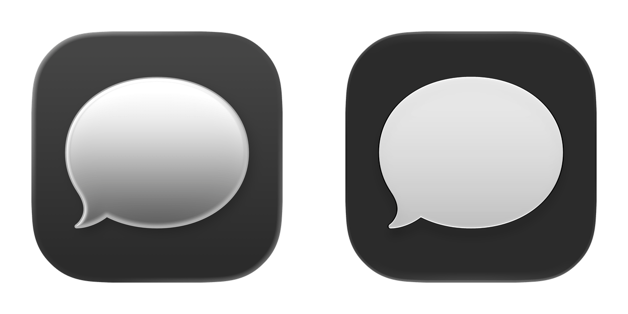
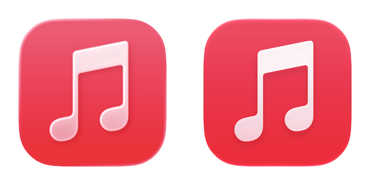
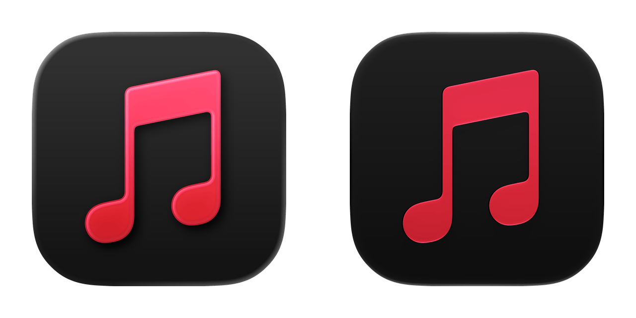
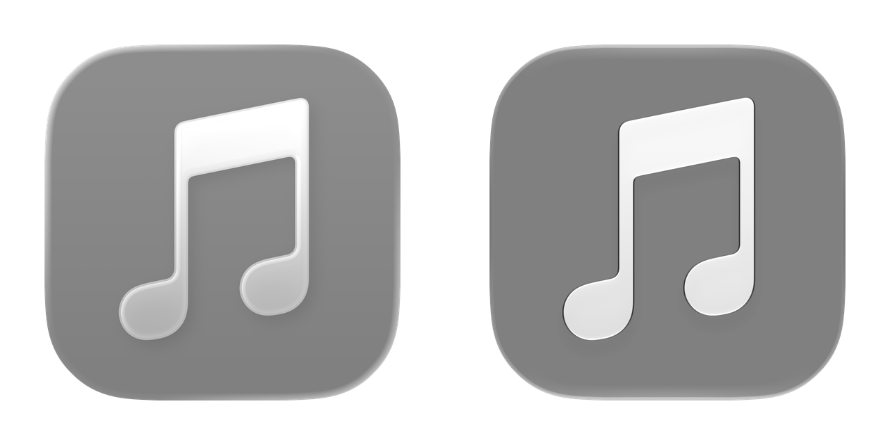
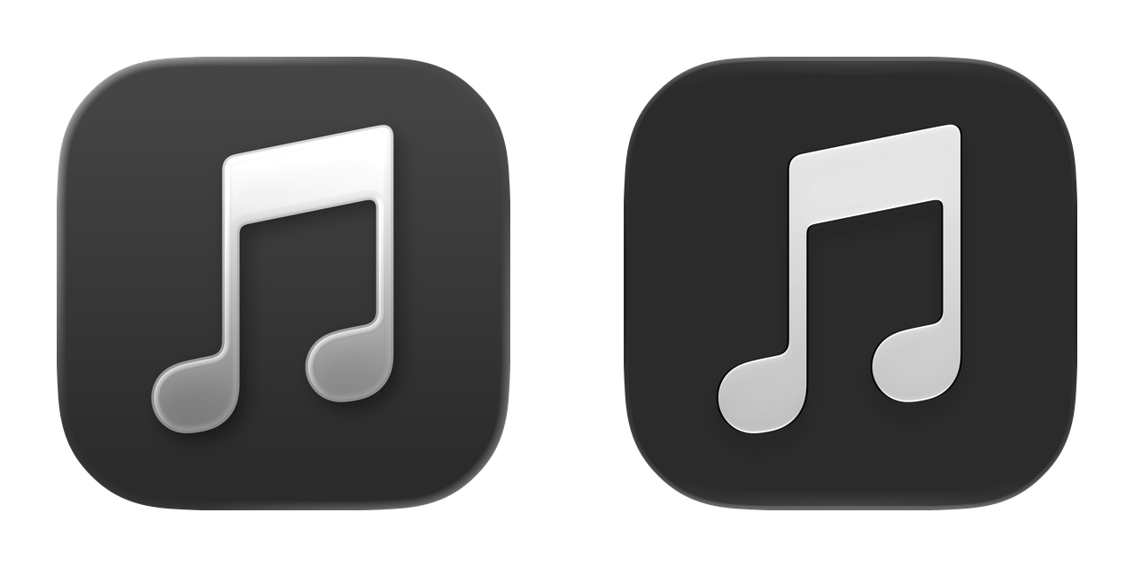
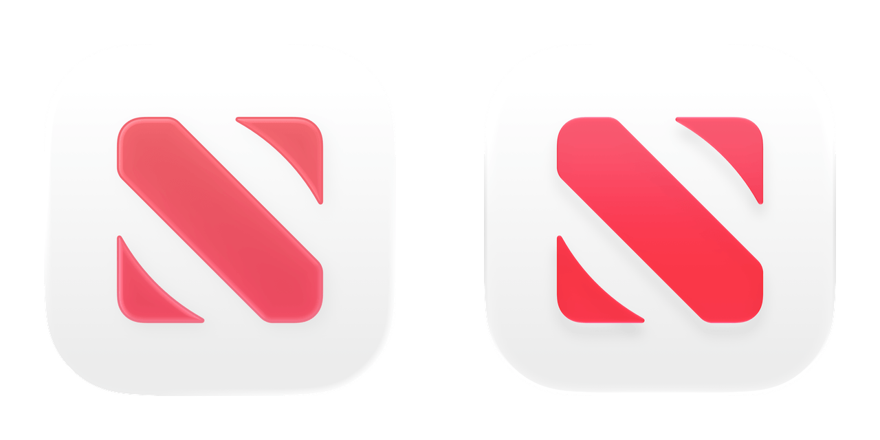
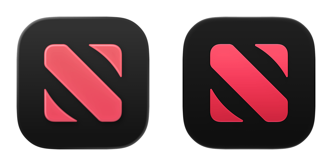
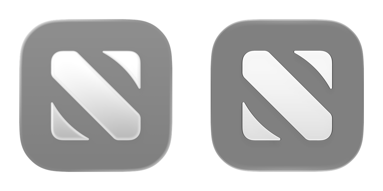
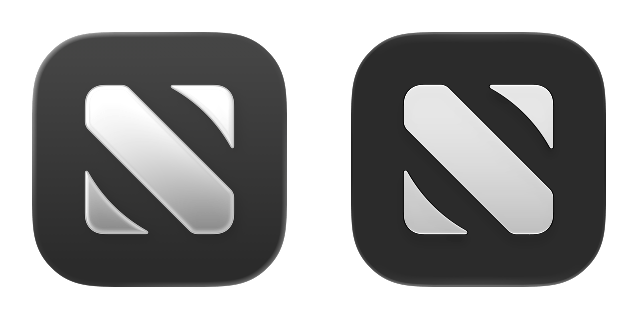
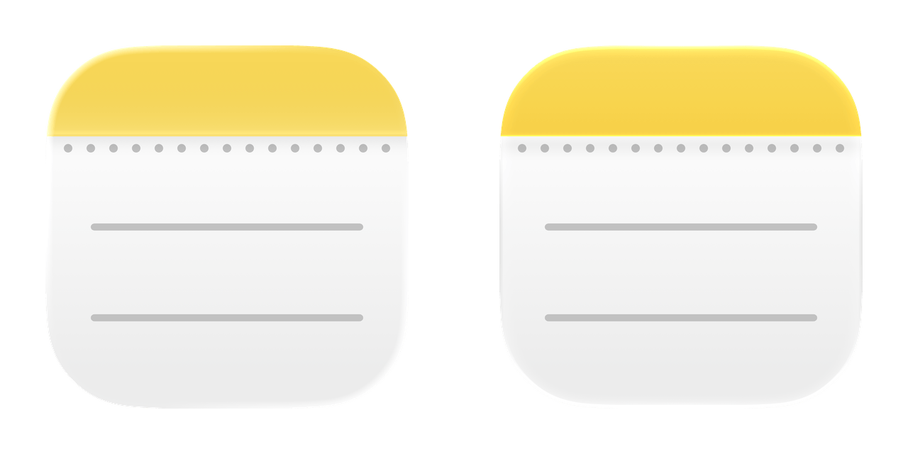
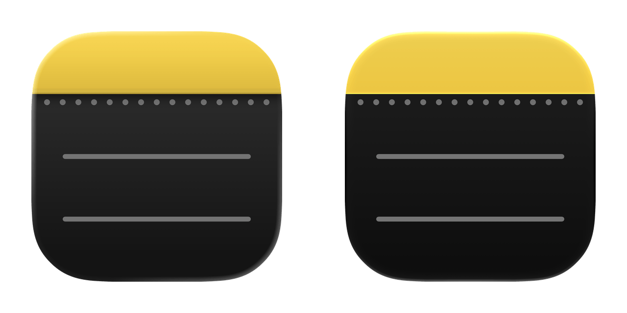
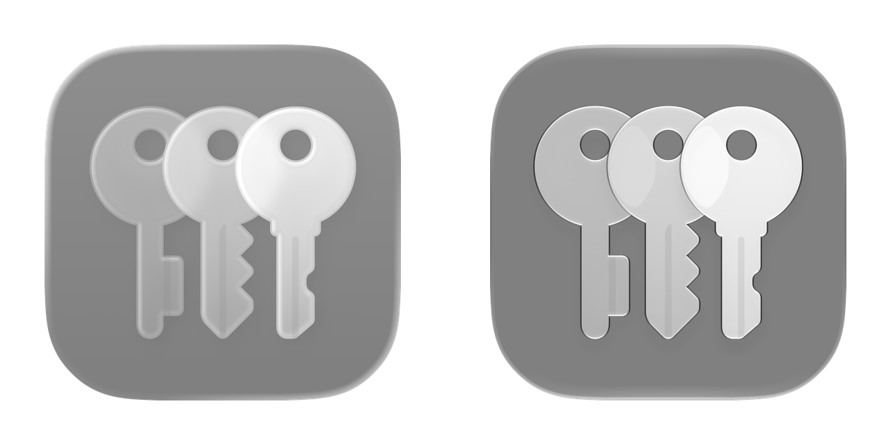
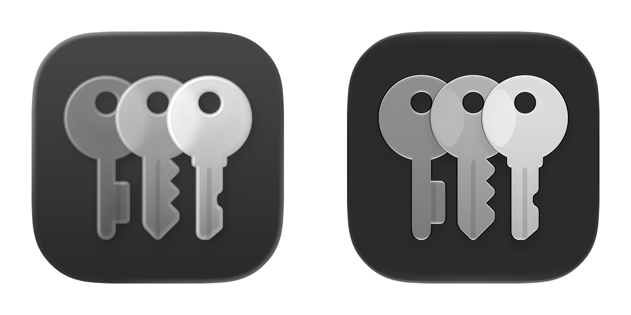
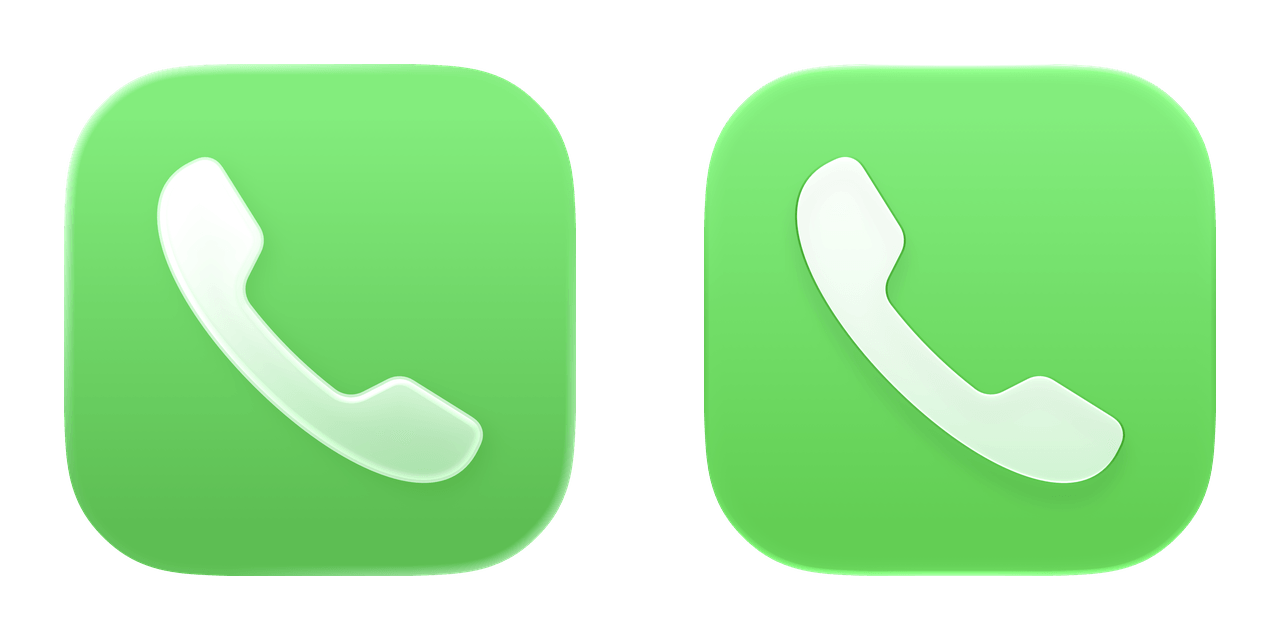
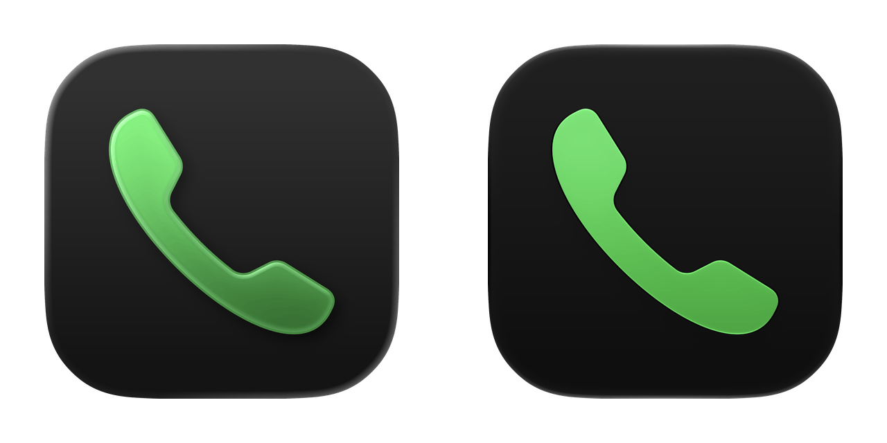
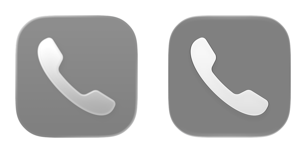
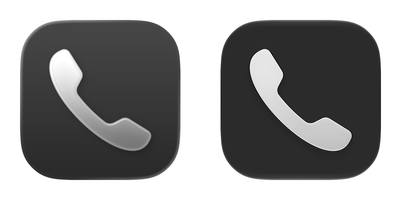
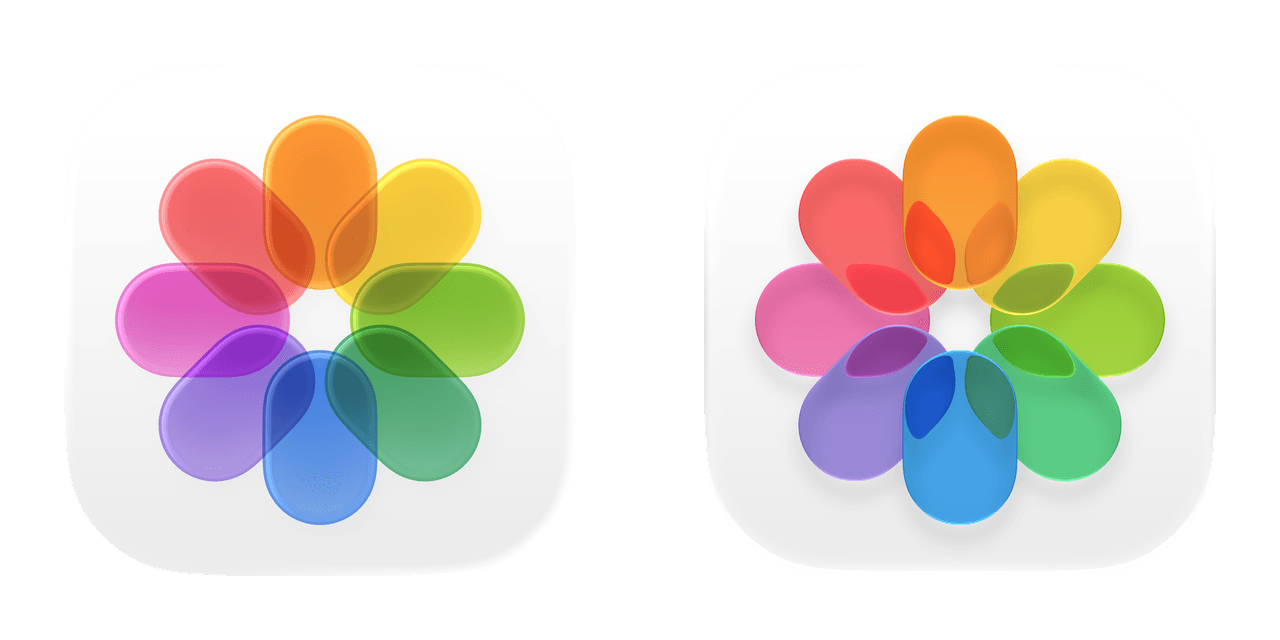
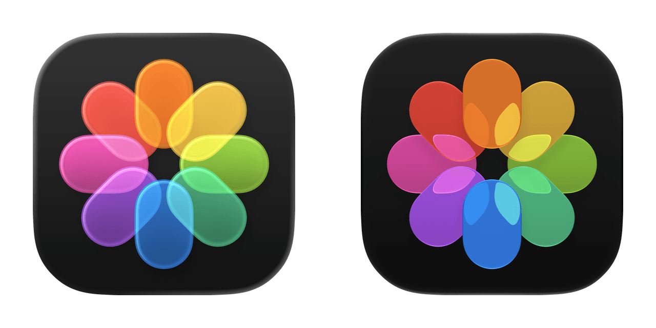
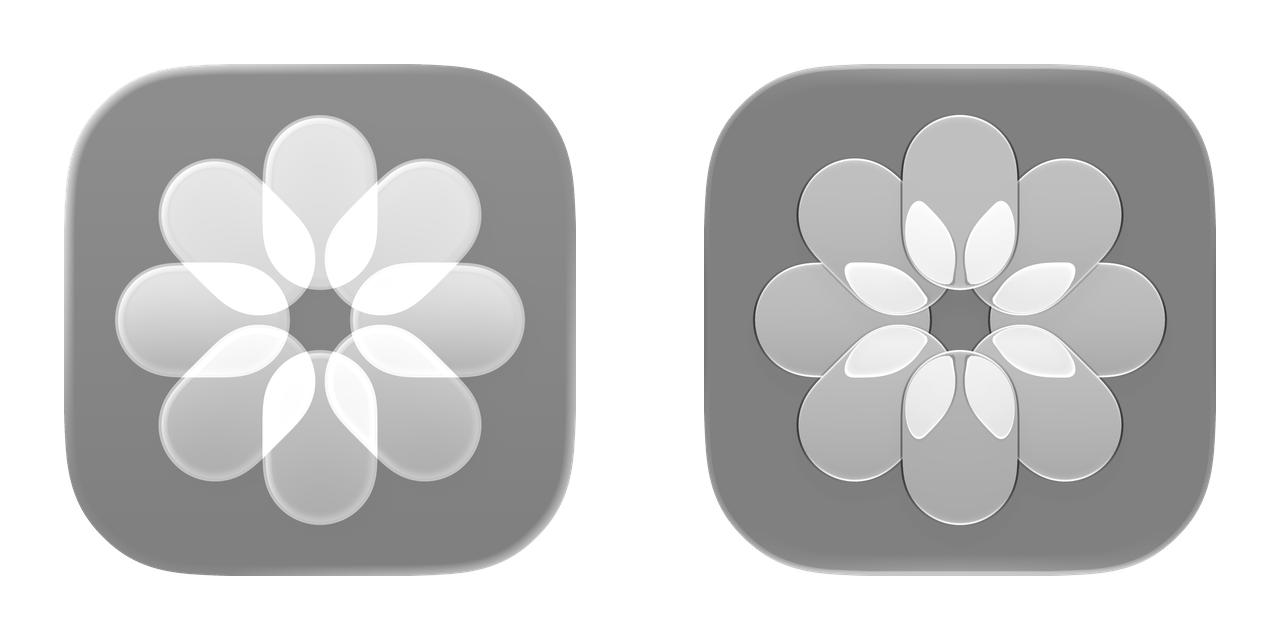
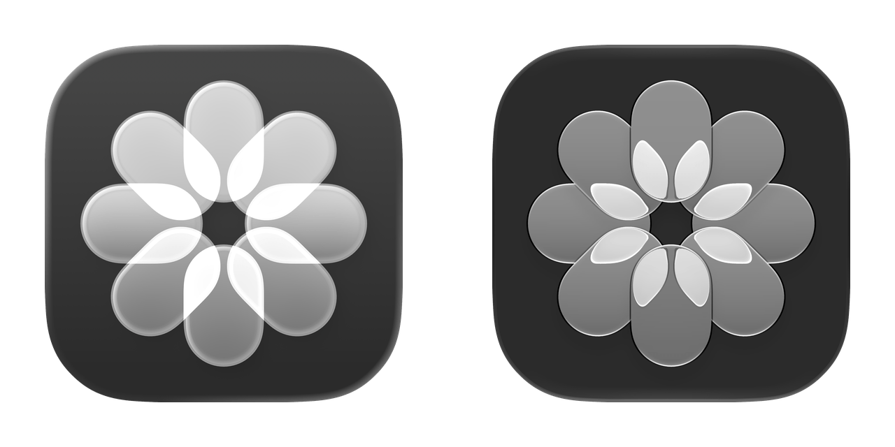
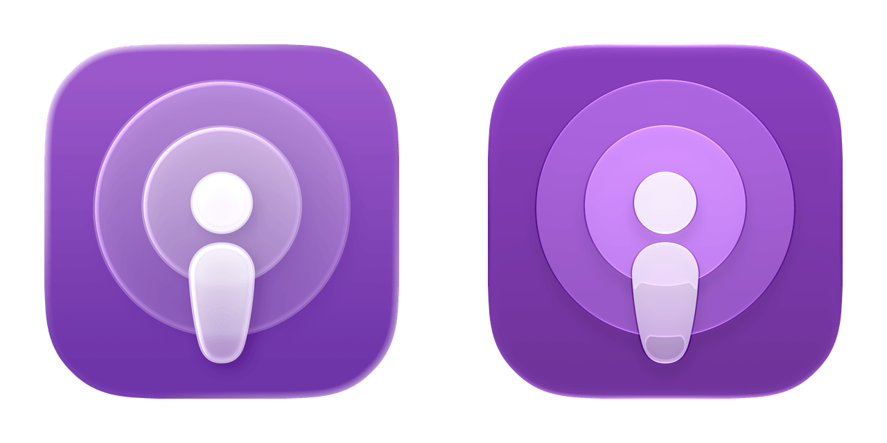
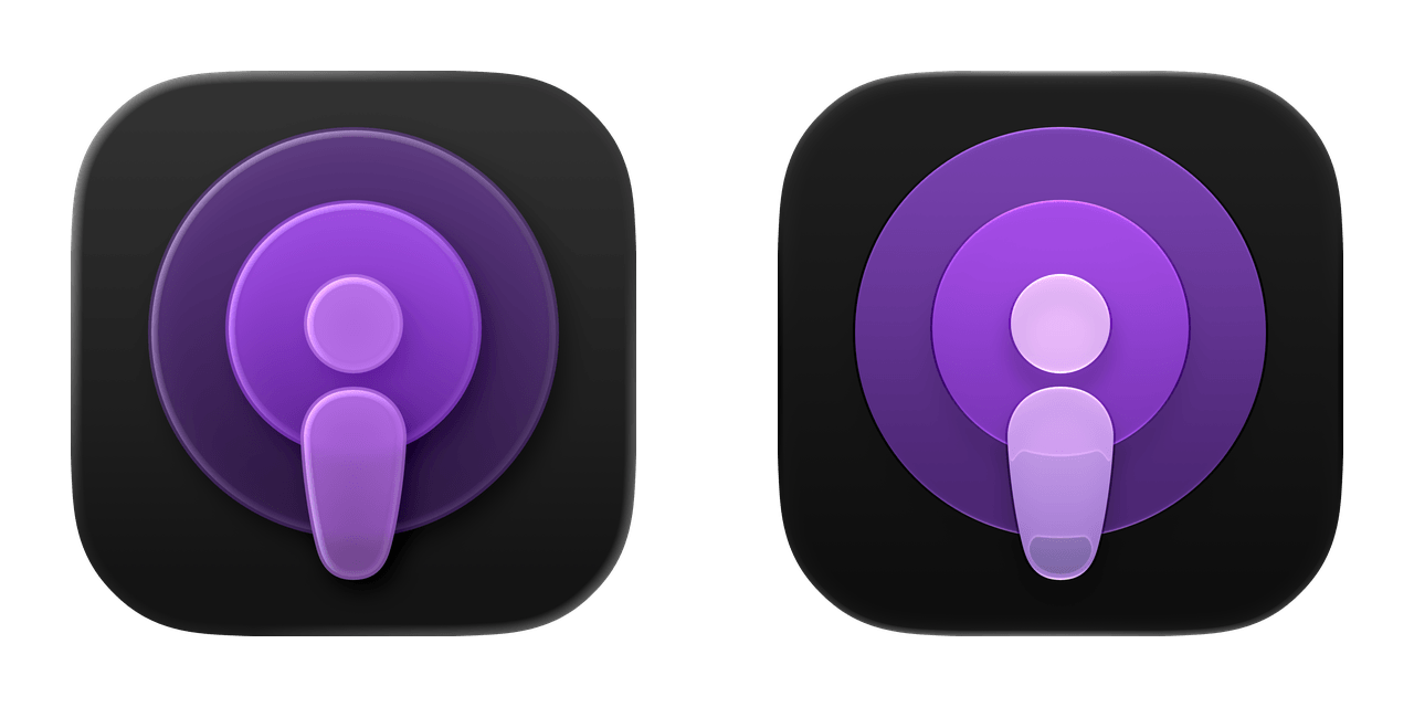
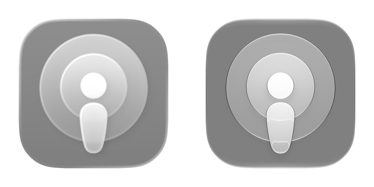
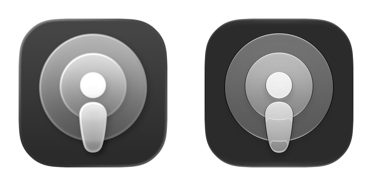
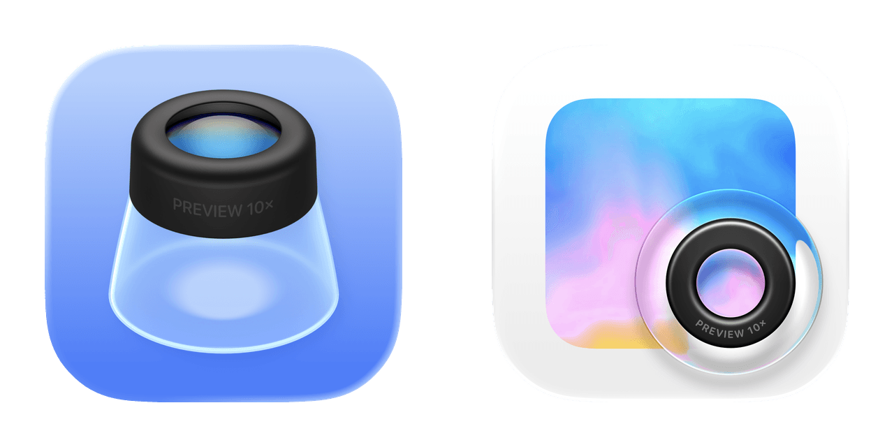
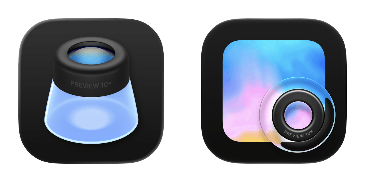
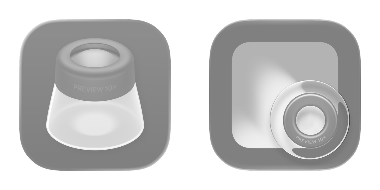
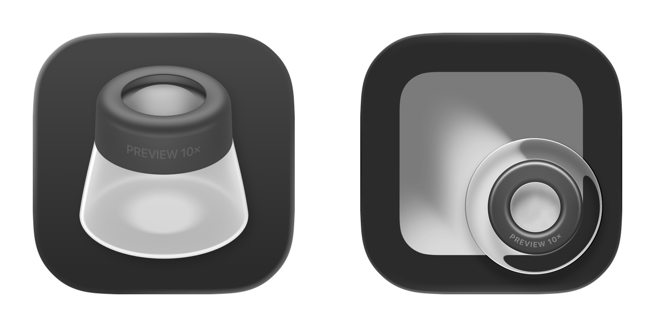
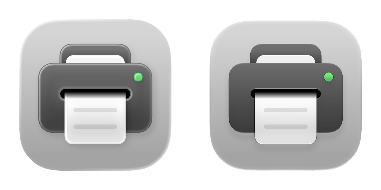
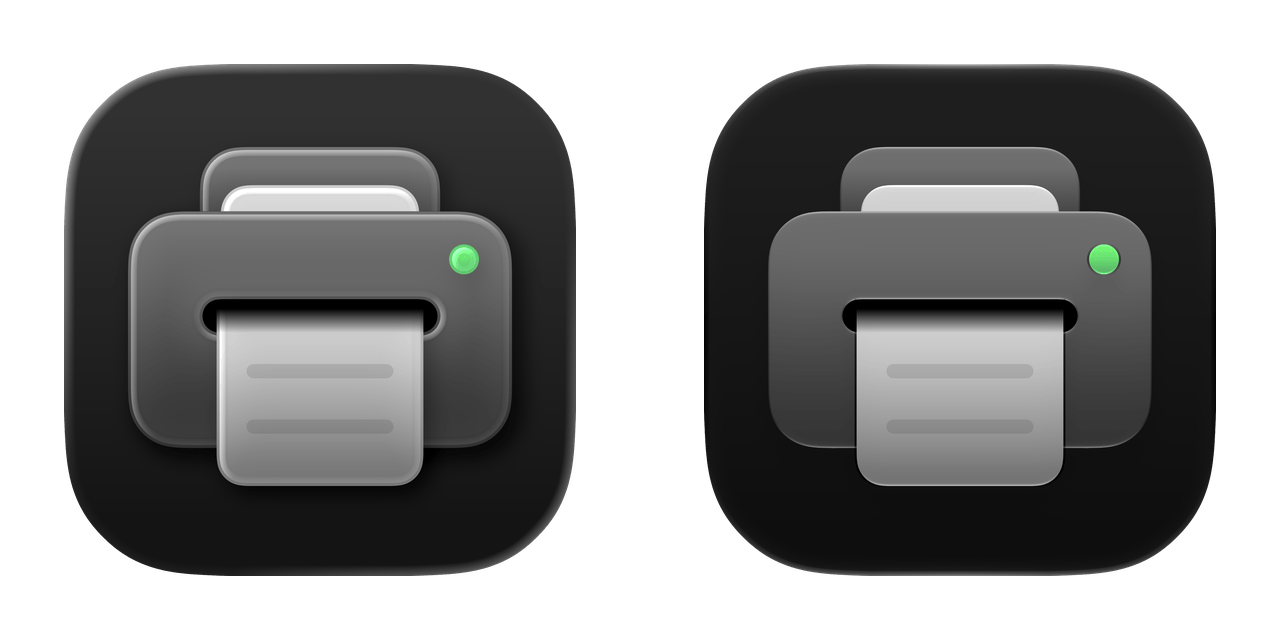
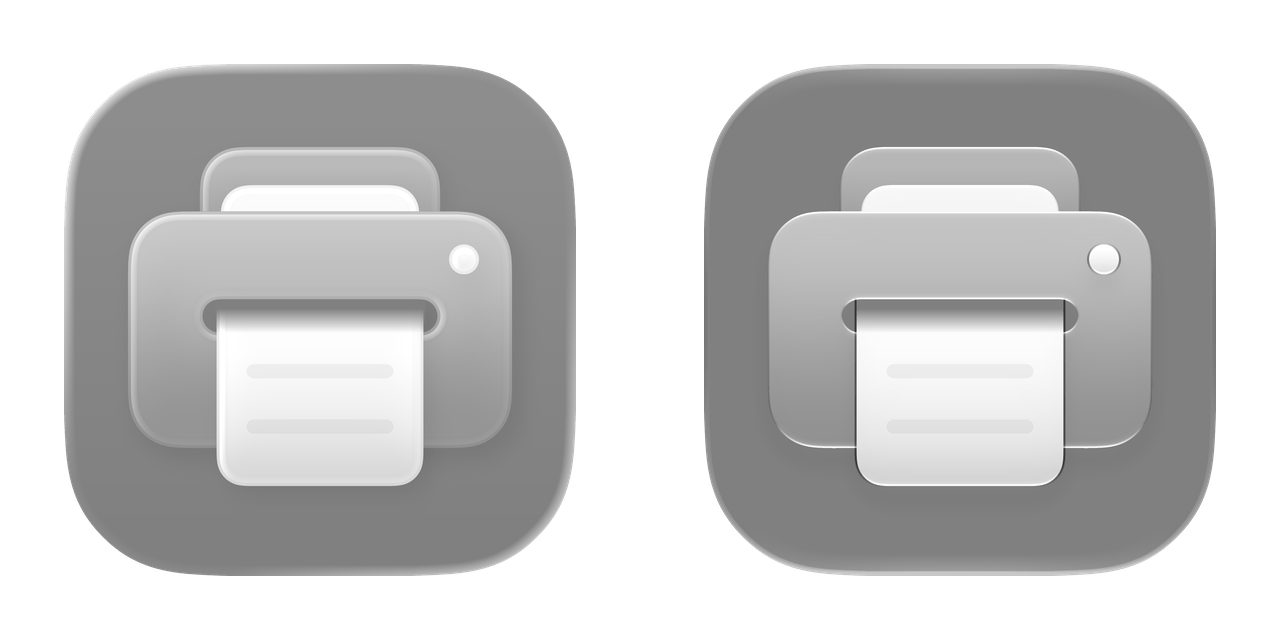
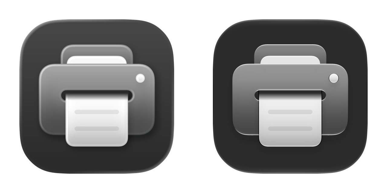
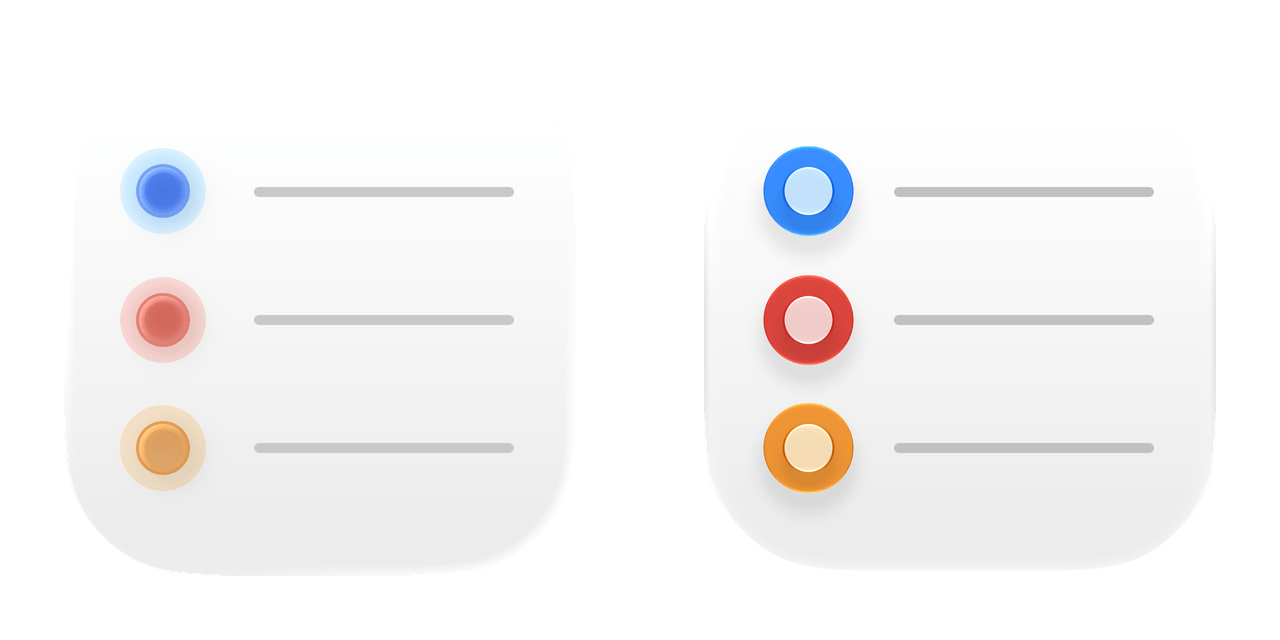
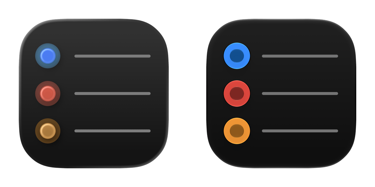
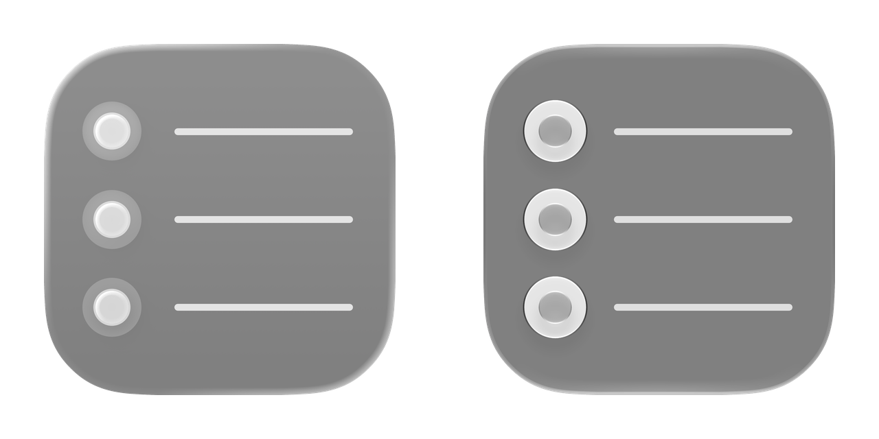
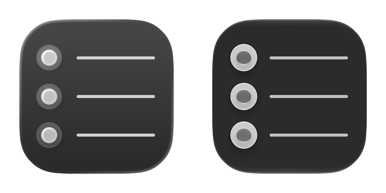
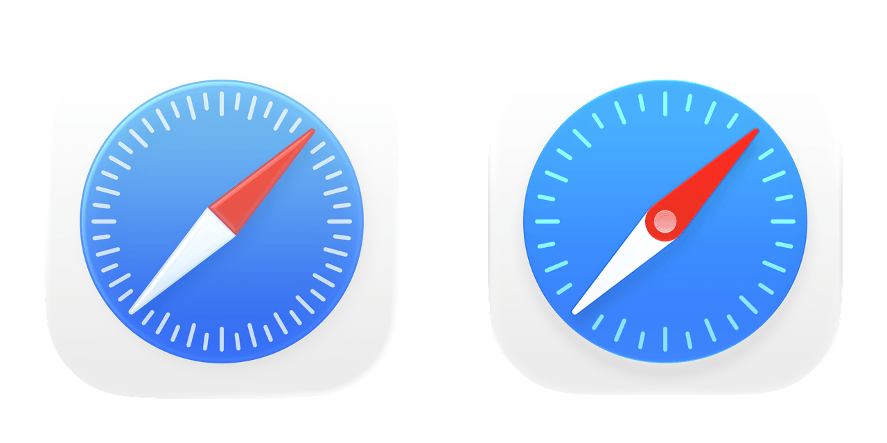
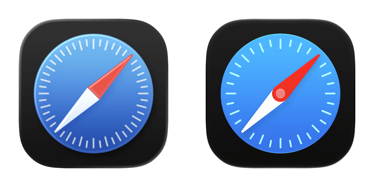
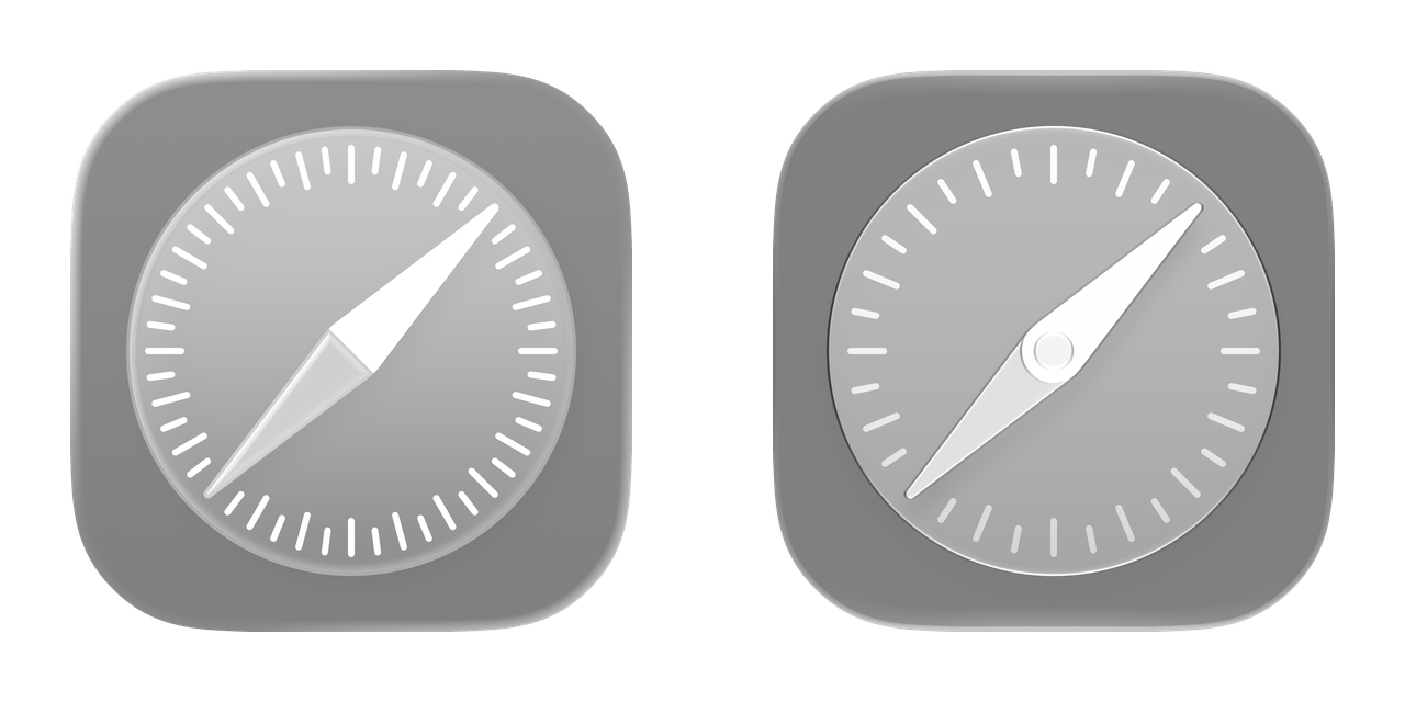
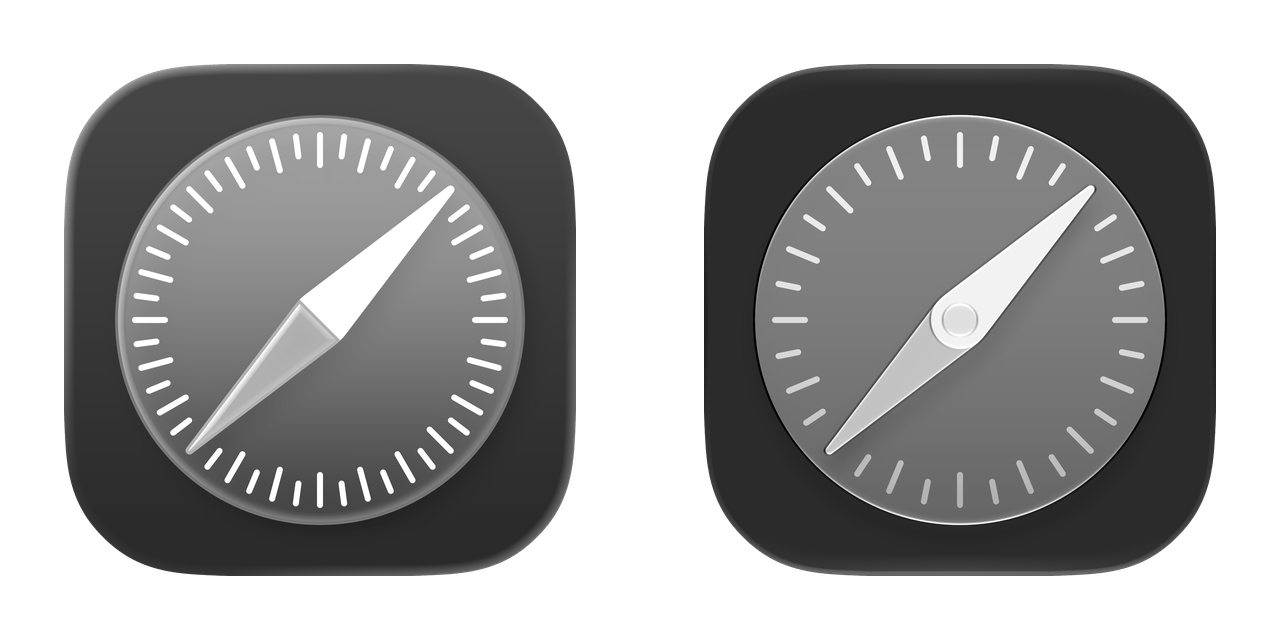
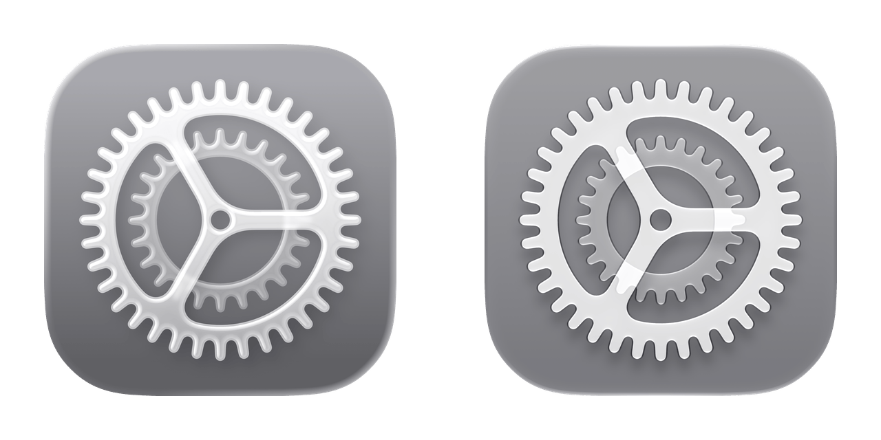
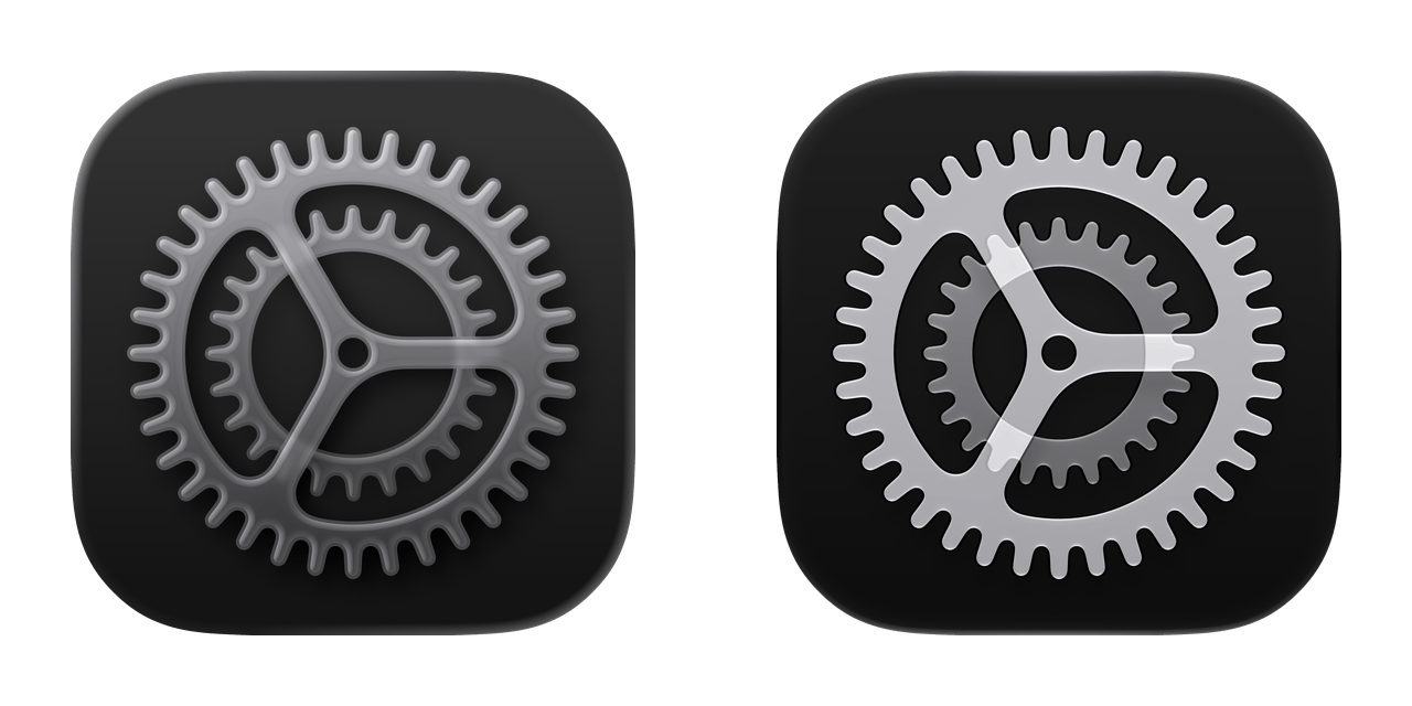
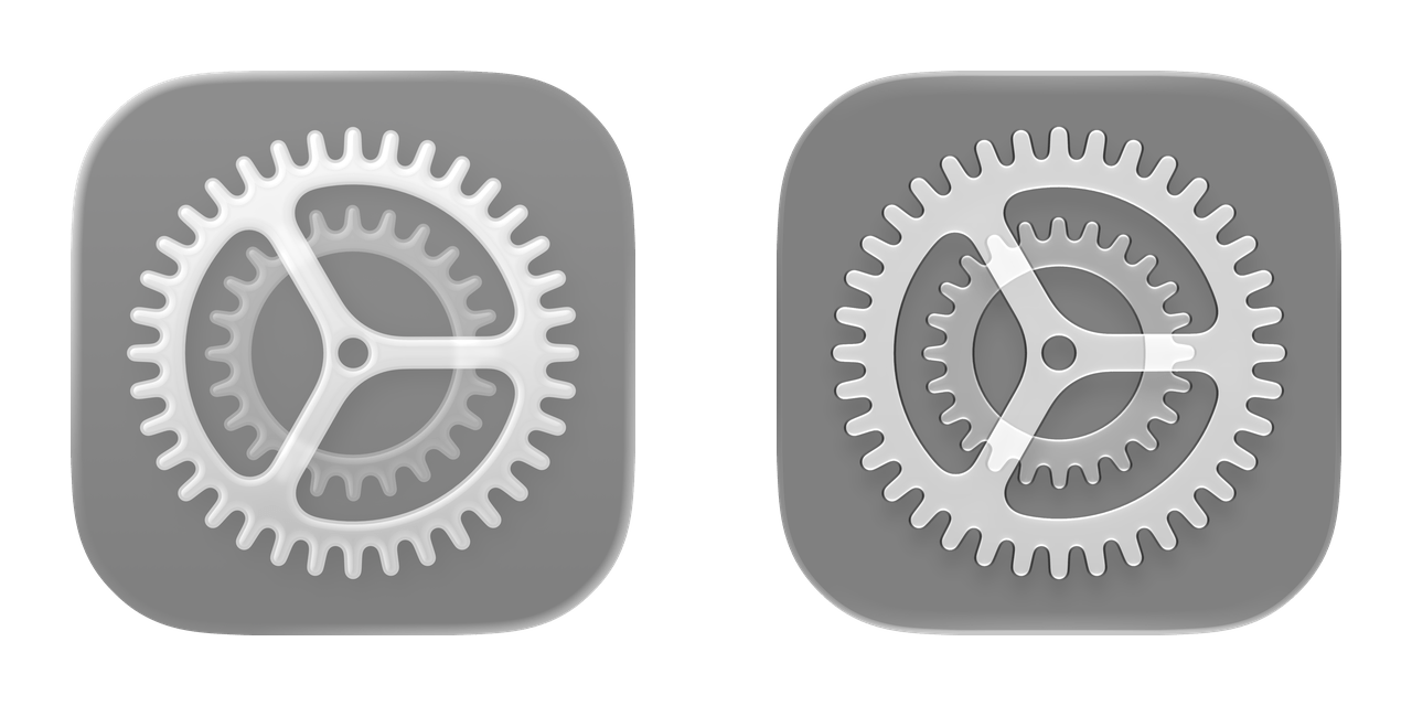
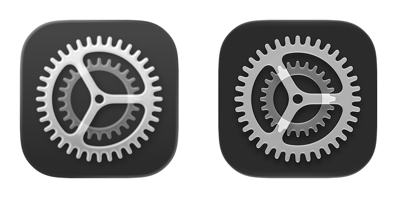
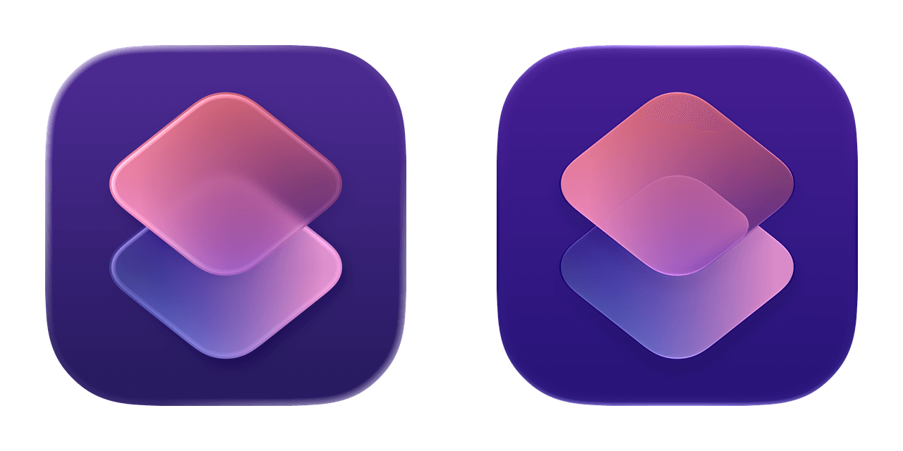
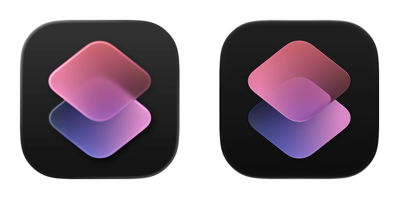
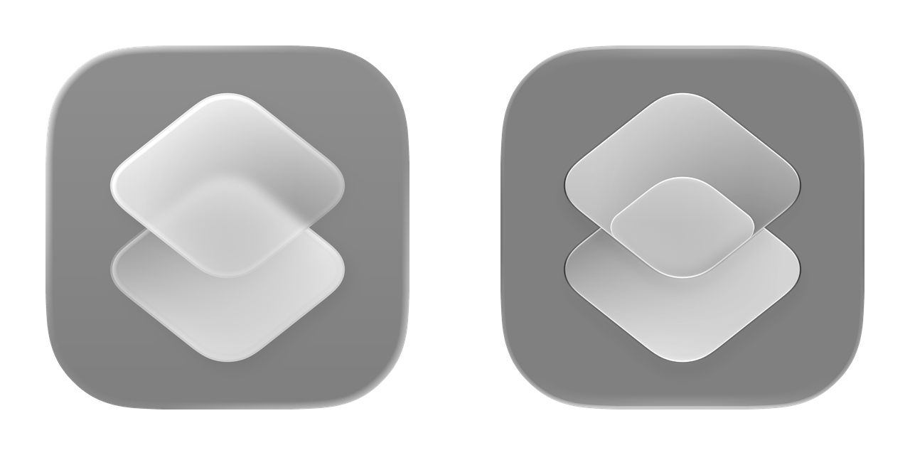
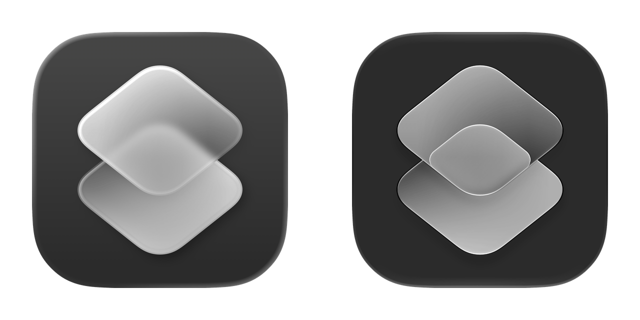
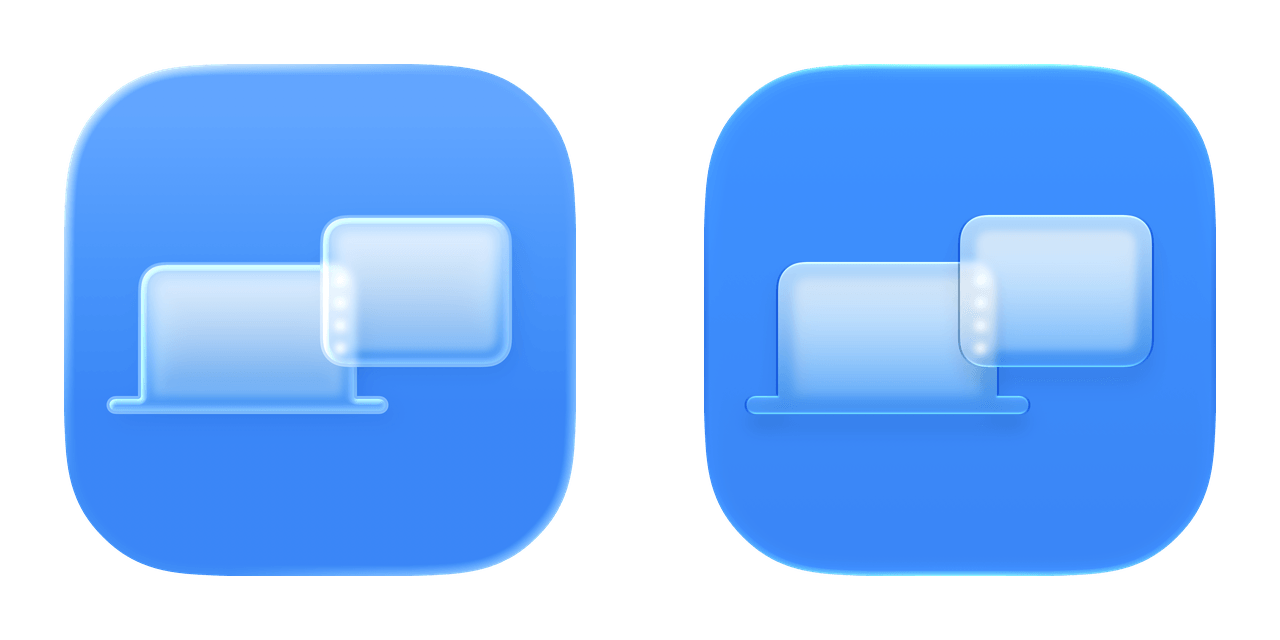
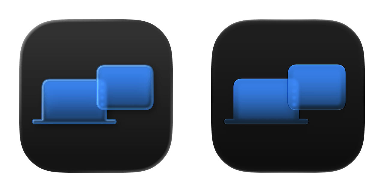
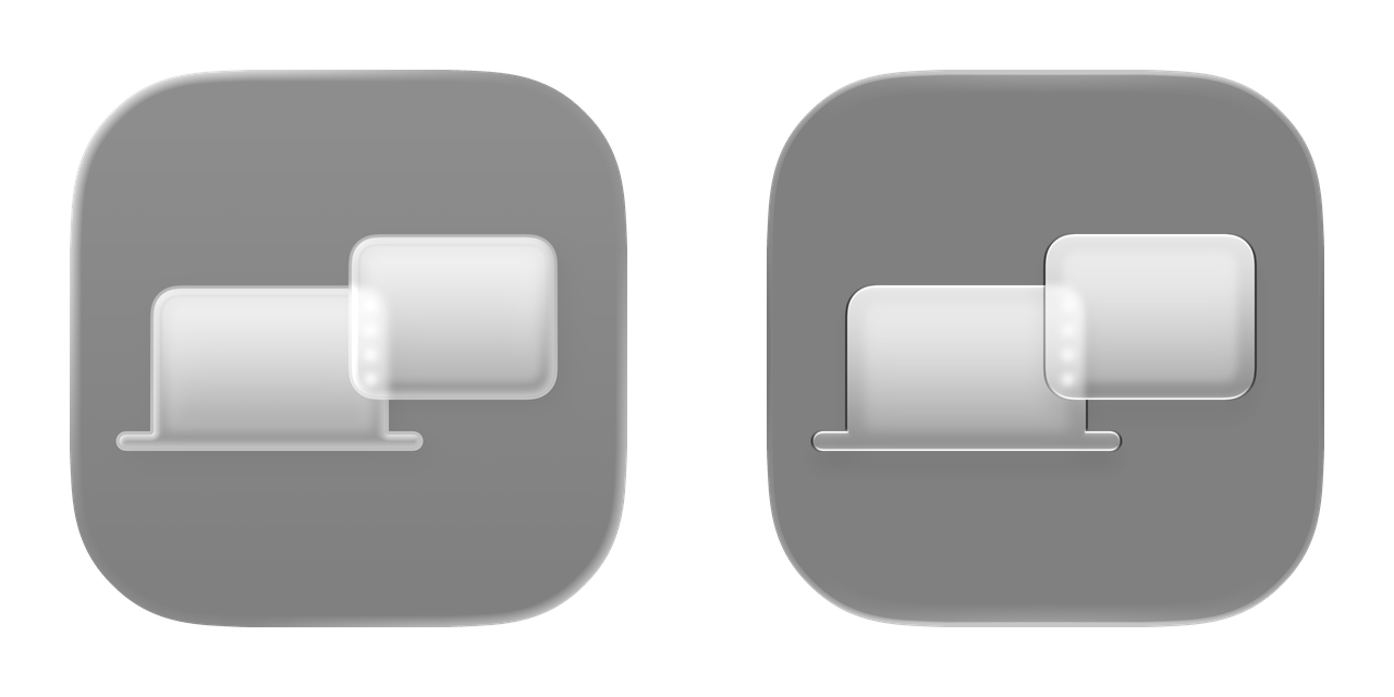
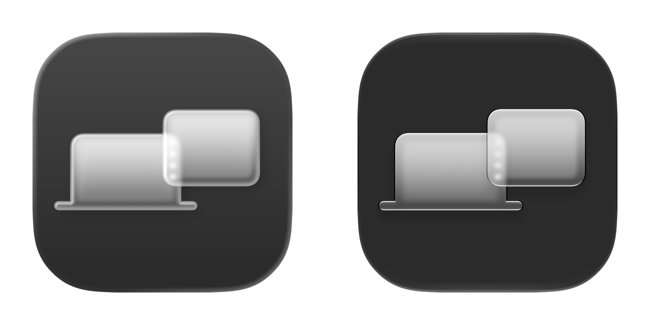
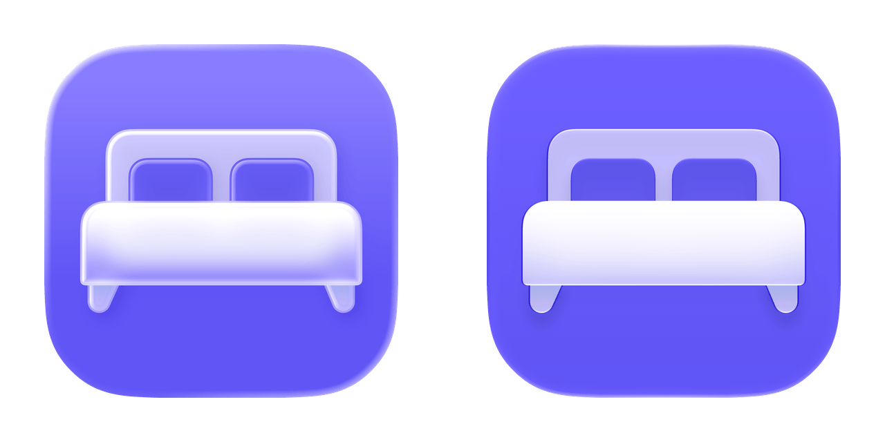
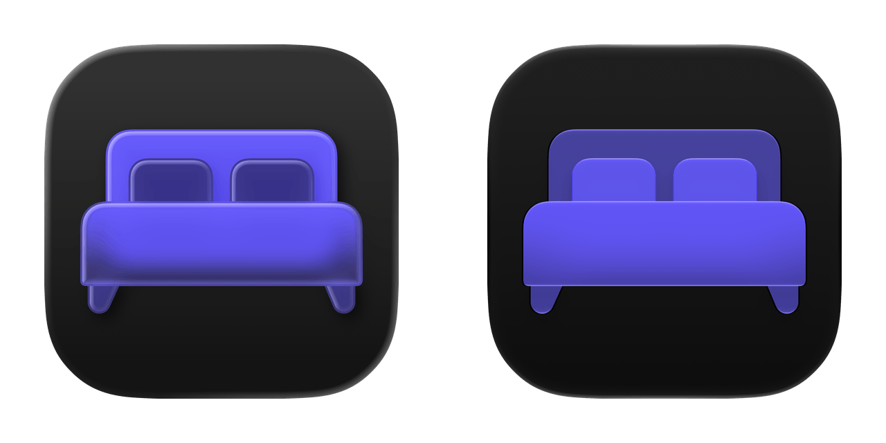
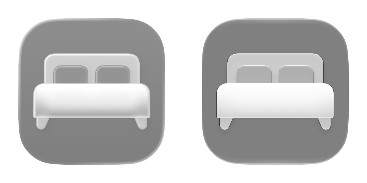
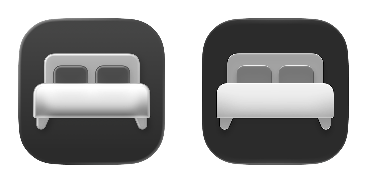
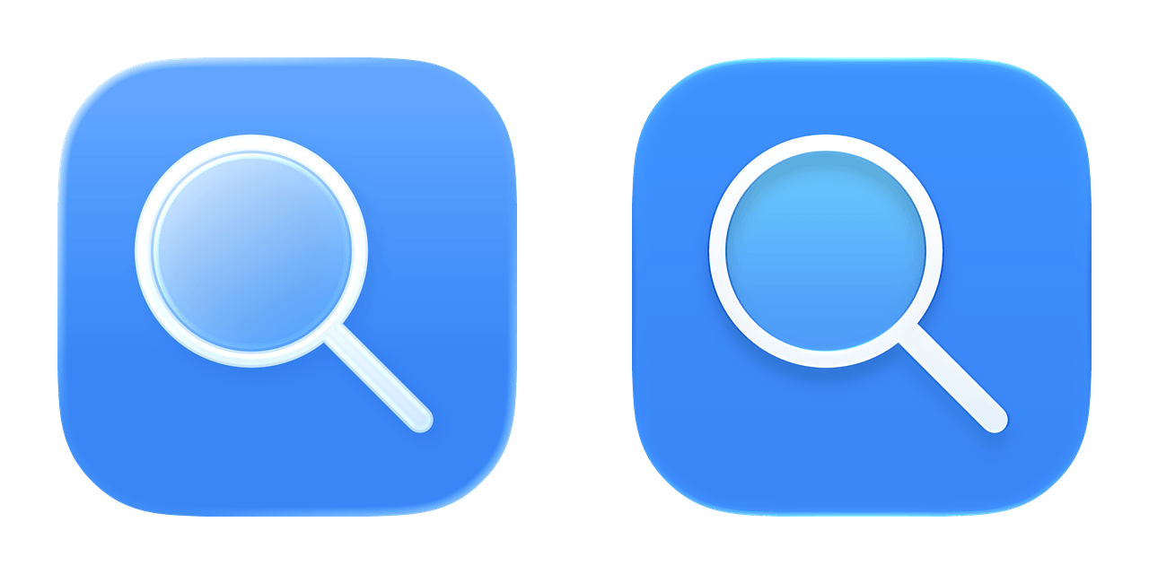
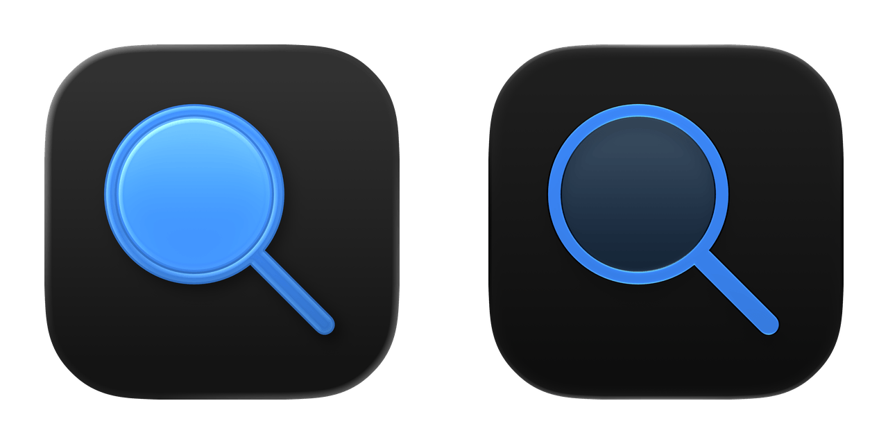
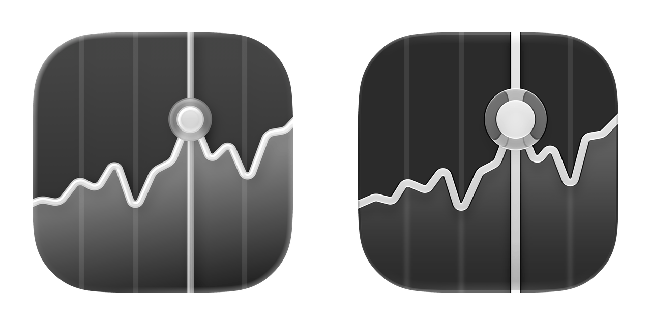
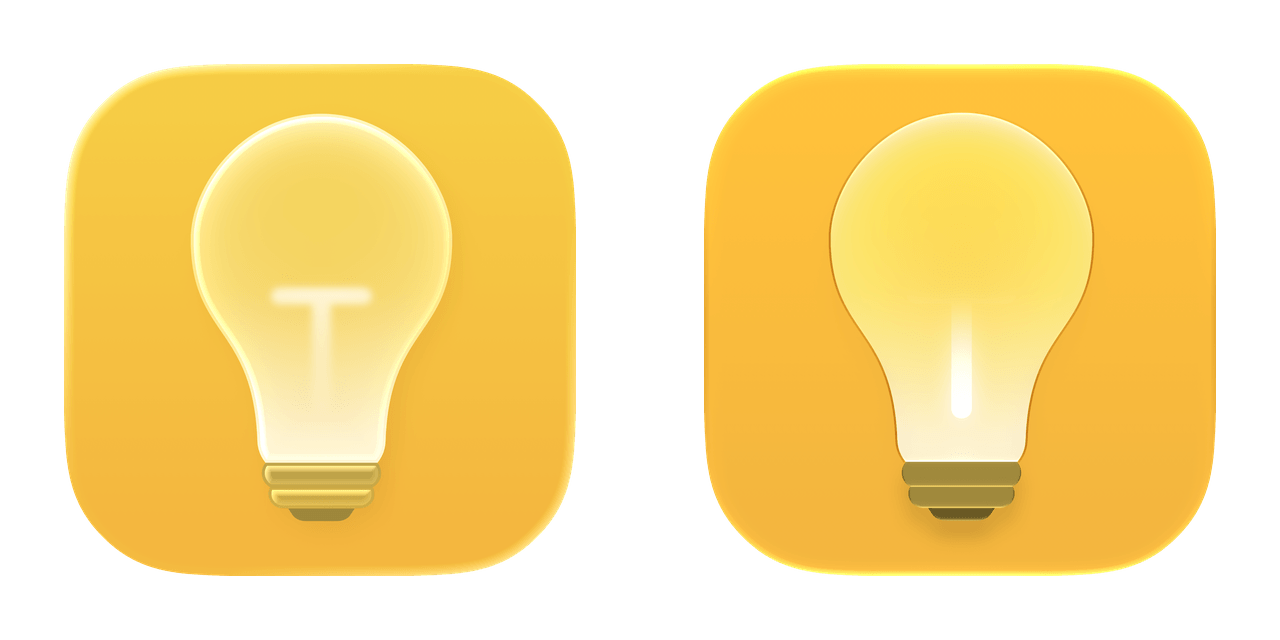
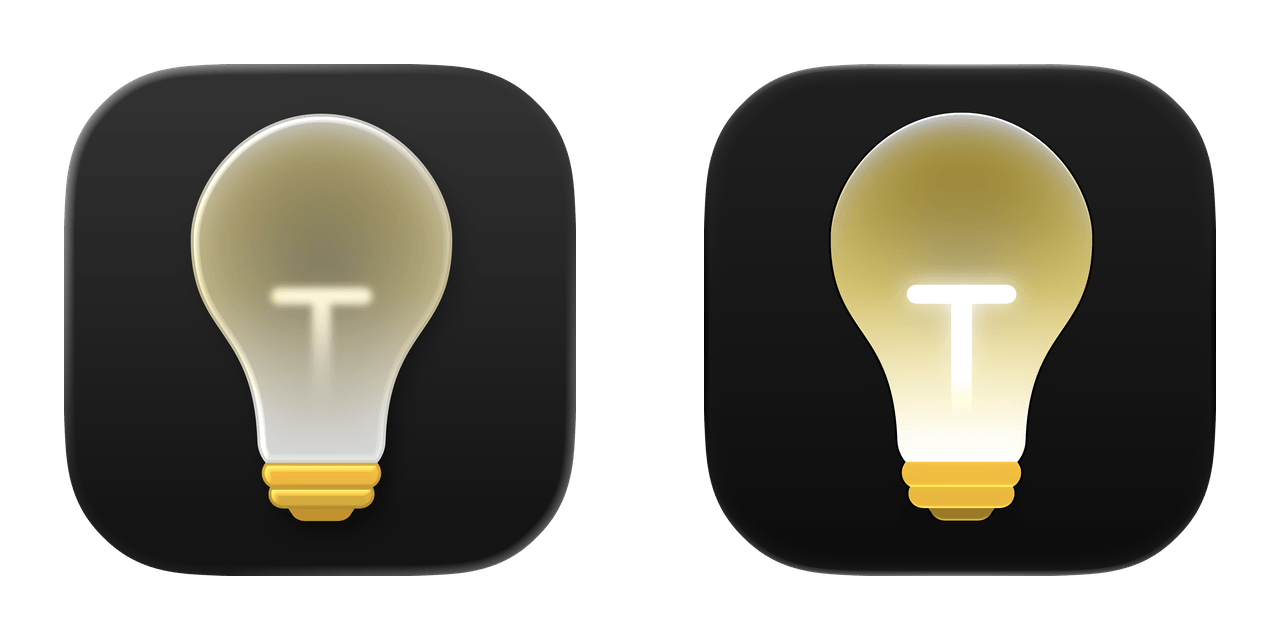
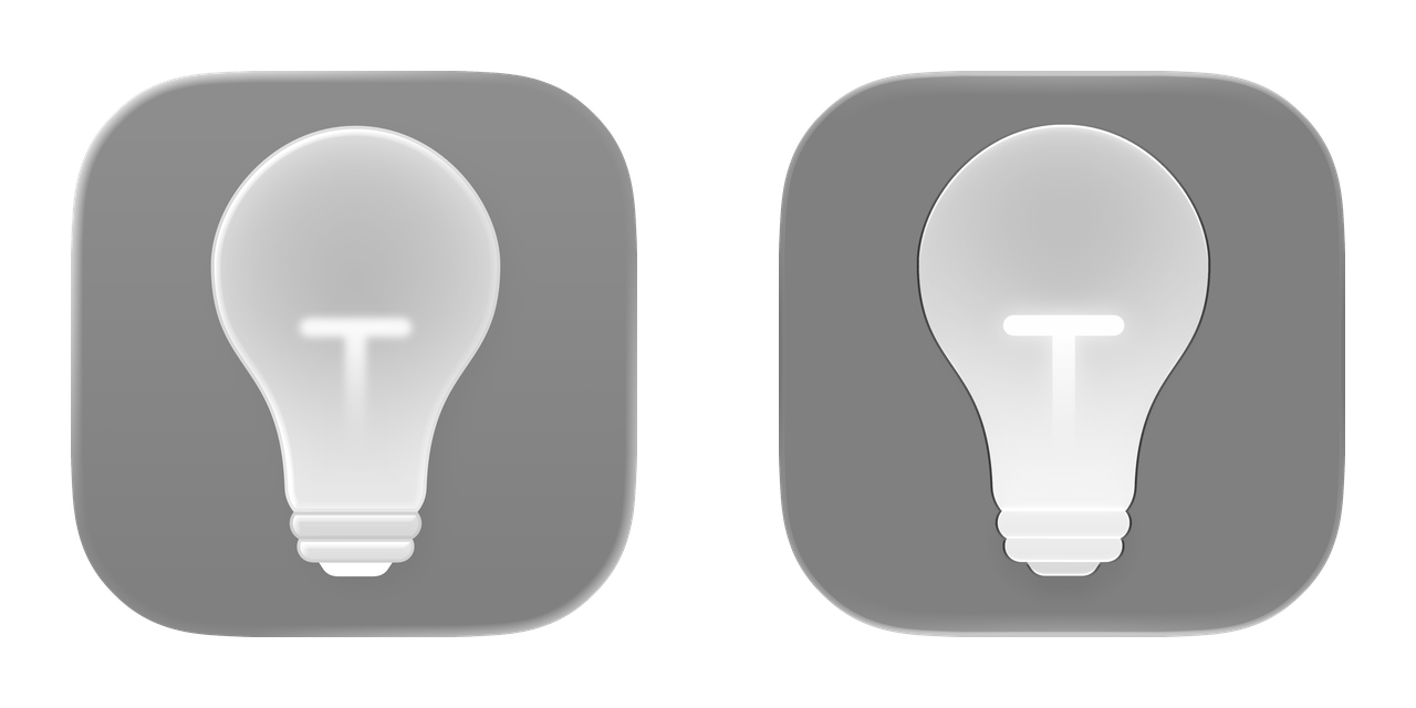
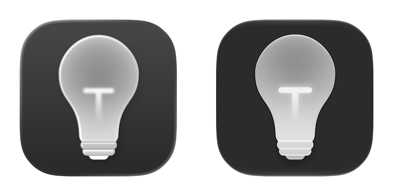
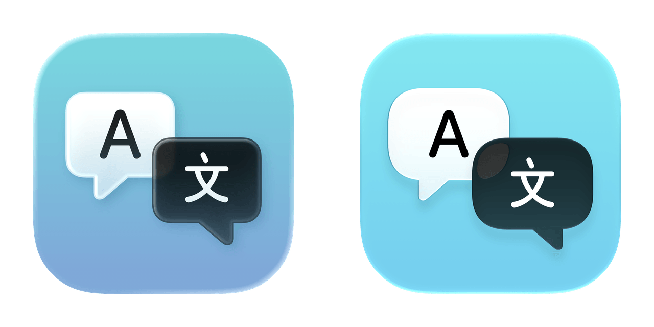
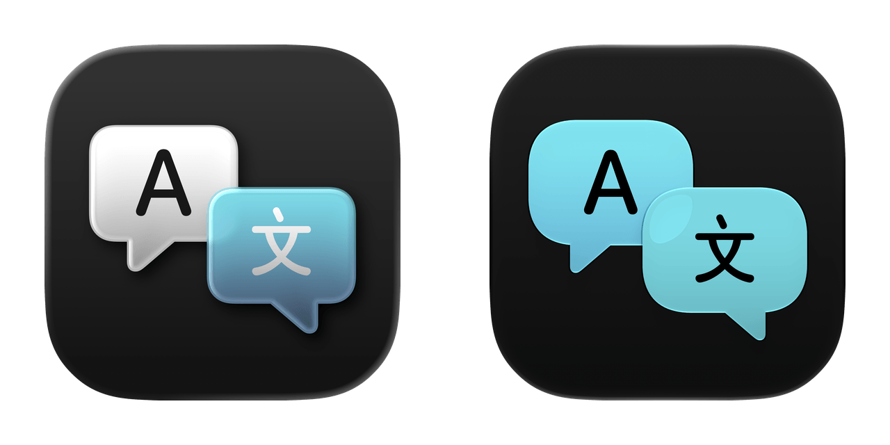
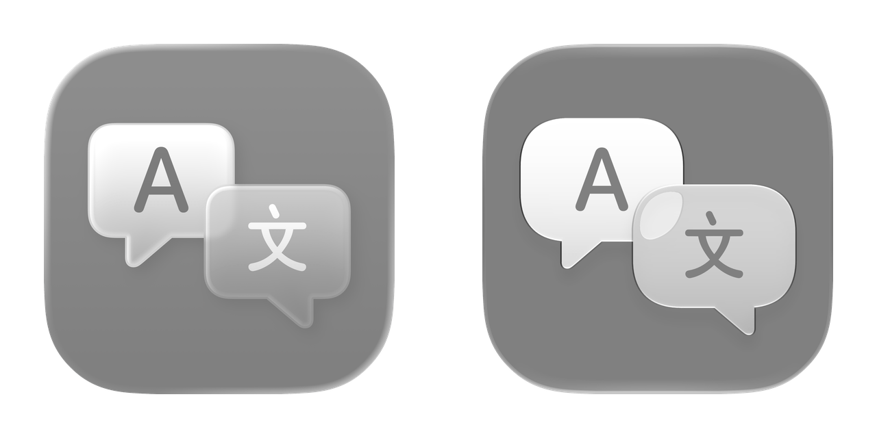
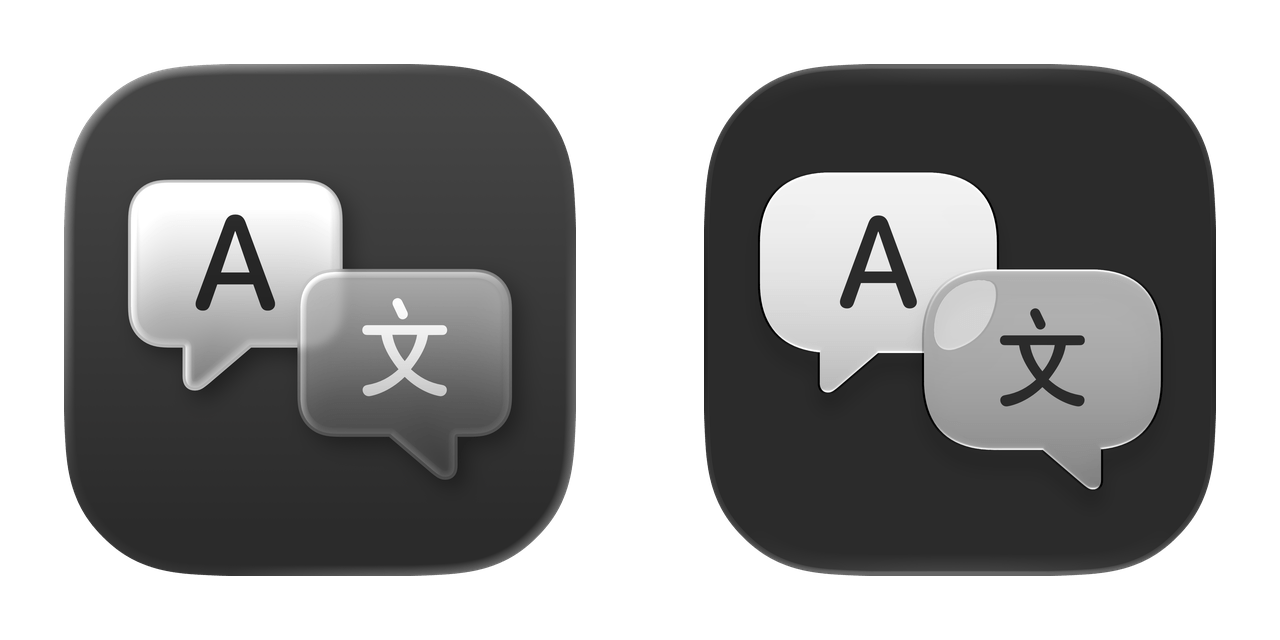
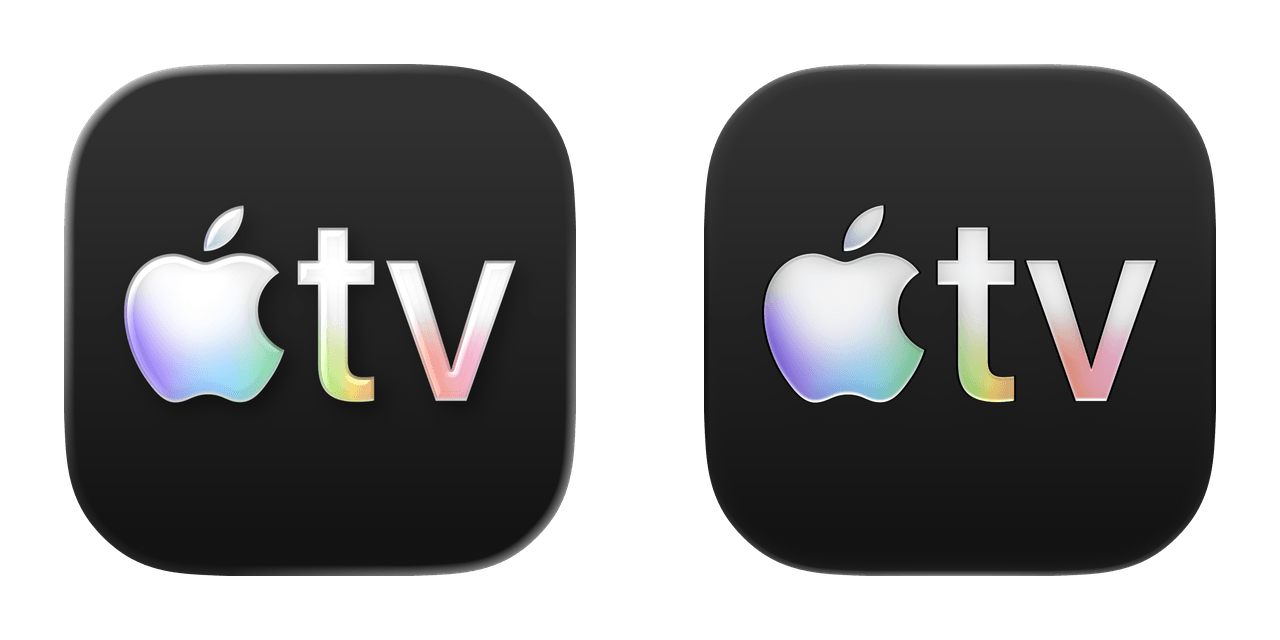
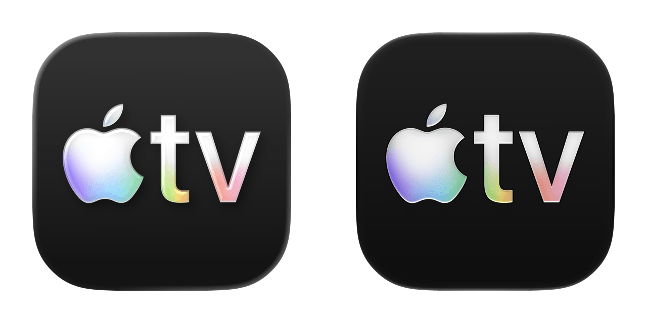
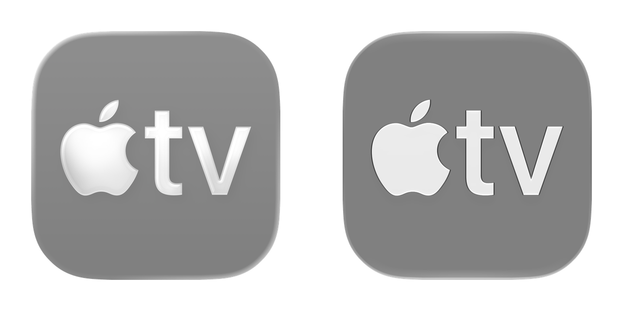
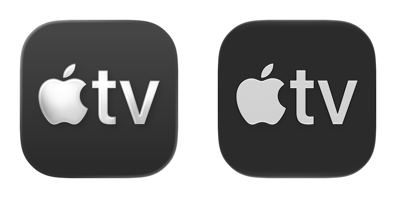
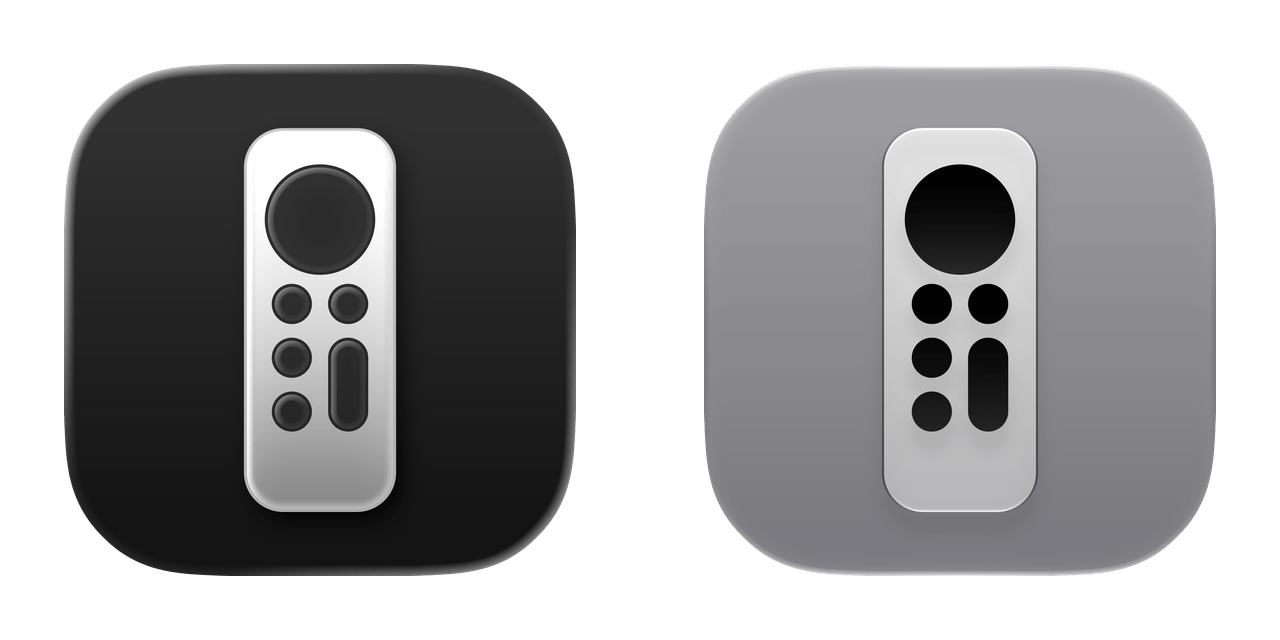
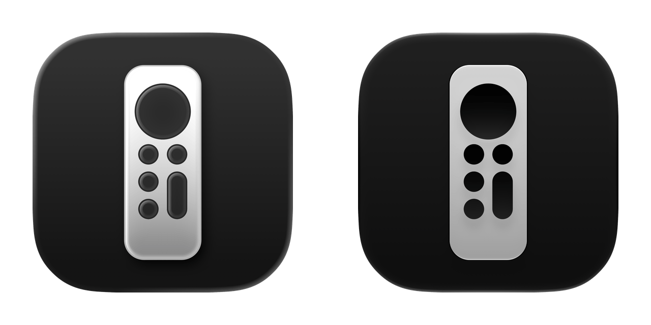
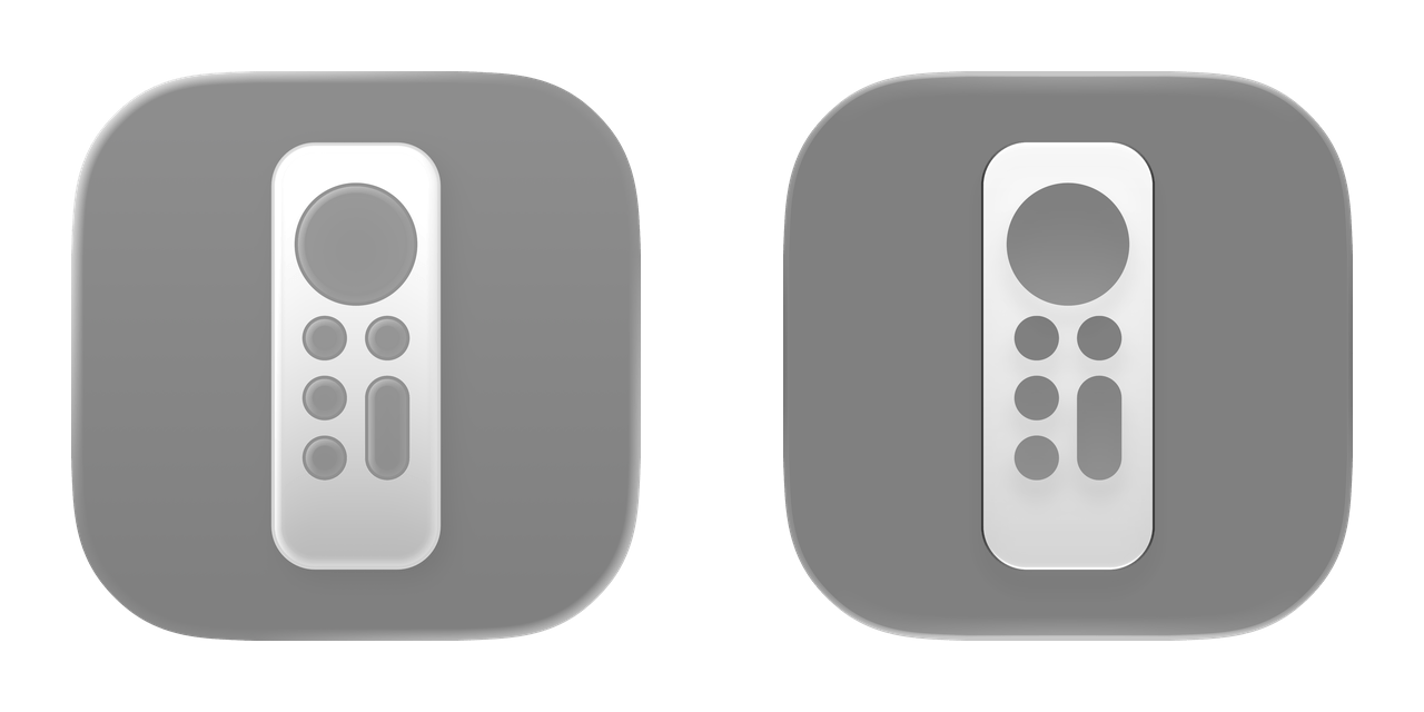
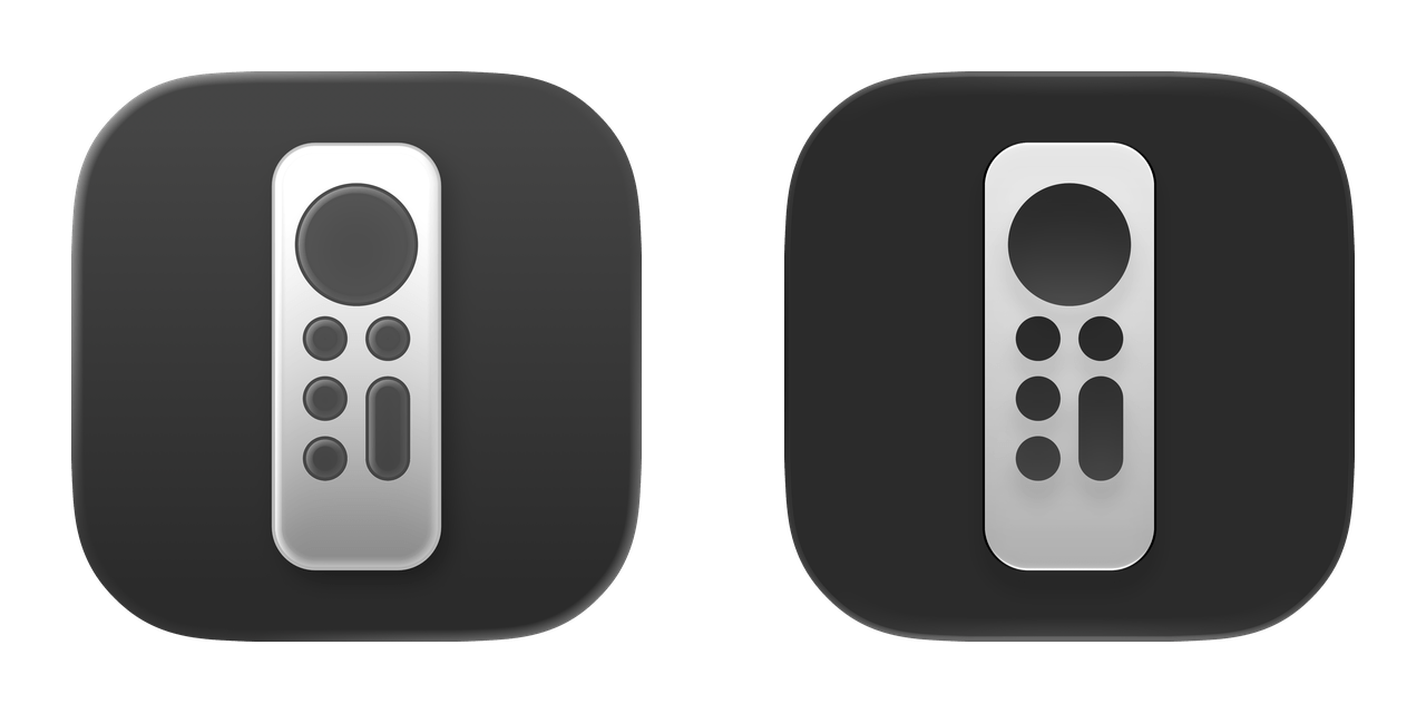
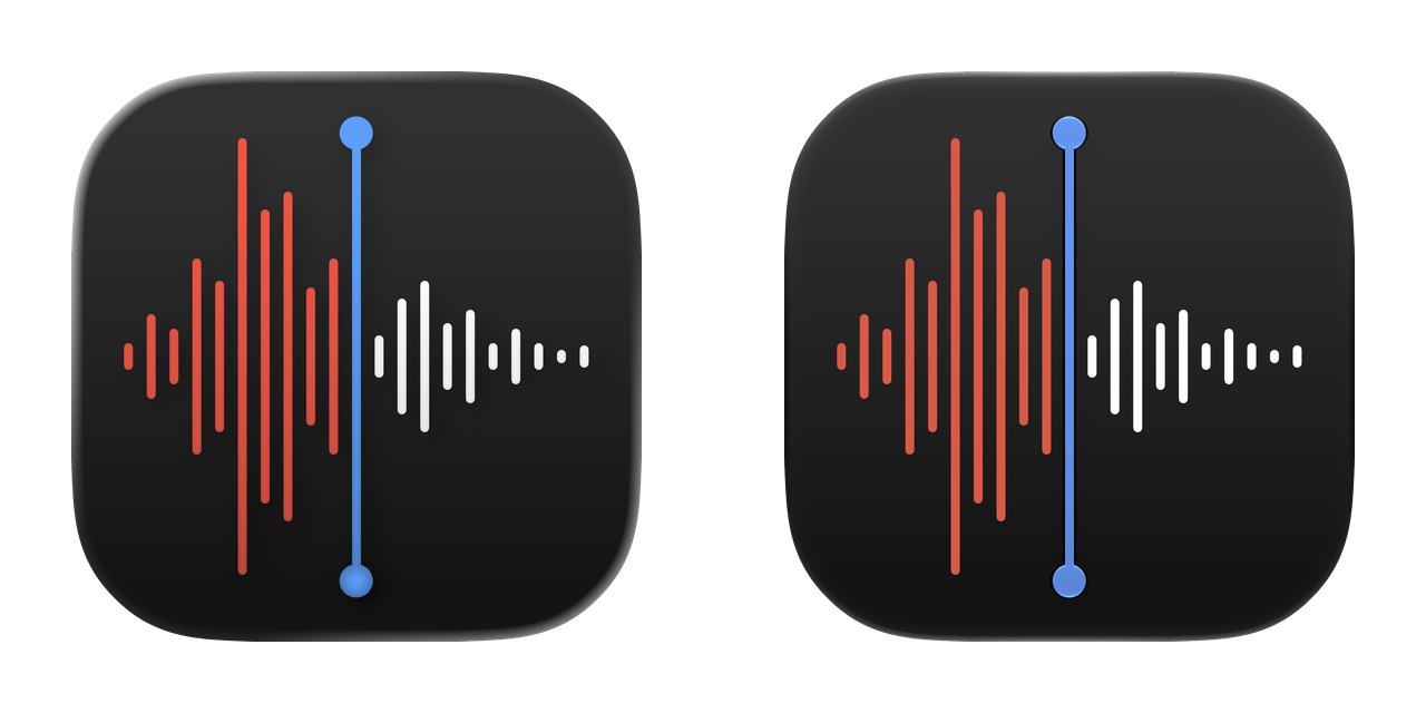
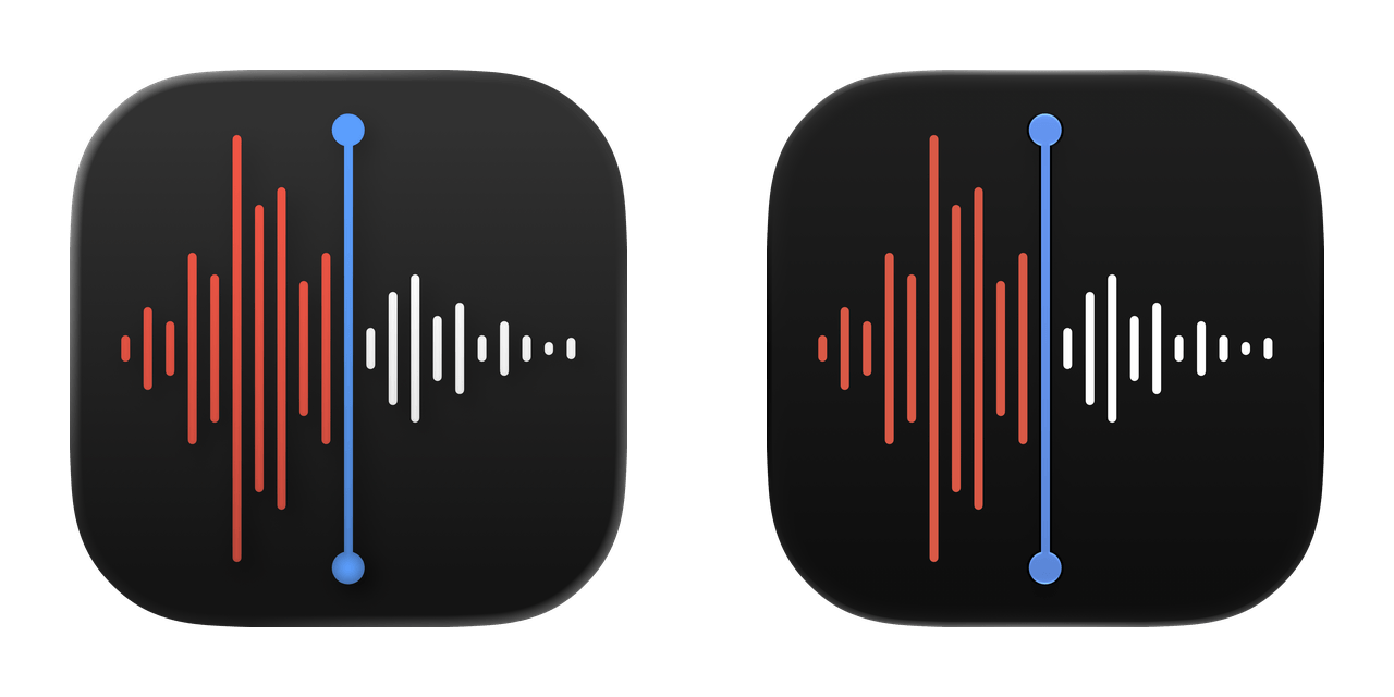
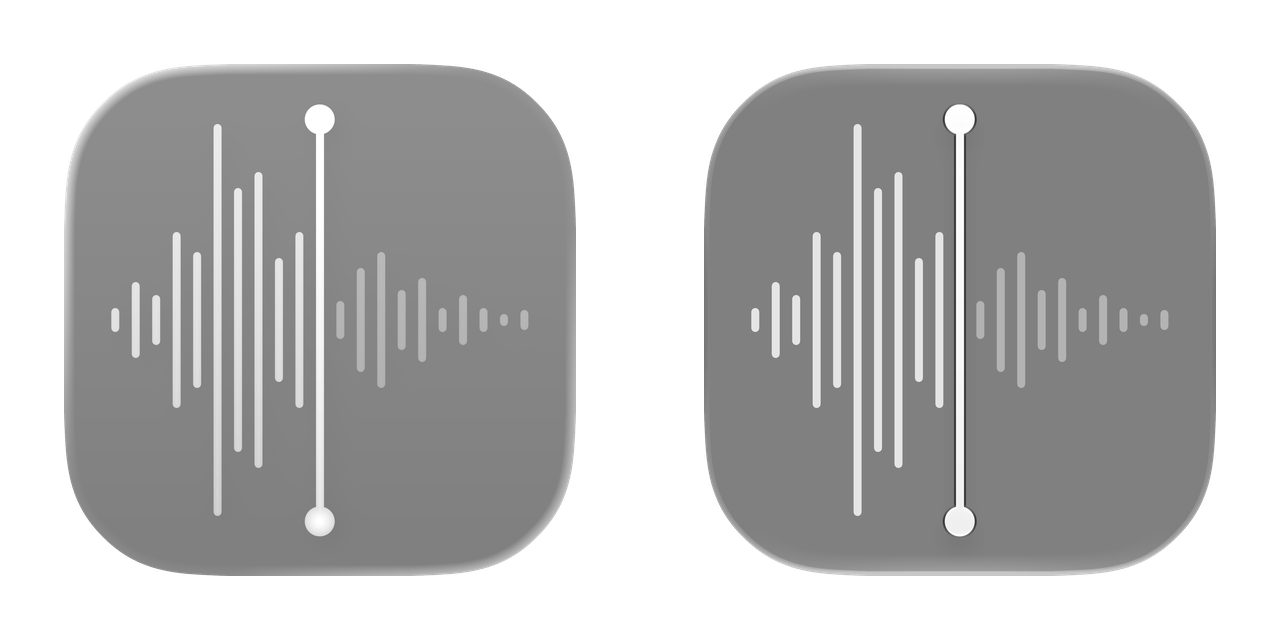
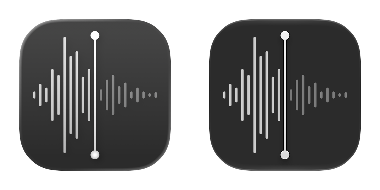
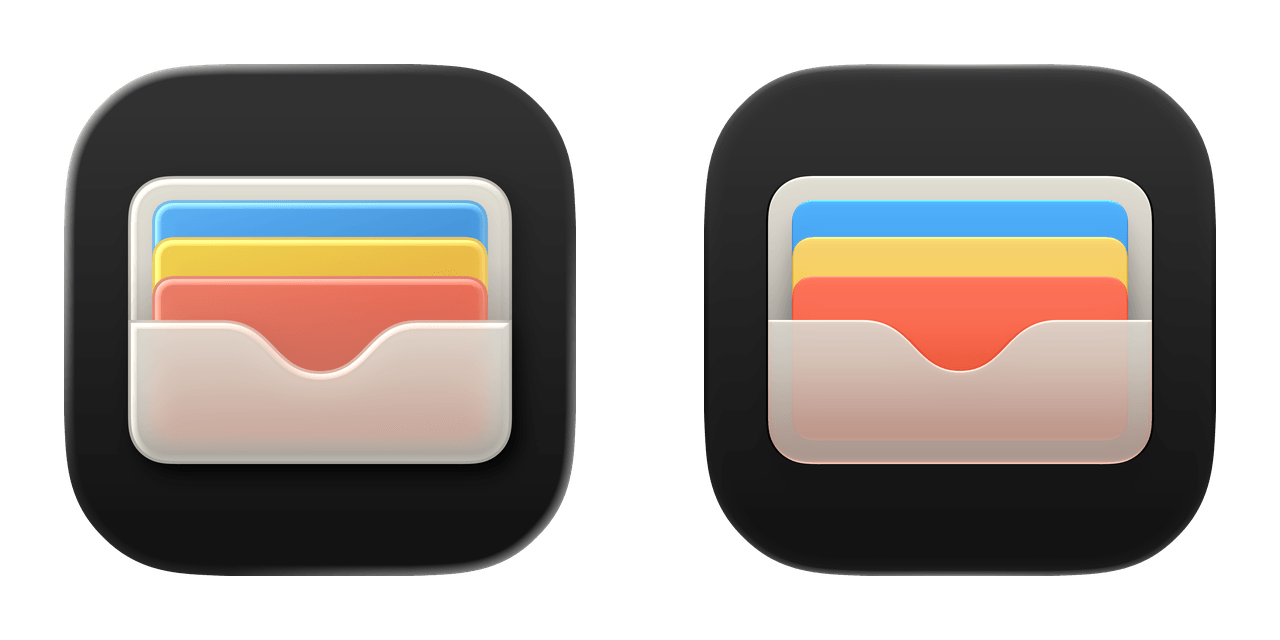
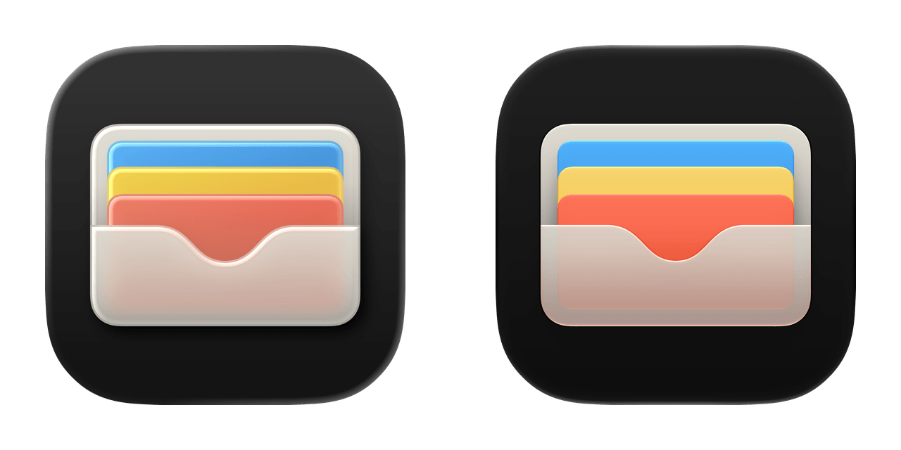
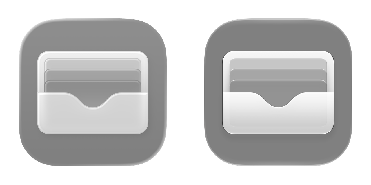
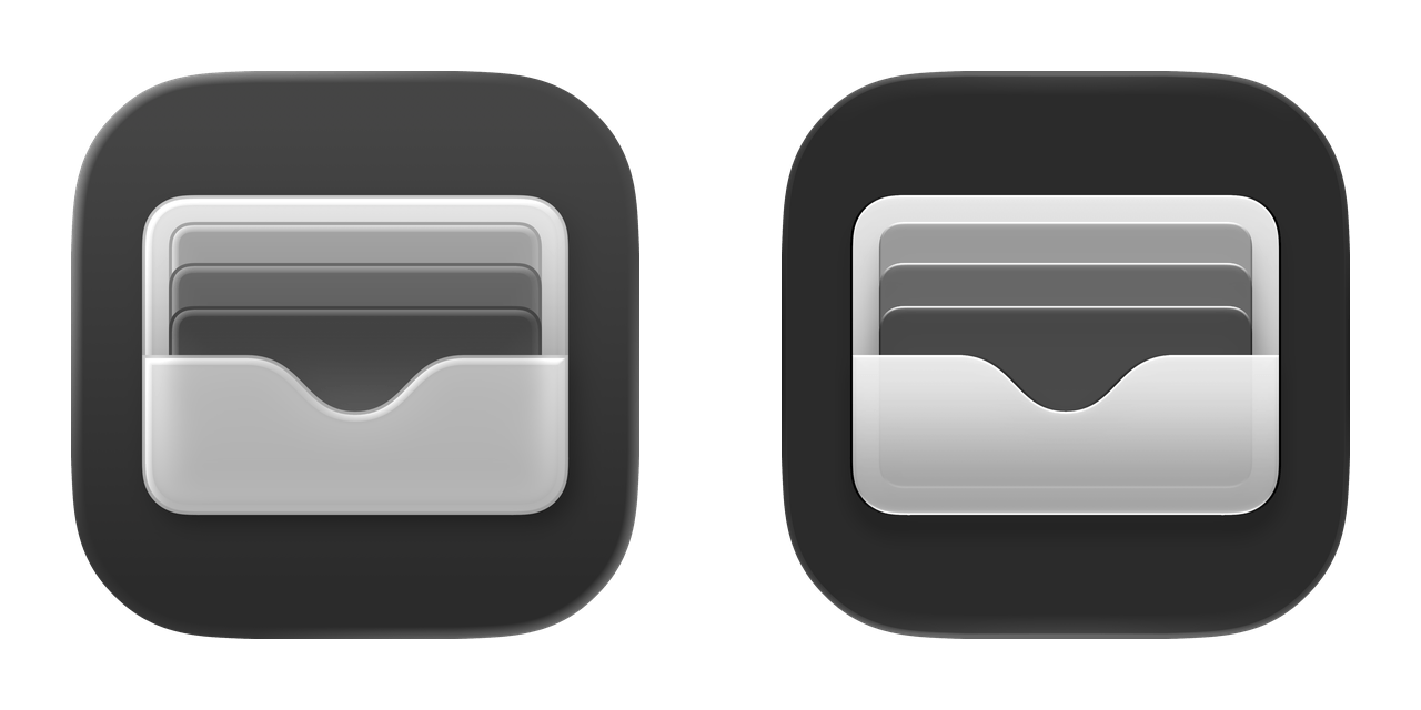
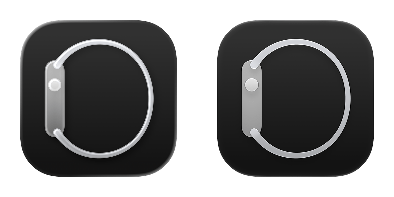
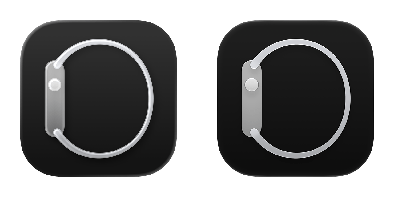
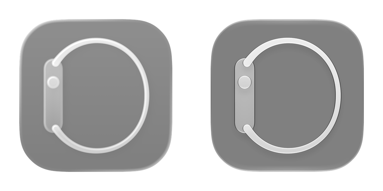
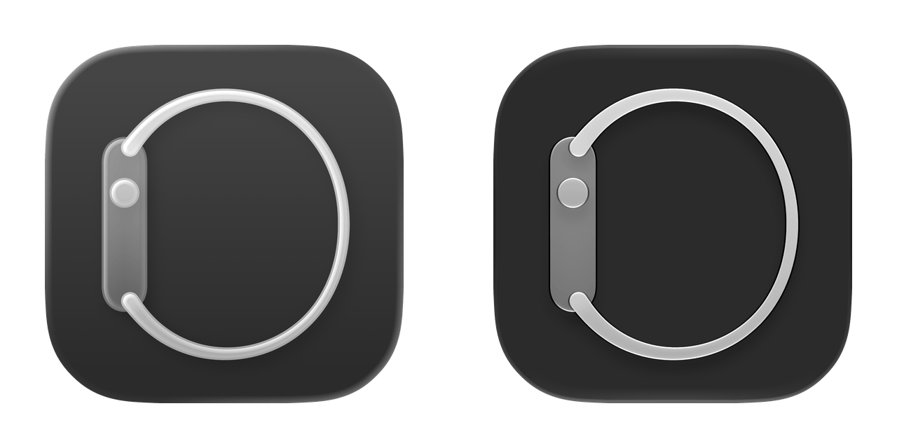
One last favorite change of mine deserves a proper visual look instead of too many words about it: all the Liquid Glass Home Screen icons have been refreshed with a more detailed, sharper look.
According to Apple, the new app icons in iOS 27 have “more character, detail, and sharpness in light, dark, tinted, or all-clear looks,” and this has been made possible by the use of additional Liquid Glass layers in each icon as well as the aforementioned improvements to rendering and diffusion.
I’ll explain it another way: comparing the old iOS 26 icons against the new ones in iOS 27 feels like putting prescription glasses on and seeing everything clearly for the first time. There is an underlying blurriness and softness to iOS 26’s original icons that I didn’t notice until I actually started comparing them side by side with iOS 27.
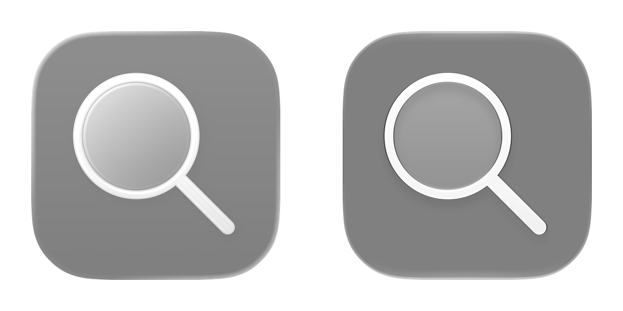
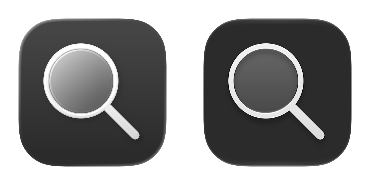
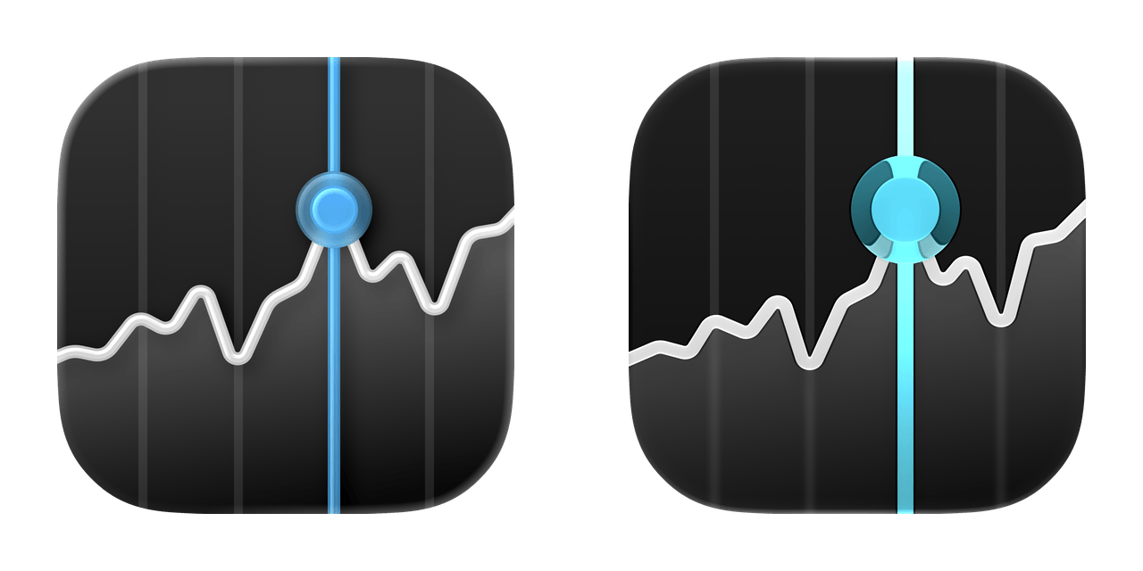
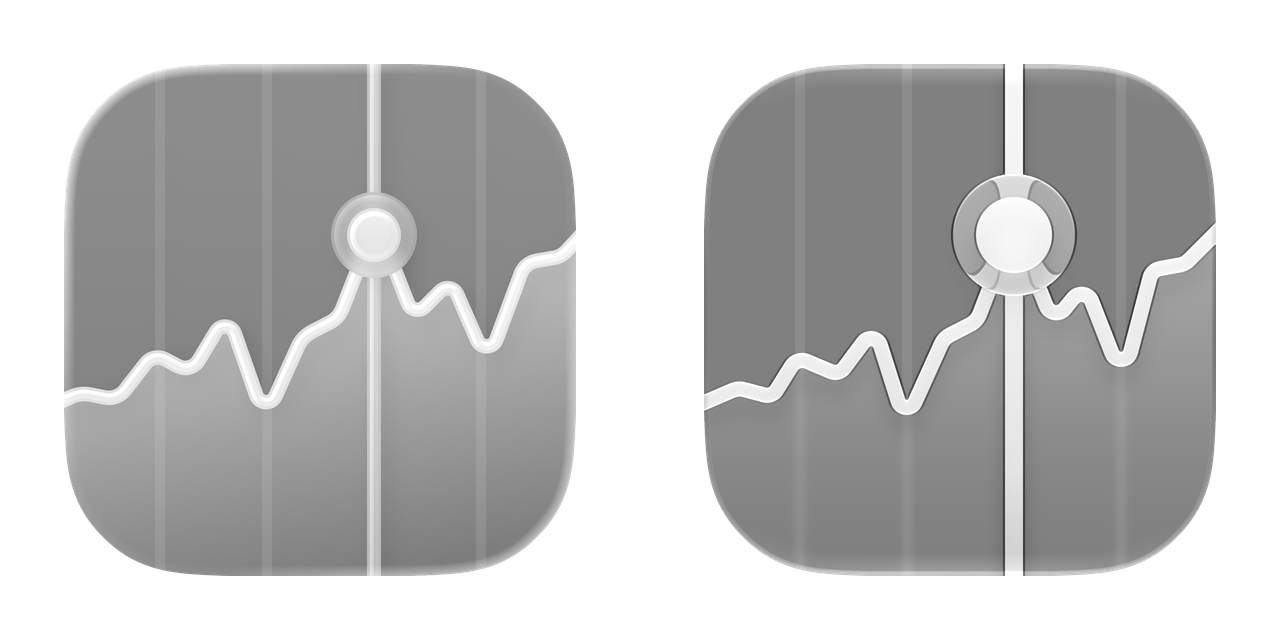
I love this change, and to properly show off the differences in this review, I decided to try something different. Below, you’ll find a gallery of all system icons from iOS 26 and iOS 27, which you can compare across the four system tints: light, dark, clear light, and clear dark.
I’ll let Apple’s work speak for itself here. If you’re like me, after seeing the new icons, you’ll probably wonder how we lived with iOS 26’s blurry Home Screen mess for a year. Good riddance.
Each comparison initially follows the surrounding site's appearance, with your system appearance as a fallback, until you choose an option.
Adaptive Music
App Store
Apple Music Radio
Apple Music Sing
Apple Vision Pro
Barcode Scanner
Batteries
Books

Calculator
Calendar
Camera

Clock
Compass
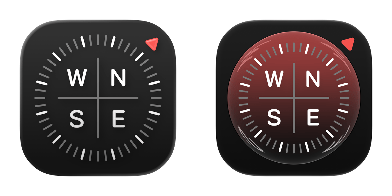
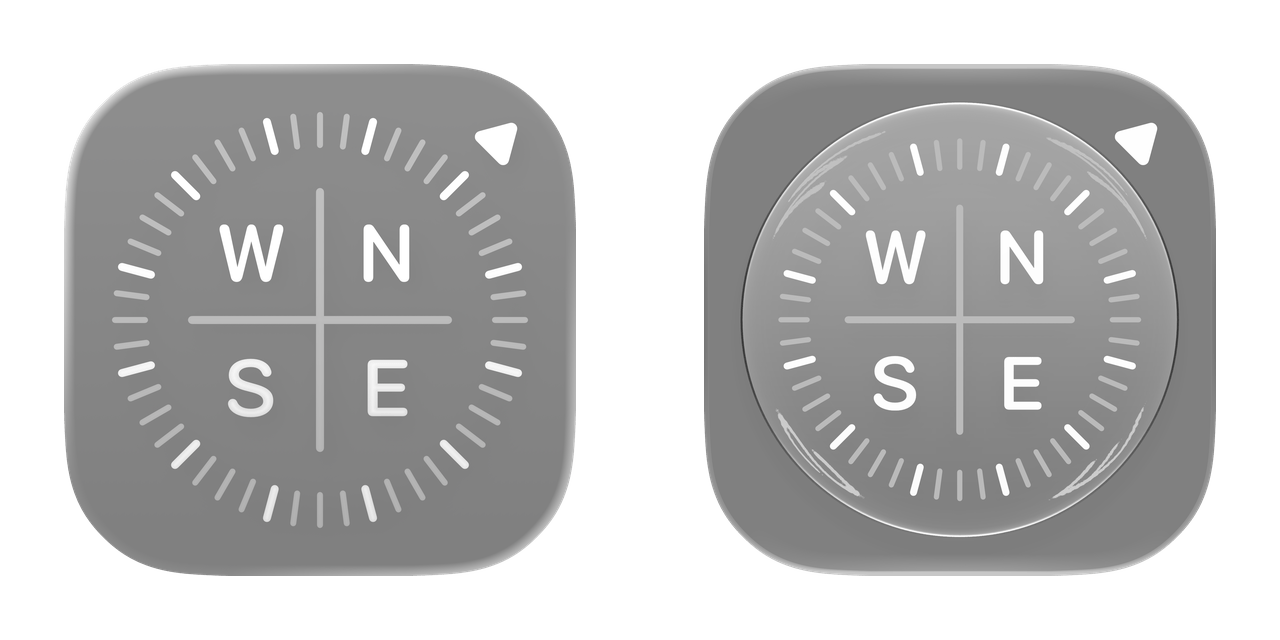
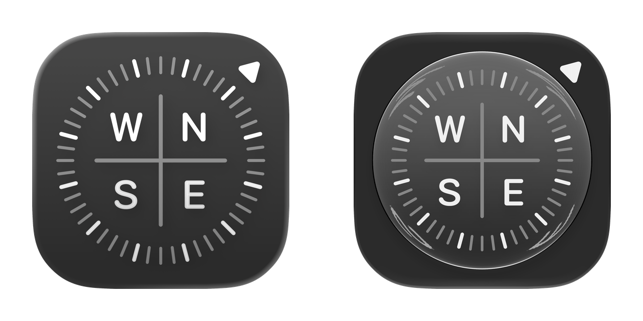
Contacts
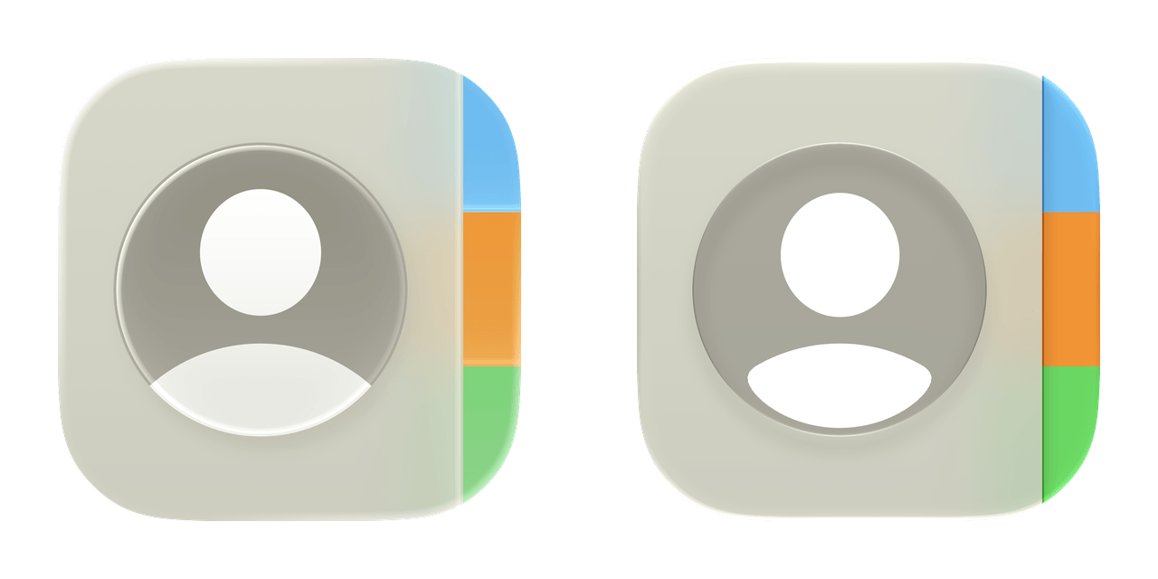
Diagnostics
FaceTime
Feedback Assistant
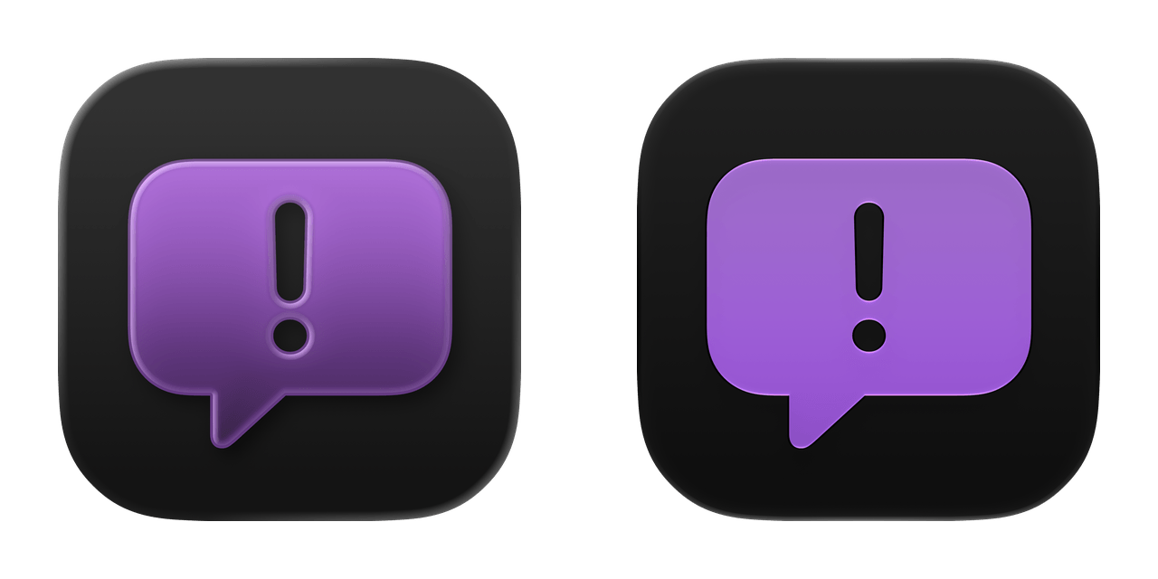

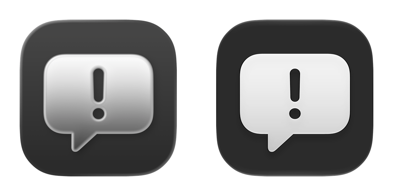
Files
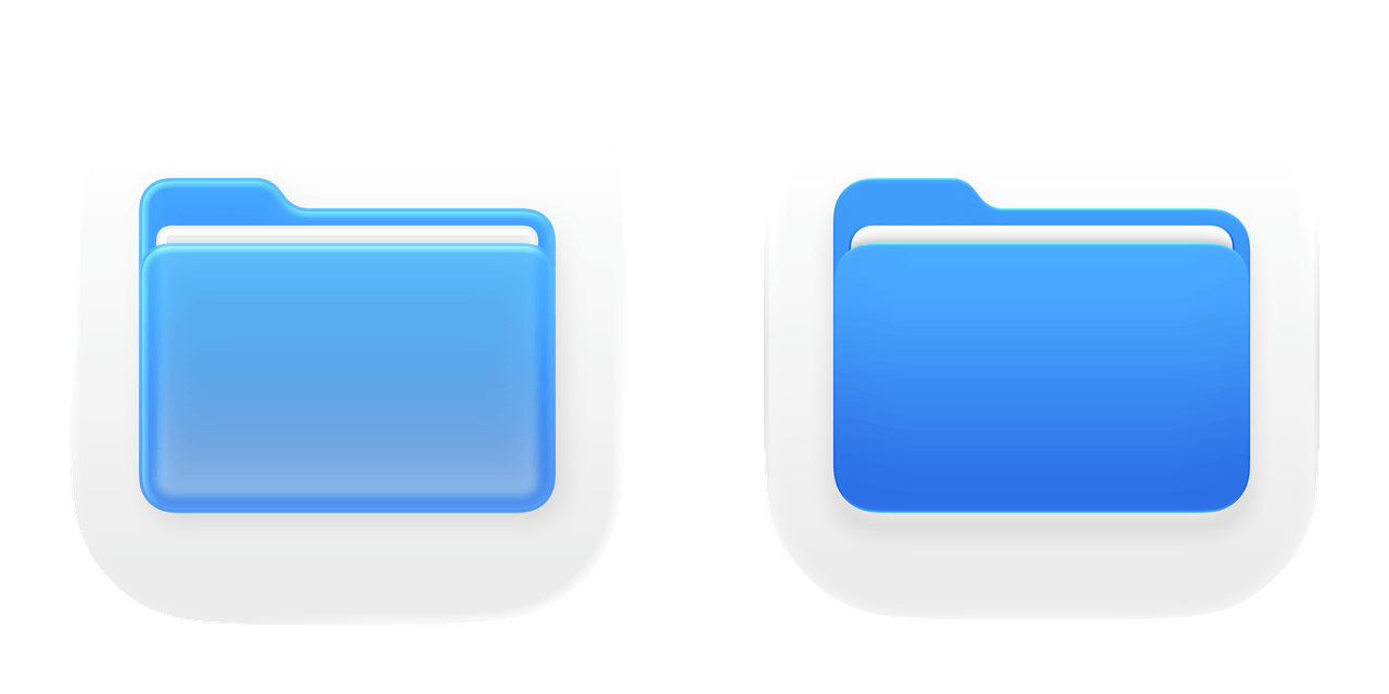
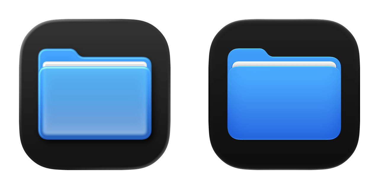
Find My
Fitness
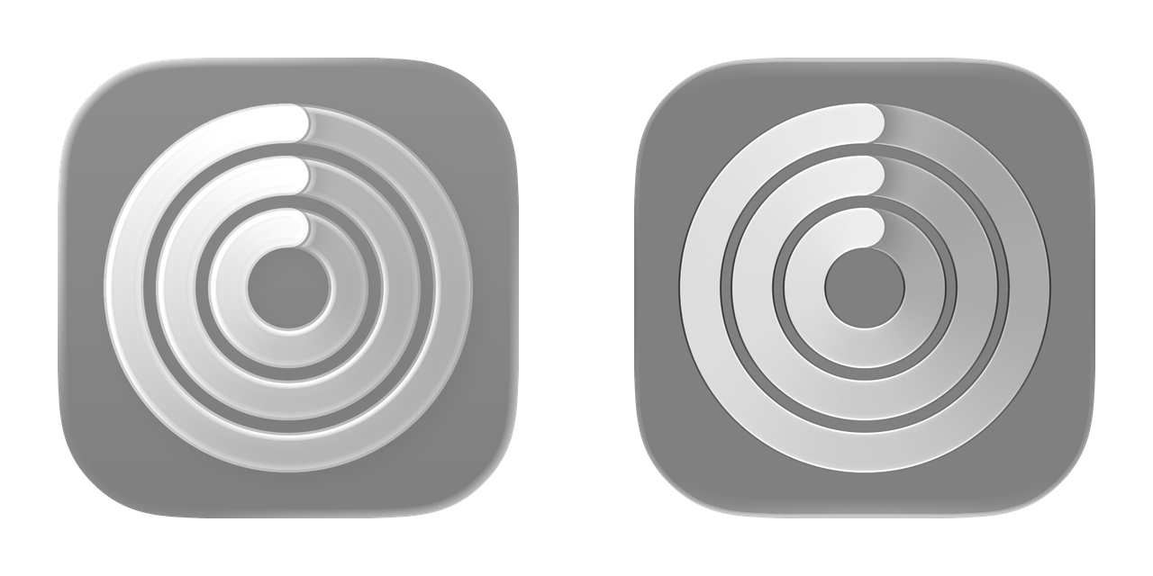
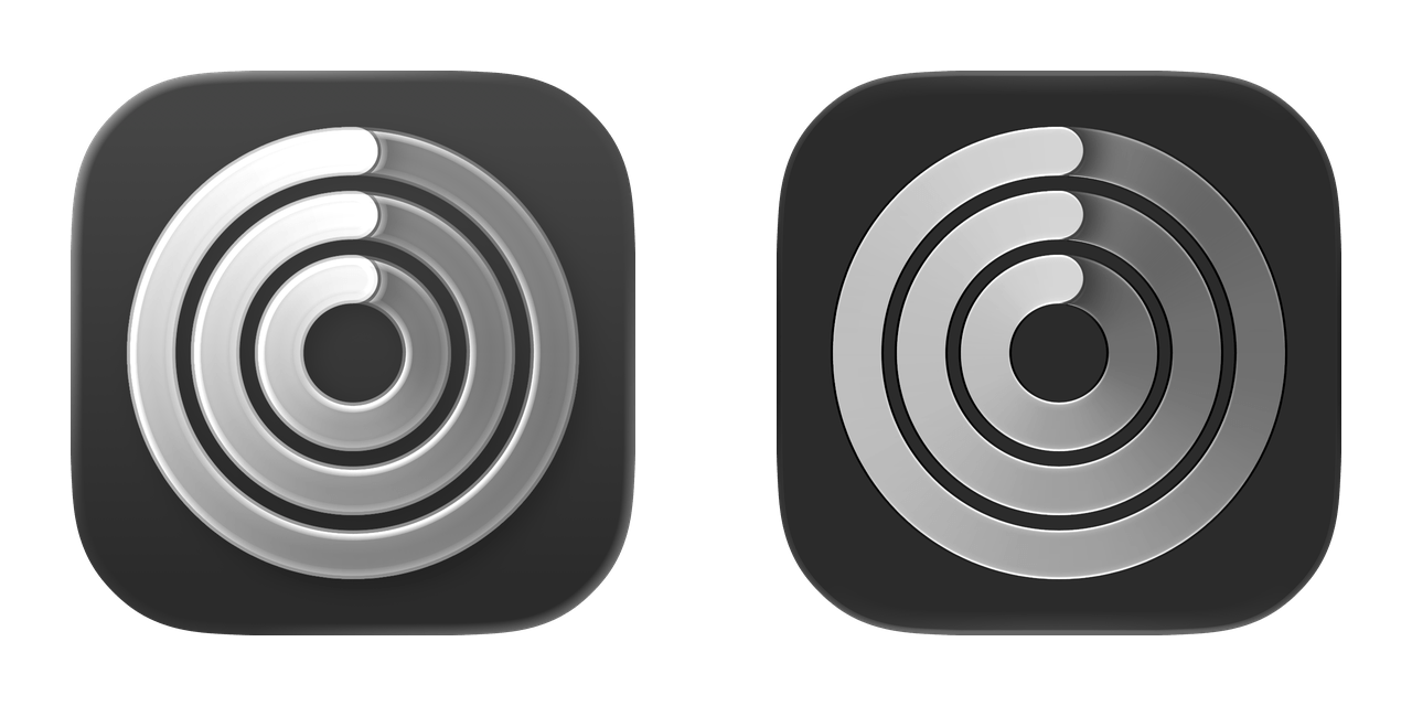
Freeform
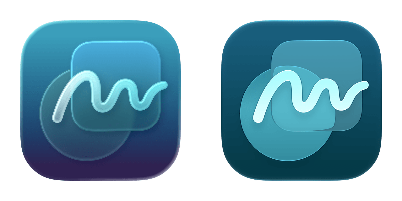
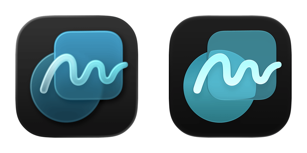
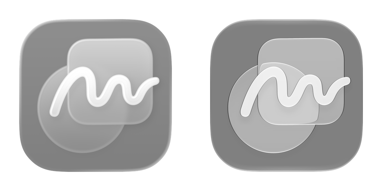
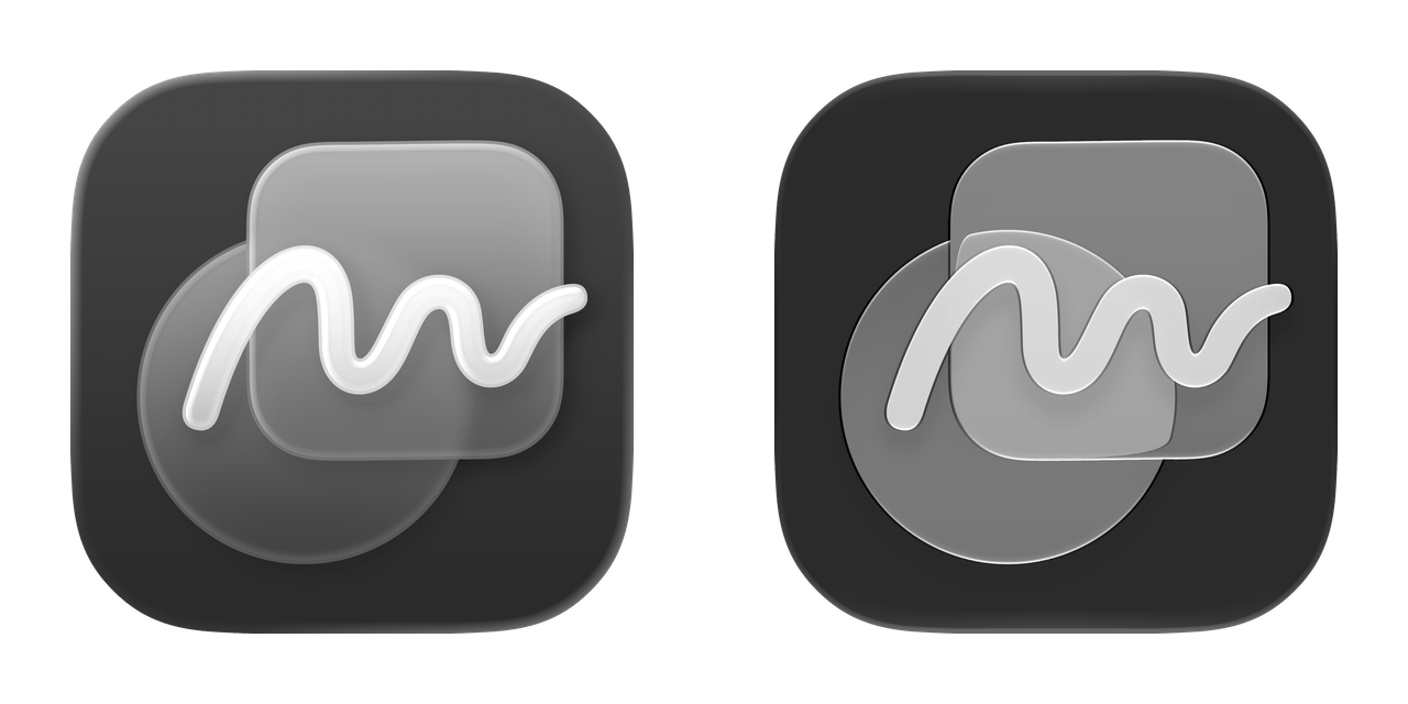
Game Center
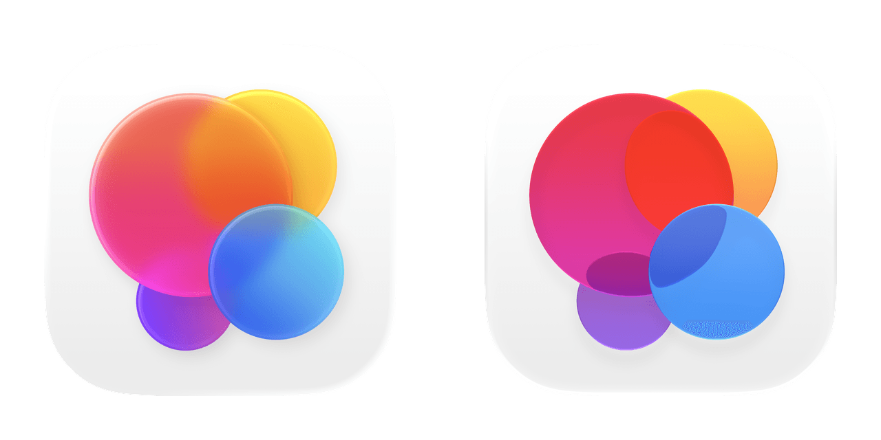
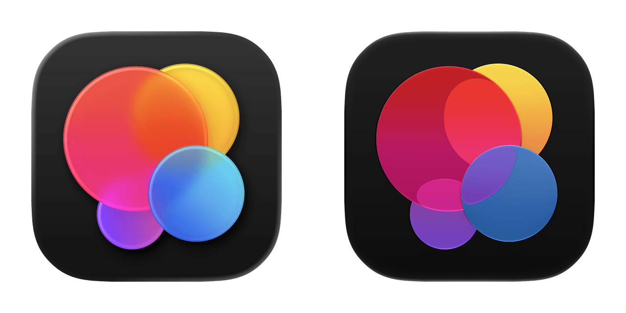
Games
Health
Home
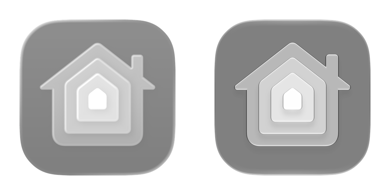
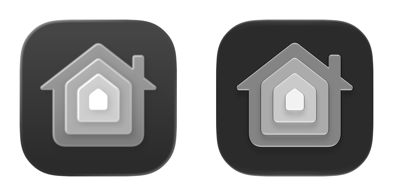
iCloud
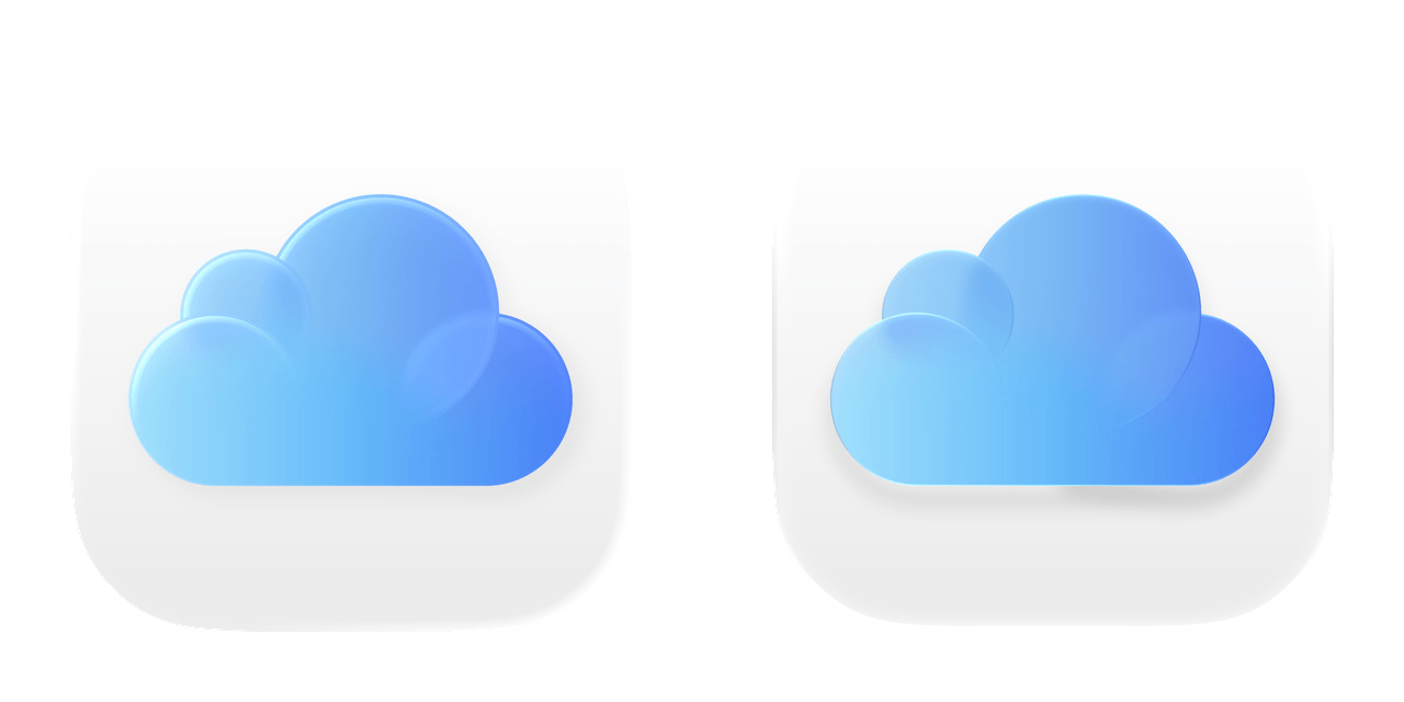
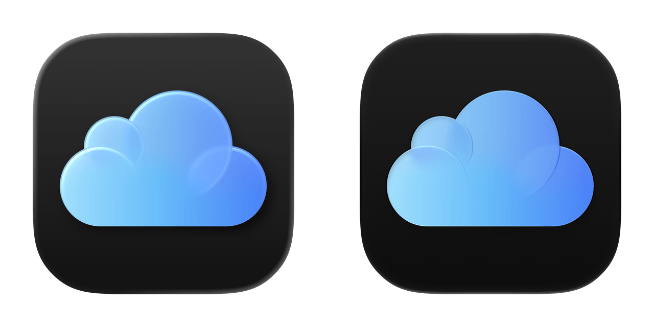
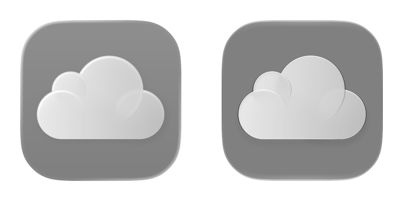
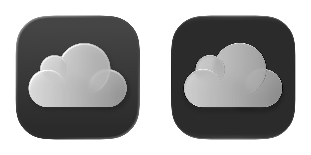
Image Playground
iTunes Store
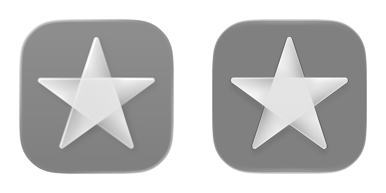
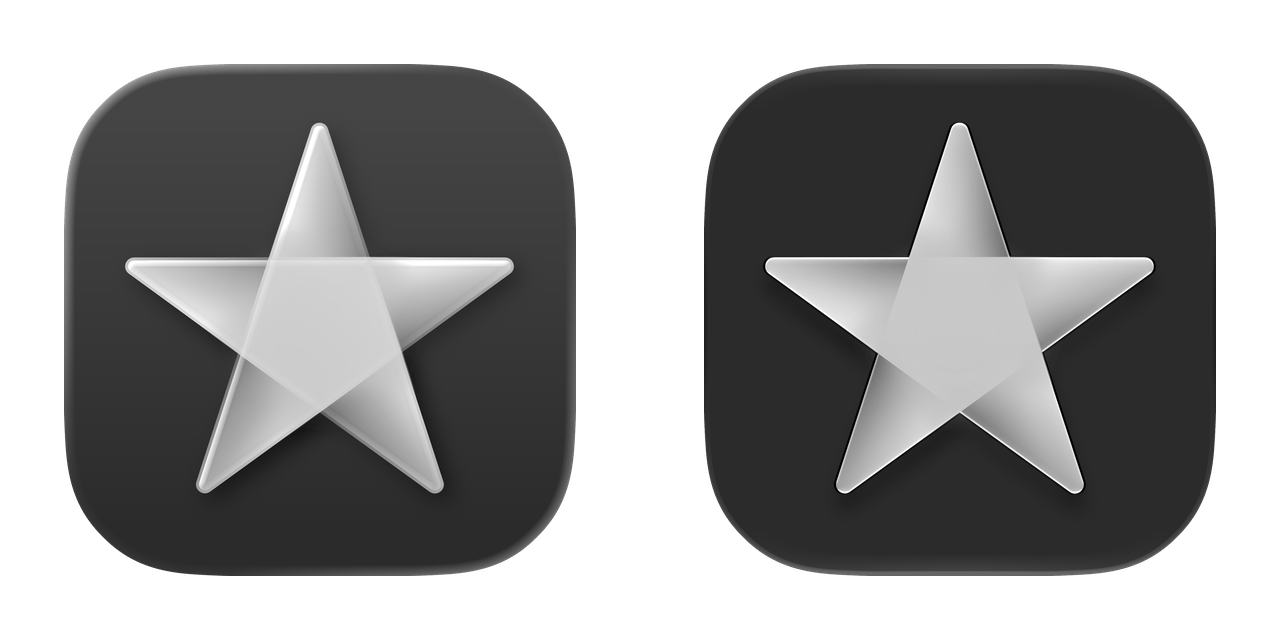
Journal
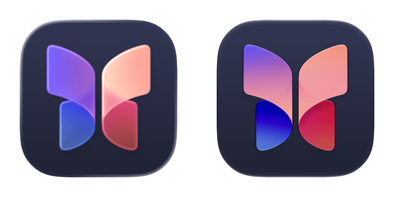
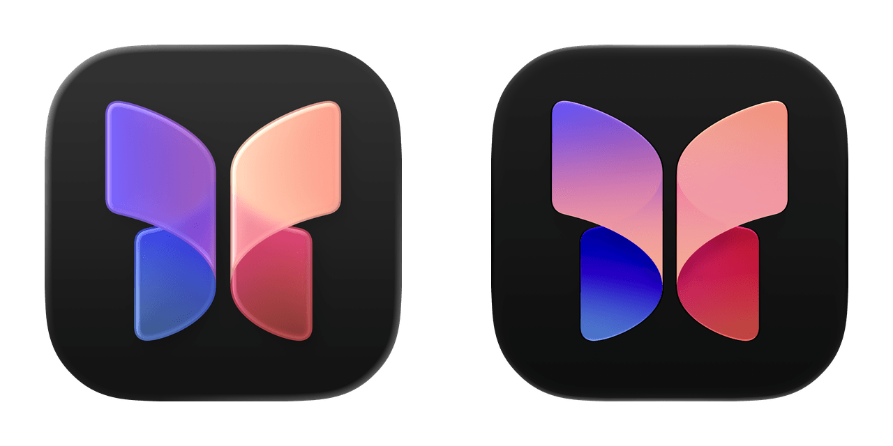
Magnifier
Maps
Measure
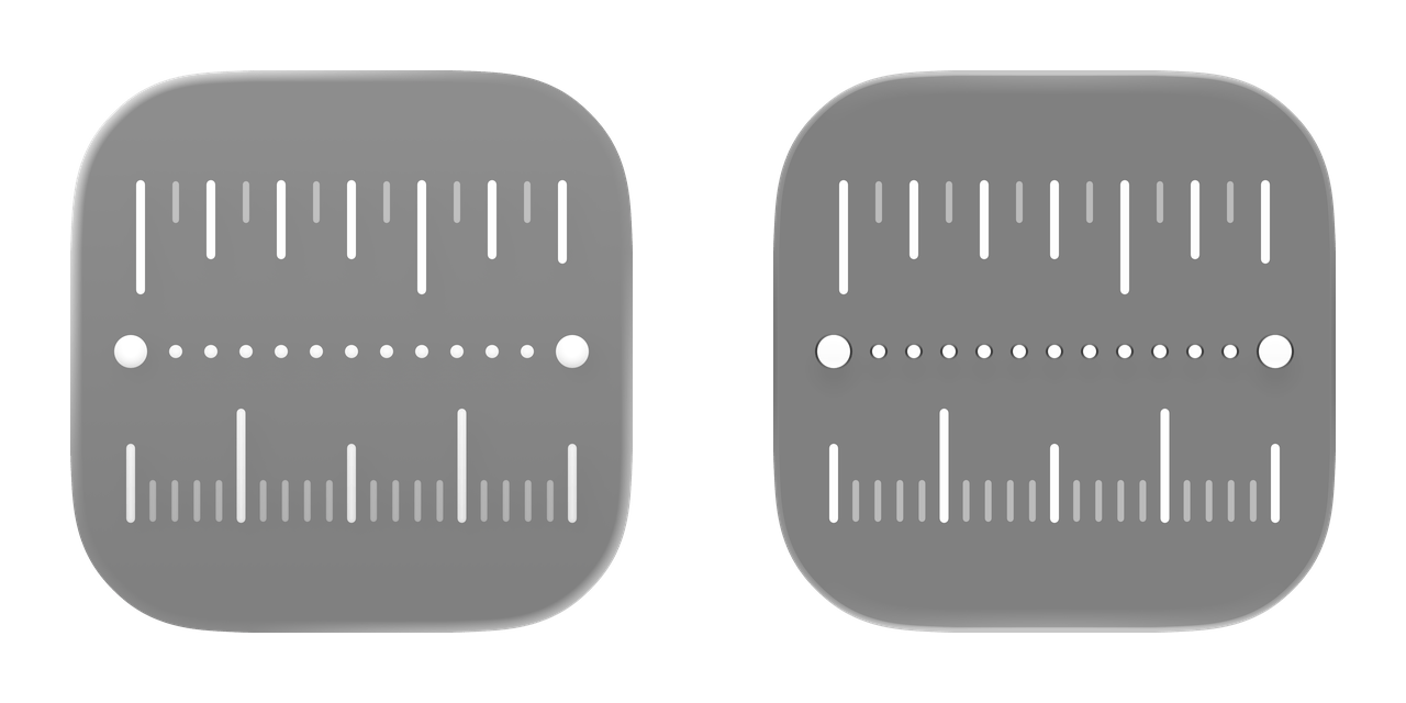
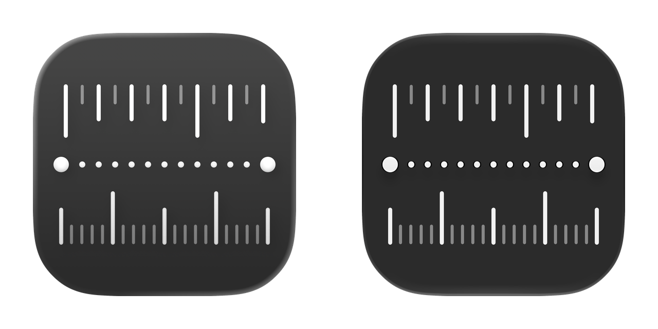
Messages
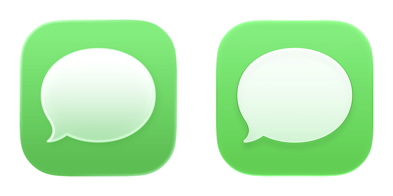
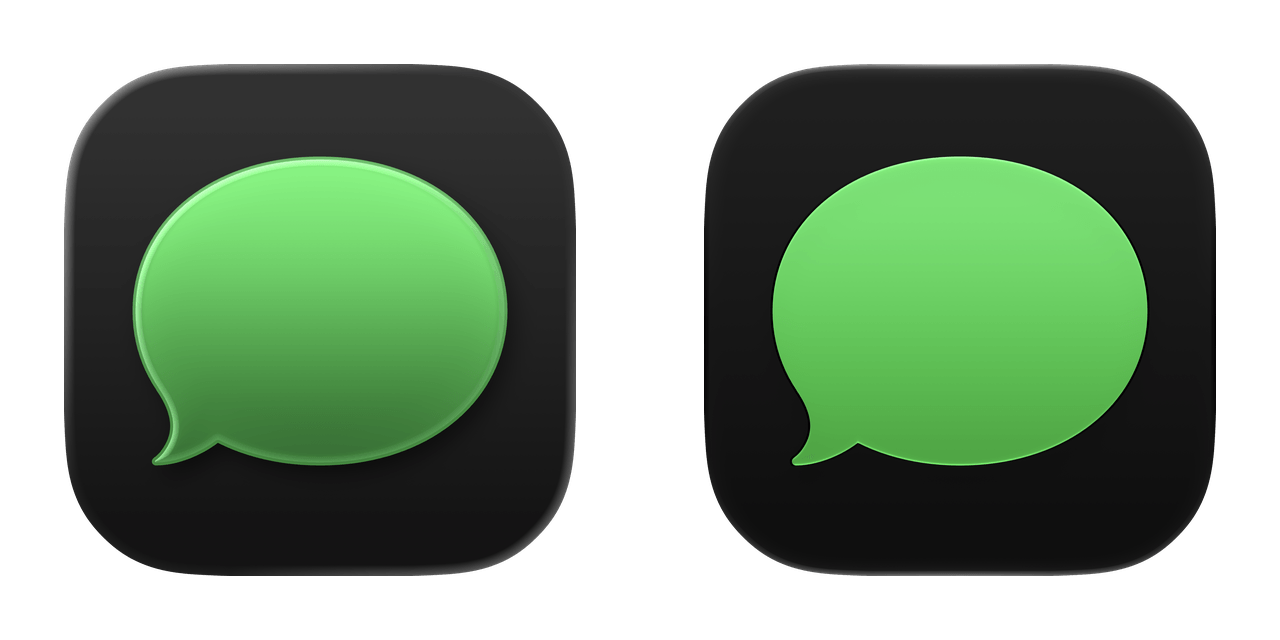
Music
News
Notes
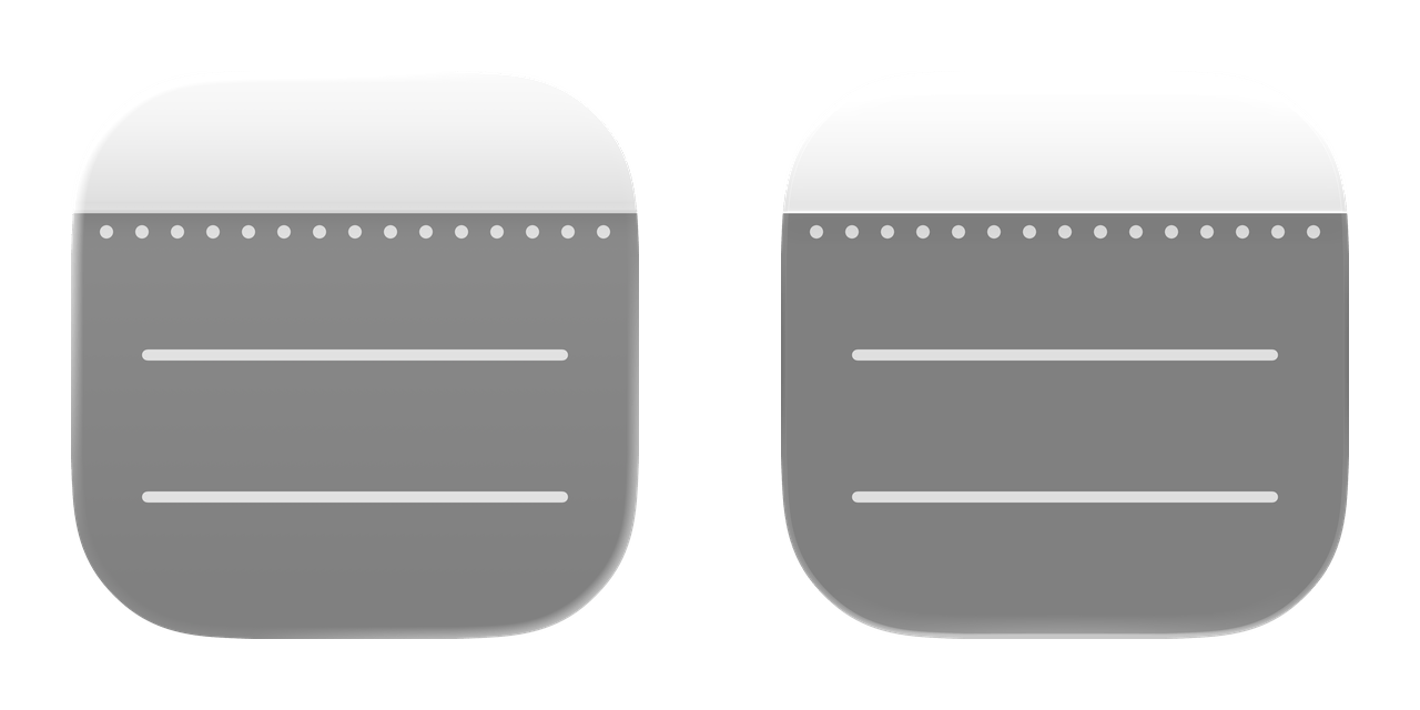
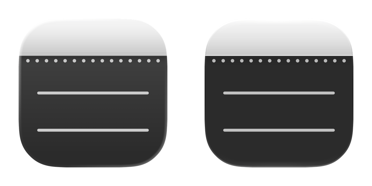
Passwords
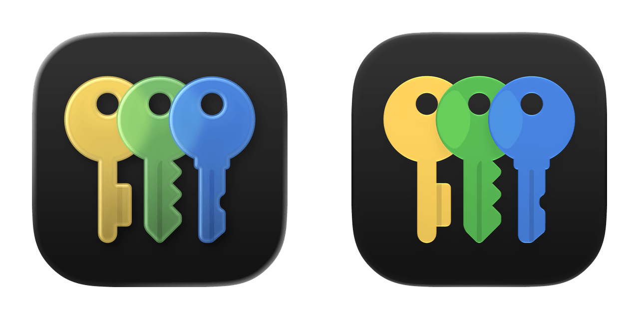
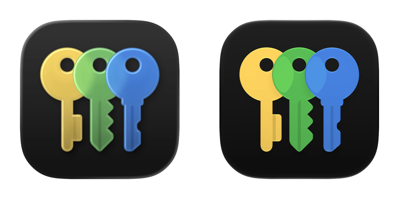
Phone
Photos
Podcasts
Preview
Print Center
Reminders
Safari
Settings
Shortcuts
Sidecar
Sleep
Spotlight
Stocks

Tips
Translate
TV
TV Remote
Voice Memos
Wallet
Watch
Weather