In 2021, I reviewed the Loupedeck Live, a programmable control panel for the Mac and Windows PCs for Club MacStories members as part of my Macintosh Desktop Experience column. It’s an excellent device, but its price put it at a disadvantage to a similarly-sized Elgato Stream Deck despite several other advantages that I explained in the review.
Last year, Loupedeck released the Loupedeck Live S, a smaller, more affordable Loupedeck that retains the core experience of the Loupedeck Live, but dispenses with a handful of physical buttons and dials. The new device retails for $189 compared to the Loupedeck Live, which is $269. That’s still $40 more than the 15-button Stream Deck MK.2, but a significantly narrower difference for a device that offers a wider range of functionality, making it worth another look if you were put off by the Loupedeck Live’s price.
Before digging into the details, I want to note that Loupedeck are providing us with a Loupedeck Live S free of charge as one of the prizes that we’ll be awarding to the winner of the Best Overall Shortcut as part of the Automation April Shortcuts Contest. However, this is not a sponsored post and reflects my options about the Loupedeck Live S, which I think you’ll find are in line with my previous reviews of Loupedeck products.
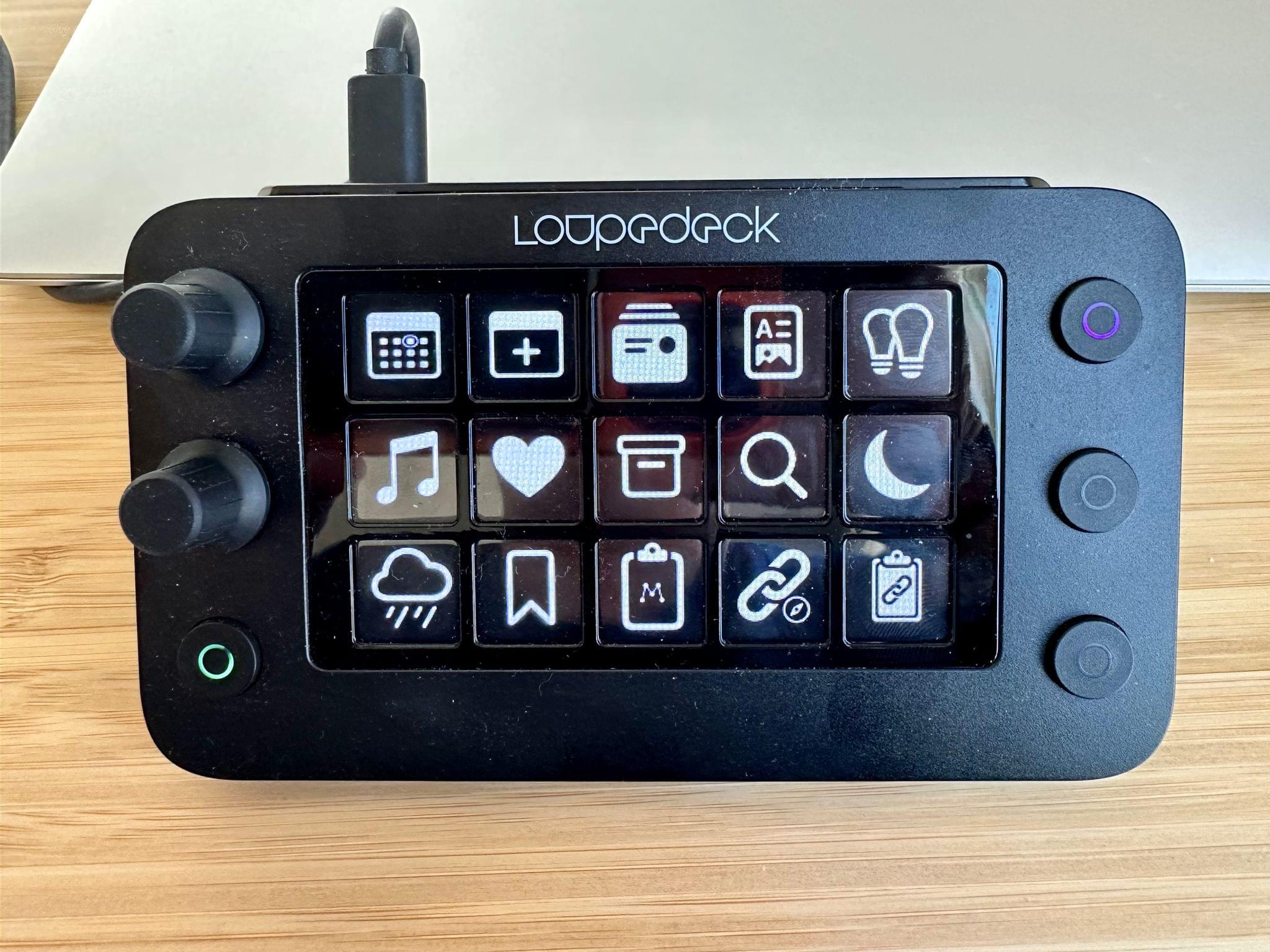
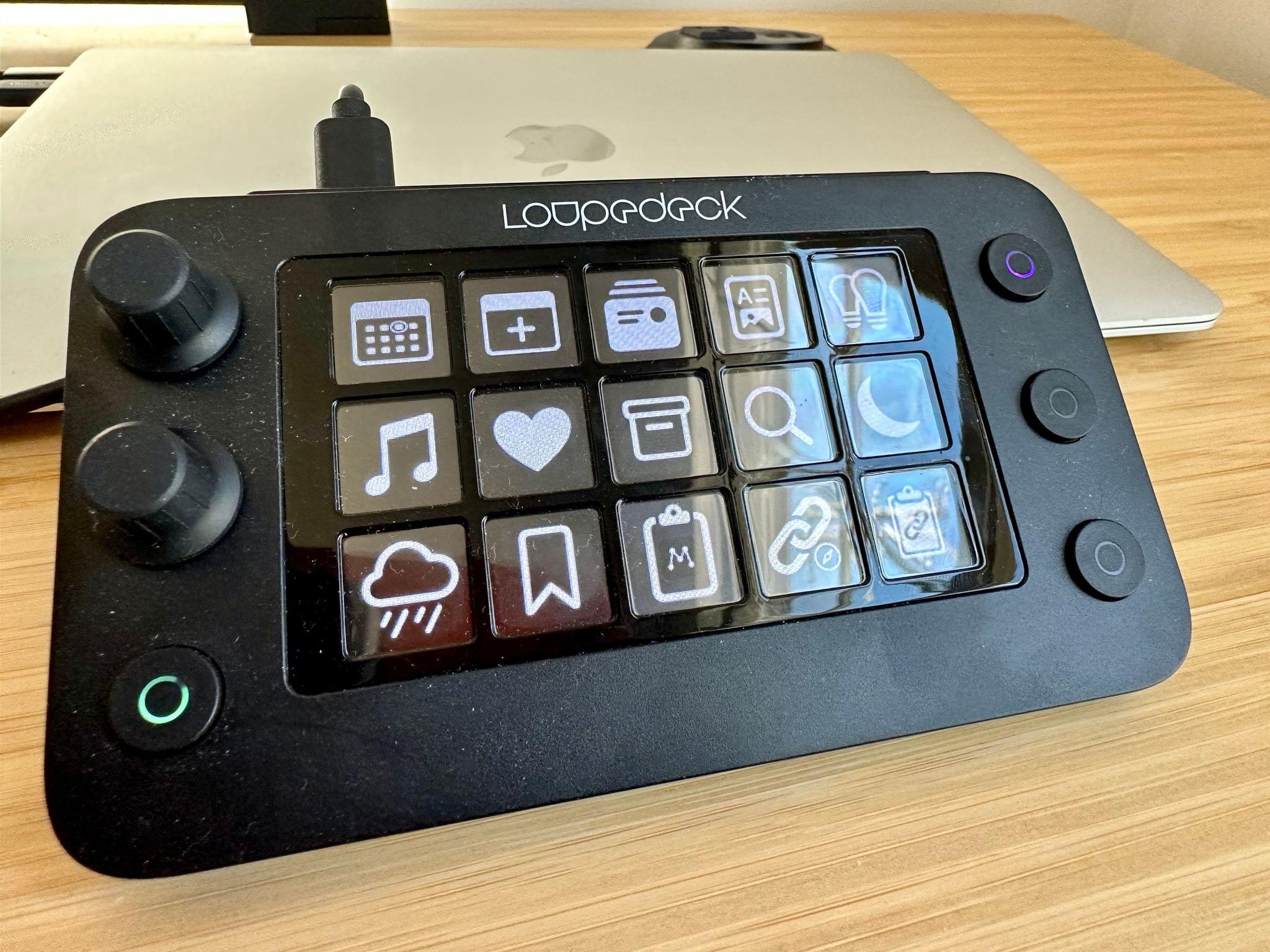
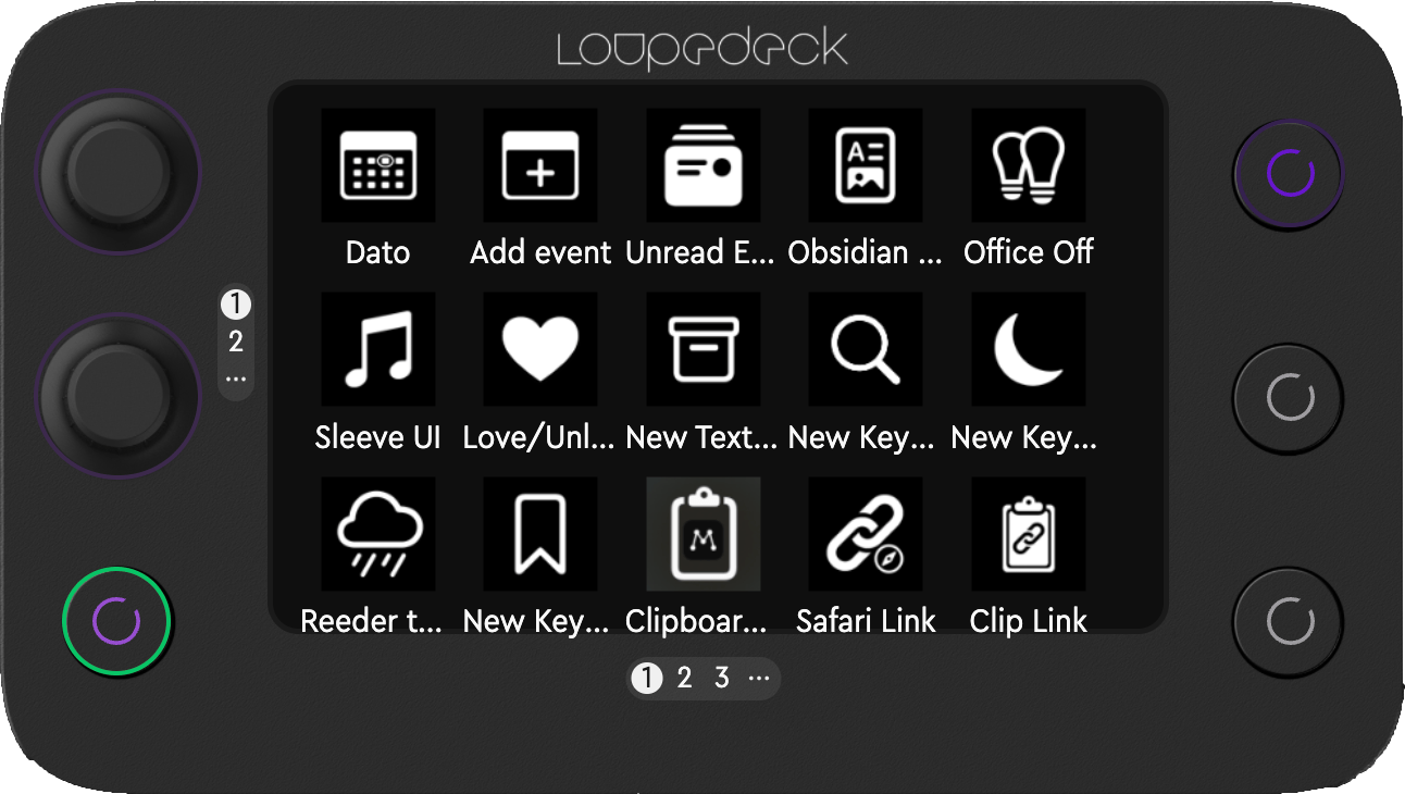
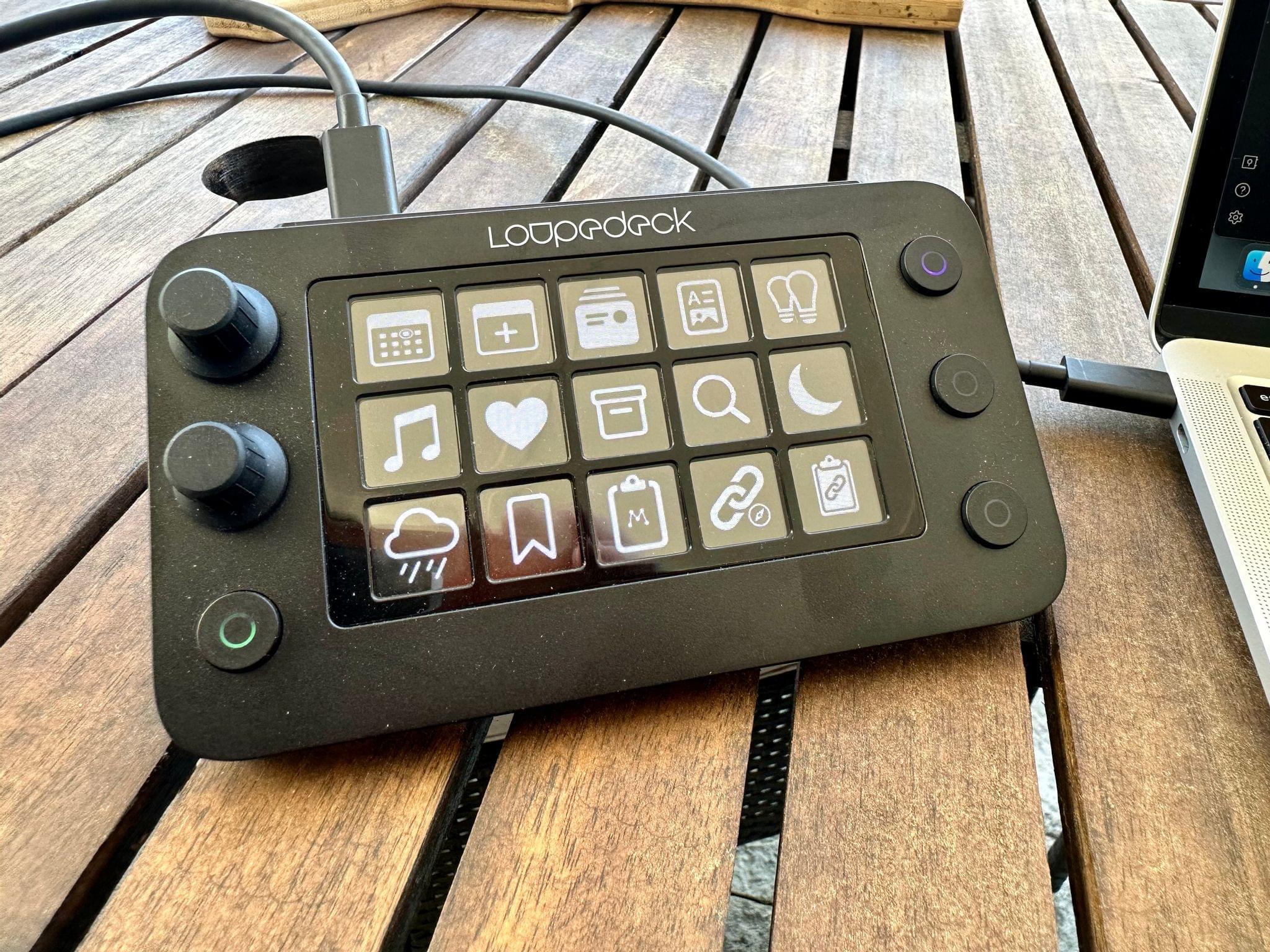
Like the Loupedeck Live, the Live S has the same number of LCD buttons in the center of the device. There are three rows of five buttons for 15 in total that can be assigned a variety of actions. What’s changed is that instead of six dials, the Live S has two, and instead of eight physical buttons, the Live S has four.
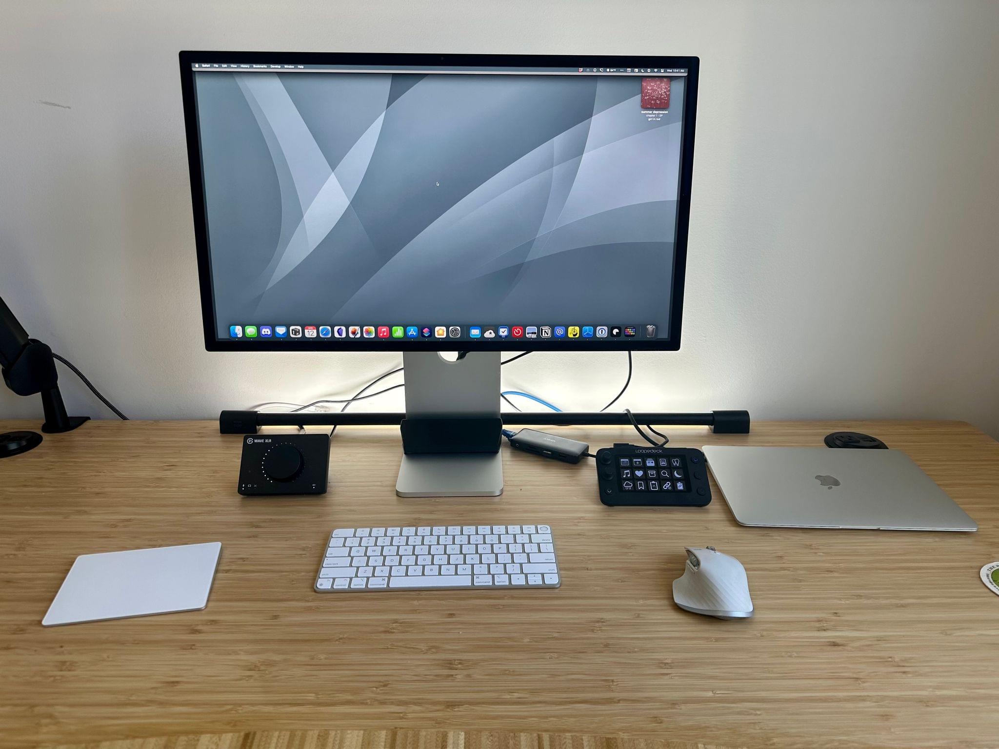
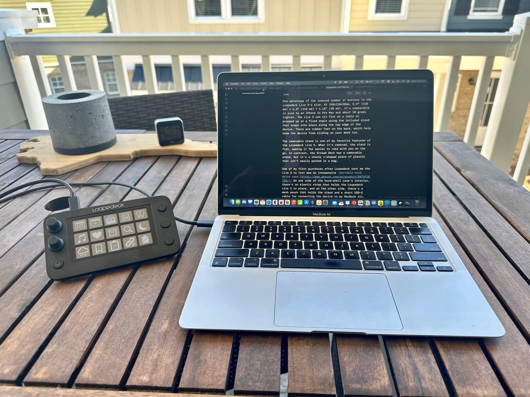
One advantage of the reduced number of buttons is the Loupedeck Live S’s size. At 150x110x30mm, 5.9” (150 mm) × 4.3” (110 mm) × 1.18” (30 mm), it’s comparable in size to an iPhone 14 Pro Max and about 10 grams lighter. The Live S can sit flat on a table or propped up at a fixed angle using the included stand that snaps into place along the top edge of the device. There are rubber feet on the back, which help keep the device from sliding on your desk too.
The removable stand is one of my favorite features of the Loupedeck Live S. When it’s removed, the stand is flat, making it far easier to take with you on the go. In contrast, the Stream Deck has a removable stand, but it’s a chunky v-shaped piece of plastic that isn’t easily packed in a bag.
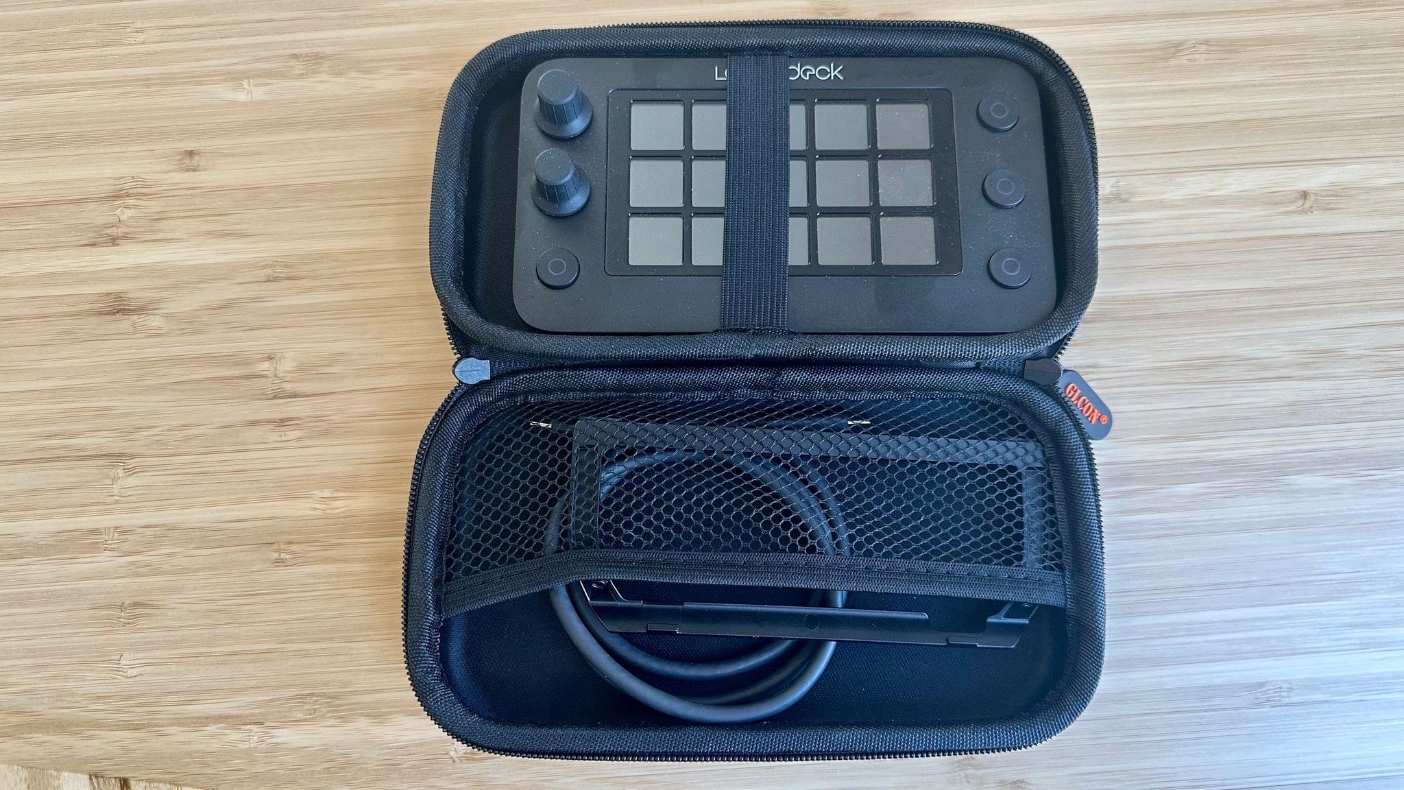
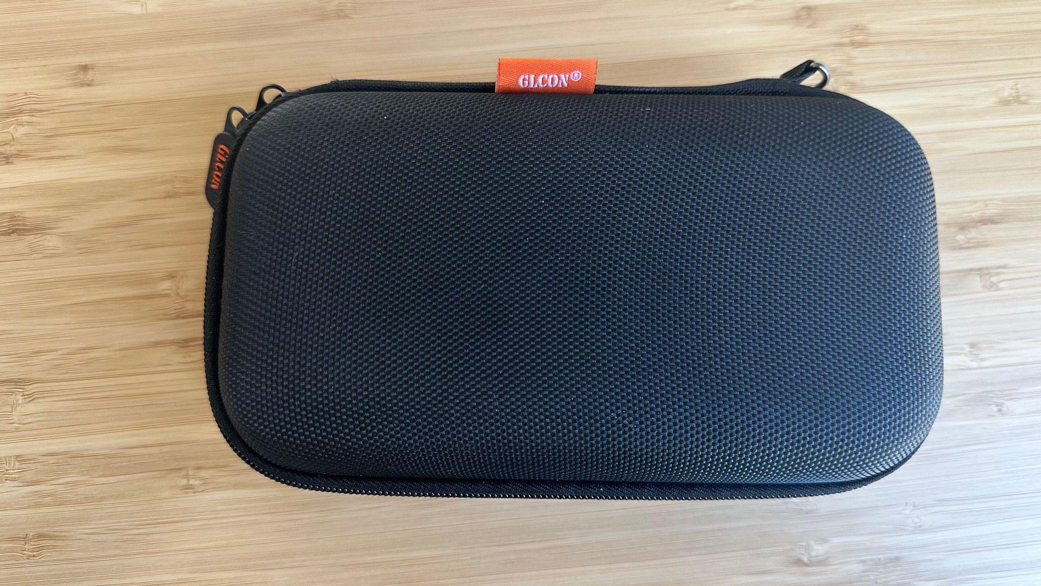
One of my first purchases after Loupedeck sent me the Live S to test was an inexpensive portable hard drive case. On one side of the hard-shell case’s interior, there’s an elastic strap that holds the Loupedeck Live S in place, and on the other side, there’s a mesh pouch that holds the stand and a short USB-C cable for connecting the device to my MacBook Air. I’ve never considered taking a Stream Deck or the Loupedeck Live with me in my backpack, but the diminutive size and light weight of the Loupedeck Live S make it an excellent travel companion.
The Live S has fewer buttons and dials than the Live, but I don’t miss them. The dials are great for incremental adjustments like applying slider-based effects and filters to photos, controlling volume and brightness, or zooming in and out of a Logic Pro X timeline. The dials can also be pressed to execute an action, which makes them the most versatile controls on the device. However, only having two is not a major compromise if, like me, your primary use of a Loupedeck is to run shortcuts, macros, and other automations. If you’re doing the sort of photo or video editing where more dials would be an advantage, I’d suggest looking at the Loupedeck Live, Loupedeck+, which I reviewed in 2019, or CT, which are more focused on those sorts of workflows.
On the Loupedeck Live, there are eight buttons along the bottom edge of the device for switching between workspaces, which I’ll cover more in depth below, or triggering actions. The Live S’s physical buttons are along the sides of the LCD buttons, which enables the smaller form factor. The buttons include a circular LCD element, which can be customized too.
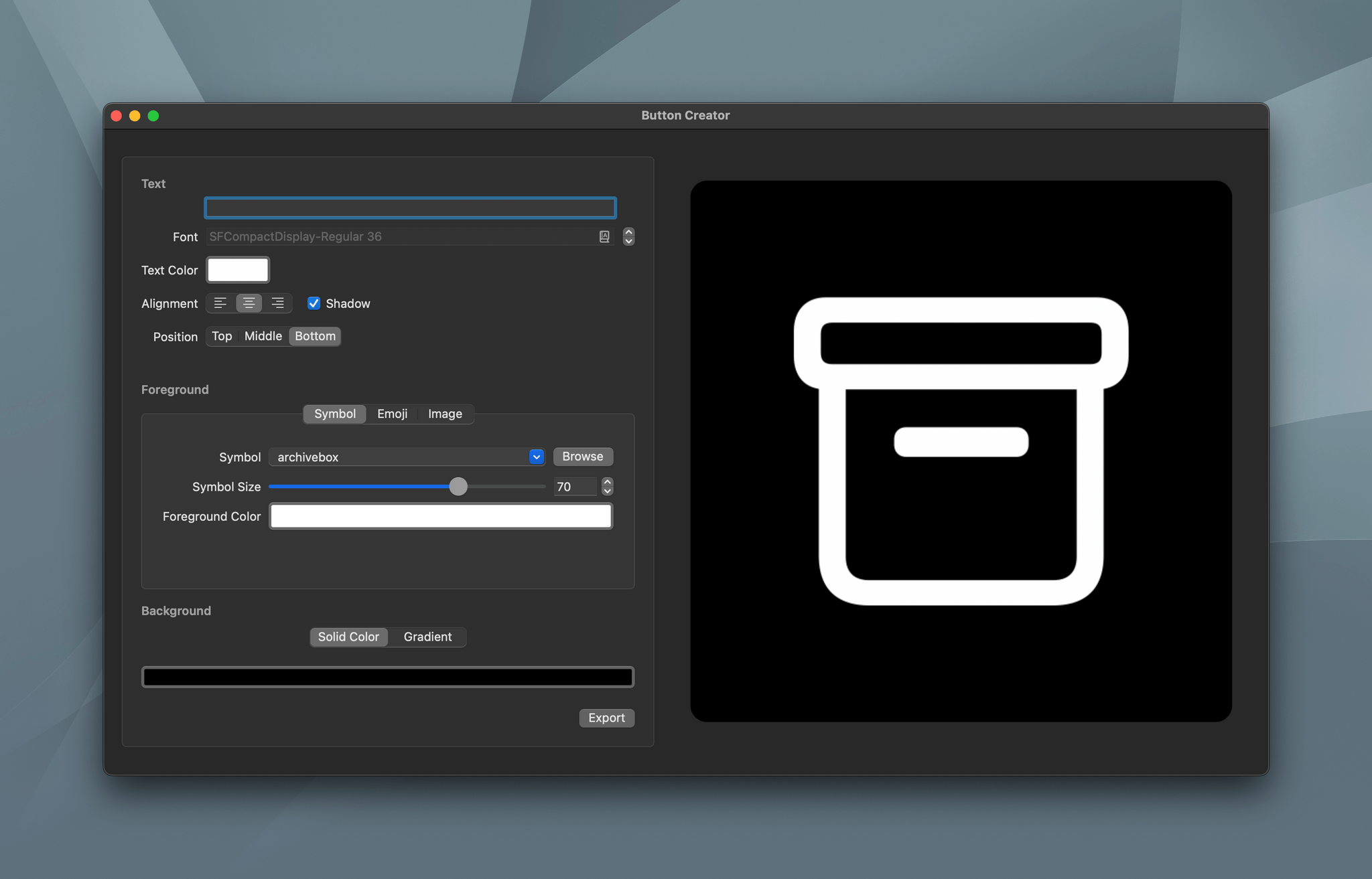
What the Live and Live S have in common are the fifteen full-color LCD buttons in the center of the device. The buttons, which trigger customizable actions, are touch sensitive and feature haptic feedback. Although the Live S’s buttons display color, I prefer to use black and white images for them, so the device fades into the background of my desk setup instead of drawing my attention. The icons I use are a combination of SF Symbols and the MacStories Shortcuts Icons by Slivia Gatta that I adapted for the Loupedeck Live S using Button Creator. You can also set up multiple pages of LCD buttons that are accessed with a swipe across the screen.
The build quality of the Loupedeck Live S is excellent. The physical buttons and dials are clicky when pressed, and the dials have a satisfying incremental click as you twist them. I’m a fan of the LCD buttons too. Icons and text are sharp and can be set at a brightness that works with your environment. It’s a design that’s head and shoulders above the Stream Deck, which is chunky and uses concave buttons that distort the images beneath them. In contrast, the Loupedeck Live S is far sleeker, which is important for something that’s going to sit on your desk every day.
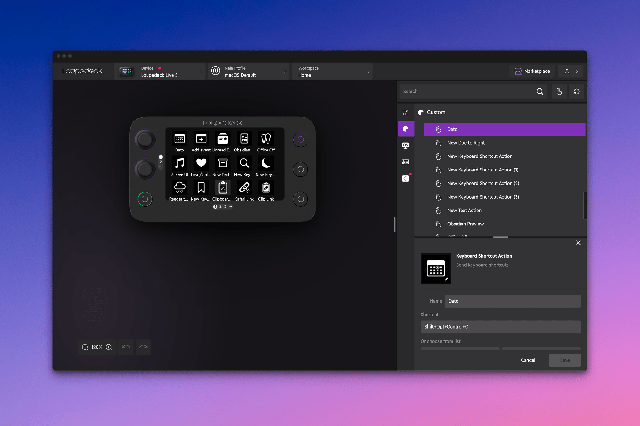
Setting up the Live S’s buttons and dials is accomplished from the Loupedeck app, which has evolved since I reviewed the Loupedeck Live. The app isn’t going to win any awards for following conventional Mac metaphors; you don’t have to look farther than the keyboard shortcut to invoke the app’s Preferences, which is ⌘P, to see that. However, it’s also not an app you’ll be using day in and day out. You’ll use it a lot initially as you set up actions, but once you have a configuration you like, you’ll only use it now and then to add new actions or modify your existing setup, so I can’t get to worked up about it.
That said, the app itself has improved quite a bit since I last reviewed it. The bulk of the app’s window is dominated by an image of your Loupedeck Live S. To the right is where you can add OS, device, custom, and plugin-based actions, and, at the very top of the window, is where you choose between devices and switch between profiles and workspaces.
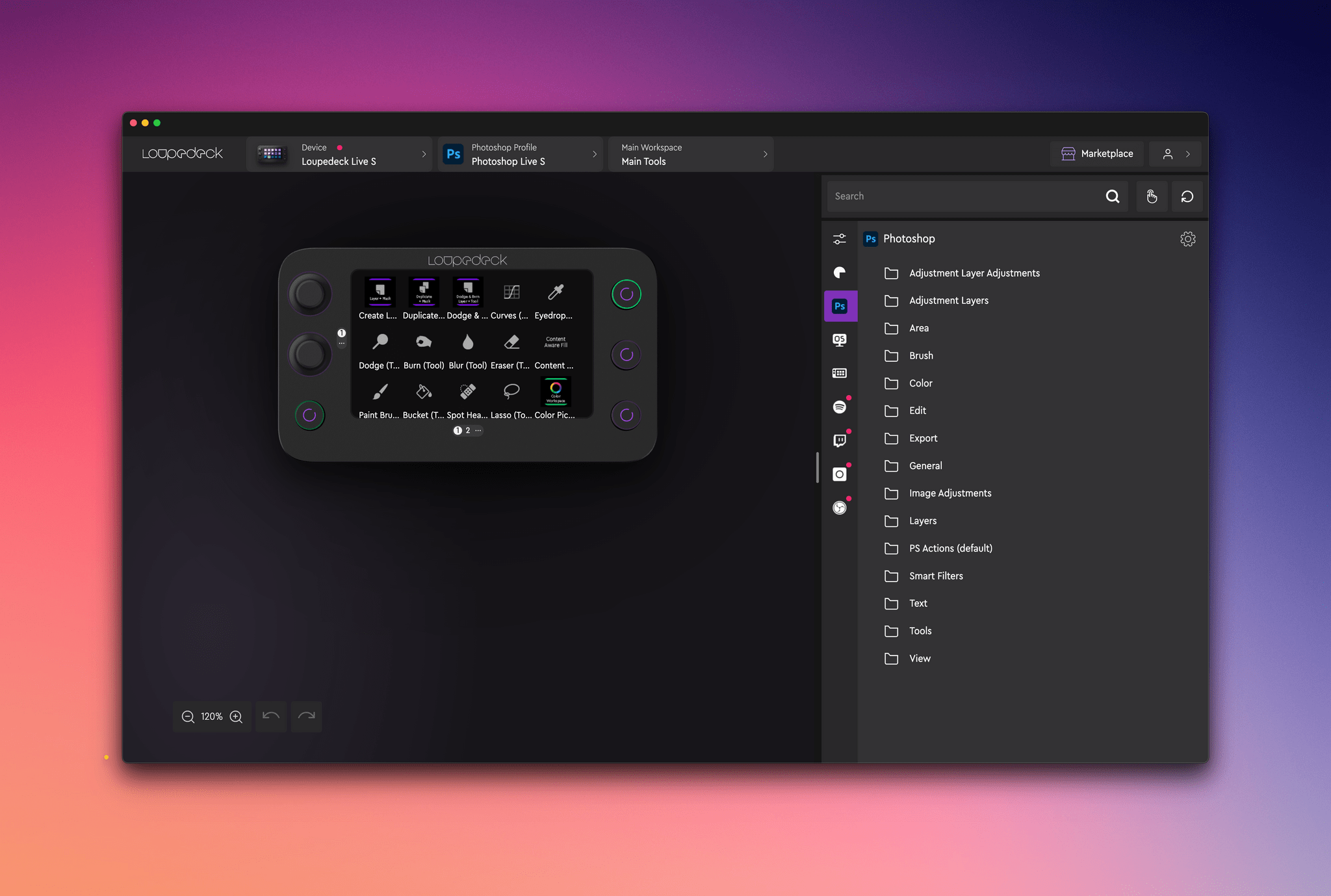
My main profile is my macOS Default profile, which is a set of actions that appears whenever I’m using an app for which I haven’t created a specific profile. Loupedeck comes with a bunch of predefined profiles for apps like Ableton Live, Adobe apps, and Capture One, and there’s also a marketplace you can browse for more. Alternatively, you can build your own profiles for other apps. I’ve been working on an Obsidian profile, for example.
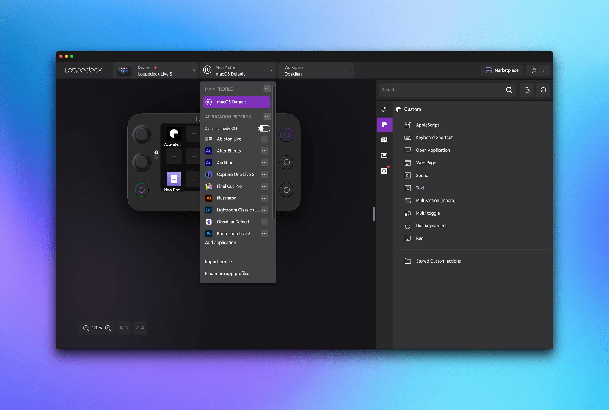
What’s interesting about profiles is that they can be assigned to buttons or activated dynamically when you switch to an app. Dynamic switching is great if you work in a single app for long periods of time and have set up multiple pages of actions you rely on. That way, as soon as you open the app, your Loupedeck Live S switches to the controls you set up for that app. Because I use multiple apps at the same time so frequently, I haven’t used profiles a lot. Instead, I mostly stick to my macOS Default profile and manually switch to other profiles as needed.
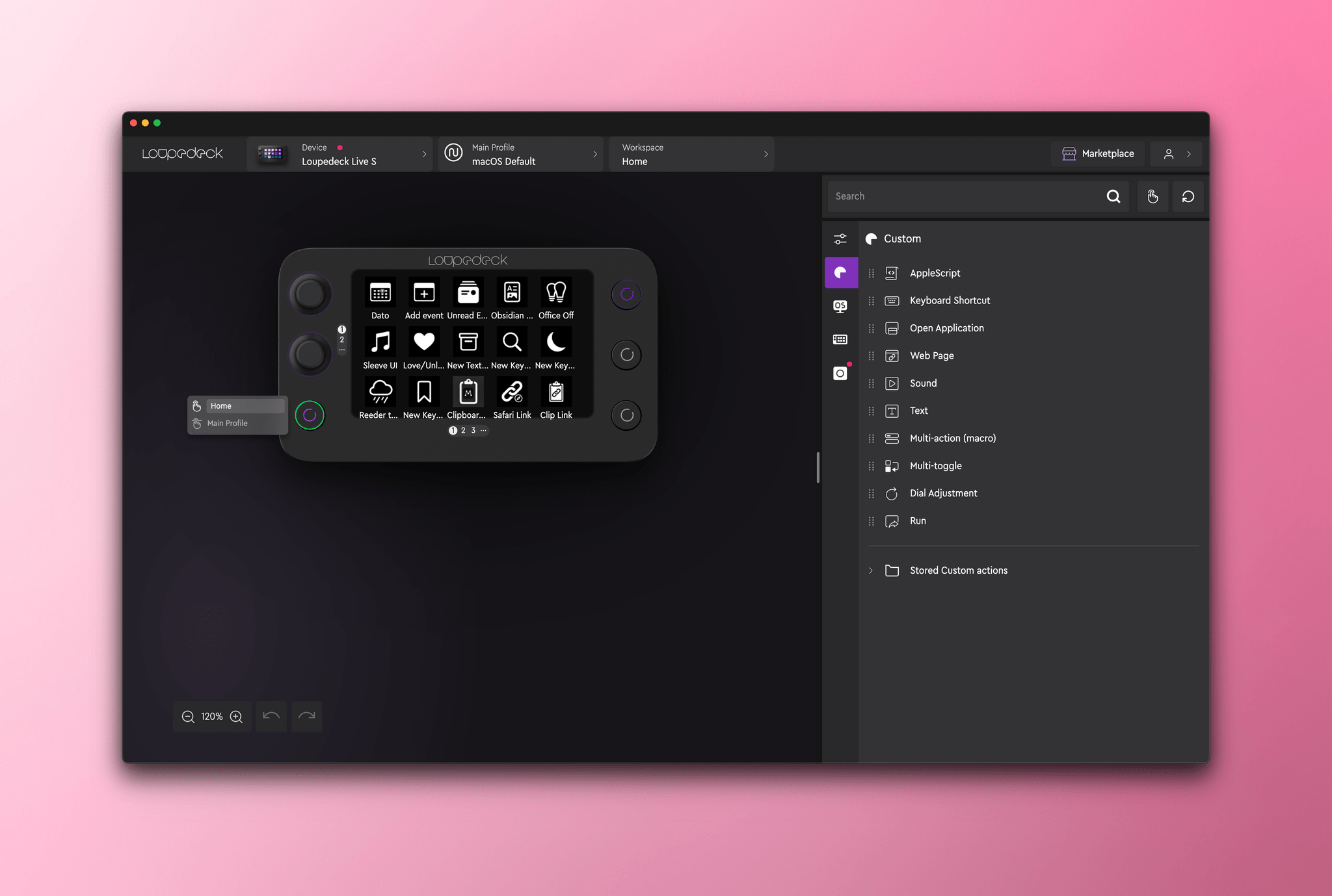
For example, my Obsidian profile is tied to the purple button on the right side of my Live S. Pressing it switches me to a dedicated page of Obsidian actions that I’m in the process of building out, and it stays there until I tap the green button on the left side of the Live S to return to my default profile.
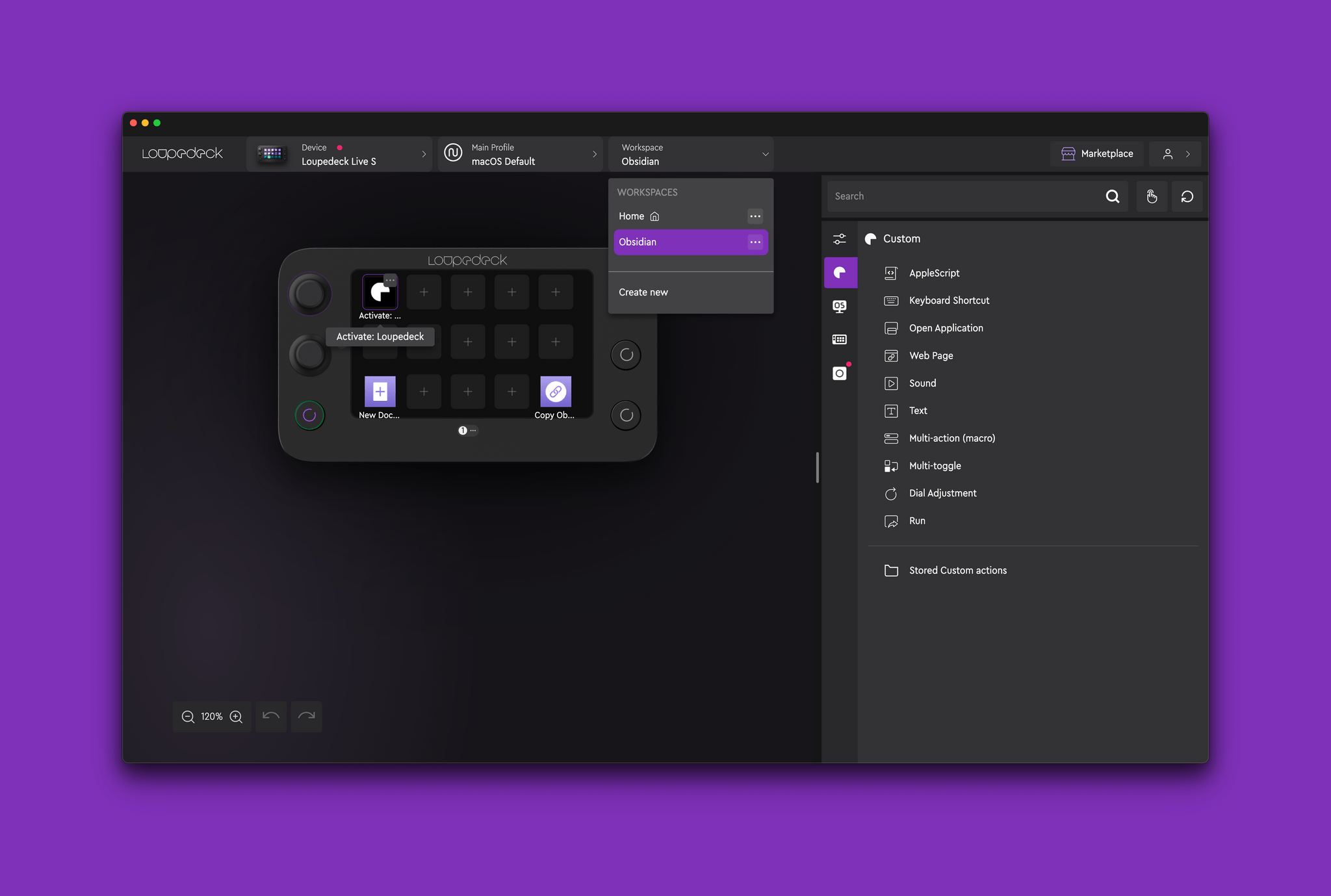
Workspaces are similar to profiles and can be composed of unique combinations of actions that you switch between for different tasks. However, workspaces don’t include the physical round buttons of the Live S, allowing those buttons to be used to switch between workspaces. The conceptual difference between profiles and workspaces can be difficult to grasp until you use them, but at the same time, I expect most people can get a lot out of the Loupedeck Live S just by sticking to profiles.
Once you get beyond the organizational structure of the Live S, it’s worth poking around to see the actions you can assign to buttons. There is a series of OS-level actions, including:
- Clipboard actions
- Time and date actions
- Actions for controlling all the keys on your Mac
- Media and mouse controls
- System app controls for Finder, Activity Monitor, and System Settings
There are also built-in actions for navigating and controlling the Loupedeck Live S itself.
However, the actions I think most MacStories readers will use the most are the Custom actions for:
- AppleScript
- Keyboard shortcuts
- Opening apps
- Opening webpages
- Playing sounds
- Inserting Text
- Executing multiple actions
- Triggering Multi-toggle actions
- Adjusting the device’s dials
- Launching executable files or URLs
Most of the actions are self-explanatory, but it’s worth considering the difference between multi-toggle actions and multi-actions. Multi-toggle actions execute up to five separate actions sequentially, whereas multi-actions execute individual actions simultaneously or in sequence, allowing for some very powerful automations.
I, however, use the Keyboard Shortcut action more than any other. That’s because most of what I trigger from the Loupedeck Live S are features of apps that have predefined keyboard shortcuts or shortcuts built using the Shortcuts app. Some of the shortcuts I’ve built could be constructed, in part, using Loupedeck Multi-toggle or Multi-actions, but then they wouldn’t be available when I’m not using the Live S, which is why I assign them keyboard shortcuts to everything that can be accessed with a press of a Live S button, by their keyboard shortcut, or using Raycast.
, but others work better as buttons on the Live S.](https://cdn.macstories.net/cleanshot-2023-04-12-at-14-40-29-2x-1681324883216.png)
I use Raycast for shortcuts that require text input like S-GPT, but others work better as buttons on the Live S.
This brings me to a broader point about automation on the Mac and how my use of control panels like the Live S has changed since I reviewed the Loupedeck Live. Raycast has cut down on my use of control panels a lot because it’s always available, and I never have to take my hands off the keyboard to trigger actions. That makes a lot of automations faster to trigger with Raycast.
Still, I’ve found that I like the Live S for activating menu bar apps without searching for their tiny and potentially hidden, icons, controlling apps I keep hidden like Sleeve, and activating shortcuts for activities such as web browsing when my hands are less likely to be on the keyboard.
Even these things could be handled by something like Raycast, but sometimes it just feels easier to tap a single button. For me, that’s meant using the Loupedeck Live S to primarily do things like:
- Quickly checking my calendar or the time in Rome using Dato’s menu bar app
- Activating Dato’s quick event entry window
- Revealing Sleeve’s playback controls
- Loving a song I’m listening to in Music
- Sending links to Raindrop.io or Matter
- Generating Markdown-formatted and plain links from webpages I’m reading
- Toggling between Obsidian’s source and preview modes
- Putting my Mac to sleep when I’m finished working
I’ve also got my Mac’s system volume and music volume connected to the Live S’s dials and profiles dedicated to Obsidian and Logic Pro X.
I like what Loupedeck has done with the Live S a lot. The device retains the excellent design and versatility of the Loupedeck Live that I reviewed previously in a more affordable and smaller package. That makes it fit better with use cases like mine. I’m not streaming video or working in photo or video editors all day. Instead, I want a subset of my automations and app features available to me at the press of a button or twist of a dial. With the Loupedeck Live S, you get exactly that in a package that easily fits in a bag, making it a terrific Mac companion on your desk or on the go.
You can also follow MacStories’ Automation April coverage through our dedicated hub, or subscribe to its RSS feed.