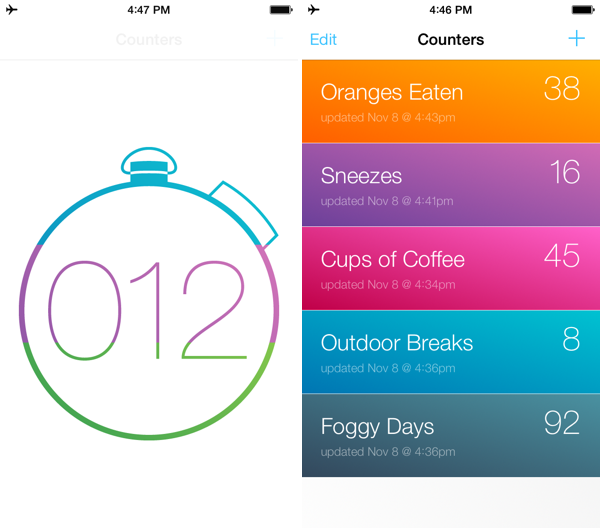
Keeping score? Counting how many of cups of coffee you drink? Need a quick way to count up for a science experiment? Keep track of multiple figures with Counters, a simple, focused app that keeps tabs on how many times you do… well, anything. It looks great and is a buck on the App Store.
Counters: For Tallying Things→
Runtime: Track And Share Your Runs→
Runtime keeps track of not only where, but how you run, highlighting workout intervals and displaying your path on a shareable map. Runtime lets you add individualized notes to each workout, define custom interval timers (useful for mixing up intensity), and safely backs up your data to Dropbox. You can even use it as a basic pedometer and step counter, as a tool to track hikes, and as a way to measure your athletic progress. Because Runtime is so focused around places and routes, I’d love to see integration with an app like Day One so you can turn trips into memories. It’s simple, looks great on iOS 7, and is well done.
Runtime can be had for $2.99 from the App Store.
Video Trailers Debut On The App Store With ‘Clumsy Ninja’
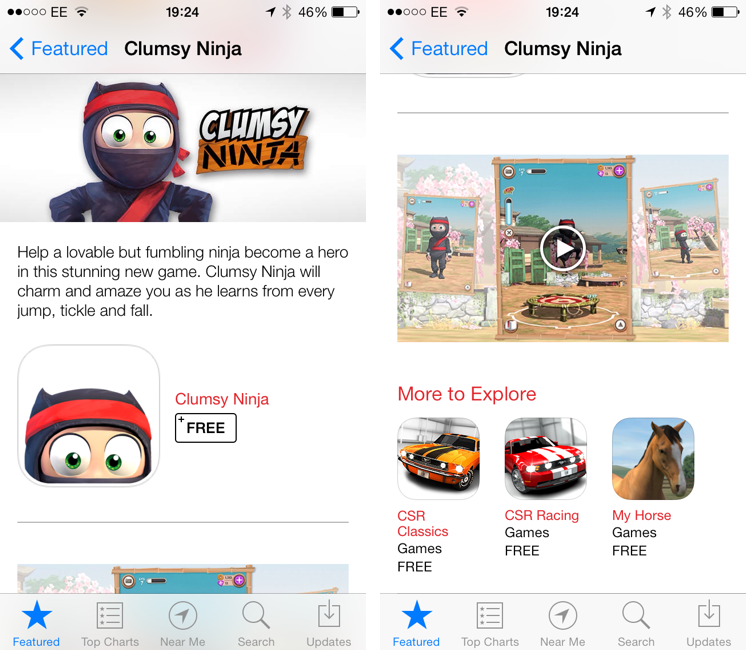
Apple is featuring Clumsy Ninja, an iOS game that was first announced at the iPhone 5 keynote in 2012, with a custom page on the App Store that, alongside a description, features a 1-minute trailer for the game. The custom “Featured” page is live on the UK App Store at the moment and it features Clumsy Ninja as Editor’s Choice for the week; it’s likely that the game will also be featured on the US App Store and other international stores later today.
The big news is, of course, the fact that Apple is embedding a video in the App Store, which has historically only allowed developers to include up to five static screenshots for their apps. Clumsy Ninja’s video opens the built-in iOS media player in portrait mode, and it features music playing in the background with no voiceover or custom App Store branding. It is, effectively, a game trailer on the App Store; right now, it’s only available in the special Featured page for the app, as the app’s regular App Store page doesn’t show the trailer.
The possibility of including videos alongside screenshots on the App Store has long been one of the most requested features by third-party developers who, over the years, have struggled to explain App Store customers the purpose of their app or game with just text and images. With iOS 7’s focus on motion and animations, the lack of videos on the App Store was particularly surprising, and it led many to wonder as to whether Apple would soon add support for videos besides screenshots. When iOS 7 was first announced in June, even Apple produced a series of short videos for the OS’ official website, where they showcased the new features and design through animations and quick demonstrations of Messages and other apps.
It’s unclear at this point if Clumsy Ninja will remain an isolated case or become the norm for the App Store going forward. It’s also not clear whether any developer will be able to add a video for their app on the App Store, or if trailers will be limited to Editor’s Choice and managed by Apple’s curation team on a weekly basis. Developers have traditionally resorted to creating videos and screencasts of their apps for their websites or YouTube channels, and an integrated solution available in the App Store alongside screenshots, description, and buy buttons would be a fantastic addition to better illustrate an app’s feature set, flow, and user experience.
FlightTrack 5→
If you’re catching a flight this holiday season, Mobiata just announced FlightTrack 5, a completely redesigned must have flight tracking tool that always keeps you in the know about departures, delays, arrival times, and weather conditions.
Now, all FlightTrack users get push notifications with flight updates and can view terminal maps to help navigate to the gate. With FlightTrack, you can search flights by number or route in a single search field, create trips with multiple flights and travelers, and view the progression of an entire trip within a single workflow.
As always, you get real-time departure info, delays, and gate numbers at a glance. International coverage allows you to track flights worldwide. We even inform you of cancellations and help you find alternate flights when you’re in a pinch.
Nab it from the App Store for $2.99 for a limited time.
TextTool: Text Manipulation On iOS
It used to be that, to do nerd stuff, you had to get a Mac or PC. As iOS progressed over the years, however, developers saw that users were spending a lot of time trying to do work on their iPhones and iPads, and started building utilities that packed powerful functionalities in what looked like “just an app”. We got Drafts and Launch Center Pro, calendar apps and password managers just as powerful as their desktop counterparts, and, of course, apps to script iOS and a text editor with its own workflow system. To sum up: iOS is still maturing, but there’s no shortage of nerdy apps and utilities at this point.
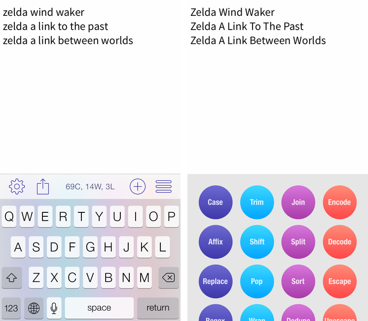
iOS is great for quick text entry thanks to the portability of an iPhone or iPad mini, but doing advanced text manipulation is a bit tricky unless you want to get dirty with Editorial and Python scripts. On the Mac, it’s easy to fire up Automator and create a workflow that takes a line of text and turns it Into Title Case or UPPERCASE; even going the extra mile and building services to take selected text and indent it or swap spaces with tabs takes a few minutes, but it’s doable with a basic knowledge of built-in OS X tools. On iOS? There’s no Automator (yet?), so, until today, if you wanted to do automated text transformations you’d have to get Editorial and Pythonista or use some of Launch Center Pro’s (limited) text filters.
Craig Pearlman noticed this problem and built TextTool, a $4.99 Universal app that comes with 28 built-in text transformations that you can use inside the app’s text editor or chain to other iOS apps with URL schemes and workflows.
Oak: A Pokédex for Your iPhone→
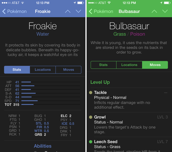
I’ve had Oak on my iPhone for a while, but now that it has Kalos region Pokémon for X & Y, I’ve been using it more and more as a companion for referencing abilities
The hardest decisions you’ll have to make in these games is deciding which of your Pokémon’s moves stay and which ones go. Not having played since I was a kid, I’m not familiar with a lot of the new moves and types that have been added since Red and Blue. Oak lets me search for Pokémon, find pertinent stats, and browse through their entire moveset. The app is free to try, with an in-app purchase unlocking the full directory of over 700 Pokémon for $4.99.
Download it from the App Store.
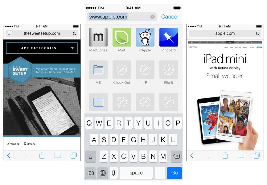
Leaving Google Chrome: Why I’ve Returned To Safari
I guess you could say that I was quite the fan of Google Chrome.
Before switching to Chrome last year, I didn’t have a “favorite” browser or “browser of choice”: I just kept jumping between Safari, Chrome, and Firefox, trying out all the features that the three major players had to offer on OS X. I’m pretty sure that, at one point, I even tried to go a full week with using Opera. My browser requirements have always been fairly standard (several open tabs; a lot of reading; sync with mobile devices), so I could afford to change browsers without having to worry about setting up a complex environment from scratch.[1]
As I started using my iPad as my primary computer last year, I was growing increasingly annoyed with the state of iCloud sync in Safari and lack of major overhaul to a design that originally shipped with iPhone OS 1. I don’t frequently abandon systems that work for me due to stagnation, but iOS 6’s Safari exhibited a certain staleness on top of issues with bookmark and tab sync that, for me, were becoming an annoying problem. I liked Safari’s speed and native integrations with iOS, but it was prone to errors and boring.
On the other hand, Google Chrome for iOS was promising, familiar, and power user-friendly. I fell in love with Google’s support for x-callback-url, which I integrated in several workflows of mine as it allowed me to save time when switching between apps on my iPad; sync was nearly perfect; I praised Google’s superior implementation of voice dictation and feedback, although I noted how their Voice Search couldn’t exactly compete with Siri. Google kept pushing updates to Chrome for iOS, making it a capable browser for average and power users alike.
A few weeks after publishing my review of iOS 7, I decided to uninstall Chrome from all my devices and move back to Safari as my main and only browser on my iPhone, iPad, and two Macs.
I’m not looking back. I’m happy with the new Safari – so much, in fact, that I’m even considering Reading List as my “read later” service going forward.
First iOS 7 Game Controllers Now Available→
As reported by The Verge, the first third-party iOS 7 game controllers are going on sale this week, although with mixed reviews by the press. Namely, PowerA has released the MOGA Ace Power ($100) and Logitech announced the PowerShell (Controller + Battery, shipping in December in the United States, priced at $99).
Both controllers take advantage of Apple’s new game controller API that was added in iOS 7, which allows hardware makers to create physical controllers that follow a specification provided by Apple, and that lets game developers easily add support for the controller framework once and expect their games to work with controllers by any company. However, Apple decided to make controllers optional in iOS 7 games (multi-touch is still required as primary input) and they didn’t launch or highlight a specific section of controller-ready games in the App Store, which led me to wonder about the potential of game controllers in the future.
Polygon’s Russ Frushtick tried the MOGA Ace Power, and he was not impressed:
It has a cheap, plastic feel and a rattle that makes it seem like the controller could shake apart at any moment. There’s also no wireless support, which means that you can only use devices that fit inside the controller’s expanding design (basically just newer iPod Touch and iPhones that support Apple’s lightning connector will work). There is a battery pack in the controller, so you can use it to charge your phone in a pinch, but it’s far from ideal for anything beyond that.
The MOGA Ace Power uses the “extended” controller option of Apple’s framework, which has support for dual analog sticks and shoulder buttons + triggers. Apparently, Apple asked PowerA to make sure iPhones and iPod touches could sit in the middle of the controller.
In his hands-on post, TouchArcade’s Eli Hodapp noted the potential of the MOGA Ace Power, its poor build quality, but also described the experience of playing first-person shooters on iOS:
Additionally, I’ve found myself actually enjoying playing first person shooters on my iPhone for the first time I can ever remember. All the frustration of having your thumbs all over the screen desperately trying to look and move while avoiding and/or hitting a plethora of virtual buttons just totally fades away. If you’re a huge fan of iOS first person shooters, consider one of these controllers an absolute must-have accessory.
Alas, it sounds like most game developers haven’t tested their games with the first iOS 7 controllers, resulting in interfaces that don’t disappear when a controller is connected (virtual buttons and sticks) or control schemes that don’t use all the provided buttons.
The Logitech PowerShell, on the other hand, uses the simple, SNES-like controller configuration with no dual analog sticks. SlashGear’s Chris Davies tried the PowerShell, although I’m not sure this justifies its premium price tag:
As you might hope for a hundred-dollar controller, the keys are sturdy and firm, with just the right sort of response under your fingertip. If you’ve tried a recent Logitech pad for PC, they’ll be very familiar.
On the official website, Logitech has posted a list of games that are compatible with the PowerShell (and presumably any other controller as well) and a product page with additional information and photos.
Based on initial reviews, it sounds like it’s too early to invest in an iOS 7 game controller: as expected, the first controllers work but they’re not great, and, more importantly, you won’t find many games with proper support for game controllers today. iOS 7 game controllers keep having enormous potential to enhance gaming on iOS; at the same time, though, we’ll have to wait and see if physical controllers are what iOS really needed to go beyond freemium games, ports, spin-offs, and the occasional gem.


