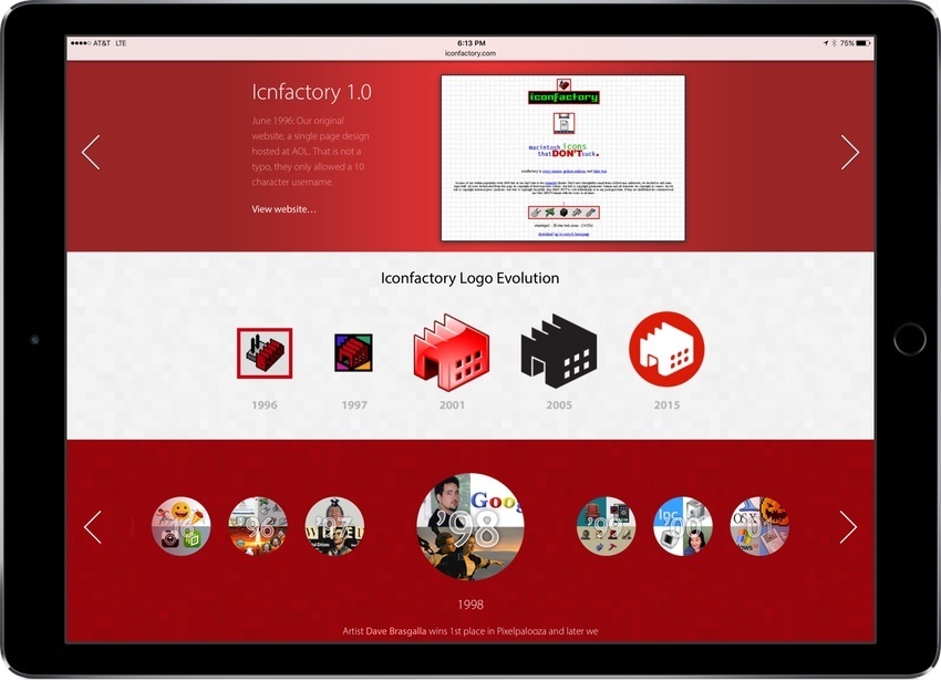
The Iconfactory is celebrating its 20th anniversary this week with a special website that shows off the evolution of its website, icon, and animations through the years, chronicles major events in the company’s history, and much more. I got a sneak peak at the site after my WWDC interview with Craig Hockenberry and this isn’t something you want to miss. It’s a fascinating exploration of the evolution of web and icon design over the past two decades.

In addition to the 20th anniversary site, the Iconfactory released a new photography app for iOS called Exify, that provides photographers with several pages of metadata for any photo on your iOS device. Whether it’s a histogram, location data, or data about where the camera was focused, Exify can display it. Exify also includes extensions that let you add watermarks and copyright data to images nondestructively, get data about an image from within Photos or another app, and magnify images.