Useful site by Sandro Roth (via Six Colors) to browse every command supported by Siri in Apple’s apps. I almost wish iOS had a similar interface to explore commands. I wonder if we’ll start seeing more sites like this pop up after iOS 10 and SiriKit.
Collecting Siri’s Supported Commands→
Notebooks for iOS and Mac Organizes Your Research and Reference Materials
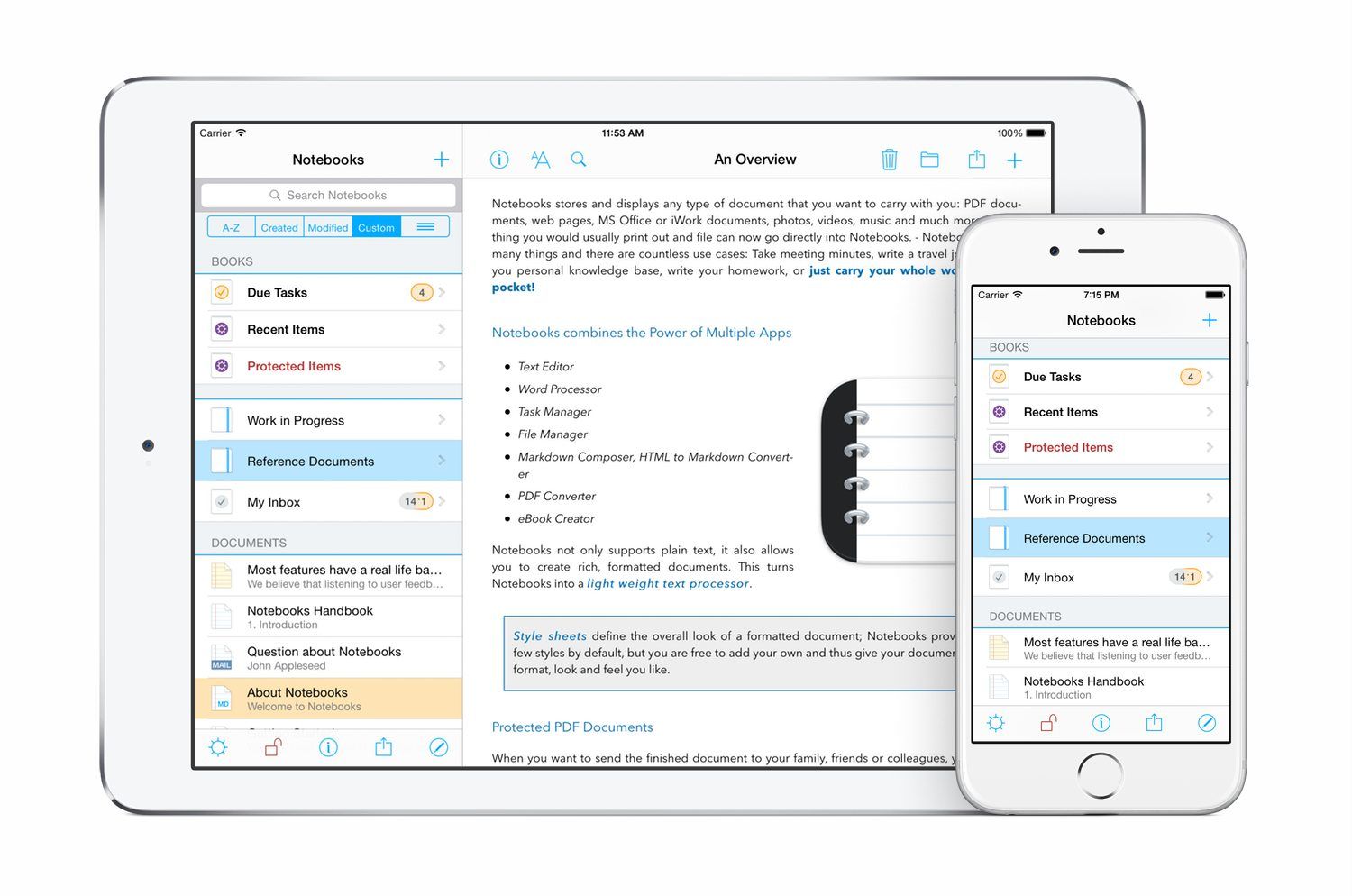
There’s a reason why there have been so many different notebook-style apps on iOS and the Mac over the years. Media-rich research projects and reference materials benefit from the familiar metaphor of a notebook as a way to organize everything in one place. The difficulty, though, is balancing organizational functionality with editing tools. Good organizational tools like search, sorting, and sync are a must, but apps that go too deep into editing features can quickly become a bloated mess. Go too light, and the editing features aren’t of much use.
Notebooks by Alfons Schmid is an iOS and Mac notebook app that has excellent organizational tools on iOS and the Mac. With solid search, sorting and sync options, your notebooks and documents are always readily available to you, which makes it a great research tool, especially on iOS. Notebooks’ editing tools are a different story. Notebooks for iOS strikes a nice balance with excellent text and PDF editing tools. The more recently released Mac version of Notebooks, however, doesn’t go much beyond text editing, which is a little disappointing.
Whether Notebooks is right for you will depend on the extent to which you want to edit files stored in it and, if so, whether iOS or OS X is the dominant platform you use. People who work on iOS will love the power of Notebooks; on the Mac, Notebooks is closer to a viewer app and may not be sufficient to meet your needs.
Game Day: Bulb Boy
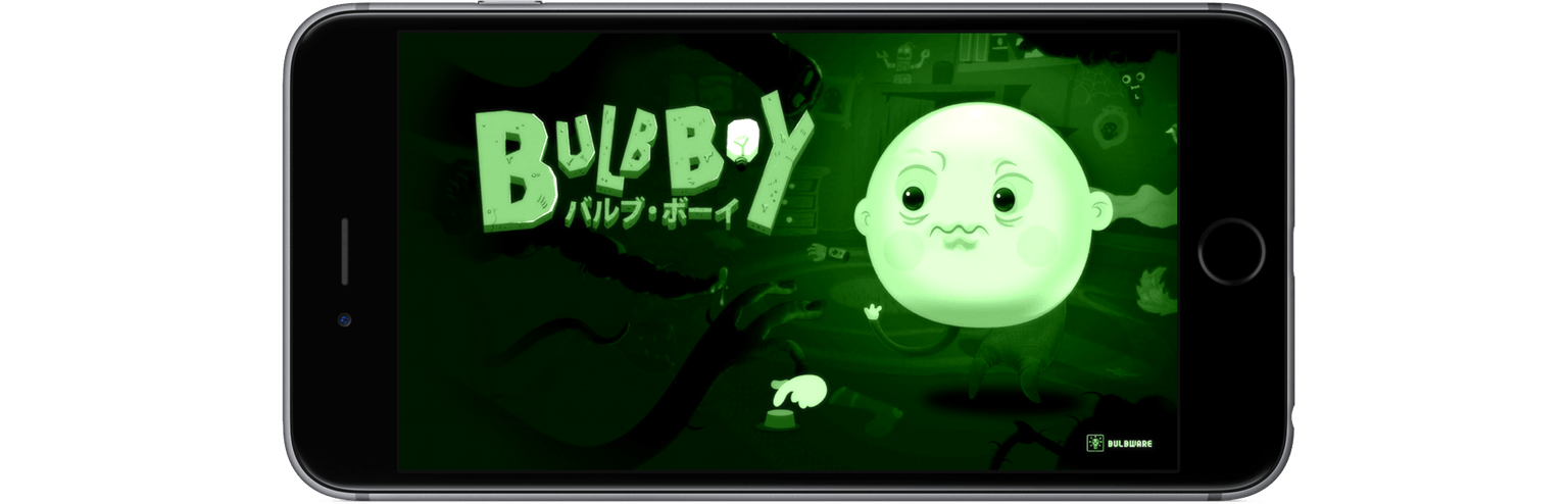
Bulb Boy is a bizarre point-and-tap puzzle adventure on iOS from Kraków, Poland-based Bulbware that draws inspiration from games like Machinarium. As the name suggests, the story centers around a boy who is a lightbulb. Bulb Boy appears to be going about his business, living a quiet life with his grandfather and bulb-dog in their bulb-house, until strange things suddenly start to happen. Bulb Boy’s world is beset with monsters and it’s up to you, as Bulb Boy, to defeat them by collecting a series of items that help you solve puzzles.
Everything in the game is black and green like an old CRT monitor. The animation has a distinctly retro feel too. When I started Bulb Boy I immediately felt like I had stepped into a demented version of an old cartoon from the 1930s.
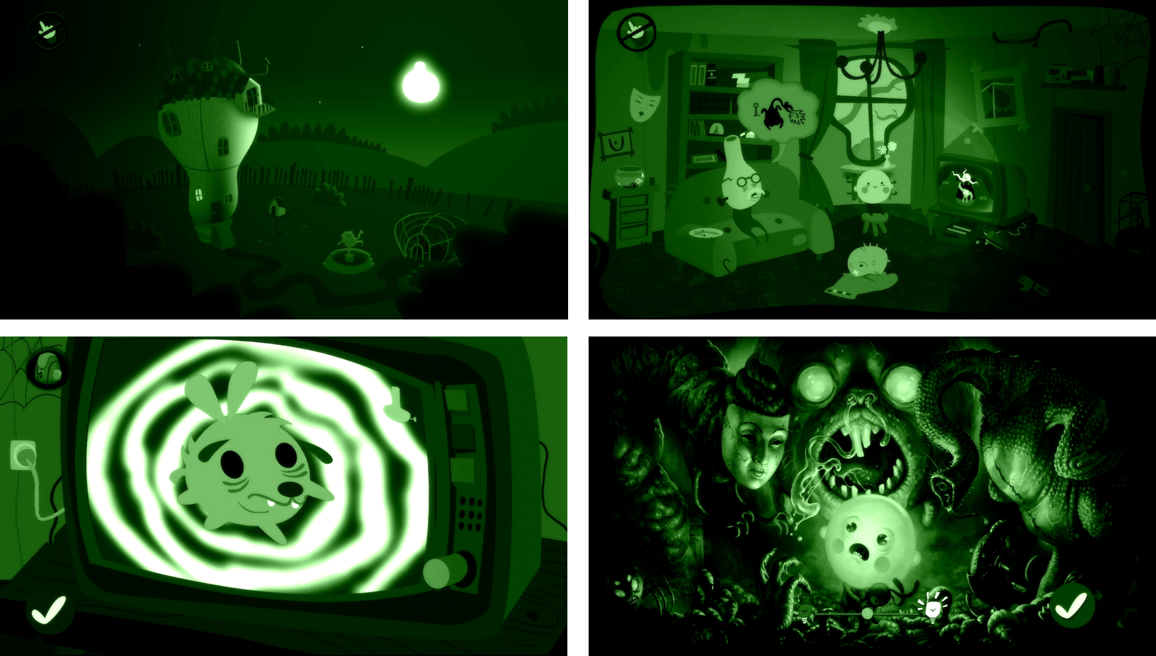
The mechanics are straight-forward. You explore each scene by tapping the screen. Bulb Boy moves to where you tap and examines any items in the area. The items you collect help you solve the puzzles and move on to the next stage. In addition, Bulb Boy can take off his head to illuminate dark areas and help solve puzzles. As the game progresses it continually introduces new challenges that keep the game fresh.
Bulb Boy, which has won more awards than I can list here, is as creepy and weird as it sounds. Originally released for PCs on Steam, the game translates well to iOS’s touch interface. I played on my iPhone 6s Plus and iPad Pro and greatly preferred the experience on the iPad, where the artwork and soundtrack could really shine.
Bulb Boy is as much about exploring and enjoying its strange world as it is about the puzzles. The lead character is so charming that I very quickly found myself wanting to help him out of all the tight spots he finds himself in, which makes for an absorbing game. For the most part, the puzzles are challenging without being too hard, but if you do get stuck, Bulb Boy provides hints in the form of pictographic thought-bubbles that appear above Bulb Boy’s head. There are also walk-throughs online.
Bulb Boy is available on the App Store for $2.99 and, although I have not tried it, it’s worth noting that Bulb Boy is also available on the Mac for $9.99.
An Ode to the iPod Classic→
Lindsay Zoladz, writing for The Ringer, has a great story on the role of the iPod Classic in today’s music streaming landscape. I understand where she’s coming from, and I found this passage on the paradox of choice particularly accurate:
“When I’m searching for something to listen to on Spotify, I feel like I end up listening to the same albums and artists again and again,” my friend Becca wrote in an email, after I asked a handful of acquaintances about their post-iPod listening habits. “My brain by itself isn’t good at cataloguing everything I love.”
The psychologist Barry Schwartz has written (or, if you don’t have too much time on your hands, has TED-Talked) about a related phenomenon he calls “paradox of choice” — the notion that, although we tend to think of freedom of choice as an inherently good thing, too much choice can leave us feeling paralyzed and anxiety-ridden. “With so many options to choose from,” he says, “people find it very difficult to choose at all.” I personally have proven this theory many times over in the past few months, when I’ve stared for a few moments at the infinite void that is the Apple Music search bar and decided, “I guess I will just listen to Pablo or Lemonade again.” Another friend I emailed summed up the Paradox of Digital Music Listening succinctly: “With device-bound listening, I absolutely feel limited by [storage] space. With streaming, I feel limited by my own memory.”
This is why I often buy videogames from a small shop in my hometown. I could open the App Store, or the eShop, or the PlayStation Store, and buy anything I want. But there’s just so much stuff. There’s too many games and too many reviews and too many Let’s Plays to choose from. Sometimes, it’s nice to have fewer options.
Bluetooth Headphone Revenue Overtook Non-Bluetooth for the First Time in June→
According to The NPD Group’s Retail Tracking Service, Bluetooth headphone revenue overtook non-Bluetooth for the first time in June accounting for 54 percent of headphone dollar sales and 17 percent of unit sales in the U.S.
And:
Beats and LG have led the Bluetooth headphone market throughout the first half of the year, accounting for approximately 65 percent of dollar sales.
Not necessarily a direct indication of decline in wired headphones, but a sign that, as average prices of Bluetooth headphones go down, consumers may prefer wireless.
Removing the headphone jack from the next iPhone will be annoying; at the same time, limitations notwithstanding, I can’t deny how nice it is not to deal with wires anymore.
Blyss Review: Dots, Combos, and Relaxation
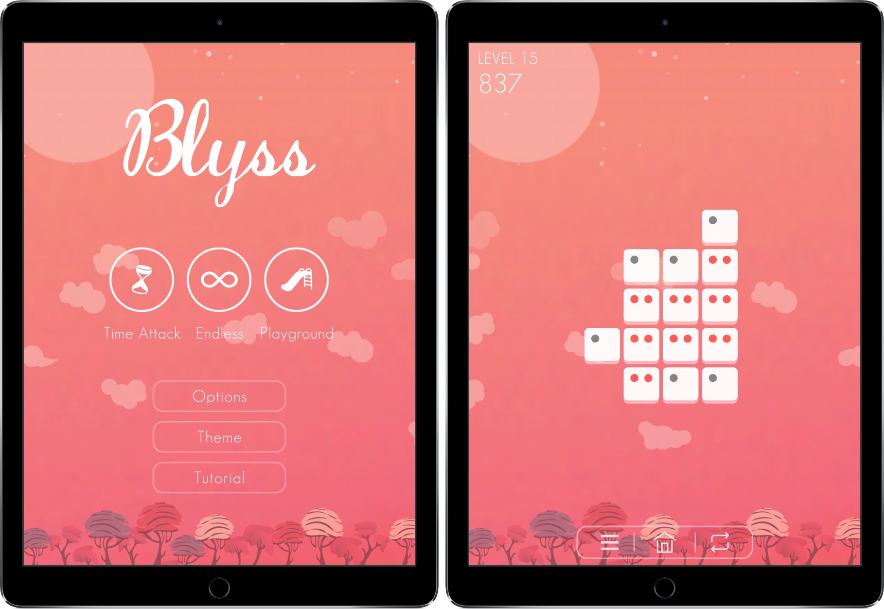
Late at night, I’m listening to a soft, ambient piano tune while sitting in my bed. I’m not sleeping, though – in fact, I’m far from completely relaxed. I’m swiping feverishly on my iPad’s screen, wiggling my fingers between every gesture as I try to find patterns in a group of tiles. Points rack up in the upper left corner of my screen and I anxiously look to get a set of combos so I can complete a challenge I’m stuck on.
I mess up and create a pattern I can’t escape from. Amid music that could put a baby to sleep, I loudly criticize myself.
How could I fail on level 2?
The game I’m playing is Blyss, a title whose name is often representative – but not always. Created by Dropout Games, Blyss has the potential to be the next big puzzle game, like Two Dots or Flow Free before it.
Apple Maps vs. Google Maps vs. Transit→
Concise, well-illustrated comparison of transit maps from the developers of Transit for iOS:
Transit maps are hard. Really hard. Even for Apple and Google. Piecing a transit map together, city by city, agency by agency, stop by stop, without it turning into a hairy mess is INCREDIBLY difficult. So far, no one (not even Apple or Google) have been able to create a transit map that is both automatically generated and well designed. Why is that?
As Apple outlined at WWDC, their approach to transit takes a long time because it involves manually curated details (things like signs, directions, and cultural conventions that match the real world), which wouldn’t be possible with an algorithm alone.
That said, I can vouch for Transit in Rome. The app is excellent. Well designed, with some clever interactions (such as an “arrive by” option to plan a trip on a timeline), and a joy to use. It’s also the only decent transit app that combines public transit with local car sharing services on the same map.
I wish Apple Maps transit data was a) available in Rome and b) as flexible as Transit.
Parkopedia and Apple Strike Maps Deal→
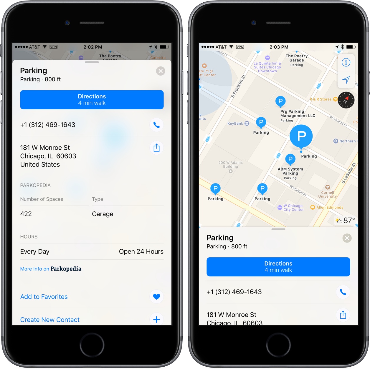
Parkopedia, a parking service provider with data on over 40 million parking spots world-wide, has struck a deal with Apple to provide parking data to Apple Maps. Parkopedia announced that Apple Maps users in North America, Europe, Asia and Latin America:
will be able to view key information about parking garages and lots around the world. In addition, users will have the option to click through to Parkopedia’s website and iOS app to view more detailed information including pricing, user reviews, special offers and real-time space availability. They will also be able to make reservations.
I ran a parking search for downtown Chicago, and many of the parking lots are still listing Yelp ratings and information, but I did find one nearby with Parkopedia information that included the number of spaces, the type of parking lot, payment methods accepted, height limits, hours, and a link to Parkopedia for more information.
It’s good to see Apple continuing to work with other companies to provide additional information for Apple Maps. The last week has seen a couple Google Maps announcements and with today’s news, it seems as though the competition to provide rich map data will only heat up from here.
One Billion iPhones→

This morning, Apple CEO Tim Cook celebrated the one billionth iPhone, holding it aloft at an employee event in Cupertino, California. Cook said:
”iPhone has become one of the most important, world-changing and successful products in history. It’s become more than a constant companion. iPhone is truly an essential part of our daily life and enables much of what we do throughout the day,” said Cook. “Last week we passed another major milestone when we sold the billionth iPhone. We never set out to make the most, but we’ve always set out to make the best products that make a difference. Thank you to everyone at Apple for helping change the world every day.”
It’s remarkable to think that less than ten years ago, Apple launched the iPhone with 2007 sales of just 3.7 million units.