 MacStories Weekly: Issue 388
MacStories Unwind: Flora and Son and Federico’s Latest Tech Discovery


This week on MacStories Unwind, I recommend an Irish family drama on Apple TV+, while Federico has been out exploring new corners of the tech world.
Sponsored By:
- Kolide – It ensures that if a device isn’t secure it can’t access your apps. It’s Device Trust for Okta. Watch the demo today!
Links and Show Notes
John’s Pick
- Flora and Son, on Apple TV+
Federico’s Pick

- XREAL Air
- XREAL Beam
- Also mentioned:
MacStories Unwind+

We deliver MacStories Unwind+ to Club MacStories subscribers ad-free and early with high bitrate audio every week.
To learn more about the benefits of a Club MacStories subscription, visit our Plans page.
Access Extra Content and Perks
Founded in 2015, Club MacStories has delivered exclusive content every week for nearly a decade.
What started with weekly and monthly email newsletters has blossomed into a family of memberships designed for every MacStories fan.
Club MacStories: Weekly and monthly newsletters via email and the web that are brimming with apps, tips, automation workflows, longform writing, early access to the MacStories Unwind podcast, periodic giveaways, and more;
Club MacStories+: Everything that Club MacStories offers, plus an active Discord community, advanced search and custom RSS features for exploring the Club’s entire back catalog, bonus columns, and dozens of app discounts;
Club Premier: All of the above and AppStories+, an extended version of our flagship podcast that’s delivered early, ad-free, and in high-bitrate audio.
The Creativity Enabled by the iPhone 15 Pro’s New Cameras and Action Button

Every year, one of the most anticipated iPhone hardware announcements is changes to its camera. This year, the iPhone Pro Max’s new telephoto lens was the center of attention. However, there were other notable tweaks to the camera hardware and software across the iPhone lineup, too. Plus, we got a hardware bonus in the form of the iPhone 15 Pro and Pro Max’s Action button, which can perform some interesting tricks. Now, with the new iPhones in the hands of people around the world, we’re starting to see what that hardware can do in practice, and I’ve got three examples I’d like to share.

The first is an update to the camera app Halide that does something incredibly clever. Built into version 2.13 of the app is a shortcut that can be tied to the Action button to open Halide with a single press. That’s something you can do with any app using an Open App action, but Halide goes a step further by offering in-app functionality if you tie the button to its app. In the app’s settings, you can choose to tie the Action button to any of the following options:
- Do nothing
- Lenses
- Exposure Mode
- Focus Mode
- RAW
- Resolution
- Capture
After using the Action button to open the app, pressing the button again will perform whichever action you picked in its settings. For example, if you chose Lenses, the first press of the Action button from outside the app will open Halide, and subsequent presses will cycle through each of the available camera lenses. I love this use of the Action button and hope other developers do the same, adding contextual actions to more apps.

Speaking of Halide, Sebastiaan de With, one of its creators, published a review of the iPhone 15 Pro Max camera today, concluding that:
With iPhone 15 Pro Max’s default 24 megapixel resolution, added ‘lenses’ under the main camera lens, automatic depth capture for portraits, and that 5× lens, this release might not blow away on a spec sheet, but is massive for everyone who uses an iPhone to take photos.
There’s a lot of ground to cover between the hardware and processing changes happening behind the scenes. Plus, de With is an excellent photographer whose shots do a fantastic job illustrating what is possible with the iPhone 15 Pro Max. So be sure to check out the full review.
Finally, the iPhone’s camera takes amazing video, too. This year saw the introduction of Log encoding for Pro Res 4K footage. That opens up a wider range of editing control using apps like Final Cut Pro, which Joey Helms used to create this amazing video of Chicago:
I’ve had my iPhone 15 Pro Max for just four days, and already, I’m enjoying taking photos as I walk around my neighborhood and playing with features like adding Portrait mode after the fact to images like the one below.

The result is a lot more creative freedom that’s more accessible than ever, not only because your iPhone is usually in your pocket but because the tools Apple has created for taking great photos and videos are so easy to use.
Access Extra Content and Perks
Founded in 2015, Club MacStories has delivered exclusive content every week for nearly a decade.
What started with weekly and monthly email newsletters has blossomed into a family of memberships designed for every MacStories fan.
Club MacStories: Weekly and monthly newsletters via email and the web that are brimming with apps, tips, automation workflows, longform writing, early access to the MacStories Unwind podcast, periodic giveaways, and more;
Club MacStories+: Everything that Club MacStories offers, plus an active Discord community, advanced search and custom RSS features for exploring the Club’s entire back catalog, bonus columns, and dozens of app discounts;
Club Premier: All of the above and AppStories+, an extended version of our flagship podcast that’s delivered early, ad-free, and in high-bitrate audio.
Three Ways to Use BetterTouchTool to Enhance Window Management with a Trackpad
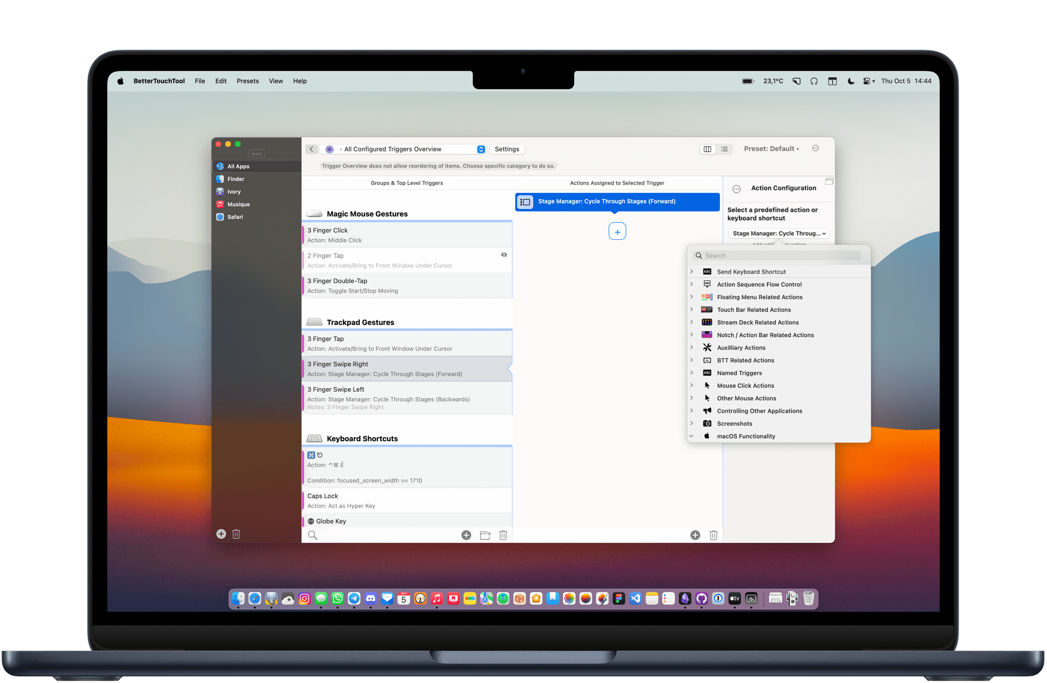
BetterTouchTool is an essential tool that can help anyone streamline their workflows, but I think it really shines when it helps me solve some of my everyday frustrations.
I mainly use a Magic Trackpad at my desk. It’s a great way to navigate a Mac: smooth scrolling, great haptic feedback, and gestures for multitasking with Mission Control. However, Apple has not gone far enough to make the trackpad as useful and easy to use as it could be when it comes to managing windows. So, to fix three tiny window management annoyances, I use BetterTouchTool.
Access Extra Content and Perks
Founded in 2015, Club MacStories has delivered exclusive content every week for nearly a decade.
What started with weekly and monthly email newsletters has blossomed into a family of memberships designed for every MacStories fan.
Club MacStories: Weekly and monthly newsletters via email and the web that are brimming with apps, tips, automation workflows, longform writing, early access to the MacStories Unwind podcast, periodic giveaways, and more;
Club MacStories+: Everything that Club MacStories offers, plus an active Discord community, advanced search and custom RSS features for exploring the Club’s entire back catalog, bonus columns, and dozens of app discounts;
Club Premier: All of the above and AppStories+, an extended version of our flagship podcast that’s delivered early, ad-free, and in high-bitrate audio.
Customizing App Icons on a Mac in 2023
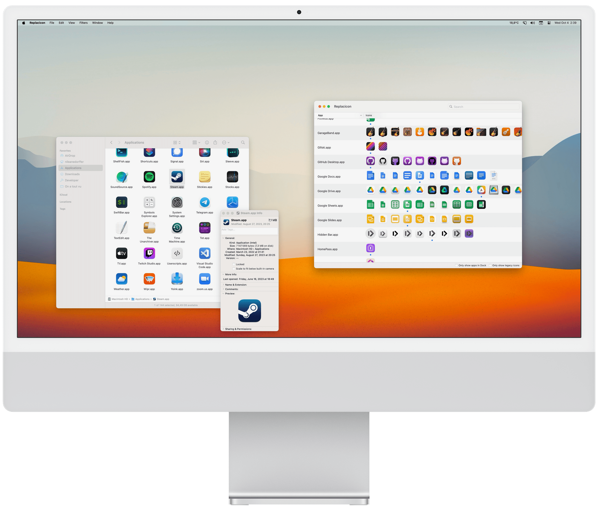
The age of wildly personalizing the look of macOS might be over, but customizing app icons is still fun, and the phenomenon is more popular than ever since the advent of Home Screen widgets and custom Shortcuts launchers that have allowed millions to personalize the look of their iPhones.
Just like on iOS, I believe there is still room for custom icons on the Mac. Whether you’re looking to completely change the look of your Dock or simply tweak a couple of app icons, here’s how you can do it.
Access Extra Content and Perks
Founded in 2015, Club MacStories has delivered exclusive content every week for nearly a decade.
What started with weekly and monthly email newsletters has blossomed into a family of memberships designed for every MacStories fan.
Club MacStories: Weekly and monthly newsletters via email and the web that are brimming with apps, tips, automation workflows, longform writing, early access to the MacStories Unwind podcast, periodic giveaways, and more;
Club MacStories+: Everything that Club MacStories offers, plus an active Discord community, advanced search and custom RSS features for exploring the Club’s entire back catalog, bonus columns, and dozens of app discounts;
Club Premier: All of the above and AppStories+, an extended version of our flagship podcast that’s delivered early, ad-free, and in high-bitrate audio.
TV Remote: Control Your TV From Your Lock Screen, Home Screen, and Live Activities

Developers have come up with endlessly clever uses for interactive widgets. I love testing them all, but one type is beginning to stick more than others. It’s the widgets for apps that require quick interactions when you’re in the middle of something else. Turning off the lights in my home office when I’m finished working for the day, toggling work timers as I switch from task to task, and then checking off those tasks as I complete them are all perfect interactions for widgets that require minimal switching away from whatever I’m doing. Hopefully, that means fewer distractions and, in turn, a more productive day.
But not everything is about peak efficiency and checklists. Sometimes, you just want to relax, which widgets can help with, too. One of my favorite apps to help with that, which recently added interactive widget support, is TV Remote by Adam Foot. Foot’s app is one I already used with my LG C2 TV, but it’s the app’s new widgets that have graduated it to a regular part of my TV routine.
Access Extra Content and Perks
Founded in 2015, Club MacStories has delivered exclusive content every week for nearly a decade.
What started with weekly and monthly email newsletters has blossomed into a family of memberships designed for every MacStories fan.
Club MacStories: Weekly and monthly newsletters via email and the web that are brimming with apps, tips, automation workflows, longform writing, early access to the MacStories Unwind podcast, periodic giveaways, and more;
Club MacStories+: Everything that Club MacStories offers, plus an active Discord community, advanced search and custom RSS features for exploring the Club’s entire back catalog, bonus columns, and dozens of app discounts;
Club Premier: All of the above and AppStories+, an extended version of our flagship podcast that’s delivered early, ad-free, and in high-bitrate audio.
AppStories, Episode 353 – tvOS 17: The MacStories Review with Sigmund Judge→
This week on AppStories, we are joined by tvOS expert Sigmund Judge, who just finished writing his tvOS 17 review for MacStories, to understand what has changed in tvOS and where it might be heading.
Sponsored by:
- TV Forecast – Track, Explore and Discover Your Favorite Shows and Movies
](https://cdn.macstories.net/banneras-1629219199428.png)
On AppStories+, I explain iPads of a Plane, a far safer version of Snakes on a Plane.
We deliver AppStories+ to subscribers with bonus content, ad-free, and at a high bitrate early every week.
To learn more about the benefits included with an AppStories+ subscription, visit our Plans page, or read the AppStories+ FAQ.
tvOS 17: The MacStories Review

Apple TV may have received its most surprising update release this year, and I’d argue that tvOS 17 is also Apple’s most impactful. With the launch of Apple TV+ and the expansion of Apple’s TV app to third-party devices, Apple TV the platform had gone through a bit of a confidence crisis. It was hard enough before to get developers and the wider Apple community to talk about its software, but now it had to compete for attention with the likes of Jennifer Anniston, Reese Witherspoon, and Ted Lasso.1
Attention then moved onto Apple’s next big platform reveal, a project so steeped in secrecy and excitement that when a tvOS engineering manager made a brief public change to their social media profile indicating they had moved on to work for the company’s AR/VR division, I began to wonder if Apple TV and tvOS would ever get their special moment to shine. That special moment would come exactly nineteen minutes before the debut of Apple Vision Pro, and while it may have been a fleeting moment quickly forgotten by the majority, it’s a moment in Apple TV’s story I’ve been thinking about ever since.
The introduction of FaceTime on Apple TV was more than just a feature announcement. It also represented a realignment in what mattered most for the platform and Apple’s customers and a shift away from a focus previously reserved for the needs of the wider entertainment industry.
FaceTime and Continuity Camera may be the headline acts in this year’s tvOS update, but they’re also supported by a cast of big changes elsewhere. They include a newly redesigned Control Center – Apple’s latest triumph in intuitive interaction – automatic profile switching, Find Siri Remote, third-party VPN support, Shared Spatial Audio, updates to Fitness and Music, enhancements to both audio and video presentations, and a small but meaningful update to the tvOS Home Screen.
After using tvOS 17 over the summer, I’m happy to impart that the new features are all positive additions, even though there remains work to be done. So, without further ado, in a MacStories return to tvOS reviews, let’s dive into tvOS 17.
- Played by the incomparable Jason Sudeikis. ↩
Access Extra Content and Perks
Founded in 2015, Club MacStories has delivered exclusive content every week for nearly a decade.
What started with weekly and monthly email newsletters has blossomed into a family of memberships designed for every MacStories fan.
Club MacStories: Weekly and monthly newsletters via email and the web that are brimming with apps, tips, automation workflows, longform writing, early access to the MacStories Unwind podcast, periodic giveaways, and more;
Club MacStories+: Everything that Club MacStories offers, plus an active Discord community, advanced search and custom RSS features for exploring the Club’s entire back catalog, bonus columns, and dozens of app discounts;
Club Premier: All of the above and AppStories+, an extended version of our flagship podcast that’s delivered early, ad-free, and in high-bitrate audio.
The Dirty Secret of OS Updates [Sponsor]

Getting OS updates installed on end user devices should be easy. After all, it’s one of the simplest yet most impactful ways that every employee can practice good security.
On top of that, every MDM solution promises that it will automate the process and install updates with no user interaction needed.
Yet in the real world, it doesn’t play out like that. Users don’t install updates and IT admins won’t force installs via forced restart.
Let’s talk about the second problem first. Sure, you could simply schedule updates for all your users, and have them restart during non-work hours. But this inevitably leads to disruptions and lost work. This, in turn, leads to users (especially executives) who simply demand to be left out of your update policy. The bottom line is: any forced restarts without user approval will lead to data loss events, and that makes them so unpopular that they are functionally unusable.
There is another class of tools that claim to get users to install updates themselves, through “nudges.” These reminders pop up with increasing frequency until users relent or the timer runs out. This is an improvement, since it involves users in the process, but users still tend to delay updating as long as possible (which for some tools can be indefinitely).
At Kolide, OS updates are the single most common issue customers want us to solve. They come to us because we have a unique (and uniquely effective) approach to device compliance.
With Kolide, when a user’s device–be it Mac, Windows, Linux, or mobile–is out of compliance, we reach out to them with instructions on how to fix it.
The user chooses when to restart, but if they don’t fix the problem by a predetermined deadline, they’re unable to authenticate with Okta. (At present, Kolide is exclusive to Okta customers, but we plan to integrate with more SSO providers soon.)
If your fleet is littered with devices that stubbornly refuse to update, then consider these two principles:
- You can’t have a successful patch management policy without involving users.
- You can’t get users to install patches unless you give them both clear instructions and real consequences.
Installing OS updates is a top priority for both security and IT, and when you make it part of conditional access, you can finally get it done without massive lists of exemptions or massive piles of support tickets.
To learn more about how Kolide enforces device compliance for companies with Okta, click here to watch an on-demand demo.
Our thank to Kolide for sponsoring MacStories this week.
Access Extra Content and Perks
Founded in 2015, Club MacStories has delivered exclusive content every week for nearly a decade.
What started with weekly and monthly email newsletters has blossomed into a family of memberships designed for every MacStories fan.
Club MacStories: Weekly and monthly newsletters via email and the web that are brimming with apps, tips, automation workflows, longform writing, early access to the MacStories Unwind podcast, periodic giveaways, and more;
Club MacStories+: Everything that Club MacStories offers, plus an active Discord community, advanced search and custom RSS features for exploring the Club’s entire back catalog, bonus columns, and dozens of app discounts;
Club Premier: All of the above and AppStories+, an extended version of our flagship podcast that’s delivered early, ad-free, and in high-bitrate audio.