Here are today’s @MacStoriesDeals on iOS, Mac, and Mac App Store apps that are on sale for a limited time, so get them before they end!
#MacStoriesDeals - Tuesday
Flexiglass: The Dock & Menubar Utility That Makes Window Management a Breeze
One of the old habits Apple kept around in Snow Leopard was the handle that’s used to resize windows from the bottom right corner. While convenient out of habit, my transition to the Mac from Windows back in 2008 was met with a few minor complaints with window resizing and “snapping” being two convenient features I missed. Other oddities, such as the close button (which is really a close window button) and the zoom button (which questionably works as a maximize button) took some getting used to, although I’ve adopted the common command-Q reflex.
While Spaces manage the slew of windows I’ll open during the workday, there is an occasional need to sort between multiple windows in the same place and to group work or school related content together. The problem is that it’s not always easy getting everything just the way you want it, and as I drag windows to each side of the screen for some crazy dual setup, I would gripe before grabbing the corner, then snatching the titlebar and dragging the window to the left or right side of the display. It’s not always a problem, but boy it would be convenient if…
Flexiglass! Oh yes, we have yet another utility designed to manage your windows as efficiently as possible. I’ve covered my fair share of “window controllers” including MercuryMover, SizeUp, Cinch, Zooom/2, DoublePane, WindowFlow and I’m sure there are many others to solve a switcher’s common complaints. Flexiglass meets a nice middle ground. While MercuryMover and SizeUp are clearly geared towards power users who can’t keep their fingers off the keyboard, Cinch and DoublePane were designed for the everyday Joe wanting to replicate basic Windows features. Flexiglass contains a little bit of everything, and I think it’s one of the most approachable, yet tricked out window managers I’ve seen. It doesn’t overwhelm users with a handful of keyboard shortcuts, and it does a good job of striking a balance between mouse and keyboard interactivity.
“One Time Exception” with Final Cut Pro X Refunds
As noted by The Next Web, amidst criticism surrounding the release of Final Cut Pro X on the Mac App Store (seen by several video professionals and customers as a consumer-level app lacking many of the “pro” functionalities of the previous version) Apple has begun issuing refunds to App Store customers who have bought Final Cut Pro X, Motion, or Compressor. In an attempt to do “damage control” after the criticized release, an alleged email to a customer outlines how the company is making an exception to issue refunds for FCP X, as opposed to their usual policy for iOS and Mac apps.
EOSHD reports the following email:
Moving forward, I understand that you are not satisfied with the app “Final Cut Pro”. I can certainly appreciate you would like a refund, and I would be more than happy to help you out with this today. In five to seven business days, a credit of £179.99 should be posted to the credit card that appears on the receipt for that purchase.
Please note that this is a one time exception because the iTunes Terms and Conditions state that all sales are final.
Apple has been known for not including refunds for apps in their sales policy, thus forcing customers to deeply consider each purchase before clicking the buy button. In a support document, in fact, Apple clearly states that “all sales are final”:
Subject to the iTunes Terms of Sale, all sales on the iTunes Store are final. When you agree to purchase an item by clicking the Buy button (using either 1-Click or Wish List), your Apple ID is charged and the transaction cannot be cancelled. See the iTunes Terms of Sale for additional information.
The same policy is corroborated by the iTunes Terms & Services, which outlines the “final” status of sales and rentals and indicates Apple doesn’t issue refunds for price reductions:
All sales and rentals of products are final.
Prices for products offered via the Services may change at any time, and the Services do not provide price protection or refunds in the event of a price reduction or promotional offering.
However, Apple has also been known for applying a different policy before: by filing a formal request on the App Store customer support website (usually within hours after a purchase) and providing an explanation of what went wrong with a purchase, Apple usually issues app refunds to unhappy customers who believe the software they purchased doesn’t function as advertised or has technical issues that prevent a correct usage. Indeed, this seems to be the most common explanation provided by Final Cut Pro X customers as a thread on Apple Support Communities confirms.
It’s not clear how exactly Apple is making an “exception” with FCP X – whether it’s because several days have passed since the release, or because they never had to deal with large-scale Mac App Store refund request – but it appears the company is moving forward to ensure customers who don’t find FCP X suitable to their needs will get their money back. Refunds are nothing new to the App Store, but this may be the first time Apple has to provide such extended support due to Final Cut Pro’s troubled launch.
How To Child-Proof Your iPhone→
How To Child-Proof Your iPhone
Dave Caolo at 52 Tiger shares a series of interesting tips to “child-proof” an iPhone (though most of these features are enabled on the iPad as well) to make sure kids using a device won’t get access to functionalities like deleting apps and pulling the trigger on in-app purchases. Something I never had the chance to play with is the restriction settings panel for location and email:
Next, exercise (limited) control over location services and email accounts. First, tap Location to see the locations options screen. You can disable/enable location services on an app-by-app basis or turn it off entirely. Once you’ve set this up how you’d like it to be, select Don’t Allow Changes. Likewise, tapping email accounts and then Don’t Allow Changes won’t let you modify existing email, contacts or calendar information or create new ones. Of course, Jr. can still read your mail (and reply to it), so this isn’t entirely useful.
You can read more at 52 Tiger by hitting the source link below, and enable restrictions under Settings->General on your iOS device. Apple has been criticized in the past for not offering the right tools to parents to prevent children from spending money in iTunes, though with iOS 4.3 they introduced a broader set of restrictions and brought the in-app purchase window (when a device asks for your Apple ID password) from 15 minutes down to 5 minutes.
Opera 11.5 Released, Features Streamlined UI, Live Speed Dials And Password Sync
Opera has today released Opera 11.5, a fairly major upgrade on Opera 11, which was released six months ago. The update’s most obvious feature to users will be its new and improved “featherweight” UI that has been significantly streamlined – shredding a number of buttons and increasing the display area. According to Jan Standal, VP of Desktop Products at Opera, a major reason for the change was that users were reporting that Opera was slower than the other browsers. In 11.5, Opera is now around 10-15% faster in SVG rendering.
Opera’s Speed Dial is another feature that has received some big improvements in 11.5, and now touts a new ‘Live Speed Dial’ feature. The feature allows a new type of extension that lets developers create live content for a Speed Dial box. Some examples of this include a stock ticker, weather information and a Twitter box.
As all web browsers have been doing, Opera 11.5 continues to improve support for web standards and in particular HTML5. Another nice new feature is that passwords can now be kept in sync on multiple computers with Opera Link in 11.5 – but Opera makes special note that they have focused on improving security to enable this feature and have also introduced features to help users create secure passwords. The final new feature of note in Opera 11.5 is simplified installation of missing plug-ins, whether it be Flash, Java or some other plug-in, it can be installed with a few clicks and users do not have to restart the browser to start using them.
You can download Opera 11.5 for Mac and Windows directly from their website, the Mac App Store version has not yet been approved. Jump the break for some screenshots of Opera 11.5.
[Via TechCrunch]
Rovio Hires Iron Man 2 Executive Producer For Angry Birds Movies
Back in August last year, there was news of Rovio being approached by several movie studios to potentially create an Angry Birds movie. Over the following year, Rovio’s Angry Birds franchise has continued to see exceptional growth on the iOS platform and has since launched Angry Birds merchandise and a deal with 20th Century Fox to create Angry Birds Rio – a crossover version of Angry Birds with the animated movie Rio that arrived in cinemas earlier this year.
I’m very honored and excited to join Rovio, and my goal is to help unleash its great potential, Rovio has already had amazing success and established a great brand with Angry Birds. The business model, intellectual properties, and the franchise potential of Angry Birds give Rovio the most exciting prospects I have seen in the entertainment business since Marvel in 2003.
Yet this isn’t enough for Rovio, they are set on creating their own Angry Birds movie and if you haven’t thought that they were serious about it, think again. Today they revealed that they have brought David Maisel on board to be a special advisor to Rovio and the executive producer for the Angry Birds films – yes, “films”, according to this Rovio blog post. Maisel has got considerable experience for this role as he was the executive producer for Iron Man 2, Thor and Captain America: The First Avenger and was the Chairman of Marvel Studios.
Rovio also reveal in the post that earlier this month they had acquired a Finnish animation studio, Kombo, to add to its in-house animation capabilities. They note that they are still looking out for more animation talent – but it isn’t clear if this is for the Angry Birds apps or movie development.
[Via The Next Web]
Apple Releases Thunderbolt Cable, Sony Unveils Details Of New PC Featuring Thunderbolt
Update: The cable has made its way on to the online US Apple Store and it is indeed US$49.
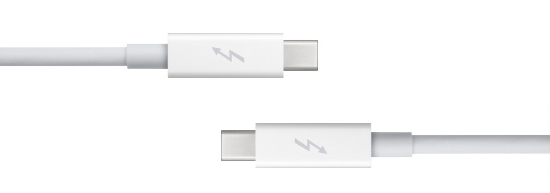
Following yesterday’s Thunderbolt firmware update that brought “performance and stability fixes”, Apple has released the ‘Apple Thunderbolt cable’ that allows users to connect and daisy chain multiple Thunderbolt capable devices. The 2m long accessory is simply a cable that features the Thunderbolt connector on both ends. It is priced at $55 in Australia, £39.00 in the UK but has not yet made it into the US Apple Store – although based on similarly priced accessories it will be roughly US$49.
Thunderbolt technology supports blazing-fast data transfer with two independent channels of 10Gbit/s each. Use the Apple Thunderbolt cable to connect your Thunderbolt-equipped peripherals to your new iMac or new MacBook Pro.
As explained in our Thunderbolt editorial a few months ago, the Thunderbolt specification works by daisy chaining multiple devices together – allowing just one cable from the Mac to actually connect a number of devices together. This Thunderbolt accessory cable is that cable that can connect multiple Thunderbolt capable devices together.
The other piece of Thunderbolt news is that Sony has announced details of its new 13.1-inch VAIO Z that features Thunderbolt, except they are calling it Light Peak (the old name of the specification). Interestingly it features a ‘Power Media Dock’ that includes an external GPU and optical drive – all connected by Light Peak. It is certainly an interesting use of the Thunderbolt specification, and with its speeds that external GPU will certainly make that laptop much more powerful when connected.
[Via This is my next]
Thunderbolt Firmware Update Released
A few minutes ago Apple released Thunderbolt Firmware Update through its downloads website and the desktop Software Update control panel, targeting all machines running the recently introduced Thunderbolt I/O connectivity standards. Until today, Apple has released new MacBook Pros and iMacs featuring the Thunderbolt technology from Intel. The update brings “performance and stability fixes”.
This update provides Thunderbolt performance and stability fixes.
When your computer restarts a gray screen will appear with a status bar to indicate the progress of the update.
Do not disturb or shut off the power on your computer during this update.
Apple’s release notes don’t specifically mention the targeted machines so we assume it applies to all 2011 Macs with at least a Thunderbolt port. The new MacBook Airs rumored to be getting a Sandy Bridge and Thunderbolt update later this month or in July will likely come with these fixes pre-installed, so if you need to download the patch now go ahead and pull the 486 KB package from Apple’s website.
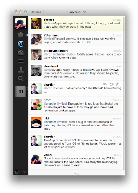
Don’t Be Stupid: Keep App Reviews To Yourself While Using an iOS Beta
These past few weeks of iOS 5 testing and casual talking with my fellow writers and Twitter followers had me thinking about the fact that some people really don’t get the difference between “public previews” and “developer-only betas”. I’m talking about those people who are leaving negative reviews in iTunes for apps that are allegedly “broken” under iOS 5, which reached the beta 2 status last Friday.
There’s an important difference between previews and developer betas. With previews, like iTunes in the Cloud, Apple feels confident enough to release a new piece of software with new features to the public and let everyone enjoy it until the final version (with more features) comes out. Example: automatic downloads and past purchases. In spite of Apple calling it a “beta”, this is in fact a public preview (that requires iTunes 10.3, also public) of the new iTunes in the Cloud system that will gain the additional Match functionality this Fall. So why is Apple letting regular users mess with a beta? Because it’s not really a “beta”, not in the sense we geeks are used to when seeing the beta label on Apple’s various Dev Centers. iTunes in the Cloud is a public preview of something that will grow even bigger in a matter of a few months. The company knows it’s stable enough for everyone to play with. All the systems are in place. No third-party support is required. All users can benefit from it now, and will get to use more functionalities once the faux beta label goes away. It’s a good deal. Read more


