This Week's Sponsor:

Textastic

The Powerful Code Editor for iPad and iPhone — Now Free to Try


Adobe Releases Lightroom 4 Beta, Carousel To Become “Adobe Revel”

Released as a free update on labs.adobe.com, Lightroom 4 beta is the next major version of Adobe’s solution for photographers and professionals aimed at making it easy to import, adjust and catalogue photos on the desktop. Whilst Adobe obviously recommends to work with backups and advises against running beta software on a main computer, Lightroom 4 appears to be fairly stable to provide a good indication of features to come once the app goes public.

The Lightroom team is proud to introduce the fourth major version of the product designed for and by photographers. It was 6 years ago today when we introduced the very first public beta of Lightroom at MacWorld on January 9, 2006. (Yes, it was Mac only, smaller in footprint than most raw files and didn’t have a crop tool!) Since 2006 we’ve been hard at work improving an application that’s intended to be as easy to use as it is powerful. This release builds on the fundamental performance architecture and image quality improvements in Lightroom 3 to provide a truly complete workflow solution.

Adobe says Lightroom 4 focuses on image quality and output options. The app now features additional tools to get the most out of highlights and shadows while preserving image quality – Adobe calls this functionality “Highlight and shadow recovery” and goes alongside white balance brush to adjust white balance in specific sections of an image. Long release notes with technical details on image adjustments, supported file formats, known issues and minimum system requirements are available on Adobe’s official blog post.

Alongside image refinements and extended, robust video support for organizing, editing and sharing videos on Flickr and Facebook (again, make sure to check out Adobe’s blog for the full details on video adjustments), Lightroom 4.0 beta features photo book creation with over 180 page design layouts, drag & drop support with layout guides, background graphics and integration with the Blurb book printing service. Adobe says photo books have grown in the popularity in the last couple of years, and I have no doubt this is a good move on Adobe’s side (assuming the service is impeccable) at the light of Apple’s moderate success with iPhoto photo books. Lightroom photo books can also be exported to PDF; in this beta, Blurb books are limited to 160 pages.

Similarly to iPhoto, Lightroom 4.0 now allows users to organize and browse photos by location. Thanks to a new Google Maps module (which obviously requires an Internet connection), Lightroom 4.0 will determine a a photo’s location if the camera that created the file supports GPS coordinates; otherwise, users can manually drop photos onto a location and create saved locations for future usage.

Lightroom’s release notes also reveal Adobe is planning on adding significant functionality to Adobe Carousel (my review) and changing its name to Adobe Revel. Lightroom 4 will feature an Adobe Revel export option, and I expect Revel to gain much needed fixes and improvements that I mentioned in my original review of the subscription-based service.

Adobe plans to change the name of Adobe Carousel to Adobe Revel. We originally chose the name Adobe Carousel because it was descriptive of core functionality in the product, in that photographs were viewed in a circular manner, like a carousel. However, we now plan to offer additional photography solutions on this platform, including but not limited to the ‘carousel’ feature. Our rapidly expanding charter for this new platform requires a name that is less narrowly descriptive of the current product features.

Other features of Lightroom 4.0 include:

  • Publish Collections can now include rendered video publishing
  • Enhanced output model for saving/storing settings applied in Web, Slideshow, Print and Book. Efforts are now clearly visible in Collections panel.
  • New Zoom ratios (1:8 and 1:16)
  • Noise reduction adjustment is always displayed regardless of zoom level
  • Collapse the tether toolbar down to the shutter button by Option or Alt clicking the close button
  • Module picker can be customized via right-click option
  • Filter and search images by a saved or unsaved metadata property
  • Additional Metadata controls on export
  • Disk burning now available on Windows 64-bit systems
  • Stacking is now possible in collections
  • Flash galleries are now color managed

Lightroom 4 for Mac and Windows can be downloaded here. Check out a video after the break and Adobe’s YouTube channel for more information on the beta. [via setteBIT]

Read more


MacHash Apple News Aggregator Gets iOS 5 Twitter Support, Podcasts

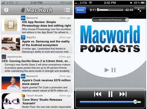
I’ve been a huge fan of MacHash since I started using the service last year. With a straightforward web interface that aggregates the latest Apple headlines from websites like ours, MacRumors, TUAW, Macgasm, AppStorm, iMore and many others and an iOS client that offers more customization options alongside an in-app browser, MacHash has become my go-to place to stay on the top of the latest Apple news and commentary from the community. I’ve already covered MacHash for iPhone and iPad in Episode 5 of App Journal.

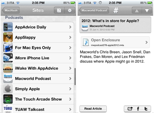
An update to MacHash for iOS released last night (version 3.2) brings a variety of bug fixes and technical improvements, as well as support for native Twitter sharing on iOS 5 and a podcast directory. The latter option is something I’ve been looking forward to since it was teased with the 3.0 update: in the Site Browser, MacHash now lists a series of Apple-themed podcasts and allows you to listen directly within the app without using a separate podcast app such as Instacast or Downcast. You won’t find podcast features as deep as the ones from Instacast our review, but you’ll still be able to run audio in the background and listen without having to keep MacHash open.

Currently, MacHash comes with the following podcasts:

  • AppAdvice Daily
  • AppSlappy
  • For Mac Eyes Only
  • iMore iPhone Live
  • iWake With AppAdvice
  • Macworld Podcast
  • Simply Apple
  • The Touch Arcade Show
  • TUAW Talkcast

I expect the selection of podcasts available inside the app to grow in the next weeks; in this version, audio functionalities are pretty limited, but I like the fact that Apple news and podcasts coexist within the same application.

Aside from MacHash, the same developers (MobileInfocenter) have also released an update to Tech News Tube last night, reaching version 3.2 and adding podcast support and bug fixes. Tech News Tube is a more tech-oriented version of MacHash, aggregating general tech news from Engadget, The Verge, paidContent, Techmeme, ReadWriteWeb, and many more. The app is very similar to MacHash both in terms of design and functionality, so make sure to check it out if you’ve been looking for a much broader news aggregator with an iOS app.

You can find MacHash and Tech News Tube for free on the App Store.


Day One 1.5 for iOS: Now With iCloud Sync

Earlier this year, I started using Day One. Not just another text editor with Mac and iOS versions and support for Markdown formatting, Day One is at the same time a flexible and focused solution to archive your thoughts, memories, experiences into a well-built interface that keeps everything in sync across Macs and iOS devices. A fresh take on the old paper journal, Day One takes advantage of modern technologies such as local reminders to tell you when it’s time to write your journal; on the iPhone and iPad, the app supports different font sizes and Markdown, so you’ll be able to write nicely formatted documents that you can easily export to HTML. On the Mac, Day One comes with a standalone menubar application that makes it incredibly fun and quick to jot down thoughts whenever you want.

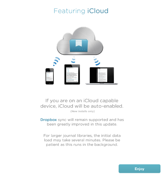
Day One’s 1.5 update for iOS, released today on the App Store, brings a more powerful Dropbox sync for iPhones and iPads (Day One can store its database in Dropbox, and it allows you to export notes on the Mac via File>Export) and the long-awaited iCloud sync, which I’ve been able to test on my iPhone 4S and iPad 2 (Day One 1.5 for Mac isn’t live yet, but it’s been submitted to the Mac App Store).

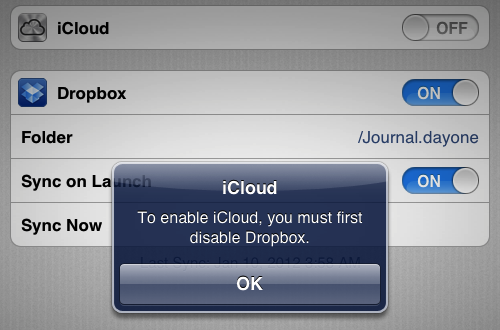
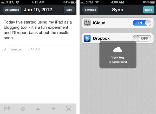
I came from an old installation of Day One with a Dropbox database synced to my iPhone and iPad. As I upgraded to version 1.5 and launched the app on both devices, I was asked to disable Dropbox sync if I wanted to use iCloud. I disabled Dropbox, and waited a few minutes for the initial iCloud background sync to finish (it had to pull at least 50 entries to begin with).

Once iCloud is up and running in Day One, it is extremely reliable, fast, and invisible. Unlike Dropbox, it’s not manual sync you have to initiate or automatically perform upon launch and quit – it’s push technology that constantly sends changes back and forth between devices. As an example, I started writing a new entry on my iPhone and it showed up after a few seconds on my iPad, which was running Day One. The main list of notes on the left basically refreshes to accomodate a new note – no manual sync needed. For the same reason, notes are pushed with iCloud as you write them – typos included.

Day One 1.5 clearly fits in a much bigger picture with the Mac client constantly receiving changes from the cloud, but this doesn’t mean you can’t enjoy Day One 1.5 for iOS now. In fact, I often find myself writing my journal on iOS devices rather than the Mac, so iCloud support (with this kind of invisible push technology) is more than welcome.

Day One for iOS is $1.99 on the App Store.


Dom Leca On UI Conventions and Sparrow 2.0

Dom Leca on UI Conventions and Sparrow 2.0

Sparrow’s Dom Leca on The Verge:

What’s the give and take between adhering to popular OS X UI conventions and going in your own direction?

I think there is a huge variety of design on OS X but the 2 main choices that a developer / designer really has are the orthodox way, sticking with the Apple HIG in a strict manner, or the Loren Brichter’s way.

I am not saying that there is no in-between. A lot of our inspiration in Sparrow comes from other developers who are not strictly following the HIG or Loren’s UI style. But like on the iPhone with the pull to refresh or the cell swipe, Loren created a new standard with its Tweetie core animation sidebar.

Jared Erondu has another interview with Leca today over at Macgasm today; in the article, Leca mentions some of the future plans for Sparrow 2.0, including a people-centric view for the desktop application:

The main idea we have for version two is that the concept of messages will be thrown in the background and people will take a central place. It will be a people centric app. You won’t look for the last message you received, but for the last people who talked with you. In terms of navigation, and the way you will treat your mail, the functioning of labels, folders and stuff like that – it changes the way it works a lot.

Sparrow may have borrowed a lot from Brichter’s Tweetie design, but in the past year the app has been constantly updated, adding innovative functionalities that you can’t find anywhere else (CloudApp and Dropbox integration for attachments is a personal favorite). Whilst Sparrow recognized Brichter’s UI approach as functional to what they were trying to achieve (switching accounts) and iterated on the concept blending that specific UI convention with new Lion elements, standard HIG stuff and their own vision, others have – unfortunately – blindly re-implemented Tweetie’s design adding little or no innovation to the mix.

This is what the first Sparrow beta looked like. With Sparrow for iPhone announced in August and now nearing the beta stage, I have big expectations for Sparrow in 2012.

Permalink

Calendr for iPhone: Fast and Elegant Event Creation

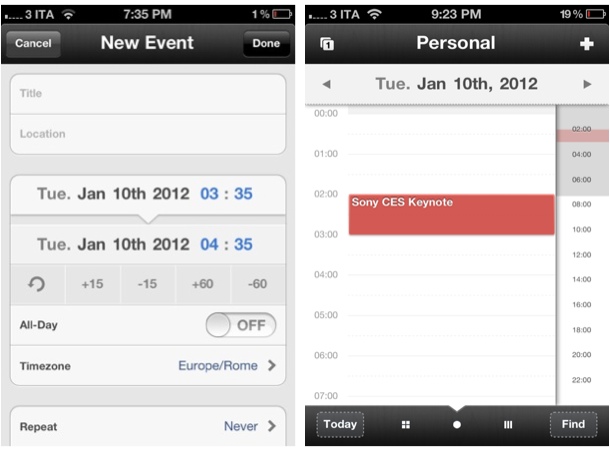
I’ve never been a dedicated user of calendar software on my Mac and iOS devices, but I’ve always been interested in checking out well-made applications capable of working with Google Calendar, MobileMe and, more recently, Apple’s iCloud. Whereas Apple’s Calendar app (iCal on the desktop) has taken quite the skeuomorphic turn with the latest iOS and Lion upgrades (in spite of the iPhone version still lacking the leather and stitches Apple seems to love so much), other utilities like the excellent Fantastical (our review), QuickCal, Week Calendar and Agenda have all offered their unique takes on event creation, quick reminders, access to multiple calendars, and more. I may not be entering events in my “Personal” iCloud calendar all day long, but I enjoy trusting a fine app when I need to schedule that Sony CES keynote or NBA game and don’t want to even look at iCal. To me, calendar has always been a system I’ve wanted to use more – perhaps the right app is key to this.

Chocomoko’s Calendr, which I discovered in the App Store last week, is yet another iPhone client that comes with built-in integration with iOS calendars; unlike other apps that focus on supercharging the iPhone’s native calendar experience with features (Week Calendar, QuickCal) or interface approaches (Agenda) different from Apple’s, Calendr caught my attention because it doesn’t come with hundreds of alternative functionalities, focusing instead on two key elements: navigation and touch-based event creation.

Read more


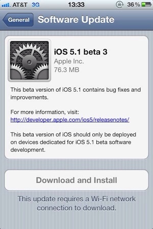
Apple Releases iOS 5.1 Beta 3

As noted by MacRumors, Apple has released a few minutes ago the third beta of iOS 5.1 to developers. The new beta comes almost a month after iOS 5.1 beta 2, which was released on December 12. Currently, it appears beta 3 is only showing up as over-the-air update with the Developer Center still reporting beta 2 as the latest available.

The new beta carries build number 9B5141a. The first two betas of iOS 5.1 brought bug fixes and minor new features to the operating system, and it’s still unclear whether Apple may be planning to add more functionalities throughtout various betas seeded to developers.

We’ll update this post with relevant information in case it becomes available. iOS 5.1 beta 3 should become available on the iOS Dev Center shortly.


Vimeo for iPad Previewed, Coming “Later This Month”

Originally released on the iPhone back in March, today web video platform Vimeo confirmed a major update for the iPhone client, as well as a brand new app specifically designed for the iPad are in the works and should become available “later this month”. The Verge has posted an initial preview of the iPad version, which sports a completely new design, various sharing options, and the built-in video editor that was introduced with version 1.0 for iPhone and iPod touch users.

The Vimeo iPhone app, in fact, besides allowing you to access your Vimeo account and thus check on liked videos, “watch later” queue and items from Vimeo’s popular picks, packs a rather impressive video editor to adjust media on the go and upload directly to the service without using a computer.

Vimeo is also launching apps for Android smartphones and tablets and Windows Phone 7, and it looks like interface-wise, Android and iOS users are at least going to share the same “dashboard grid” paradigm made popular by Facebook and several other iPhone apps.

Judging from the screenshots posted by The Verge, it appears Vimeo for iPad will allow for both shooting and browsing within the same app; similarly to the iPhone app (whose update hasn’t been revealed just yet), iPad users will be able to browse featured videos, liked items, subscriptions, videos saved for later and personal uploads.

Vimeo for iPhone is currently free and available on the App Store.


Slippery slopes

Slippery slopes

Good response by Marco Arment to my counterargument to his post about auto-renewal subscriptions and iOS technologies Apple doesn’t open up to developers (or at least the majority of them). I particularly like his proposed solution for Newsstand Kit’s push notification applied to other apps:

Newsstand Kit’s background-wakeup push notification can only fire once a day, and background NKAssetDownloads only work if the device is on Wi-Fi and has a healthy battery charge. So give all apps the ability to receive that background-wakeup push notification once a day, as long as the user has granted them permission to use push notifications. Then let them update or download whatever they can do in the 10 minutes that they’re allowed to run in the background. And if the system decides to terminate them during those 10 minutes for any reason, that’s fine, too.

Even without NKAssetDownloads, and even if Wi-Fi was required, this would be a huge benefit. Unlimited-time NKAssetDownloads are only required by magazines because so many of them are ridiculously bloated at hundreds of megabytes per issue, but a huge class of apps could download everything they need in a few hundred kilobytes over a few minutes, at most.

I still think auto-renewable subscriptions should be limited to a specific set of apps (and Apple must be clear about that – enough with the unwritten rules), but I have to say I’m intrigued by the idea of smaller lightweight downloads now.

Permalink