A few months ago, my friend Myke Hurley asked me if I wanted to launch a new podcast. There are many tech podcasts these days – maybe too many – and, back then, I didn’t know what I wanted to do. I have thought about this very deeply, and I’ve come to this conclusion: the great thing about the Internet is that everyone is free to produce their own content, because the readers will eventually decide what they like and what they don’t. Or, in our case, the listeners: today, Myke, Stephen, and I are announcing The Prompt.
From Stephen’s blog post:
Each week, we’ll be looking at not only the news, but the ecosystem and culture around Apple and its products.
The real twist is what we do with guests. Instead of the three of us running around trying to cover everything, we’re building an army of correspondents.
I am extremely grateful for the opportunity, and I look forward to beginning this new adventure with Myke and Stephen. I realize that there are several podcasts about Apple and technology nowadays; my hope is that, like MacStories, 512 Pixels, and 70Decibels, The Prompt will distinguish itself because of quality, not trends. Our listeners will decide.
We haven’t recorded the first episode of The Prompt yet, but, when we’ll do after WWDC, you’ll find it on the 5by5 network. Here’s something cool: if you subscribe to the 512 Podcast today, you’ll be automatically migrated over to The Prompt feed when it launches. And, to kick off things properly, you can listen to the just-posted penultimate episode of the 512 Podcast, where I was invited to announce The Prompt and discuss iOS 7 and WWDC predictions.
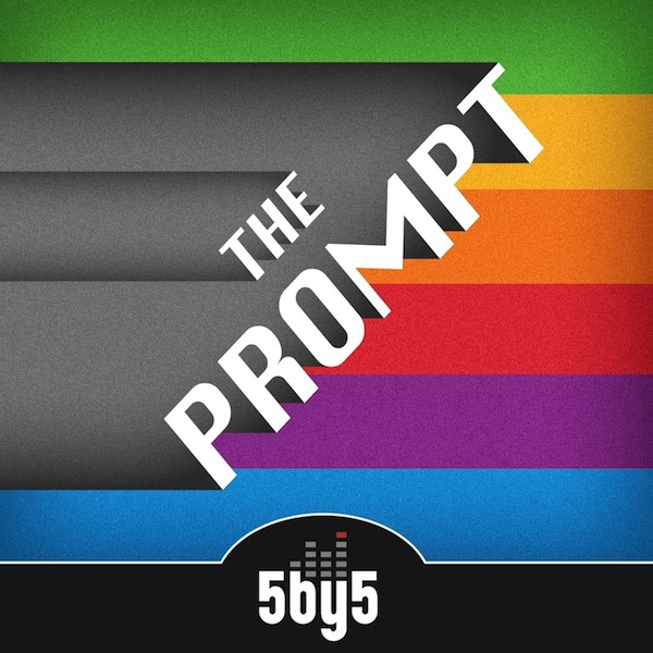
I have big expectations for The Prompt, and I hope that you’ll pardon my accent. You can follow @_theprompt on Twitter, and check out the beautiful artwork by Jory Raphael above.