

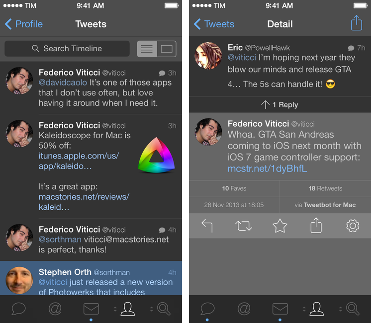
After a 3.1 update that added text size controls, timeline switching options, and quick actions, Tapbots are back today with a second major update to Tweetbot for iPhone that brings a night theme, account reordering and quick switching, plus various bug fixes. Read more
Posts in news
Tweetbot 3.2 Brings Night Theme, Account Reordering and Quick Switching
The New, Adjustable Glif
In 2010, we wrote about an interesting Kickstarter campaign for an iPhone stand and tripod mount called Glif. Simple and elegant, the Glif allowed you to easily mount an iPhone 4 on a tripod or act as a kickstand to prop it up at an angle. After the Kickstarter success, the duo behind the project, Tom Gerhardt and Dan Provost, went on to form Studio Neat; in the past three years, they have released other products that include the Cosmonaut stylus, iPhone apps, and a book.
Today, Tom and Dan are back with an update to the original Glif (called, in a very iPad 3-esque way, “The New Glif”) that makes it adjustable for practically any smartphone size. From their description:
The Glif will fit virtually any smartphone, between 58.4–86.4mm wide and 3.1–12.7mm thick. Some exceptions include “phablets” like the Samsung Galaxy Note, or phones with incredibly bulky cases.
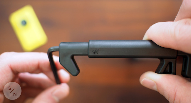
With the new Glif, you’ll get a 5/32 hex key to adjust the device for your smartphone. Besides non-Apple phones, I think that having an adjustable Glif is a good idea for users who like to keep their iPhones cases that don’t fit with the original Glif design (which is still available for purchase).
The new Glif is $30 and available here.
Dropbox 3.0 Released with iOS 7 Redesign
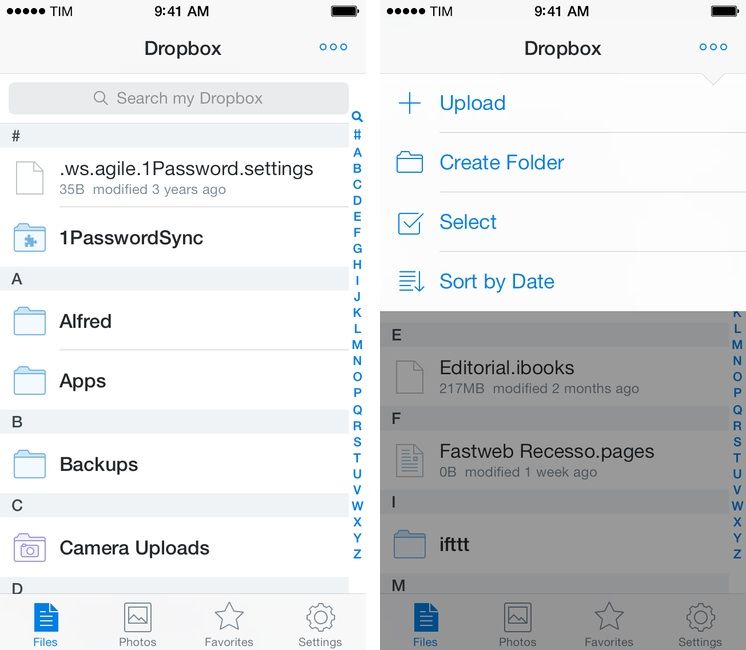
Released today on the App Store, Dropbox 3.0 is a complete redesign that gets the app ready for iOS 7.
Two months after the release of iOS 7, the new Dropbox shows the work of designer Tim Van Damme, who left Instagram to join the Dropbox design team earlier this year. “Dropbox 3.0 is all about your content. We stripped out as much branding as we could, just so you can focus on what’s important”, Van Damme told me. Noting how several functionalities and interactions have been simplified in this update, he mentioned how, for instance, documents and photos are easier to enjoy in full-screen: “On your iPad, it used to take two taps to see a photo full-screen. Now, a single tap will let you enjoy your photo full-screen, and this also works for most other file-types”, Van Damme added. Read more
Video Trailers Debut On The App Store With ‘Clumsy Ninja’
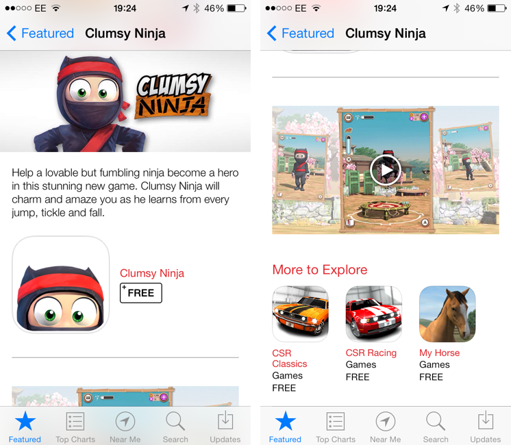
Apple is featuring Clumsy Ninja, an iOS game that was first announced at the iPhone 5 keynote in 2012, with a custom page on the App Store that, alongside a description, features a 1-minute trailer for the game. The custom “Featured” page is live on the UK App Store at the moment and it features Clumsy Ninja as Editor’s Choice for the week; it’s likely that the game will also be featured on the US App Store and other international stores later today.
The big news is, of course, the fact that Apple is embedding a video in the App Store, which has historically only allowed developers to include up to five static screenshots for their apps. Clumsy Ninja’s video opens the built-in iOS media player in portrait mode, and it features music playing in the background with no voiceover or custom App Store branding. It is, effectively, a game trailer on the App Store; right now, it’s only available in the special Featured page for the app, as the app’s regular App Store page doesn’t show the trailer.

The possibility of including videos alongside screenshots on the App Store has long been one of the most requested features by third-party developers who, over the years, have struggled to explain App Store customers the purpose of their app or game with just text and images. With iOS 7’s focus on motion and animations, the lack of videos on the App Store was particularly surprising, and it led many to wonder as to whether Apple would soon add support for videos besides screenshots. When iOS 7 was first announced in June, even Apple produced a series of short videos for the OS’ official website, where they showcased the new features and design through animations and quick demonstrations of Messages and other apps.
It’s unclear at this point if Clumsy Ninja will remain an isolated case or become the norm for the App Store going forward. It’s also not clear whether any developer will be able to add a video for their app on the App Store, or if trailers will be limited to Editor’s Choice and managed by Apple’s curation team on a weekly basis. Developers have traditionally resorted to creating videos and screencasts of their apps for their websites or YouTube channels, and an integrated solution available in the App Store alongside screenshots, description, and buy buttons would be a fantastic addition to better illustrate an app’s feature set, flow, and user experience.
The Apple Store App, Now on iPad
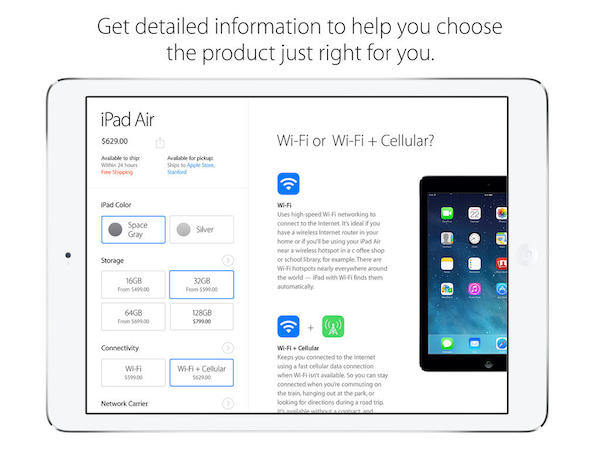
Apple has launched a brand new version of their Apple Store app for the iPad, bringing their online digital storefront to iOS 7. Just like the iPhone app, you can browse through all of the Apple Store’s available listings for backpacks, accessories, and Apple products; customize products like iPod touches and iPads with engraving and add gift wrapping at checkout; and explore products using gestures to zoom and browse. Unlike the iPhone app, however, Mashable writes that the app brings some new functionality to the big screen.
Many features baked into the iPad app don’t appear on the existing iPhone app version, like highlighting products trending on the site based not only purchases, but also reviews. It also draws attention to a slew of products, not just iPads and iPhones, like the Anki Drive racing game, headphones and a connected basketball. The app is also rich with filtering capabilities, including colors and price.
The Apple Store for iPad app is separate from the iPhone version, likely due to new features and to accommodate iPads that don’t have cellular capabilities. Download the app for free from the App Store.
[via Mashable]
Mozilla Previews New Firefox Design
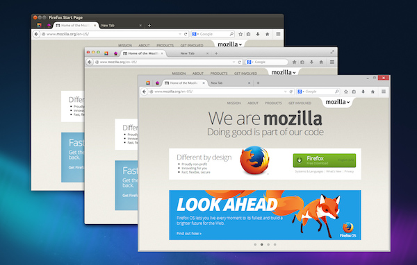
Something I’ve been following very closely is the development of Firefox, which has become my browser of choice, replacing Safari on OS X and Chrome on Windows. What it lacks in the latest and greatest features it makes up for with privacy controls and a robust library of add-ons. Opera’s interesting since it dropped the Presto rendering engine in favor of WebKit, but despite being a near carbon copy of Chrome it’s currently without expected features such as tearaway tabs. Chrome is a privacy concern, and Apple dropped Safari on Windows. Firefox it is.
There’s a lot to talk about with Firefox, namely Mozilla’s proactive efforts in the mobile space. Firefox has seen rapid development for Android phones and tablets, and Mozilla has made Firefox OS for use in developing countries. In a very Apple “back to the Mac” sorta way, Mozilla is taking what they’ve learned and bringing it back to the desktop.
The result is Australis (not to be confused with Aurora).
It’s been a long time coming. Firefox’s latest design beginnings stem all the way back to 2011, when Mozilla’s Product Visual Designer showed off early designs in a detailed blog post. You might also recognize Australis from the Mozilla Wiki; last year potential mockups were published that demonstrated new Firefox features such as a new options panel and customization mode. TechCrunch highlighted the latest design earlier this year, and Mozilla even hinted at the updated interface in their celebratory ninth birthday post.
Mozilla is talking about the surface changes in their UX blog update, focusing on the organic design of their tabs, how customizable Firefox is, and how streamlined the interface has become. Having used Firefox throughout the years, it’s refreshing but I’m interested to see where it ends up. I’m currently using the Nightly build for my day to day browsing to get an idea of where the browser is headed, and for the most part they’re all good changes. The entire interface has been simplified, right down to the menus. There’s little things, however, that I’m concerned about for the time being.
All the major browsers have combined address and search bars, but Firefox remains in the past unless you install an extension such as Omnibar. Maybe it’s in the works since it’s not omitted from the mobile designs, but I’d really like to hear Mozilla’s reasoning if they decide to keep the search bar separate for Australis’ stable build.
The same goes for the currently missing-in-action Add-on Bar. There are certain add-ons (like the EFF’s HTTPS Everywhere) that don’t need to be in the same space as add-ons like Evernote’s Clearly, and could be kept neatly out of the way at the bottom of the browser window. With the Add-on Bar gone, however, status indicators like HTTPS Everywhere are left heaped in with actionable tools or are hidden in the menu panel.
Firefox was known for being a memory hog in the past, but this has gotten much better in recent versions. While not design related, Mozilla’s main goal for Firefox should be focusing on things like sandboxed tabs for safer browsing. If a Flash plug-in chugs or halts, it affects the entire browser, which usually isn’t the case in multi-process browsers like Chrome that simply stop offending tab. Projects like Electrolysis aimed to solve this, which was put on hold for a while, but has since been put back on the table and is currently in continued development.
As for Australis, I think the new visual theme is largely beneficial for garnering interest from new users or recapturing those who left for Chrome after sensing stagnation. I don’t know if this alone will be enough to keep them if Mozilla doesn’t have key performance improvements under the hood, but I personally welcome the changes (especially on OS X where a visual refresh was much needed).
Read more about the changes on Mozilla’s UX Blog, and download the Nightly here if you’d like to help contribute feedback and bug fixes.
Find My Friends Updated for iOS 7

There’s not much to say about Find My Friends for iOS 7. I don’t know why the previous version of the app used leather detailing in such excess (see our original article), but it’s done away with now, leaving behind just the bare essentials. It’s a convenient app to use with friends and family when meeting up or bouncing around town before reconvening, and it’s free on the App Store.
FiftyThree Announces Pencil, a Sustainable Smart Stylus Made for Paper
Fair warning: the product video made us a little motion sick.
FiftyThree’s Pencil brings smart technologies like palm rejection, smart sensors, low power Bluetooth Smart wireless, and long lasting battery life to a stylus made specifically for Paper on the iPad. Shaped like a carpenter pencil to prevent rolling, Pencil pairs with the iPad by simply pressing the tip to the screen. Two gold plated sensors, one for the tip and one for the eraser, detect how you’re using the stylus so you can sketch and erase by simply flipping the pencil over. When paired, your finger becomes an extra tool that lets you smooth rough edges and blend colors. Pencil lasts up to a month on battery with regular use, and can be charged in 90 minutes by simply connecting it to a common USB port.
FiftyThree is well known for Paper, which was awarded Apple’s ‘App of the Year’ in 2012 for the iPad. For Paper, FiftyThree carefully crafted an app that makes people feel unashamed about their lack of artistry, developing a core set of tools that encourage people to draw and note take freely while producing beautiful results. Also known for its in-app purchase model, FiftyThree asks customers to buy only the tools they need, providing the essentials for free.
In addition to Pencil, FiftyThree also recently launched Book, which turns drawings from Paper into a printed foldout notebook.
Pencil comes in two sustainably manufactured flavors: Walnut (which includes a magnetic strip for adhering to Smart Covers and iPads) for $59.99, and a Graphite brushed aluminum model for $49.99. You can pre-order Pencil from http://shop.fiftythree.com/. You can download Paper from the App Store for free.
Learn more about Pencil from FiftyThree on their news page.
Evernote’s New Web Clipper for Safari
Bake in Clearly, integrate Skitch, toss in the clipper from Evernote’s helper, then add sharing, and you end up with Evernote’s new Web Clipper for Safari. Once a pop-up that simply copied the full page or URL, the new Web Clipper condenses page grabs and annotation tools into a simple sidebar, adding almost all of the base features you’d find in Skitch, a standalone screenshot, image, and PDF markup and sharing application for desktops and mobile devices.
The new Web Clipper is activated by clicking on the toolbar button, which slides out a sidebar that’s reminiscent of the formatting bar found in iWork’s updated apps for OS X Mavericks. All of the actions are organized neatly into various sections for cropping the web page, drawing shapes, and sharing the results. Arrows, squares, and text can be dragged around, rotated, and resized using onscreen handles for annotating webpages. Clip tools give you a wide variety of options, including the ability to format the page into a readable article view as Clearly would before taking the final screen grab. Sharing gives you a URL that you can paste into a chat app or your favorite website, while also presenting options to share via Facebook, Twitter, or publicly via Evernote itself. There’s a couple kinks with the extension, mainly that it doesn’t like to be used with swipe back gestures or the back button while the sidebar is open, but otherwise the tools work just as Skitch lets you on a Mac.
Saving web pages into Evernote is a great way to remember a cool design, highlight an important note, or refer back to a piece of content for later reading, homework, and marketing research in an instantly searchable database. The extension is a complete revamp over the previous one, putting all of the tools that used to require two or three apps into a streamlined list of actions that doesn’t get in the way. Chrome received the new look a while ago, and hopefully the Firefox extension is next.
Learn more and grab the Safari extension here from Evernote.