Federico Viticci

10758 posts on MacStories since April 2009

Federico is the founder and Editor-in-Chief of MacStories, where he writes about Apple with a focus on apps, developers, iPad, and iOS productivity. He founded MacStories in April 2009 and has been writing about Apple since. Federico is also the co-host of AppStories, a weekly podcast exploring the world of apps, Unwind, a fun exploration of media and more, and NPC: Next Portable Console, a show about portable gaming and the handheld revolution.

OmniFocus Mail Drop Beta

OmniFocus Mail Drop Beta

As noted by Sven Fechner, a post by The Omni Group on the company’s forums publicly describes a new feature of Omni Sync Server: Mail Drop. An enhancement to OmniFocus’ existing support for Mail.app, Mail Drop is a proper way to email tasks directly to your OmniFocus inbox.

We call this new feature the “OmniFocus Mail Drop”. Unlike previous mail-processing features, we wanted a method that wouldn’t require any of your devices to be present in order to add items to OmniFocus, we wanted to add the much-requested better attachment support, and we wanted to reduce the amount of extra work you had to do in order to get your items into OmniFocus as much as possible.

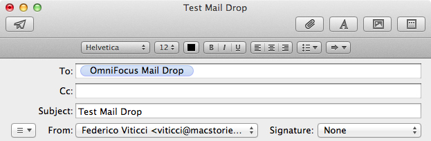
To this end, we implemented the feature as part of the Omni Sync Server. Accounts on the server can now have a special email address generated. Any message forwarded or sent to that address will be processed (including attachments) and added to your OmniFocus database right there on the server. (If a spammer gets ahold of your Mail Drop address, we give you a way to generate a new one.)

I have been testing Mail Drop for the past few days, and, indeed, it works as advertised. Once generated in your Omni Sync Server’s account page, you’ll get a unique email address you can send tasks to. Unlike previous solutions, this is a real “cloud capture” tool: you don’t need a Mac to be always running to turn emails into tasks, as everything will be processed server-side by Omni Sync Server.

Right now, Mail Drop doesn’t seem to support OmniFocus’ email syntax for adding tasks, but it’s really fast. In my tests, tasks sent via email using Mail Drop were added in seconds to my Omni Sync Server account.

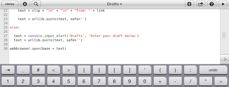
Personally, I think this is the right path to follow. As our devices become increasingly interconnected and “always-on”, it doesn’t make sense anymore to make task management – arguably a fundamental part of many’s workflows – simply “local”. People have been asking for a real web-based OmniFocus for years, and Mail Drop is a good start. I have been running my own OmniFocus server using Drafts’ email actions to quickly add tasks, but I welcome the user-friendliness of Mail Drop as a promising indication of OmniFocus’ cloud future.

Permalink

Transloader: Download URLs On A Mac From iOS

Transloader: Download URLs On A Mac From iOS

Nice new utility by Matthias Gansrigler (creator of Yoink and ScreenFloat, among other apps): Transloader is a $2.99 Mac app that can download URLs remotely. What this means is that, from an iPhone or iPad running the free companion app, you can send a URL to download on your Mac using iCloud.

Have you ever stumbled upon a Mac demo, a zip or dmg file, an image or a movie on your iPhone and wished you could download it to your Mac right away? Transloader uses your iCloud account to transfer URLs you enter on your iOS device to your Mac for download. Once you’re back on your Mac, your downloads will be ready for you.

The idea is interesting, and it reminds me of the old NoteTote app based on Simplenote. In my tests, Transloader has worked as advertised with .zip archives and PDFs, but I’d like to see an option to download webpages as .html files as well. iCloud took a couple of seconds to beam URLs from my iPhone to my Mac, but I have to mention iCloud has been far from reliable for me lately. Transloader’s concept is executed well in this version; I’d also like to have support for notifications for completed downloads and Preferences to set a specific destination folder; on iOS, it’d be nice to have automatic recognition of URLs already in the clipboard.

Transloader for Mac is available at $2.99 on the Mac App Store; the iOS app is free and Universal.

Permalink

Miro Video Converter 3.0

Miro Video Converter 3.0

Nice update for Miro Video Converter:

Keeping with the original simplicity of Miro Video Converter that has made it popular with all of our users, the updated Miro Video Converter comes with a great new look. Just drag and drop or browse to your list of video files.

Free and open source, Miro Video Converter 3.0 notably introduces batch processing of videos (depending on the cores available on your computer), a new design, more devices and formats, thumbnail generation, and better control on aspect ratio and output sizes. It looks good; you can also add files to the queue while a conversion is in progress.

For MacStories, I usually take videos of iOS apps using Reflection Reflector and QuickTime on my Mac. In QuickTime, I export “for the web” (at broadband quality), and then use ffmpeg2theora to convert to Theora, so I can use two formats for the same HTML 5 video (it means both Chrome/Safari and Firefox users will get a native, Flash-free video player). The big downside of ffmpeg2theora is that you’ll need to run it from the command line: it doesn’t have a graphical user interface to go with. In that case, Miro is a good option, albeit slower: in my tests, a 49 MB .mov QuickTime file took 101 seconds to be converted to .ogv with ffmpeg2theora; it took 177 in Miro. The same file took 87 seconds to be converted to mp4 with Miro. Both tests were run on this MacBook Air.

If you need a GUI for video conversions that’s not the fastest option, but still should get the job done and it’s free, Miro is available here.

Permalink

Behind The Scenes Of Twitterrific 5

Behind The Scenes Of Twitterrific 5

The Iconfactory’s Craig Hockenberry has published a “behind the scenes” look at their most recent release, Twitterrific 5. I recommend reading it, as it doesn’t involve too many technical aspects of the software, but instead puts the decisions made by The Iconfactory in more context:

We are well aware that people are going to complain about missing features: push notifications and streaming are obvious examples. But so are trends, and video support, and in-line photos, and… well none of that matters. We believe in building opinionated software.

Our Cody Fink, in his review of Twitterrific 5 posted last night:

It may be completely redesigned, but the core tenets that Twitterrific were founded upon remain in 5. Twitterrific has always been opinionated, decidedly simple, and never wanted to compete for your attention. And at its heart, Twitterrific 5 is still a Twitter app built with the same passion The Iconfactory builds into all of their apps. Twitterrific 5 is simply a better Twitterrific.

Here’s my take on Twitterrific: it is the result of a very specific vision. The Iconfactory doesn’t prioritize notifications, filters, third-party service integration, or custom image uploads as much as they strive to build an extremely polished Twitter client meant for reading.

I am what you may call a “Twitter power user”. There’s truth to that: I use filters, custom uploads, web services, and I spend most of my day on Twitter. Twitterrific isn’t meant for me. Thinking to rely on it as my go-to Twitter client will probably make me frustrated in the end, leading me to “hate” an app that’s actually made by nice people. I don’t want to do that.

So I have a simple suggestion. If you don’t think Twitterrific 5 can be your main client, it doesn’t have to be. No one is forcing you to buy the thing everyone is talking about. You’re probably not “missing out”. But I will also say this: if you have three bucks and you’re genuinely interested in trying something new – a fresh experience – go get Twitterrific 5 and try it. I’m not saying it’ll become your favorite app, but if you care about quality handcrafted software, maybe you’ll take away something from it.

I’m glad I did, because even if Twitterrific won’t be in my dock, as someone whose job is to write about software, now I know that other things are possible.

Permalink

Party Monster

Party Monster is a Universal iOS app to queue songs in a temporary playlist, perfect for parties, dinners with friends, or, generally, every time you want to listen to specific songs in a specific order. As you may know, I’m a passionate Rdio user, and local music with iTunes doesn’t really fit with my listening habits. I wouldn’t mention Party Monster, however, if it weren’t for its approach and attention to detail that made it stand out for me. Read more


Reverse Engineering Penultimate

Reverse Engineering Penultimate

Fascinating analysis by Alex Caithness of CCL-Forensics about Penultimate (thanks, Clark), a digital note-taking app that was acquired by Evernote earlier this year. Penultimate allows users to draw on screen, simulating virtual ink with smooth lines and curves drawn upon a notebook-like background. That’s what CCL-Forensics tried to reverse-engineer.

Opening one of the “page” files we find another “NSKeyedArchiver” property list. After unravelling the structure of the file we find a top-level object containing further metadata (including a “blankDate” which appears to match the “created” timestamp reported in the “notebookList” and the dimensions of the note) along with a list of “layers”. Each of the “layer” objects (again represented by dictionaries) have keys for the layer’s colour (more on that later) the layer’s dimensions and a list of “layerRects” – sections of the layer where the user has drawn their notes; and that’s where we finally find the image itself.

Sort of.

The description of how Alex got around understanding how Penultimate stores information inside its library is highly technical, but easy to follow with screenshots and Alex’s clear explanation. Essentially, Alex ended up using Python and XML to retrieve the user’s drawings, stored as coordinates – not as “images of the ink”, as one would initially assume.

If anything, it’s a great reminder that our data can usually be retrieved in a variety of ways using forensic tools (and intuition).

Permalink

Disable Auto-Correct In Tweetbot for Mac

Disable Auto-Correct In Tweetbot for Mac

I write in English, but I live in Italy. Some of my Twitter followers are Italian, too, and I like to talk to them in my native language. In the past weeks, I noticed an annoying bug: Tweetbot for Mac, my Twitter client of choice, couldn’t disable auto-correct (Edit > Spelling and Grammar > Correct Spelling Automatically) permanently. The option is there, but it appears it “doesn’t stick” after you enable it to send a tweet without auto-correct. This led to an increasing number of misspelled Italian tweets with English words mixed in (as per my Mac’s system language).

Fortunately, I’ve found the solution here. With a simple Terminal command, you can override Tweetbot’s default setting and disable auto-correct (but not spell checking) automatically.

This is exactly what I was looking for, so make sure to hit the source link to check out the full command.

Permalink

Pages For iOS and Change Tracking

Pages For iOS and Change Tracking

Yesterday, Apple released an update for iWork on iOS that added, among changes to Numbers and Keynote, support for change tracking in Pages. I’m not a frequent user of this particular feature, but it could have come in handy when we edited my Mountain Lion review earlier this year. However, last night I noted how the way Apple implemented Change Tracking on iOS felt outdated and convoluted.

Jeff Richardson does use Pages on a regular basis and posted his thoughts on the new version (via David Sparks):

Track changes support has long been the Holy Grail for many litigators using an iPad or iPhone. For the most part, I really like the way that Apple implemented this feature in the latest version of Pages. I wish that the update included a better way to review each edit, but for the most part I suspect that I’ll just scroll through a document and look at the redline edits in the context of the document as a whole so this omission is not critical for me. The lack of support for Comments will sometimes be a problem (depending upon how often you work with people who use that feature), but as long as you know about it and have an app like Documents to Go, Office2 or Quickoffice Pro, you can work around the Comments omission when it becomes an issue.

I can see how lack of Comments and Review mode can be an issue for some users. Mostly though, I believe that the interaction of Change Tracking needs to be redesigned entirely. On Pages for Mac, you can simply click on a change to review it and accept it from a sidebar on the left; in fact, if you click on the blue boxes in the sidebar you can see the blue line connecting the change to the actual text being highlighted in real time. It’s a subtle visual hint, but it’s there.

I’m not sure why Apple decided to go with this simpler interface rather than cooking up a completely new one, but I have a couple of theories. My first thought is that text rendering and manipulation on iOS still doesn’t allow for fairly complex on-screen drawings such as the aforementioned blue lines; a second reason may be scrolling performances, especially on older devices (Pages still supports the iPhone 3GS). But I think that, overall, Apple decided to use this approach because is consistent with the current iOS text selection and because a major new version of iWork for iOS (possibly requiring iOS 6 or later, not iOS 5.1) could be on track for next year.

Apple has long touted iOS devices as heralds of the post-PC era, but iWork has been far behind its desktop counterpart (originally launched in 2009) for months. I expect iWork 2.0 for iOS to level the field in every area.

Permalink

Improving The iOS Keyboard

Improving The iOS Keyboard

Chris Bowler, writing about possible improvements for the iOS keyboard:

The negative with writing on the iPad is typing. It’s a bit of a mixed bag experience — the iOS autocorrection is (at times) brilliant and I can fly along with confidence, knowing the OS is going to correct my typos. But when mistakes are made and are either not autocorrected, or autocorrected incorrectly, then the iPad becomes a less comfortable environment.

Remember when, ahead of the original iPad’s announcement in January 2010, rumors tended to focus on what the “tablet keyboard” would be like? Here are a few examples. In spite of the iPhone having shown that Apple simply wanted a regular keyboard’s appearance translated to multitouch, several people wondered whether Apple should do something different for the bigger screen. The answer was that they simply designed a “full-screen” keyboard.

As Chris notes, over the years third-party developers have extended the iOS keyboard with additional bars. Look at Writing Kit, Pythonista, Textastic, and iA Writer for examples of these modifications.

I think the discussion on the iOS keyboard often mixes writing with editing. Personally, I believe the iOS keyboard is great for writing, because it’s just a normal keyboard, but iOS text selection is in serious need of an update, because it feels outdated. I’m not sure the average user cares about better text selection, but for the sake of the argument, I will say that a better solution should be explored.

If you read those old pre-2010 posts on the “iSlate keyboard”, you’ll notice a common thread: that Apple must build something revolutionary for text entry. I recall some people guessed a split keyboard could be a possible implementation, and, in fact, that one came true in 2011. But what about text selection? I don’t think keeping on adding bars above the keyboard is feasible. Especially on the landscape iPad, a single bar alone sensibly diminishes the space available for writing – space being one of the most commonly cited advantages of the iPad against 16:9 and 16:10 tablets. On the iPhone 5, it’s an acceptable solution thanks to the taller screen, but, then again, the bar is too narrow to be a meaningful improvement.

Rather, I would say entirely new ideas for text selection and manipulation are the future. It’s the reason everyone got excited for the Hooper Selection: once you saw it, it just made perfect sense. Too, I wouldn’t completely forget about features that Apple put on the shelf, as they tend to come back.

So here’s my hope for the future of iOS for writing: the same keyboard, but also new, fresh ideas for text selection and editing.

Permalink