This Week's Sponsor:

Collections Database

A Powerful Database with iCloud Sync


Search results for "drafts"

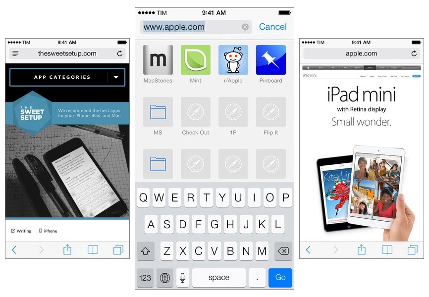
Leaving Google Chrome: Why I’ve Returned To Safari

Safari

Safari

I guess you could say that I was quite the fan of Google Chrome.

Before switching to Chrome last year, I didn’t have a “favorite” browser or “browser of choice”: I just kept jumping between Safari, Chrome, and Firefox, trying out all the features that the three major players had to offer on OS X. I’m pretty sure that, at one point, I even tried to go a full week with using Opera. My browser requirements have always been fairly standard (several open tabs; a lot of reading; sync with mobile devices), so I could afford to change browsers without having to worry about setting up a complex environment from scratch.[1]

As I started using my iPad as my primary computer last year, I was growing increasingly annoyed with the state of iCloud sync in Safari and lack of major overhaul to a design that originally shipped with iPhone OS 1. I don’t frequently abandon systems that work for me due to stagnation, but iOS 6’s Safari exhibited a certain staleness on top of issues with bookmark and tab sync that, for me, were becoming an annoying problem. I liked Safari’s speed and native integrations with iOS, but it was prone to errors and boring.

On the other hand, Google Chrome for iOS was promising, familiar, and power user-friendly. I fell in love with Google’s support for x-callback-url, which I integrated in several workflows of mine as it allowed me to save time when switching between apps on my iPad; sync was nearly perfect; I praised Google’s superior implementation of voice dictation and feedback, although I noted how their Voice Search couldn’t exactly compete with Siri. Google kept pushing updates to Chrome for iOS, making it a capable browser for average and power users alike.

A few weeks after publishing my review of iOS 7, I decided to uninstall Chrome from all my devices and move back to Safari as my main and only browser on my iPhone, iPad, and two Macs.

I’m not looking back. I’m happy with the new Safari – so much, in fact, that I’m even considering Reading List as my “read later” service going forward.

Read more


Tweetbot Workflow: Upload and Share Dropbox Text Files

Tweetbot workflow

Tweetbot workflow

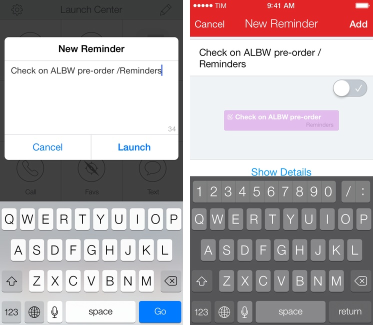
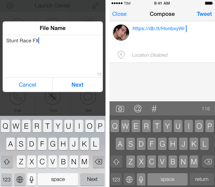
In Tweetbot 3, Tapbots removed the ability to post tweets longer than 140 characters using built-in services for text upload. While I understand that it wasn’t one of Tweetbot’s most used features, its removal got me thinking: would it be possible to replicate the feature using Dropbox and plain text files in an automated iOS workflow? I came up with a solution that requires Launch Center Pro and Drafts, and I’m quite happy with it.

Read more


Soulver for iPhone Updated for iOS 7 with Syntax Highlighting, More Unit Conversions, New UI

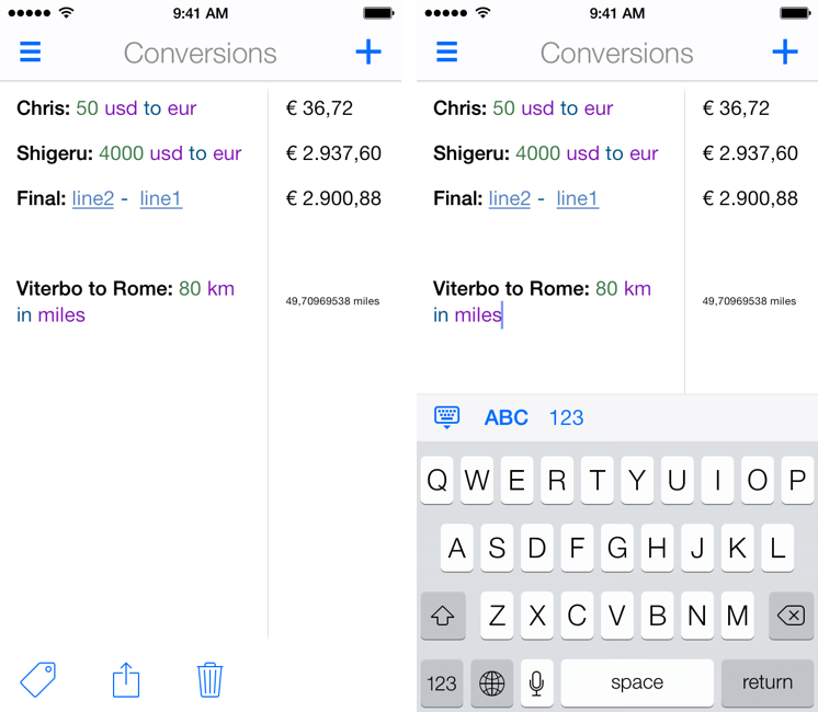
I’ve written about Soulver before: a calculator that isn’t really a calculator, Soulver lets you work with numbers for calculations and other operations using text commands across multiple lines. Soulver is, in a way, the Fantastical of calculators: using natural language, it lets you do quick calculations without having to tap dozens of buttons or scroll long menus. As the developers call it, Soulver is a “notepad calculator”.

Considering iOS 7’s focus on typography and legibility, I was looking forward to seeing how Acqualia would update Soulver (which is heavily text-based) to take advantage of the new OS, and I wasn’t disappointed. Version 2.3, released today, builds upon the app’s existing feature set to offer a redesigned interface (and icon), more unit conversations, and syntax highlighting.

If you’ve used other iOS 7 apps like Byword, you know how syntax highlighting is beneficial to the user experience: numbers turn green, units are purple, operations are blue, and plain text is standard black. Syntax highlighting makes lines more scannable because operations and individual bits of text stand out more; furthermore, because Soulver allows you to type units manually (you can write “USD”, “usd”, “dollars”, etc) you’ll instantly know if what you typed has been recognized by the app thanks to color highlights. Besides being nice visually speaking, syntax highlighting – a simple addition in theory – makes the experience of using Soulver considerably better.

With the update, Acqualia has added new unit conversion types, which come in handy for people who, like me, often trigger the app using a URL scheme that lets them type queries in apps like Drafts or Launch Center Pro. Like Fantastical, I’m faster at writing with natural language on my iPhone than tapping menus and lists, so the addition of more units allows me to use Soulver as the primary unit converter app on my device.

Soulver 2.3 includes other design improvements such as simplified navigation and easier access to total when the keyboard isn’t shown. The app hasn’t been updated on the iPad for almost a year now, and I hope that Acqualia is working on an iOS 7 update for that platform as well. Soulver 2.3 for iPhone is $2.99 on the App Store.


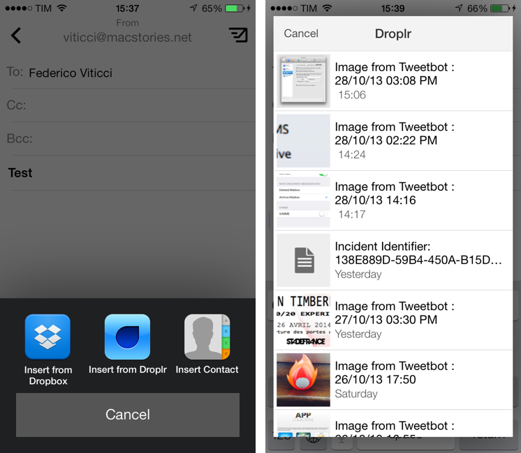
Dispatch 1.3 Gets Unified Inbox, Dropbox and Droplr Integration, Action and URL Scheme Improvements

Dispatch is my favorite third-party email client for the iPhone. Released in June, Dispatch stood out from similar apps as it implemented a powerful feature set that took advantage of native iOS apps to bring inter-app communication and snippets to mobile email. In September, the app was updated with iOS 7 background fetch, message search, and a change to individual message links that allowed iOS apps to open specific messages directly in Dispatch. Thanks other several minor features and details (such as custom salutations and link actions), Dispatch became a fantastic alternative to Apple’s Mail app for users who wanted more out of their iPhone email client.

With today’s 1.3 update, Dispatch gets even more powerful and versatile with the addition of a unified inbox: a feature that I had been asking for since the first version of the app, unified inbox is a new top-level item in the app’s sidebar and it groups all, unread, and starred messages from all your configured accounts’ inboxes. From the All Inboxes view, you can manage and respond to messages as usual, but you can also search and compose a new message without switching to an individual account’s view. Read more


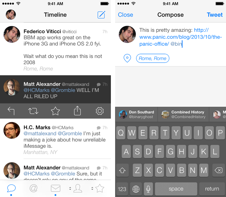
Tweetbot 3 Review: Human After All

Tweetbot 3 for iPhone

Tweetbot 3 for iPhone

Tweetbot is, by far, the iPhone app that I use the most on a daily basis. It’s not just that I keep Twitter open essentially all day to check for news, talk to friends, or post GIFs: since I got the first beta of the original Tweetbot three years ago, the app has become so ingrained in my workflow that I wouldn’t be able to switch back to any other client that doesn’t have the same capabilities. What started as a moderately advanced take on Twitter clients by Tapbots has evolved with time into a powerful app that spans three platforms and that comes with dozens of unique features and a solid engine that, for me, has no equal. I don’t say it lightly: because of Tweetbot’s feature set, I have been able to reliably communicate with other people (via DM or Mentions), reference tweets for articles, or build complex workflows that have allowed me to be more efficient, faster, and generally happier with Twitter.

That’s why I take major changes to Tweetbot’s overall structure and design, such as Tweetbot 3 for iOS 7, very seriously. Tweetbot 3, released today as a new app sold at $2.99 on the App Store (launch sale), is many things at once: it’s Tapbots’ first foray into the iOS 7 design aesthetic, which marks a radical departure from the small studio’s former visual style; it’s a profound reimagination of Tweetbot’s looks, animations, and sounds, which had gone largely unchanged since 2011; and it’s a confirmation of Tweetbot’s existing feature set with changes aimed at further enhancing the app’s functionality and making room for future additions. It’s iPhone-only, with a new version for iPad coming next.

I have been using Tweetbot 3 every day on my iPhone 5 for the past couple of months. I think that I have a good understanding of the decisions behind the app’s redesign, feature changes, and complete embrace of iOS 7’s visual and hierarchical approach to building interfaces. With version 3.0, Tweetbot, the robotic toy for your Twitter stream, eschews its mechanical roots and graduates to a modern, fluid, and fun assistant that, in the process, is still Tweetbot. I wouldn’t be able to go back to the old Tweetbot now, but I also think that getting used to the new app will take some time. Read more


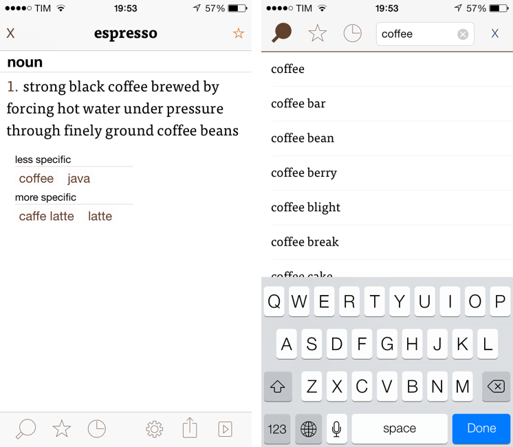
Terminology 3 Review

Less popular than Drafts but equally impressive in terms of functionality and inter-app communication, Greg Pierce’s Terminology, a dictionary and thesaurus app for iOS, is relaunching today for iOS 7 with a new Universal app that adds sync, configurable actions, and a redesign that matches iOS’ new general aesthetic. I have been testing Terminology 3 for the past few months, and this new version holds up to expectations by honoring Terminology’s tradition of simplicity and bringing powerful new features.

We first reviewed Terminology in 2010, when it was an iPad-only app that already showed how developer Greg Pierce wanted to focus on words and definitions rather than heavily custom graphics and fancy effects. A few months after the iPad version, Pierce released a standalone iPhone version, called Terminology Ph, that carried all the features of the tablet counterpart onto the smaller screen; a year after version 1.0, Terminology 2.0 was released, refining the user interface and adding new app integrations. Throughout 2011, 2012, and the better part of this year, Pierce maintained Terminology with compatibilty updates but otherwise focused on Drafts, which, as MacStories readers know, has contributed to redefining iOS automation and the idea of a “quick notepad” for iOS.

The new Terminology represents a break from the past, fully embracing iOS 7’s new design philosophy and offering customers an easier purchase experience with a Universal version. As a new app, you will have to buy Terminology again – something that is perfectly acceptable after three years of usage of the same app. Read more


Trucks and Cars

David Sparks:

As the analogy goes, the desktop PCs are the trucks and the emerging classes of tablets and pocket computing devices, such as iPhones, are the cars. When he made the analogy, it made a lot of sense to me but I felt like it was still something pretty distant into the future. I don’t think that’s the case anymore. Looking at my new iPhone, it has a 64 bit processor and is more powerful than anything I could’ve imagined just a few years ago. Moreover, software developers are getting smarter about ways to implement these touch devices in a way that’s quick, efficient, and just better than a traditional PC.

For geeks and professionals, there are still many tasks an iOS device isn’t good at. And yet, when you think about the fact that just three years ago stuff like this, this, or this didn’t exist, I do believe, like David, that Jobs was absolutely right in his prediction.

Permalink

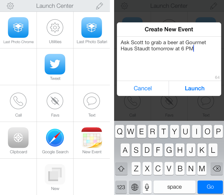
Launch Center Pro 2.0 Review

Launch Center Pro, developed by Contrast (née App Cubby), can be considered the app that spearheaded a small revolution among iOS power users. Initially envisioned as a Notification Center tool, following an Apple rejection in late 2011 the app was released as Launch Center; in the summer of 2012, App Cubby completely reworked the inner workings and design of Launch Center and turned it into Launch Center Pro, allowing users to create custom actions with personalized URL schemes and therefore kicking off a series of months that saw the apperance of several other apps focused on actions, URL schemes, and automated workflows. In looking back at the past year of iOS automation, I think that Launch Center Pro 1.0 was a major turning point in that it proved that many iOS users wanted to create actions and workflows to save time and be more productive.

In March 2013, App Cubby released Launch Center Pro 1.1, which focused on TextExpander integration in URL schemes, Action Composer tweaks, and deeper system integration with clipboard actions for text and more. The app’s library of supported third-party apps kept growing as more developers took the opportunity to address the interest sparked by Launch Center Pro to add URL schemes to their apps. I remember, however, that back then App Cubby’s David Barnard – the same developer behind the recently released and successful weather app Perfect Weather – started telling me about his plans for the future of Launch Center Pro and expanding to other supported services, apps, and devices.

With today’s Launch Center Pro 2.0 for iPhone, a free update for existing customers, Contrast wants to ask: in the era of Drafts actions and Control Center, can Launch Center Pro still have a spot on a user’s Home screen, and possibly in the dock? Read more