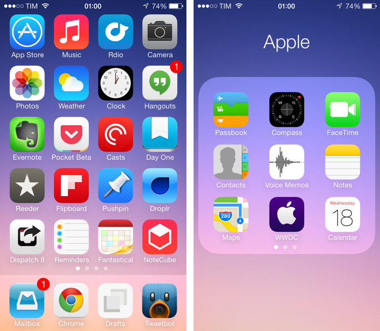
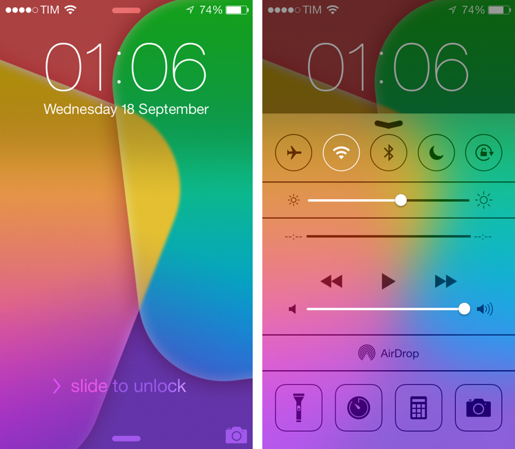
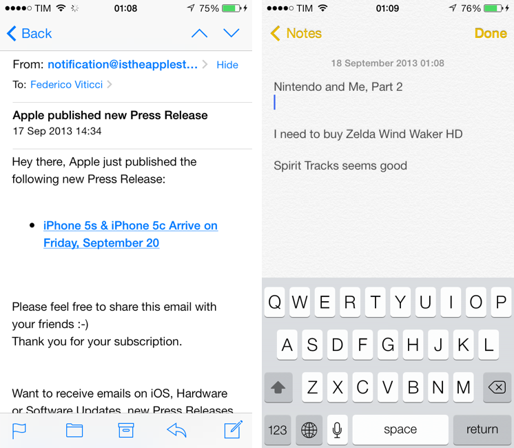
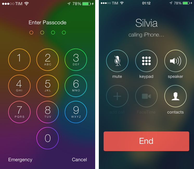
iOS 7, released today, is a deep reimagination of Apple’s mobile platform: using familiarity and the need for a reset as catalysts, iOS 7 represents Apple’s attempt to make iOS ready for the future. iOS 7 is, effectively, the epitome of a large company that knows it’s time to get rid of cruft and inconsistencies to bring a new order to a platform that has grown exponentially in the past five years. For developers, iOS 7 brings powerful new tools that will allow for a new generation of more flexible, intelligent, and versatile apps. iOS 7 is not perfect: there are rough spots and some wrong assumptions, but it’s not flawed or, as many will argue in the next few weeks, a “mistake”. It would be extremely silly and shortsighted to judge iOS 7 by the look of its application icons or the gradients Apple has decided to use on some graphics. More than any other Apple product, iOS 7 isn’t just defined but how it looks: iOS 7’s new look is devoted to functionality – to how things work.
It’s difficult for me to offer a comprehensive review of iOS 7 today, because I have only been able to test a fraction of the third-party apps I will use on a daily basis with my iPhone and iPad mini. Mirroring the concept of “design is how it works”, I would say that, for me, iOS isn’t just how Apple’s apps work on it – it’s increasingly become about how apps from third-party developers can take advantage of it.
I have been running iOS 7 on my iPhone 5 since Apple released the first beta in June. I later installed the OS on my iPad mini, and have been working with an iOS 7-only setup ever since. As MacStories readers know, I primarily work from my iOS devices, which helped me get a good idea of how iOS 7 will change the way I write, take photos, respond to emails, listen to music and podcasts, and all the other things that I use iOS for.[1] Fortunately, I had the chance to test a good amount of third-party apps that solidified my thoughts on iOS 7 and the way it impacts my digital life and workflow.
It was also hard to get ahold of fellow iOS 7 users in my town. While I imagine that it would be easier to come across a nerd running an iOS 7 beta at a bar in San Francisco, I didn’t have much luck in Viterbo, Italy. I tested new features like AirDrop – which allows you to share files and information locally with other iOS 7 devices – with my iPhone and iPad, and, in the past week, managed to convince my girlfriend to install iOS 7 on her iPhone.
I needed to provide this context: my livelihood directly depends on iOS and how I can work from my iPhone and iPad without having to use my Mac. Therefore, if you’re looking for a list of new features and smaller details of iOS 7 (and there are many), bookmark this article. My “review” of iOS 7 will focus on my thoughts on the update, how it made my iPhone and iPad better devices, and what I believe iOS’ future will be going forward.
Principles of Design
Until iOS 6, the visual appearance of the operating system was largely related to interface elements and ornamentations aimed at suggesting interaction through the use of real world metaphors. Buttons were shaped as encapsulated buttons, linen drapes adorned the top and bottom of the device for Notification Center and Multitasking, and apps like Notes and Podcasts hinted at their primary functionality by recreating distant relatives of the physical world with pixels on a screen.
The design of iOS 7 is based on what I call “The Four C Principles”:
- Content
- Color
- Context
- Clarity
There are several other concepts, guidelines, and deviations from the main theme at play in iOS 7, but, overall, everything leads back to the four key principles above.
In iOS 7, content is the star of the show. Content comes first; everything else is secondary, playing a supporting role. Content can be text, your photos, videos, gameplay, your music, tweets – content is what you want to produce or consume. Content is what you access when you use an iPhone or iPad, for leisure or work. iOS 7 wants to reclaim content from the interface and present it back to you, elegant and uncluttered. In iOS 7, the interface is deferential to your content.
From June:
The terminology Apple has chosen is different: by Apple’s parlance, iOS 7 is precise, sharp, coherent, simple, and efficient with a focus on clarity, vitality, motion, structure, color, context. Content is paramount; the interface defers control to the user, rather than claiming it. To quote Jony Ive, iOS finds “profound and enduring” beauty in simplicity, “a sense of purpose” in the way the interface takes a step back, reasseses its role, and comes forward again, subdued, neutral, more intimately “connected” to the hardware that lies underneath the OS.
The visual change of iOS 7 is immediately clear from the Lock screen: gone is the iconic arrow of “Slide to unlock”, leaving room for a chevron that points to a “slide to unlock” label that you can drag to move the Lock screen away and get to your Home screen or Passcode unlock screen. There’s a subtle animation that runs across the chevron and text, indicating that you can hold and move those elements; if you just tap them, they bounce, suggesting that something is waiting for you behind them. The keypad no longer resembles a physical keypad – it’s a grid of tappable numbers.
The predominance of content in iOS 7 is well exemplified by the OS’ use of whitespace, clean and neutral typography, and use of available space on a device’s screen. Navigation bars and toolbars tend to be white or black, depending on the color theme of the application, and they blend with the system’s status bar, now an element of design that integrates with apps and doesn’t make them feel like objects inside another part of the UI. For the same idea, content extends from edge to edge, using every available pixel to make apps feel more spacious and less constrained. In email messages, inline images go from edge to edge; in Settings, white section headers extend to the full width of the display.
In iOS 7, the edges of the display are even more relevant: in iOS 6, only the top edge could be used to access Notification Center, whereas now the bottom edge can be used to activate the new Control Center, and there is a system-wide gesture to swipe from the left edge of the display to navigate back to the previous screen of an app.
This approach reveals the intent to ensure software can be true to the hardware it runs on: by bringing pixels to the edge of the screen and making those edges areas that can be swiped to access system features or navigate through content, the hardware and software act more as a whole – they complement (instead of limiting) each other. It’s an invisible interplay under the hood, but, to me, it’s a new cohesion that simply makes sense.
A side effect of freeing the fundamentals of the iOS interface from real world metaphors, photorealistic objects, and 3D elements like buttons and glossy bars is that iOS 7 comes with borderless buttons and relies on color and text to indicate interactivity and selection.
In a typical iOS 7 app – such as Apple’s Mail – the blue color indicates interactivity and black text means “content”. The Back button, still available in the upper left corner, isn’t contained in a capsule: now, buttons are generally pieces of colored text that lose opacity when tapped and are desatured when inactive. This choice may be confusing at first: in the iOS 6 era, buttons shaped as glossy, “fat” buttons easily meant “tap me here”. In iOS 7, their simpler, textual look disorients at first, but, in my experience, with time the color/text association becomes more natural and obvious. Text labels as tappable items/buttons have some advantages in my opinon:
- Without a button drawn on screen, the text of a button doesn’t have physical limits – because it doesn’t have to fit inside a button of a specific shape or size. This is especially important for international users: a button’s text that looks good in English may not necessarily fit well inside a button shape in German or Chinese. While strings of text are still cut off by iOS if too long for a navigation bar or toolbar, removing the boundaries of a button’s shape gives developers more room for their localizations.
- By reducing the use of images to indicate interactivity, apps should feel less cluttered. In theory, making interfaces less reliant on heavy, custom images should also make apps snappier and more responsive, because the OS doesn’t need to animate several images at once.
- Without borders, buttons often feel more integrated with an app’s toolbar.
Besides interactivity, color also plays a big role in how it gives your device and your apps a unique identity.
Apple apps tend to use a distinct color scheme that should help users better differentiate and remember them. Notes uses yellow buttons and navigation items with a subtle letterpress effect[2] while Calendar has a white/red theme that is applied throughout the entire UI; Messages’ blue and green tones and gradients for chat bubbles are obviously different from Mail’s black & white look, and the Music app’s new pink color scheme is one of my favorites. For third-party apps, Apple is advising developers to consider color as one of the key elements for their app’s branding; while I’m not sure that color will be enough to avoid apps that look all similar to each other in the long term, from what I’ve seen so far it certainly looks like developers are listening.
Color is more notable in how it completely changes the look of your iOS 7 device through wallpapers. As I detailed in my initial overview in June, iOS 7 relies heavily on translucencies and blurring to hint at portions of the user interface hidden behind what’s currently in the foreground. I wrote:
Then there is translucency. In iPhone OS 1.0 and up until iOS 6, Apple used solid and glossy bars and controls, with the occasional transparency effect that, in the end, tended to feel like a gimmick and not a core part of the experience. In iOS 7, essentially every element that is layered on top of others is translucent, so that you’ll be able to get a hint of what’s underneath. In the process of considering translucency as a catalyst for context and “giving a sense of place” to the user, Apple has taken apart the layers that iOS accumulated over the years and rebuilt them from the ground up while adding new user features.
Look at Apple’s exploded view of iOS 7: your device and your wallpaper share the same level of importance in the OS’ new hierarchy and structure. Apps and software features like Notification Center and Control Center exist on top of the wallpaper level, and as such they inherit its most basic quality: color. In practice, this means that the simple act of changing your wallpaper will also personalize (through translucency) your experience with a device. Control Center will look different depending on your wallpaper; the numeric keypad will gain outlines based on the wallpaper’s color; in apps like Reminders for iPad, the wallpaper will influence the look of the sidebar, making an app feel like an extension of your device, which is exactly the point.
And yet, in spite of Apple’s fancy exploded view, there is one element that can overlay the system wallpaper: your contact’s photos. This is a simple, delightful touch that I deeply appreciate. iOS 7 has new circle-shaped profile pictures for your contacts, which show up in the Contacts and Phone apps, as well as Game Center. I’m particularly a fan of the fact that your favorite contacts can have profile pictures next to their name, and I also like the editing UI for adding and cropping a photo you want to assign to someone. But more than the tools, I like that when you’re calling someone, that contact’s photo becomes the blurred wallpaper behind the keypad and Phone UI. Effectively, you’ll see a blend of blurred colors behind the keypad, but, because you know what the real contact photo is supposed to be like, the feeling of communicating with that person will be reinforced. It’s a more personal, human experience than the static, plastic, glossy buttons of iOS 6, and it’s gorgeous to look at.
The use of translucency in operating systems isn’t new, but iOS 7 takes it to another level by combining its reliance on color and cleaner interface elements with your content to increase the sense of context that using an app gives you.
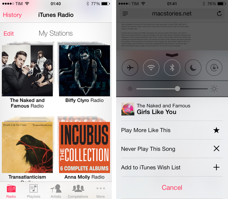
Here’s an example: when I’m using my iPhone, I’m typically listening to music, either on Rdio or the new iTunes Radio, while reading or just browsing around my favorite websites and subreddits. When I follow a link and Safari/Chrome launches, I don’t like watching a blank page for a few seconds, so I bring up Control Center with a swipe from the bottom edge to double check the title of a song or maybe give it a “star” with iTunes Radio’s widget. Because Control Center is a semi-transparent panel, I don’t have to look at the progress bar in the browser’s address field to know if my webpage has finished loading – I’ll just see the webpage’s content peeking from below Control Center.
Another good example that gives you an idea of how much iOS 7 values context are the new translucent bars. Again, in an app like Safari (but also the App Store and Mail) the status bar and toolbar are translucent, showing a portion of blurred content with a subtle transparency effect. This isn’t just good-looking (I personally love the effect), it’s also useful in that, if there’s, say, a photo below the text you’re reading, you’ll know before scrolling to it. iOS 7’s graphics layout engine is smart in this regard as it treats photos and text differently: photos will be blurred with their primary colors, but, in order to avoid confusion with overlapping icons and letters, if text is behind a bar, iOS 7 will automatically increase the opacity of its UI to not show blurred text. This is the reason why, in apps like Mail and Safari, photos that underlap navigation bars and toolbars will be blurred, but text won’t show through the UI, cluttering it.
In February 2012, I wrote about the problem with the iOS Home screen:
The problem Apple needs to overcome is that the Home screen tries to be a real object while providing access to the gates of the digital world. To reinvent it, Apple needs to tear apart the whole concept and rebuild it from the ground up.
When I first installed iOS 7 three months ago, I thought that translucencies were cool, but ultimately useless, if not detrimental to the user experience. Today, I think that, if used correctly and strictly where necessary, blurs and translucency can provide utility in how they hint at content available under the interface. Furthermore, I’ve seen developers (and Apple) using blurring effects to show the new spatiality of the OS: iOS 7 and iOS 7-ready apps have a clear structure based on layers of content and interface, and these effects can help make that structure more obvious.
The simplification of the Home screen that I envisioned in 2012 happens in iOS 7 with a refined layout that uses blurs, layers, and transparencies to tell you how elements are arranged in the new structure. Apple has thought this through to the smallest detail, such as making the app icon that you held to activate wiggling mode be on top of the one next to it.
What I don’t get is the new parallax effect. In June, it was described as a way for your device to feel “alive” in your hands by tilting the interface according to your hand’s movements, making for cool implementations such as being able to see behind the icons on top of a wallpaper. I wrote:
Parallax effects haven’t been enabled everywhere in the OS yet, and I’m looking forward to understanding whether developers will have APIs to implement them in their apps. In practice, parallax was described as being able to see behind the icons while using a photo of your family as wallpaper. Simple and human.
It is indeed a neat effect that makes for a great demo to friends on a Saturday night when the alcohol intake has reached the maximum allowed for the week and you want to show them “how much phones have progressed over the years, now they follow your eyes too”. I get that. But its novelty wears off fast, and I have yet to see a practical implementation that considerably augments the user experience in a way that goes beyond the “it’s cool” factor.
Apple has applied parallax to various iOS elements like alert dialogs, icons, badges, and it has provided developers with APIs to add parallax and other motion effects to their apps. While parallax contributes to iOS 7’s feeling of depth and layering, I think it’s mostly a gimmick, and not as effective in communicating certain aspects of the user experience as translucency, color, precise typography, or animations.
Apple has built a physics engine into iOS 7. I had a feeling that Apple had an interest in making interfaces feel more human when they first showed iBooks Author, which, back then, was highly reminiscent of Mike Matas’ work on Push Pop Press (a technology that was later acquired by Facebook). Like other past experimentations that are referenced in the new OS’ design[3], iOS 7’s take on physics is a full-on assault: Apple uses its new engine in several apps, and developers have been given an API to integrate it in their own apps. This new engine has helped Apple (and will help third-party developers) create animations and transitions that give the operating system a new kind of personality, one that is perhaps less immediately visible, but more tangible when using iOS 7 apps.
iOS 7’s guiding principle of clarity uses, among other elements, motion to convey information and express functionality to the user. It starts with minor details: when you press the Home or Power button to wake a device, the wallpaper subtly zooms in and the current time and date fade in before the rest of the Lock screen UI. Besides looking nice, it’s a useful touch as most people tend to wake their iPhones to look at the time.
On the Lock screen, two flat lines at the top and bottom indicate activation areas for Notification Center and Control Center: swipe, and the indicator starts following a Center’s panel, becoming a an up/down chevron when a panel is fully revealed to communicate that you need to swipe up or down again to dismiss the view.
When you unlock a device, app icons fly onto the Home screen, revealing their new, slightly tweaked shape that follows Apple’s new grid system to achieve a more harmonious, “tappable” feeling. Many have criticized the new icons’ shape and grid, but I think they are a massive improvement over the old iOS 6 icons, which now feel rigid to my eyes. Especially in apps like iTunes Store, App Store, and Messages, the combination of Apple’s color palette, squircle, and grid makes for more fun, approachable icons.
As you start using an iPhone with iOS 7, you’ll begin seeing all sorts of other animations and transitions that leverage the previously mentioned color, context, and content principles to tell the user what’s happening on screen in a delightful new way. When you tap an app, the transition between the Home screen and the app’s launch screen zooms into the icon; when you close an app, iOS zooms out, and the Home screen comes up again. Or when you do something as trivial as tapping the folder button to move an email message into a folder, the current message shrinks and goes into a toolbar at the top of the screen.
iOS 7 is full of animations that contextualize actions through the use of natural motion. With a mix of color, translucency, and physics the OS’ animation system seems more human. If Apple was trying to make iOS 7 feel “alive” on the screen, I think that animations and transitions do a much better job than parallax in this regard – they are always there, always part of the system, not necessarily making (some sort of) sense only if you tilt a device. They don’t have the over the top, look-at-this-real-moving-object aspect of iOS 6’s Passbook paper shredder, but because they aren’t limited by physical metaphors, they can respond to different, varying qualities such as gravity, mass, or spring.
When Apple does try to more heavily imitate the real world, such as in the new Weather app for iPhone, both the interface and animation system are done tastefully and thoughtfully. In Weather, conditions become part of the user interface with clouds, fog, sunrays, snowflakes, hail, or snow reflecting or bouncing off text and slowly moving in the background. Again, it comes down to providing context to the user and creating software that makes information more human, easily understandable, and obvious.
iOS 7’s animations are digital, but, under the surface, they are more real than shredders and torn bits of paper. They don’t try to replicate our physical world through pixels and photorealism – Apple is simply recreating the physical rules that govern our world. That’s a profound, far-reaching vision.
My only problem with iOS 7’s animations is that some of them take too long to execute and complete, and they can become boring after a while. I agree with Marco Arment when he says that some animations are too heavy-handed and patronizing after the first dozen of times you’ve seen them.
Generally speaking, I think it would be better if Apple sped up the Home screen and multitasking animations. But I also think that it’s important to not lose perspective and understand that the majority of iOS users (read: not geeks and developers) won’t likely notice the extra milliseconds that Apple has built into some of the animations. In fact, I’d tend to say that most users will actually like the obvious, in-your-face animations because they make iOS feel new and different. Being iOS 7 the major departure from the past that it is, it’s important to make the transitions stand out to instill the new basics of the OS in the average user. The speed of some of the animations is a bitter medicine for geeks, but a necessary means to say “this is what’s happening on screen on the new iOS”. With time, as users grow more accustomed to iOS 7, my hope is that Apple will start cutting the execution time of animations, making the OS feel snappier.
iPhone OS 1.0 was designed for a world that didn’t know smartphones and tablets would redefine our digital lives. It was all about making touch interactions obvious through visual cues and metaphors that could easily transition the user from the physical world onto the reality existing inside multitouch screens. Without a mouse or a physical keyboard, Apple’s best decision was to make iPhone OS 1.0 futuristic and advanced but at the same time reminiscent of its apps’ analog counterparts. The Notes app was a legal pad and the OS had buttons shaped like capsules. It had to be done, and it was amazing.
Six years have passed since iPhone OS 1.0. The tech world has changed, design trends have matured, and Apple has kept adding feature after feature to iOS, struggling to find physical metaphors to explain additions like Passbook and its player in the Podcast app. At what point do fun designs become an exercise for Photoshop skills and, overall, just gaudy and tacky?
Apple finds itself in a unique position now, trying to keep the familiarity of iOS 6 while imagining the next five or ten years of the platform. Last week, Craig Federighi stressed how iOS 7 will become the most popular mobile operating system in the world thanks to over 700 million iOS devices sold to date. Even if we assume that just half of those devices will upgrade to iOS 7, that would make for 350 million users who know how to operate iOS. How do you balance the need of explaining iOS to new generations of future customers with millions of existing users who want iOS to be more useful and more delightful?
From a design standpoint, part of iOS 7 comes down to taste, and the rest is based on principles that should allow a further growth of the operating system for the next several years. I don’t think that iOS 7’s design language is misguided or poorly managed: there are some false steps and rough spots, but I think that iOS’ new design will allow Apple to be more flexible and innovative with the features they’ll add in the next few years.
iOS 7’s new design doesn’t tell the whole story, though. In the end, people use iPhones and iPads – they don’t spend hours looking at them and over-analyzing their UI designs. It’s important to remember that, after all the discussions about typography and animations, iPhones and iPads have to work for us. They have to be useful.
iOS 7 has powerful new features and developers tools. Aside from my personal preference for the new look, functionality is my favorite part of iOS 7. But with some caveats.
Living with iOS 7
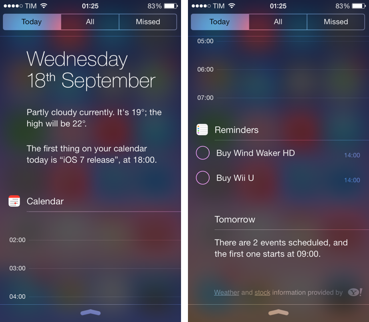
As I’ve previously shared on MacStories and The Prompt, when I installed the first beta of iOS 7 I decided to run an experiment with my workflow and see if I could move my task management system from OmniFocus to Apple’s Reminders. I was intrigued by iOS 7’s new Today view in Notification Center, which gives you an overview of your day by grouping weather information with events from your Calendar and todos from Reminders. It’s like a summarized assistant, in textual form, up in Notification Center, available anywhere. It sounded like a good deal, so I figured I could try it.
It really worked for me. I’ve come to rely on the Today view as a way to quickly see all relevant information for a day, and also a brief glimpse of tomorrow thanks to the iCloud Calendar integration. The Today view works for me for various reasons:
- The date is prominently featured at the top with a natural format: day of the week, day of the month, and month. This is how I want to know the current date, and now it’s only a swipe away in Notification Center.
- A quick weather summary is available under the date. It’s just the current condition, plus expected low and high temperatures for the day.
- Events and reminders are listed at the bottom. If there’s an upcoming event, iOS 7 will tell you “you have event x in x minutes” and then provide a list of events. If you have events for the next day, iOS 7 will tell you what’s the first one of those future events.
- Reminders are color-coded (for Reminders lists) and interactive. As you complete a reminder, you can pull down Notification Center, swipe to the Today view, and check it off from there without looking for it in the Reminders app. With iCloud, the completed reminder is synced across devices so you can forget about it.
It would be great to have third-party apps in the Today view, but, to my surprise, I’ve been fine with Apple apps in Notification Center’s Today view for a personal overview of my day and the things I have to do. Notification Center has gone from a linen-themed panel to a full-screen translucent view on the iPad, and, even if it’s not Apple’s most original design ever, it is functional.
Back in June and July, I had to drive each morning to a local gym for my daily physical therapy session. After a few days of sessions, iOS 7 noticed a pattern in my behavior and, without configuring anything, it started telling me (through the Today view) how many minutes it would take me to drive to the gym at a specific time between 11 AM and 12 PM. Depending on traffic conditions, iOS 7 would change from 5 minutes (normal time) to 7 or 10 minutes. I don’t know how iOS 7 figured out the traffic information (my town, Viterbo, doesn’t have traffic information in Apple Maps), but it worked and it was accurate. My best guess is that iOS 7 used the new Frequent Locations feature (available in Settings > Privacy > Location Services > System Services > Frequent Locations) to understand my driving behavior, driving times, and daily patterns to improve the information it would feed to Notification Center and the Today view.
I don’t understand why Apple didn’t go the extra mile and enhance every calendar event that contains location information with the weather and directions. Apple knows how to triangulate and parse this data, because tapping on a location in a Calendar event takes you to the Maps app that displays directions (either driving or walking depending on your default preference, a new feature of iOS 7) and looking up a location in the Weather system should be trivial. Most of all, OS X Mavericks’ Calendar will come with exactly this functionality. Instead, iOS 7’s Calendar requires to jump to the Maps app and displays no weather data, while the Today view can learn from your patterns but can’t display a summary of directions and weather forecasts for each event. It seems like a missed opportunity, especially because, again, Apple is doing it in Mavericks.
Even more surprising is the decision to completely hide all-day events from the Today view. I typically create all-day events for days when I know something important will happen and require my complete attention for several hours (a monthly check-up with my doctor, or a big app release) and they are hidden from the Today view because Apple said so. I don’t see any reason why all-day events – which, as the name suggests, are important! – wouldn’t have to appear in a view called Today. It doesn’t make any sense.
I like iOS 7’s Today view in Notification Center, but it would be much better and useful if it handled all-day events and embedded weather and driving information next to each event. I could understand Apple’s willingness to restricting Today summaries to built-in apps only, and I could even see why adding weather and directions could clutter the UI[4], but the lack of all-day events is a silly choice.
As a consequence of my increased usage of iCloud Calendar and Reminders, I’ve tried to live with Apple’s native Calendar and Reminders apps. Calendar doesn’t work for me, but I like some things about the Reminders app.
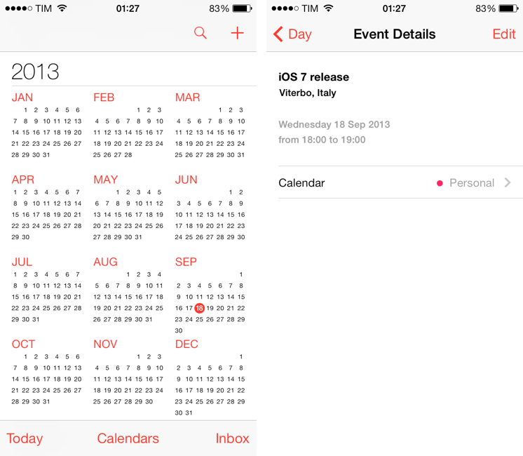
On the iPhone, the Calendar app starts with an elegant year view that lets you drill down into single months and then days with transitions that are smooth and fast. The animations help contextualizing the action of entering a different view by using a zoom in/out effect that is consistent with the in/out transition of the Home screen and app icons. There are delightful touches such as the way a month’s name follows you along from the year layout to month view or how a selected day shifts the entire week to the upper portion of the screen, revealing a day’s list of events in the bottom half. Days with events have gray dots, there is a Today shortcut, and you can swipe horizontally to switch between days. The app is extremely polished, focused, and precise.
The problem is that, besides good looks, I don’t like the way the Calendar app works for me. First off, it doesn’t support natural language input like Fantastical and Calendars 5, and I can’t stand adding new events by having to tap menus and operate spinners to set locations and duration. Second, unlike Fantastical’s excellent DayTicker, Apple’s Calendar for iPhone shows a single day view for each day – if you have an empty day, you’ll see empty hours. The view that I like – a list of upcoming events in chronological order, with no empty days or hours – is available by tapping the search icon, which is incovenient to do every time. Fantastical and Calendars 5 start with a list of all my upcoming events (and, in Calendars 5, reminders); in Apple’s Calendar, I have to remember to tap the search icon to see that list, and there is no natural language support. iOS 6 displayed the List view as a tab in the bottom toolbar, and I think Apple should add it back in that original position (possibly giving the option to set it as default launch view).
It doesn’t get any better on the iPad. On the iPad mini, the app doesn’t come with the playful transitions of the iPhone’s counterpart on the iPhone 5, and it adds a Day view that, in a larger layout, lists a single day’s worth of events…with empty hours and empty days if there are no events. The list view is tucked away inside a popover. On iOS 7 for the iPad popovers are generally white and borderless, which often makes it hard to distinguish them from the rest of the (mostly white) interface. Popovers are a fantastic piece of UX on the iPad, but I feel like iOS 6’s ones, with borders and well-defined bounds, were easier to separate from content underneath.
Overall, I’m much faster in adding and managing events with Fantastical, Agenda, and Readdle Calendars 5, which may not be as good-looking as Apple’s app, but at least they are more efficient for a power user like me. For people who usually add a couple of events per week I think that Apple’s app will be fine, but for everybody else I would recommend, like on iOS 6, looking for a third-party alternative.[5]
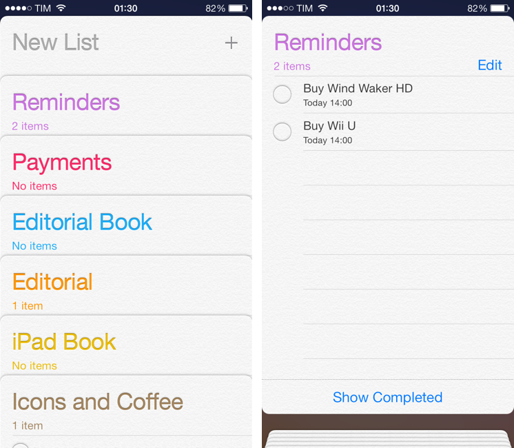
The Reminders app is good, and, for me, it comes with a minor but annoying issue. On the iPhone, the app gets rid of leather but keeps the paper texture to display lists as cards that you can tap to open, close, or swipe to take a peek at the first item of a list when they’re closely grouped together. The lists’ names use Apple’s new API to have a nice letterpress effect, and the system wallpaper acts as background in the app, which is a nice touch for user personalization. Thanks to the cards layout, you can tap & hold a card and rearrange it vertically just by dragging it. On the iPad, Apple eschewed the stacked cards representation and opted for a more classic, but convenient split layout that shows lists in a sidebar on the left.
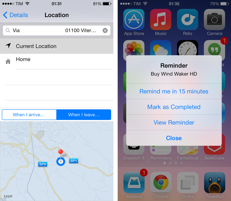
The options for creating and managing reminders are unchanged, but there is a handy addition for location-based reminders: you can tweak the radius of a location. The “When I arrive” and “When I leave” settings are now displayed on top of a map view that lets you hold your finger on screen to change the radius of a location’s trigger from 100 meters up to kilometers. If you enlarge the radius far enough, you can create location reminders that will alert you when you leave the country.[6]
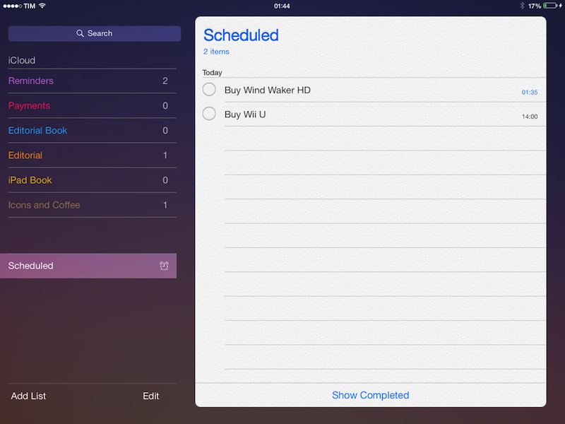
The reason I truly like the Reminders app is the Scheduled view, available by tapping the alarm clock icon that resides in the top right corner on the iPhone, or at the bottom of the sidebar on the iPad. The Scheduled view gives you a simple, direct visualization of all your reminders that have due dates, sorted by chronological order from top to bottom. It gathers reminders from all lists, and it’s a great way to see all your reminders in one place.
Also worth of mention is iOS 7’s alert dialog for due reminders. When a reminder’s alert fires off (possibly using one of iOS 7’s new, futuristic, beautifully synth-based sounds), you get a dialog with two buttons: Options and Close. The Close one is displayed with bold text, making it the default choice for most users – close it, complete the reminder, then open the app or the Today view and check it off. But if you tap options, you get an expanded dialog with shortcuts to be reminded again in 15 minutes, mark as completed right away, or open the reminder. This is a superior design that speeds up the process of acting on alerts, and I wish Apple did it with more kinds of notifications.
My complaint about the Reminders app is that it doesn’t support tappable URLs. Using Reminders as my main todo system and writing for the web, several of my reminders include URLs in the notes, and iOS 7 doesn’t let me tap them to open them in the browser. To add insult to injury, Apple knows how to do URL matching, because URLs are tappable in both the new Notes app and Calendar. For tappable URLs, I’d recommend using something like Agenda (which also lets you open links in alternative browsers like Chrome), or Due (which has its own sync system, but comes with many other nice touches).
Speaking of the Notes app: it retains the essentiality of its iOS 6 ancestor, it gets rid of leather and yellow paper, and it murdered Marker Felt with the fury of a letterpress machine (the letterpress effect is the same of Reminders). What I don’t like is that a note’s title isn’t repeated in the title bar, which makes it easy to lose context in longer notes. It supports iOS 7’s new Back gesture for navigation and AirDrop, but, in my tests, AirDrop led to duplicate notes on the receiver’s end, which wasn’t cool. I think that some of the Notes animations, especially on the iPad mini, are a bit rough and unfinished (such as swipe to delete).
I haven’t been able to use AirDrop much in real-life scenarios, but, from what I could test in my limited home environment, I think it’ll be a great addition for peer-to-peer sharing that will obviate the need for cumbersome solutions like Dropbox and Mail when you just need to share a document or piece of data with a friend or colleague next to you.
Like its OS X counterpart, AirDrop for iOS uses an encrypted, WiFi ad-hoc communication to share files between compatible devices nearby. AirDrop is supported only on Apple’s most recent devices like the iPhone 5 and later, iPad 4th gen, iPad mini, and iPod touch 5th gen. In iOS 7, AirDrop settings live in Control Center, where you can tell iOS 7 to make yourself visible through AirDrop to everyone nearby, just contacts, or nobody. If you choose the Contacts setting, only people who are in your contact list and using an iCloud account will show up.
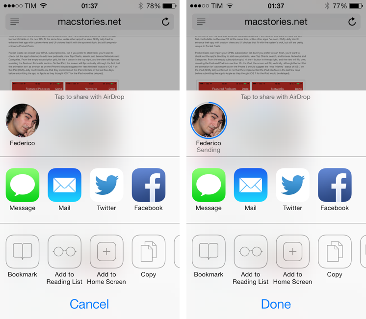
Using AirDrop is extremely easy and I believe it’ll supplant awkward web based sharing solutions for things like photos and URLs. Available by default in the new share sheet, people visible through AirDrop will show up with profile pictures; tap one (or multiple ones) and they will get a request to accept what you’re sharing; when done, the receiver will get the file or information open in the default iOS system app, and you’ll see a progress bar filling the outline of that person’s avatar, followed by a “Sent” label in the share sheet. Everything is familiar if you’re coming from OS X, and even if you’re not, it’s easy to use and intuitive once you’ve tried it a couple of times.
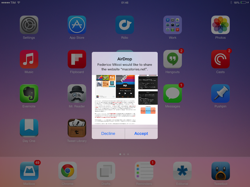
I found some interesting touches in iOS 7’s AirDrop implementation worth noting. AirDrop’s alert dialogs can contain inline pictures, which is a neat way to see a preview of the file you’re receving (such as a photo) directly in the AirDrop confirmation dialog. So, say you’ve left AirDrop visible to everyone in a public place and someone tries to send you an inappropriate photo, you can see a preview of the photo before accepting, so you can decline and file request and turn off AirDrop. Apple’s inline preview system is well done, as it supports snapshots for web pages shared from Safari, icons for App Store apps, and a screenshot of a location’s view for Maps sharing. It’s a nice addition on a technical level, which ends up being a practical implementation to enhance AirDrop’s security and user experience.
By default, AirDrop tries to open a received file or bit of data in the system app that is associated with it. So, for instance, a photo will be received and added to the Photos app, an app’s link will open in the App Store, a map in Maps, and so forth. For files and data that AirDrop can’t launch in a default app, however, Apple added an instance of its Open In menu to the AirDrop confirmation dialog. In iOS 7, the Open In system hasn’t been redesigned, and it lives in the share sheet in the form of application icons. When sharing a document like a .txt file through AirDrop, iOS 7 will ask you to accept the file, and then choose an app to open it with. I would have preferred an Android-like option to always default certain file types to a specific app, but I’ve learned a long time ago not to expect this sort of feature from Apple (it’d always be welcome, though).
I’ve always advocated for a version of AirDrop for iOS devices, and its implementation on iOS 7 doesn’t disappoint. Within the existing limitations of iOS that haven’t been addressed in 7.0 (Open In system, lack of user-configurable default apps) AirDrop “just works” thanks to peer-to-peer sharing that is fast and doesn’t require passwords or uploading to cloud services. I would like to see a simpified management of the “contacts-only” setting, but, otherwise, I think that AirDrop sharing will immensely improve things like local photo and video sharing for everyone.
They’re not actionable like some of their Mavericks counterparts, but I’ve found myself liking iOS 7’s new banner notifications. They haven’t received any sort of new functionality that iOS 6 didn’t have before, but they’re now translucent and, for apps that have been designed following Apple’s guidelines, they’ll cover up the exact upper portion of an app where the status bar and navigation controls should be. You can really tell when an app hasn’t been designed using Apple’s advised size for the navigation bar because of how banner notifications will cover parts of the interface they shouldn’t cover.
One minor addition that I do appreciate is that you can pull down a banner notification to reveal it in the full-size Notification Center. It makes for a neat way to see a single notification with more context in regard to others that were sent by the same app; if you want to immediately dismiss a banner notification, you can swipe it up and it’ll quickly go away.
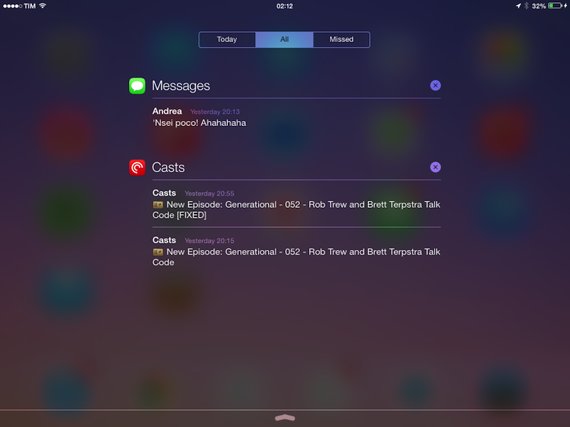
I haven’t been using the Missed view of Notification Center at all. According to Apple, the new view is supposed to show you only alerts that you haven’t addressed in the past 24 hours, but, in practice, I always ended up opening the default All view and cleaning notifications from there.
Which leads me to my two personal favorite features of iOS 7’s Notification Center: sync and Lock screen access. The latter is obvious and convenient: you can now pull down from the status bar in your device’s Lock screen to access the real Notification Center, so if you want to manage your missed alerts from the Lock screen while waiting in line at the grocery store, you can now do that. But that’s not the best part of Notification Center.
What I found truly great is notification sync through (what I assume is) iCloud. Imagine this: you receive a text message on your iPhone, but because you have also an iPad, you get it on that device as well. Now you have the same notification on two devices. Prior to iOS 6, you’d have to manually address the notification both on the iPhone and iPad. No more. On iOS 7, once you’ve addressed a notification on one device, it syncs to the other device automatically, removing the notification from Notification Center. Try it with the Messages app: get a notification, read it on one device, watch what happens to that notification on the other device’s Notification Center. You’ll see it disappear with no manual intervention.
Notification sync is amazing if you, like me, rely heavily on apps that can send a lot of notifications on a daily basis (like Messages) for daily communication needs. It’s the way Notification Center should have worked from the start, and I can’t go back to a system that doesn’t sync notifications across devices. I don’t know if only apps built with the iOS 7 SDK will be able to take advantage of this feature, but I wasn’t able to sync notifications for iOS 6 apps like Mailbox and Dropbox on my iOS 7 devices.
I’ve also found myself interacting with my iPhone using gestures rather than buttons – more than I used to with iOS 6. Control Center has been a fantastic addition for me, if only to access the Flashlight, the music playback controls, and Bluetooth/WiFi shortcuts. I wish that iOS 7 let me activate the Flashlight during a FaceTime call (it would be useful to show things to people if you’re in a dark room), but, in general, I’ve come to rely on Control Center so much, it seems crazy to think iOS didn’t have this functionality before. The only gripe I have with Control Center is that it’s hard to activate when the keyboard is shown on screen, because you’ll end up inadvertendly hitting some keys before the panel comes up. When the keyboard is visible, I think that the gesture recognition should be improved.
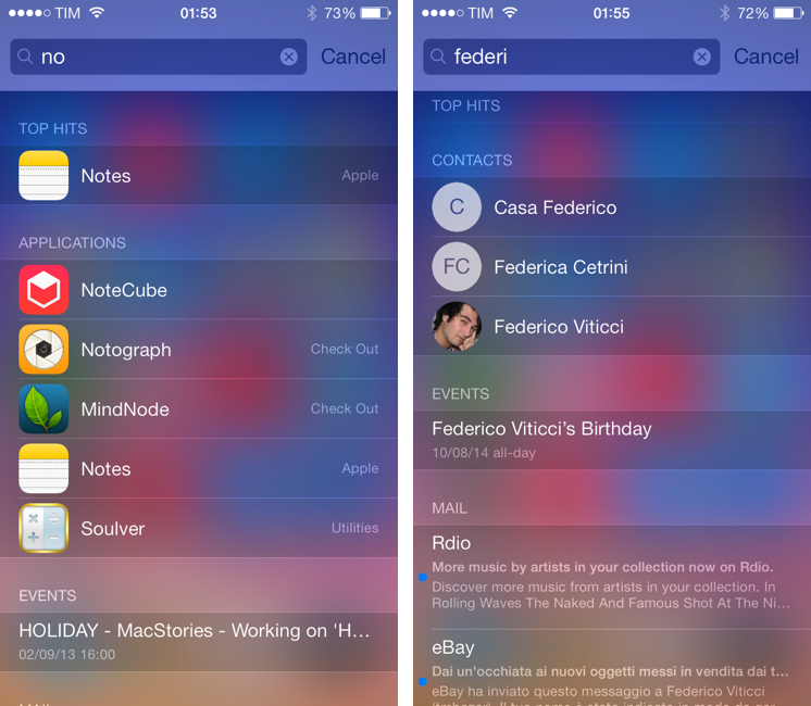
Aside from Notification Center, the other feature activated with a pull down gesture is Spotlight. Previously confined in a separate page on the SpringBoard, Spotlight is now available by pulling down the Home screen, on any screen. If you’re on screen #2 and you want to search for something, you can do it. I believe this is a better design than iOS 6, as it makes Spotlight more accessible without having to go to a separate area, albeit certainly more hidden for first-time users because there is no indicator telling that Spotlight is available by swiping down.
Thanks to Control Center’s Camera shortcut, I’ve taken a lot more photos and selfies. The Camera app has been redesigned on iOS 7, with a black interface that focuses on the fact that you can swipe to change between four camera modes: Video, Photo, Square, and Pano. HDR, Flash, and the switch button are still available at the top, the Camera Roll is at the bottom left, and a new button in the bottom right lets you access live photo filters.
Filters and Square are really meant to complement each other for Instagram users and people who like to apply filters to photos without Instagram.[7] I am not an expert of photography or filters, I never use them in my photos, but I guess it’s nice that the grid displays them in real-time, and that the Photo and Square mode can have separate filters: set a filter for Photo, another for Square, quit the Camera, launch it again, and each mode will still have the filter you chose. When a filter is active, the button is colored (as opposed to desatured).
I’m conflicted about the photo taking experience. Swiping between modes is a better solution than iOS 6’s various buttons, but the app needs more visual feedback when pressing the shutter. In iOS 6, you’d get a sound and an animation showing what you’d see on a real camera; in iOS 7, the eschewal of real-life objects has led Apple to replace the shutter animation with a brief flash of the screen accompanied by the same sound. The problem is that the new flash animation, which lasts less than a second, is easy to miss, and if you’re in a loud public place you’re going to miss the sound notification too. That will result in you not knowing whether you took a picture or not, and therefore taking another one “just to make sure”, but then ending up with duplicate photos in the Camera Roll because you actually missed the shutter animation. This is what happened to me, and I’ve heard the same complaint from other users as well. I think this is bad design in the name of change, and I hope that Apple will return to a more obvious camera animation.
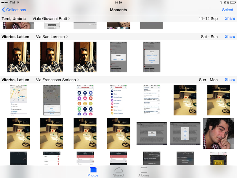
I am, on the other hand, a fan of the new Photos app. Photos (either from your device or other devices’ Photo Streams) are available in a single Photos tab that organizes items by Years, Collections, and Moments. The last two are smart groupings that divide photos that were taken in different places while still sorting them by time, filtering down by single days when you reach the Moments view.
Moments, in particular, are more effective than a simple vertical list of photos (what the app used to be) because they provide a logical organization of your photos without you having to do anything about it: your device’s camera already has the time and location information to do the heavy lifting for you. You can tap on the location to view photos on a map (make sure to pinch the photos on the map view to see some cool animations), or, better yet, share a specific moment (or selected photos inside a moment) to Facebook or iCloud.
The new iCloud shared streams are good, and I plan to use them with my family a lot. In iOS 7, you can create a private photo stream shared with selected users, and everyone will gain the ability to upload photos and videos to the stream if you enable the setting. Then, every user will be able to like photos, leave comments, and members of the stream will receive a notification every time there is activity. To catch up on recent activity in a stream, there is an aptly named Activity view. Streams can be published on the web at a public iCloud.com webpage so users who don’t have iOS devices will be able to view them. Overall, it’s a useful and intuitive functionality that I will use with my parents to let them see what I’m seeing on a vacation or a particular day without having to rely on email or message threads. That’s a powerful idea, beautifully developed in iOS 7.
My opinion of Maps has only slightly improved from last year. The app has been redesigned with a white theme, but the map views have stayed the same. For my area, there is still no Flyover or 3D support, but there seem to be more recent businesses listed in the search results. However, the app is still inferior to Google Maps when it comes to parsing search queries and finding results, sometimes bringing up results that are in a different region because it isn’t smart as Google at matching my input. Other times, the app generally picks routes that aren’t the best ones available, and, as I noted last year, voice navigation still uses the system’s language, and not the Siri language, which is, in my opinion, a bad decision (for voice stuff, iOS should pick the language the user sets for Siri, not the interface). There is a night mode now, but I can’t recommend Maps because of a color theme. For me and for my area, I believe Google Maps is superior for search results, quality of voice navigation, listed businesses, and traffic information.
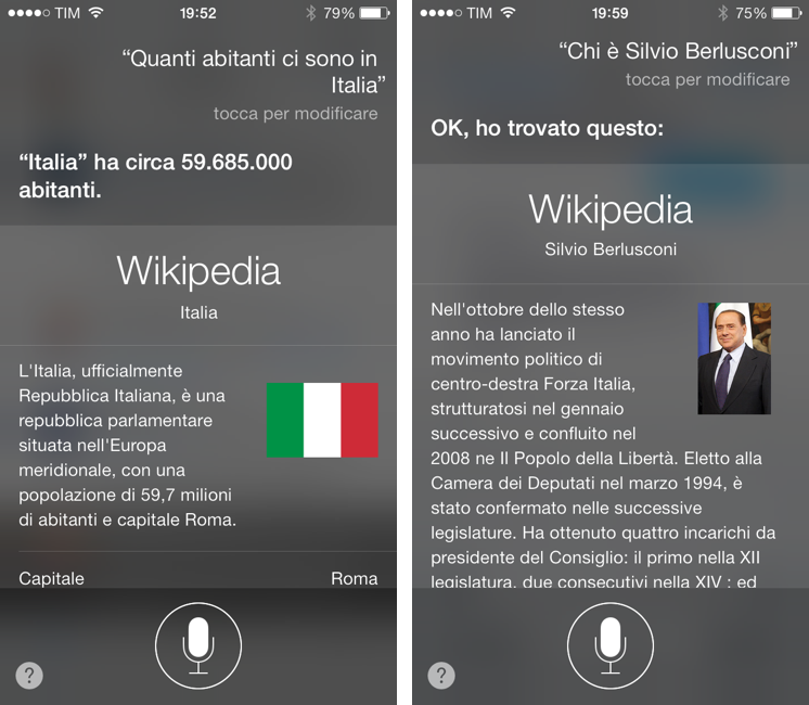
A feature that I didn’t initially like and that I’ve criticized on multiple occasions, Siri, is much improved in iOS 7. I actually am using Siri quite a bit more now, and I was surprised by the quality of the Italian voice, its increased speed, clean new design, and new functions. Notably, Siri is now a black translucent panel like Notification Center, showing light text on a dark background. There still isn’t a live text transcription akin to Google’s one, but at least there is a more immediate visual feedback with an audio waveform. In the past few weeks, Siri for iOS 7 has been much faster than its iOS 6 counterpart, and I wonder if this is the reason Apple is now confident enough to say Siri is out of beta.
I have noticed that Siri has gotten better at understanding the Italian language as well. The assistant is more capable when it comes to pronouns and subordinate clauses, although it still struggles with conjugations and more advanced sentence constructions (that’s the more advanced stuff though, and it’s understandable). The new commands that Siri supports in iOS 7 are useful: you can change settings, get and return missed phone calls, see what’s playing in iTunes Radio, and tell Siri how to pronounce your name (it did get Federico right on first try, to be fair).
The best addition, though, is integration with Wikipedia. When I first demoed Siri to friends two years ago, they would always try to ask common questions like “how many people live in Italy” or “what is a pizza”, and Siri would provide a shortcut to a web search because it didn’t know how to parse that information. With Wikipedia information, you can now run Q&As within Siri, asking the most disparate questions and getting spoken results back with inline text and image previews directly from Wikipedia.
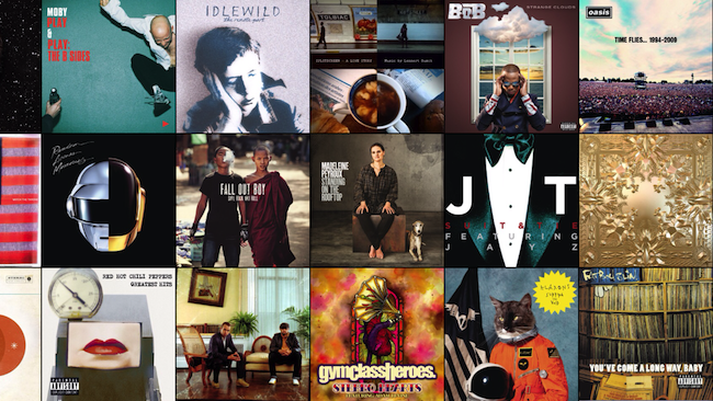
As MacStories readers know, I never used Apple’s Music app much because all the music I need is on Rdio. I only keep a couple of albums in the Music app, and that’s about it. With iOS 7, the Music app has gotten a visual refresh that, to my inexperienced eye, looks mostly good, especially in the new “wall of artists” landscape mode.
To my surprise, I’ve been liking iTunes Radio, Apple’s new Pandora/Rdio-like feature to serve up stations of songs that are chosen by iTunes and based on your tastes. You can create stations starting from a specific artist, song, or genre; stations are synced across devices with your iTunes account; and, you can tell the app to play more songs like the current one, never play the current song again, or add it to the new synced wish list of iOS 7. iTunes Radio is, essentially, a gateway to purchase more content on the iTunes Store, which Apple makes easy to do by prominently featuring a Buy button in the title bar.
Besides Apple’s strategy, though, iTunes Radio is quite good. The algorithm is accurate thanks to Apple’s years of experience in analyzing customer purchases and aggregate listening habits through the Genius feature of iTunes, so, as you’ll keep liking/diskling songs and tuning stations to hits, variety, or discovery mode, iTunes Radio will learn from you and present you songs that it knows you’ll like or at least not hate. In my three months of testing, my Oasis and Bloc Party stations have turned into an endless stream of songs that I really like, so I guess that’s encouraging. I’m not moving away from Rdio, but I enjoy listening to Apple’s iTunes Radio every once in a while, and I think that a lot of people will like it (especially in the free version, where ads aren’t that intrusive).
Working with iOS 7
iOS 7 hasn’t negatively impacted the way I work from my iPad and iPhone. Some changes have made my workflow better, there are some annoyances with the OS’ performance, and, for everything else, I’ll have to wait for third-party developers to update the apps I use.
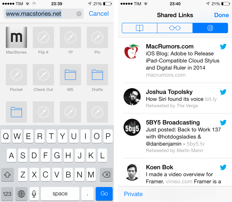
I haven’t switched from Google Chrome to Safari as my main browser, primarily because Safari still doesn’t come with an inter-app communication system like x-callback-url, which I’ve come to rely upon. There are, however, some changes that I truly like in Safari: most notably, the address bar is now a unified URL + search field, and, on the iPhone, bookmarks are available as website apple-touch-icons right below the address bar when you select it. If you have a lot of bookmarklets installed in Safari, it’s very convenient to be able to tap the address bar and launch one. This is a much better bookmarks menu than iOS 6, and it works especially well in conjunction with Safari’s new Shared Links feature, which collects all links shared in your Twitter timeline, right in Safari. I like to open Shared Links, find something, then send it to other apps with a bookmarklet.
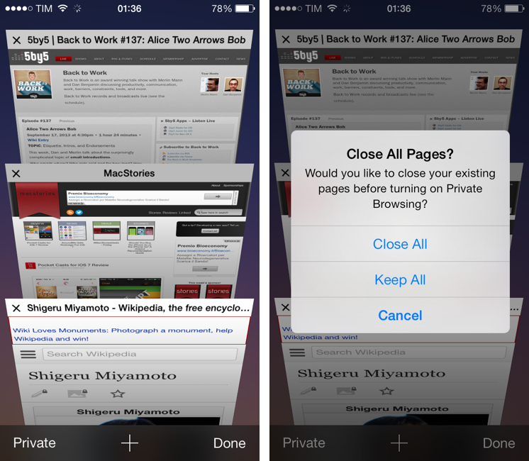
And yet, in spite of Safari’s clean new UI, Reader and Shared Links features, and new bookmarks menu, I can’t bring myself to leave Chrome. Google has done an excellent job with the x-callback-url integration between its apps and third-parties, and I find Google’s sync to be superior (faster, more reliable) than Apple’s, even under iOS 7. The new tab carousel view in Safari for iOS 7 is beautiful, but not practical for me: I open a lot of tabs on a daily basis, and to close them in Safari for iOS 7 I have to swipe them away, remembering that only swiping to the left is supported.
If you want to achieve some sort of “close all tabs” feature, there is a workaround to enable Private mode and disable it right away, so that all your tabs will be closed. Compare this to Google Chrome, which automatically closes a tab that was triggered by x-callback-url when you go back to another app (like Tweetbot) and that lets you swipe tabs away in both directions. I won’t get the speed improvements, text selection support on iPad, and better bookmark access on iPhone, but my workflow depends on Chrome’s inter-app communication/sync and I can’t switch to Safari. Plus, I’m curious to see what Google will do with Chrome and iOS 7-specific features.
The iOS 7’s App Store is a huge improvement over the performance-riddled mess that was the iOS 6 App Store. From last year:
I’m not alone in thinking the App Store on iOS 6 needs serious improvements before being ready for an optimal and stress-free customer experience. As the app is an HTML wrapper for content and styles Apple can fix “server-side”, there’s hope Apple will push fixes to the App Store without software updates. For now, however, the new App Store feels like a step backwards in terms of speed and reliability, and this is not good news for third-party developers who need users to pleasantly browse and discover software through Apple’s storefront.
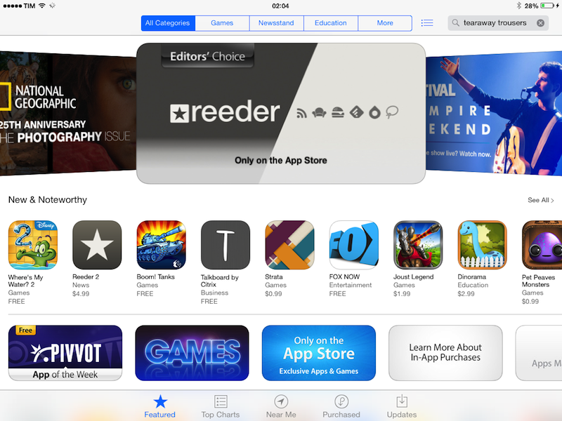
In iOS 7, the App Store is now native and, as such, it comes with smooth scrolling, fast opening times for app descriptions, sections, and charts, a finally usable Purchased tab that loads thousands of apps in seconds, and an overall unprecedented fluidness. I am serious when I say that the new App Store app is one of my favorite additions to iOS 7: I browse the Store to find apps, see sections, and read updates on a daily basis, and the iOS 6 App Store was terrible for that. The layout hasn’t changed, but the App Store is now a proper Apple app.
I still think several aspects of the App Store could be improved, though. Search, for instance, is still based on a cards layout and a ranking algorithm that, supposedly, Apple should be improving to lead to more accurate and genuine results. The persistence of cards is interesting, as the Top Charts have switched back to the original, pre-iOS 6 vertical layout, and I would like to see Apple making the same change to regular search too. As I argued in July, the new Near Me feature sounds good for populated areas and tourists who visit a lot of attractions or attend events, but, in practice, it’s always empty for me. When it does have something, it features my local newspaper’s app, which is terrible. I don’t think that Near Me will prove to be a substantial addition to the App Store in the next few months, and I think that Apple should consider replacing it with a more flexible Genius feature (this time, one that actually works). It seems like the sort of feature built for tech journalists who live in San Francisco and always try new apps, not “normal” folks who commute each day from home to work. It’s a neat idea, but ultimately useless in my opinion.
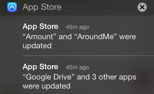
iOS 7 now lets the App Store automatically update apps for you, and, overall, I like this addition. It can be disabled from Settings > iTunes & App Store, but I’d suggest leaving it on to get the stress out of seeing a red badge on the App Store and having to remember to update apps manually. It’s just too convenient to always have your apps up to date to the latest version, with iOS 7 taking care of downloading updates in the background all the time, letting you know which apps were updated in Notification Center.
At the same time, I’d caution against automatic app updates if you’re the type of user who wants to know exactly what kind of update you’re about to install: if you don’t like it when developers remove a feature you really like from your favorite app, maybe it would be better for you to disable automatic updates and retain control over how apps are updated. Ideally, Apple could add more granular controls to disable automatic updates for certain apps, but I understand by they simply added an on/off switch in iOS 7.0.
I don’t use Apple’s Mail app because I need the push notifications of the Gmail app and Mailbox (as well as the ability to open links in Google Chrome), but the Mail app has received other nice additions in iOS 7. First off, the app supports Dynamic Type, Apple’s new system-wide control for font sizes. Configurable in Settings > General > Text Size, Dynamic Type allows apps that have been built with the iOS 7 SDK (and that support the feature) to intelligently scale text at various sizes automatically, without developers having to care about advanced attributes like kerning and ligatures because Apple’s iOS 7 typographic engine will take care of them. Obviously, the Mail app takes advantage of the feature, so you can adjust the text size to your liking in the Settings, and you’ll get a bigger or smaller size in Mail messages.[8]
Search in the Mail app still isn’t as fast as the one in Mailbox, but Apple added a feature to create custom mailboxes in the main screen of the app to facilitate the process of, for instance, looking for a specific message in All Mail. Just tap the Edit button in Mail, then Add Mailbox, and choose Gmail’s All Mail folder as the root folder for the new mailbox. You’ll get a custom mailbox in Mail’s initial screen, from where you can start a new search that looks in every message of your account. Apple is also including built-in shortcuts for messages that are CC’d to you, or ones that contain attachments.
For power users, Apple added support for message URLs in iOS 7. A feature that OS X supported since Leopard but that few people know about, message URLs allow you to open a specific message in Apple’s Mail app using the message:// URL scheme. MacStories readers may be familiar with these URLs because I rely on them for some of my Evernote scripts and automation tools.
In iOS 7, if you have a message URL that corresponds to a message, the URL will correctly open it directly in Mail. There are two limitations: the message has to be already downloaded in the Mail app, and, of course, you have to know the URL. So far, I haven’t found a way to create URLs to reference Mail messages on iOS, but the ones you create on your Mac through AppleScript and Mail.app will continue to work on iOS 7 devices. Therefore, if you have scripts that generate these URLs to, say, attach them to OmniFocus or Evernote, you’ll be able to tap them and open the associated message on an iPhone or iPad. I look forward to seeing whether developers will figure out a way to generate message:// URLs on iOS.
I spend most of my time writing and taking notes on iOS, but, unfortunately, Apple hasn’t made changes to the iOS text editing and selection mechanisms, which, in my opinion, are showing evident signs of time. I still find it utterly cumbersome to place and move the cursor on iOS 7, and, due to the keyboard’s new lighter “glass” design, I think that keys have lost too much constrast, making it harder to quickly peek at the keyboard if you, like me, can’t type without looking every once in a while. Personally, I still get confused by the Caps Lock key, which has lost the white glow and blue highlight of iOS 6 to leave room for a more subdued black outline and white key color.
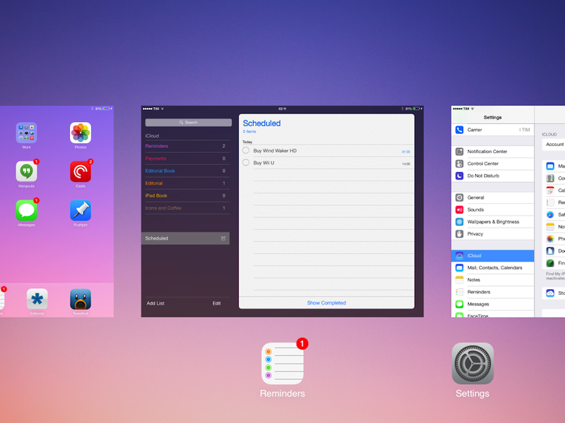
I wasn’t sure about it initially, but I now think that the new multitasking view of iOS 7 is a good step forward. iOS 7 eschews app icons in the multitasking tray and brings full app previews when double-clicking the Home button to switch between apps. While less icons are shown on screen (both on the iPhone and iPad, you get 3 icons/previews), the new multitasking view gives more context as to what you’re really switching to, the status in which you’ve left an app, and new content available in an app. In iOS 7, in fact, apps can update their latest snapshots in the background if something has changed, an obvious example being that you can quickly look at the multitasking view to see if you’ve received a new message without opening the Messages app. While the animation of the multitasking view is slower than iOS 6, the slightly reduced speed is compensated by an increased convenience in switching to an app by tapping the large snapshot in the middle of the screen. One small touch that I like is that iOS 7’s multitasking puts the most recent app in the middle of the screen, which is the most comfortable area to tap, so that switching back and forth between two apps can be easier. The only problem I’ve encountered is that, due to the iPad mini’s amount of memory, apps are often closed in the background, and the multitasking view gives you the illusion of switching to a “live” app while you’ll actually be forced to wait because an app has to relaunch.
In iOS 7, removing an app from the app switcher (by swiping up) stops its background service. The new Background App Refresh system is one of my favorite iOS 7 features and one that I’ve long wished for. I haven’t been able to try many third-party apps with support for background refresh, but, based on what I’ve seen so far, I believe it’ll be an excellent addition to my workflow with minimal impact on battery life.
In iOS 6, it used to be that apps could transfer data in the background only for a limited amount of time (usually 10 minutes) and receive push notifications for new content available remotely. In iOS 6, if Instacast started downloading podcast episodes and 10 minutes passed, you would receive an alert that required you to open the app again or the download session would time out. In OmniFocus, you couldn’t get the app to always be in sync with the Omni Sync Server in the background. In Instapaper, Marco Arment had to come up with a workaround to make the app fetch your latest articles when the user’s location changed, not any time there were new items in your account.
In iOS 7, the system has been completely overhauled. Through a new Background Transfer service, apps can now enqueue multiple downloads in the background, leave them running, and the OS will take care of making them stick after an app is closed or a device is restarted. There are no time restrictions, so you don’t have to launch apps every 10 minutes – you can just leave them in the app switcher, and they will always download new content for you, in the background, automatically. This is great for apps like Pocket Casts and Instacast, which can now always present your up-to-date content without any additional manual operation.
In general, through background fetch, developers have now a way to periodically launch apps and check for new content. When using background fetch, iOS 7 will determine at opportunistic times when it’s appropriate to check and fetch new data: by analyzing user patterns and other criteria like battery life, network, and location, iOS 7 can pick the best time to run the background fetch, coalesce fetches from multiple apps, and then use the Transfer service to download files in the background if necessary. If new content is critical and of immediate importance, developers can send a remote notification (optionally making it a silent one, so a device won’t ring) to tell iOS 7 to fetch updated content right away.
For developers, Apple is now offering proper tools to manage background updates and downloads by making iOS do the hard work of checking device and network conditions. On the user’s side, what I have noticed with the handful of iOS 7-ready apps I could try is that, as long as you keep apps in the app switcher, everything seems to “just work”. It’s great to be able to launch Pocket Casts and find your latest episodes waiting for you without having to wait for a refresh.
I’m excited to see how developers will integrate with the new background refresh APIs to make switching between apps and working with them even more seamless and intuitive. I can’t wait to see the day when Day One will always fetch my latest diary entries, when Tweetbot won’t force me to reload timelines and DMs, or when Evernote won’t have to sync every time I launch it.
Stability, Polish, and iPad
In my experience, the iOS 7 Golden Master seed that Apple released on September 10th has been more problematic than GM seeds for iOS 5 (2011) and iOS 6 (2012). Assuming that the version that Apple released today is the same one of the Golden Master released to developers a week ago, I can say that iOS 7 has been fairly smooth and fast on my iPhone 5, with occasional system crashes and reboots. On the iPad mini, I have experienced several hiccups in terms of animations and overall performance, with SpringBoard crashes, reboots, and hard resets.[9]
In the past week, I’ve had two random crashes of the SpringBoard on my iPhone 5, and one when using the Phone app to make a phone call. In my workflow, I haven’t noticed any other reproducible serious bugs that prevented me from using my iPhone 5 on a daily basis. On the iPhone 5, animations are, in general, fluid and smooth, if only a bit too slow in certain areas. I can safely recommend updating an iPhone 5 to iOS 7, keeping in mind that, in this first build, crashes and reboots may occur occasionally.
I would have given some extra weeks of development to iOS 7 for the iPad. On my iPad mini, aside from an overall inferior level of polish of the interface, graphical glitches, UI inconsistencies, and slower performance, I’ve seen Home screen crashes and hard resets, which forced me to re-configure my iCloud account and Apple ID. I still managed to get my work done on my iPad mini when I was writing in Editorial, but issues were frequent when moving across multiple apps.
Both on the iPhone and iPad, I’ve experienced issues with Reminders synchronization, with completed or new items not syncing changes back and forth, even after I deleted my iCloud account and added a new one. Reminders sync worked mostly well when using Reminders on just an iPhone and iPad, but it started presenting issues when configuring Reminders for OS X and for the new iOS 7-inspired iCloud.com website with my iCloud account.
In many ways, iOS 7 for iPad feels more “beta” than iOS 7 for the iPhone. There are a few rough spots with design issues and inconsistencies on the iPhone, but, in the iPad GM release, there are design problems that go beyond performance.
Many areas of the OS and Apple apps feel like scaled-up pieces of the iPhone UI that don’t take advantage of the iPad’s larger canvas, such as folders, which are now full-screen and paginated but present the same amount of apps at once as the iPhone. Notification Center doesn’t try anything clever with the new full-screen view and the extra space provided by the iPad’s screen. The Music app is a larger replica of the iPhone’s version, not attempting more audacious features such as inline album expansion a la iTunes 11, but instead spacing out large rows of whitespace and forcing users to navigate inside multiple screens.
The spatiality of apps in the multitasking view is broken by the iPad’s multitasking gestures: while I wouldn’t make a big deal of the fact that the three-finger swipe up is no longer mapped to an actual direct slide-up of the interface (as it was on iOS 6), the four-finger and five-finger horizontal swipes to move between apps are just downright confusing when compared to the multitasking view’s layout. When swiping to the right, you’re taken from App A to App B, and you can swipe to the left to return from App B to App A. However, in the multitasking view, the first time you switch App B becomes App A, and vice versa. In my opinion, this is only confusing at a high-level design consideration (i.e. gesture works, and normal people won’t care), but it shows that it’s time for Apple to rethink several of its old UX and UI choices on the iPad.
I would have liked to see Apple experimenting with brand new ideas for iPad interfaces and gesture interaction. My hope is that Apple will iterate quickly with 7.0.1 an 7.0.2 releases with bug fixes and performance improvements, saving possible design and interaction improvements for 7.1 and future major updates.
To The Future
Today, you’ll read many stories saying that iOS 7 is iPhone OS 1.0 for the modern age: a reset of the iOS design language, a fresh start for Apple, and a new opportunity for all developers. To an extent, that’s certainly true. But such a statement can only be representative of reality if the history of iOS 7 is also properly contextualized. iOS 7 is the new iPhone OS 1.0…with six years of iOS software changes and advancements behind it. That’s a big difference.
I think that Apple’s greatest accomplishment is to make iOS 7 feel new and cleaner without losing any of the powerful functionality that allows people to use iPhones and iPads as computers. In spite of having more features than iOS 6, Apple’s new design language and structure gets rid of much UI cruft and makes iOS more organized, precise, fluid, and less rigid. When I think of iOS 7 after three months of intensive usage, I don’t get upset about the icons (though they’re still odd) or the gradients, but I associate this update with flexibility, ease of use, and fewer annoyances. It’s extremely hard to add features without complicating a user interface, and I think that Apple achieved its goal here.
It’s important to remember that Apple’s audience for iOS 7 isn’t the vocal minority of people who point out every design inconsistency, but the millions of customers who rely on iPhones and iPads every day for communication, work, entertainment, creation, consumption, and everything in between. A design critique is always necessary – especially for a company like Apple that prides itself upon higher design standards – but it’s not the only metric that should be used to judge iOS 7. That would be inconclusive and shortsighted.
iOS 7 comes with powerful additions like Control Center, better Siri, AirDrop, improved Notification Center, and Background App Refresh out of the box, and these will be enough for most people to upgrade to iOS 7. Less promoted new features like FaceTime Audio (for audio-only FaceTime calls), possibility to check cellular usage for individual apps (finally), and new options for Find My iPhone will also substantially improve the everyday experience of all iOS users, whether they’re “average users” or geeks.
When the developer APIs are taken into account, however, is when it’s easy to see Apple’s advantage over the competition: iOS 7 now lets developers implement animations that respect the laws of physics, easy controls for typographic styles, better text layout and reflow controls, background fetch and download APIs, new graphic rendering engines, and much more. Looking ahead at the iPhone 5s, iOS 7 will also let developers access accurate motion data from a dedicated motion coprocessor that is always on with less strain on a device’s battery. iOS 7 is powerful as it is, and even more for the people who will make the apps that we use.
In the short term, you’ll see thousands of apps adopting Apple’s iOS 7 design style with few custom variations on Apple’s take. This is completely normal as it happened before with the launch of the iPhone App Store in 2008 and the iPad in 2010: developers want to be on this new platform today, and the easiest way to do it is to follow Apple’s guidelines for a fast and relatively painless transition, leaving more risk-taking design ideas for later. I wouldn’t be surprised to start seeing iOS 7 app designs that move away from Apple’s default look in 3 or 4 months, when the dust will have settled on iOS 7’s design and the general public will be more familiar with the new OS.
You should also start seeing apps that take advantage of background refresh and better text controls and layouts starting today. Expect a lot of new animations in your favorite apps, major updates to existing apps sold as separate paid versions in the App Store, and, occasionally, an abuse of transitions and translucencies. A lot of new apps will launch as iOS 7-only, and, in a matter of 12 months, I don’t think there will be many popular apps that still support iOS 6. After the initial wave of App Store releases this week and next week, I expect to see text editors with support for custom shortcuts with Bluetooth keyboards, new photo apps with slow motion modes and other effects, and updates to fitness-oriented apps to support the 5s’ M7 chip and CoreMotion API.
iOS 7 could have used more development time on the iPad, more UI polish in some iPad apps and features, and less minor bugs that can annoy people with an attention to details. I hope that Apple will release bug fixes and performance improvements soon.
It’ll be interesting to see where Apple will take iOS 7 next year. The new design gives the company new areas to explore, such as improvements to Notification Center to support actionable notifications (coming in Mavericks), inline traffic and weather conditions in Calendar (also in Mavericks), or personalization of shortcuts in Control Center (currently, Control Center’s panel in Settings has only two options). With popular user requests such as background downloads, Control Center, and new multitasking now out of the way, it seems reasonable to hope that Apple will consider revamping interoperability and communication between apps in the future. A Siri API has long been rumored, and I like to think that the special widget that iTunes Radio has in Control Center (with controls to like songs, etc) will someday be opened to third-party developers. Text editing and selection, system clipboard, and Open In are still unchanged from the early days of iPhone OS, and now’s the right time to address them.
7.0
iOS 7.0 is beautiful, coherent, structured, and powerful. Apple has made improvements to key areas of the OS that allow me to use iCloud and Siri more, and third-party developers now have the tools to make apps that will let me be even more efficient from my iPad and iPhone. I think that iOS 7 is a great step in the right direction: making the iOS interface more versatile both in terms of design and functionality.
I can’t wait to see what’s next.
- Yes, I do also make phone calls and send text messages. I don’t keep the Phone and Messages apps on my Home screen, but I am, indeed, still using the iPhone as a real phone as well. ↩︎
- Also an API available to third-party developers. ↩︎
- Last year, when Apple added a subtle motion effect to the Camera icon in the iOS 6 Lock screen, many noted how that concept should have been used in more areas of iOS that felt too static. Yep. ↩︎
- If that’s the reason, at least put that information in the Calendar app. But it’s not there either. ↩︎
- A nice change: iOS 7’s new time-picking wheel lets you set individual minutes, and not five-minute increments, for alerts. ↩︎
- In my tests, I couldn’t bring the radius outside the European continent. I guess there goes my plan to be notified by Reminders to call my mom when I’ll decide to flee Europe and take to the sea. ↩︎
- Why would they do that? ↩︎
- I’ve talked to several third-party developers, and Dynamic Type seems to be one of the most popular SDK additions because it takes so much pain away from typographic settings. Apple’s engine is aimed at making text look great at any size, and it allows developers to specify styles semantically using nomenclatures such as “Headline 1” or “Caption 2”. Text is dynamically made bold when smaller, thin when larger; Apple’s engine will make size-specific adjustments to character space and weight, as well as line spacing to ensure that text will always be legible at any size. Dynamic Type has Accessibility built-in, and there’s even an option to increase contrast between normal and bold text for impaired users. In short: Dynamic Type is a huge help for developers, and apps that integrate with it are much more flexible with their font sizes and typographic styles because they can follow a system-wide setting that is consistent across other iOS 7 apps. It’s great. ↩︎
- By hard reset, I mean when an iOS device crashes, reboots, and forces you to go through the initial setup again without losing data (app, documents, etc). ↩︎


